About issues and terminology

Thanks Thomas !

I think it has been brought on Slack that a proper definition of the Notorious 6 would be interesting for this group. So I have tried to come up with a definition and some examples.

The “Notorious6”

Let’s see if we can start with the definition given by Troy and elaborate from there :

The “six” are the inherent skew poles all digital RGB encoding systems skew to; pure red, green, blue, and their complementaries of red + blue magenta, green + blue cyan, and red + green yellow. As seen with camera clipping at the high end to the compliments, and to the primaries on the low end. So as emission increases, all mixtures skew to the gamut volume of the device, but towards compliments of whatever the working / device range primaries are. As emissions decrease and exceed the floor, they skew toward pure primaries.

The best example I have seen so far (not only on this forum but also in the whole wide world) is this video by Jed Smith.

Some may call it mind-blowing, some others may not… But I personally think it is simply the best way to show the Notorious 6. :wink:

You start with a whole range of colors/mixtures :

image

And you end up on the path to white with only 6 of them (aka The Notorious 6) :

image

You can clearly see 6 spikes on the path to white in the image above : red, green, blue, cyan, magenta, yellow. If I understood correctly, any curve that asymptotes at 1 will have this unfortunate behavior.

The following plot is also quite useful to visualize them (ACEScg sweep of values on their path to white through the P3D65 Output Transform) :

On the path to white/achromatic axis, we can clearly see a trend towards 6 mixtures : three primaries and three complementaries. This is why by only doing these sweeps we can really appreciate the issue.

A render that shows clearly one of the notorious 6 (magenta) is the following one :

image

We start with a sweep from an ACEScg blue primary to a magenta complementary. And on the path to white, we end up with one mixture : magenta ! (Well, actually two, but you get my point.)

What this render should look like in my opinion ? Possibly this :

On their path to white, hues are respected/preserved rather than going towards a single colour/mixture. This is actually a big deal because per-channel actually prevents us from reaching certain chromaticities at certain levels of exposure and forces us into one of the notorious 6.

Which is put much more nicely by Troy this way :

As in as we move toward the vast majority of unique mixtures, per channel makes it virtually more and more impossible to hit them.

I also think it would be important to add (from Troy again) :

Anyways, primaries and compliments are the worst demo. Because the skews are for all other mixtures. As in the least distortion happens along those axes. The most heavy distortions come from all other mixtures.

Just for fun, I have plot the same sweeps with sRGB primaries under different DRTs :

Nuke_default : sRGB eotf

spi-anim OCIO config : Film (sRGB)

ACES 1.1 OCIO config : Rec.709 (ACES)

TCAM v2 OCIO config : Rec.1886: 2.4 Gamma - Rec.709

I hope these several examples and definition clarify a bit what are the Notorious 6. And if we want to dive a bit deeper in the topic, two of them already have nicknames :

  • Cyan hell ® (typical of overexposed skies for instance)
  • Rat piss yellow ® (typical of lamp shades shot at night)

In summary, the notorious 6 are the values hit at display on their path to white by any system using per-channel (or any curve that asymptotes at 100% display) and are a direct consequence of the hue shifts.

I am barely an image maker trying to point out stuff/issues that could/should be improved. Sharing and learning is at the core of this community. So if anyone could reply to this thread explaining what is a Jones diagram, how do you read it and why it is important to this OT VWG, that’d de much appreciated. @Alexander_Forsythe maybe, since you were the one who brought up this on Slack. :wink:

Regards,
Chris

2 Likes

Hello,

I was interested to group in one place information about colour appearance phenomena. This is barely a collection of information shared in different threads, that I will try to update whenever possible.

About appearance modeling :

About the “Hunt Effect” :

  • Interesting answer posted here by Thomas :

Something to keep in mind though is that while a global colourfulness tweak tend to work fine, because the Hunt Effect is driven by the display Luminance increase, itself modulated by the tonescale, the tweak should be weighted somehow, e.g. shadows and midtones require different strength than highlights.

About Lightness and HKE :

[…] to me the “right” way to tonemap involves moving away from the per-channel compression schemes that our industry is fond of, and instead towards better hue preservation (and separation of grading from compression) via mappings more akin to what Timothy Lottes described in his presentation Advanced Techniques and Optimization of VDR Color Pipelines, and Alex Fry in his presentation HDR color grading and display in Frostbite.

About Luminance and Lightness :

  • Some interesting informartion is mentioned here. This is a Siggraph talk from 2018 by James Ferwerda and David Long.

Human beings perceive lower contrast (Stevens Effect) and lower colorfulness (Hunt Effect) when stimuli luminance is reduced. The display environment is almost always less bright than the original scene in motion picture applications.

Hope it helps a bit,
Chris

Thanks @ChrisBrejon !

Thought it interesting that this was actually a different Alex Fry than @alexfry ! Here’s a link to the video for that talk which is also worth a watch:

That’s amazing! Thought it was the same person as I only read the slides before. The genius is in the name I guess :wink:

1 Like

Gary Demos says in this talk that Abney means we get curved lines on the path to white. Yet a hue-linear model gives us straight lines. Could someone explain this? Does this mean that the straight lines are addressing the Abney effect, giving us a perceptual path-to-white for a monochromatic color so we want straight lines? What about other color appearance phenomena? That is, would we expect non-linear in order to address color appearance phenomena? Just trying to process Gary’s talk, and I’m afraid I’m in way over my head! Thanks!

1 Like

I raised this point in yesterdays call, but I’ll repeat here for posterity. We’re being a bit too loose with our terminology for some of these transform descriptions.

With regard to the path-to-white methods, the group has been calling “hue-linear” or “chromaticity preserving” to mean straight lines in chromaticity/ratio space, which is definitely the wrong term to use. I was proposing to use the terms “dominant wavelength preserving” or “white-light-mixing”, since the method more correctly adheres to those behaviors.

The main point of confusion for me was that we’re simultaneously discussing a tonemap/tonescale operator which is truly chromaticity preserving in the correct technical sense. So we should be distinct in the differences between the two.

@Derek to address your points a bit…

I’d be a bit careful to focus on “straight lines” themselves, but instead it should be qualified that we’re discussing “straight lines in the chromaticity domain”.

The isoline (invariant line) of stimuli which produce a constant sensation of hue, but vary in chroma tend to be curved in the chromaticity domain. Remind ourselves that straight lines in the chromaticity domain can be produced by the combination of any two (non-equal) light sources, e.g. colored and white in Abney’s case. It was his experiments which showed that this situation (a straight line to adopted white in chromaticity domain) does not produce a hue isoline.

The term “hue-linear” describes the desire for color models to predict/model these curved hue isolines. So the base data is the curved hue isolines from various experiments, and the desire is for a color model (like Lab* or ICtCp) to transform these curved lines to straight lines in their domain. So in the chromaticity domain, hue isolines will be curved, in the ideal/perfect color model hue isolines will be straight. Which would basically just mean that we’ve isolated the perceptual “hue” attribute of the experimental dataset, and it is decoupled/orthogonal to the other lightness and chroma dimensions.

So in judging the quality/performance of a color model we discuss the “linearity” of its hues, or its ability to make hue-isolines straight as a sign of its predictive/descriptive capability.

For example, this is a plot from the Dolby ICtCp White Paper…

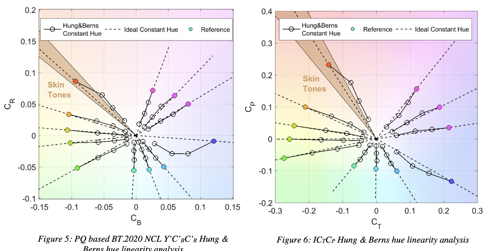
All that to say, in the chromaticity domain hue isolines are generally curved. In the idealized color model domain hue isolines should be straight, curves are sign that the model is less predictive of that dataset.

4 Likes

A thousand times this. This is the fundamental basis of all transforms using 3x3 linear matrices, and is essentially complimentary light mixing, yielding chromaticity linear straight lines with respect to the CIE chromaticity model.

This approach in my mind is absolutely critical for a number of reasons:

  1. Historical and forward looking reasons; all DCC tooling is based around grabbing an RGB ratio for keying, despilling, “hue” control, etc. and changing this would throw a bone into the mix.
  2. It’s how all render engines will process the light data. If adjustments are required post-image formation, that becomes potentially more acceptable. The light data isn’t an image until the image is formulated after all.
  3. It is an aesthetic flourish, subject to the creative choices. The creative choices should be via the creative application of grading the image formed, not in the fundamental mechanic. We wouldn’t expect our sRGB displays to magically do secret sauce perceptual mumbo jumbo, so the basic image formation pass should not either likely.
  4. Chromaticity linear additive light approaches are the sole way to avoid gamut volume voids in the destination, that effectively significantly destroy the output gamut volume.

I would perhaps caution against mixing wavelengths with chromaticities, as the former are absolute and the latter are subject to stimulus models. Might be wiser to be a term relative to the underlying three light RGB and ultimately XYZ model?

Its in line with the definition of Dominant Wavelength (17-23-062 | CIE), but I confess it is a bit of a mouthful and isn’t as intuitive for colors along the line of purples.

It could also potentially be described as a “purity” transform (17-23-066 | CIE), e.g. “at higher luminances we reduce the (colorimetric excitation) purity”…

But this really is bikeshedding…

With regard to the vanilla default rendering transform, I’m of two minds about this. Yes it is good to keep the creative choices “choices”, but what aspect of fixing a blue light from turning magenta for example is “creative”? Hue linearity is an admirable goal, but the more critical aspect is generally “hue category constancy” to me. That is to say, objects should generally retain their hue category (red stays red-ish, blue stays blue-ish) but small deviations are generally acceptable, and even welcomed in some scenarios (pull in the red->orange fire debate here*). To completely cast aside a humans perception of hue or hue category constancy is kicking the can of perceptual corrections down the road to artists.

I would be curious to see a middle road. One in which we don’t create the umpteenth color appearance model, nor force the hand of artists to try and make their own.

If this is produced by a LMT + RRT combo, that’s fine too, I’m only talking about the “fall off the truck” version.

1 Like

I think that the group is referring to the underlying model on top of which you build the path-to-white. I’m hoping that it is well understood that desaturation will affect chromaticities as it is its job in the first place. It is certainly what I’m alluding to when I talk about chromaticity-preserving in this context. The lines can be straight in chromaticity space because some of the models are effectively chromaticity preserving at their core, separating chrominance from luminance.

White-light-mixing does not really tell much about the path taken by the chromaticities when colours are made achromatic, I much prefer dominant-wavelength-preserving here.

To be complete and pedantic, we should probably say something along the lines of a chromaticty-preserving based model with a dominant-wavelength-preserving chrominance-reduction-transform or something along those lines :).

We agree that this has nothing to do with perceptual issues, and everything to do with channel clipping?

Agree. Hence why chromaticity linear results in the most “patterned and predictable” behavior for the fundamental mechanic component?

See also “creative flourish”; something exterior / post of the fundamental?

I am not suggesting having a proper perceptual correction negotiation as a punt, but rather discussing the formalities of position of the flourish.

Specifically, if we think in terms of film emulsion-like terms, we calculate how much we need to correct the dechroma, based on the open domain light data. Once we have the corrections for the tonality, we can easily, as already demonstrated by Jed, evaluate the two linear light domains (open domain, pre image formation, and closed smaller domain, post image formation) and provide any hue constancy via whatever model desired.

That Abney-corrective aesthetic flourish could be selectively applied, as required; it is a perceptual negotiation between two radically different light transport domains, in accordance with simulated perceptual models.

This also would nicely firewall the need to say, despill / key pull / “hue grade” etc.

I believe firewalling as above allows for flexibility to swap out as newer models or developments happen.

Except it is in a stimulus chromaticity space. Imagine something further built atop of some idea of “wavelength” and then this moves into 2021 and everyone uses 2006 instead of the less than optimal 1931. Now the wavelengths have potentially changed.

1 Like

Can you clarify what you mean by this? Are you saying the Abney effect is a matter of aesthetics, rather than a matter of human perception of color?

Also isn’t the Abney effect currently addressed in Jed’s OT via the OKlab color model so that the path-to-white maintains “hue category constancy” as opposed to (for example) blue in CIELAB where blue appears to go into magenta in its path-to-white?

Nice interactive visualization of this here:

I’m saying that not every creative decision will want this potential flourish, and as such, it should not be considered a default flourish. Further still, if folks are using image referred tooling, all of the things like keying, despilling, “hue” grading selection / manipulation, albedo calculation evaluations etc. will all become vastly more challenging with this as a default, and as such, the flourish should be considered a post-image formed state flourish, where access to the underlying non-perceptually warped variant may be desirable.

Would help it if folks were to analyze why this “white” thing exists in the first place, and what the fundamental mechanic is behind it “working”. I still haven’t seen anyone appear to vocalize what it does, and as such, it would seem that there’s no mechanic driving the code to dechroma the light mixtures.

Thanks Sean, that helps tremendously.

I don’t really understand the “except” part here nor the relevance of the Standard Observer change. If we swap the Observer, everything will change as it defines the foundations, i.e. the basis, on top of which pretty much everything we do is built.

Because the line traced is between two chromaticities, not a wavelength?

If we were tracing a line on a longitudinal / latitude map, we wouldn’t turn around and say “city dominant linear” or such?

Seems to be an odd way to describe the plotting, and one that will likely have too broad of an overstep in the near future.

Well, you can certainly describe something by what it is or its effect/quality. We are not saying that the path-to-white is implemented by tracing lines between dominant wavelengths and the whitepoint, instead we are saying that one of its quality is that it preserves the dominant wavelength of any chromaticity coordinates it affects. I honestly cannot think about a better concise way to describe it using colorimetry terminology.

See how you had to use “chromaticity” to define what is happening? That strikes at the root of the issue with layering “wavelength”, which is completely unrelated, into a term. If a descriptive component becomes superfluous, because it is unrelated, it is likely a poor choice.

Also, there is a mechanic there. “Path” doesn’t do the mechanic justice I reckon.

Speaking purely from an artist’s perspective, I find “wavelength” to be confusing/unhelpful as a descriptor of what the intended goal is. That is, it does not communicate meaningfully to the non-scientist visual artist end-user.

I also find Chromaticity-preserving to be confusing as I understand chroma to mean colorfulness or saturation, being the opposite of achromatic. To speak of a “chromaticity- preserving path to achromatic white” thus sounds inherently contradictory.

If we are wanting to describe "“hue category constancy” in the path-to-white so that blue stays blue and orange stays orange to our eyes, I’d vote for hue-preserving, possibly with the modifier of “perceived hue-preserving” or “hue appearance preserving.”

My 2 cents. Worth every penny! :slight_smile:

2 Likes

I only used chromaticity because the context was using it, I could have used colour and a domain expert or colour scientist would have understood equally well.

My take on this is that if the artist is willing to understand a domain he is new to, he must learn its terminology and definitions. We are not at a point where we are talking about surfacing an interface or documentation to an artist so we should not refrain from using terminology that describes precisely the behaviour of the algorithms.

As mentioned earlier, the chromaticity-preserving part is not related to the chrominance reduction, it only implies that the luminance mapping will not affect the chromaticities of the input colours.

Hue-preserving is certainly appropriate, been seen and used a few times (I certainly do). It is mostly less precise because hue, in its definition, implies appearance similarity, not a colorimetric match which is an important difference: the former is tied to colour appearance, i.e. advanced colorimetry, and the latter is about basic colorimetry.

For aesthetics reasons, we actually might want to modify them, so we will have to amend the vocabulary anyway.