CAM and Image CAM Papers

All,

Below is the list of references I shared at last week’s Output Transforms Architecture meeting.

Please feel free to keep the thread going with other interesting papers relevant to the topic.

Alex

Short history of Color Appearance Model and Image Color Appearance Model research

2 Likes

Worth noting that iCAM06 is the only model here that is not entirely global but has also local appearance modelling.

Mandatory link to Color Appearance Models from Fairchild (2013).

Cheers,

Thomas

This one is the basis of ZCAM:

Safdar, M., Hardeberg, J. Y., Kim, Y. J., & Luo, M. R. (2018). A Colour Appearance Model based on J z a z b z Colour Space. Color and Imaging Conference, 2018(1), 96–101. doi:10.2352/ISSN.2169-2629.2018.26.96

It is noteworthy because it might answer some questions about the CAT used in ZCAM, i.e. Zhai and Luo (2018).

Worth noting that some changes to CAM16 have been proposed in what’s being called CAM20u

1 Like

Hello guys,

I don’t know if after the TAC meeting of today (17th of November 2021), the road of Color Appearance Models will be pursued. But I wanted to share a couple of things.

I do remember someone saying at one of our previous meeting (Thomas maybe ?) that we should cherry pick our color appearance phenomena. Like maybe pick one effect over the others. And I was wondering if you had checked by any chance tone-mapping solutions that are related to the Helmholtz–Kohlrausch Effect.

It took me a while to wrap this up into my head. But here is the logic behind it. With tone mapping, we are trying to handle gray scale information in a predictable way (quote of Rory Gordon). This gray scale information can be called luminance or brightness.

All the images I have provided over the past months, when they look weird or wrong, it is because we have lost this sense of tonality. Like a broad range of values have collapsed into one and are clipped onto the border of the gamut display volume, right ?

And so, coincidence or not, the Helmholtz–Kohlrausch Effect belongs to the… Brightness appareance type… And I was wondering if you had ever googled “Helmholtz–Kohlrausch Tone Mapping”.

There has been some interesting research about this phenomena that might be worth exploring and may be like reducing our development cycle, since we have until end of next January to come with some sort of plan if I understood correctly.

And if I’m correct, this wraps up with the whole stimulus/sensation topic.


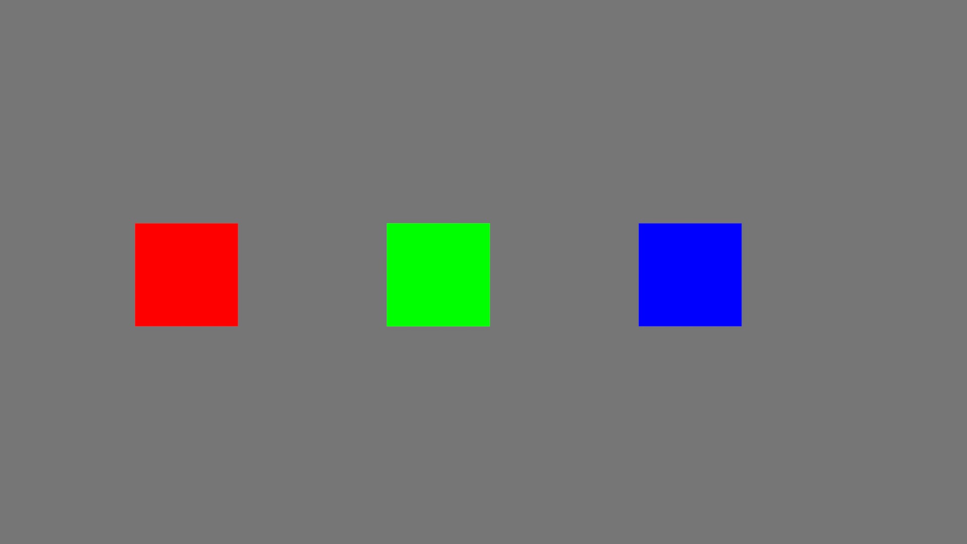
You have a three “equal” stimulus that lead to three different “sensations”. And vice-versa. It is very well explained in this tweet : stimulus maintains a non uniform relationship to sensation.

I must thank @Troy_James_Sobotka to explain all this stuff. I hope I am not butchering the terminology here. And I will stop here since I feel like I am dealing with stuff that I barely understand… :wink:

Chris

2 Likes

Yeah, I’ve always naively assumed that the Y in Yxy mapped fairly directly to the sensation of brightness.

Left and right have the same xy coordinates, but the patches on the left all sit at 7.2nits (assuming a 100nit display), whilst the patches on the right are all max emission for each channel combination.

Clearly at the same 7.2nit level, the blue patch on the left feels much brighter. I haven’t yet worked through what this means in my head yet. But if we’re going to be mapping tone, then whatever we abstract out to push around has to map pretty closely to the sensation of brightness.

3 Likes

Luminance certainly doesn’t directly correlate with brightness. I think you probably meant Log Luminance.

Most of the time when talking about the perceptual correlate, Lightness (J) is more useful as it’s Brightness of a color relative to a the reference white.

Here’s a paper on the topic from John McCann.
https://www.researchgate.net/publication/221502061_The_Appearance_of_Brightness_and_Lightness

2 Likes

I think the point is that luminance, under any uniform gain / scaling, doesn’t work as a correlate for lightness / brightness?

1 Like

I think the Helmholtz–Kohlrausch effect is one of the reasons why blue and red are so useful as proofing colours. Getting them at the right brightness and saturation levels after tone mapping is a delicate balancing matter. You don’t want them to be necessarily equally bright to green and the secondaries but you don’t want them to be too dark either when the input luminance is equal.

1 Like

This is a great example Alex ! Exactly what I was hoping to see / had in mind !

A couple of links from this Google Search I was mentioning :

Since this thread is about papers, I thought this was the right place to share them.

Chris

3 Likes

It is beyond brightness only, do they also feel to have the same hues?

Hue is a different problem altogether but Alex’s example don’t evoke that much of a mismatched hue feeling for me between the darker and brighter patches. Maybe the dark yellow feels a bit brownish but that’s acceptable to me considering that this colour is needed in sRGB to fake gold. Only P3 and Rec.2020 are capable of displaying the gold colour.

Helmholtz–Kohlrausch effect has been a pain for us with all the DRTs that we have tried and has even forced us to disable some blue glow effects due to the distracting nature of it being too dark compared to other colours.

The second next pain in my backside is the Bezold-Brucke shift. If left unchecked, there’s a variable amount of red shifting to yellow when comparing SDR and HDR. Same for blue shifting to cyan.

That is the beauty of it! I don’t feel like the bright yellow, cyan and red swatches for example are of the same hue than their dark counterparts. The effect is certainly less pronounced than the difference in brightness though.

Here is the result of matching the lightness of the 3 patches using CAM-16.

Unmatched lightness
Unmatched

Matched lightness
matched
Note: this version replaces an earlier version where lightness was indeed matched but because of a typo in my colab I inadvertently reduced the Chroma.

Just for kicks here’s the result using CIELAB
cielab

3 Likes

Yesterday, being pragmatic and cognizant of the deadline having been missed I did not want to stir the pot around colour appearance but I certainly feel like not exploring that track is a huge missed opportunity.

I have a hard time understanding how not relevant it is when there are discussions about SDR <–> HDR matching and surround changes.

5 Likes

Thanks Thomas,
SDR Vs HDR is not a binary thing.
So you need a model or at least an heuristics which moves smoothly between those different viewing condition.

2 Likes

I feel like there were some very interesting topics discussed in the last few meetings I missed due to being deep in debugging. Especially SDR<->HDR matching and HK effect (and some others) which are some of our most important pet peeves. I’ll read the notes.

1 Like

A Digital Test Chart for Visual Assessment of Color Appearance Scales : https://www.ingentaconnect.com/contentone/ist/cic/2021/00002021/00000029/art00027?crawler=true&mimetype=application/pdf

2 Likes

Mark just presented this at cic. Very timely

Hello,

I think Björn´s work was mentioned during the meeting of the 1st of December 2021. So I will link the GitHub here :

Where you will find the articles about sRGB Gamut Clipping, OkLab, Okhsv and Okhsl.

It is worth mentioning that the latest update of Photoshop uses Oklab for its perceptual interpolation in gradients. It is explained here and here.

Regards,
Chris

2 Likes