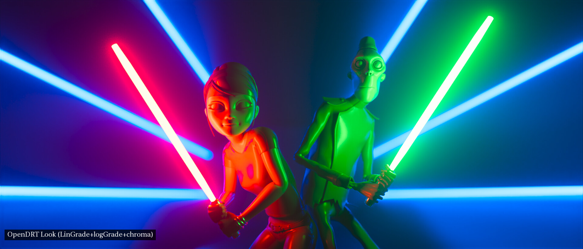
Looking at the images you linked I’m seeing it also helps the red light on the Emily character in @ChrisBrejon’s light sabers image as well as in @TooDee’s Red X-mas not to clip! Pretty cool!
It does indeed help red a lot. Previously, I used your the latest version gamut compression operator as a look transform (yeah it’s not really intended for that but it helps to keep highlights on Chris’ light sabers image a lot). The Nayatani transform does help reds in a similar way but I’d have to do more experiments to see if it really brings back highlights on the red character body.
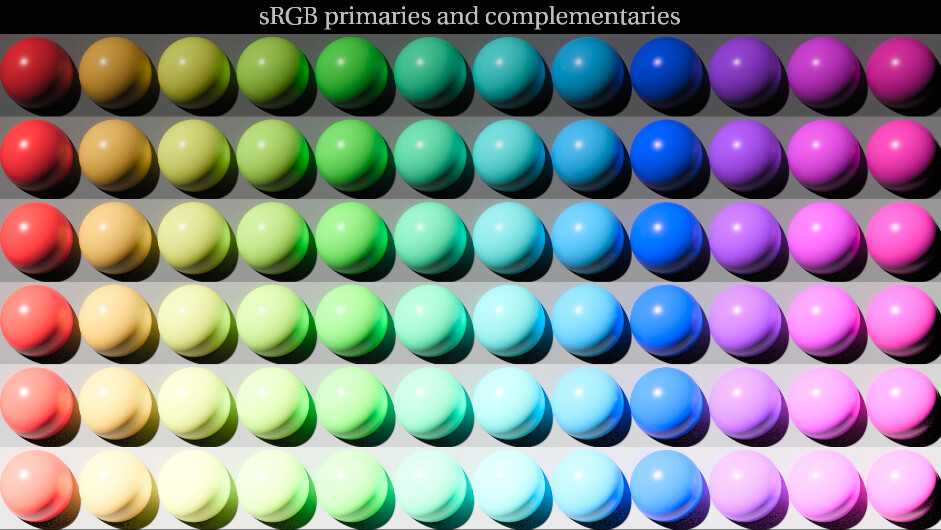
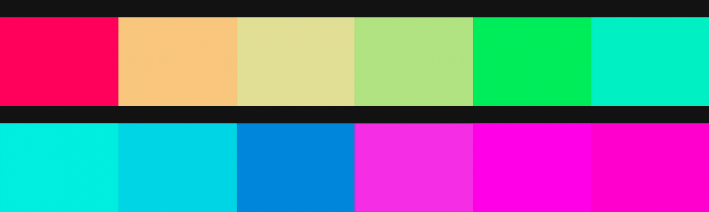
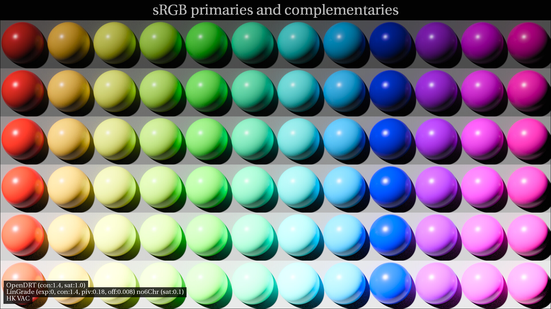
I wanted to clarify for my own understanding what the intended result of HK compensation should be? I read that HK means “brightness depends on luminance and chromaticity.” I’m I correctly understanding that with HK compensation the first row of the spheres in the image below (here viewed through OpenDRT without HK compensation) should all appear to have the same brightness?
That’s basically it. However, HK is a perceptual effect and blindly compensating for it might make the image worse in many cases. If we’re going to go down the road of providing default look transforms, I would prefer to call them sample look transforms and also provide a library of them. Providing a single one would trick novice users into thinking that there is single blessed way and railroad us down the ACES 1.0 path of everything looking the same.
The HK effect describes a perceptual phenomenon. When presented with stimulus of equal intensity, but varying saturation and color, reds blues and purples of higher saturation will appear brighter to our eyes than the emission intensity indicates.
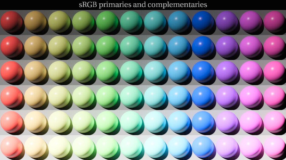
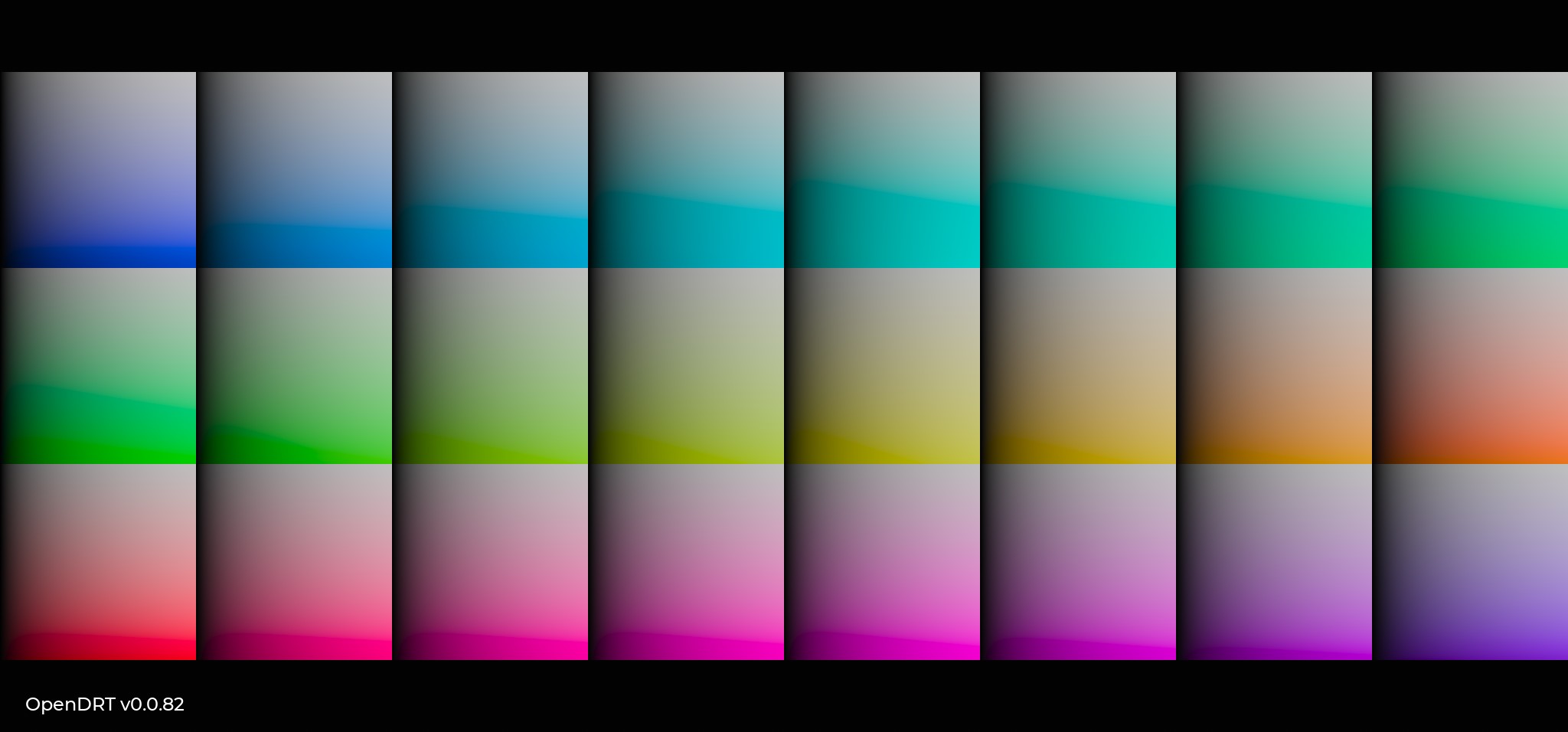
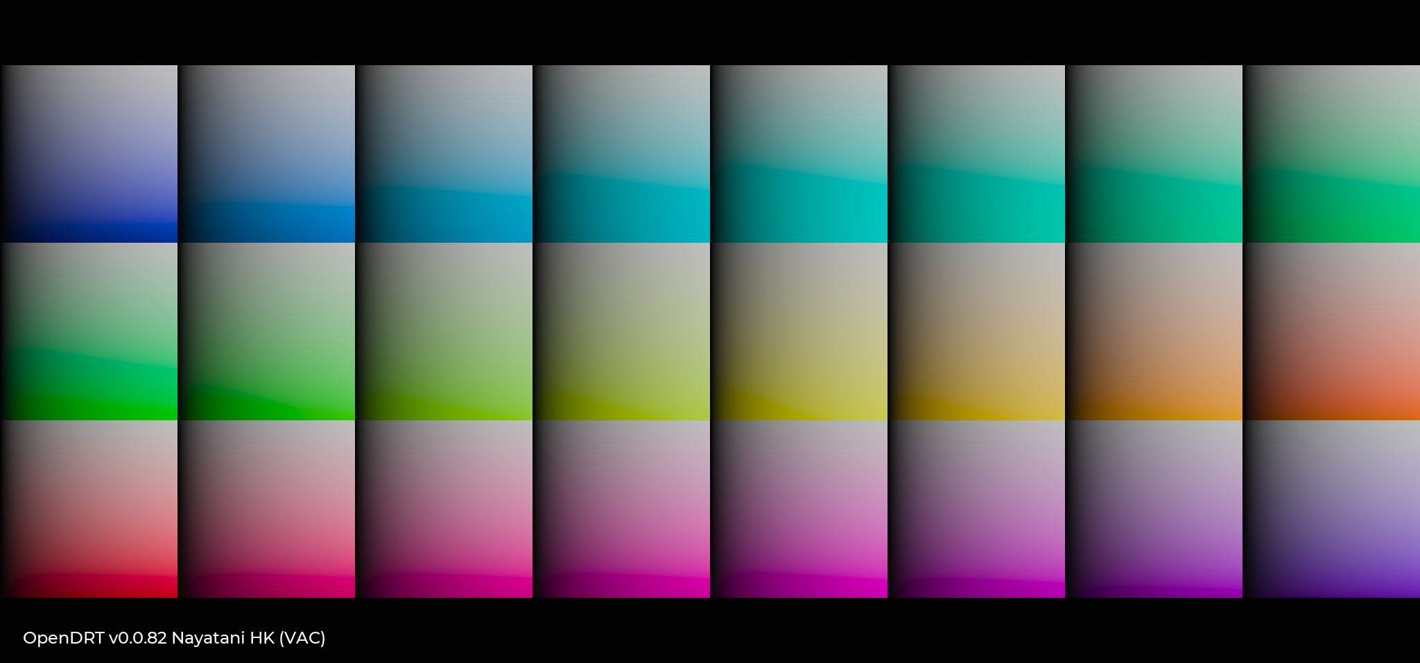
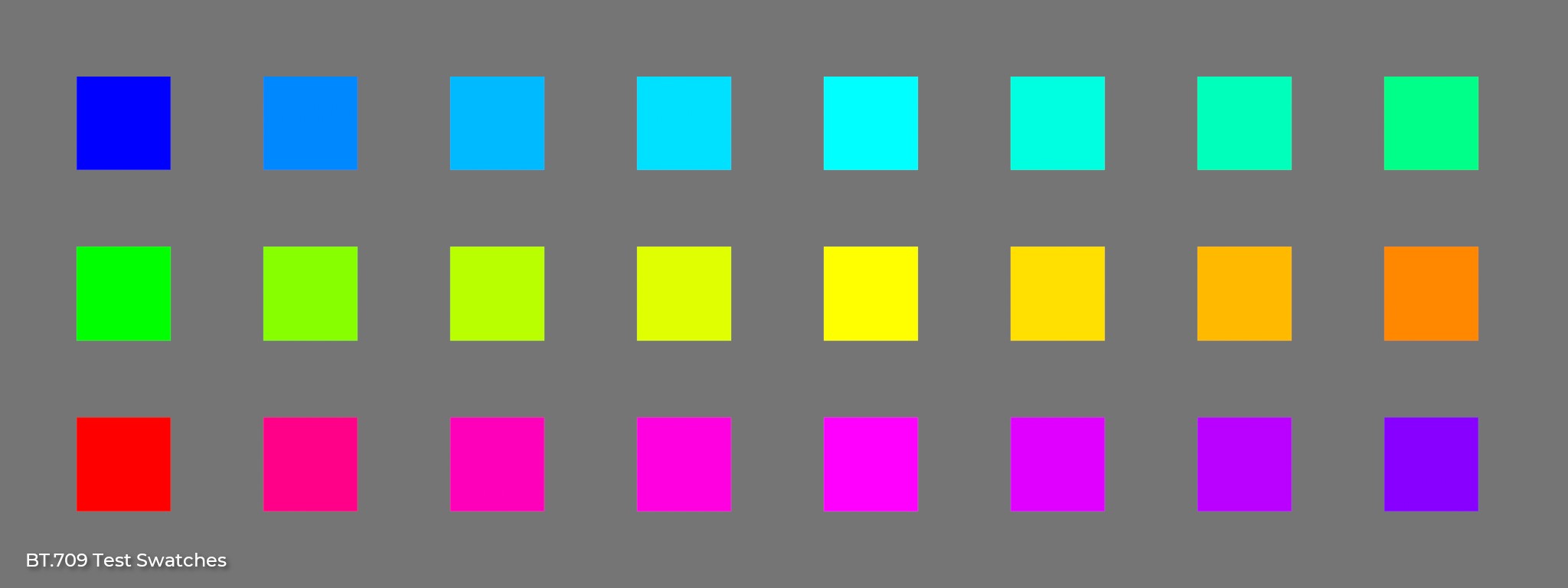
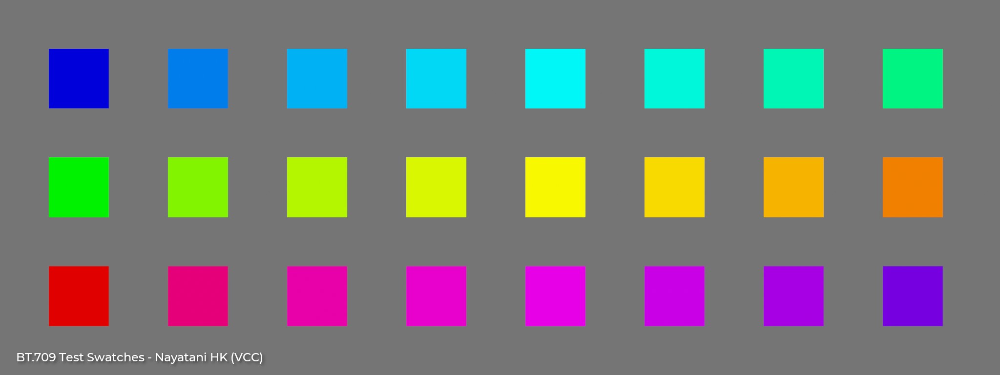
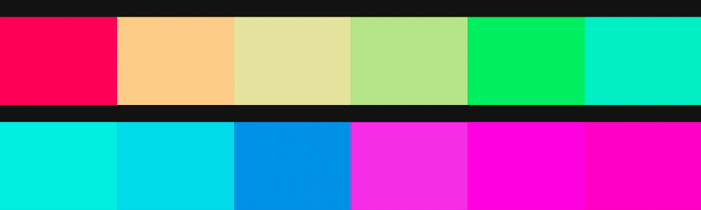
HK effect compensation darkens these colors enough to achieve something resembling uniform brightness appearance. Here are a couple test images that might better show this than what I posted above. No display transform involved (just 2.2 power function inverse EOTF , just 24 swatches evenly spaced around the BT.709 gamut boundary, of uniform emission (max(r,g,b) == 1.0), against a middle grey (0.18) background.
In the first image, Red, Blue and Magenta swatches appear brighter than the others.
This model was created by matching pure chromaticity samples over a uniform achromatic background, so it should probably be taken with a grain of salt for working on complex stimulus like images… but the behavior seems to be the right idea.
At least this is my basic understanding of the phenomenon. If I’m misunderstanding something here, feel free to correct or elaborate, anyone who understands this better.
Although more related to image editing, Dan Margulis (of Lab color space advocacy) and associates have programmed a Photoshop panel that includes an H-K action to emphasize color.
Gerald Bakker, a fellow Applied Color Theory group member, has written about H-K and the Photoshop action here:
First of all, thank you both for the education! I’m learning so much in these discussions. My mind is constantly being blown in the best possible way. Please know that it is greatly valued! @jedsmith I’ll explore those Nuke swatches to get a better understanding of what’s going on, thank you. I’ll dig into this a bit more before reaching any conclusions.
I did want to say something about the general topic of color shifts and skews in a look transform, since I’ve been one of the folks asking for them. Here I’m thinking of the aesthetic hue shifts, rather than ones for purposes of color appearance modeling.
Regarding those aesthetic hue shifts, the more I work with OpenDRT the more I love it, and what I love about it is the way it faithfully gives back colors without skewing them. I’d hate to lose that in the default look. As an artist the most important thing for me is to be in control of my tool so that I can get the color I want on my “canvas” and that’s exactly what I get with OpenDRT.
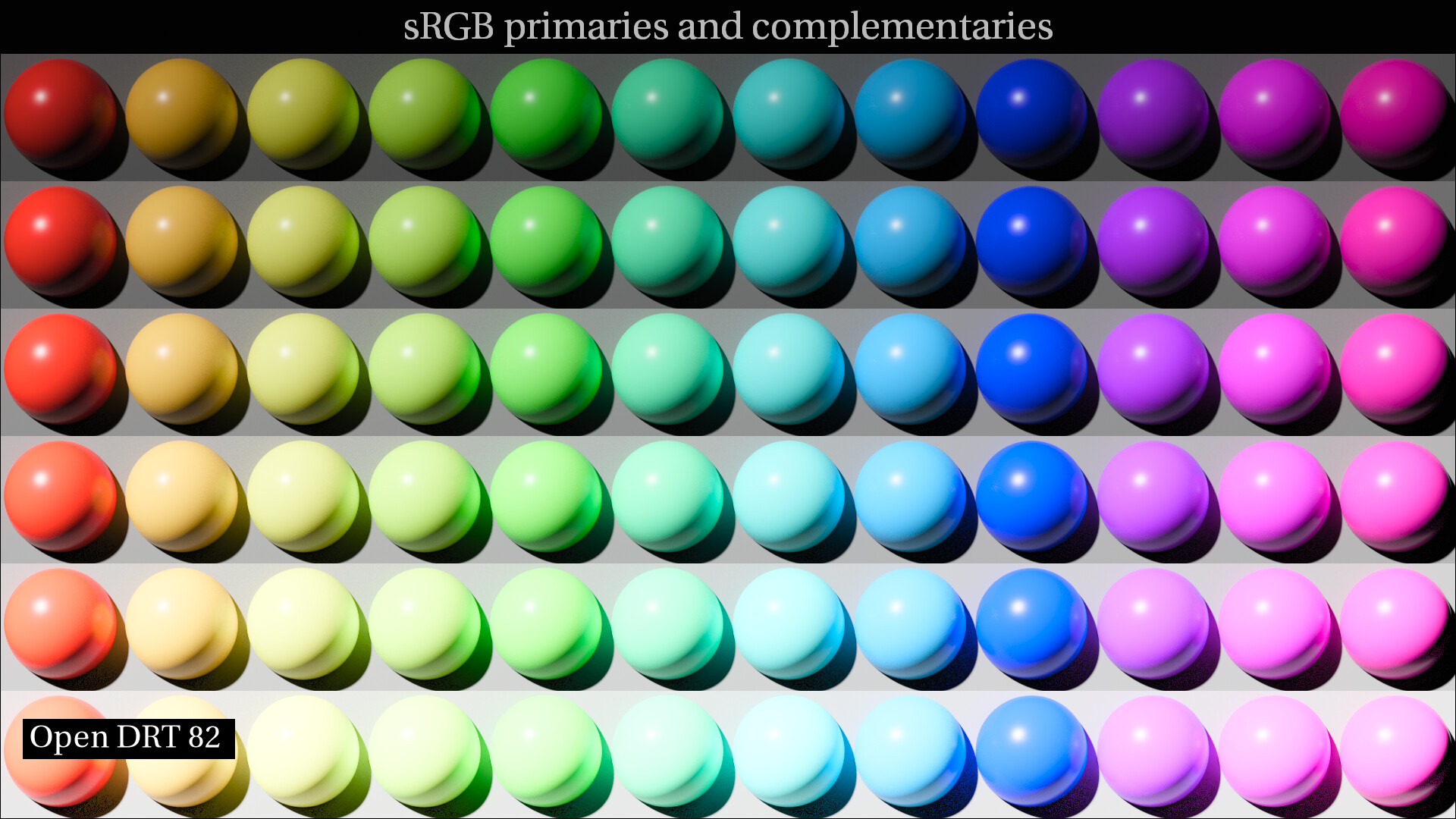
Along those lines, I’ve been playing around with grading OpenDRT, and am asking myself if any hue shifts are needed at all? It looks pretty awesome to me without them. With that in mind, I’d like to share some images of OpenDRT with a quick grade I did. This is just a simple grade with no color shifts or skews. This grade is by no means perfect (I keep changing it constantly!), but what it illustrates for me is that it’s pretty easy to get OpenDRT to look awesome without any hue shifts or color skews at all.
On skin tones it is not doing the shift towards yellow/green that a lot of folks were not super happy with in ACES. I might want to play more with the tonemapping to get the specular highlights to pop a bit more, but I think the skin colors in OpenDRT look more natural/realistic.
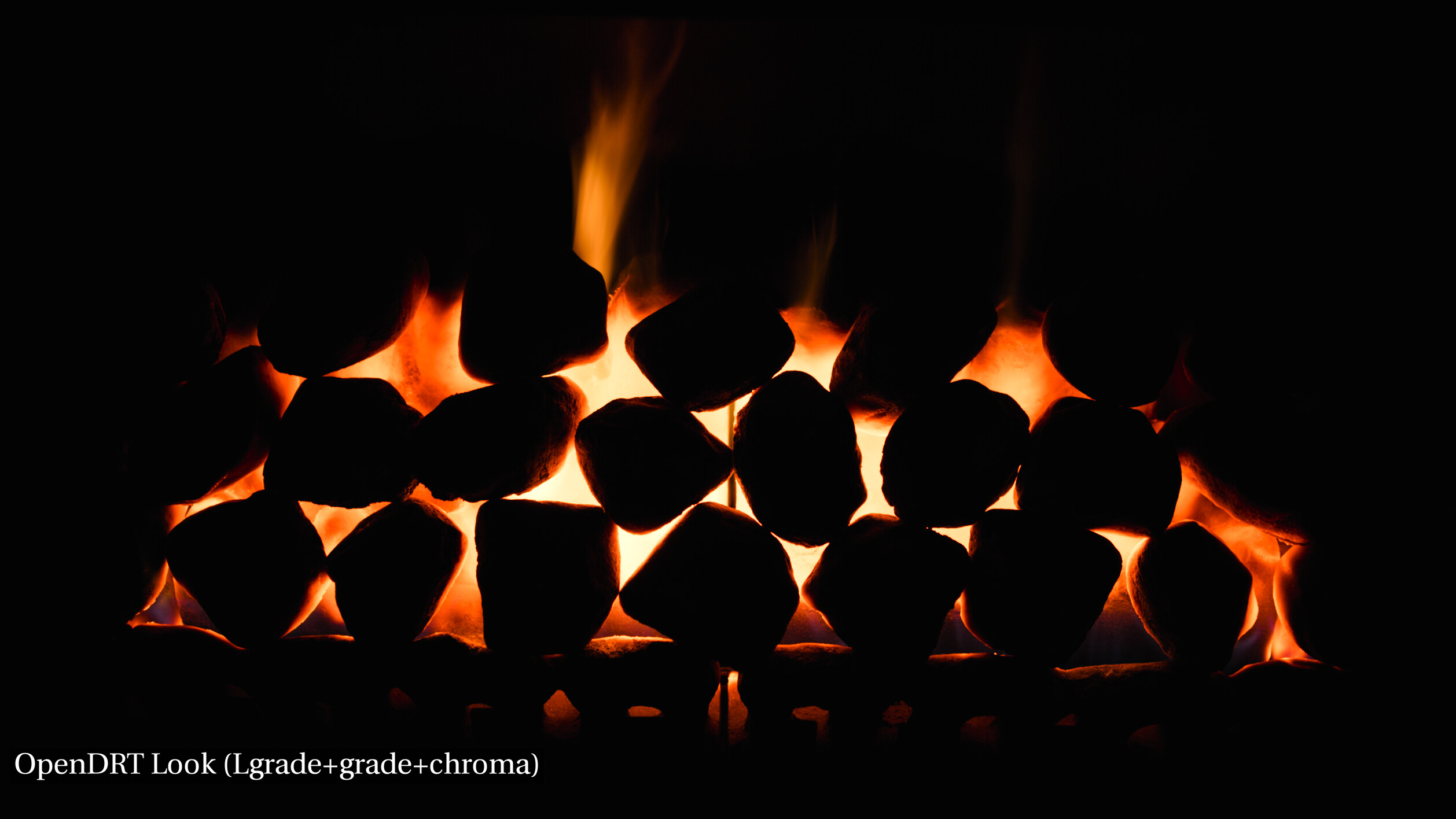
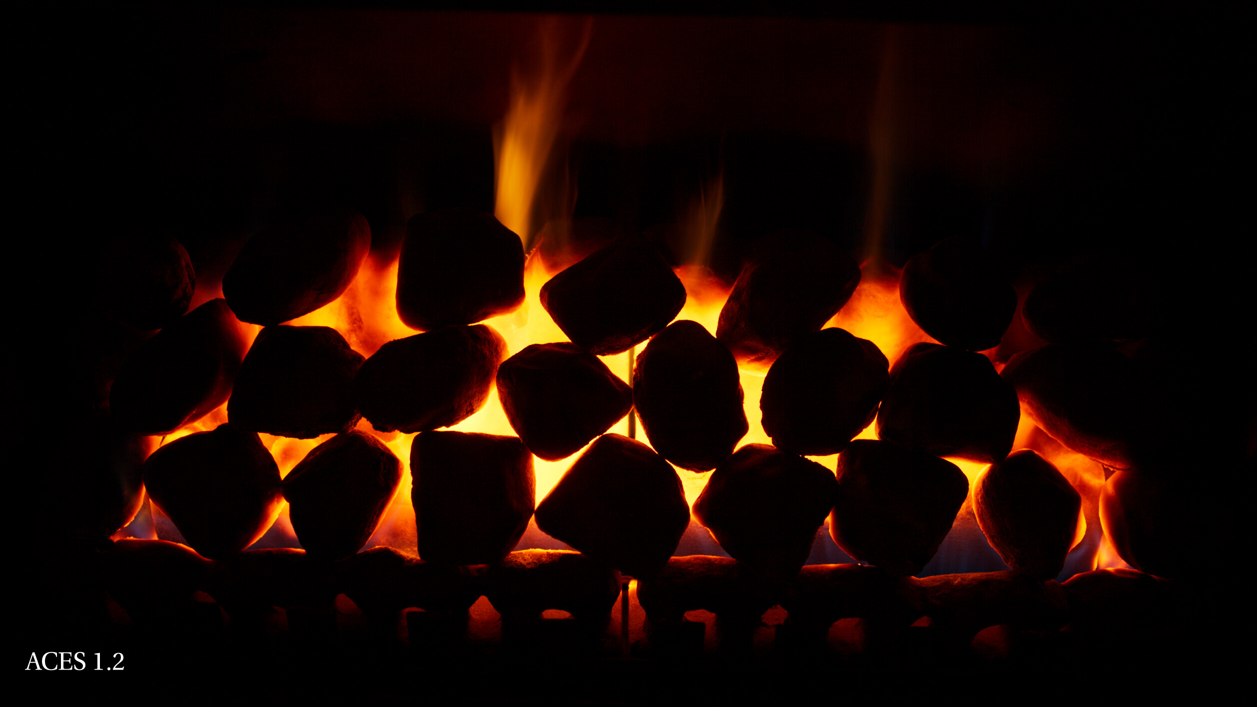
For fire again while it does not have the saturated yellow of ACES, I think the color it does have looks much closer to what my eye sees i.e. what fire looks like. I think it would of course be reasonable and very doable to have an LMT that emulates ACES 1 (as has been the practice for all previous versions) but personally I hope that the default ACES 2 looks more like natural fire. I believe this in in line with the desire to have the Output Transform be more neutral as opposed to imposing a strong look.
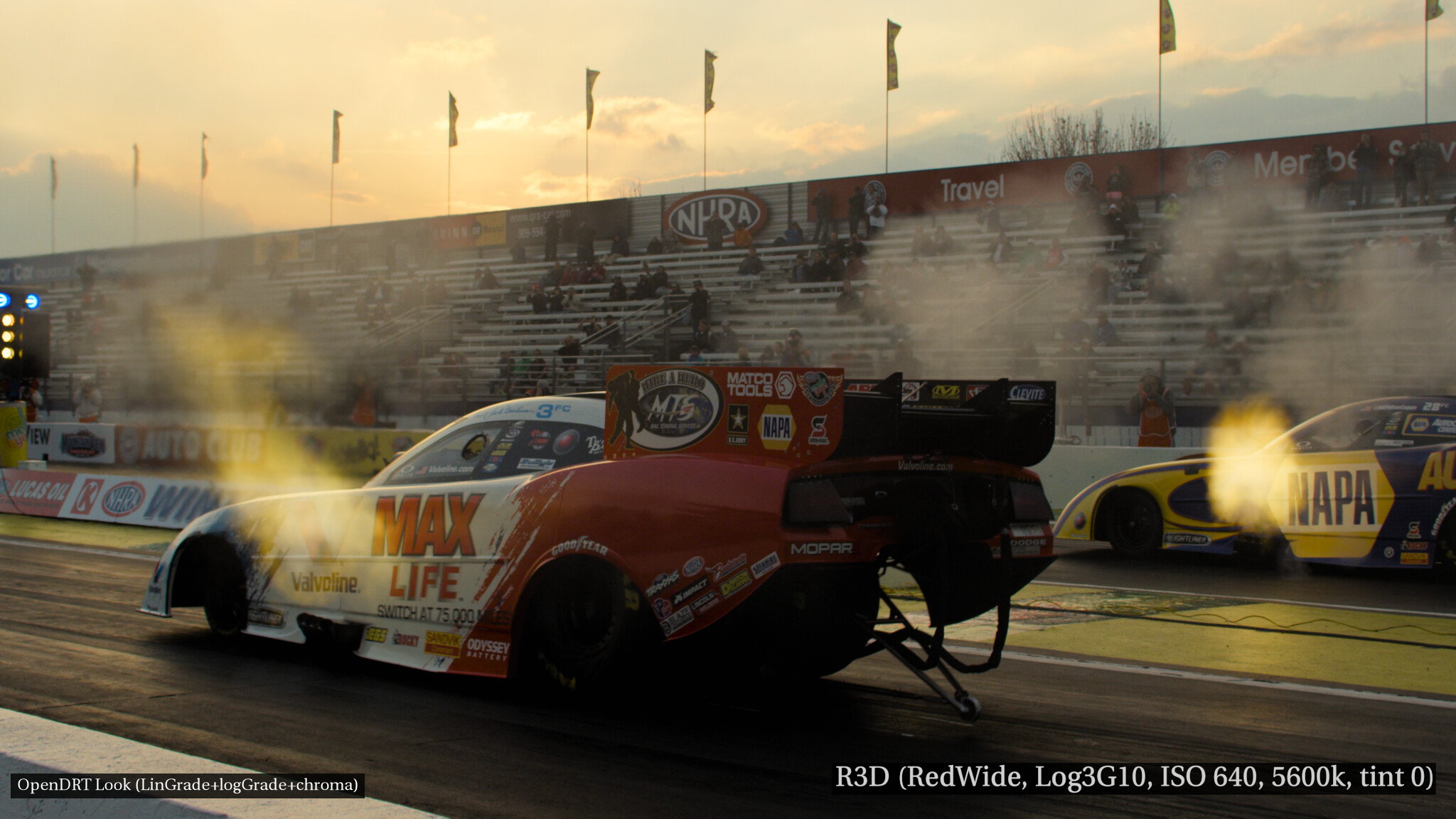
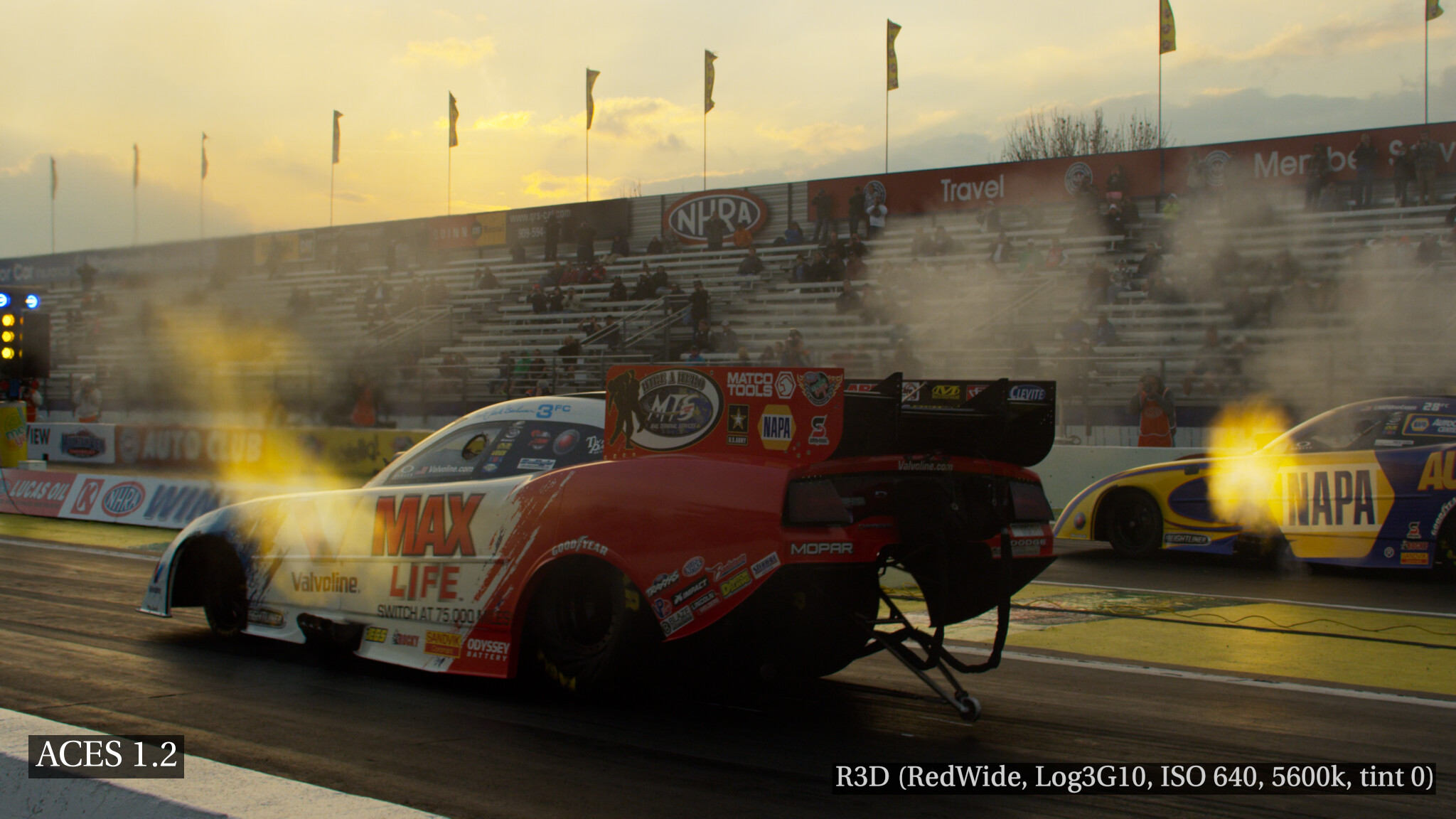
Also that shift from orange to yellow of ACES can be undesirable. For example look what happens to the clouds in this image with ACES compared to OpenDRT:
@Derek I’m with you about hue shifts not being needed at all. Kudos on reproducing the Lego yellow under OpenDRT in that shot as, if my mind does not play tricks on me, I seem to have read somewhere around these forums or somewhere linked from here that they had to compensate against ACES to achieve this exact colour for the movie. As for the saturated yellows, that’s not a great default to have. If saturation is wanted, saturation can be added back.
You might also be interested to see this. The spec on the red are coming through pretty nicely. It’s not perfect, and I know @ChrisBrejon has said he has wished it would go to white, but I think the red going to yellow is due to the Bezold–Brücke shift in ICtCp and thus actually more realistic.
@ChrisBrejon has also mentioned this in regards to the contrast of the tone mapping in the look. I think it makes sense to have at least 3 in the library:
Legacy ACES current “high contrast” legacy look,
Neutral the OpenDRT neutral tonemapping (i.e. no look),
Default A less aggressive tone mapping with slightly lower default contrast, as per the VWG proposal:
“Look is too strong-contrast and saturation are frequently reported as too high as a starting point for color gradingand look development” and “Slightly lower default contrast”
Does that sound reasonable?
In terms of things like HK compensation or the “glow” modifier, I wonder if this could be in the form of modules in OCIO look so one could have a combo of tone mapping combined with what ever extra things are desired in a “flavor + toppings” kind of structure.
I wanted to give some feedback on the HK compensation after some testing. In general I really like the effect as it echos my own aesthetic preference when picking colors to both darken and saturate them to avoid objects like apples looking like neons.
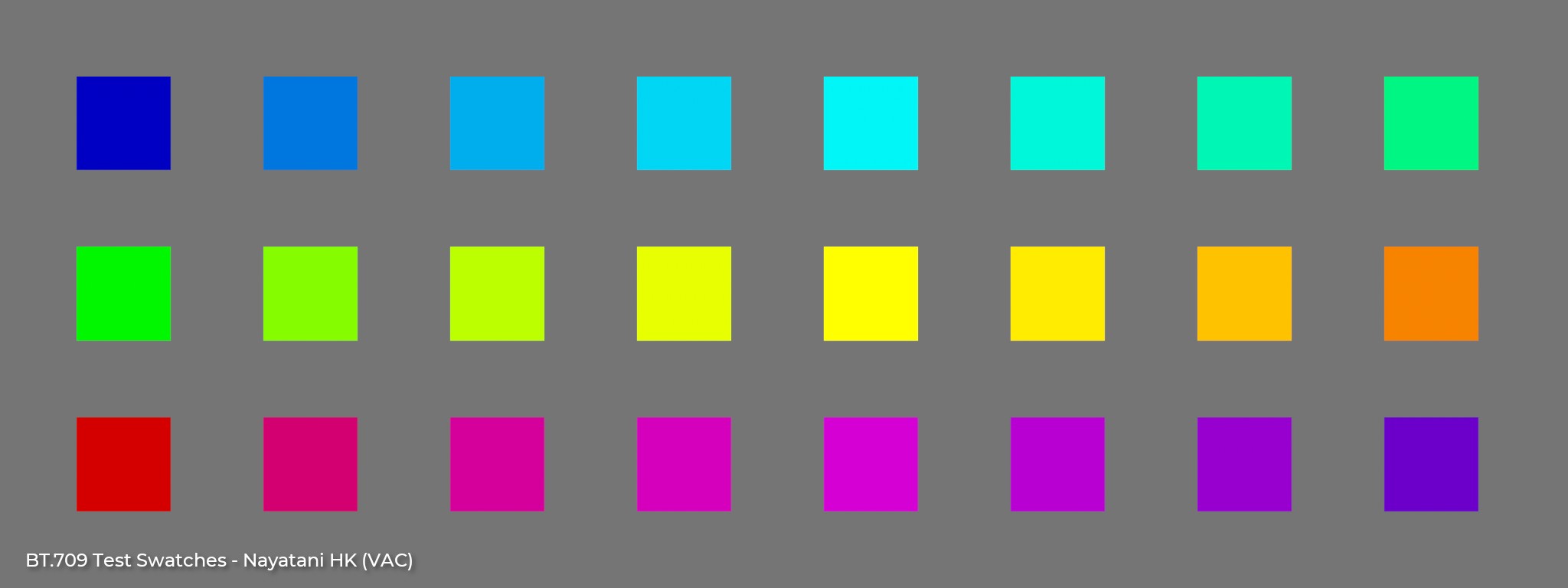
In my observation VAC seems to have a more uniform result compared to VCC.
It does seem to my eyes like blue is getting darkened a bit too much. Here is VAC with the blue brightened using your HueLuminance node with the blue set to 0.2. To my eyes this appears to have a better uniform brightness. I’m of course just eyeballing this.
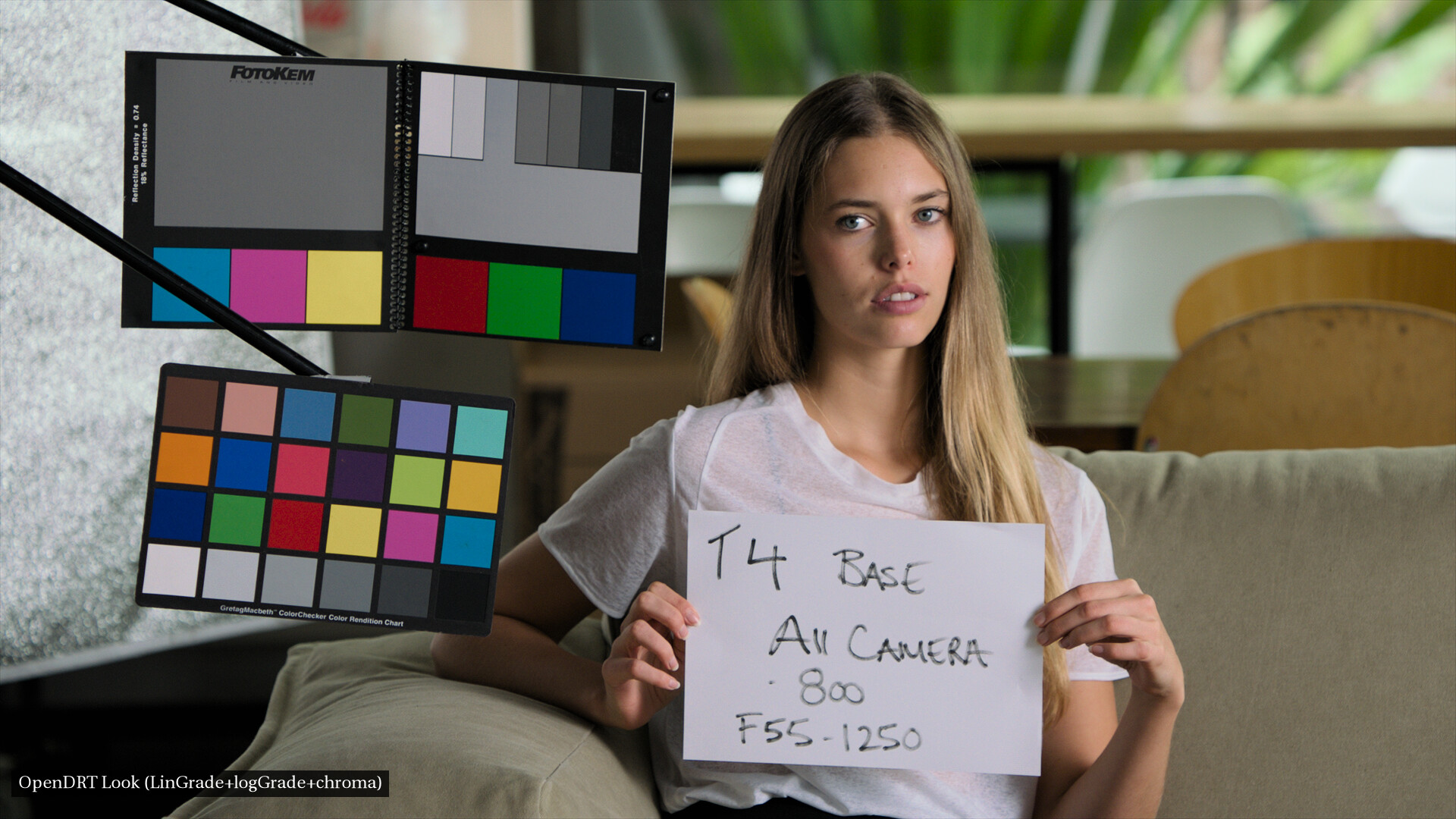
This dark blue is noticeable on images with color checkers, such as this one where you can see on the red, green, and blue swatches at the top that the blue appears darker than the others. This is with VAC through OpenDRT.
Attached is a parametric version of the Jed’s Nayatani_HK.dctl. One could come up with actual names for the parameters (weights on hue angles or something to that effect) but I just quickly assigned letters for them. I did notice these numbers changed between studies, so obviously there’s no right set of numbers and parametric version is justified!
Hello every one,
I’m very new to ACES and it’s the first time I hear about OpenDRT. I do have a question about it: how does it differ from the chromatic adaptation OFX provided by Davinci resolve?
I am curious in using the Helmholz-Kohlrausch effect. Is it like the Neon Surpression LMT that comes with Davinci? And since I am not a software engineer, could maybe some one help me in where I should paste the code inside the source code of the DCTL provided by Jed Smith?
Hey @DawidNozadze thanks for your interest. I’ll answer your questions as best I can.
Know that I’m making some progress on some better documentation, so please forgive the lack of complete information at the moment.
First, sorry if I’m missing something obvious… I’m not super familiar with Resolve’s tools believe it or not. Taking a quick look at the chromatic adaptation OFX it looks like it is just doing what the name indicates: converting from one illuminant or white point to another using various common methods like Bradford and CAT02.
OpenDRT is a full display transform. It converts scene-referred input imagery to display-referred output imagery, given a viewing condition defining a display device and a surround illumination. Chromatic adaptation is just one component used in this process.
Short answer: no. I tried to describe the HK effect above as best I could… It has more to do with unexpected nonlinear relationship between color purity or “saturation”, and our perception of the brightness of that color. The so-called “Neon Suppression LMT” is a 3x3 matrix which desaturates the blue primary by moving it towards the achromatic axis (it also darkens saturated greens and yellows but you can’t see this on a 2d chromaticity plot).
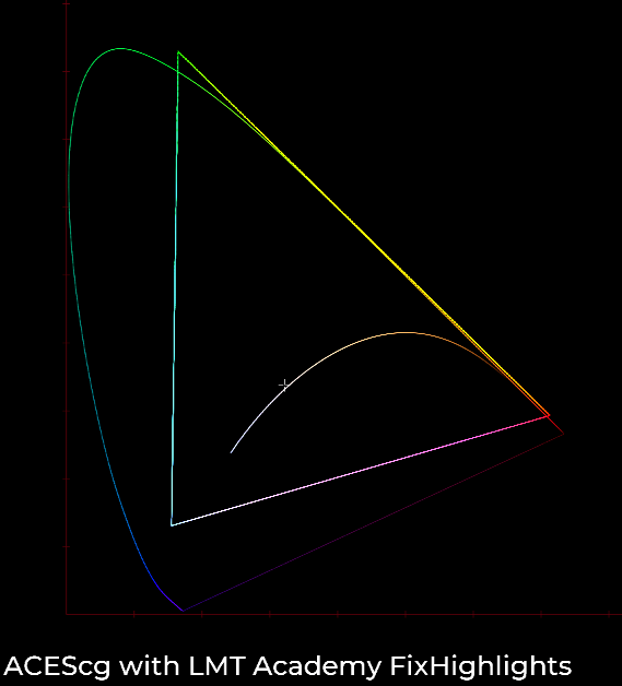
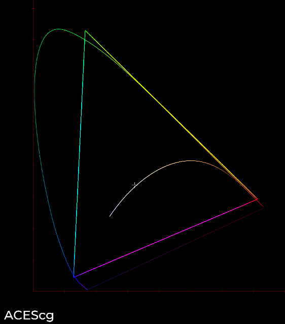
The LMT.Academy.FixHighlights.dctl is intended to remove artifacts that occur with colors that are outside of the ACEScg gamut boundary. These artifacts occur because the current ACES Output Transforms do not have any mechanism to render this type of colorimetry. There is the Gamut Compression algorithm as well, but this is a solution that treats a symptom of the problem, it does not cure the disease.
Again, managing gamut and rendering highly saturated colors in a pleasing way is just one aspect of a display transform.
Easy enough. If you download a DCTL file you can install it by copying the fileinto your LUTS folder.
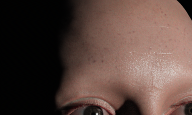
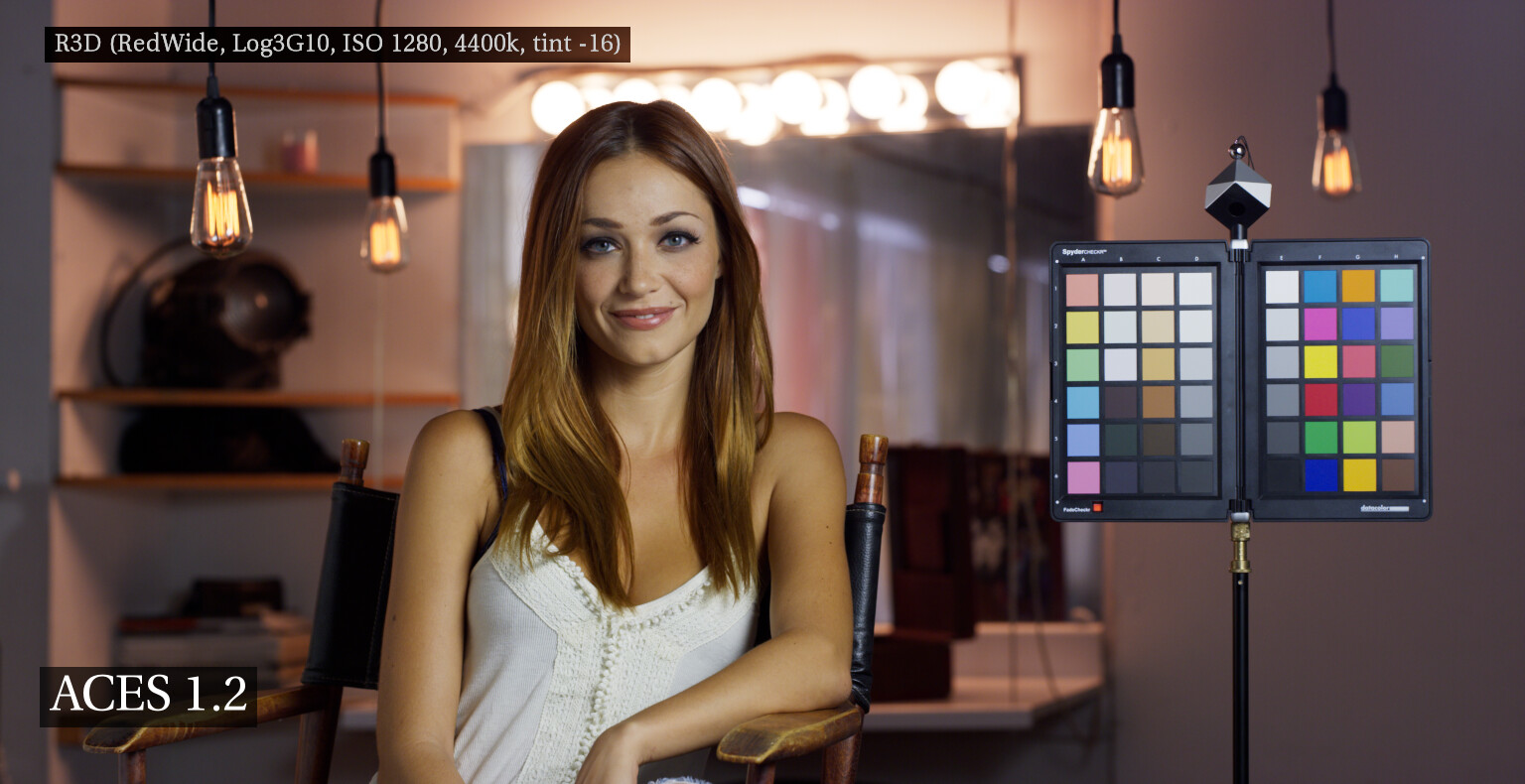
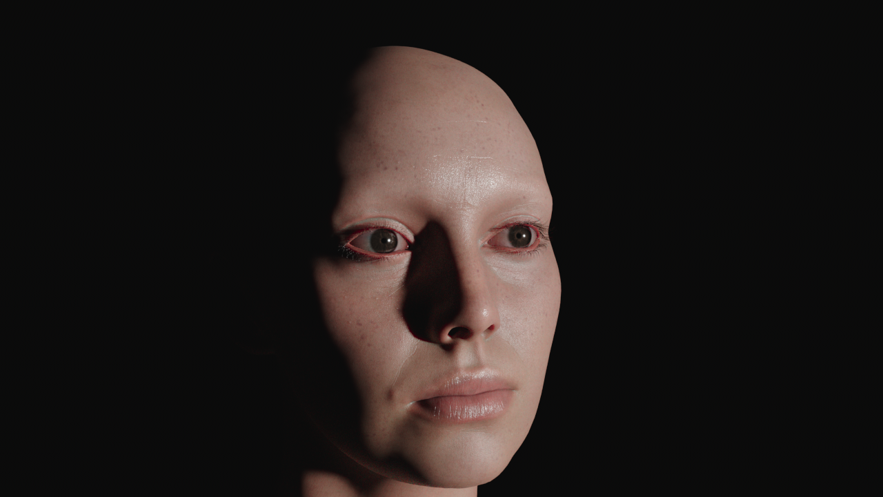
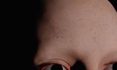
Can I submit a wishlist item for a LMT? It has to do with skin. I’'l try to illustrate this with a render of Digital Emily. Here’s that render in K1S1:
The major difference I believe is in the terminator where you can see the subsurface scattering “bleed” at the edge. Note how it goes to red before black at the terminator in ALF-2:
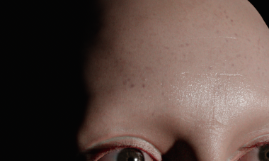
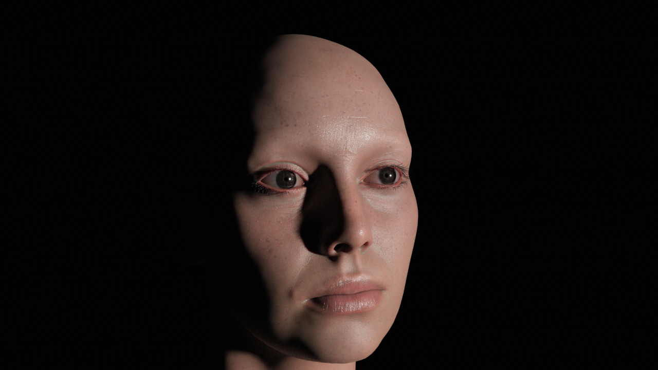
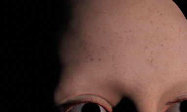
compared to OpenDRT which does not go to the red subdermal blood red color, but stays flat:
In addition to the red terminator, there is also a brightening around the highlights in IPP-2 and K1S1 whereas OpenDRT stays flat/uniform throughout.
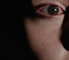
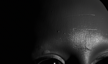
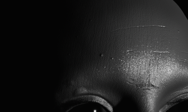
We can see this more clearly by looking at the individual AOVs. First here is the SSS where we can see the red terminator in ALF-2:
compared to OpenDRT:
Next when we compare the specular AOV we can see the difference between OpenDRT which looks more flat in the grey spec:
…compared to ALF-2 which has more shaping and falloff.
.
Here’s that area with the AOVs combined. First in OpenDRT:
Then in ALF-2:
All together these give skin that luminous “glow” that makes skin look alive. In contrast OpenDRT makes people look like they are wearing lots of foundation make-up, blocking the translucent nature of skin.
Would it be possible to engineer this same pleasing skin effect as an LMT “sweetener” for OpenDRT?
@Derek I believe that the yellow highlights are something you made yourself with your grade as I don’t get them myself. As for the lights in the background that don’t go to white, this didn’t happen with the version of OpenDRT right before 0.0.82 (called 0.0.82b1). It can be fixed by dialing back saturation to 1.0, contrast to 1.2 and pushing to dechroma to 0.6 though. This will make blues desaturate at speed much closer to the other colours.
That grade only changed the contrast and saturation so it would only accentuate the yellow highlights. Settings the dechroma to 0.6 will definitely reduce that as it desaturates all bright colors to white.
Regarding the dechroma specifically, Jed has explained that highlight highlight dechroma compression is a tradeoff. If it is too low, you will get clipped highlights. If it is too high, you will get very desaturated highlights and loose saturated colors. That means that for example golden sunlight on clouds looks unnaturally desaturated and dull. So ideally you want this as low as possible without of course getting clipping. I’ve gone back and forth between having it set to 0.4 and 0.6. I get lots o clipping at 0.4 and I get too much desaturation at 0.6 so I’ve ended up at 0.5 which still does show some clipping. I’m hoping that there can be a change to how the highlight compression works that will fix that clipping.


 .
.