I made a few stress tests and found that VAC is way more noisy than VCC. I think, this is also very important for a look transform. And probably not introducing artifacts - is more important than anything else. So my vote for VCC
And thanks again @jedsmith !
I always notice desaturaton in shadows with OpenDRT. And can’t say I like how it looks on skin. Is this also something, that is essential fo OpenDRT gamut mapping and will be altered by default LMT?
Or it’s just me and it looks fine actually?
@jedsmith
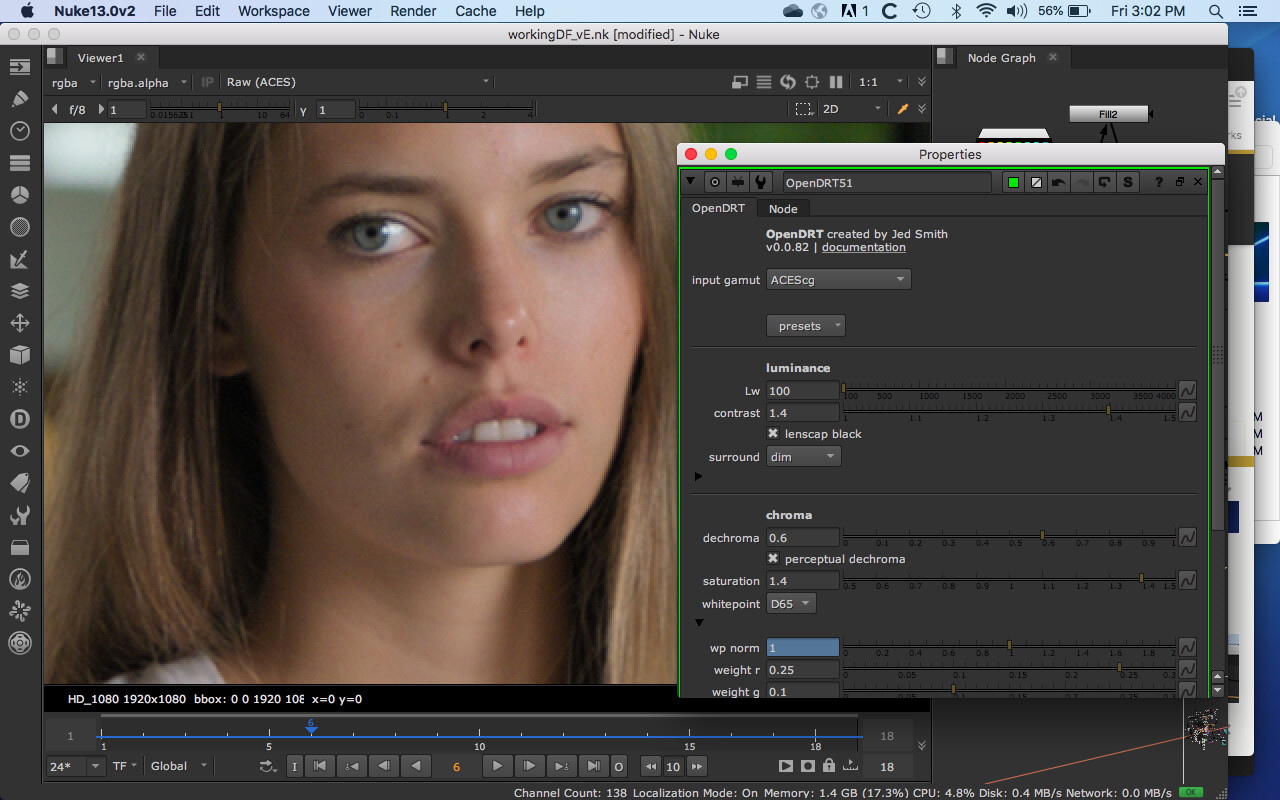
I think this is the same thing I was noting about skin SSS above. Before OpenDRT v82 the dechroma affected the highlights only. As of v82 it dechromas both the highlights and the shadows. This causes the parts of the image on skin where subsurface scattering would make it more saturated in the shadows to desaturtate there. Additionally the dechroma appears to cause the image saturation to be uniform, making the image look colorized.
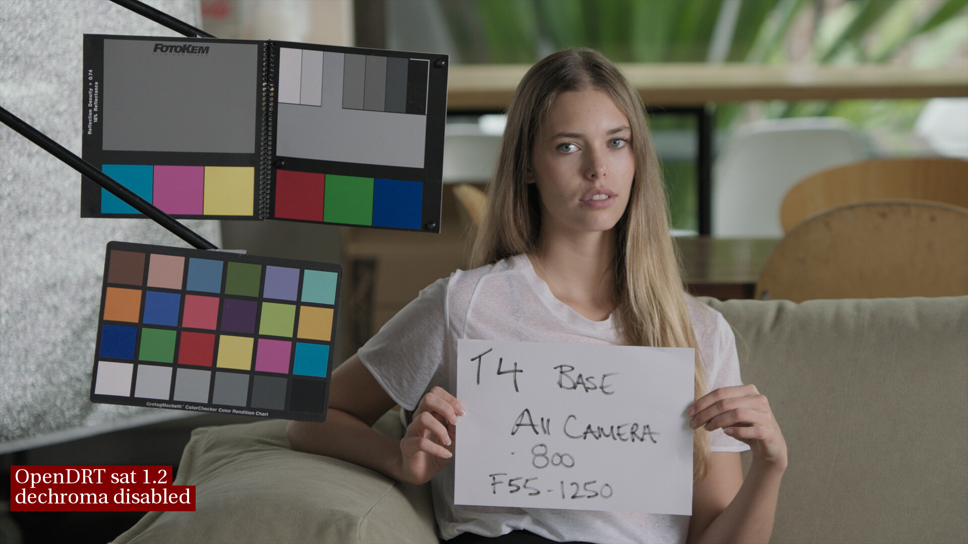
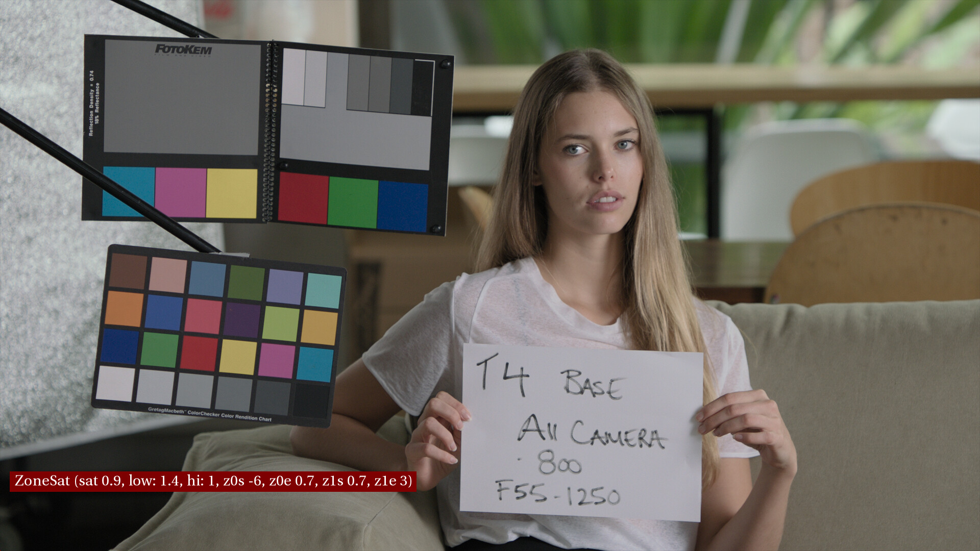
Here’s an example of skin with dechroma disablabled , saturation at 1.4. Note how the shadows around her nose are saturated, while other parts of her face have less saturation (tip of her nose, cheeks, etc.). This is I believe reflecting the chroma of the scene data.
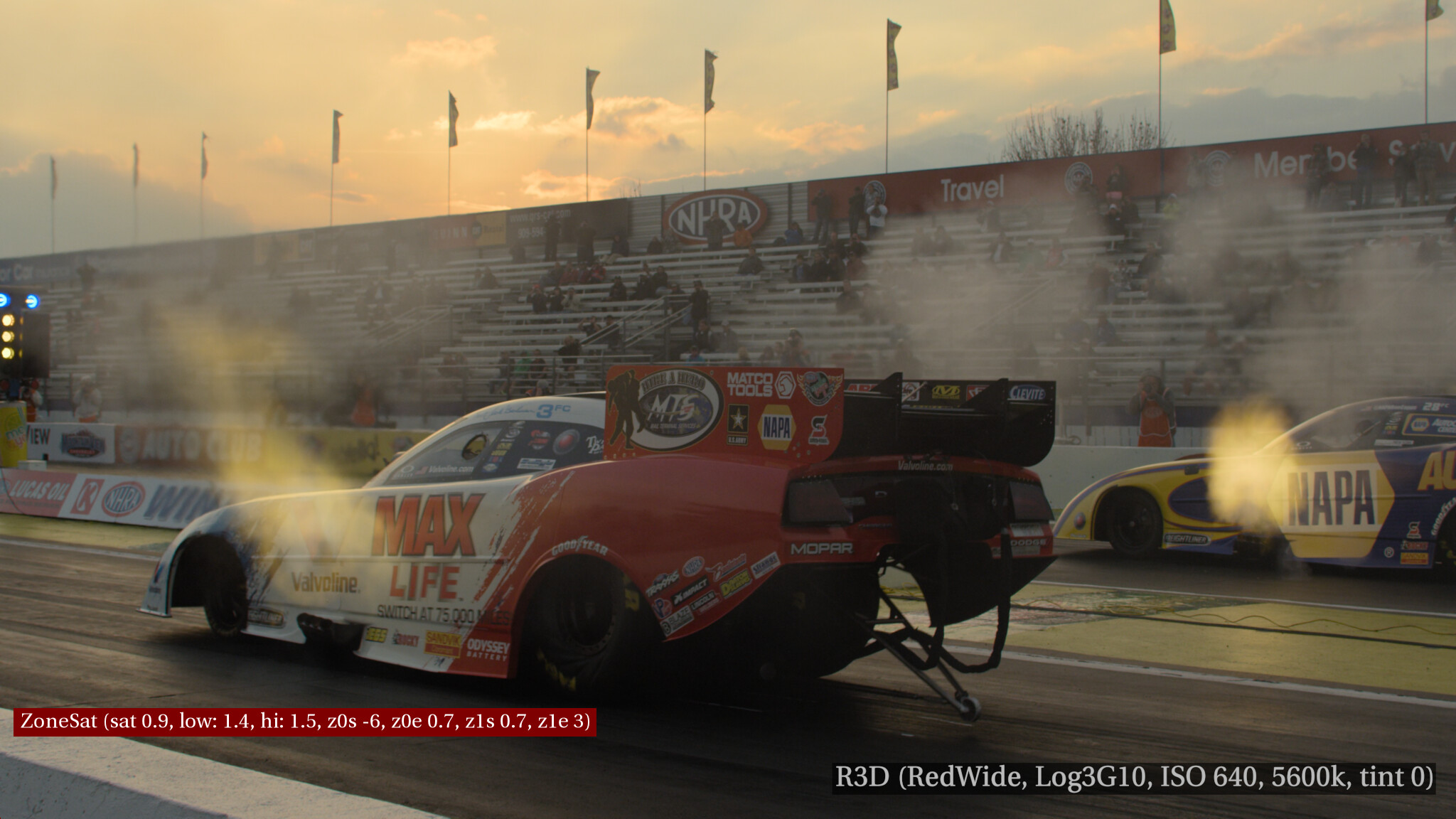
Here’s that image with the same settings, dechroma enabled. Her face looks over-saturated because of the uniform way the saturation affects the whole image due to the way dechroma is working.
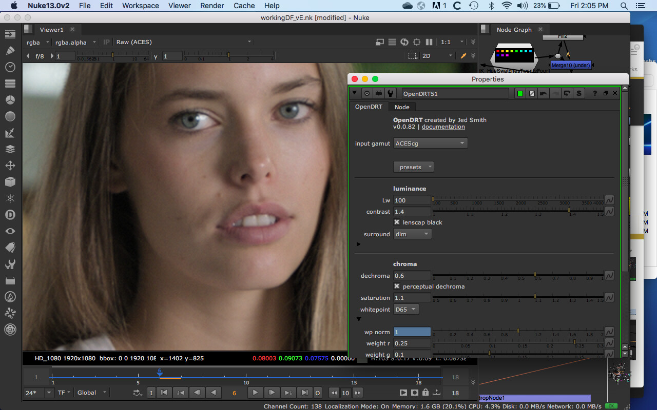
If the saturation is lowered to 1.1 the light parts of the face looks more natural (comparable to the above image with dechroma disabled) however the shadows are getting desaturated when what we should see on skin is the opposite: saturated shadows due to subsurace scatter with desaturated midtones.
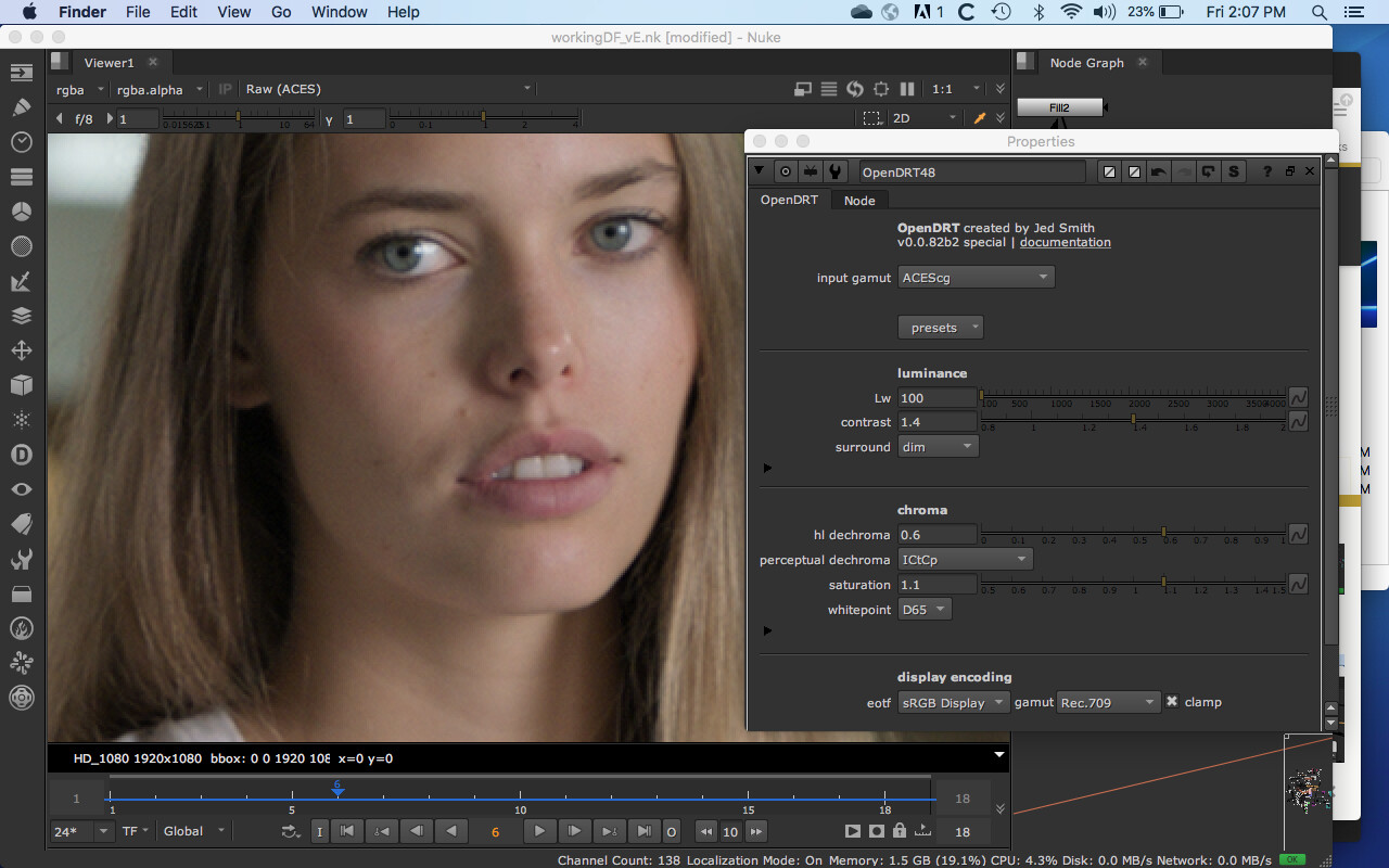
An easy remedy to this is to simply revert to the previous behavior of highlight dechroma (not shadow dechroma). Noting that the shadow dechroma was added in v82 I tried the previous version (v82B special with the drop-down menu for perceptual decroma options). This does help as it appears that the shadows are not desaturated. However because of the uniform way saturation works with the dechroma the saturation in the shadows is still slightly less than on the one with dechroma disabled. So the shadow saturation is improved but not quite enough.
I wonder if a possible solution would be, rather than disabling the shadow dechroma, to instead engineer a slight saturation boost in the shadows with the aim of making it look like it does when dechroma is off (i.e. making it match the chroma in the scene data more closely and thus having skin look more natural/pleasing?
If you think that this behavior is more something that should be handled in the look rather than the DRT another approach might be a tool (Nuke node) that allows for different chroma values in the shadows, midtones and highlights. I did a makeshift version of this with a ColorCorrect node in Nuke modifying the shadow saturation and adjusting the range. This seems rather kludgy to me however, so is at best a temporary proof of concept as Nuke’s saturation luminance math is Rec709.
@Derek Food for thought. I’d noticed too that the 0.0.82b1 had better behavior w.r.t. to the blue dechroma but I didn’t know about the shadow saturation. However, I had a feeling that I had to manually raise shadow saturation and manually decrease highlight saturation even further when comparing against other DRTs. I’m going to have a look at that when delving in the code this weekend since we need it for work and if I find a solution I’ll submit a patch to @jedsmith .
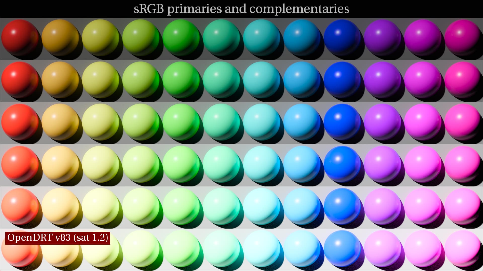
This is a byproduct of the per-channel approach: midtone / shadow saturation is increased and hue skews towards the primaries, highlight saturation is decreased and hues skew towards the secondaries.
I agree that control of chroma over luminance is something that we want to do in a look transform. One of the tools I’m working on is something to do this. A zoned saturation control. It’s just a prototype and there are some kinks to work out but if anyone wants to play with it I’ll post it here. ZoneSat.nk (16.3 KB)
Yes. I added chroma compression in shadows based on the toe adjustment in v0.0.82. It is an experiment, to try to reduce rainbow grain in deep shadows. This way of implementing it may hit midtones too hard in SDR where there is significant flare compensation however. I might make this an absolute factor instead of based on flare compensation in the next version. More experimentation to be done…
The differences you are seeing in blues is probably coming from the addition of a gamut compression operator to handle out of gamut colors.
@priikone sorry I missed this question! Yes the algorithm is trivially invertible and it is very accurate. I did a small commit to add the inverse direction.
The zone stop-range appear not to work as expected. I fixed it by changing the f0 expressions to max(r,g,b) > p.0 ? clamp((p.1-max(r,g,b))/(p.1-p.0)) : clamp((max(r,g,b) - p.0)/(p.1-p.0)). Seems better after that.
Attached. It changes the behavior so that the saturation change is affected only within the defined range, like from -6 to +1, and from -1 to +6. Might be good idea to overlap the zones… Not sure if this is how Jed intended this to work, but this was my expectation with the zones.
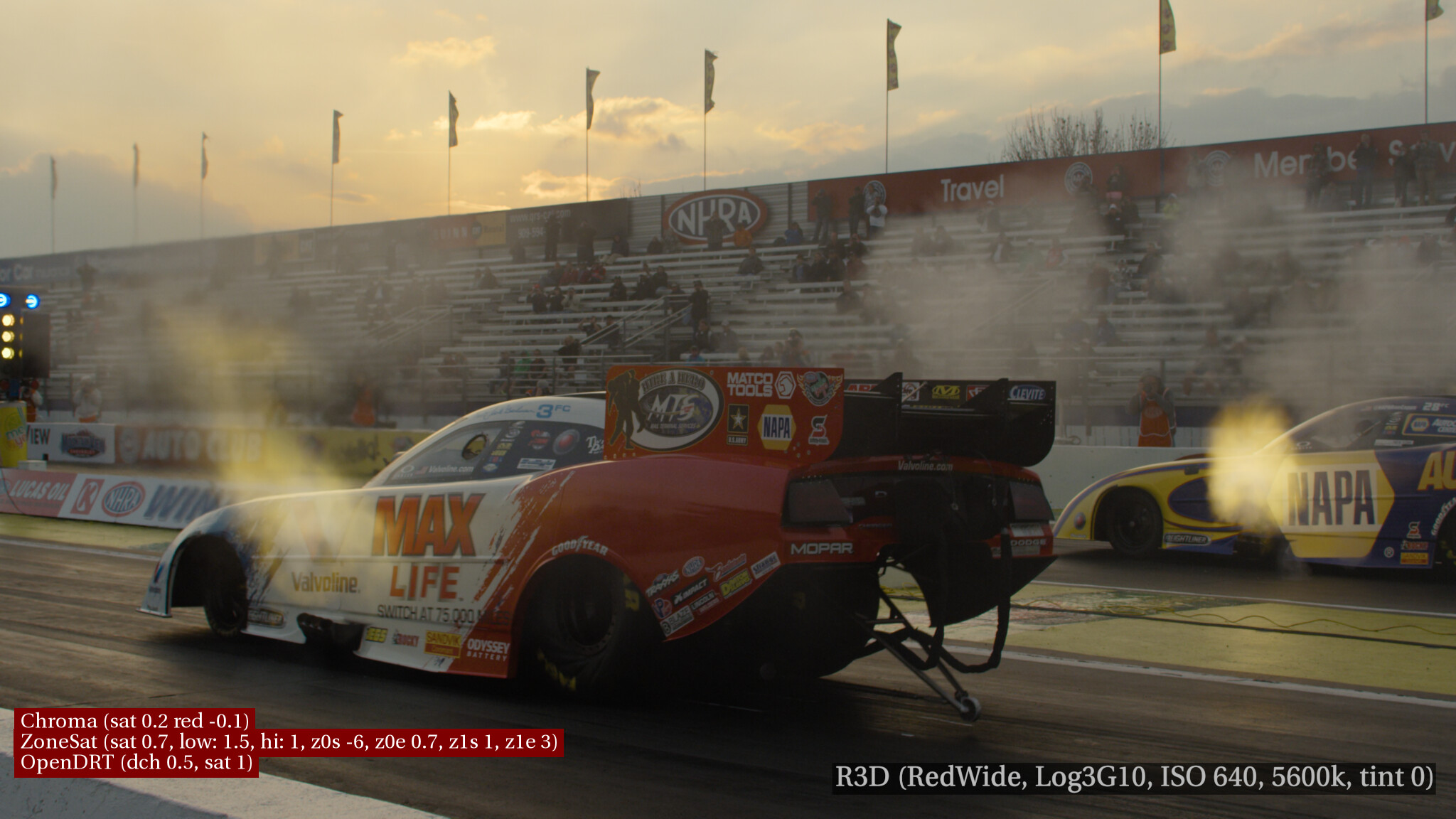
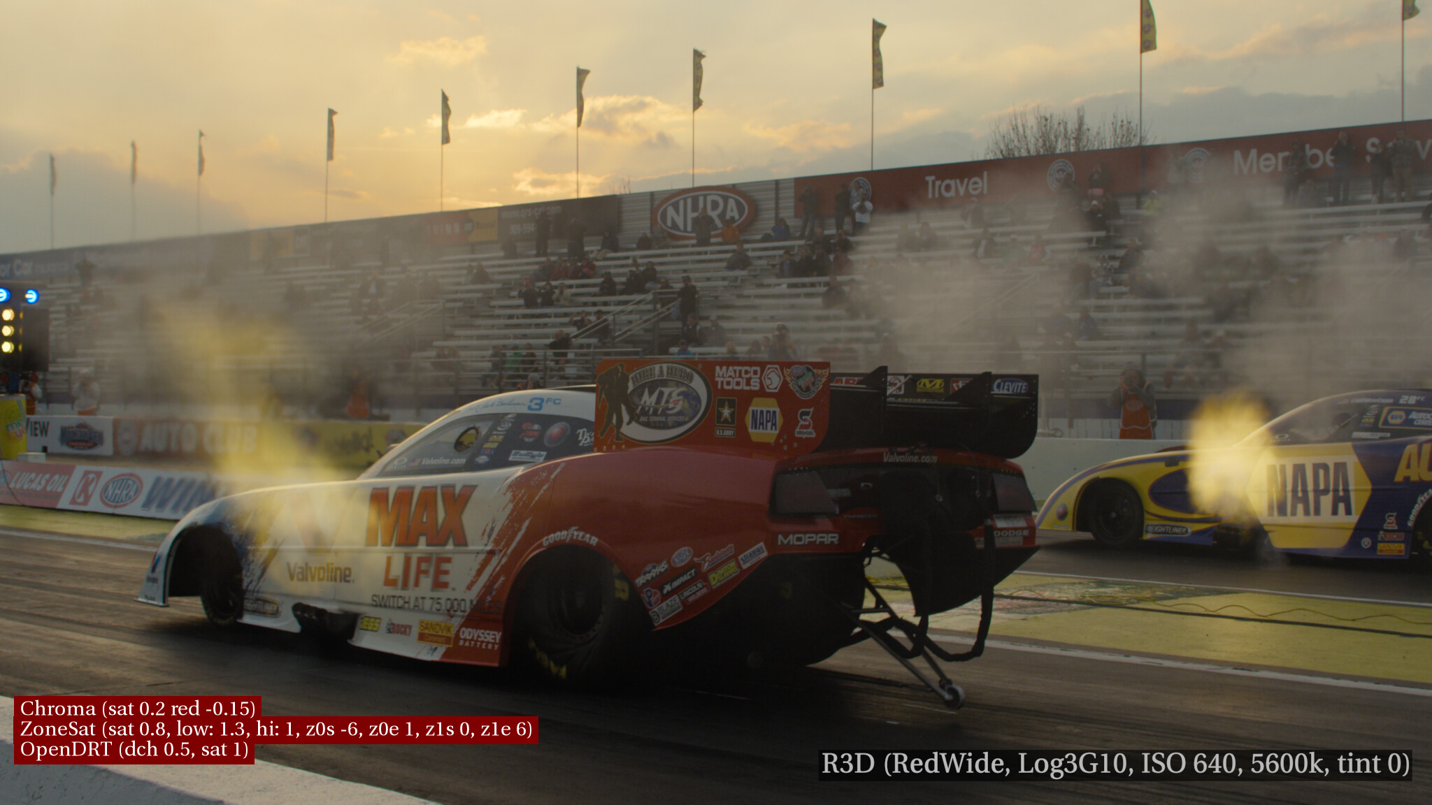
However what I don’t like is the way the saturation handles hilights. For example the color of the clouds in this image is going from orange to white (with OpenDRT decroma 0.5 sat 1.0, ZoneSat hi sat 1.5):
This is where the No6Chroma node comes in. With its saturation I get golden sunlight in the clouds and I also get blue sky, as opposed to having the whole sky go pollution orange like it is above. Settings are on the bottom left corner of the image:
Comparing the skin and clouds in the ZoneSat and Zonesat+chroma what seems to be the difference is that the combination Zonesat+chroma looks like its doing a nicer tone mapping compared to the flattening of ZoneSat. Not sure that’s technically the right description of what’s going on, but it definitely looks much nicer/more natural.
A byproduct of the combination of ZoneSat+Chroma is that both red and blue are darkened. Sort of an accidental HK compensation I guess! Additionally red gets saturated which is why I lowered the red on the No6Chroma node to counter balance this.
I’m thinking that it might be good to have these two nodes integrated into one node so we can keep the good things that are happening (skin shine, golden sunlight) but not the unwanted things (hue shifts) or at least have more control.
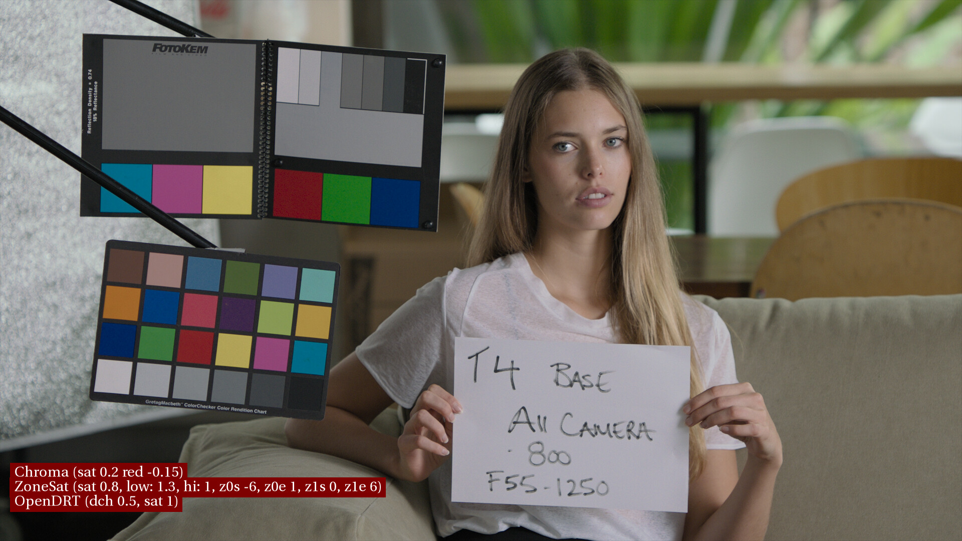
EDIT: Here are the two images with @priikone 's expression (and corresponding updated settings). What’s nice about this is that yellow is not getting desaturated like it was on the v1 ZoneSat. You can observe this in the yellow color checker swatch in this first image:
Hm, I’m not sure what the problem is that you are seeing. Your modified expression would have a hard cut at p.0. The expression in the original node is intended to extract a range to use as a lerp factor. The extracted range is intended to be from 0 to p.0 with a smoothstep falloff to p.1. Your expression will create a result that is 0 from 0 to p.0, with a cut to 1 at p.0, with a smoothstep falloff from p.0 to p.1.
If you are trying to create a smoothstep window function, which would extract a range with a falloff on each side, you could so something more like this:
# params controlling range
s0 = 0
e0 = 0.2
s1 = 0.3
e1 = 0.5

# linear extraction of falloff range
x0 = clamp((max(r,g,b)-s0)/(e0-s0))
x1 = clamp((max(r,g,b)-e1)/(s1-e1))
# smoothstep
x0s = x0*x0*(3-2*x0)
x1s = x1*x1*(3-2*x1)

# assemble
max(r,g,b)>s1?x1s:max(r,g,b)<e0?x0s:1
A significant point of a chromaticity linear rendering approach is to enable creative choices by preserving the chromaticities in the image, and firewall some flourishes from further down the pipeline. There are plenty of times where one absolutely requires the chromaticity expressed to make it directly out the display, such as with media walls.
One is free to grade the resultant chromaticities as they see fit.
Adding warps / distortions / or other non-light transport manifestations are clearly in the creative domain, and would inhibit the ability to add the range of creative expression.
For example, if someone is obsessed with the digital gaudy rat piss skews, it is absolutely trivial to grab the range of chromaticities and skew / distort them as they see fit in the image. Resolve has a very good mesh distort for this, as well as the versus tools.
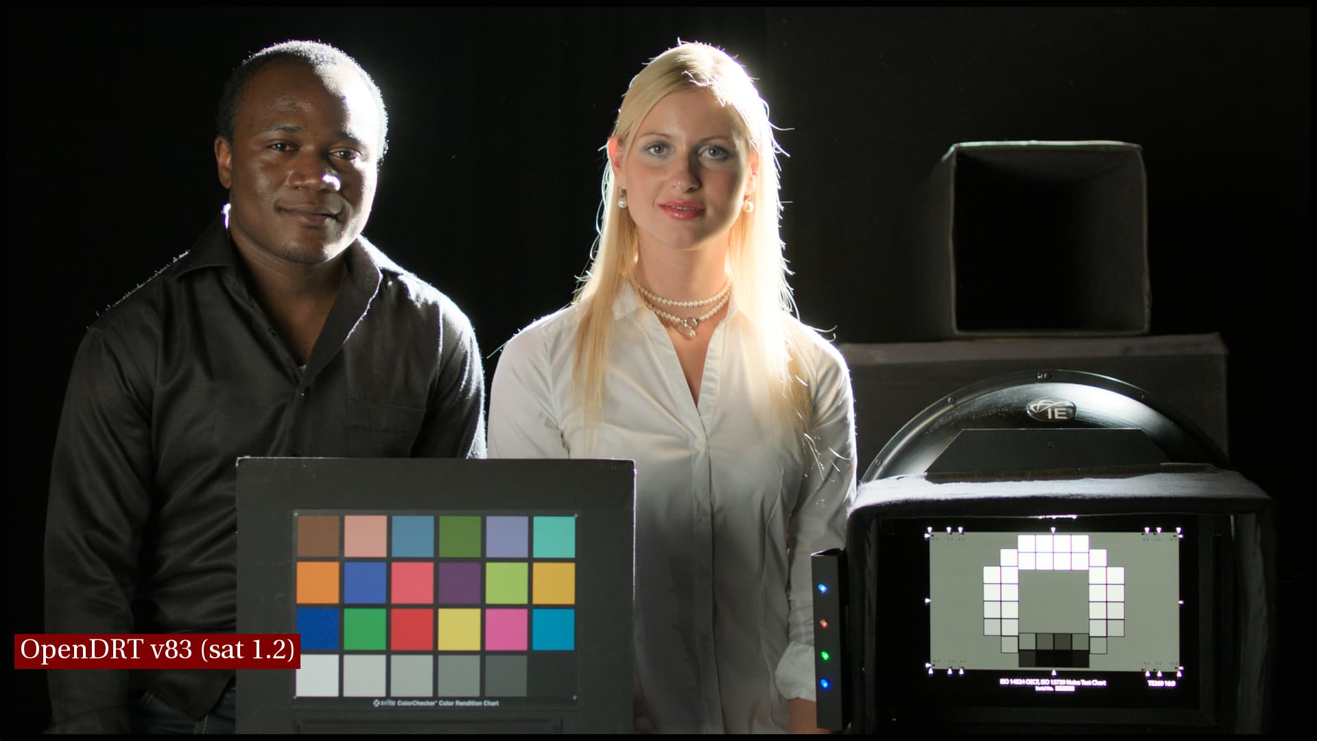
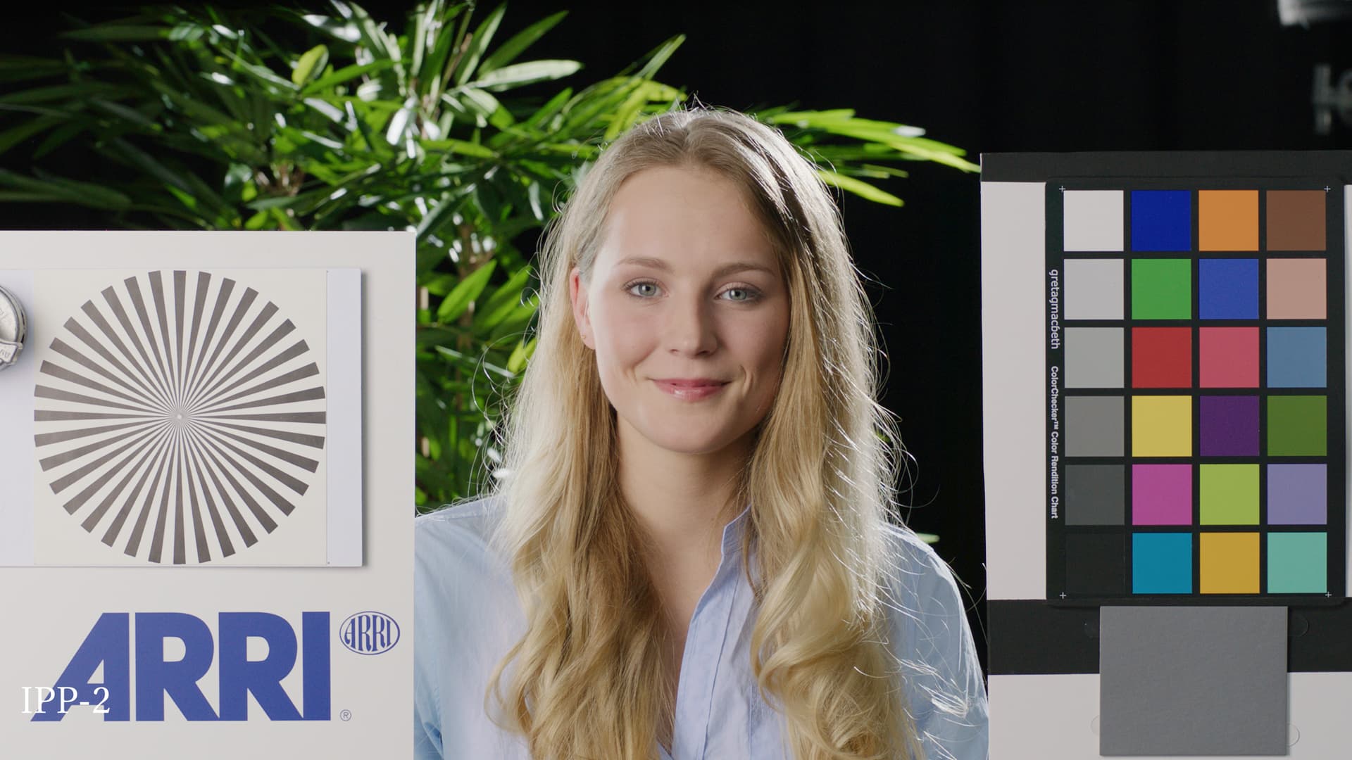
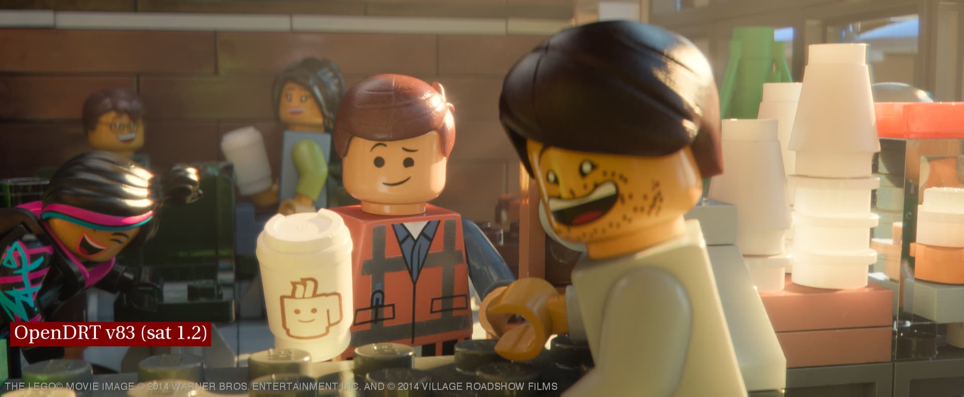
Posting an update to the skin look with the recently updated v83 OpenDRT and an updated ZoneSat. I’m feeling like skin tones are looking pretty great with these tools from Jed.
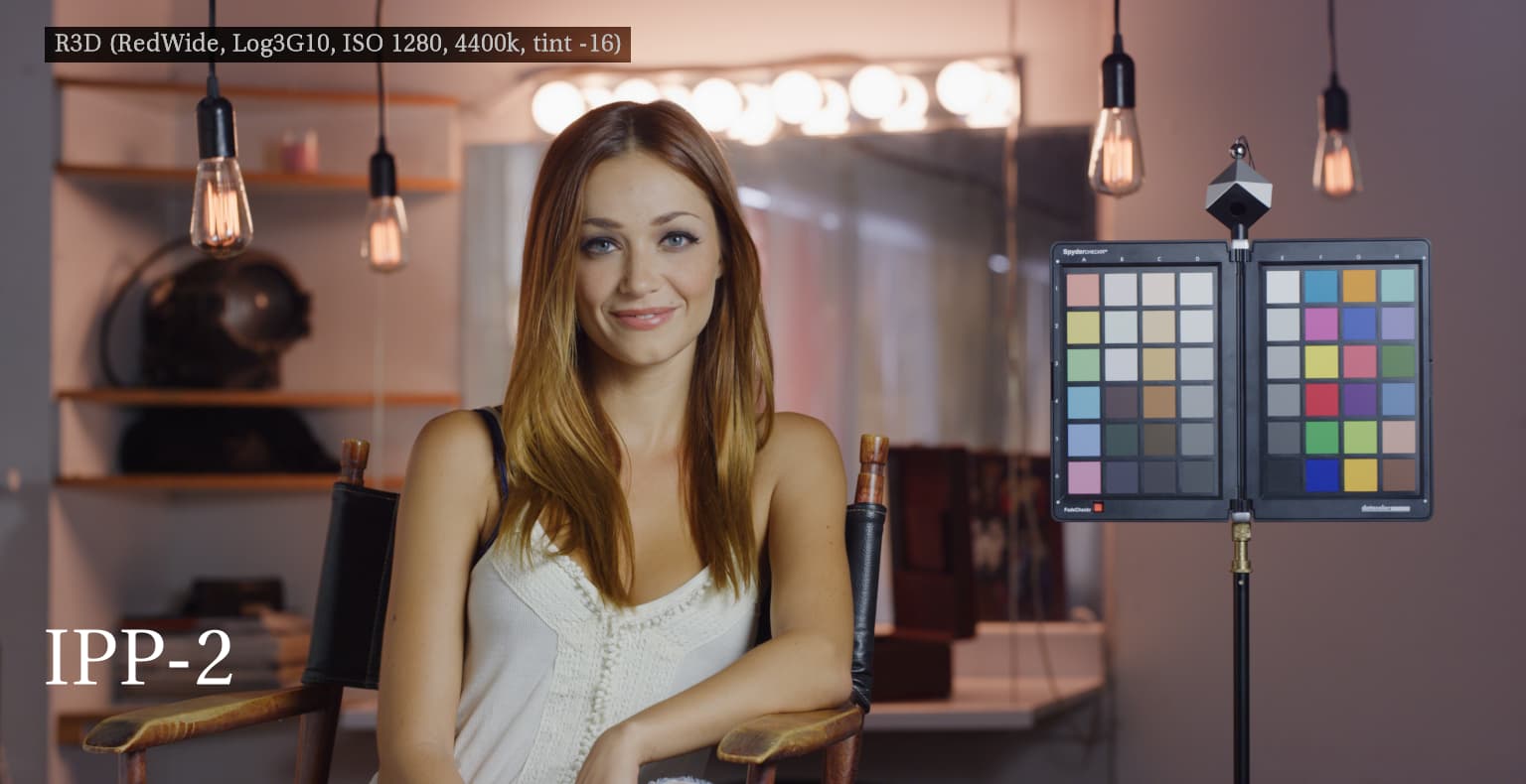
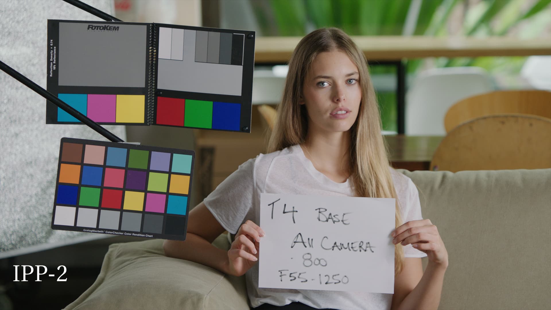
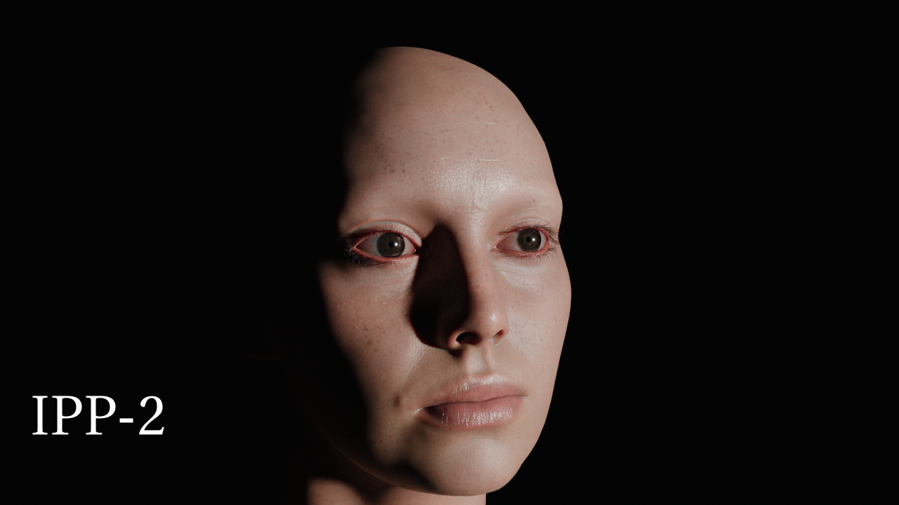
IPP-2
First image in each set is RED IPP-2 using a gamut convert from ACEScg to REDwide > RGB to Log3G10 > RWG_Log3G10 to REC709_BT1886 with HIGH_CONTRAST and R_4_VerySoft size_33 v1.13.cube (thanks to Jed for help with this workflow which works much better than the IPP-2 OCIO display from the VWG config I was using previously).
I’m using IPP-2 as a reference for an example of what appealing skin looks like. I also looked at ALF and K1S1 which also render skin nicely. My intention is not to attempt to match any of these, but rather to identify what is nice about them in how they display skin and to attempt to get the same qualities in a look for OpenDRT without any unwanted “side-effects” such as skews or changes in color.
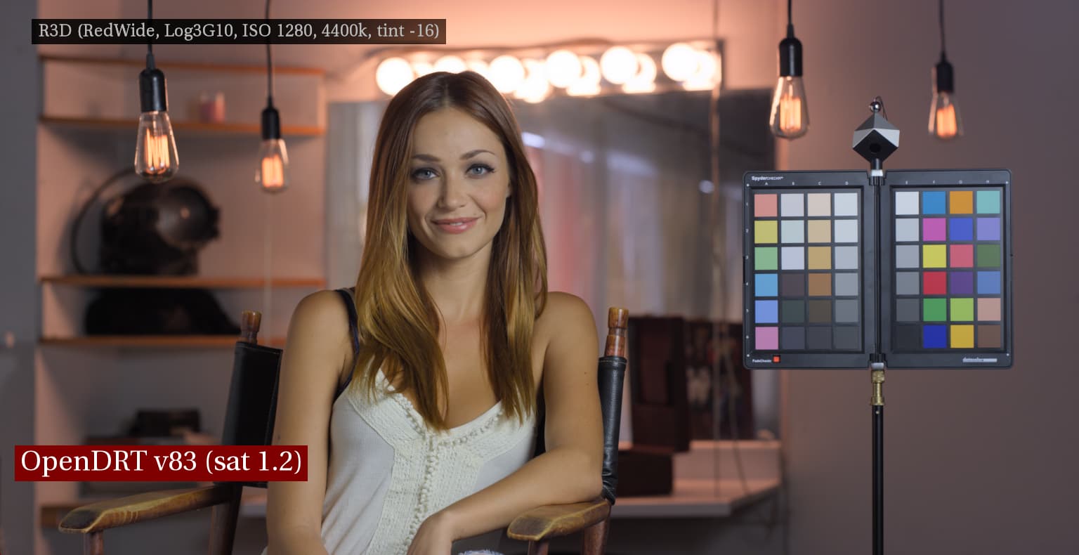
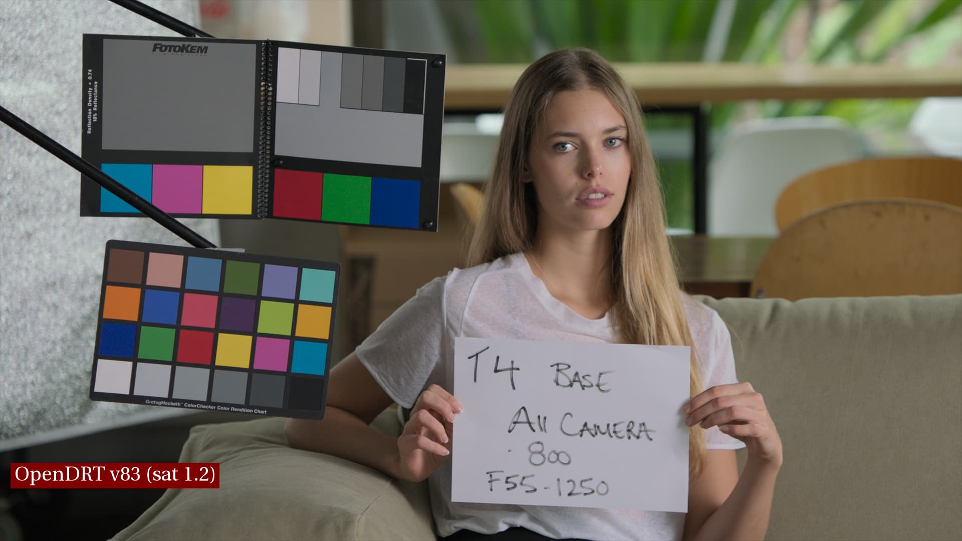
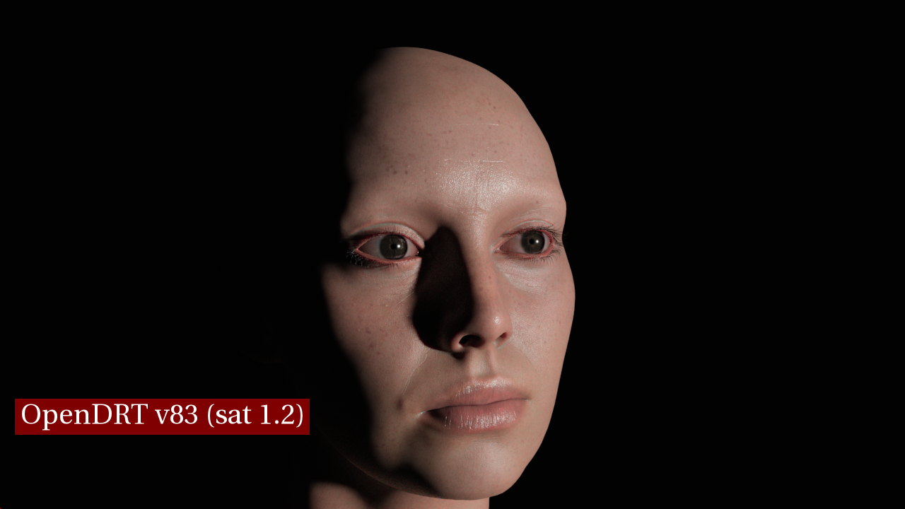
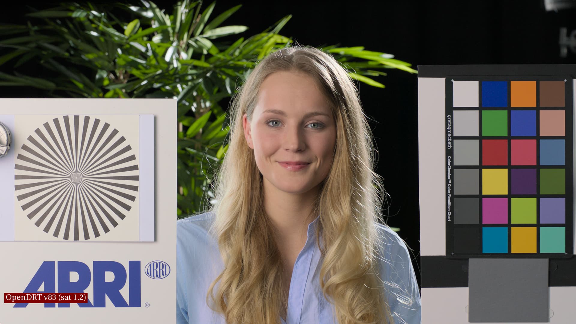
OpenDRT v83
Second image in each set is OpenDRT as is. This is using OpenDRT v83 with default settings (i.e. saturation 1.2, dechroma 0.5, EOTF sRGB Display).
What is looking great on the skin is that the midtones and shadows are not losing saturation in v83 like they were in v82. However, compared to IPP-2 the color/saturation is looking too uniform across the subject’s face, making it look like one does when their skin is caked in foundation makeup losing skin’s natural glow (subsurface scattering), which brings me to…
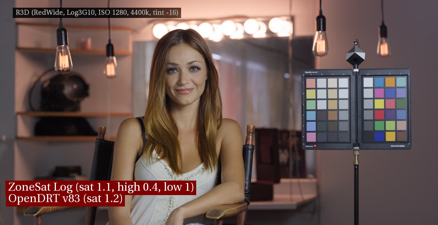
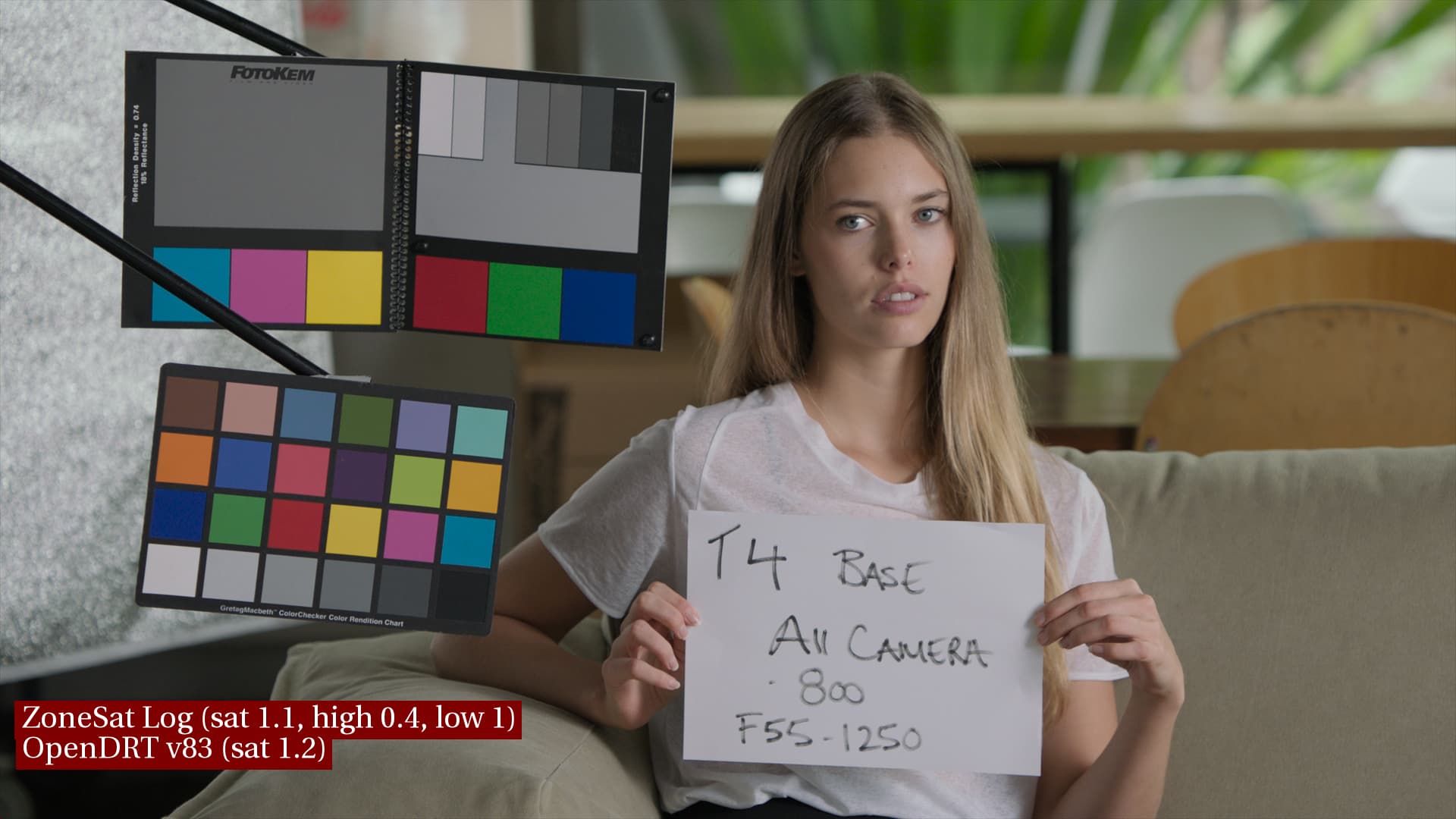
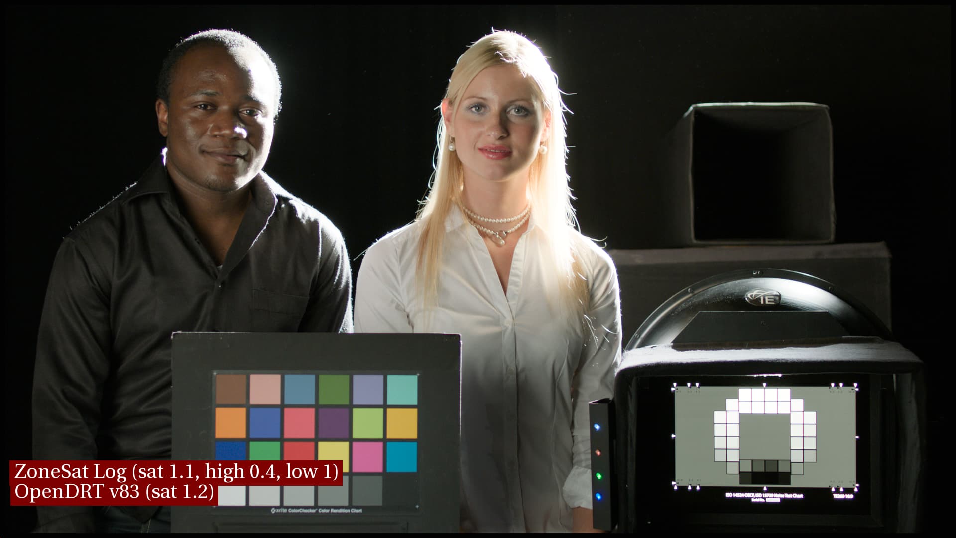
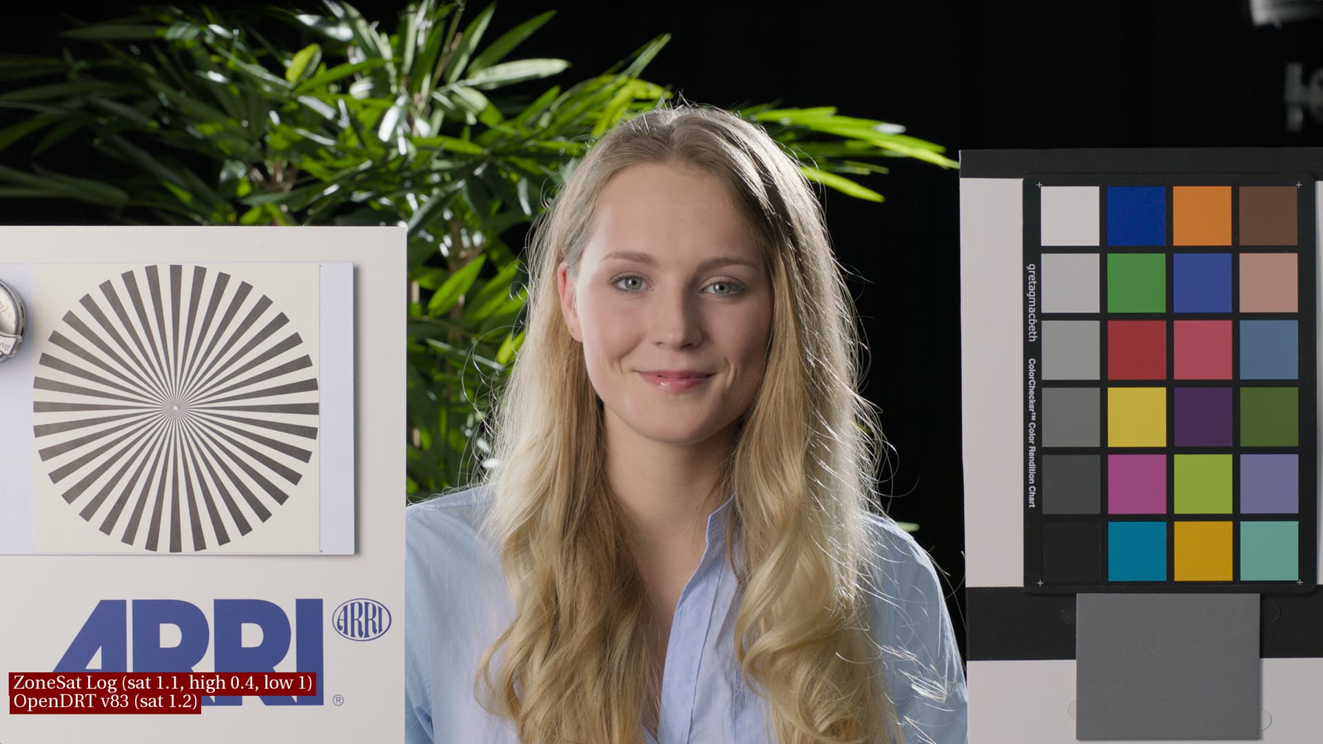
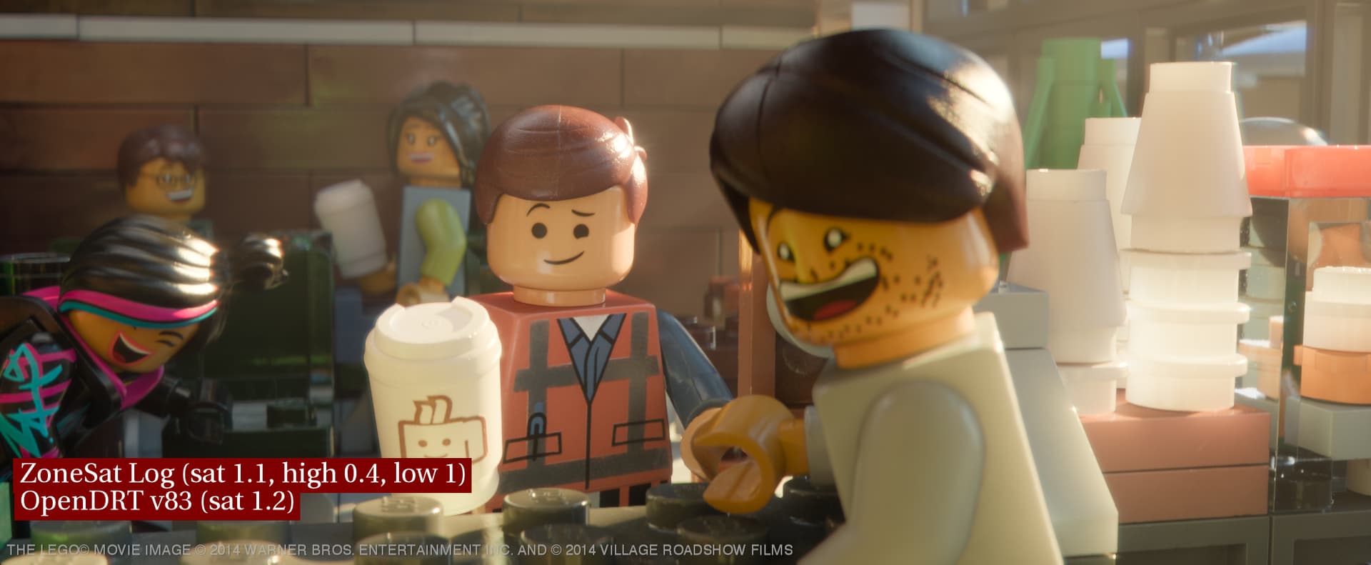
Log ZoneSat
Third image in each set adds the latest log ZoneSat from Jed upstream to OpenDRT. My aim of the ZoneSat is to address the saturation looking too uniform across the subject’s face as noted above. My understanding of why DRTs like RED IPP-2 does not do this is that this is a “happy accident” of the per-channel approach where highlight saturation is decreased and hues skew towards the secondaries, in this case skewing skin towards yellow.
I’d like to keep the good parts of that “happy accident” (the desaturated highlights) and “spit out the seeds” avoiding any color skews, as color fidelity is what I especially like as an artist about OpenDRT. I’m therefore desaturating the highlights with ZoneSat, while striving to not lose saturation elsewhere (for example in the color checker swatches), in particular I’m looking to preserve saturated yellow, which ACES notoriously has a hard time with, but is coming through nicely in OpenDRT.
I made the overall saturation in the ZoneSat 1.1, with the goal not to increase saturation, but rather to keep it looking the same as it did in OpenDRT. These settings are just my preliminary tinkerings, and certainly more experimentation is needed! I’m thinking now it may make more sense to make the overall sat 1.0 and instead make the low sat 1.2, which gives virtually identical results but perhaps in a more intuitive way.
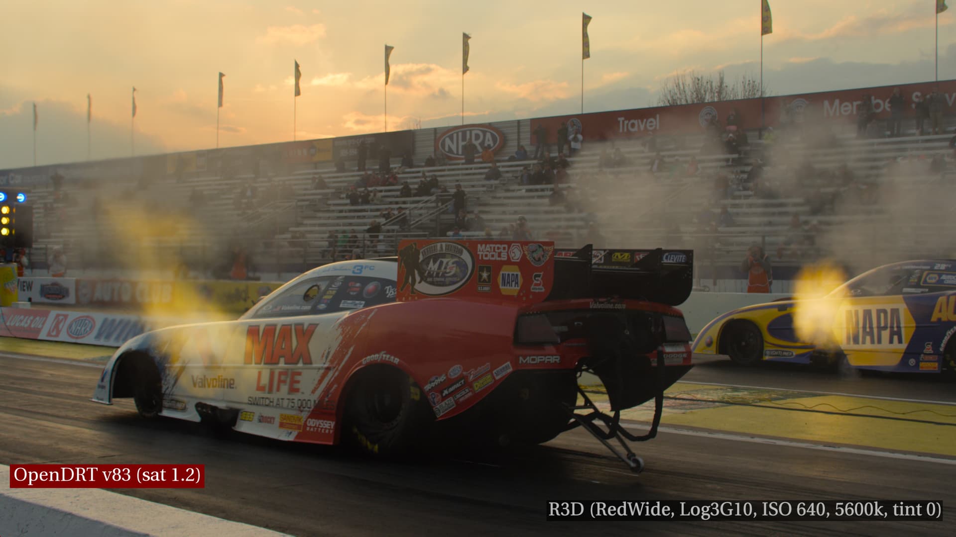
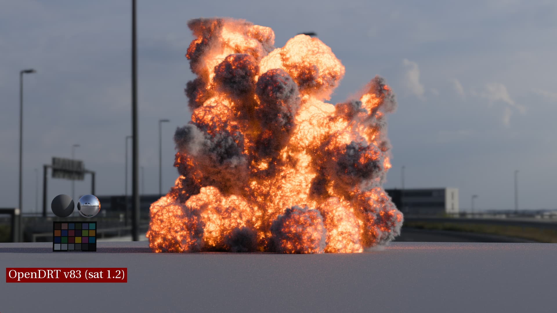
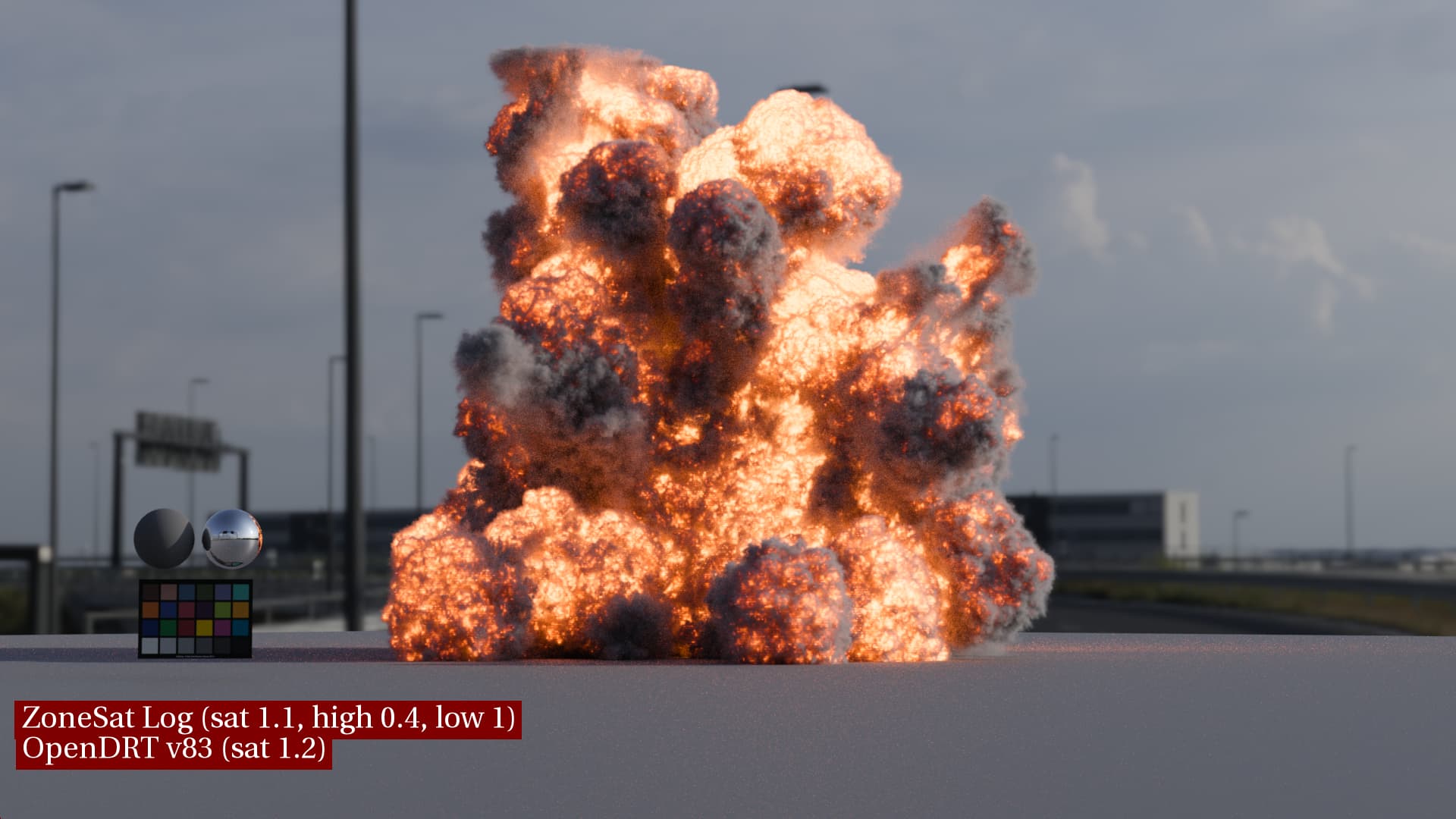
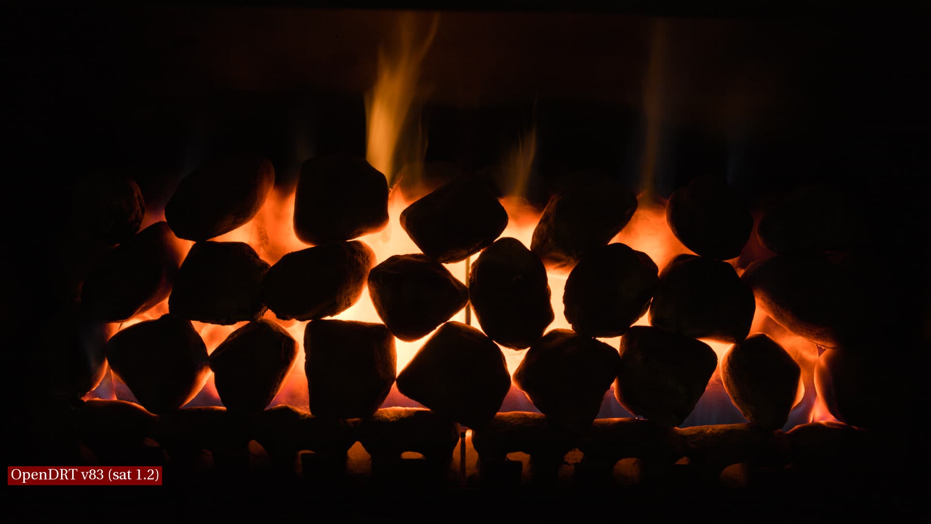
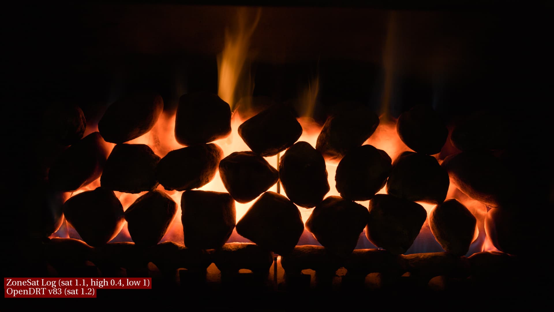
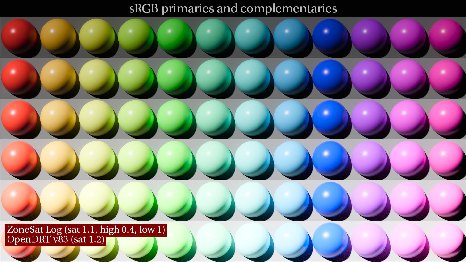
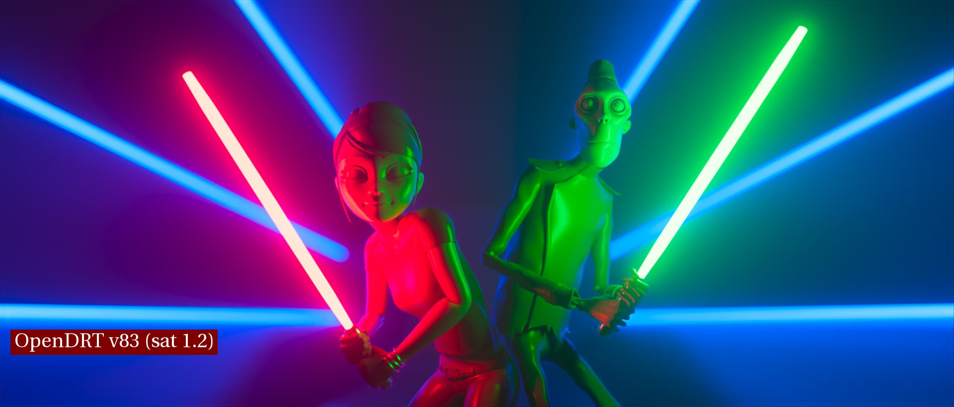
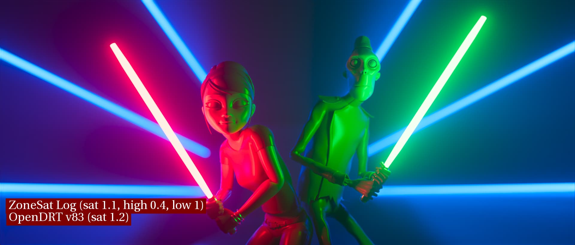
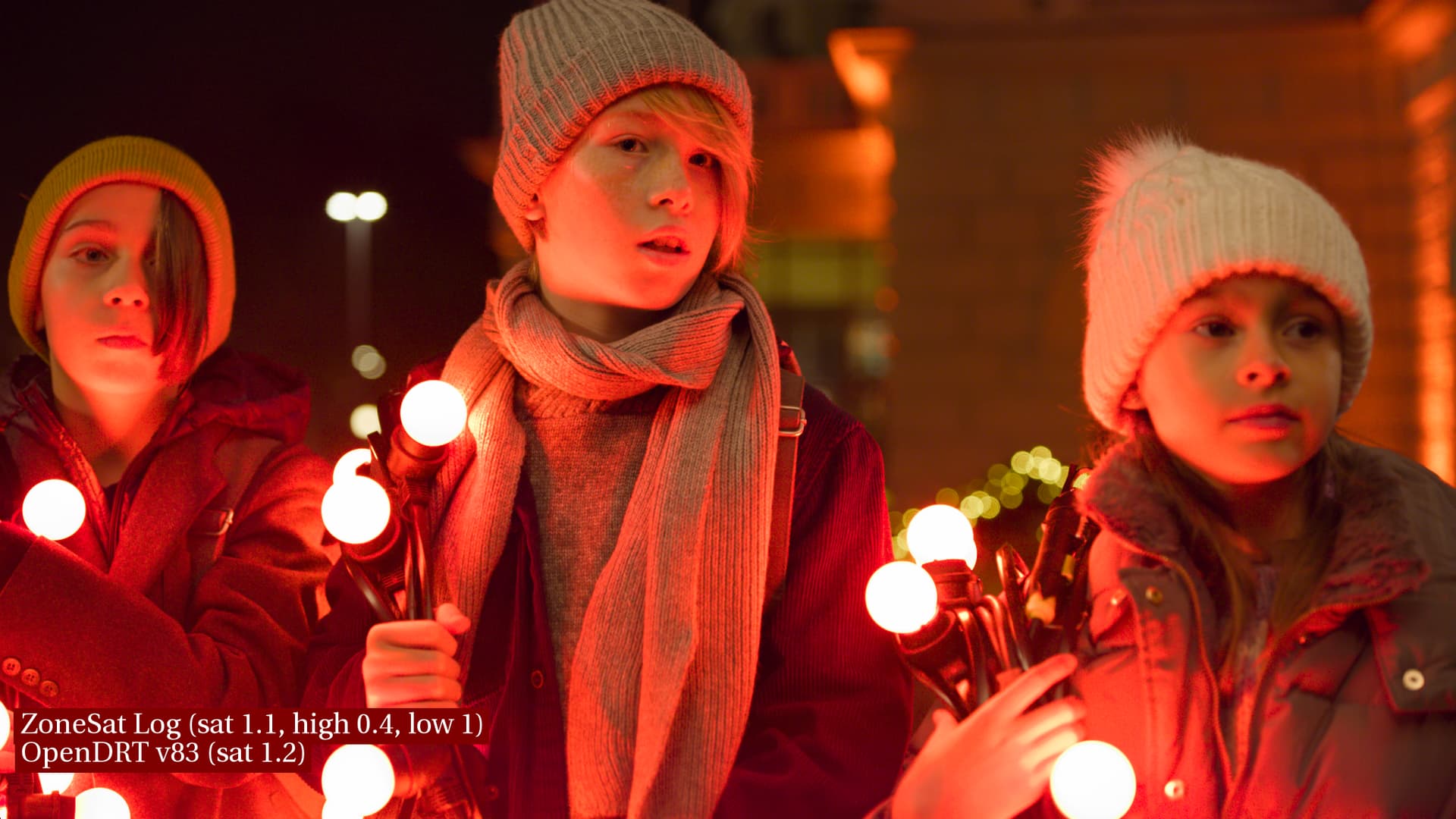
Finally, here are some other test images to show how they are affected by the look. I’m excluding IPP-2 from these and just showing OpenDRT and OpenDRT+look
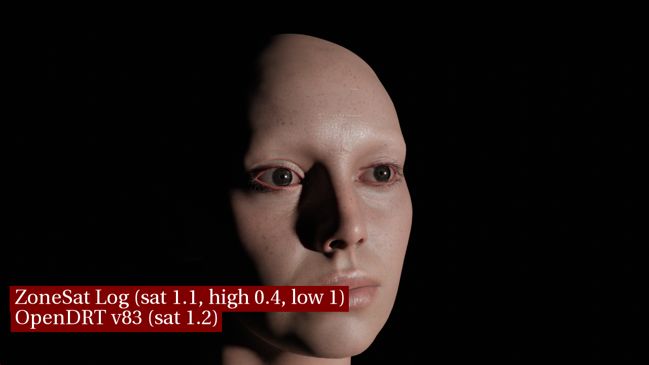
ZoneSatLog is just another experimental prototype, which adjusts saturation over a certain zone or range in a log domain instead of in a linear domain. In case anyone was wondering what the heck Derek was talking about
@jedsmith I’ve tested the v82 and v83 versions with a short film, I’ve recently graded for a theatrical release, that has a lot of dark scenes and where I had to deal with those colorful artifacts in the shadows from current ACES 1.2 ODT.
For sure, v82 was awesome for dealing with these artifacts. But in warm scenes with tungsten lighting, faces become a little bit dead with v82. So I definitely prefer v83 version with " remove toe dechroma. it was a bad idea. " for these shots and its overall look for any shots with faces.
But… are there any plans to compress saturation somehow in the darkest shadows, so it could deal with these artifacts? Is it possible at all?
My commit probably should have said “remove toe dechroma while I figure out a better way of doing this”. I do not think chroma compression in super dark shadows is a bad idea. That corner of the display gamut cube is just as sharp and unforgiving as the white corner, even though we see it less. Using the amount of flare compensation to control this was maybe just not the right approach.