Hi,
I finished the hopefully last blog post about the “Red Star on Cyan”.
I ended up writing four parts about this one image:
- Understanding pixel values and the EOTF
- P3-Wide Gamut and HDR
- Heading to Rec.2020
- Expanding beyond Rec.2020
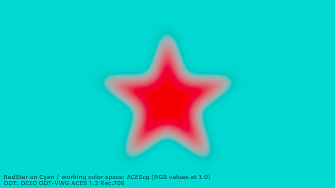
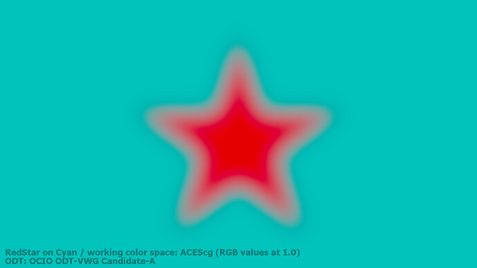
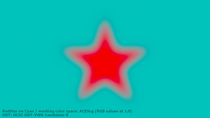
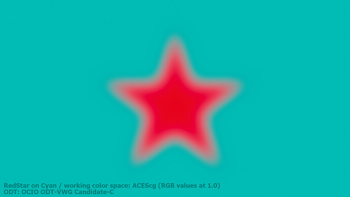
In the last blog post I tested out the three new candidates from the VWG ODT with this specific “image”.
Candiate C still has a smaller outside dark glow around the “star” followed by a lighter glow going inwards to the center of the image. But it certainly renders the most useful image out of the four variations.
I am aware that this graphics makes little sense in a day to day workflow, but values like these could be easily introduced in a graphics app like Affinity Photo or Krita or coming out of a 3D render that should look like a cartoon or have a motion graphics style when using a working colorspace with virtual primaries.
I wonder if there should be a limiter or feedback in these apps that tell the user that they put in values that are not a colour anymore? @ChrisBrejon


