A fully red star on a fully cyan background... in ACES

Hi,

I came across the blog from @Troy_James_Sobotka and wanted to try out question #9 for myself. (https://hg2dc.com/2019/07/21/question-9/) “Why the F*ck is Linear Light Important for a Digital Artist?”

As I am working mostly in ACES, so I tried out this example in ACES as well and I got strange results.

But first, I started out in Affinity Photo 16-bit sRGB. I can replicate the result from the blog as expected.


The moment I convert the document to 32-bit float (sRGB linear), the problems go away.

But by assigning the ICC profile ACEScg to the document, so changing the working space to ACEScg, and having a red star with RGB 1/0/0 and the cyan background with RGB 0/1/1 with the view transform sRGB, this happens:

I am using the official OCIO/ACES 1.2 config.
Note: I am aware that Affinity Photo has a bug, where it cannot save an image properly with an ODT selected. I normally use it only with EXR files.

I am sure that I can “trust” Nuke more, so next, I moved over to Nuke 12.2v4 non-commercial with ACES 1.1.

I replicated the steps with only Nuke nodes and compared the Nuke-Default pipeline vs. the Nuke-OCIO pipeline side by side. For this I set the view transform to ACES (RAW), so that I can apply the view transform by myself with nodes. The tree looks like this:


And the results look like this: (left side Nuke-Default vs. right side ACES(sRGB)

I can fix the problem by using sRGB-linear primaries and convert these to ACEScg, hence lowering the values. The tree looks now the following:( I just added two OCIO color transforms from Lin_sRGB to ACEScg after each constant node)


Left is again Nuke-Default vs. right Nuke-ACES 1.1

I must say the first part of the tests in Affinity Photo I can kind of understand. Kind of.
But the Nuke tests show something different I think.
I guess it has to do with the ODT, but don’t really get why.

At last, I tried two more things. Replicate this test in Resolve. The result looks even more ugly with maximum ACEScg RGB values, because the blur of the image is applied in ACEScct instead of ACEScg. I checked this again in Nuke. This is now the left image of the side by side. And for the right side I forced the ACEScg comp first to linear-sRGB values (which doesn’t make any sense of course, because I start with values over 1 and some negative ones) and then simulated the Nuke-Default pipeline. Now I get on the right side again the same result as up with Affinity Photo in ACEScg (which doesnnot seems to work properly?)


I am confused.

I found out, the moment I choose a ODT with a bigger gamut, like P3 or Rec.2020, the problems seems to get “smaller”.

And I know that I am using a usually “display-referred” motion graphics example in a scene referred Nuke environment, which is not happen often I assume. But I guess in a rare case some of this problem could occur in a 3D rendering as well. I am using extreme values for sure, but they are “normal” ACEScg values.

I hope this is easy to follow. I can upload the files if needed.

Best regards

Daniel

It’s an interesting effect, but not unexpected when you think about it. The mid point between [1, 0, 0] and [0, 1, 1] is [0.5, 0.5, 0.5] so is achromatic. Depending on the different curves you are applying before and after the blur, the achromatic region will end up larger or smaller, and dimmer or brighter.

The version where you convert sRGB linear to ACEScg is just another example of the way a legacy sRGB VLUT maps linear 1.0 to display 1.0, whereas ACES makes room for highlights, so maps 1.0 input to a lower display value. Hence the cyan background ending up dimmer compared to legacy sRGB’s [0, 1, 1].

And blurring in ACEScct is not energy preserving. Hence the dark band. That was the point of @Troy_James_Sobotka’s article – if you want to simulate the behaviour of light, you need to work in linear.

As for the version where you don’t convert sRGB to ACEScg, you are then using a fully saturated ACEScg red primary and cyan secondary. Putting fully saturated ACEScg primaries through the current Output Transform has known issues, and is something the Output Transform VWG is looking into (see @ChrisBrejon’s posts on the subject). Because the ACEScg primaries are out of gamut for sRGB, one channel hits clipping before the end of the blurred transition, producing that ugly hard edge within the blur. That is why using a wider gamut Output Transform mitigates the issue – the Rec.2020 primaries are almost the same as those of ACEScg.

Here is my Nuke script if anybody wants to look (VLUT “None”, OCIO ACES 1.1):
star_blur.nk (3.7 KB)

1 Like

Thanks Nick for your good explanations as always.

I am slowly understanding why this happens, but it simply shouldn’t happen. I am using the “system” as intended. Maybe not in a way how a camera could produce such values, but in 3D as @ChrisBrejon sets up his tests now, eventually yes. For a very colorful cartoon for example :slight_smile:

I am looking forward to the work in the Output Transform VWG.

Best regards
Daniel

Hi, @nick @ChrisBrejon,

I have two more questions after giving the topic some more thoughts.

1.) Wouldn’t be an “ideal” result in this strange image from ACEScg (red 1/0/0 and cyan 0/1/1) to linear sRGB also result in red 1/0/0 and cyan 0/1/1 after a gamut mapping operation?

2.) Does an example like this one even matter? If I understand it okay, the red star is no plausible, because the red primary couldn’t even made with a red laser.
But at least the cyan color is real.

Hey @TooDee ,

sorry for the late reply !

  1. About question 1, I asked myself the exact same question, like three days ago ! Would a gamut mapping operator in an “ideal world” map the ACEScg primaries onto the display primaries ? I am afraid I don’t have an answer for that one…

  2. I also sometimes ask myself the same thing about my renders. Does it even matter to be able to light with ACEScg primaries ? Some supervisors seem to think so… About the star test itself, may I ask you : what are you trying to achieve ? Would you need ACES for such cases ? It seems to me that someone who’d want to put a red star on top of a cyan background would do it in Photoshop. Then of course, the blur issue would appear with the dark outline… And we’re back to square one.

I did try this test with the nuke-default color management setup (linear/sRGB) :

It looks okay to me. What do you think ? It’s just that I have a hard time wrapping my head around ACES and 2d medium/pipelines to be honest.

Sorry I cannot shine any more light on this,

Chris

Hi @ChrisBrejon,

About 1. (Your answer makes me think again :slight_smile: )
From a “number” standpoint it might makes sense that the before and after the gamut mapping values are the same. But the “position” of both colors are on a different place on the CIE diagram, so at least this means that these are two different colors. It hard to separate numbers and colors! :slight_smile:

about 2.
Here I can give two answers.
First, I was reading the blog from @Troy_James_Sobotka, found his example of the red star on cyan and had to try it out myself. I started with ProCreate/Affinity Photo on the iPad, they failed like described, but I somehow thought “come on, these are far more modern apps, they should have fixed that by now”.
Next, I know it works in Nuke the “right way”, but as my Nuke is by default set to ACES I was amazed that it also failed, although the comp-math is right. Therefore this issue raised again my interest in the ODT VWG and before already in the Gamut Mapping VWG efforts last year.

And secondly, sure you are right. This is motion graphics, so I would do that anyway in Affinity/PS or After Effects. But the same way as you are testing “pure laser” primaries for renderings, imagine there would be a new version of AE with ACES support. Or someone has an ACES project in Resolve and wants to add an ugly red star on a cyan background graphics in a title or something.
I bet that I would too choose 100% red 0% green and 0% blue for my star and 0% red 100% green and blue for my cyan background. Because I did it always like this. And then I would run into problems again.

What I learned so far from this whole example? There is more than one place in the image processing pipeline that has to work properly to give us a good result. And I was not aware that it could be the view transform.

Just a funny side note: (which is not ACES related)
In AE in a standard 16-Bit comp the “star” fails too until you check the “Blend Colors using 1.0 Gamma” in your working space settings.
But in Motion from Apple, which is now already almost 10 years old, does not fail at this test in a standard type project. It works by default, same as FCPX, as both tools linearize the assets on input.
As soon as I use a HDR project type, the overall result looks darker (different tone-mapping) and the star breaks too (I found out that Motion/FCPX uses a linear Rec.2020 working space when setting a project to HDR). But less, as @nick was suggesting. I view this example in Motion on a 2020 iMac 27 which is P3 and supports EDR.

Hi @ChrisBrejon and @jedsmith,

I could not help it and had to try out what happens if I use the “NaiveDisplayTransform7” on the red star too. I am very thankful for the gizmo and to be able to peek inside. It helps to understand and follow along the ODT discussions.

Nuke-Default: sRGB

Nuke-ACES (Rec.709)

Nuke-ACES naiveDRT (default)

Nuke-ACES (Rec.709) - but with reduced sRGB primaries instead of ACEScg primaries

Daniel

I would say not, as the ACEScg primaries don’t have the same perceptual hue as Rec.709 primaries. And certainly Rec.709 primaries have a different perceptual hue to P3 primaries. So a gamut mapper which mapped the ACEScg red primary to Rec.709 red (slightly orange) or P3 red (deep “blood red”) for those two display standards would not produce images which looked similar.

2 Likes

thanks ! great answer Nick ! makes sense indeed ! I guess it all comes back to the display limits.
If we overcompress we will get gamut clipping. If we undercompress, we may not maximize the image density coming out of the display. Interesting questions !

1 Like

Interesting that Lars Borg just said the exact same thing during the meeting :

And where do I put for example, BT. 2020 green ? Do I make it slightly cyan in 709 space, or people want to map it to the green in the 709 space, which I think is wrong, right ?

Great minds think alike. :wink:

Chris

Hi,

I hope this is my last question about this topic. But I really just don’t understand what I am seeing on the following screenshots. I think I understand why the first screen-shot has a fringe that is actually different from a fringe that I would see in Photoshop for example.

Nuke-Default:

Just comped, no view transform.

Just comped, blurred, no view transform.

Comped, blurred, Nuke-Default sRGB view transform.

Comped, Nuke-Default sRGB view transform.

Nuke-ACES (Rec.709)

Just comped, no view transform. (Same as image 1)

Just comped, blurred, no view transform. (Same as image 2)

Comped, blurred, Nuke ACES (Rec.709) view transform.

Comped, Nuke ACES (Rec.709) view transform.

My question is: to me image 4 and 8 look similar at the edges, coming from the same comped result,
but what is causing the artifacts in image 7? I know, the ODT, but at which stage?

Thanks for the help.

Hi,

it’s been a while, but I am still not finished with this topic. I just finished up a little blog post on my website and I also want to share it here. I restarted to think the topic and thought (and was told) to keep it as simple as possible.

This is the first part without any ACES to keep it easier to follow. But I am planning to continue in a another article and focus on WideGamut, HDR and also OCIO/ACES.
Actually while reviewing the text I found out I even have to be careful with screenshots from Nuke on my iMac, because when I convert the PNG (Display P3) to a JPG just with the Mac Preview app I can end up with strange results in the browser. :flushed:

Here is the link: Understanding pixel values and the EOTF – Brylka – TooDee – PanicPost

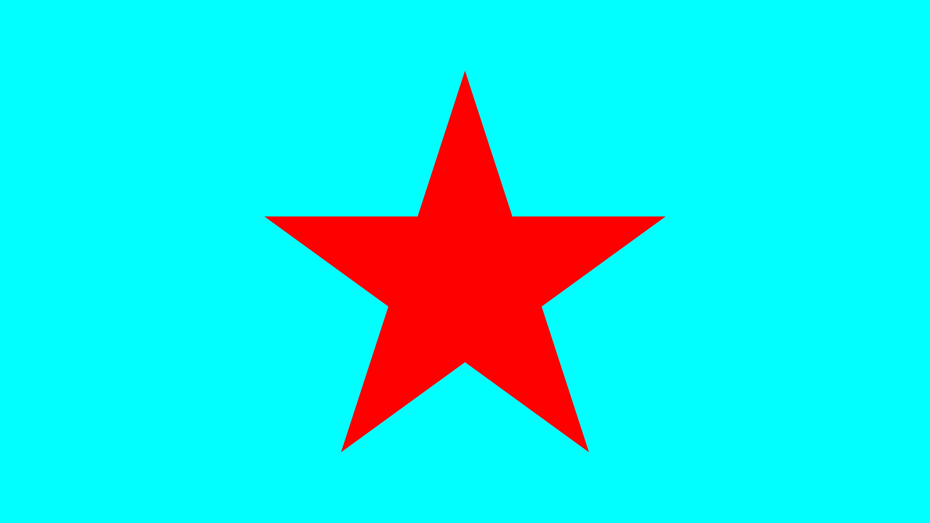
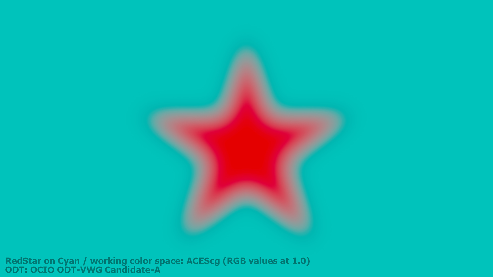
A blurry red star on a cyan background

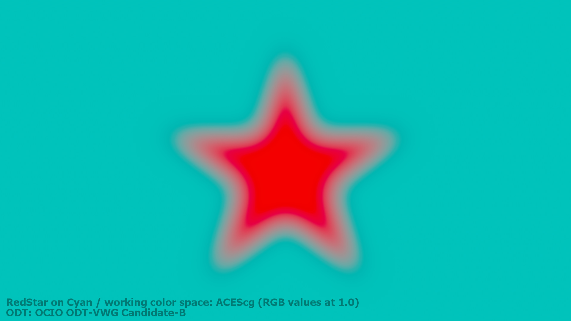
A simple A over B comp in Affinity Photo (sRGB 8-Bit).

A while back I found this very simple example on the page Question #9 in The Hitchhiker’s Guide to Digital Colour blog from Troy Sobotka. Please the blog from the beginning, but especially Question #9 for this article.

Once in a while the blog gets updated with new topics, so I read the whole blog several times, but one image got stuck in my „head“. After numerous chats with Troy S. and a thread on ACESCentral.com, I revisited my notes of all the tests I did since I became aware of this topic. Here we go…

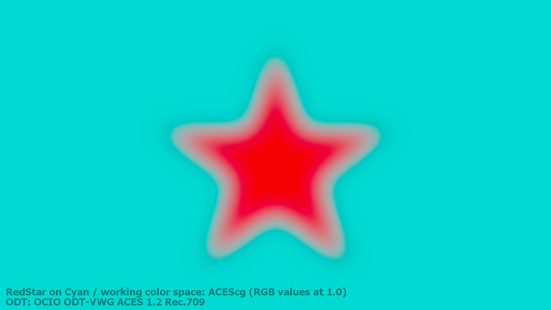
Note: In the ACESCentral.com thread I did comparisons including OCIO/ACES. This article will not touch anything related ACES to keep it more simple. I want to add this in another article.

I recreated the image above in Affinity Photo on a Mac in the RGB 8-Bit sRGB mode. Try it yourself in Photoshop, Pixelmator on a Mac, on iOS or on Windows PC. The result will be the same in most cases.

Pixel values have a meaning

The Affinity Photo document contains a background layer filled with the RGB values 0/1/1 (in a range from zero to one) or 0/255/255, also known as cyan. The next layer on top has a star shape filled selection with the RGB values of 1/0/0 or 255/0/0 and we call it red. The second layer has a „live“ gaussian blur filter applied to blur the star and create a gradient from red to cyan.

Here is a download link to the Affinity Photo documents:

Affinity_photo_red_star_on_cyanHerunterladen

What are we looking at?

A cyan background with a blurred red star composited on top of it.

It is such a simple example, but I learned a lot from it. And I am working professionally with digital images for over 20 years.

A problem is also visible in this image. The blurry areas between the two colors are getting darker. The blurry red star has a dark halo and that does not look right.

But how should it look? How can I fix the dark halo?

The simplest way in Affinity Photo that I found is to convert the document format from 8-Bit RGB to 32-bit RGB and export another JPG (with the ICC profile embedded).

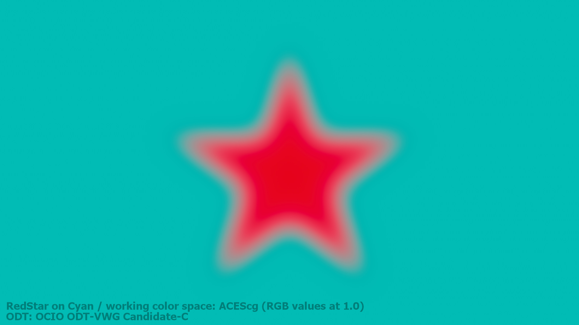
Convert the document to 32-bit and it looks like this.

This looks better, more natural and somehow how I would expect it. There is a soft and even transition from red to cyan.

It does not matter if the image is in 8-bit mode or in 32-bit mode in Affinity Photo, the mathematical operations are the same. Something else must have changed so that the result looks better.

So what’s the difference?

The 8-bit document seems to have no display transform enabled, whereas the 32-bit document does have one.

My guess is that the 8-bit document “assumes” that the image data is already properly encoded with an inverse EOTF.

What’s an EOTF? In a display’s hardware the electronic monitor signal get converted to optical values that drive the display’s linear light output, hence the name Electro Optical Transfer Function. Before a program sends an image to the monitor a inverse EOTF should be applied to the image data. The inverse EOTF and EOTF should cancel each other out. It’s a no operation.

The 32-bit image contains floating point pixel data and needs to be “told” how it should be viewed.
The image pipeline from Affinity Photo is using the „ICC Display Transform“ on a Mac. This transform „knows“ which display is connected to the computer and adds the right inverse EOTF to the image data. The hardware in the display applies then the EOTF and the light emitting pixels in the display emit the linear light that we can see right now when you read this text and watch the images.

The 8-bit document is missing the inverse EOTF step in the image pipeline so you end up with a non-linear image data that is displayed on the screen. That non-linear ramp from red (emitting pixels) to cyan (green and blue) emitting pixels seem to create the dark halo.

In the 8-bit document I choose a “color” by setting RGB emission values in the display in a range from 0-100% (0.0-1.0) or in case of 8-bit 0-255. But I don’t set the emission values directly because I need to take into account that the image data is encoded for the display. Inside the display hardware the EOTF is always applied to the image data. Only then the data is ready to emit linear light with the help of the RGB lights in the display. The light emission can only range between 0-100%, from no light to 100% of each little RGB primary lights.

The 32-bit document contains pixel values that could mean a lot of different things, but not display emission values. Only 32-bit image data that is in a sensible range of values and has an appropriate inverse EOTF applied at the end of the image processing pipeline can drive a display in a sensible way. In other words, 32-bit EXR files need a display transform to show an image on a display.

This demonstration of the blurry red star no the cyan background is very specific. The image result looks like an ugly logo without putting my glasses on.

It is a simple demo, because there are not a lot of visual changes possible when the inverse EOTF get applied to the image data. The red and cyan sliders are set to their maximum values, therefore to the maximum light emission from the display. The transfer function leaves the minimum and maximum values untouched, but their meaning change on the way to the display.

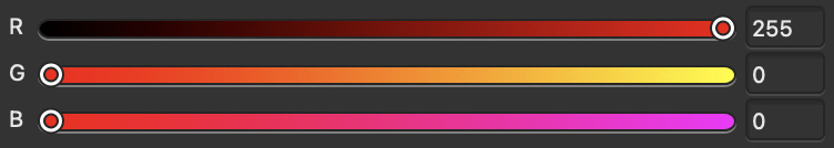
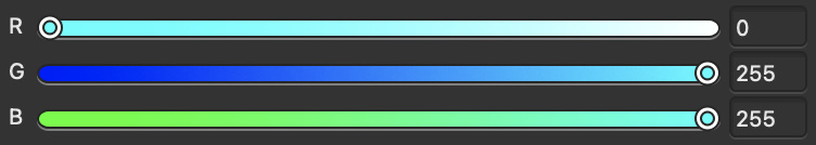
Affinity Photo Color Sliders

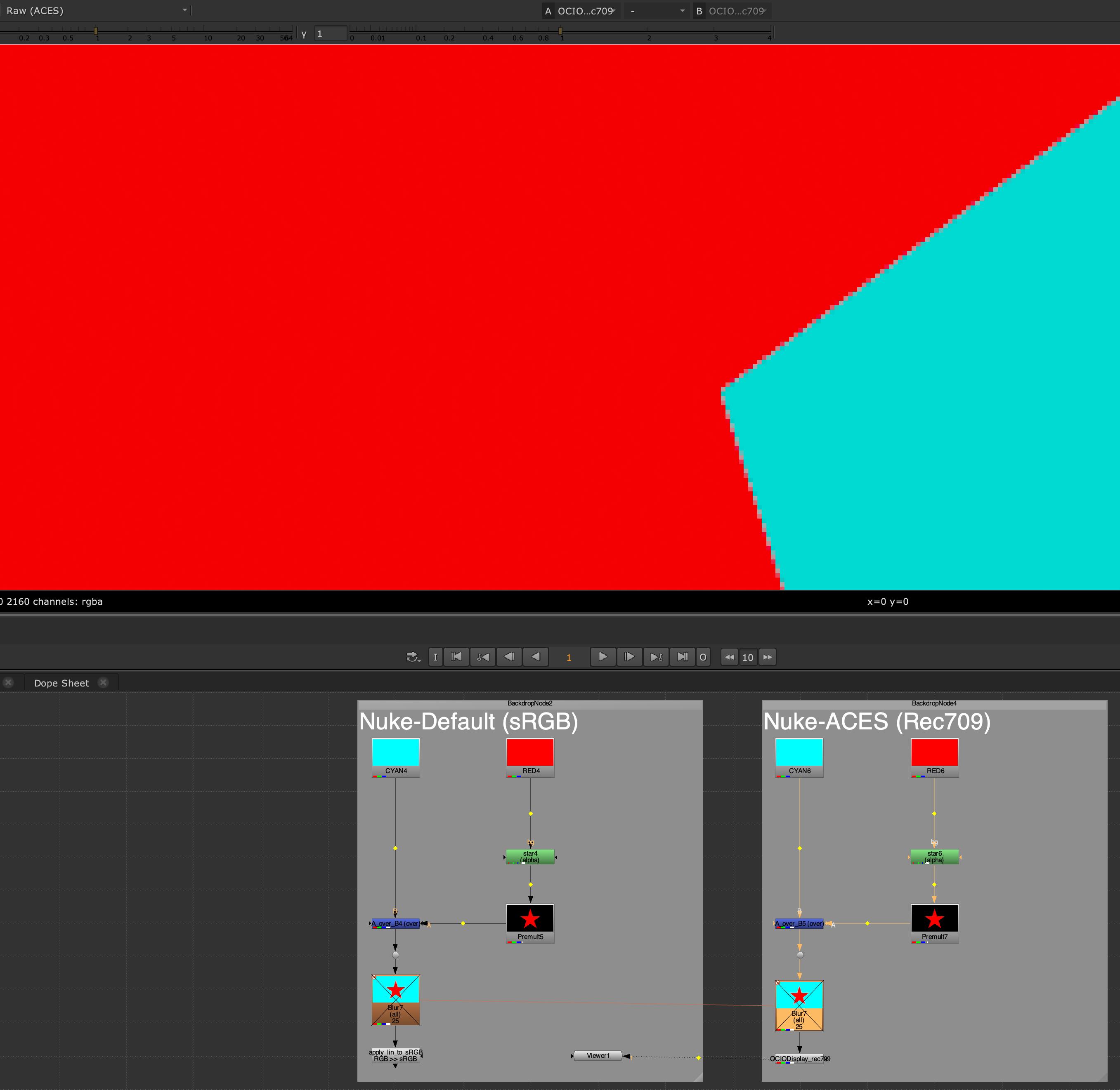
Switching gears from Affinity Photo to Nuke

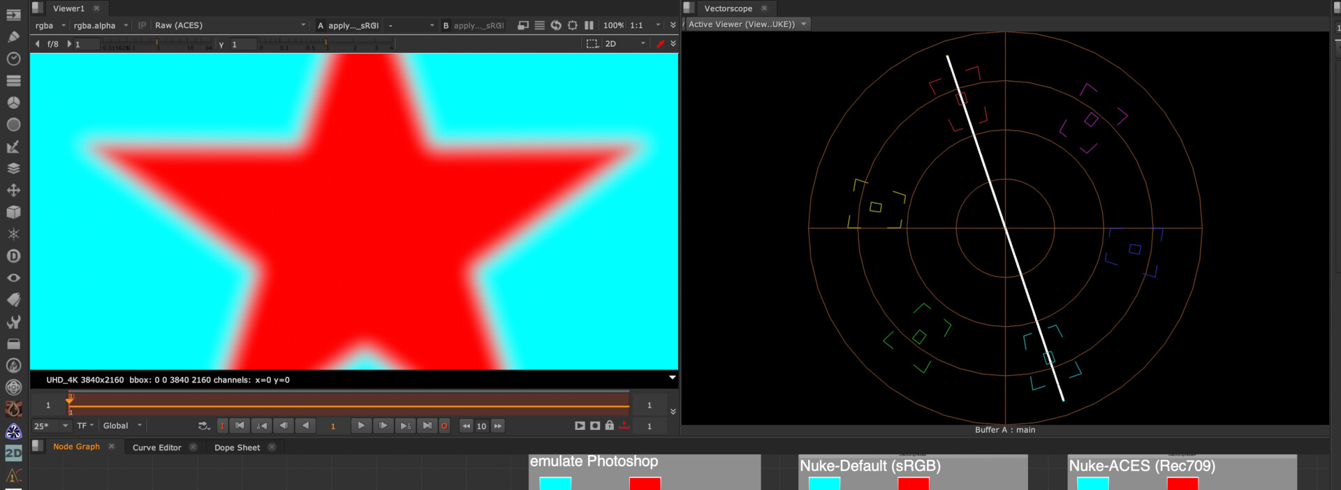
I started out digging this rabbit hole in Affinity Photo where this kind of graphic imagery is found more often than in Nuke. Nuke started from the beginning as a tool that always separated the image pipeline in the working space (linear by default) and a view transform. In the default Nuke settings the view transform is called sRGB. This is more or less the inverse EOTF that a typical sRGB display expects.

Please check this video from FilmLight about another rabbit hole: “sRGB… We Need To Talk” (45 min.)

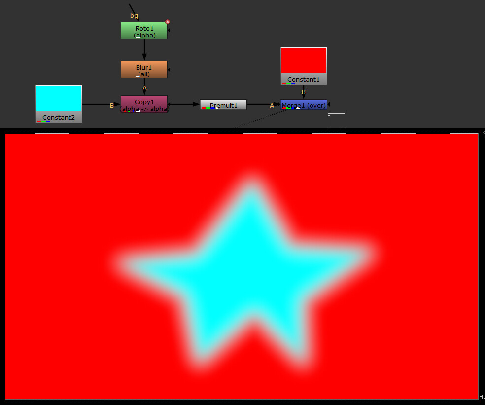
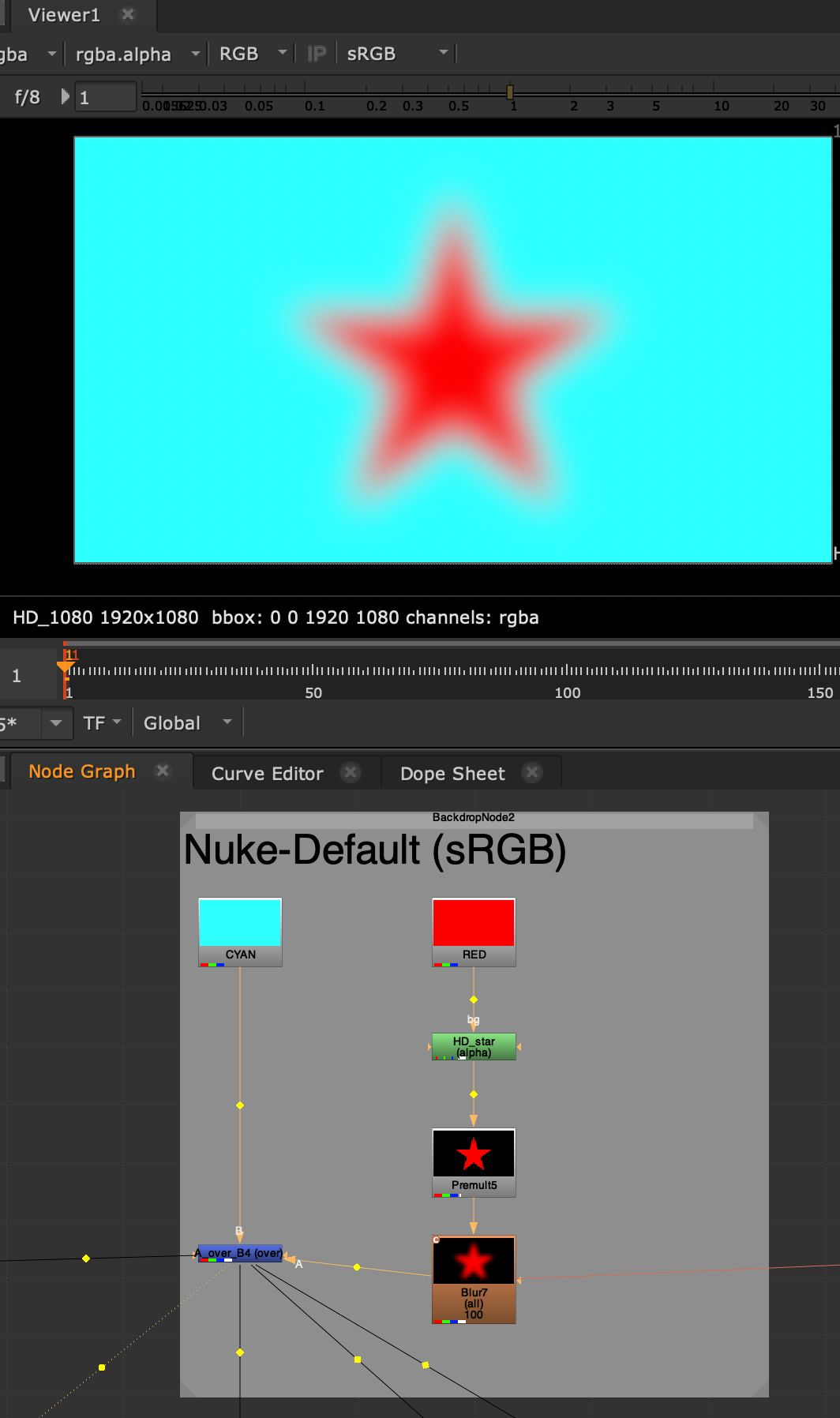
The Nuke default sRGB viewer and the very basic Nuke comp script.

The image looks right from the start.

The script in the node graph is essentially doing the same operations that are happening in Affinity Photo. Both programs calculate their operations in the same way, but use different buffers that can hold more or less numbers.

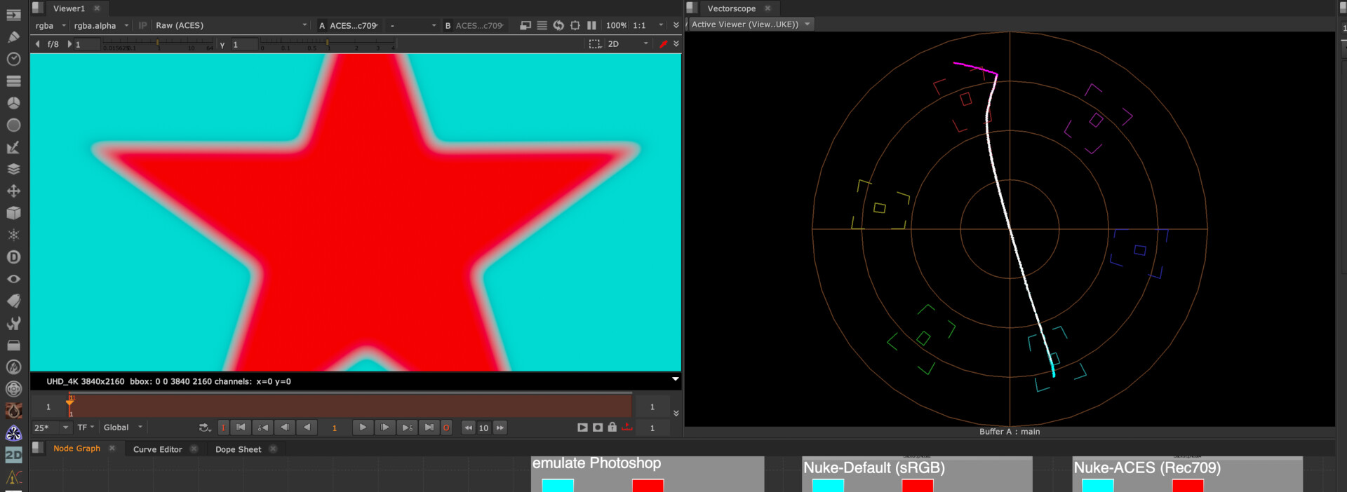
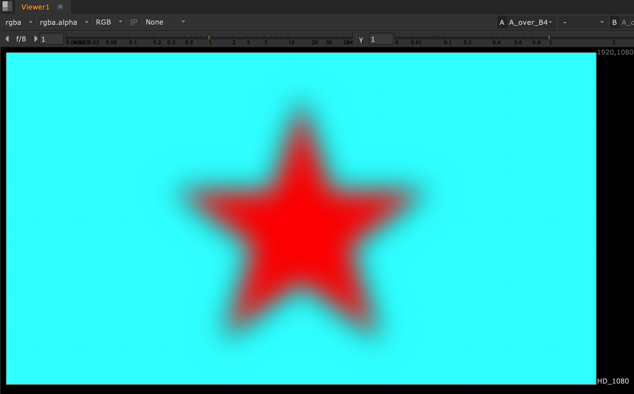
Let’s turn of the view transform to “NONE” and thereby not adding the inverse EOTF in the image pipeline. The result looks now again the same as in Affinity Photo with the 8-bit document.

The comp is done right, the display transform is missing.

This means adding the inverse EOTF is a crucial step to get a sensible image from the display to your eyes. The transition area between full red emission to full green and blue (and no red) emission has to be linear and with values between zero and one, otherwise the image will look unnatural.

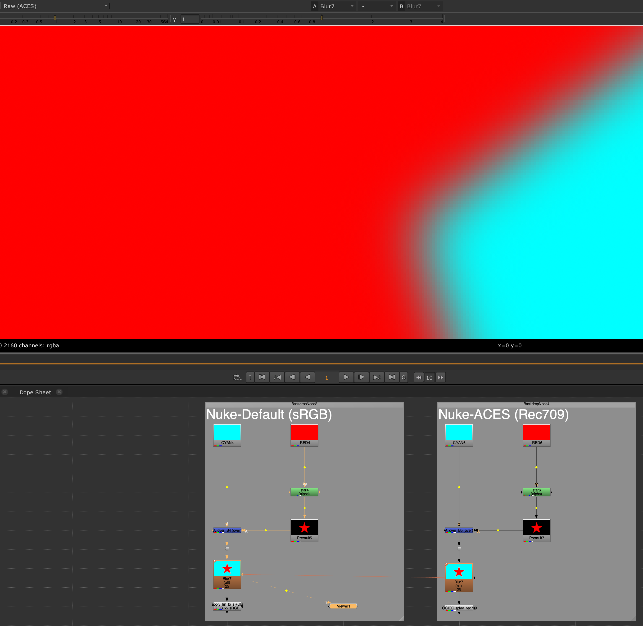
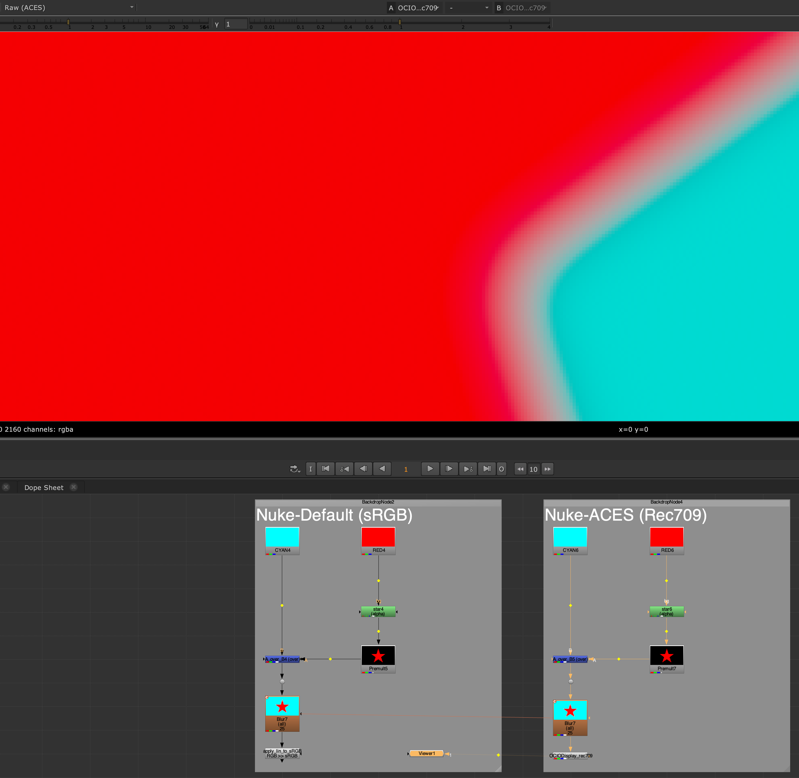
So let’s turn the sRGB view transform on again add a grade node in the node tree to alter the image result.

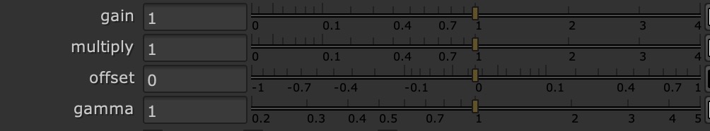
Some of the controls of a nuke grade node.

But of course always before the inverse EOTF gets applied.

Nuke processing pipeline is very simple and clever. In the next video I will only use gain, offset and gamma to make changes to the image result.

When you hover with the mouse pointer over a number field, a description of the internal variable name appears. As you will see in a moment it makes sense that gain is labeled “white” and offset is called “add”.
Also note that the numbering scale in the grade node is different from programs like Affinity Photo. These are not linear but logarithmic scales.

First I will only use gain (white) and offset (add) to change the image. You will see that the numbers on the log scale are actually matching the direct light emission values (in percent) of my display.
Enter 0.5 for gain in the range between 0.0-1.0 and the slider will end up a bit higher than around 2/3 of the way, 0.73 or 73% emission to be exact.

Gain set to 0.5 ends up 73% of the way between 0-1.

In Question #21 of the “The Hitchhiker’s Guide to Digital Colour” I learned more about the math used in this transfer function.

The gain and offset sliders control directly the levels of light emission from the display. I was never aware of that fact. This works only with sRGB displays and the specific inverse EOTF.

https://my.hidrive.com/lnk/7j0rlW4J

Playing around the the grade node.

What is happening here?

As I described already, the emission of red and cyan (green & blue display elements) is already set to the maximum before I change any value in the grade node.

White=1.00, that is display white, more is not possible. I cannot emit more light than 100%. The first part of the animation lowers white till zero or 0%. The image appears black, there is no emission from the display. Then the slider moves back to the initial value of 1.00.

Next Add=0.00, no additional light emission is added to all three RGB channels. The animation changes until Add=1.00 or 100%. The image appears white, the maximum that the display can emit light. On the way you can see a white halo around the star. The gradient contains pixel values where red has additional green and blue emission and cyan which was already some red emission mixed in. The areas in the gradient will read 1.0 or 100% earlier than the pure red and cyan pixels.

These two operations are the only ones I can be expressed on the display: Gain from 1-0 and Offset from 0-1.

The next parts of the animation will show more funky results. Raising the gain over 1.0 or 100%, moving the offset slider into negative values. Both parts will look broken.

Lastly the gamma value gets animated which result in a black or white halo. So to keep the image intact, I should leave it at 1.00.

How to continue?

There will be a second article looking into other EOTF’s as well as OCIO/ACES. The topic gets quickly more complicated as soon as I try to touch WideGamut displays.

1 Like

Hi,

I finished the hopefully last blog post about the “Red Star on Cyan”.
I ended up writing four parts about this one image:

https://www.toodee.de/?p=5913

In the last blog post I tested out the three new candidates from the VWG ODT with this specific “image”.


Candiate C still has a smaller outside dark glow around the “star” followed by a lighter glow going inwards to the center of the image. But it certainly renders the most useful image out of the four variations.

I am aware that this graphics makes little sense in a day to day workflow, but values like these could be easily introduced in a graphics app like Affinity Photo or Krita or coming out of a 3D render that should look like a cartoon or have a motion graphics style when using a working colorspace with virtual primaries.

I wonder if there should be a limiter or feedback in these apps that tell the user that they put in values that are not a colour anymore? @ChrisBrejon

1 Like

Hello,

thanks for the study.

Two thoughts come to mind :

Regards,
Chris

2 Likes