I downloaded during the meeting last night the new configs and just checked the three versions with the A fully red star on a fully cyan background... in ACES - #12 by TooDee image once again in Nuke. Here is the file just in case. (HiDrive)
I just added a Blur Node with a value of 100 and viewed the result with three different OCIO configs (all only for Display P3 on an iMac27").
This is a strange “client logo” with ACEScg primaries ![]() example.
example.
I rendered out 4 jpgs with Rec.709 plus one display P3 screenshot from Nuke:
ACES 1.2 - Rec709 (halo as expected)
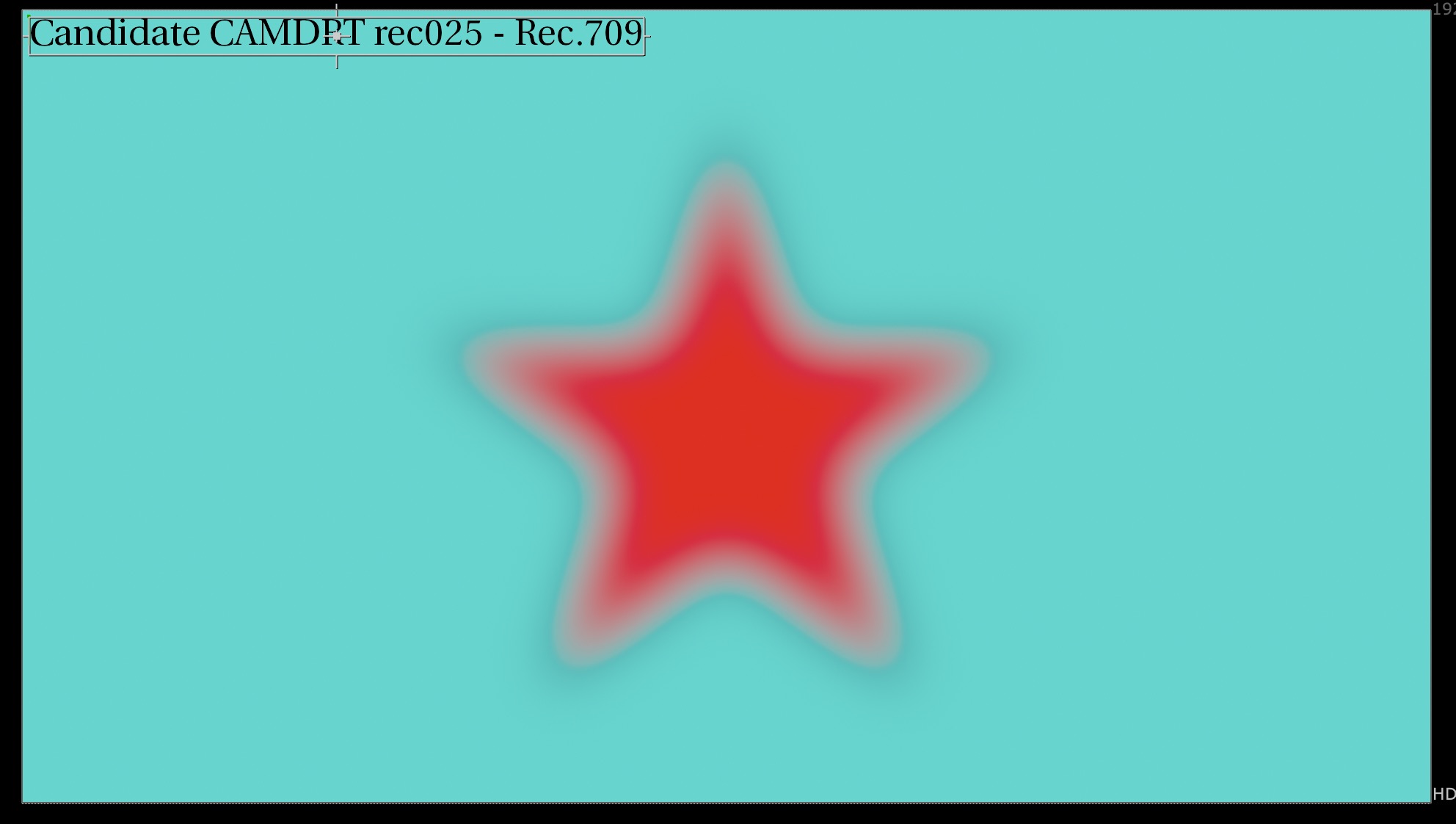
CAMDRT v025 - Rec.709 (a new dark halo)
CAMDRT v025 - Rec.709 (a new dark halo) screenshot - the P3 viewer shows me a different result
CAMDRT v026 - Rec.709 (no halo! dark or bright!)
CAMDRT v026b - Rec.709 (a new dark halo slightly different to v025)


I don’t what to make of it, but I am happy that v026 can render this unusual image without any dark or bright halos.
Maybe @priikone can explain why this suddenly works?
Thanks
Daniel