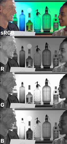
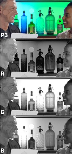
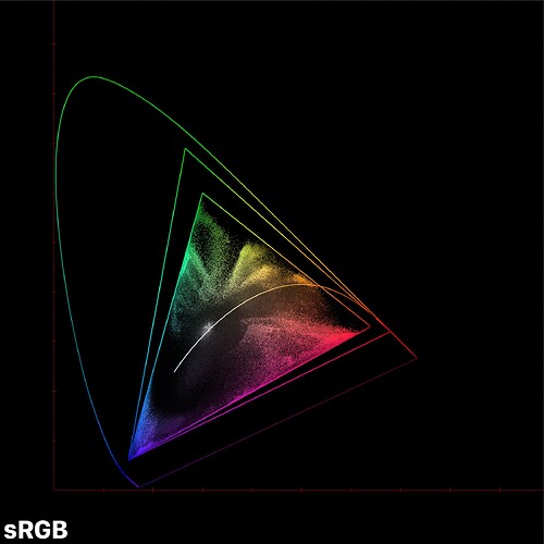
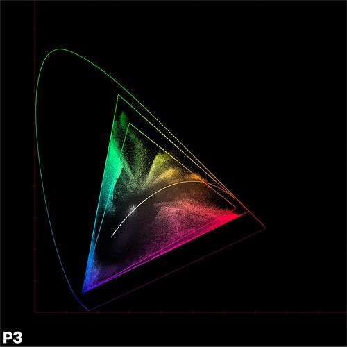
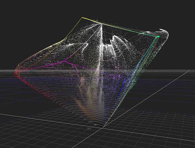
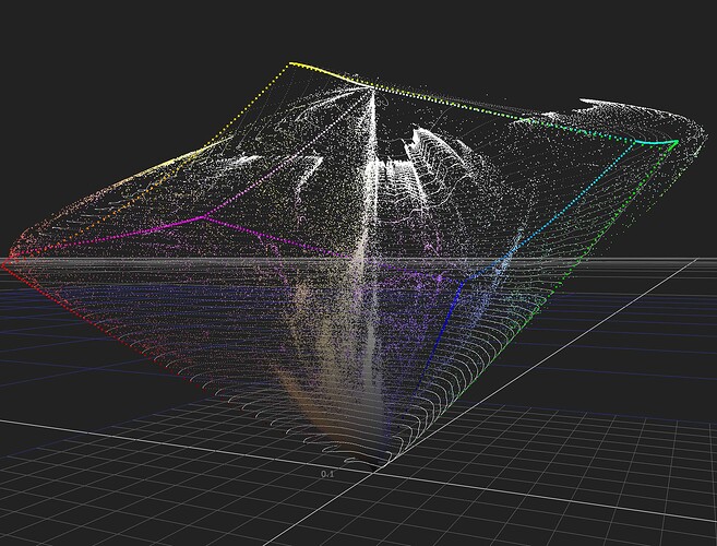
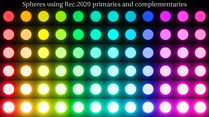
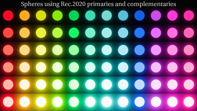
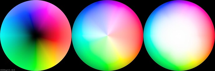
LUT repo is updated with @priikone’s v035
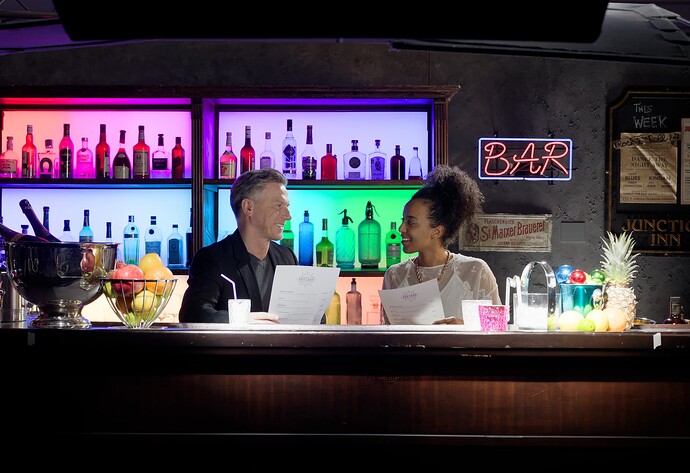
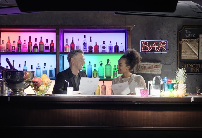
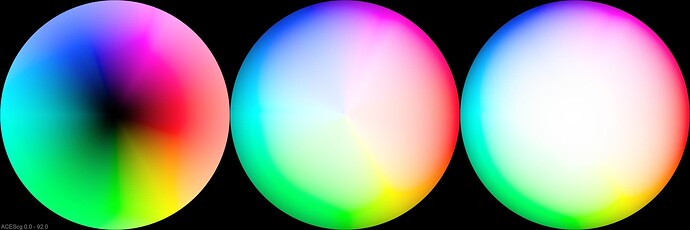
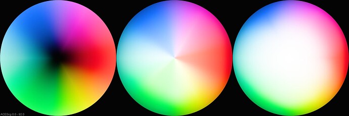
Been doing some tyre kicking on the sRGB vs P3 clip/clamp issue.
Both the image below are encapsulated within a P3 container.
Nothing conclusive, feels like we need to pump up the compression when we’re targeting a wider gamut, but it’s not obvious to me why. Looks like the same thing has been happening at least as far back as v028. Also looks much worse when we look at individual channels vs actual imagery.
Something we can talk through in the meeting more tomorrow.
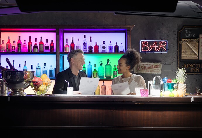
I just tried v035 and get similar results for the solarization like issue mentioned in posts:
and
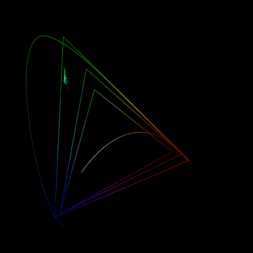
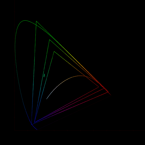
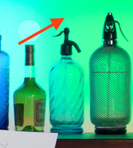
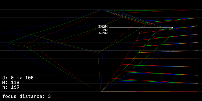
I did check where the cyan-green bottle ended up going in P3 and Rec.709. The scene values are highly saturated. The only difference seemed to be that Rec.709 was just the more compressed value, and so also the less saturated one and also darker. The P3 was more saturated and brighter version of the color. Below 2D diagrams, but I looked this in 3D too, and I think it was clear to me the Rec.709 version was darker because it’s compressed more. But I guess, in this case, it’s supposed to be compressed more.
Input:
P3:
Rec.709:
So, following up on the discuission about brightness differences in sRGB vs P3 for highly saturated images, I’ve made some example images to help discuss the trade offs.
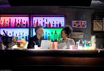
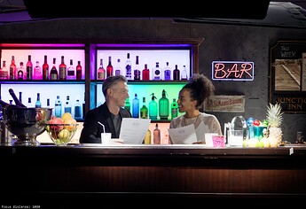
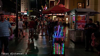
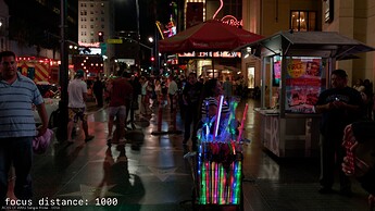
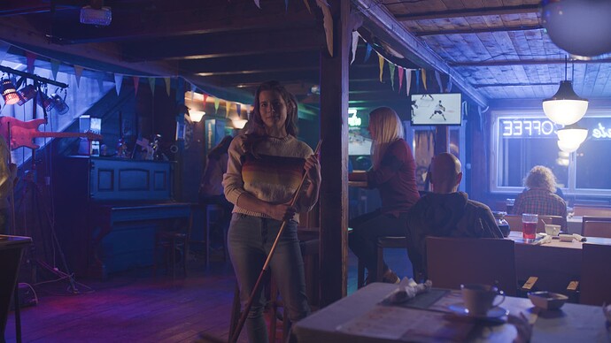
The image we were looking at was the backlit panels in the Arri 35 bar image:
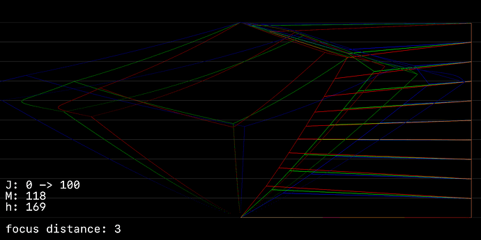
The image below is a sort of side view JMh scope.
The lines on far right represent a JMh ramp from 0->100 in J, an M value of 118 (which is the intensity green from the image above), and a h of 169 (again from the image above)
The lines projecting in from that border show the angle and the distance the values move as they get yanked into the gamut hull.
Red = Rec709
Green = P3
Blue = Rec2020
And with a sweep of h:
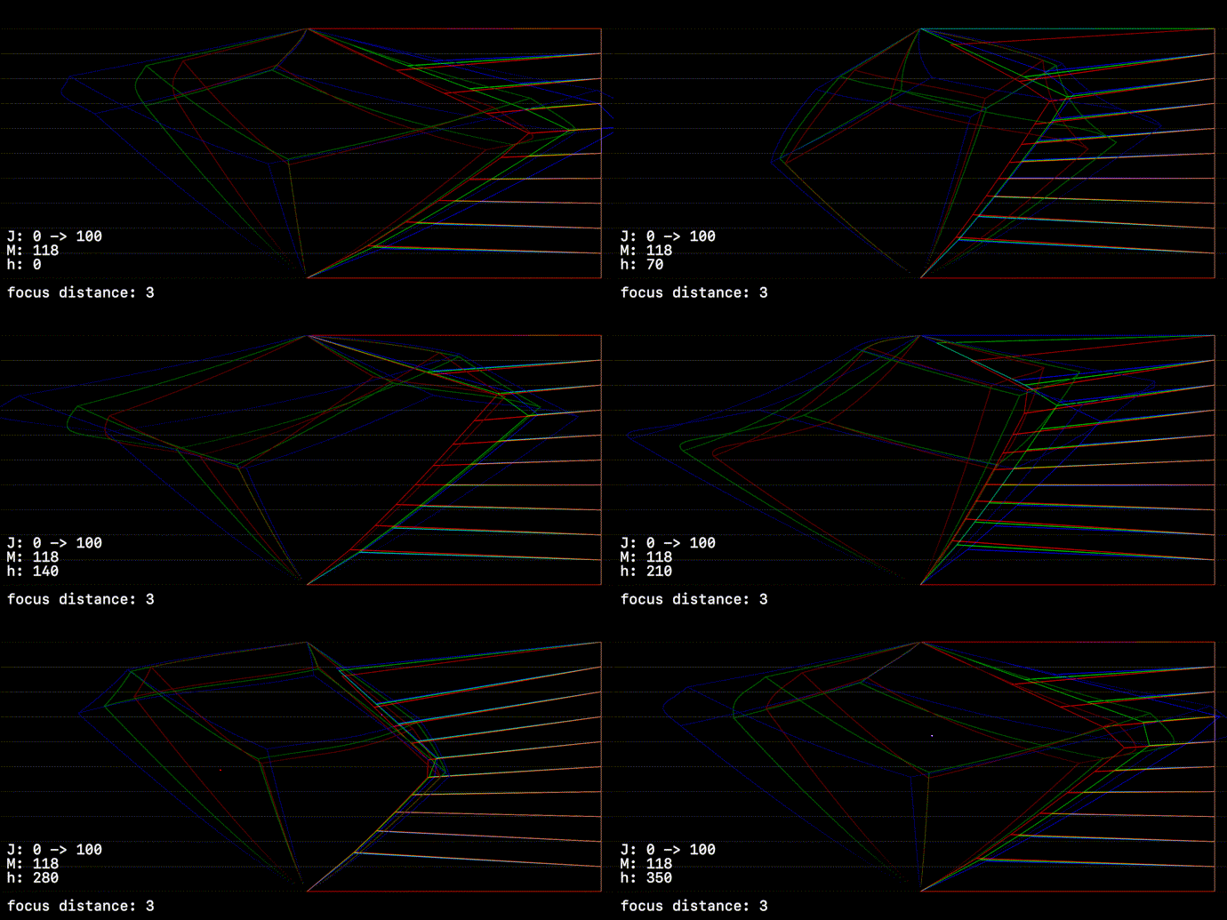
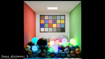
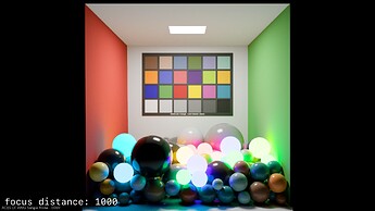
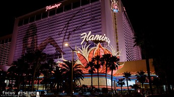
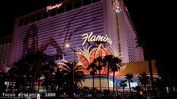
The thing to note here is that whilst the angles arent radically different here, the extra distance the values have to move here to reach the 709 boundrey produces a larger drop in J.
This is not totaly unexpected. The original intention with this was that we wanted to trade some level of brightness to maintain more colour information. But this is a slightly subjective matter.
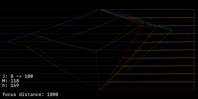
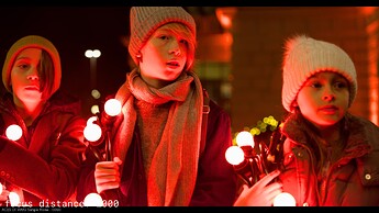
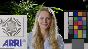
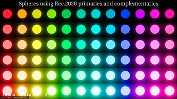
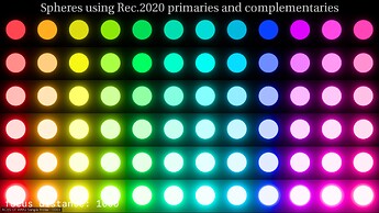
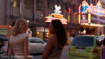
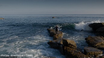
If we straighten the projection lines (by using a very large focus_distance value), we can better maintain brightness, but at the expense of colourfullness.
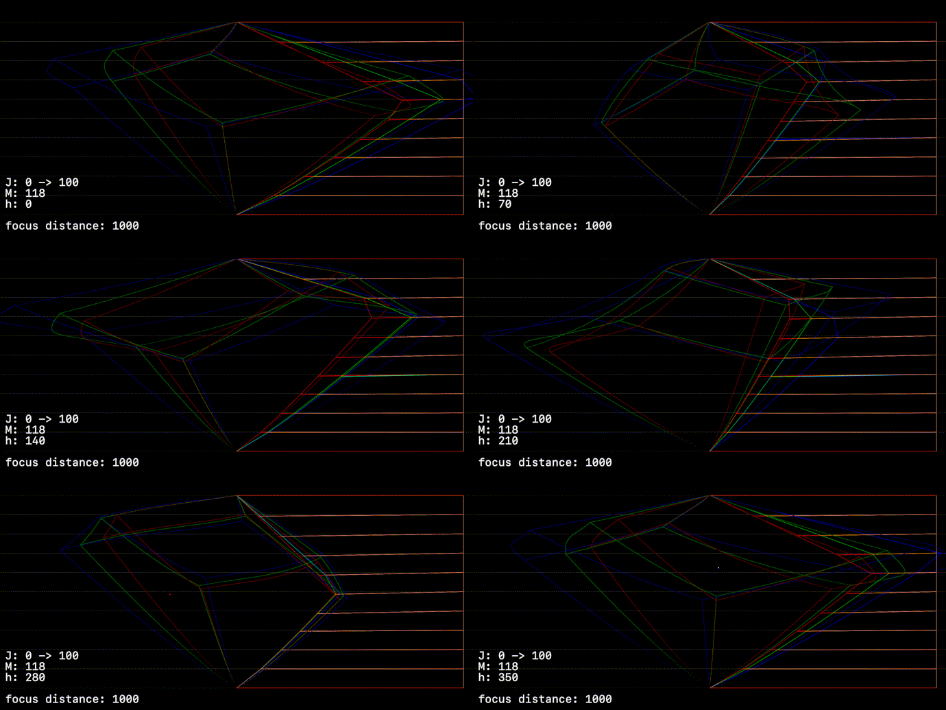
The effect of this is nothing on images that exist entirely withing the target gamet, negligable on highly saturated reflective colours, and very noticable on high brightness high saturation colour like neon signs.
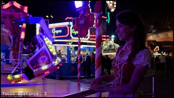
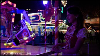
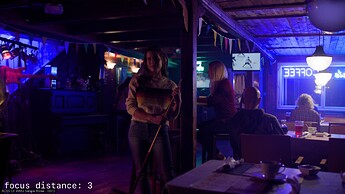
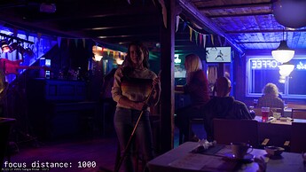
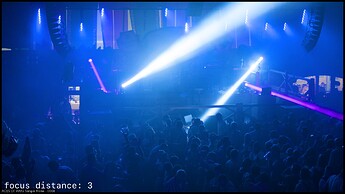
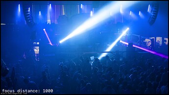
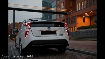
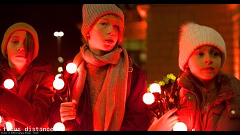
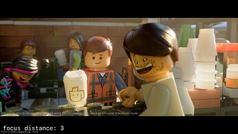
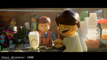
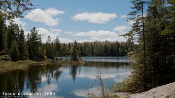
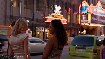
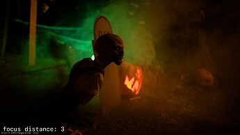
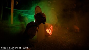
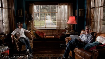
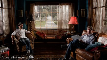
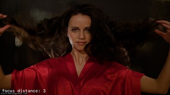
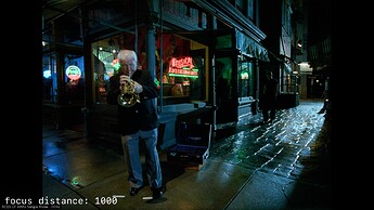
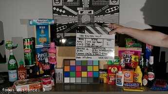
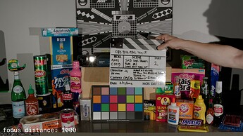
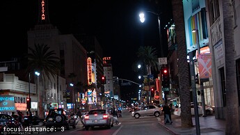
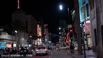
I’ve put a selection of images below to compare. It’s highly debatable which one is “better”, depending on the context.
The upsides of the linear (or near linear) projection is greater brightness consistancy between gamuts, and greater transmission of brightness ‘information’
The downside is once you’re above the cusp, we’re always sacrificing colour in favour of brightness.
Paticularly with the SDR/HDR match, it’s highly debatable which one matters more for any given image.
Thanks Alex ! Great examples.
From everything that I have read on this forum, I would go for brightness. “Tone/Tonality” seems much more respected in the images you posted. Clear win for me.
Thanks for the hard work !
I suppose an important question is if the DRT takes approach A, can you achieve the result of B through grading? And vice versa.
If one is possible and the other isn’t, that might influence the choice.
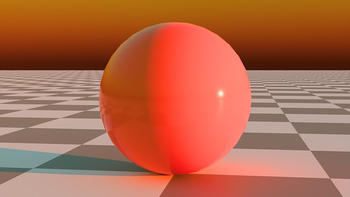
My understanding is that the downloads of the images above are all SDR Rec.709 with two focus distances (3 & 1000) - Is this correct?
If so, could downloads be provided in HDR - Rec.2100 ST2084 (Rec.709sim) & Rec2100 ST2084 (Rec.2100 540nit & 1000nit limited)
Also could the frame of blue bar with the pool ball shadows be included.
I can maybe see advantages to both focus distances. Maybe even an option could be provided if grading cannot accomplish the range of results. However, getting a good look of HDR with the SDR will be beneficial. I am using the iPad Pro M2 so can get some nice comparisons with that display. I understand that the image viewing is limited here, but as downloads should provide full viewing potential. These downloads seem to be SDR Rec.709.
Thanks, and by the way even at this point the results are outstanding. Indeed there has been much talented thinking going into this.
I believe those colors will become impossible to reach. So then you can try to get a similar color by darkening the colors.
But, I don’t believe the choice has to be between 100% lightness preserving gamut mapping and the current one. For SDR/HDR match the current one provides obviously better appearance match, IMO. For SDR appearance match of different gamuts perhaps not. But that doesn’t mean we couldn’t achieve both, ie. trying to use same projection angle (other than horizontal) for each gamut. I think that should be tested first.
Edit: I believe this should be easy to test with the Blink script by, for example, replacing following line:
float focusJ = lerp(JMcusp.x, midJ, cuspMidBlend);
with:
float focusJ = midJ;
Rendering will change of course from the current one, but the projection angle should be same despite the gamut (assuming the gamut cusp distance doesn’t affect the angle, which I believe was the whole point of the quadratic so that it wouldn’t, right @nick?)
Isn’t that just the same as setting cuspMidBleand to 1.0?
Yes, point being the value can’t change with the gamut, or has to come to same value (like maybe use cusp lightness of Rec.2020 gamut always).
Thanks again Alex for all the visualizations, these are crucial to understanding what is happening inside the model.
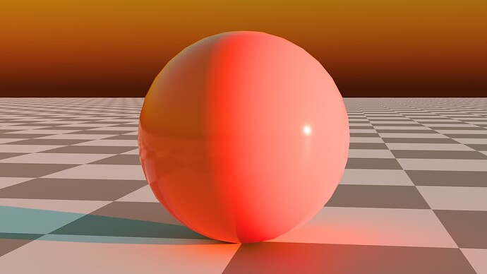
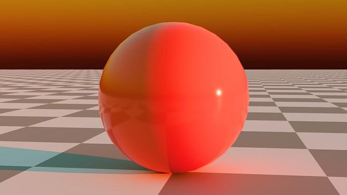
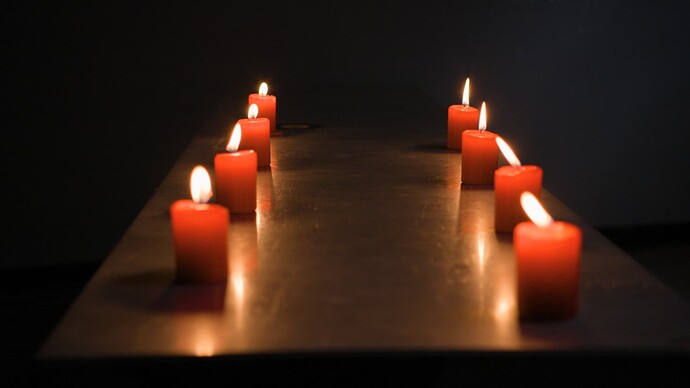
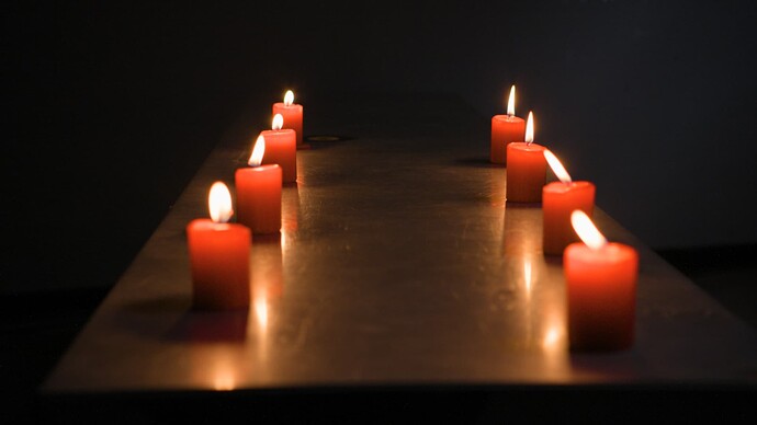
I am going to post two images just as a point for continued discussion.
These were made by the simplest means to show a simple point, and could be easily done on any images if someone was curious.
These are simply a 50/50 blend of P3 and 709 limited P3.
One version is kept in P3 and the other is converted to Rec709 (2.4 Gamma)
The only point that is worth making with this example is that as certain logic should be that the rec709 image that has clipping if it is to be as “colorful” as P3 and P3 should be able to be as colorful while retaining more detail.
That said, it does not mean that this logic applies if the tools available do not agree!
But what this example could suggest is that maybe there is an abstract/virtual middle cusp that that clips 709 and is well inside P3/2100.
Pictures are not really needed to make that point, but these images do match very well and the 709 is a little brighter/more colorful and the P3 is only a little dimmer but with all the detail/tone retained.
None of this changes all the work Alex, Nic and Pekka have been doing regarding focus distance and angles, but it could demonstrate what a target could look like and whether it is a good target.
I don’t know if ACES Central processes images when you upload them, but when I download both images it’s not that they look identical. They ARE identical to all intents and purposes, and both tagged as sRGB.
If they look identical that is good. (they should)
If they are tagged srgb that is bad.
Maybe I should tag both srgb or no tag so they will look wrong in browser but correct if you download?
Here are the images above untagged
Again, just a simple/stupid experiment that anyone can replicate, but might be a quick way to visualize what tradeoffs could look like and what should/could be targeted in the gamut mapper.
Following the 101th meeting, I would like to make a few comments about Alex´s latest experiment.
Why do I prefer the focus distance at 1000 ? Because I feel like tonality and luminance is much more preserved. It really reminds me these experiments from back in the day where we tried to show that “tonality” matters.
Look at this for instance :
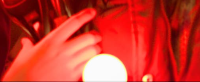
With a focus distance at 3, I don´t feel at all the (quadratic) decay of the light. This looks “wrong” to me. ![]()
I really agree with this statement from Christopher :
- We don’t absolutely need to know how the human visual system works.
- We only really need to know how to make pictures work! […]
- WTF is going on with the shadows and the blue light on the pool table in blue bar!
- How did it look? How should it look? How could it look? […]
And my take on “how pictures work” is that (smoothness of) gradients are absolutely essential to picture formation (this is what I care about as a lighter). So I support 100% Pekka´s suggestion to look at gradients and I do agree that the “compression rate” on the “path-to-peak-brightness” is essential.
Overall I feel it is complex to wrap up this VWG because we haven´t made a clear choice as a group on which design requirement should be prioritized above others. On the list we have :
- Should look good out-of-the-box.
- Must be invertible.
- Must reach corners of the display gamut (somehow ?)
And my fear is that because we try to please these three requirements, we will end up with a “jack-of-all-trades” Output Transform (I will not use the acronym DRT here since it is a Baselight term).
The only way that I can think of to satisfy these tree requirements is to provide a very good set of LMTs to be used with ACES 2.0.
Regards,
Chris
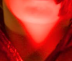
PS : About the “looking good out of the box” requirement, just a friendly warning that it seems that this prototype is clipping (breaking the smoothness of gradients). You can see it on the neck here :
I repeat myself saying that the choice doesn’t have to be between not doing lightness mapping at all (preserve original lightness == horizontal projection) and the current projection. There’s a whole world between those two. Doing horizontal projection below the cusp I think is perfectly reasonable. Less so above the cusp as it can desaturate colors too much and make them appear clipping when there’s no reason to do so. I think @bottosson says it well in:
One challenge with preserving lightness though is that all colors … get projected to a single point, and that highly saturated colors can become almost completely desaturated if light or dark enough, even though sacrificing just a small amount of lightness would have resulted in a much closer match.
Björn’s page is a good read obviously. I’ve implemented most of those mappers previously and the one I like the best is Adaptive L hue dependent one. I have a blink version of that somewhere but the behavior with dark colors doesn’t make it suitable for this DRT, was my conclusion.
Here’s few images comparing v035, v035 horizontal projection and ARRI Reveal (for state of the art third party comparison), in that order. I’m showing here what I would consider over desaturation that happens with horizontal projection above the cusp:
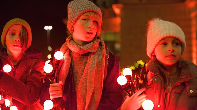
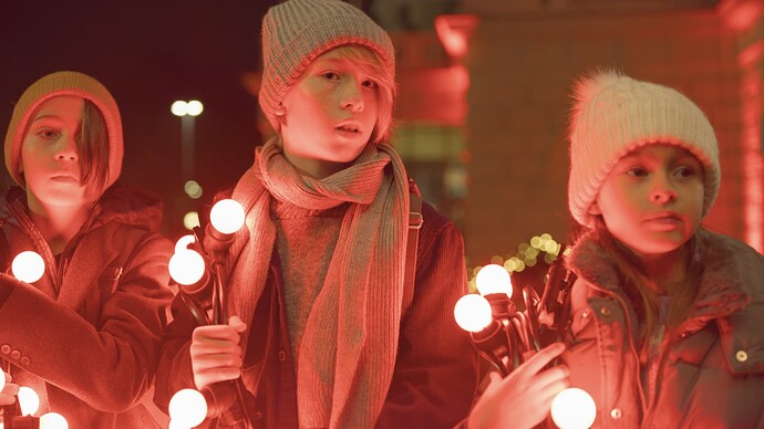
Here’s just an example with RED christmas of v035 and v035 with an LMT that changes contrast. One thing to keep in mind is that the rendering out of the box is less contrasty than ACES1, so if we assume people are going to increase contrast it’s good to check how it looks (I’ve been doing this throughout the DRT development). This is still less contrasty than ACES1 but much closer. Make what you will of it.
But, the problem at hand was that the the ARRI bar cyan-green appearance match was less than perfect between Rec.709 and P3. My feeling is we should primarily address that issue rather than revamp the whole rendering. The Rec.709 rendering, with its darker mapping, is a result of developing the SDR/HDR appearance match, and I can take the blame for it. Obviously we could do it the other way around and match HDR to SDR instead. Horizontal projection would create more of a mismatch for SDR/HDR.
So, I think we should first do what we did in the meeting, which is to bring the projection on the same trajectory in different gamuts. That should make it a little bit better. If that’s still not good enough appearance match for Rec.709 and P3 (SDR), then we could think about matching the lightness also between the gamuts. And that then opens that whole world of possibilities between the horizontal projection and the current one. I assume the biggest discrepancy in the match between Rec.709 and P3 comes from the brightness of the color, so it would then make sense to test how they look when the lightness mapping is identical for all the gamuts.
But, personally, I consider the less than perfect appearance match between different gamuts less of an issue compared to following:
Correct. The mapping is not smooth. I’ve tried to bring this up a few times. It seems doing the compression along the constant hue lines results into discontinuities in the final mapping. This is what we should address - somehow.
Here’s those three example DRTs again in same order.
Anyway, these are my thoughts on this particular issue…
Cool. Thanks Pekka for the insight !
I can share with you two examples (red xmas and blue bar) which I thought to be good attempts at smoothness.
I agree this should be looked into.
Regards,
Chris
Hi @ChrisBrejon, thanks for keeping the conversation going. I just want to çlarify the intent of the two pictures you posted… are you proposing these as examples of an acceptable rendering?
Yes, exactly. If you look at blue bar, I find the example very compelling, probably a better starting point for an Output Transform.
In the CAM DRT prototype, those areas look concerning or “wrong” :
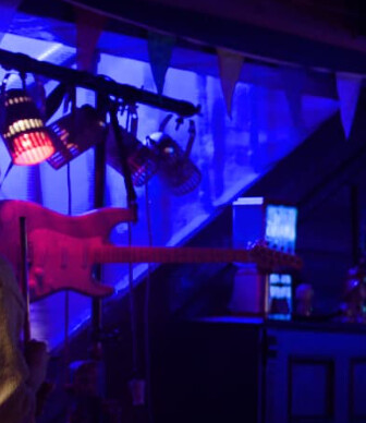
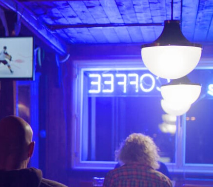
Troy might call these two screenshots “cognitive dissonant”. Now the challenge is to define precisely what and why it looks “wrong”.
Chris
