Thanks Alex ! I have read the whole document over the weekend and took some notes. I think this is great to have access to a document such as this one. Many thanks for sharing !
Back in November 2005, I was in my last year of studies and had no idea what color management was. So yeah it is pretty fascinating and even moving to read the document that kinda gave birth to ACES.
Here are a few notes and questions I have taken that may interest the VWG. Get ready for a noob review of “Color management for digital cinema”. ![]() I was actually surprised and even pleased on how the whole document is easy to read and to understand.
I was actually surprised and even pleased on how the whole document is easy to read and to understand.
I actually loved the tone (pun intended) and how M. Giorgianni started the document with this statement :
[…] the work of color-management technical comittees is often impeded by a number of widely held misconceptions. […] Often little progress can be made until all participants fully agree on the relevant technical issues. […] Disagreements often cause the same issues to be argued over and over […]
I can say from my own experience that this is very true and that fighting these colorimetric myths (and my own !) have been my biggest battle for the past two years. I just love how M. Giorgianni came with a “top-ten list” of issues since I have done my own list (for a school where I teach) not more than two weeks ago !
I also loved how this document while being quite technical and scientific, never looses track of production realities and constraints. I personally like when stuff is concrete, like in applied arts. For example :
My experience suggests that if such observer-related problems exist at all, they are so small as to be insgnificant in practical imaging applications.
Or this one as well :
Creating an appropriate transform, in the form of a 3x3 matrix, involves at least as much art as science. […] That is where art must be used together with science.
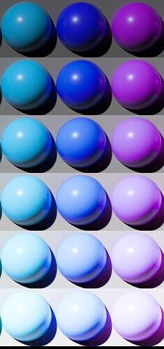
I had the chance to work closely with a developer for the past two years and I can totally relate to this statement. This why I like colour topics so much : perfect mix of art and science. I also got curious about these two images :
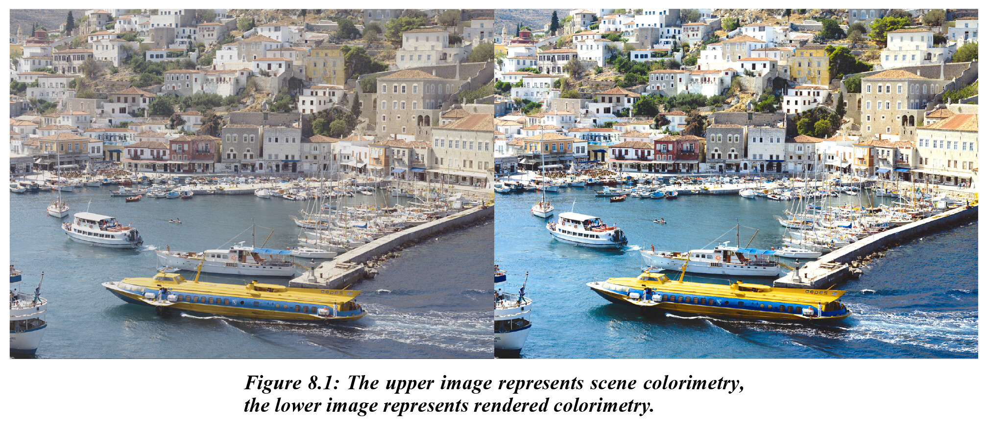
I remember these two images have been used on slack like a month ago but I would like to ask : what do they mean to you ? I quote from the document :
The images demonstrate that although scene-space images may be colorimetrically accurate, when displayed directly they are perceived as “flat” and “lifeless”. The fundamental reason rendering needed, then, is to translate original-scene colorimetric values to output colorimetric values that produce images having a preferred color appearance.
Although I don’t disagree with this statement, I got a bit confused by it, especially, the term “preferred color appearance”. I have always felts that “respecting the original artistic intent” would be our North Star in this VWG. What if in the example above the “original artistic intent” was to have the water grayish and not saturated blue ? A bit later it is written that :
[…] the use of a single Reference Rendering […] that is as “neutral” as possible. […] only as necessary to generate […] colorimetric values for an image that when displayed, is true to the Input CES color. The role of the transform, then, becomes one of delivering color in the intended viewing environment, not one of creating new color.
I probably misunderstood these quotes and I am sure someone will be able to shine some light on it. But I guess my question is : how objective can we be, before getting all subjective about colors and hues preferences ? If I put back the examples of my light sabers :


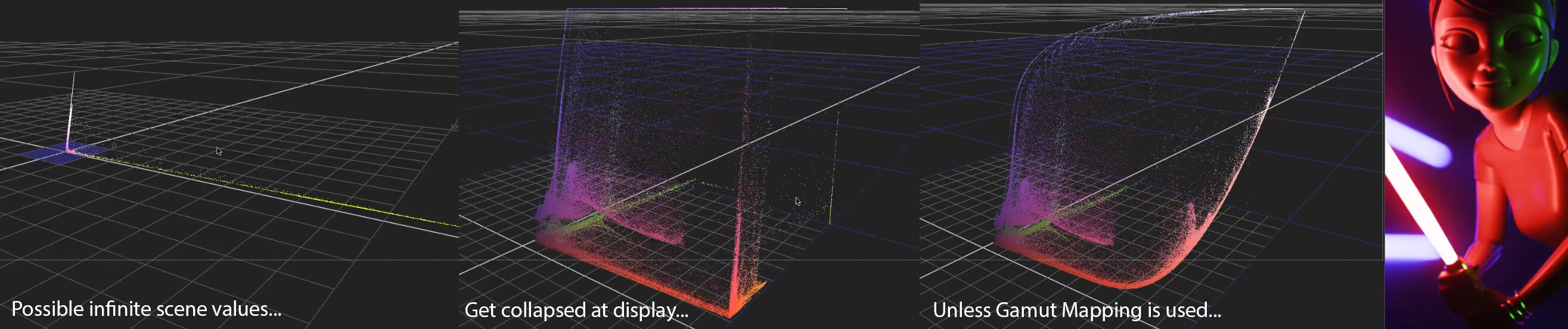
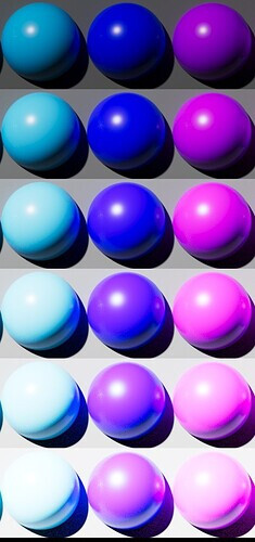
I think I can honestly tell that the right image respects better my “original artistic intent” because of the blue neons in the back. Let’s forget about the character for the sake of the argument. I was not able under the ACES Output Transform to make the overexposed blue neons as white as I would have liked. And believe me I tried to crank up the exposure as much as I could ! And if we look back at my blue ball, same thing here. Look at the blue neon :
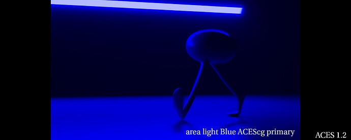

So can I objectively say that this blue neon should be white since I know how many stops/lumens it is using ? Or am I already in the subjective field ? By the way this is why I liked Jed’s video so much ! I think it is a very simple and objective way to look at our problem. Would you agree on this ?
And this is where I got a bit confused to be honest by comments like “skin lacking sparkle” or “lacking saturation” about Jed’s experiments. Because I feel like we are not there yet. I personally like the idea of going back to basics like he did and building on that.
Going back to the document :
color is represented as true to the Reference Rendering as possible, within the capabilities of the particular output.[…] the intent is not to create anything new; it is to deliver the color specified in the Output CES as faithfully as possible, withing the limits of the given output.
So it looks like display limitations is totally being accounted for by M. Giorgianni. A solution is even proposed :
Appropriate gamut mapping would then be applied to transform those colors as needed for real outputs.
And this is where I also get confused because it just seems weird to me that :
- On one hand, gamut mapping seems to be the key of this VWG.
- On the other hand, gamut mapping is nowhere to be found in the paper dropbox of the VWG.
Is this intentional ? Did you guy already try these techniques and were not satisfied by the results ? I completely acknowledge that I am probably the less skilled person in this VWG and probably the one who asks the most questions. But I am afraid that focusing on details first (instead of broad strokes) will not help the group.
Here are more fascinating bits about gamut mapping :
It would be expected, then, that some form of gamut mapping will be required in going from the Output CES to any real output device or medium. I would suggest, however, that if the grayscale mapping just discussed is peformed in ERIMM RGB or another space based on similar primaries, that process alone may also provide color gamut mapping that is entirely satisfactory.
Is this the conclusion you reached as well ? I am really curious about this part to be honest. At which point is gamut mapping compulsory ? I only found one mention of gamut mapping in the Background Information Dropbox paper :
This is a simple, fast gamut mapping algorithm. It maps RGB values onto the 0 to 1 cube using line/plane intersection math which has been optimized to take advantage of the fact that the planes are the [0,1] cube faces. Out-of-gamut points are mapped towards a value on the neutral axis. If the RGB values are linear tristimulus values for arbitrary RGB primaries then the algorithm preserves dominant wavelength on a chromaticity diagram. It also preserves hue in the HSV sense. Light out-of-gamut colors are darkened as they approach the gamut, while dark colors are lightened (i.e. some lightness is traded off to preserve chroma). There are certainly many more sophisticated algorithms for gamut mapping, but this is simple, fast, robust, and useful as a point of comparison.
Is it possible to test this algorithm ? To have access to it to see how it performs ? Finally I thought these recommendations about gamut mapping to be very interesting :
I would certainly suggest that the results be evaluated before concluding that some type of comlex gamut mapping is required. […] Interposing gamut mapping within the two-step process is likely to cause unwanted color distortions. […] The fact is that practitioners with appropriate skill and experience routinely construct gamut-mapping transforms based only on a knowledge of the limits of the specific output involved.
Interesting to see how M. Giorgianni already mentions the hue shifts (and color distortions) :
Their use minimizes hue rotations. […] hue shifts (from shadow-to-highligt) resulting from the application of a nonlinear transformation. […] reduced hue shifts resulting from the application of the same nonlinear transformation in ERIMM RGB space.
If our goal is “not to create anything new”, I hope that hue shifts will be solved (like in Jed’s experiment) :
I also read with much interested about “grayscale curves” and especially this bit :
Depending on the design of the grayscale, the above processing may cause too little or more likely too great an increase in rendered-image chroma levels. If so, a simple matrix operation can be included in the process to adjust the chroma levels as needed.
Which seems to me like a direct consequence of per-channel lookup… I was suprised by this chroma statement, since “neutral” is the target. Maybe I misunderstood it too. I would also be curious if your testing and the craft of ACES 1.0 went against some of M. Giorgianny’s recommenations and why ?
Finally (sorry for the long post), I really appreciated how a list of precise requirements is present in the document :
- Viewing Flare
- Image Luminance
- Observer Chromatic Adaptation
- Lateral-Brightness Adaptation
- General-Brightness Adaptation
- Local-Brightness Adaptation
- Color Memory and Color Preference
- Output Luminance Dynamic Range and Color Gamut
I sometimes wonder how accounting for all these things and keeping a simple algorithm at the same time is possible. But heck, what do I know ? I tried to come with a list of design requirements three weeks ago but did not get much feedback about it :
- invertibility (since it has come up again and again as a problem with v1.x)
- easy to work with, i.e. no strong look
- easy to extend, i.e. good framework (targeting new displays should be easy for examples)
- simple, fast, performant and invertible by a closed form
- hue-preserving (no hue shift on the path to white)
- no gamut clip
I guess what I am trying to say is that we could proably discuss design requirements, come with an accurate list of things we want to take care of and appropriate solutions for each of them. Focusing on the big picture first.
Regards,
Chris