ACES background document

All,

Attached is a document written by Ed Giorgianni that might be helpful in level setting and providing some historical context.

For those of you who don’t know, Ed is a former Kodak Senior Research Fellow and RIT adjunct instructor who spent 40 years working on color systems modeling, color film technology, digital color management, human color perception, etc. in the Research and Development Labs at Kodak.

In about 2005 the Academy asked Ed to put together a concept for a color management framework for cinema applications. This document was the result. Many of the concepts are extensions of what he’s covered in his book “Digital Color Management: Color Encoding Solutions”. This paper served as the basis for what would eventually become ACES.

It’s worth noting that some of the terminology has evolved since he wrote the paper (e.g the ICES became ACES). We just thought this document, in particular Section 8 “Rendering for Output” which starts on pg 29, might be good reading considering the conversations currently going on around Output Transforms.

Academy Final 11-25-05.pdf (2.3 MB)

10 Likes

Hi @Alexander_Forsythe,

Thanks for sharing that, such a great classic! I think I probably have my decades-old photocopies from the ICES section of Digital Color Management: Color Encoding Solutions.

Cheers,

Thomas

This predates the 2nd edition of the book. Some of what’s in this document was used in the digital cinema section of the 2nd edition.

Thanks Alex ! I have read the whole document over the weekend and took some notes. I think this is great to have access to a document such as this one. Many thanks for sharing !

Back in November 2005, I was in my last year of studies and had no idea what color management was. So yeah it is pretty fascinating and even moving to read the document that kinda gave birth to ACES.

Here are a few notes and questions I have taken that may interest the VWG. Get ready for a noob review of “Color management for digital cinema”. :wink: I was actually surprised and even pleased on how the whole document is easy to read and to understand.

I actually loved the tone (pun intended) and how M. Giorgianni started the document with this statement :

[…] the work of color-management technical comittees is often impeded by a number of widely held misconceptions. […] Often little progress can be made until all participants fully agree on the relevant technical issues. […] Disagreements often cause the same issues to be argued over and over […]

I can say from my own experience that this is very true and that fighting these colorimetric myths (and my own !) have been my biggest battle for the past two years. I just love how M. Giorgianni came with a “top-ten list” of issues since I have done my own list (for a school where I teach) not more than two weeks ago !

I also loved how this document while being quite technical and scientific, never looses track of production realities and constraints. I personally like when stuff is concrete, like in applied arts. For example :

My experience suggests that if such observer-related problems exist at all, they are so small as to be insgnificant in practical imaging applications.

Or this one as well :

Creating an appropriate transform, in the form of a 3x3 matrix, involves at least as much art as science. […] That is where art must be used together with science.

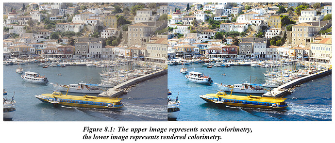
I had the chance to work closely with a developer for the past two years and I can totally relate to this statement. This why I like colour topics so much : perfect mix of art and science. I also got curious about these two images :

I remember these two images have been used on slack like a month ago but I would like to ask : what do they mean to you ? I quote from the document :

The images demonstrate that although scene-space images may be colorimetrically accurate, when displayed directly they are perceived as “flat” and “lifeless”. The fundamental reason rendering needed, then, is to translate original-scene colorimetric values to output colorimetric values that produce images having a preferred color appearance.

Although I don’t disagree with this statement, I got a bit confused by it, especially, the term “preferred color appearance”. I have always felts that “respecting the original artistic intent” would be our North Star in this VWG. What if in the example above the “original artistic intent” was to have the water grayish and not saturated blue ? A bit later it is written that :

[…] the use of a single Reference Rendering […] that is as “neutral” as possible. […] only as necessary to generate […] colorimetric values for an image that when displayed, is true to the Input CES color. The role of the transform, then, becomes one of delivering color in the intended viewing environment, not one of creating new color.

I probably misunderstood these quotes and I am sure someone will be able to shine some light on it. But I guess my question is : how objective can we be, before getting all subjective about colors and hues preferences ? If I put back the examples of my light sabers :

image image

I think I can honestly tell that the right image respects better my “original artistic intent” because of the blue neons in the back. Let’s forget about the character for the sake of the argument. I was not able under the ACES Output Transform to make the overexposed blue neons as white as I would have liked. And believe me I tried to crank up the exposure as much as I could ! And if we look back at my blue ball, same thing here. Look at the blue neon :
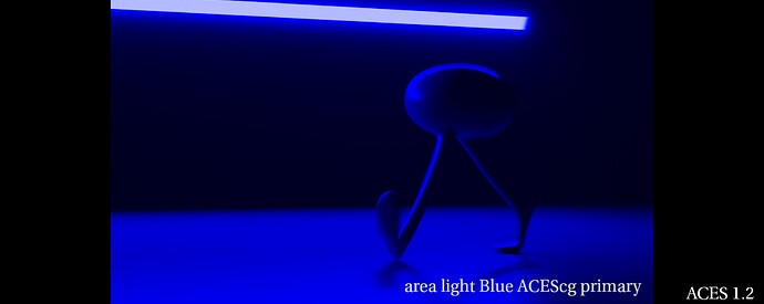
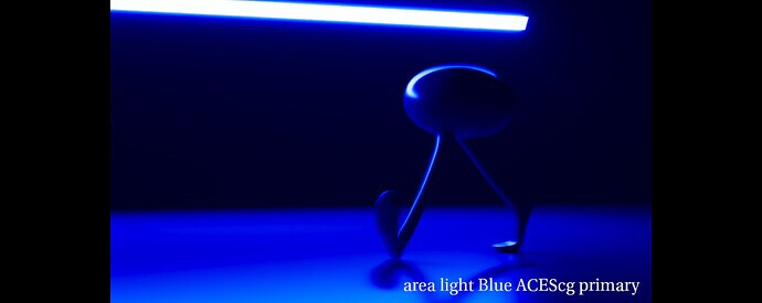
image
image

So can I objectively say that this blue neon should be white since I know how many stops/lumens it is using ? Or am I already in the subjective field ? By the way this is why I liked Jed’s video so much ! I think it is a very simple and objective way to look at our problem. Would you agree on this ?

And this is where I got a bit confused to be honest by comments like “skin lacking sparkle” or “lacking saturation” about Jed’s experiments. Because I feel like we are not there yet. I personally like the idea of going back to basics like he did and building on that.

Going back to the document :

color is represented as true to the Reference Rendering as possible, within the capabilities of the particular output.[…] the intent is not to create anything new; it is to deliver the color specified in the Output CES as faithfully as possible, withing the limits of the given output.

So it looks like display limitations is totally being accounted for by M. Giorgianni. A solution is even proposed :

Appropriate gamut mapping would then be applied to transform those colors as needed for real outputs.

And this is where I also get confused because it just seems weird to me that :

  • On one hand, gamut mapping seems to be the key of this VWG.
  • On the other hand, gamut mapping is nowhere to be found in the paper dropbox of the VWG.

Is this intentional ? Did you guy already try these techniques and were not satisfied by the results ? I completely acknowledge that I am probably the less skilled person in this VWG and probably the one who asks the most questions. But I am afraid that focusing on details first (instead of broad strokes) will not help the group.

Here are more fascinating bits about gamut mapping :

It would be expected, then, that some form of gamut mapping will be required in going from the Output CES to any real output device or medium. I would suggest, however, that if the grayscale mapping just discussed is peformed in ERIMM RGB or another space based on similar primaries, that process alone may also provide color gamut mapping that is entirely satisfactory.

Is this the conclusion you reached as well ? I am really curious about this part to be honest. At which point is gamut mapping compulsory ? I only found one mention of gamut mapping in the Background Information Dropbox paper :

This is a simple, fast gamut mapping algorithm. It maps RGB values onto the 0 to 1 cube using line/plane intersection math which has been optimized to take advantage of the fact that the planes are the [0,1] cube faces. Out-of-gamut points are mapped towards a value on the neutral axis. If the RGB values are linear tristimulus values for arbitrary RGB primaries then the algorithm preserves dominant wavelength on a chromaticity diagram. It also preserves hue in the HSV sense. Light out-of-gamut colors are darkened as they approach the gamut, while dark colors are lightened (i.e. some lightness is traded off to preserve chroma). There are certainly many more sophisticated algorithms for gamut mapping, but this is simple, fast, robust, and useful as a point of comparison.

Is it possible to test this algorithm ? To have access to it to see how it performs ? Finally I thought these recommendations about gamut mapping to be very interesting :

I would certainly suggest that the results be evaluated before concluding that some type of comlex gamut mapping is required. […] Interposing gamut mapping within the two-step process is likely to cause unwanted color distortions. […] The fact is that practitioners with appropriate skill and experience routinely construct gamut-mapping transforms based only on a knowledge of the limits of the specific output involved.

Interesting to see how M. Giorgianni already mentions the hue shifts (and color distortions) :

Their use minimizes hue rotations. […] hue shifts (from shadow-to-highligt) resulting from the application of a nonlinear transformation. […] reduced hue shifts resulting from the application of the same nonlinear transformation in ERIMM RGB space.

If our goal is “not to create anything new”, I hope that hue shifts will be solved (like in Jed’s experiment) :
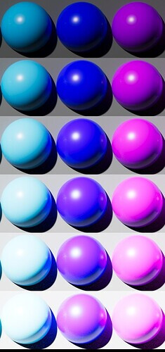
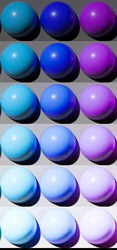
image image

I also read with much interested about “grayscale curves” and especially this bit :

Depending on the design of the grayscale, the above processing may cause too little or more likely too great an increase in rendered-image chroma levels. If so, a simple matrix operation can be included in the process to adjust the chroma levels as needed.

Which seems to me like a direct consequence of per-channel lookup… I was suprised by this chroma statement, since “neutral” is the target. Maybe I misunderstood it too. I would also be curious if your testing and the craft of ACES 1.0 went against some of M. Giorgianny’s recommenations and why ?

Finally (sorry for the long post), I really appreciated how a list of precise requirements is present in the document :

  • Viewing Flare
  • Image Luminance
  • Observer Chromatic Adaptation
  • Lateral-Brightness Adaptation
  • General-Brightness Adaptation
  • Local-Brightness Adaptation
  • Color Memory and Color Preference
  • Output Luminance Dynamic Range and Color Gamut

I sometimes wonder how accounting for all these things and keeping a simple algorithm at the same time is possible. But heck, what do I know ? I tried to come with a list of design requirements three weeks ago but did not get much feedback about it :

  • invertibility (since it has come up again and again as a problem with v1.x)
  • easy to work with, i.e. no strong look
  • easy to extend, i.e. good framework (targeting new displays should be easy for examples)
  • simple, fast, performant and invertible by a closed form
  • hue-preserving (no hue shift on the path to white)
  • no gamut clip

I guess what I am trying to say is that we could proably discuss design requirements, come with an accurate list of things we want to take care of and appropriate solutions for each of them. Focusing on the big picture first.

Regards,
Chris
3 Likes

In the image on the left, the greyish sea is not artistic intent. It is an error in reproduction. The sea did not look like that to the person who took the photograph. The image on the right better represents what the photographer actually saw. Artistic intent in terms of lighting a scene, or filtration in front of the lens, should be perceptually matched on the display by the base DRT, in my opinion. Artistic intent in the sense of “I want a flat desaturated image” is not “what the camera saw” and should be applied by an LMT, in my opinion.

Images like your CGI light sabers are tricky, because there is no real scene that the camera saw, and which you also saw with your eyes. You may say that a particular rendering matches what you had in your mind when you lit the scene. But you don’t have a real world reference for faces lit by light sabers. I would argue that while your right hand light saber image is certainly more pleasing looking, it gets nowhere near the true appearance of monochromatic light sources. But then again, an sRGB display never will…

3 Likes

The point here isn’t to dictate creative intent, but to support it. You’re certainly free to make the reproduction look however you want, but this should be done while looking at the scene referred image though a rendering transform. As @nick points out, creative adjustments to the rendered image are done with an LMT in ACES.

It doesn’t sounds like you’re advocating not using a rendering transform, but if displaying your scene colorimetry directly gives you the look you want and you decide not to use a rendering transform, you’re essentially treating the image as output referred.

Thanks Nick. Makes sense.

I realized that my question was a bit silly after writing the post. :wink: I guess the whole challenge is how to go from scene colorimetry to rendered colorimetry without hue shifts nor gamut clips. Because if the rendering transform twists values (like per-channel does), well you have to compensate for it and the "original artistic intent" is not respected anymore, right ?
That’s why I got confused about “preferred color appearance” because the expression kinda implies a look preference sort of thing (at least for me). Like do I prefer this or do I prefer that ? And I remembered these two images had been brought up on Slack before, so I wondered if they were proving anything special or not.

Thanks Alex, I am not advocating for not using a rendering transform. Without a rendering transform, I basically could not do my daily job. :wink: I am just asking these questions because some stuff doesn’t make sense to me (yet) and I have a great interest in what this group is trying to achieve. I hope I’m not being too annoying.

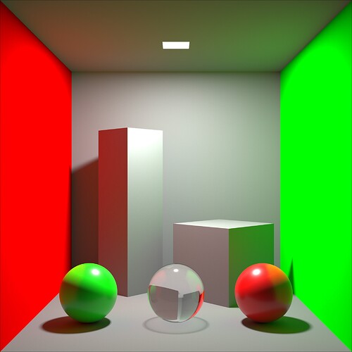
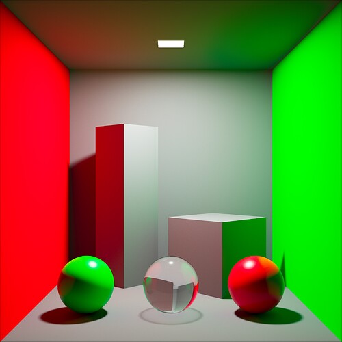
I understand the light sabers render is extreme and maybe I should come up with a different example. Here are two cornell boxes :

  • One is rendered with ACEScg primaries displayed in Rec.709 (ACES).
  • One is rendered with BT. 709 primaries displayed with a BT. 1886 EOTF.


Which is which ? :stuck_out_tongue: Except of the extra contrast and the highlight rolloff, they look quite close to me…

Maybe another way to look at the issues I have been pointing at is the following scenario. Imagine a 800 people studio color managed with ACES. The working/rendering space is ACEScg, which means all these artists have access to ACEScg primaries. How do you make sure without micro-managing nor relying on a colorist in DI that overexposed red lights neither clip nor go Dorito orange ? How do you make sure a colored blue glass (from which the main character will eventually drink) does not clip nor goes purple ?

Sure, nobody knows how a face lit by a lightsaber looks like. But maybe my point is, as Nick also hinted in his last sentence, that a sRGB display will never be able to display properly a BT. 2020 laser show… Unless it is gamut mapped ?

Regards,
Chris

1 Like

I think when most people talk about “original artistic intent” they are talking about reproduction. The scene is just something that you can manipulate to get the reproduction you want but it’s usually with knowledge of how the reproduction will react.

For example, if you’re light with a key light and a fill light you’re usually lighting with ratios that aren’t about making the scene look perfect to your eyes. You’re lighting with knowledge of how the film and print react to that light so that you get a reproduction you know will be pleasing when you look at the print in a theatre. Cinematographers know how their capture medium reacts to light and know instinctively what the result will look light through the entire imaging chain. They just manipulate the scene to get what they want in the end.

Sorry, Chris … stupid question but what exactly is this trying to show? Also, it’s not 100% clear to me what the path for each is.

If I understand correctly,

  • One is rendered with ACEScg primaries displayed in Rec.709 (ACES).

This is a scene where the colorimetry is encoded as AP1 then then result is sent through the RRT+Rec.709 ODT (which by the way uses the BT.1886 EOTF)?

  • One is rendered with BT. 709 primaries displayed with a BT. 1886 EOTF.

This is a scene where the colorimetry is encoded as 709 then the BT.1886 EOTF is applied directly to that?

@ChrisBrejon

I just thought of another slightly more appropriate example …

In “The Wizard of Oz” everyone knows Dorthy had ruby red slippers. At the Academy Museum of Motion Pictures we are lucky enough to have a pair of the slippers. I’ve seen them in person and they aren’t exactly what you would call “Ruby.” Rather, they are a dark maroon color. This color was specifically chosen so that the slippers would appear ruby and not orange on three-strip Technicolor. [1]

I’m not suggesting we put these sorts of hue skews into ACES but this is a good example of where the “creative intent” lives. I don’t think anyone would describe the maroon shoes as being the creative intent. Rather, the maroon shoes were just a means achieve the creative intent on the screen.

In summary, I just tend to think of creative intent as an attribute of the reproduction. The original scene is manipulated as a way to achieve the creative intent.

Thanks Alex. That’s much much appreciated !

Yes, I have read this in the document you shared (about reproduction). Very interesting part indeed :

Because these differences will produce substantial changes in the physical and perceived color of the displayed image, the colorimetry of that image must be altered such that its appearance will be correct in the intended viewing environment. In the jargon of the industry, this alteration is one aspect of what is called rendering. […] But as with all color reproductions, for correct color appearance, the colorimetry of those images must be entirely different from that of an original live scene.

Yes, we do manipulate the scene as artists to get the reproduction we want. 100% agreed. But would it be fair to say that the most faithful this reproduction process is, the better it is ? An other way to put it would be : the less we need to compensate/manipulate, the better it is ? Sure, people can compensate and have done that for many years. But isn’t this group a great opportunity to improve this process and aim at the most faithful reproduction possible (like hue-preserving for instance) ?

If I have to put like 7 or 8% of green on a blue sphere so it doesn’t go purple under a sunlight, wouldn’t you say that this compensation/manipulation of the scene should be improved ? Again, part of the issue for me is the scale : possibly hundred of CG artists compensating on a single show. How do you control that ? Or better formulated : how do we make their lives easier ?

I don’t think you can make the light sabers look good with the current Output Transform. I agree it is an extreme example but it is not uncommon for an animated feature to reach this level of saturation. I have tried on our very saturated show at the studio and did not succeed. I either clipped or skewed.

In most Animation studios I have worked at, all of the CG work is done under one Display Transform. If the Display Transform is broken, what are the consequences ? At a place I cannot name for legal reason, we used to work with a LUT which highlight’s rolloff was broken. As a consequence, we could never set the sun’s exposure high enough (on a city for example). The renders were therefore lacking energy : not enough Global Illumination, not enough SSS in the leaves of the trees… So we had to compensate for that by tweaking the values, sometimes outside of the PBR range (physically-based rendering). Not ideal.

I am the king for stupid questions. And as once Thomas put it : there is no such a thing as a stupid question, only poor explanations! So let’s see if I can come up with an explanation. :wink: With these examples I am trying to show that lighting with ACEScg primaries (displayed in Rec.709 ACES) kinda puts us back in the same place as lighting with BT.709 primaries (displayed with a simple BT.1886 eotf). Sure, the s-curve is doing part of the job but I believe that without gamut mapping, we are kinda stuck. I think Jed’s videos are a great way of showing that. In the document, M. Giorginanni wrote about the encoding method :

It allows information to be encoded in a way that places no limits on luminance dynamic range or color gamut. Any color that can be seen by a human observer can be represented.

So we have possibly infinite values encoded both in luminance range and color gamut. But what about the display and its limitations ? How do we alter the values so they don’t clip for instance ?

Funny example ! I love this kind of anectdotes. Thanks for sharing !

Disclaimer : I do not mean to be annoying. I am certainly passionate about this stuff and will never thank you enough for welcoming me here and making me feel part of the family. I hope this discussion is not bothering anyone and that some of the stuff I have written makes sense.

Regards,
Chris

1 Like

This is a tricky scenario, and one that seems to crop up a bit in animated features where there isn’t a plate to keep people tied down to reality.

My feeling is in this situation, there should be a show specific LMT designed to push the saturation by default, rather than having everyone crank things around so every second light in the scene is sitting right out at the edge of gamut, in near pure wavelength land.

There are exceptions of course, like scenes lit by lasers, but outside of that there aren’t many plausible scenes where lots of lights should be using values out at the edge of AP1. This is easier said than done though. When people get a comment back saying it should be ‘more green’ the first impulse is grab the slider and wang it all the way. But maybe there is a case to be made for restricting your lighting toolbox to only allow for more plausible values, and pushing the rest of the way with a boosted sat LMT?

1 Like

I think there’s a couple of buckets that compensation can fall into …

  1. The things you need to do in order to compensate for the reproduction viewing environment and display capabilities not equal to that of the original scene. (e.g. general brightness adaptation, viewing flare correction, etc.)

  2. Things that you do that are more preferential (Color memory and color preference adjustments)

Sometimes it’s hard to put a specific operation in a rendering in bucket #1 vs. #2. Sometimes an operation may be primarily compensating for something in bucket #1 but also have an affect on bucket #2.

For instance, compensation for output luminance dynamic range and color gamut limitations objectively need to be there because the scene has more dynamic range and a greater range of colors that can be reproduced by the display device but how you map the scene to the display is, in many ways, a creative choice. This came up in the gamut mapping work. Where’s the “right” place for a gamut mapping algorithm to put an out-of-gamut color. The answer is “where ever looks right.” There’s an choice that’s made based on preference.

One can easily put the scene’s measured colorimetry on a display, but as Ed points out … that probably won’t look great, especially when the reproduction environment varies greatly from the environment associated with the original scene encoding.

Tone mapping does impart some level of gamut mapping, however, it tends to maintain brightness and the expense of hue and saturation. Something has to give regardless of the gamut mapping algorithm. I think you’re heavily in favor of maintaining hue. The hue preserving tone scale stuff tends to preserve hue and saturation and the expense of brightness which tends to manifest hard break points as you move to clipping.

In the end, I think we need to do something different around gamut mapping but what exactly that is remains to be seen.

This is false I believe?

Per channel “tone mapping”, in no uncertain terms:

  1. Changes the “hue” of the intended light mixture.
  2. Changes the “saturation” of the intended light mixture.
  3. Changes the “lightness” / “value” / “brightness” / “intensity” of the intended light mixture.

It strikes me that it might be a bit of myth that per channel tone mapping accomplished anything other than an “almost acceptable accident”?

But then again, I see “tone” uttered all over this forum, and very few attempts to define it precisely.

Haven’t had a chance to read through the paper yet, but appreciate all the resources and links to materials being shared by this group. This is obviously a complex topic with numerous inter-related issues and some of us “newcomers” I think are thirsty for the knowledge (and background)!

I’m assuming by this statement that the light is a pure color blue, just at high luminance, right? In that case, while maybe not as visually pleasing, in my mind the current ACES transform is actually closer to what the “scene” is, which is a pure blue. You don’t actually have any white light, correct? You’re just achieving that by pushing the luminance to get what you’d expect out of a “path to white” transform?

My experience is with live action and not CG scenes or lighting, so I apologize if I don’t understand the nuances or limitations (or maybe lack-thereof as Alex mentioned). There is of course I think a bit of a chicken-and-egg situation here as well where you are lighting based on current (or maybe expected) transforms, and a different transform would require a re-light. For instance, you might be able to get an ACES rendered version that looks closer to the “naive” version if you lit it to include white lights at the center of the neon and lightsabers and re-balanced some of the intensities. However, would this spill too much white light around and wash out the scene? That’s well out of my expertise to be able to guess what that might look like.

That is the crux of what I’m on a mission to figure how (if even possible): how to map scene luminance (particularly with bright, saturated colors) down to a display’s luminance range without clipping colors (at least objectionably so) but still maintaining the proper “look” of the scene. I’m hoping Ed’s paper might give me some insights, but perhaps the issue is unsolved, or worst case, is unsolvable.

How specific are you expecting? At its most basic level I believe most are using tone mapping/tone scaling to mean reducing highly dynamic scene luminance down to a dynamic range suitable for display. There is all manner of ways to accomplish this, and multiple targets (display HDR and SDR for starters) so I don’t know how precise the definition can get.

For the uninitiated (such as myself), when talking specifically about per channel tone mapping, as opposed to straight luminance mapping, do you/we mean the scaling is different/weighted for each of the (three) channels?

Right.

And per channel doesn’t do anything even remotely close to this.

It’s not; it’s just a skewed and posterized variant, that destroyed the intention of the ratios.

Why not?
Per-channel tone mapping is exactly the mapping which affects mapping of whole scene luminance too. How that mapping should be done? It is a completely subjective/creative. Even compensation of viewing environment is a subjective transformation too. And doesn’t exist precision ways for doing it. What is even remotely close for “correct” mapping?

Great questions.

Because the per channel approach on anything beyond an inverse EOTF changes the ratios of light mixtures in the source encoding.

When the ratios of light mixtures change across the surface of intensity, it changes in a nonlinear and non uniform manner.

False.

You used the word luminance here. The light mixture in the working space has a specific chromaticity, and therefore luminance, based on the ratios of the three lights. When the lights are adjusted on a completely independent basis, the intention of the light mixture in terms of chromaticity is completely lost. Again, to be clear, per channel approaches will, throughout an image emission range:

  1. “Hue” in terms of chromaticity and chromaticity-linear paths, is broken.
  2. “Saturation” in terms of chromaticity positions, will be broken and shift in arbitrary ways.
  3. “Value” / “lightness” / “luminance” / “intensity” will be completely random based on the above facets, sometimes inverting two exposure sequences!

Then why bother doing colour formation matrices at the camera? Further, imagine picking a colour in a DCC and having it end up a completely different light mixture colour.

Is it all creative?

We can adjust and compensate for certain facets of perceptual-like responses. This is 100% correct.

However, at the point we throw technical and analytical changes into the same bin as “random subjective / creative”, we might as well give up.

Why not just generate random light mixtures? Why not have blue lights turn green?

Either we do colour science things to get the camera to try and represent what it captured in terms of colourimetry, or we don’t. Either we honour the intention of the light mixtures in the working space, or we don’t.

Why not make all skin tonality turn yellow? Magenta? Cyan?

  1. The colorimetry of original scene have to be changed to fit target media dynamic range. What changes of “Hue” and “Saturation” expected by the viewer? Should both chromaticity and saturation be always kept? There are some complex color appearance and color prediction models. They are complex and I didn’t remember result which was aesthetically pleasant. May be you have a good examples? On the other hand we have some history of film photography/movie/paintings… What if our eye want (or get used to) pleasant color reproduction more than colorimetrically correct (if it is even exists) one?

  2. “Hue” and “Saturation” in terms of chromaticity and chromaticity-linear paths are changed. I can be wrong but I expect some non-linear continuous nature of changes of color ratios. But why do you call that changes “broken” and shifted in “arbitrary” ways? We don’t talk about random changes. Color mixtures are shifted in the directions and with power defined by non linear mapping function and primaries of the working color space. May be the problem lies in RGB working color space primaries?

  3. By the way, often camera matrices are built (optimized) on some sub-set of subject-important colors (ColorChecker24 etc)? But we talk about scene reproduction colorimetry. Capture and display devices should be colorimetrically correct devices as much as it possible.

If an image maker picks a colour in a DCC, 99/100, do they expect the mixture to randomly change?

Less of a discussion. Perceptual mappings are an additional consideration here. Remember, per channel isn’t some sort of engineered output! It is random based on the shape of the curve, and is applied irregularly based on the ratios of the mixture, and the chosen working space primaries!

Per channel does not do this. Again, it is:

  1. Working primaries dependent in terms of the degree of distortions.
  2. Intensity compression curve dependent, depending on the shape and form of the curve.

It’s accidents all the way down, as opposed to engineered solutions.

So you expect a blue to turn magenta or cyan, a red to turn yellow or magenta, and a green to turn yellow or cyan, per curve, per working space primaries set?

Look at the variables above and try to arrive at it being anything other than an accident. Utterly arbitrary, and distinctively digital RGB artifacting.

Try it! Plot the results in a chromaticity space such as 1976. Most folks who do so are completely surprised that the assumptions do not hold up in any way.

Why bother when the actual application of the rendering is completely arbitrary and not delivering the mixtures represented in the working space.

There are some hard limitations here when approaching it from an engineering standpoint at a given bit depth, but random and arbitrary skewed output isn’t an entry point to these sorts of discussions.