ACES2065-1 to ACEScg negative value issue question?

Agree. My issue with this though is that we are simply deferring our problem further down the road. Often putting greater labour on a colourist to face against an unsolvable problem by the time they get the unfortunate series of scientism choices.

A key point with the “larger” ( :roll_eyes:) stimuli encoding is that we can at least draw a line to a correlated response; all wattage must be positive.

The deeper problem is that we can create problematic pictures with BT.709. Or more specifically, no one has solved the problem with forming pictorial depictions within BT.709 yet. Anyone who claims so, is speaking from a disingenuous vantage.

Hence why this cup and ball routine of non-solutions needs to be arrested, as they are clearly non solutions.

Your Additive Video is a huge step in the right direction, but we need to further flesh out that problem surface. We can:

  1. Create problematic gradient stimuli relationships, yet remain “straight lines” projected into the CIE xy colourimetric stimuli projection.
  2. Create cognitively acceptable gradient stimuli relationships, yet be “curved lines” when projected into the CIE xy colourimetric stimuli projection.

Offsetting in uniform wattages does seem to resist breakage, hence why your suggestion makes a reasonable entry point.

If we can at least provide a conjecture around transparency cognition, even if it is not encompassing as a “final” solution, we can potentially supply a much firmer foundation than all of the prior number fornicating dead ends.

3 Likes

I work in camera vendor (well, not sensor native, but at least something) gamut as long as possible. The fact that it moves the problem to a LUT/DRT, doesn’t help, because they have the same issues then. Not always visible in the default state, but I haven’t seen yet a clear filmic emulation LUT (or LMT or whatever) with reach “dense” (we all know this is a bad term, but everybody knows what it means) colors, that could take wide gamut input and map it smoothly to display without clipping. Not saying, this is impossible, but I guess it is hard enough, if even most expensive LUT/software packages fail with this. Not to mention per project show LUTs, that are usually way worse, often just terrible (including very successful shows).

This is an interesting take on the matter.

Could you precisely describe what should be observed in these two images ?

Is this “transparency mechanism” you are describing related to the polarity topic ?

Thanks !

1 Like

I have been forwarded these examples that illustrate the “transparency coginition” machanism. I found them interesting to look at and so I thought it would be interesting to share here.


@sdyer We are disgressing from the original question from @vfxjimmy How do you feel splitting the thread into in a new one about “transparency coginition” or something like that ? Thanks !

1 Like

EDIT: Since pictures are not replicated in reply, I have to make clear that I’m replying to Troy’s post with two versions of the lightsaber picture and what looks like a comped in transparent shield. I still have to process the other posts in this thread.

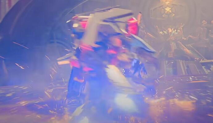
Wooo. I’m not sure what I should expect from this image since the transparent shield looks like it was clearly comped after through simple alpha blending however I’m going to give it a shot. First things first, the second picture is clearly broken. It exhibits the weird saturation and brightness cut in the blues due to which I had to request more time from my current employer in order to refine the ACES 2 code which I had initially proposed to integrate. The process to figure out a solution was a long and complicated one. It even involved me carving “ideal” tone and gamut mapping curves in Resolve using nothing but Hue vs Hue, Hue vs Sat, and Hue vs Lum in order to properly understand the final result that I was looking for.

In the second picture, the aforementioned cut can be seen on the floor, notice that the gradient from front to back is not uniform at all, and on the edge of the background lights, notice the uncanny two or three pixel border of really dark blue. It also happens with red to a lesser degree. Moreover, the contrast is so high that the lightsabers and the background lights look like they pierce the comped shield in a very weird way.

The first picture exhibits none of these artifacts although the blue is a bit too purplish for my personal tastes and I like the image better when Mery comes out in a more saturated shade of red but that’s a bias I have due to almost never working in sRGB 100 nits mode anymore unless I really have to. I’ve been working almost exclusively in ST.2084 1000+ nits Rec.2020 limiting for months and, oh God, I don’t recommend trying ACES 2 ST.2084 4000 nits Rec.2020 limiting unless you are prepared to put in the work to fix it (@ChrisBrejon 's sRGB balls image is enough to break it, especially if the raw PQ code points of the output are examined for sanity checking).

Case in point, we should be examining how we cognitively arrive at probabilities of reading a pictorial depiction along transparency mechanisms. I believe this is the axis that also embodies pictorial exposure .

EDIT: Added quote for making clear that I was moving on to another point.

However, is it just a case of transparency that causes the second image to look broken? I believe that it is not so. As mentioned earlier, the artifact is visible on Chris’ sRGB balls and Rec.2020 circles images, especially if you know what you’re looking for. The comped in transparency just creates another case where the artifact can easily show.

I’m trying to look for transparent things in these three picture and I have a hard time finding what I would call a transparent surface. Lots of emissive glowy bits and particles that would either be an extra channel in the deferred rendering or forward rendered then alpha-blended or additive blended but that’s transparent in the rendering sense not the cognition sense.

I believe it is fair to say yes; the cognitive result trends toward a probability of reading a decomposed boundary condition, instead of what we expect as “gloss”, “sheen”, and other air-material-like decomposition. That is, instead of us cognitively decomposing the form into a continuous form, the local gradient is too steep, and we track toward a higher probability of decomposing the region into a separate form. This is the exact same error that the (misattributed) subject of this thread refers to by way of negative RGB tristimuli; a tristimuli volume hull run creates a maximal excitation purity in the discrete sample, and the resulting local spatial gradients stand a higher probability to trend toward cognitively dissonant cognitive decomposition.

It is an incredibly easy one to miss, as it would seem our visual cognition has evolved to “see through” these forms and instead see the base form colour in the decomposition.

If we look at the totality of the selections, the cognitive computations track toward a decomposition of the more obvious forms, with an additional decomposed form of the “air-material”. That is, a “haze”, or “smoke”, or “glare”, etc. Typically what we’d associate with a strictly additive contribution of energy. I believe it is this additional decomposed form @ChrisBrejon was referring to? Perhaps he can confirm it?

This is plausibly because all “Colour Appearance Models”, and their siblings “Uniform Colour Spaces” ignore the baseline gradient domain neurophysiological signals, they deform the stimuli energy relationships.

Apologies I forgot to reply. I am not sure this is the best place to do it but here is my tuppence.

The screenshots that I shared were examples of cool/achromatic values “punching through” the warm volumetric/glow/wash.

I have made many tests on the current project I am working on with haze/atmosphere and it is a fascinating facet of image formation. I guess similar to the glass milk test you were mentioning.

Even if don´t understand all the details, I guess all of this related with the gain/offset mechanics that you have been hammering.

I think we could build a simple CG scene with some atmosphere of different colours and several lights and see how the “rate of change” affects our “sensation” of over/under.

A few more example:

And one shot on film:

I hope any of this mumbo-jumbo makes sense. Otherwise sorry about the noise ! :wink:

Chris

I’m curious to hear more about your experiences… the ACES 2 blues are troubling. If I’m understanding correctly, you went through a rather painful process of carefully, manually divining what one might consider finely-targeted, output-specific “sweeteners”… which, I guess, technically could be represented as ultimate per-output LMTs that invert and replace the vanilla fixed ACES-2 output transforms, which have the effect of selectively “smoothing out” the saturation-vs-lightness rate for a slice of hues, in order to compensate for the not-totally-desirable “clumps” seen in the Blue Bar ceiling, etc.?

I went through something even more painful. I first made that pseudo-ideal DRT in pure Resolve nodes to get an idea of what I would like the images to look like then I debugged the ACES 2 transform by going back to earlier prototypes in order to find the last known good version. Once I had that, I started adding back things from later versions to create a sweet spot DRT for our company’s internal usage. Here are some details I can give without running afoul of Netease’s sharing policies :

  • The iterative gamut compressor in the v39 prototype doesn’t produce any artifacts no matter whether limiting primaries are Rec.709, P3-D65, or Rec.2020.
  • It is the same iterative gamut compressor as was used for the ZCAM prototype (v13 and earlier).
  • All approximate gamut compressors from v35 onwards produce artifacts.
  • I haven’t tested versions v14 to v34 so I can’t speak about them.
  • The CAT data and the chroma compression space from the final version produce better results when combined with the iterative gamut compressor.
  • The chroma compression algorithm in v39 didn’t have the yellow desaturation issue that is noticeable in the final version. YMMV in whether that is desirable or not. Choose whichever chroma compression algorithm you like best.
  • There is a way to modify the implementation of AP1 compression mode in v39 such that it gives acceptable results no matter the choice of limiting and output primaries. You will have to figure that out for yourself though.

Of course, we’re making extra additions to the DRT on top of what I’ve described because we want to make the HDR 1000 nits version the reference image and have the SDR version visually match that instead of limiting the saturation of the HDR version to match the limitations of the SDR version like what we’ve seen the final version do to our images. That’s something that I can’t share though.

Hope those hints help,
Jean-Michel

2 Likes

little side question,

If its best practice to keep native camera RGB ,

whats the point of acesCG? or extended whats the point of ACES in general then?

What we did " before aces" seems to be better then? because thats what we did, keep camera native RGB, use it as the working space and just apply a single picture formation thing over everything in the end.

so really i struggle with the point of all of it if there is no benefit in working in non-camera RGB spaces, especially one that is ~D60 and all that.

First thing I can think of is that for an ACES workflow there simply needed to be a wide gamut space to render computer graphics in. Not all projects have camera media. ACEScg exists because the initial AP0 was problematic as a working space for a few reasons if I’m not mistaken. But I’ll leave the proper explanation to someone else.

Regarding what the actual gamut should be, especially how large is a bit tricky I think. Making it as wide to encompass all currently known camera gamuts would be problematic for precision and sensitivity of non managed tools/operations.

I think if you’re compositing in an ACES workflow technically nothing is stopping you from hopping back and forth to any space necessary to do your work. What you deliver as interchange could still be whatever was decided for the project be it ACES2065-1, ACEScg, camera log/lin.

Theoretically the same is true for grading but at that stage you can also kind of decide, if having negative values due to the working space, how and when in the chain you treat them as you move towards the final rendered image and preservation of additive mixtures comes to an end to make room for pretty pictures.

There will be a few answers but for me, it is mostly a question of production efficiency, if you have authored assets for a show in a camera space, how do you transfer them to another show in a different camera space? Beyond this, how do you collaborate with other vendors? It is about speaking the same language so that there is minimal efficiency loss. This is why many vendors, e.g., ILM, Framestore, are using ACEScg for CG assets authoring. It does not mean that they do not do the final rendering or comp in the camera space. We have also shown that ACEScg/BT.2020 are minimising error the most when compared to a spectral render.

I just personally keep a tight naming convention so in the end it doesnt matter what my assets textures where as they get promoted to working space anyhow its just highly unlikely to use acesCG as a working space , so whats the diff, realistically you need to name your stuff acesCG anyhow, so might as well use something else, why not linear/p3 or whatever else

Maybe more of a feature thing then just trying to be faster instead of making better images- but then you end up with the mess that is AP0 vs AP1 and you aren’t gaining anything anymore? I mean seriously, if you author albedo textures as exr acesCG and then send them over to another vendor are you supposed to convert them to 2065-1 as thats the “exchange format” i guess not - so isnt this more messy?

Cant really speak to rendering/ texturing CG in acesCG, ive heard many things here with energy preservation beign a issue with such wide gamut textures - idk - personally just preffer my textures to be in linear/p3 which seems to be a good middle ground.

last shows I worked on clients forced native camera gamut too because they went back from beign fully ACES due to issues on their sides.

→ ACES shouldnt be used as a working space - camera native RGB is better

→ ACES viewtransforms/DRTs quiet frankly are not up to snuff so every show rolls their own anyhow. Never found a single DP that liked the image formation, even 2.0 and I am sorry to say this but its just not good.

→ Asset textures, I dont see the point of why they have to even be the same , reusability will be complex anyhow just based on the fact that the other show is going to have completely different lighting, maybe a different view transform/look anyhow , if I lookdev a ambulance for example and I save the albedos as linear-p3 or even linear-sRGB - they would just be converted to working space which is my camera native then anyhow? so i can just re-use assets perfectly fine, i can switch working space in my scenes no sweat. ? (maybe I am missing something here?)

→ if we take camera native RGB/linear plates - and need to supply ACES 2065-1 plates to another vendor we would need to use 32bit to not end up with a rounding error, so this actually adds complexity rather than removes it, why not just send the native RGB, name it correctly and bobs your uncle.

So what do we gain? is the image getting more pretty? does it really lessen complexity in any way?

Must be missing something but all in all it feels like we are going backwards if there isnt a feasible benefit in making images more pretty and improving workflows.

1 Like

I just personally

Let’s talk “we” for a second: How many people are working at your studio, 10? 50 max? Linkedin says between and 2-20.

ACES might not make sense for your team but for a studio with couple hundreds to multiple thousands people, with 10 to 20 concurrent shows and multiple deliveries to a single client, e.g., Netflix or Disney, the constraints are radically different. Having a shared working space is about reducing costs at large scale, you know that the assets you produced on Avatar 2 can be reused on Avatar 3.

I found it interesting that Anders Langlands (Author of the “study” that I believe you are referring to) claims in this presentation for Open Source Days at Siggraph 2025 that RGB rendering in the camera native gamut has the best accuracy / is closest to spectral rendering.

1 Like

From what I saw in the video, that was a diss against RGB more than anything else. Otherwise, it seems that he was talking specifically about ARRI Wide Gamut 4 which is only slightly larger than Rec.2020 and ACEScg so the conclusion that wider RGB gamuts with primaries close to the spectral locus produce results close to spectral rendering stands.

1 Like

Anders Langlands: Even though you’ve only got an RGB renderer I believe but cannot prove that using the camera native RGB as your rendering space will actually improve the accuracy of your renders, but that’s something that needs further investigation.

Setting aside the catastrophic impact increment to decrement mismatches have on picture making for a moment…

If folks realize that luminance invariance by way of 3x3 colourimetry transforms leads to overall energy mishaps, then Mr. Langlands is plausibly correct in his estimation; the computations by way of the basic operators of multiplication and addition will deviate quite significantly from the relative wattages present in front of the camera. Daniel Brylka tried to point this out a few times in this forum regarding the problematic definition of albedos relative to a colourimetric space, but it sadly fell upon deaf ears.

I am cautiously confident a clever mind can showcase a clear demonstration of how the relative wattages go sideways under orthodox 3x3 colourimetric matrices.

Assuming a quantal catch is unmodified (shame on the vendors that take their camera quantal catches to a colourimetrically defined “space”) the energy increment to decrement relationships will remain intact in the rendering model.

1 Like

This is indeed one of the studies Anders and I worked on together (and separately also).

There is this one too: About RGB Colourspace Models Performance | Colour Science and this rendering - For shader math, why should linear RGB keep the gamut of sRGB? - Computer Graphics Stack Exchange

That being said, we, at the time, never tested against data generated from a camera. With a bit of cycles at hand, it should be trivial to re-verify with Colour.

Note that the context for those tests a decade ago was mostly animation and was started by Steve Agland from Animal Logic.

1 Like

I was thinking about this some more and concluded that rendering in the Camera Gamut doesn’t necessarily minimises the error compared to spectrally render using the camera primaries.

The Camera Gamut(s) are derived from an optimisation process that is, for practical purposes, a vendor specific blackbox where each one, following its own recipe, introduces some bias to favour specific colours, e.g., skin, uses CAMs or perceptually uniform colourspaces as error metrics, sometimes use a mix of global and local optimisations, can be further artistically tweaked, etc…

Put another way, given a unique set of spectral sensitivities for a unique camera, many vendors following their own recipe would obtain many different Canera Gamuts… Sometimes, the same vendor for a given camera ships 6 Camera Gamuts! :slight_smile:

With this in mind, I have hard time seeing a great correlation between rendering in the Camera Gamut and reduced error w.r.t. to a spectral render using the specific camera sensitivities. The Camera Gamuts are not designed with this as an optimisation constraint: They are almost systematically built with an optimisation metric that reduces error compared to a standard human observer: They optimizes perceptual outcomes and workflow robustness, not camera-sensor fidelity.

Putting the old RED camera gamuts for further thoughts!