Hey,
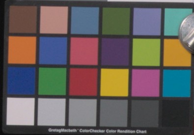
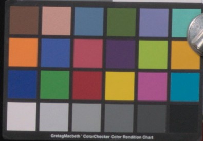
just wanted to share a couple of thoughts post-meeting#6. After carefully comparing images from v01 and v02 naive transform this afternoon, I noticed some weird shifts on the orange (hence my question in meeting#6). Here is an example on why v01 looks more neutral to me :
Naive transform v01 :
Naive transform v02 :
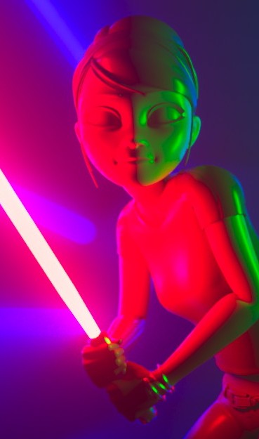
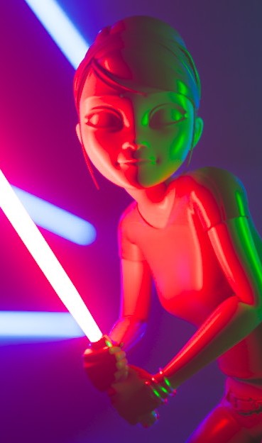
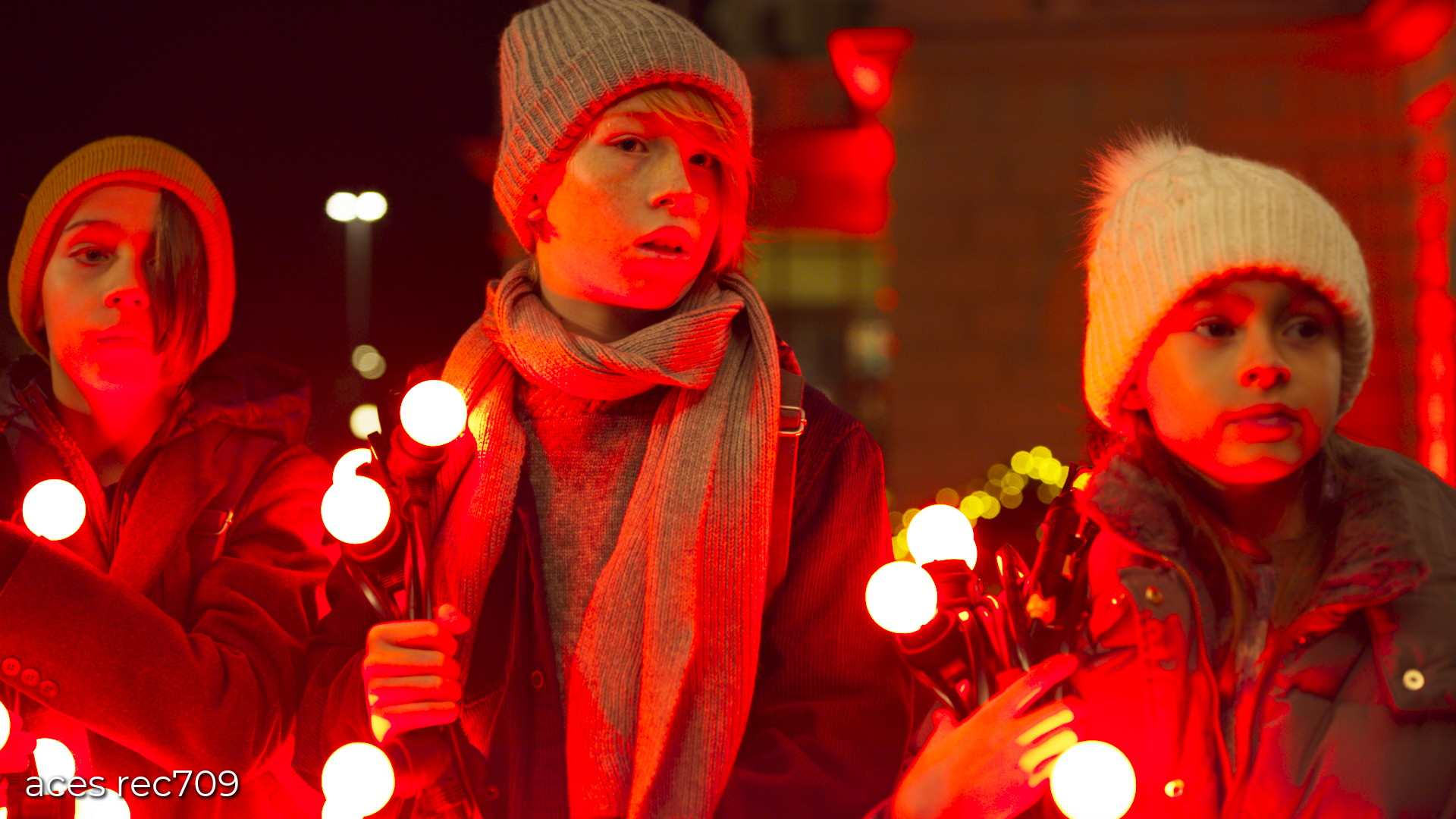
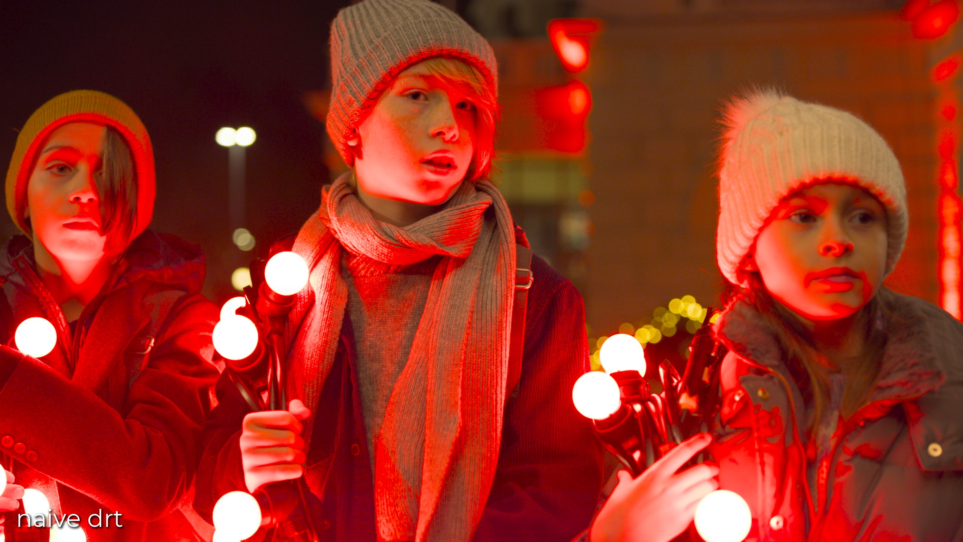
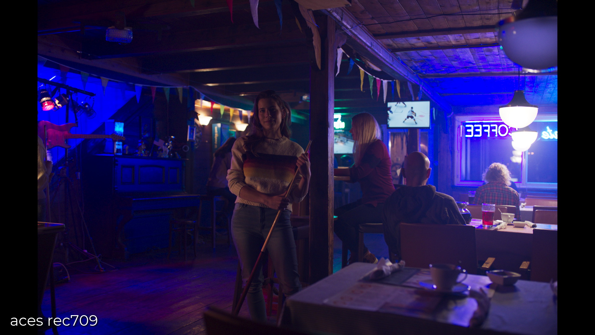
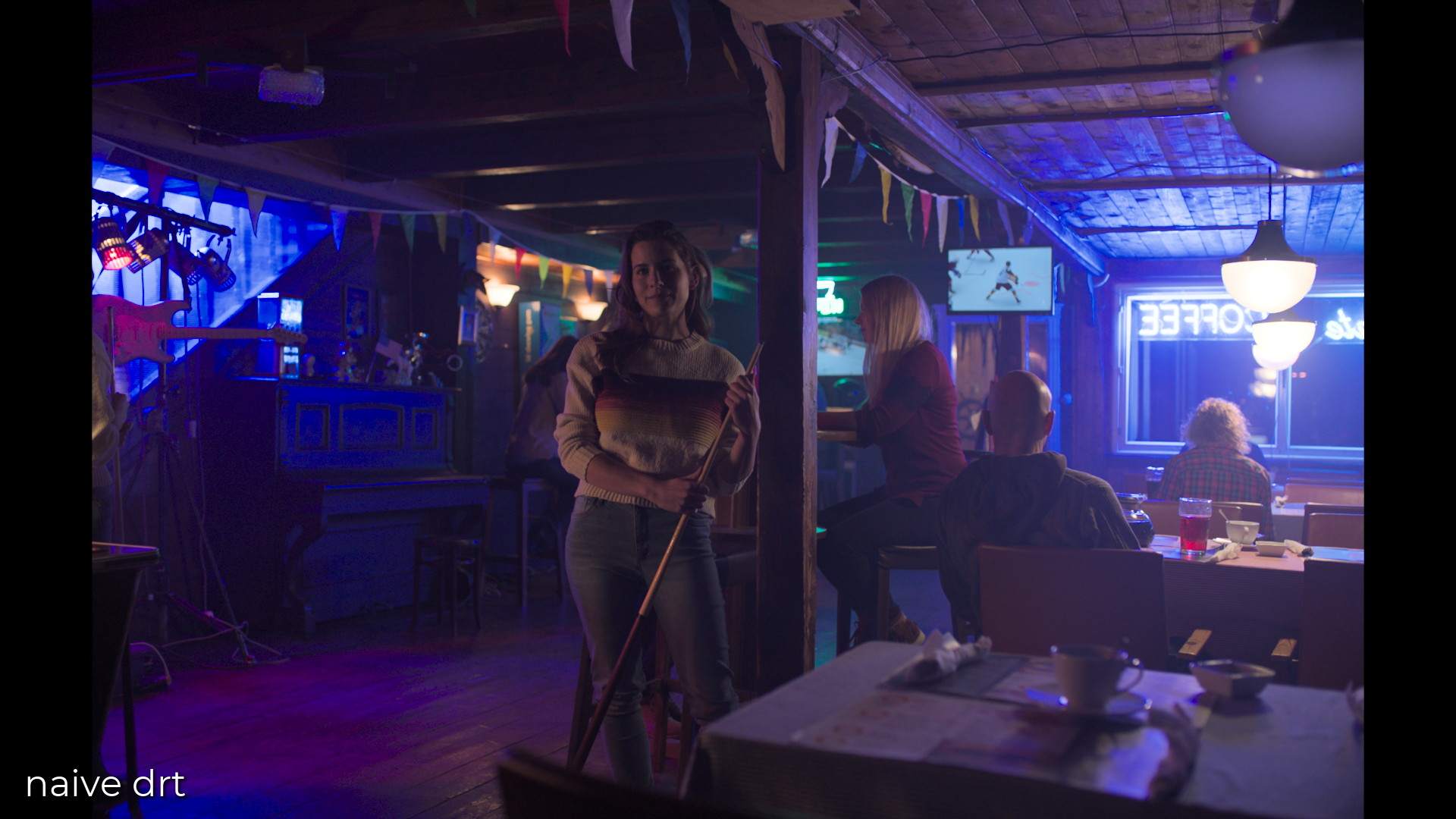
And a couple of frames that are worth comparing I think (if you didn’t have time to look at hundreds of frames) : on the left, rec.709 (ACES) ctl. On the right, Jed’s DRT. Since I am the person who did this render, I feel like that the “render” on the right is much closer to what I expected while working on it :
Same thing here. I was pretty pleased with these results as well :
I think that the red xmas picture is also a clear example we’re heading in the right direction. 
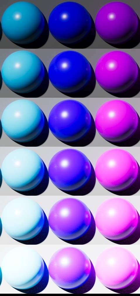
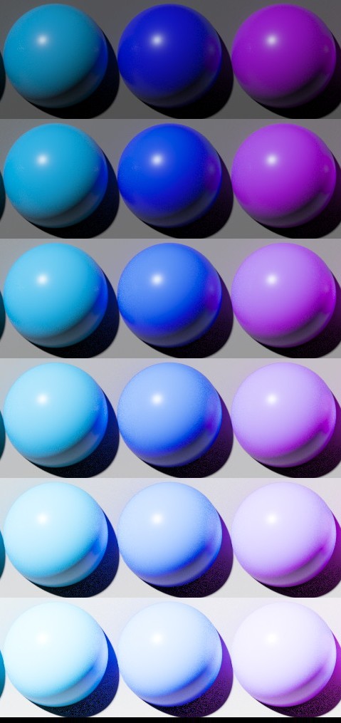
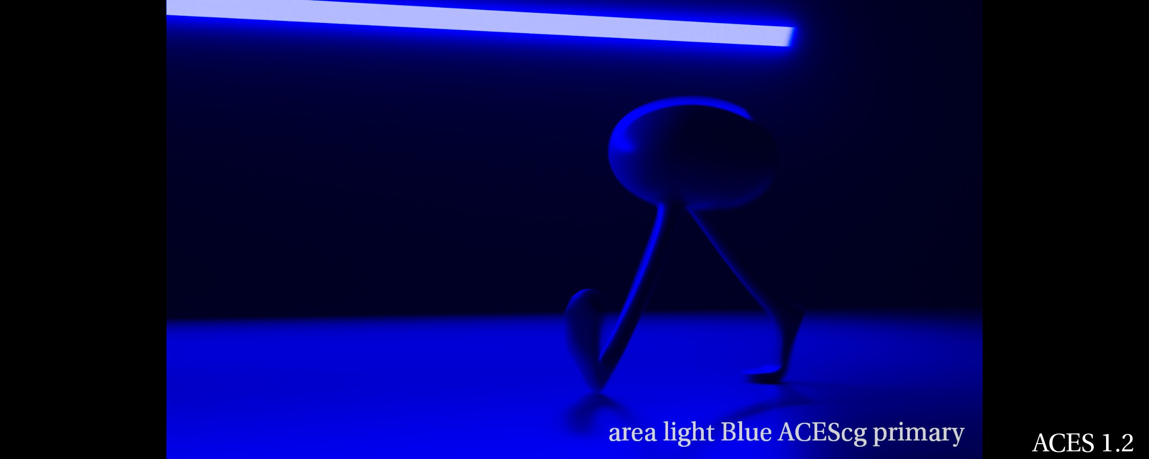
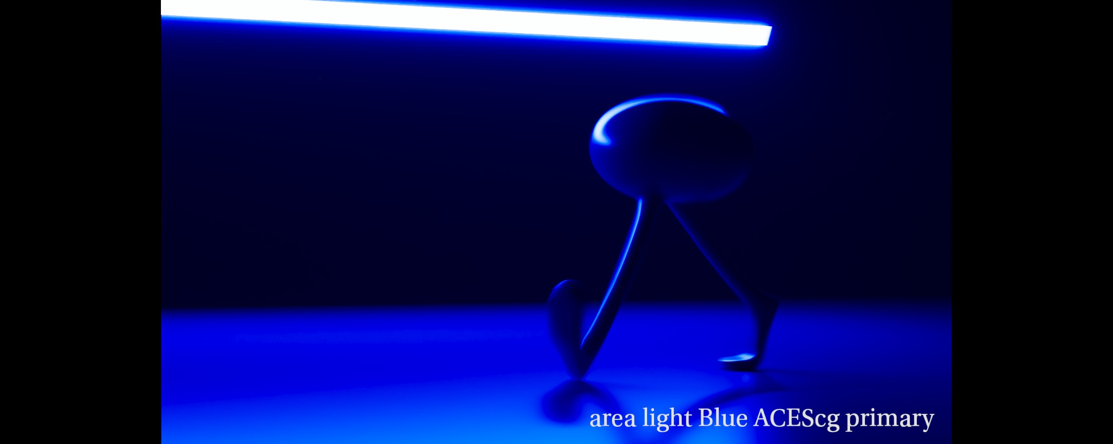
And the blue bar of course :
I think the GM VWG pictures were added to the mega.nz link a bit later. So I completely missed them when I downloaded the link 2 days ago ! I always wondered how a more robust output transform would handle this kind of imagery… I guess I have an answer now. Anyway, just a quick post in case you missed the images added later and to emphasize the excellent work from @jedsmith .
Update : my blue little sphere looks also very nice with the white specular on it. Even the exposure level on the light itself looks more consistent to me. Sweet !
Regards,
Chris