What For
If we are going to use a chromaticity-preserving tonescale, we will need tools to achieve the aesthetic image rendering we want. One of these image rendering aspects that I think is quite important is the handling of color. Both brightly saturated color, and the behavior of film (and most display rendering transforms) where highlights become increasingly desaturated as the display-referred image approaches 100% output.
How to Do It
I have been playing around with various perceptually uniform opponent colorspaces. In particular JzAzBz. I’ve had some good results compressing chromaticity values in this colorspace. The Az and Bz components encode 4 hue directions: red/green, and blue/yellow.
Applying a compression function on these 4 axes gives pretty good control over output color. A clever person could probably figure out how to encode this as a continuous lookup instead of a per-channel adjustment.
Since the origin at 0 is the achromatic axis, we can scale down the values of Az and Bz to reduce saturation. And the cool thing about this scaling is that the path the hues take towards neutral looks plausible: no noticeable hue shifting.
The cool thing about this is that it can be done in scene linear. I think it helps having access to that larger range of data.
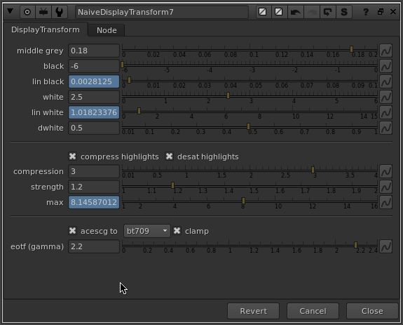
So to accomplish a reduction in gamut volume as a function of brightness, I am multiplying AzBz to 0 as a function of a log-encoded brightness range (chosen creatively). In the nuke setup I’ve also included a node called GamutCompress which applies a compression function to AzBz above a specified threshold. Something like this sketch might be useful if we wanted to do more specific adjustments to certain hue ranges.
Look at Some Pictures
Here’s a big giant folder full of rendered test images to look at:
Dropbox’s gallery mode sucks so feel free to download the images to view them.
The test images I’m using are from the following sources:
And here is the nuke script used to generate the “Weighted Power Norm Tonescale, JzAzBz HL Compress” images.
20190119_gamut_mapping.nk (124.3 KB)
Conclusions
Generally I think the rendering is quite good considering this is just a first test. The amount and range of the highlight gamut compression was created creatively and is not scientific at all. It could be scientific or more creatively based on the reference behavior of say a film stock.
The rendering of the colors seems like a nice starting point for further grading, at least to my eye.
I think it’s important that we think about what goes in the clean simple default display rendering transform and what goes in perhaps an optional “default LMT”.
If we were to create a default LMT, a couple of things I would add:
- The rendering of orangish colors doesn’t have that nice yellowish cast that is pleasing (at least to my eye) in the ACES transform. The fire especially looks pretty unnaturally red.
- Skin tones could use some love, maybe some smoothing, darkening and increasing saturation of red-oranges
- Probably other stuff that a professional colorist could spot!
I hope some of this is useful, and I’m curious to hear any and all thoughts on the subject of handling and manipulating color in the context of a display rendering transform!


