Output Transform Tone Scale

The former indeed, i.e. colour appearance phenomena. If you need to model and thus control Hunt Effect for example, the DRT, assuming it is the block that handles appearance modelling has no choice but to change the chromaticities/tristimulus values to preserve appearance between different viewing conditions.

I’d like to put out there for consideration that the questions of how we see, and how film works has the purpose of arriving at the how of implementation.

It does not necessarily impact the what is desired of the artist and image maker. That is, an artist wants the look they want and does not necessarily care whether it is realistic or faithful the medium. Artistically therefore a key goal is to provide tools that empower the artist to achieve their creative vision, and do not impose a certain look.

If we can agree that at least a good many image makers do want to have brights lose saturation and go to white. Then the tools should not prevent them from that artistic goal.

How to do this is another question. That is, are there a list of choices to choose from? Or are there controls to “dial in” the desired amount of “coloryness”? (As well as the desired amount of “crunchiness” i.e. shoulder and toe). I’d personally learn towards giving artists more interactive control.

The challenge I think is having those “dials” be ones that artists can work with. That means exposing the right parameters (and not exposing others), and also naming those controls in ways that make sense to non-scientists. Call it “metalness” not “conductor” or “highlight size” not “coefficient” and so on.

2 Likes

Chroma-preserving not Saturation-preserving

I have a hunch that there may not need to be an either/or approach to the “going to white” vs “chroma preserving” debate, but instead a both/and approach possible.

For example here’s a side-by-side of an ARRI image with TCAMv2 on top and OpenDRT below. Working space in Nuke is ACEScg. Image is exposed 2.1 stops.

Both TCAM and OpenDRT are chroma-preserving. But notice how the OpenDRT is staying a lot more saturated on the woman’s face in comparison to TCAM.

So the question for me is, could the OpenDRT be made to act more like the TCAM, where it loses saturation with increased brightness?

Here’s another example side-by-side. Again the man’s face is keeping saturation on the bottom image, looking almost as if the colors are clipping (they are not, but the saturated colors make it appear to, at least to my eyes).

Again, apologies if I am doing something wrong here in these tests. My eyes are better than my mouth, so I feel that I can see things, but it’s challenging for me to identify and articulate precisely what I am seeing. So I appreciate your patience with me as a stumble towards a analysis, and am putting these images up here in the hopes that others will be able to analyze and articulate what’s going on better than I.

Red Shift

I’m also noting a shift in red in both TCAM and OpenDRT compared to ACES. I’ve done a quick gamma adjustment on this image to better illustrate the color differences.

Observe how the yellow pepper is turning orange in TCAM and OpenDRT. Similarly the white wall is turning orange.

Here’s an example from a render. The red on her shirt is darker on the OpenDRT, and Hyperbolic and ACES have more saturation in the red.

Hope these musings are helpful in some small way.

Bear in mind that T-Cam is intended to be used in combination with a scene look or grade. It is not supposed to look “visually pleasing” on its own.

1 Like

Leaving aside the degree of compression, this is an incorrect assessment.

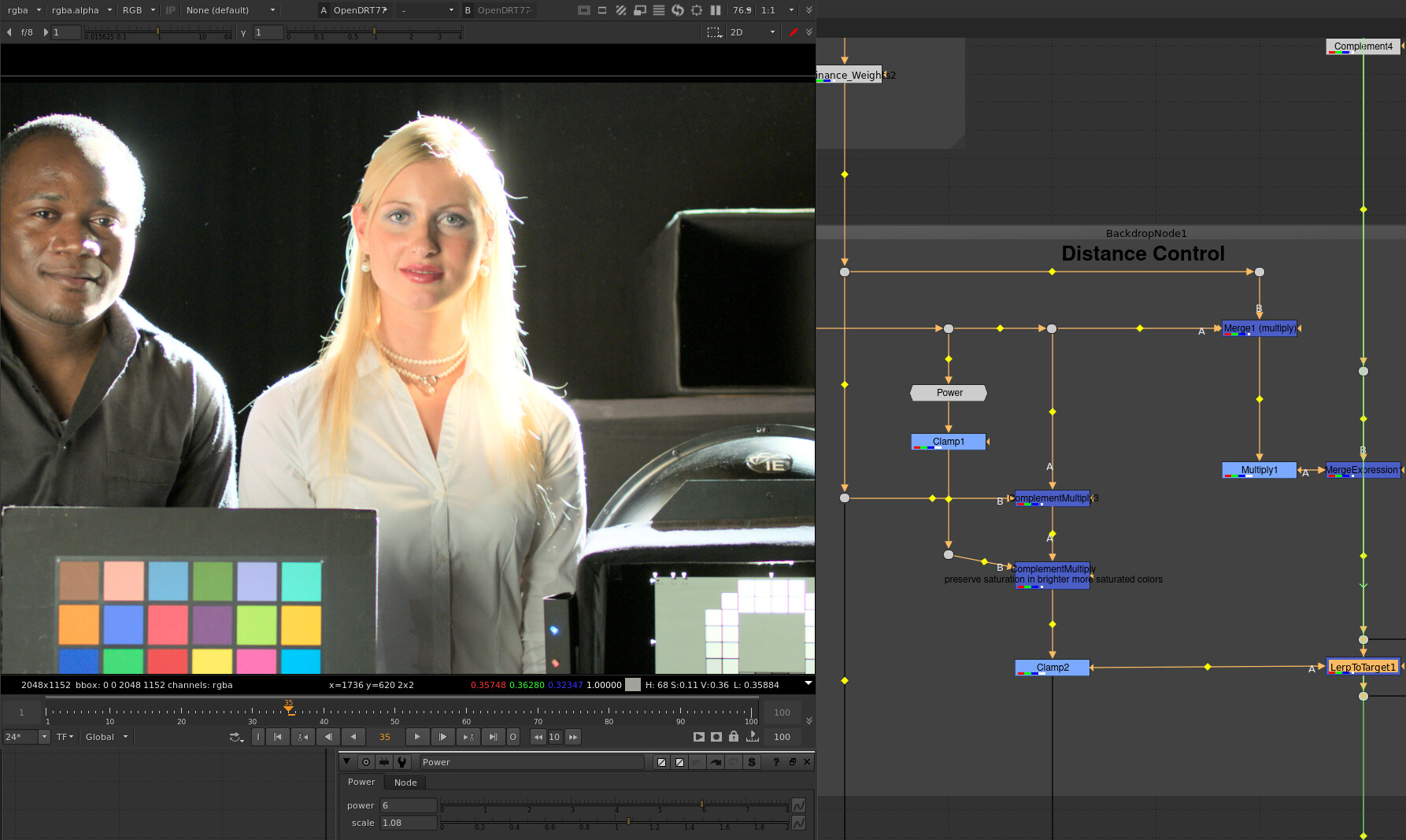
There is chroma compression as luminance approaches display maximum in OpenDRT v0.0.75. The control for how much is not exposed, but if you go inside the group (Ctrl+Enter with the node selected), you can play with it if you like. If you adjust the Power node it affects how strong the chroma compression is.

Here are the defaults as you have pictured:


Here is with chroma compression disabled:

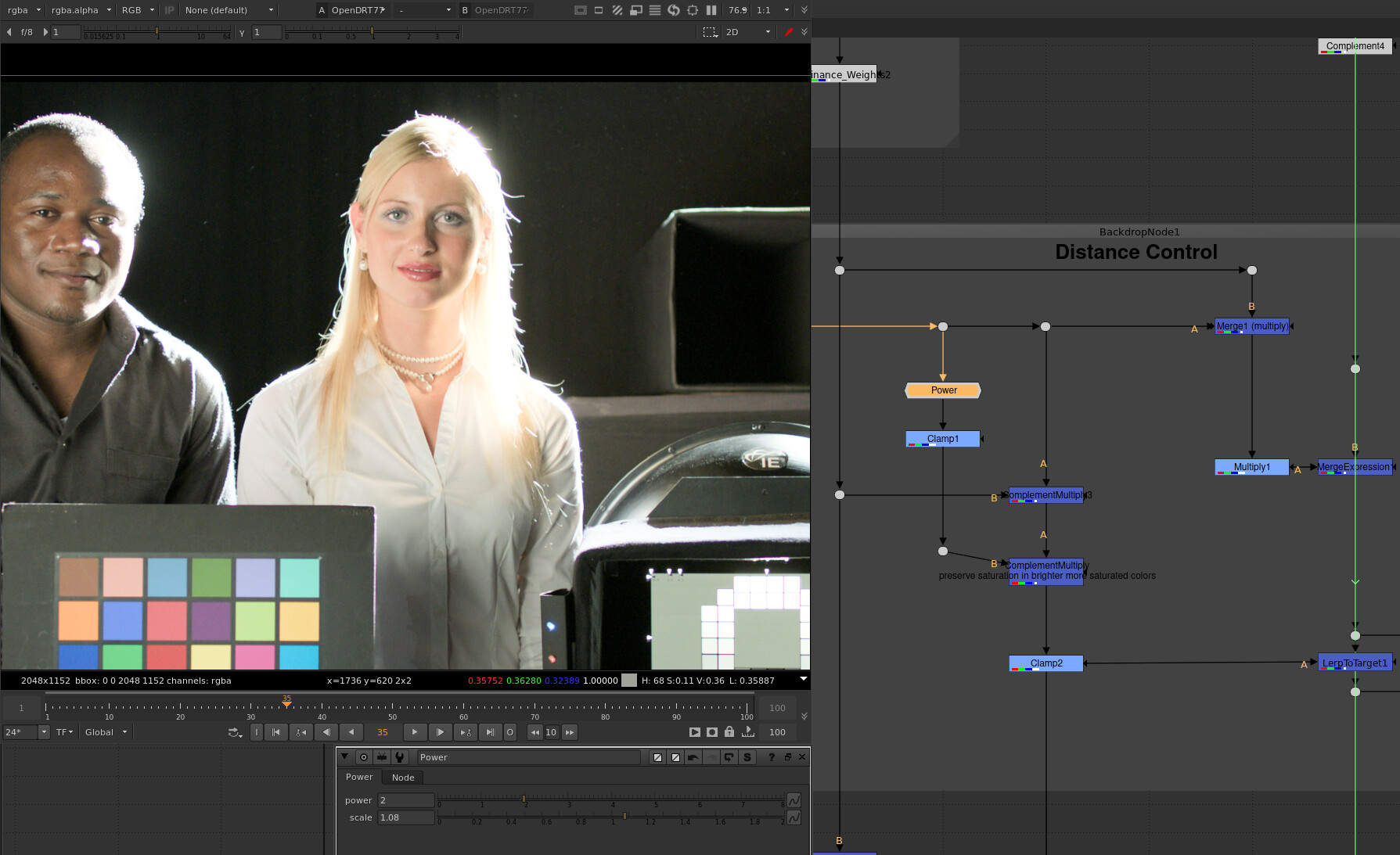
Here is with Power=2.0 to increase the amount of chroma compression:

The implied question here is “What is the reference?”

I don’t believe that using the ACES rendering as a reference makes sense in this case, because it introduces a significant “look”. A better reference might be a “pure” mapping of linear light to display light using a 3x3 matrix from camera gamut to display gamut, and a pure inverse EOTF.

Where the chroma does not clip because it is out of the display gamut volume, and where the luminance does not clip because it is outside (above) the display gamut volume (see this demo and these demos I did a while back if this doesn’t make sense), you will have a “correct” representation of the intended color without any “look”, based on the assumption that the upstream color processing performed by the camera color science is correct etc etc. If you do the experiment you will likely find that the color appearance is not as you had imagined.

I am not saying here that a look is not a good thing. Quite the opposite, I think it’s critical. But all of what I am doing hinges on getting the chromaticities to the display correctly, and then building a look on top of that.

Hope that helps.

1 Like

@jedsmith Yes, thanks so much for this! I can see that it is actually the T-Cam and OpenDRT that are faithful to the original, and the “red shift” is actually something going on in the ACES and Hyperbolic.

That make sense to me since T-CAM and OpenDRT are chromatic-preserving. So they are faithfully returning the colors. With that in mind here’s another image comparison using the digital emily 2 texture map. This is an EXR in sRGB primaries.

For OpenDRT and T-CAM it is darkening it a bit (arguably a desirable behavior with diffuse textures) but is faithfully preserving the colors. For both ACES and Hyperbolic however it is shifting to green (the “ghoulish skin tones” that others have mentioned).

I’ve noticed that sRGB primary textures viewed through ACES would change colors, fighting with my artistic intent. I’ve been playing around with T-CAM and am happy to report that that does not happen. (Btw, I unfortunately can’t do the same with OpenDRT since there is not an OCIO config for it and I therefore cannot see it in Maya, and only after the fact in Nuke.) I cannot stress enough how important that is for an artist. It makes artistic intent possible. If I’m understanding things correctly and this faithful reproducing of colors is because of chromatic-preserving then I’m gonna say that this is really a must-have feature for a DRT.

2 Likes

Here’s a side by side of OpenDRT and the DIY Per-channel. The lamp shade should be a warm sunshine yellow. Render is ACEScg. It looks perfect in the DIY Per-channel (i.e. it is the color I intended as I made the render), but note the “tangerine” shift in the OpenDRT.

Here’s the same thing on this image of fire:

Here’s a color swatch showing the same:

This appears to only happen on luminous things (fire, lampshade) as opposed to yellow objects. Is there anything that I can tweak on the OpenDRT to adjust for this?

As I mentioned before, OpenDRT doesn’t come with a look and as such isn’t really intended to “look good” out of the box without a look transform upstream. I know it’s hard to imagine what that might be without a prototype example.

This hints at interesting point I think: When you create an image you’re looking at it through some display transform. That affects the decisions you take. Whether it’s lighting on set or lighting in a CG render or even lookdev for tweaking specular response in a shader. Taking an image you created under one display transform and comparing it to another may not be comparing apples to apples in this case.

I’d be curious how easily you could get to the look you want starting from scratch under OpenDRT.

Yes, that’s very true.

I’d love to try. Would it be possible to get an OCIO color space of the display transform so I could view it in Maya? I could then test it on the lampshade from scratch as well as some OpenVDB pyro assets.

I’d also be keen to try the same with the latest hyperbolic/sirugusano DRT in Maya (which I believe are both included in the DIY PerChannel Nuke file). For that one I’d like to test lookdev specular and sss for skin from scratch.

Here’s a test comparing kelvin temperatures in ACEScg primaries from 1k to 6k. The white box indicates the transition into yellow. The ones under the red line seem to never really go to yellow, and instead stay orange.

Do others get the same results? Here’s Nuke file:
KelvinSweep.nk (3.5 KB)

The T-CAM, ACES 0.7, ACES 1.0.1, and ALF-2 were made with Baselight for Nuke. The ALF-2 is a look applied to the T-CAM RRT.

1 Like

A few points:

  1. If any value escapes the destination gamut volume, the result is device dependent unless specifically engineered otherwise. This is a fundamental that would need to be addressed in any “management” system.
  2. Baking in something to address Kelvin would also likely affect skin, and few like Rat Piss yellow skin.

In the end, it seems that fundamentals need to be focused on. Here is some good fire, as folks seem to get obsessed with device dependent digital RGB gaudy yellow.

I don’t know if anybody is “obsessed with… yellow”!

Personally my issue with the appearance of fire in unmodified chromaticity linear renderings is that it seems to take on a slightly salmon pinkish tone, which doesn’t feel like fire to me. Although I admit that it could be a learned preference.

1 Like

There is a critical piece of the puzzle being overlooked here, though.

In terms of fundamentals, I reckon that the “pink” is related to that fundamental.

Question: Is everything that comes out of Baselight chromaticity linear? For example, if in Baselight the DRT is set to ACES 0.7 or ACES 1.0.1 would that be chromaticity linear? Or is it only when the DRT in Baselight is set to Truelight CAM that it is chromaticity linear?

If folks go back and read what Jed has said, it’s pretty clear as to why it is of utmost importance.

People aren’t reading.

Tell you what… and again, Jed and others have said this dozens of times, but I’ll repeat it here yet again.

Take a single pixel mixture and run it through a display linear output.

What does it look like? If you manipulate display light in Photoshop, is anyone actually expecting that it magically skews or bends to something other than what the display light mixture is, by default?

Separate creative desires from basic foundational ideas.

Dumb Question #2: @jedsmith Jed speaks in the OP of a

and also

and @nick speaks of

am I correct in understanding that these are all synonymous?

Dumb Question #3 follows from that. Are the hyperbolic and Siragusano that @jedsmith posted here also chromaticity-preserving tone scales?

@Derek: Dumb questions are my favorite because they force explicit definitions, clarifications, and encourage common ground in understanding. Thanks for asking!

First let’s try to define what “chromaticity linear” actually means, because it is a term that believe I made up to try to describe a characteristic. In my understanding, “chromaticity linear” refers to a transformation which moves chromaticities only along a straight line between the original chromaticity and the neutral axis of the colorspace.

Note that I am not using the word “hue” here, because this has nothing to do with nonlinear perception of color in the human visual system.

I don’t believe this is true. Baselight has different display rendering transforms available. TCAM I believe is mostly “chromaticity linear” within the visible spectrum of colors. The ARRI and ACES renderings are not “chromaticity linear” because the chromaticities do not travel along a straight line, as your Planckian Locus sweep above shows pretty clearly.

“ratio preserving tone curve” and “chromaticity-preserving tone scale” mean the same thing. It refers to a compression of input intensity values into a smaller range, which does not change chromaticities in a nonlinear way as a byproduct of that transformation. A chromaticity-linear transform might change the chromaticities as a byproduct, but only in a straight line towards the achromatic axis.

These compression curves are just compression curves. Whether they are chromaticity-preserving or not depends on how they are applied. If you apply the curve directly to input scene-linear RGB values, they will not be chromaticity preserving. If you do something like this, they will be:

vec3 rgb = INPUT_RGB
float norm = max(rgb.x, rgb.y, rgb.z)
float compressed_norm = compress(norm) // some compression function
vec3 out_rgb = (rgb / norm) * compressed_norm

Here’s a little sketch showing the difference a couple test images and the PiecewiseHyperbolic compression curve I posted before.
chromaticity-preserving_vs_per-channel_planckian-locus.nk (222.8 KB)
Using this test image that I like:

This is what the per-channel intensity compression curve looks like on a 1931 chromaticity plot:

This is what the chromaticity preserving method outlined in the code above looks like:

And for interest, here’s a comparison of a chromaticity-preserving and per-channel plot of the Planckian locus looks like. The one bending towards yellow is the per-channel version:
screenshot_2021-05-21_14-49-13

Hope it helps.

5 Likes

@jedsmith yes it helps tremendously, thank you. I love how you are able to take complex brain-busting concepts and explain them in simple terms. That is truly a gift.

One more dumb questions (#4):
Is it the case that when the RRT “look” is added to a chromaticity-preserving tone map that the “salmon” color kelvin will look sunshine yellow again?

This was my hope with the ARRI ALF-2 look that I applied in Baselight over the T-CAM DRT. In my test above it does have that nice yellow sun color. That’s promising. However, I’m seeing an issue with green on the ALF-2. The following is an exposure sweep of renders of colored spheres, similar to the one from @ChrisBrejon except these are in ACEScg primaries, rather than sRGB primaries.

Both the T-CAM and T-CAM with the ALF look appear to be chromaticity-preserving, in that they are not shifting from 12 colors to the “notorious 6.” However, the pure green on the top row is clipping something awful. Looks to me like it’s a gamut problem. If I apply @jedsmith gamutCompress.nk to it, set to “ACEScg from Filmlight E-gamut” it’s not perfect (the green diffuse color is brighter than the spec), but certainly a ton better.

In the end, it seems like there is a tradeoff between having a 1 to 1 with material colors (chromaticity-preserving) or having a 1 to 1 with light color. If that is the case, then I guess the question is what would be more important to artists? However, I’m still hoping that with the right “look” (and maybe some gamut voodoo) artists can have both. Is that hope realistic?