Gamut Mapping Part 2: Getting to the Display

That colour wheel is a very useful way of looking at what is happening. The v2 seems to exhibit some strange bands alternating light and dark in the yellow to magenta quadrant. These distortions are even more obvious on a vectorscope:

Am I right, @jedsmith, in thinking that v2 is using some hue qualified adjustments, based on a similar method to that used by the red modifier in the RRT sweeteners?

I don’t intend to be negative. You are doing great work. These are really interesting experiments and visualisations, and will give us plenty to talk about in today’s meeting.

Hello, I am the one who made this render.
I can confirm it has been lookdev’ed to look good under the ACES ODT. Thought, no manual color values were used only Blackbody value (but that I think were sRGB Blackbody values).

I would love to try lookdeving the same explosion under the naive DRT to see how it behave.

4 Likes

Hey,

just wanted to share a couple of thoughts post-meeting#6. After carefully comparing images from v01 and v02 naive transform this afternoon, I noticed some weird shifts on the orange (hence my question in meeting#6). Here is an example on why v01 looks more neutral to me :

Naive transform v01 :
cc24_v1

Naive transform v02 :
cc24_v2

And a couple of frames that are worth comparing I think (if you didn’t have time to look at hundreds of frames) : on the left, rec.709 (ACES) ctl. On the right, Jed’s DRT. Since I am the person who did this render, I feel like that the “render” on the right is much closer to what I expected while working on it :

Same thing here. I was pretty pleased with these results as well :

I think that the red xmas picture is also a clear example we’re heading in the right direction. :wink:

And the blue bar of course :

I think the GM VWG pictures were added to the mega.nz link a bit later. So I completely missed them when I downloaded the link 2 days ago ! I always wondered how a more robust output transform would handle this kind of imagery… I guess I have an answer now. :wink: Anyway, just a quick post in case you missed the images added later and to emphasize the excellent work from @jedsmith .

Update : my blue little sphere looks also very nice with the white specular on it. Even the exposure level on the light itself looks more consistent to me. Sweet ! :wink:

Regards,
Chris

1 Like

I have to say, I struggle to visualise what I would expect from something lit with ACEScg primaries. Since it’s not something any of us have experienced in reality, it’s tricky. There is no doubt the image on the right looks more pleasing. But is it truly representative of an image lit by monochromatic lights which are on (or in fact slightly outside) the spectral locus?

I would say it feels to me like the right hand image is lit with fairly bright, saturated red and green lights, and I can try to imagine what the lights I think are lighting it look like. Maybe like traffic lights, but definitely real world, plausible lights. So if a DRT has to map non-physically-realisable ACEScg lights so they look like the effect of real lights, what would it do with those real lights? It would by definition have to map them to something less saturated. So everything gets desaturated to make room at the boundaries. I think this is the reason a lot of stuff looks rather “muted” under @jedsmith’s DRT.

I really am just thinking aloud here. I’m not saying the mutedness is necessarily a bad thing, if it can be overridden with an LMT. It could be compared to the complaints that go round in circles here where people say ACES is too dark because it doesn’t map diffuse white to display white like the sRGB VLUT that they are used to (it’s a similar “making space near the boundary”). But I am slightly wary of judging a DRT as being good because it makes pleasing looking renderings of CGI with super-saturated lighting where we have no real world reference for what it “should” look like.

3 Likes

Hey Nick,

thanks for thinking out loud like that ! I think it is great that people are reacting and asking questions without fear of backfiring. :wink: I am very eager to learn with the group and explore the fascinating facets of this display rendering transform. I agree that my statement can be misleading and I hope I will be able to shine some light on that.

There is maybe a trap that I set myself into which is “what I would expect to see”. For the record, when I was working on this scene, I kept in mind this reference from Star Wars. Where the lightsabers are white and the glow appears colorful/saturated.

In a sense, lighting with ACEScg primaires do not make much sense. As you stated, they are outside of the spectral locus, aka invisible to the human eye. But I can tell you that lighting this scene with BT.2020 primaries will give the same issue. Here is the same scene where I used BT.2020 primaries for the lights :

So one may think that the issue comes from the primaries themselves and that using BT.709 primaries would be the solution. But by doing that we are only offsetting/bypassing the problem I think.

It is also interesting to notice that this technique (using BT.709 primaries) will make the lights skew : blue gets purple, red gets orange and green gets yellowish. So it may look like that using BT.709 primaries in an ACEScg working space fixes the issue. But that’s not really the case as you can see :

This skew could be part of a look, which is mostly accidental. Some might like it, some might not. But for the sake of the argument, let’s say that as an artist I want control. No happy accident. The fact that complimentary light was used on the path to white lacks control and engineering in my opinion.

For the record, BT.709 primaries expressed in ACEScg are :

  • (1, 0, 0) → (0.61312, 0.07020, 0.02062)
  • (0, 1, 0) → (0.33951, 0.91636, 0.10958)
  • (0, 0, 1) → (0.04737, 0.01345, 0.86980)

Fun fact : if I were to do a render in a sRGB/BT.709 linear rendering space with sRGB/BT.709 primaries for the lasers displayed through an sRGB or BT.1886 eotf (or even the spi-anim OCIO config), I would get the exact same issue !

Here is an example of a sRGB/BT.709 render displayed with the spi-anim config in Film (sRGB) :

Apart from the lightsabers not going to white, the same issues are present here. Fascinating, isn’t it ? It is like we are chasing our tails and I guess this leads to the question : what should happen when the red hits maximum display ?

So maybe the issue here is not whether the laser primaries are outside or not of the spectral locus. I believe the issue we are facing is entirely bound to the display limitations.

A couple of days ago, something along those lines has been said on Rocket Chat that :

In digital RGB there’s just more emission on single R,G,B channels. The channels of a display do not go magically to white. The path to white for overexposure in digital RGB has to be engineered, as opposed to film.

This explanation helped me a lot with what we are trying to achieve. I never thought of that before but it makes so much sense to me.

Here is an example with ACES 1.2 to illustrate how the energy is reflected in the medium up to a certain value, and how it falls apart because of display limitations.

I believe all of the issues we are facing here are related to the display volume and its limitations :

  • Why does the blue skew to purple ?
  • Why do high emission colours skew ?
  • Why do we get massive patches of identical colours ?

And I think that what Jed is doing with his DRT is the beginning of a solution : compressing the volume. Because we have display limitations. And how we negotiate these limitations is the trickiest part.

As Lars Borg said yesterday :

You’re going to have a detail loss unless you’re very clever on the gamut mapping […].

Here is another sweep of exposure with Jed’s DRT to get a clear sense of what’s happening :

And I guess that with this technique there should be a way to get “objective". Because we should be able to say “this is beyond the display’s capability to display this blue”. Either we can display a color on our monitors, or we can’t.

In a way, our conceptual framework is to figure out the range we have at the canvas. We should be focusing on the limitations of the medium so my light colors in the working/rendering space can be displayed as best as they can be :

  • If we overcompress we will get posterization/gamut clipping again.
  • If we undercompress? We may not maximize the image density coming out of the display.

Exactly like what Lars said in meeting#6 :

The source is unlimited and only when you hit display space, you know what the bounds are.

And also Jed :

It’s tricky, because the path to white only kicks in when one channel hits maximum (a bit before actually), which is tied to the display.

So, here is a potpourri of what I have been trying to understand for the past six months and hopefully it will help to make things a bit clearer. Or not. :wink: But I do believe from the bottom of my heart that we should now focus on getting values to display (broad strokes) and then later talking about sparkling skin and other nice details.

Regards,
Chris

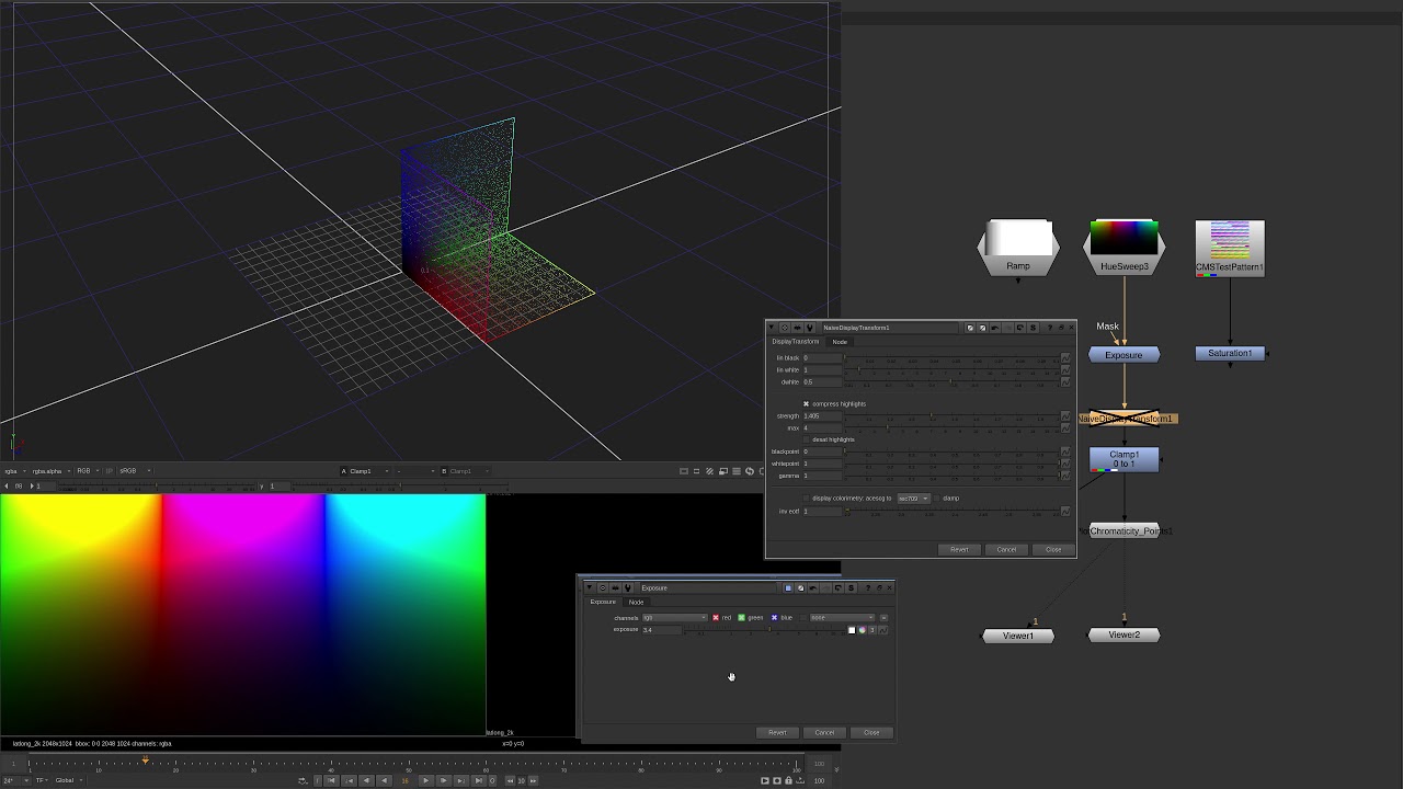
On the subject of display gamut volume, I recorded a video with some plots and visualizations.

I’m sure these are all well-understood concepts for most of the people here, but for a color science neophyte like myself I found it to be a useful visualization exercise. I’ll put the video here in case it helps any other curious folks who might be lurking and are interested in better understanding (one of the) problems at hand.

And here is the Nuke script used in the video in case anyone wants to play with it.
20210204_display-referred_gamut-volume_visualize.nk (61.7 KB)

Edit

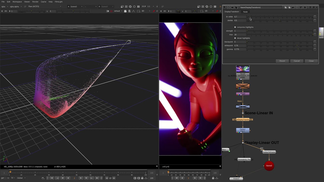
Here’s another quick demo visualizing Christopher’s lightsaber render through the same process. Again there’s no gamut mapping or conversion happening here: it’s just scene-linear rgb in mapping to display-linear rgb out.
6 Likes

Just watched the video. Probably the best demonstration I have ever seen on the topic and a much better explanation than my clumsy post.

Congrats Jed,
Chris

1 Like

Just my personal reactions to some of the renderings (and thank you for the tests; it is much easier to react to visuals):

Red Christmas:
-While the naive transform makes many improvements, there are elements of it that I wonder if they are faithful to the scene. For instance, the highest exposure points on the faces in the naive rendering all move towards white, but by what I can gather there is no white lighting and given their skin tone never approaches highlight range I wouldn’t expect so much desaturation happening.
-Large improvement in how it handles gamut mapping vs. the clearly objectionable gamut clipping/solarization in the ACES rendering.

Blue bar:
-For the neon “coffee” sign I don’t know which one is more accurate, but overall I like the rendering better from ACES; the stronger blue fringe and surround feels more like a saturated neon sign to me, but it of course causes other issues like the solarization of the ceiling above it.
-I actually like the way the piano is rendered in ACES as well. However, it’s almost laughable the amount of detail difference in the staircase on the left between renders, so definitely improvements again in the gamut mapping.
-One peculiar element is the hockey ice on the TV is dimmer in the naive render, but the neon sign and surrounding elements are brighter, so I’m curious why that’s happening. It’s acting like saturated colors are also getting a luminance boost (is the “path to white” also pushing them towards white)?

Blue sphere:
I can’t vouch for the original intent, but the naive transform seems to be an improvement in every way here.

I know Jed had originally built this just to play around and do some testing, but it’s been a great resource to help us evaluate what we like/don’t like and also something to start building around, so thank you for that.

Theoretically you would just have to compensate for this in DI/grading, not unlike you do now. For example in a simple Rec709 workflow if you wanted a red traffic light to be full saturated red at the display, unless it was captured that way in-camera you’d have to boost it in post. Unless you’re willing to clip color values and risk solarization, you have to compress from the source boundaries (AP0 or AP1) down to the display boundaries, right?

1 Like

The display is a hard limit.

At some point in all of the examples, the values simply exceed the display gamut volume or area.

Ask yourself what should happen. It is worth examining the last Jed video with the lightsabers and the accompanying visualization; the values are clipped, and as a result, the tonality ends up collapsed into near identical values.

The aesthetic convention of film was to gamut compress by transitioning to open gate bulb, and this is the inspiration behind the approach.

Every other option will yield rather hideous looking results. See Blue Bar or Red Xmas as exemplary in this regard. The huge swaths of broken blue, or the wrong red. As a reference, here are the equivalent renderings from several different vendors, including in the cases of Arri and Red, the default camera renderings.

Red XMas shot on a Red camera IIRC:

!

Blue Bar shot on an Alexa camera IIRC:


(Extreme warning: it is not at all fair / legitimate to use alternative vendor renderings to other cameras. It’s a rubbish comparison, and is simply included here for the sake of having pairs. Renderings reused from the official ODT document from S. Dyer.)

And again, the default demonstration still missing 2/3rds of the transforms:

In all of the ACES cases, the output at the display is the wrong representation of the light mixture in the working space. The TV screen here is no different, and because the more correct mixture is being represented at an appropriate level at the display, the complimentary ratios aren’t accidentally resulting in values that are closer to the display limit.

That’s why I started this thread on whether we are trying to align to how film reproduced images, or how our eyes see a scene. I am not a color scientist (yet :wink: ) but I’m nearly certain these are not the same goal. More than likely we will end up somewhere in the middle, but right now I have no idea what our target is.

I got mildly intelligent and decided to look at the original R3D file for red Christmas instead of making inferences off the renders. Simply backing off the exposure in Red Cine-X I get this:

which I believe backs up my theory that their faces are simply lit red. I guess I’m trying to wrap my head around how we deal with gamut compression (maybe volumetric compression is more accurate?) vs. a “path to white” and how/when it changes. I think this will depend heavily on our chosen aesthetic target.

I couldn’t find the original camera file for the blue bar, but I was hoping to pixel peep at it and see what the values are for some of those highlight areas just to see what is going on.

This is precisely the point. The simple fact is their faces are lit red, and there is no room left at the display to reveal the emission.

The convention of film was to burn off the dye emulsion and reveal open gate bulb. This follows that convention, albeit not starting at DMax / no exposure. There was no direct perceptual calculation happening etc; the result was fundamentally in the energy conversion domain of radiometric to chemical.

It’s as simple as looking at the lightsaber image to appreciate the rather basic question of “What is an acceptable option when a value cannot be represented at the display?”

Just keep sliding the exposure up in the Red XMas image until one channel reaches display maximum and presto, there is the problem sitting flatly in front of us.

A few options:

  1. Set value at the maximum display. This will result in tonality loss. See Jed’s video.
  2. Transform the intended value to something else. Yellow? Green? Blue? Cyan? What is a sane and reasonable choice here to provide tonality differences?
  3. Use some alternative approach to warp all the values down such that the most emissive value lives at domain maximum, and everything else is compressed. This also isn’t feasible across motion pictures because it would akin to some variant of “auto exposure”.

In the case of an RGB gamut, it is three dimensional. The area is one attribute of a gamut. The volume is another.

It’s gamut all the way down.

I’m not good at color math (actually any math), I’m just a freelance colorist. So you probably shouldn’t take my opinion into account.

Personally, I think hue preserving gamut mapping looks a little bit unfamiliar compared to what we used to see in films. So I would have to fix it somehow every time. I prefer yellowish transition from red to white. And talking about out of gamut blue - I think, the best if it become cyanish before it goes to a pure white.

This will probably make SDR and HDR to look different. But I don’t think this is a problem at all if the differences in SDR would be in a way we all are used to. For example 24 fps is far from what our eyes see, but we are used to this effect and still prefer 24 fps instead of 60 fps for movies most of the time.

Audience will never compare HDR to SDR at the same time. But probably notice that something wrong with the explosion color or with color of this lamp.

naive_drt_crop

But I’m probably talking not about what your experiments are about. I’m sorry if I say something completely irrelevant.

And thank you for the video demonstrations! They are awesome and help to understand what actually gamut mapping is.

1 Like

That’s just a digital RGB accidental look. All digital RGB skews to the compliments of the working space; cyan, yellow, and magenta. Skins skew to a nasty yellow, skies to a nasty cyan, etc.

It’s a good tell-tale sign of broken colour handling.

Awesome replies ! Thanks guys !

What ? :wink: We need more people like you in the VWG ! Every opinion counts and I feel like there are not enough image makers currently in this group.

That’s a completely valid opinion. What if clients want/like skew ? Personally I would rather have it engineered in a LMT than relying on a happy accident. This would also allow for a diversity of hue skews rather than everybody relying on the same skew all the time. Does this sound reasonable to you ?

Totally ! They are lit red but what should happen when you hit the display limit : 100% red emission ? Here are two sweeps to show you the differences between ACES and the DRT.

Values collapsing at display and skewing towards yellow (one of the notorious 6) :

Values elegantly going to white thanks to gamut compression/mapping :

Finally here is another sweep with different bias values to show the difference :
0, 0.1, 0.2, 0.3, 0.4, 0.5, 0.6. There is not only one white to path, right ?

Not bad for a DRT that is “only” 1/3 complete. :wink:

Chris

Thank you!

Wouldn’t this mean we need individual LMT for each ODT?
I think it’s ok to have a pack of different LMT for each ODT, but who will create them? And how? Is there any simple way to emulate this without artifacts? I mean, if this would be a part of ODT, a lot of people and time would be envolved. And if it would be about 25 LMT for each ODT made as unofficial LMT, it probably won’t get the same amount of human resources to make it artifact free.

I think, to make everything more clear for people like me, who are just users of color modification software, probably a good way is to make some stills with skin, neon lights, nature, fire in different display transforms including k1s1 lut, new alexa lut, ipp2, resolve DaVinci mapping algorithm, current ACES Rec709 ODT and hue preserving mapping.
I think this would let more people to understand what is going on and to feel they can say something about it, if the community needs more opinions from end users, not developers. Because now I’m just scared to say what I think, because you all speak at so high skills level (and I like it), so anything I could say would definitely be too obvious for anybody here. I feel like I’m saying spaceship developers if they understand that it should be airtight. Of course they know it without my so ‘important’ opinion.

Not necessarily. I liked Daniele’s idea of having some LMT designed by the VWG and based on different needs. For example an animation festure film does not necessarily need the same look as a feature film. So, on top of my head we could have basic LMTs like : film emulsion, saturation boost, contrast boost, previous ACES look…etc So not 25 LMTs for each ODT. But a set of LMTs for the whole system.

We could update this page with the naive DRT. That’s a good idea.

Don’t be ! Seriously this community is great at embracing people and making them feel welcome ! Nobody will be annoyed because a freelance colourist gave his opinion. On the contrary ! As Thomas said last time : the more, the merrier. And what is obvious to you may not be obvious to others. Sometimes (and I am not saying this is the case here) developers can loose track of the goal. This is why it is important to also have end-users as part of this group. In the end, we are the ones who will be using the system !

Chris

5 Likes

Many developers are dogfooding here so we are all good! :slight_smile:

There seems to be an inherent view that we are reproducing a “film type” image; that we are more or less trying to mimic the chemical response of the photographic film process (albeit selectively). I am challenging that assumption as a matter of discussion (philosophically as well as considering the variety of mediums/use cases that are embracing ACES outside motion picture production). I hope others will join me in that discussion.

My question of how to deal with colors outside a display’s gamut are related more around this question of intention. I know we need to remap them into a smaller gamut (coming from AP0 or AP1 to say Rec709/sRGB) which necessitates information loss in some form or other. Moving a high luminance, saturated color towards white is certainly one approach (and is maybe the best one), but it is not the only option.

1 Like

May be some interesting moment (or may be not): look at the yellow overexposed region on the first image of both scales. First scale (ACES) with increasing exposure distributes such color skew on other “overexposed” parts of image. So, from this point of view - ACES transform is more consistent according to initial image :slight_smile:

What is “overexposed”? Accident.

What is “overexposed”? Accident.

Yellow skin is more consistent with a random and arbitrary point where colours skew based on some idea of “overexposed”.

It’s all rubbish. Complete. Utter. Rubbish.