My point exactly. It is not relevant. We are dealing with fully formed image buffers so the term specular highlights is not applicable to our context. As I said, the term is strictly relevant to computer graphics and not to image forming in general.
Please stop saying “specular” when you mean high brightness. You are triggering my OCD. As for a specific answer, I don’t have any aside this thought experiment :
Take a picture with the sun in it (in log so you have a wide range of brightness available).
Render your picture through a DRT and assume that the sun will come out at a certain high nits level.
Is the sun emissive? Most certainly. Is the sun specular? Absolutely not.
Now, bring down the exposure on your image 2 or 3 stops in order to have the sun come out below 100 nits on display.
Is the sun still emissive? A reasonable person would say yes.
TLDR: diffuseness, specularness and emissiveness cannot be part of a display transform model.
As JM points is out, there isn’t and it is a vision inference. I however think it is fine to call a specular highlight as so when it fits the definition and helps pointing out at an area in the image. With that in mind you can train a ML model to find them for you, whether it is useful or not is kind of another topic.
Sorry but I don’t understand what you are saying here.
I don’t believe this is the case, especially given some psychophysical effects which are essentially the inverse of this. So it strikes me as an aesthetic convention that arises out of a medium, perhaps?
Feels like there might be something worth interrogating about “brightness”?
It wasn’t me! Hence my scare quotes!
Aren’t there some mediums that work along this mechanic?
Didn’t @jedsmith’s have a demo where he completely isolated the perceptual flourish from the chromaticity linear compression?
An aesthetic convention that arises out of the medium of photography, rather than human vision? Yes, that sounds right. I think that’s where the “blown out” lights aesthetic is mostly derived from.
At the same time, I think there is also an aspect of human vision where the more saturated something is, the darker it appears. The inverse is also true. Brighter means less saturated.
I’d think that Helmholtz Kohlrausch / Evans G0 brilliance and the Hunt effect might suggest this isn’t quite the simplest “straight line” here.
To try and find a fundamental “why it worked”, we’d need to figure out what the connection is between the gradual degradation / removal of the film dyes (DMax to DMin in terms of printed creative film) to pure plastic, and why it more or less “worked”?
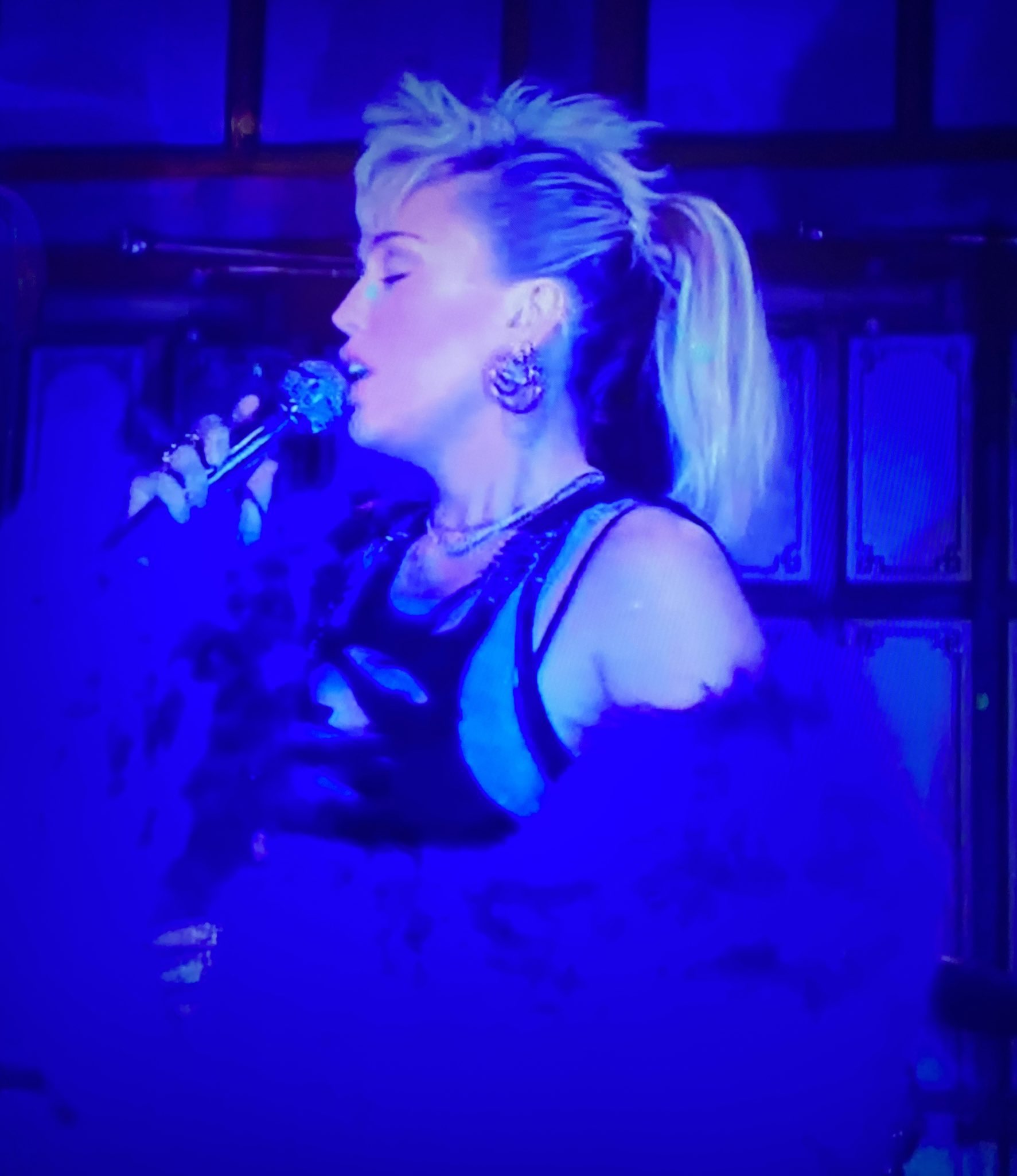
This image of Miley came into my stream the other day. Seemed relevant.
I think Helmholtz Kohlrausch is referring to images on a screen (i.e. images made from projecting light), isn’t it? Rather than to how we see physical objects in nature outside reflecting the light waves back at us as color like @daniele was describing. Similarly, Evens G0 Brilliance speaks of “florescence where color takes on an almost surreal character.” Key word here for me is surreal.
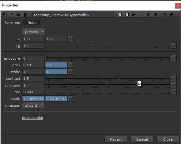
I’m really liking the controls in the hyperbolic “presets”
I’m finding quite easy to get the desired tonemap toe and shoulder. Much easier than other tonemappers I’ve used in the past. I’m curious how you envisioned these sliders would translate into something like OCIO? Would be awesome if there was a way to tweak these sliders in Nuke, and then click a button to save the results as a CTF file. Is that something being considered?
I’m not 100% sure on this one.
I feel like I’ve experienced plenty of real world situations where bright scenes can feel ‘desaturated’ when you’re transitioning from being adapted to a darker environment. “Walking out of a matinee movie session” or “Leaving a nightclub after the sun has come up”.
I’m fairly sure these effects are real, and not just me retconning historic photographic convention onto my memories. (At least I hope not…)
Once my eye has adapted, I agree that more absolute luminance will make the scene seem more saturated, but in that transition period where the world is ‘blown out’ before your iris can stop itself down, I feel like ‘desaturation’ is a pretty accurate description of the sensation.
The former indeed, i.e. colour appearance phenomena. If you need to model and thus control Hunt Effect for example, the DRT, assuming it is the block that handles appearance modelling has no choice but to change the chromaticities/tristimulus values to preserve appearance between different viewing conditions.
I’d like to put out there for consideration that the questions of how we see, and how film works has the purpose of arriving at the how of implementation.
It does not necessarily impact the what is desired of the artist and image maker. That is, an artist wants the look they want and does not necessarily care whether it is realistic or faithful the medium. Artistically therefore a key goal is to provide tools that empower the artist to achieve their creative vision, and do not impose a certain look.
If we can agree that at least a good many image makers do want to have brights lose saturation and go to white. Then the tools should not prevent them from that artistic goal.
How to do this is another question. That is, are there a list of choices to choose from? Or are there controls to “dial in” the desired amount of “coloryness”? (As well as the desired amount of “crunchiness” i.e. shoulder and toe). I’d personally learn towards giving artists more interactive control.
The challenge I think is having those “dials” be ones that artists can work with. That means exposing the right parameters (and not exposing others), and also naming those controls in ways that make sense to non-scientists. Call it “metalness” not “conductor” or “highlight size” not “coefficient” and so on.
I have a hunch that there may not need to be an either/or approach to the “going to white” vs “chroma preserving” debate, but instead a both/and approach possible.
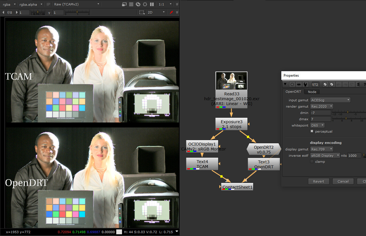
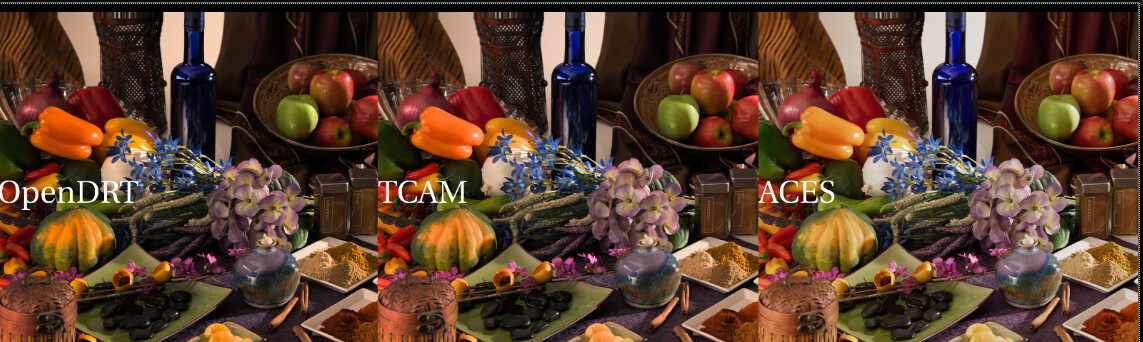
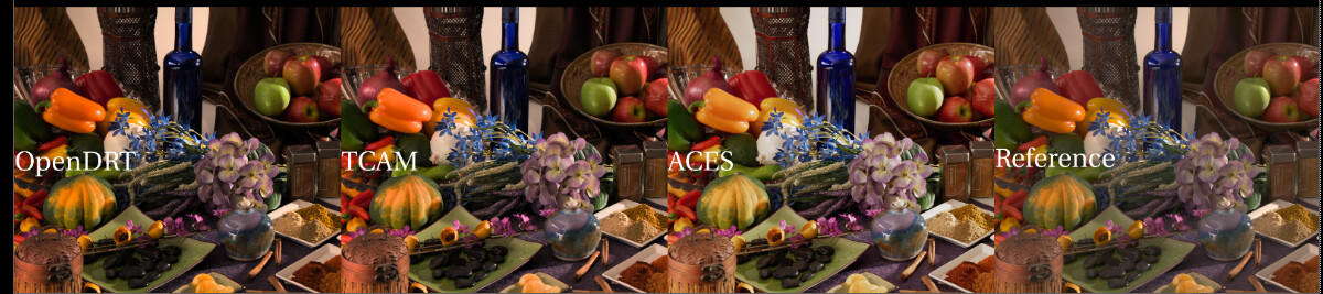
For example here’s a side-by-side of an ARRI image with TCAMv2 on top and OpenDRT below. Working space in Nuke is ACEScg. Image is exposed 2.1 stops.
Both TCAM and OpenDRT are chroma-preserving. But notice how the OpenDRT is staying a lot more saturated on the woman’s face in comparison to TCAM.
So the question for me is, could the OpenDRT be made to act more like the TCAM, where it loses saturation with increased brightness?
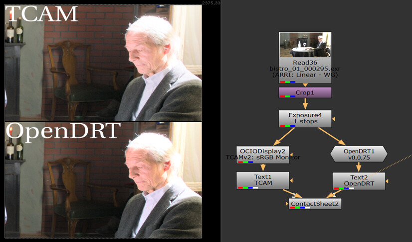
Here’s another example side-by-side. Again the man’s face is keeping saturation on the bottom image, looking almost as if the colors are clipping (they are not, but the saturated colors make it appear to, at least to my eyes).
Again, apologies if I am doing something wrong here in these tests. My eyes are better than my mouth, so I feel that I can see things, but it’s challenging for me to identify and articulate precisely what I am seeing. So I appreciate your patience with me as a stumble towards a analysis, and am putting these images up here in the hopes that others will be able to analyze and articulate what’s going on better than I.
Red Shift
I’m also noting a shift in red in both TCAM and OpenDRT compared to ACES. I’ve done a quick gamma adjustment on this image to better illustrate the color differences.
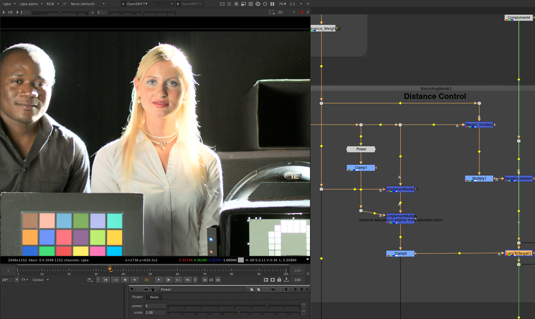
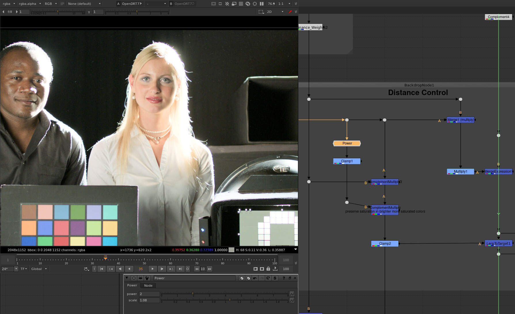
There is chroma compression as luminance approaches display maximum in OpenDRT v0.0.75. The control for how much is not exposed, but if you go inside the group (Ctrl+Enter with the node selected), you can play with it if you like. If you adjust the Power node it affects how strong the chroma compression is.
The implied question here is “What is the reference?”
I don’t believe that using the ACES rendering as a reference makes sense in this case, because it introduces a significant “look”. A better reference might be a “pure” mapping of linear light to display light using a 3x3 matrix from camera gamut to display gamut, and a pure inverse EOTF.
Where the chroma does not clip because it is out of the display gamut volume, and where the luminance does not clip because it is outside (above) the display gamut volume (see this demo and these demos I did a while back if this doesn’t make sense), you will have a “correct” representation of the intended color without any “look”, based on the assumption that the upstream color processing performed by the camera color science is correct etc etc. If you do the experiment you will likely find that the color appearance is not as you had imagined.
I am not saying here that a look is not a good thing. Quite the opposite, I think it’s critical. But all of what I am doing hinges on getting the chromaticities to the display correctly, and then building a look on top of that.
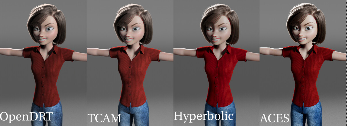
@jedsmith Yes, thanks so much for this! I can see that it is actually the T-Cam and OpenDRT that are faithful to the original, and the “red shift” is actually something going on in the ACES and Hyperbolic.
That make sense to me since T-CAM and OpenDRT are chromatic-preserving. So they are faithfully returning the colors. With that in mind here’s another image comparison using the digital emily 2 texture map. This is an EXR in sRGB primaries.
For OpenDRT and T-CAM it is darkening it a bit (arguably a desirable behavior with diffuse textures) but is faithfully preserving the colors. For both ACES and Hyperbolic however it is shifting to green (the “ghoulish skin tones” that others have mentioned).
I’ve noticed that sRGB primary textures viewed through ACES would change colors, fighting with my artistic intent. I’ve been playing around with T-CAM and am happy to report that that does not happen. (Btw, I unfortunately can’t do the same with OpenDRT since there is not an OCIO config for it and I therefore cannot see it in Maya, and only after the fact in Nuke.) I cannot stress enough how important that is for an artist. It makes artistic intent possible. If I’m understanding things correctly and this faithful reproducing of colors is because of chromatic-preserving then I’m gonna say that this is really a must-have feature for a DRT.
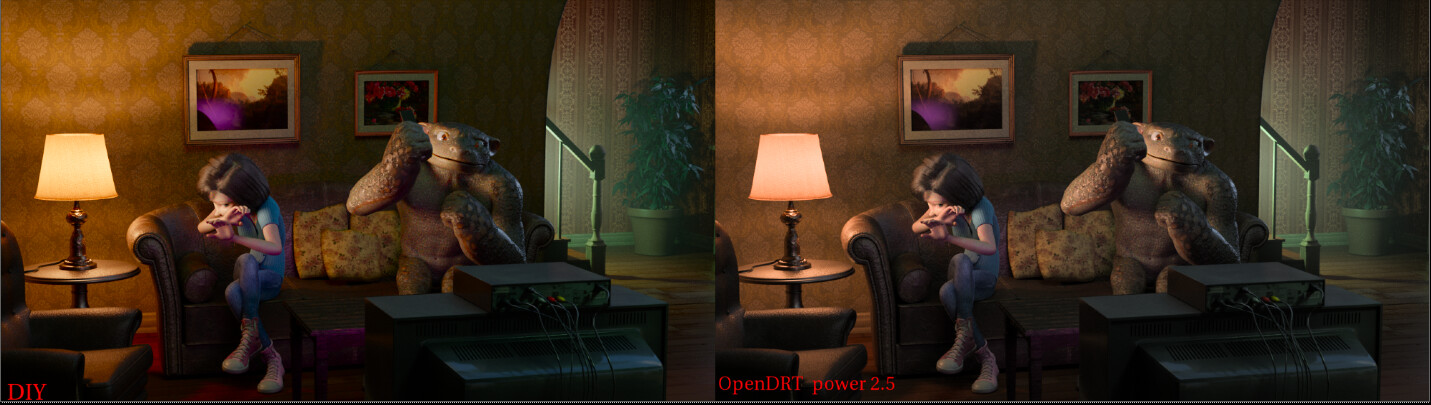
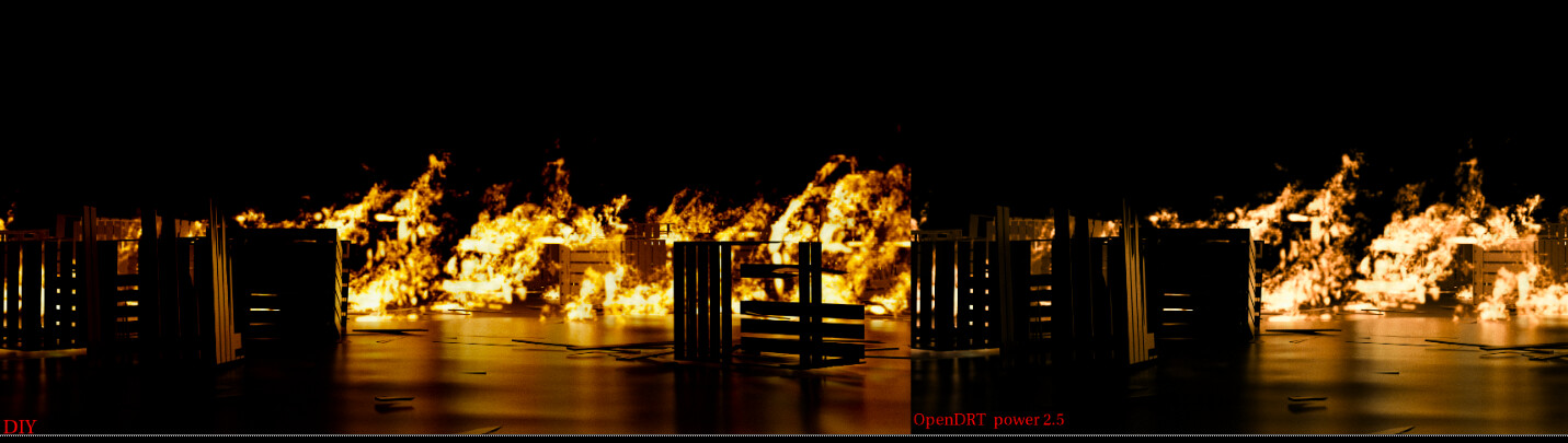
Here’s a side by side of OpenDRT and the DIY Per-channel. The lamp shade should be a warm sunshine yellow. Render is ACEScg. It looks perfect in the DIY Per-channel (i.e. it is the color I intended as I made the render), but note the “tangerine” shift in the OpenDRT.
This appears to only happen on luminous things (fire, lampshade) as opposed to yellow objects. Is there anything that I can tweak on the OpenDRT to adjust for this?
As I mentioned before, OpenDRT doesn’t come with a look and as such isn’t really intended to “look good” out of the box without a look transform upstream. I know it’s hard to imagine what that might be without a prototype example.
This hints at interesting point I think: When you create an image you’re looking at it through some display transform. That affects the decisions you take. Whether it’s lighting on set or lighting in a CG render or even lookdev for tweaking specular response in a shader. Taking an image you created under one display transform and comparing it to another may not be comparing apples to apples in this case.
I’d be curious how easily you could get to the look you want starting from scratch under OpenDRT.
I’d love to try. Would it be possible to get an OCIO color space of the display transform so I could view it in Maya? I could then test it on the lampshade from scratch as well as some OpenVDB pyro assets.
I’d also be keen to try the same with the latest hyperbolic/sirugusano DRT in Maya (which I believe are both included in the DIY PerChannel Nuke file). For that one I’d like to test lookdev specular and sss for skin from scratch.
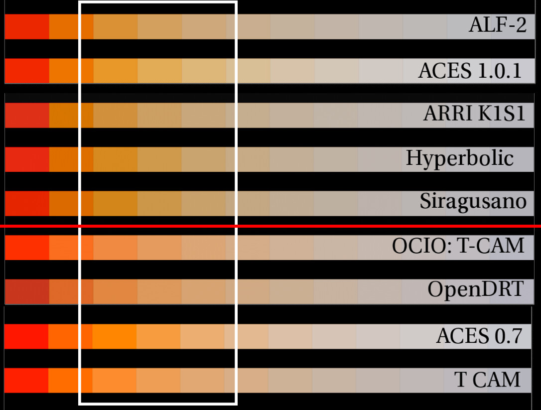
Here’s a test comparing kelvin temperatures in ACEScg primaries from 1k to 6k. The white box indicates the transition into yellow. The ones under the red line seem to never really go to yellow, and instead stay orange.