We most certainly want to add appearance mapping somewhere inside or around those points.
Cool! Can you type up a verbose description of what is should be called, where it should go and what exactly it might do, with references?
![]()
You started to put some with the surround compensation and we have all that defined here by @ChrisBrejon via myself: About issues and terminology - #5 by ChrisBrejon
But we need to decide what we want to model and where we put it.
Here is another relevant reference @jedsmith: HPA Tech Retreat 2018: Parametric Appearance Compensation
1 Like
Thanks @jedsmith that’s extremely helpful!
Based on your post I’ve chained together the following nodes:
- gamut compress
- tonemap (Piecewise Hyperbolic Presets)
- Gamut convert (ACEScg to Rec709)
- Inverse EOTF (sRGB display)
alongside that I have your OpenDRT (v0.0.75) which, if I understand correctly does all of the above, plus chroma preserving.
here’s a screenshot of both (OpenDRT is the bottom image):
EDIT: I have updated the images to correct an error in my original settings for the OpenDRT.
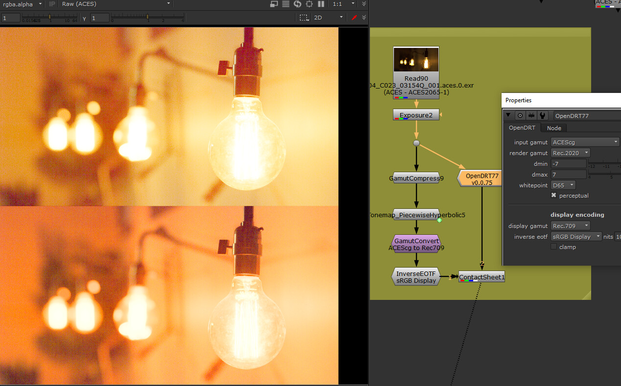
Note how the “warm sunshine yellows” go to what I would describe as a “tangerine orange.” Is this is a necessary consequence of the chroma-preserving nature of the OpenDRT?
Here’s another comparison of the two, first of the Hyperbolic on the left and OpenDRT on the right:
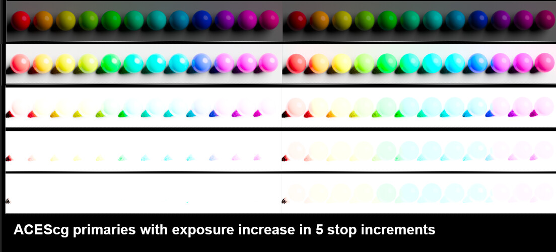
While the Hyperbolic is not maintaining the colors (the 12 colors become 6), what it is doing is all going to white with increased exposure (compare the last row of both images). The OpenDRT is not going to white at 20 stops. In fact it looks the same at 100 stops as it does at 20. So it appears to never go to white. Perhaps that’s an artifact of this being a CG render, and the same would not happen in a photo? I’ll need to do further tests there…
And here is the PPT from that presentation.
1 Like
Why is “going to white” important?
What is a “specular highlight”?
Hey @Derek, thanks for the further testing.
First, it looks like there’s an error in the setups you picture: The input gamut in the OpenDRT node should be ACEScg not ACES. This error is causing the output to be horribly over-saturated. Maybe you want to edit your post and update the images?
This is a valid creative preference. However, I don’t believe the display rendering transform is the correct place to apply creative preference. If the scene looked “tangerine orange” with your eyes, and the scene looks the same when displayed on a monitor, the display rendering is doing its job. My goal is a faithful representation of the chromaticities represented by the input image. It’s not to say that creative adjustments can not happen, they would just not be part of the display transform. I believe this approach would actually allow more creative freedom because it would allow for varying creative preferences without altering the display rendering transform.
Of course the missing piece here is the LMT, which would apply some sort of creative look. I know it’s difficult to imagine without being able to see something working.
Hope that makes sense, and I hope you’ll update those images with the proper gamut conversion. Curious to see what your comparisons look like properly rendered.
3 Likes
Thanks @jedsmith I have updated my post above. Very much appreciate you correcting my error!
Hi @Troy_James_Sobotka
by “going to white with increased exposure” I’m referring to what Alex Fry discusses in his famous ACES talk, beginning around minute 7:
")
I believe you guys are calling that “path to white”?
They are sincere questions. What does it mean to you?
- “Path to white”? What is it?
- “Specular highlights”? What are they?
The reason for these seemingly pedantic questioning is because it forces us collectively to analyze what these things mean.
In terms of light data in an open, radiometric-like domain such as that from a render or a decoded camera massage fest, the terms seem to have extremely slippery definitions.
Giving it a stab:
Highlights desaturation process that recovers clipped colour image channel data to produce a pleasing rendering.
Fraction of the radiant power unscattered and reflected from the surface of an object, at an angle opposite but equal to the angle of incidence.
Does it “recover”?
Seems to have little to do with a light data buffer?
@Troy_James_Sobotka
I appreciate the intent and importance of your question. I’m coming at this from the perspective of an artist, and so if you are looking to have these terms defined in scientific terms (again a totally valid aim), I’m afraid I won’t be much help there. I can say what it means to me as an artist if that would be helpful.
So we do not get stuck on display at full emission R, G or B ? Because it reminds us of films ? Or maybe because it is the only way to respect the RGB ratios (or creative/scene intent) at display ? So they don’t get distorted ?
It is also called “bleaching” or “highlights desaturation” ? It is the path that a certain chromaticity would follow towards the achromatic axis as exposure increases ?
Oh my god, I’m terrible at this ! ![]() I answered your questions by more questions.
I answered your questions by more questions.
Hi @jedsmith
Yes, totally. My intent/desire is similar in that I want as an artist to be able to get the colors I want on my “canvas” and want my tools to help me to do that.
Let me also add that what I am posting should not be taken as a verdict or conclusion at all. Rather I’m hoping that as I share what I’m observing as an artist, you can help me parse and understand that from a scientific perspective in order to get the bottom of what is going on. I find that kind of collaboration really enlightening, and I’m grateful to be able to have that conversation here.
At this point, I feel that I need to dig deeper into the two things I’m seeing. I’ll post tests.
BFa here. These seem like questions that are important, that result in image formation. Less to do with colour science and more to do with aesthetics and mechanics I reckon.
Why? Is there anything wrong with “getting stuck”?
Describing it is interesting. Why did it work?
If we want to be totally pedantic, specular means: having the properties of a mirror. However, in the current context, I would argue that both diffuse white and specular highlights are inappropriate terminology. They are terms which date back to the beginnings of computer graphics and have since stuck around (anyone else still own their copy of the first OpenGL red book?) Loosely defined in today words, diffuse white could mean: whatever display level you would normalize the output of a pure white Lambertian surface in a pure Lambert shader. Following from that, a bad definition for the misunderstanding of specular highlights that everybody seem to have would be: anything above that (which of course doesn’t make sense if you go back to the historic GL lighting model which had an ambient term, a diffuse term, a specular term and an emissive term).
As per my interpretation of recover meaning, yes: RECOVER Definition & Usage Examples | Dictionary.com. If you think as the image being broken when it is clipped, which is what many people think here, then recover is appropriate for me.
But you can surely see them in the image right, and even isolate the strongest of them with a bit of a key and roto.
This is interesting because faithful representation of the scene implies that the chromaticities (tristimulus values effectively) at the display must be different from that of the original scene and thus a chromaticity-preserving display rendering transform is inappropriate for that goal.
In terms of a light data buffer ready to be formed into an image, it would seem there is no way to diagnose diffuse nor specular? Seems not terribly relevant?
Are we recreating the emission at the display then, in full? If not, why not?
In terms of light data, it could be a pure BT.709 blue at 666.666 units? 6666.6666? Where is the technical line for “specular” in terms of light data?
Are these flourishes present in every representation of chromaticities at the display, or are they required under translation / negotiation / something else at work?
Okay, artistic perspective. Art is all about observation. I observe that the brighter something is, the more it goes to white. I also observe that the way color pickers work on a computer out of the box is they give you bright obnoxious saturated colors that I would never pick as a painter (I’m also a BFA). You kinda have to go out of your way to pick a non-obnoxious color that would be found in nature rather than a “neon”… lowering the saturation and value to get to the color. I recall a video posted here by @daniele where he was explaining why in nature colors with full saturation are darker, unlike the color picker (noting here that I realize this is not the Committee to Make a Better Color Picker). That’s a real eye opener, making sense of what I observe. I observe that computer full saturation is un-nature-al. I also observe that pretty much everything goes to white.
Why that is? Don’t know. What’s the best way to achieve that? Don’t know. I see it around me and so I want to reproduce it on my “canvas.”