Hey Nick,
thanks for thinking out loud like that ! I think it is great that people are reacting and asking questions without fear of backfiring. ![]() I am very eager to learn with the group and explore the fascinating facets of this display rendering transform. I agree that my statement can be misleading and I hope I will be able to shine some light on that.
I am very eager to learn with the group and explore the fascinating facets of this display rendering transform. I agree that my statement can be misleading and I hope I will be able to shine some light on that.
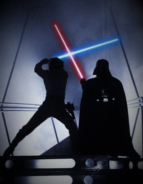
There is maybe a trap that I set myself into which is “what I would expect to see”. For the record, when I was working on this scene, I kept in mind this reference from Star Wars. Where the lightsabers are white and the glow appears colorful/saturated.
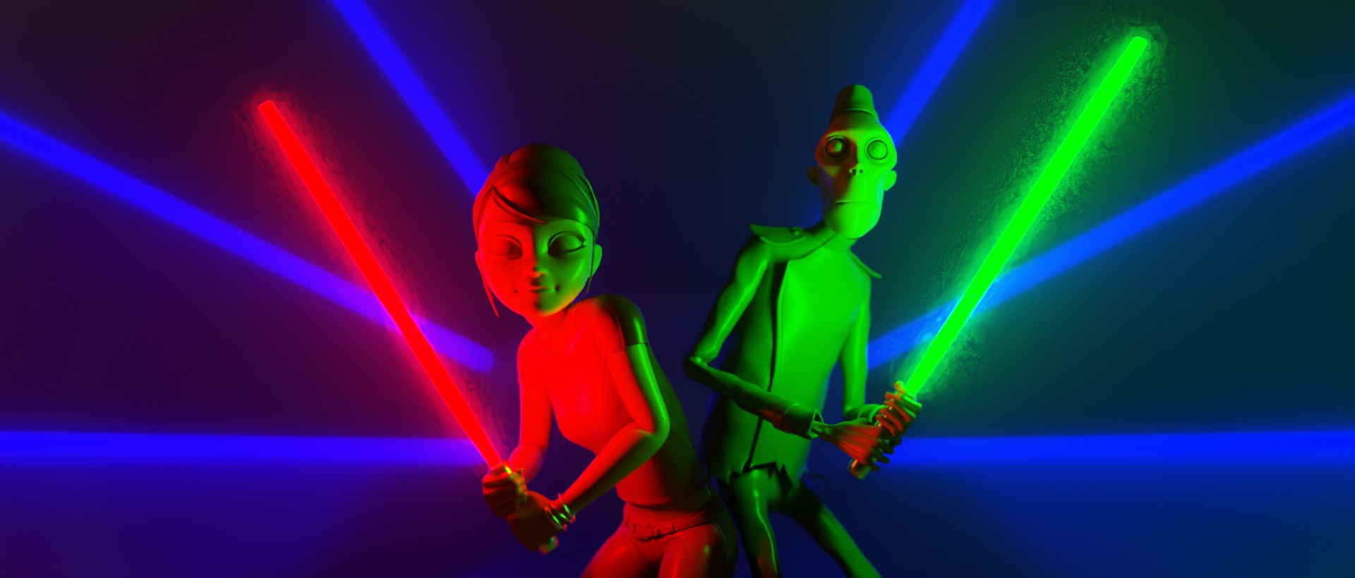
In a sense, lighting with ACEScg primaires do not make much sense. As you stated, they are outside of the spectral locus, aka invisible to the human eye. But I can tell you that lighting this scene with BT.2020 primaries will give the same issue. Here is the same scene where I used BT.2020 primaries for the lights :

So one may think that the issue comes from the primaries themselves and that using BT.709 primaries would be the solution. But by doing that we are only offsetting/bypassing the problem I think.
It is also interesting to notice that this technique (using BT.709 primaries) will make the lights skew : blue gets purple, red gets orange and green gets yellowish. So it may look like that using BT.709 primaries in an ACEScg working space fixes the issue. But that’s not really the case as you can see :

This skew could be part of a look, which is mostly accidental. Some might like it, some might not. But for the sake of the argument, let’s say that as an artist I want control. No happy accident. The fact that complimentary light was used on the path to white lacks control and engineering in my opinion.
For the record, BT.709 primaries expressed in ACEScg are :
- (1, 0, 0) → (0.61312, 0.07020, 0.02062)
- (0, 1, 0) → (0.33951, 0.91636, 0.10958)
- (0, 0, 1) → (0.04737, 0.01345, 0.86980)
Fun fact : if I were to do a render in a sRGB/BT.709 linear rendering space with sRGB/BT.709 primaries for the lasers displayed through an sRGB or BT.1886 eotf (or even the spi-anim OCIO config), I would get the exact same issue !
Here is an example of a sRGB/BT.709 render displayed with the spi-anim config in Film (sRGB) :
Apart from the lightsabers not going to white, the same issues are present here. Fascinating, isn’t it ? It is like we are chasing our tails and I guess this leads to the question : what should happen when the red hits maximum display ?
So maybe the issue here is not whether the laser primaries are outside or not of the spectral locus. I believe the issue we are facing is entirely bound to the display limitations.
A couple of days ago, something along those lines has been said on Rocket Chat that :
In digital RGB there’s just more emission on single R,G,B channels. The channels of a display do not go magically to white. The path to white for overexposure in digital RGB has to be engineered, as opposed to film.
This explanation helped me a lot with what we are trying to achieve. I never thought of that before but it makes so much sense to me.
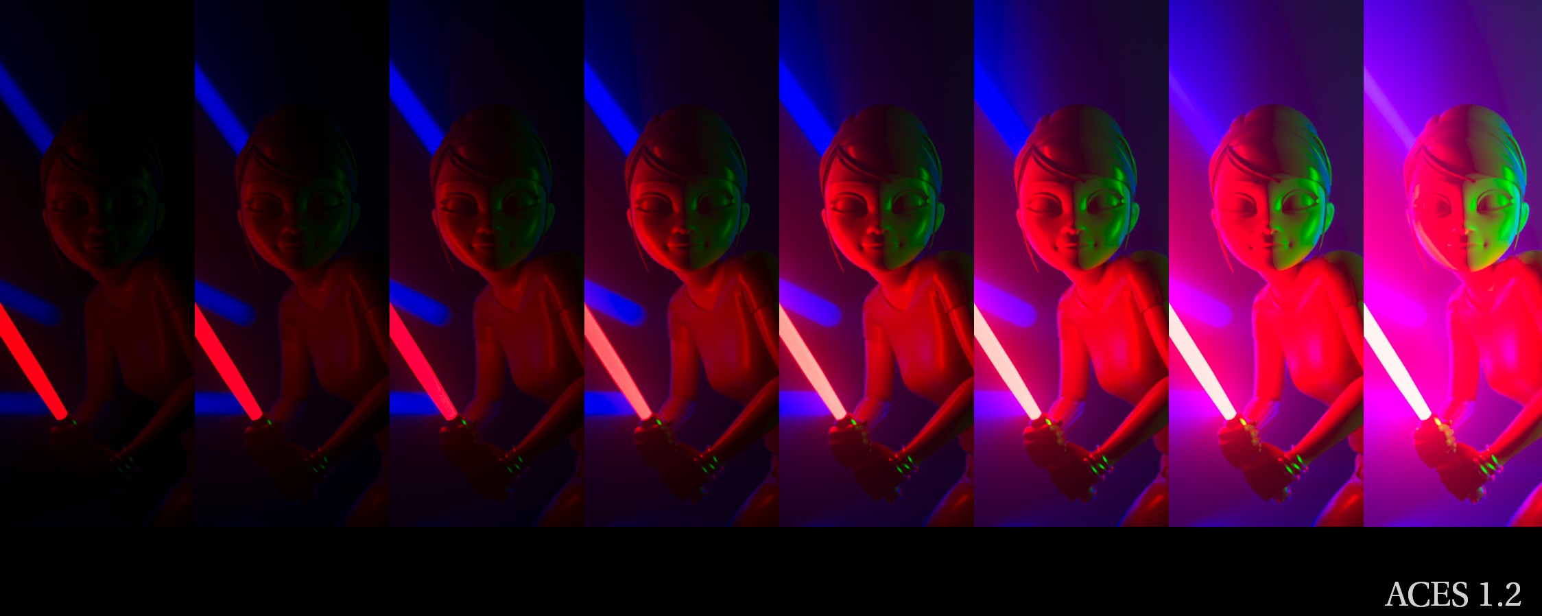
Here is an example with ACES 1.2 to illustrate how the energy is reflected in the medium up to a certain value, and how it falls apart because of display limitations.
I believe all of the issues we are facing here are related to the display volume and its limitations :
- Why does the blue skew to purple ?
- Why do high emission colours skew ?
- Why do we get massive patches of identical colours ?
And I think that what Jed is doing with his DRT is the beginning of a solution : compressing the volume. Because we have display limitations. And how we negotiate these limitations is the trickiest part.
As Lars Borg said yesterday :
You’re going to have a detail loss unless you’re very clever on the gamut mapping […].
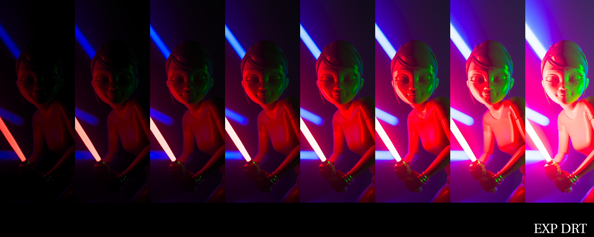
Here is another sweep of exposure with Jed’s DRT to get a clear sense of what’s happening :
And I guess that with this technique there should be a way to get “objective". Because we should be able to say “this is beyond the display’s capability to display this blue”. Either we can display a color on our monitors, or we can’t.
In a way, our conceptual framework is to figure out the range we have at the canvas. We should be focusing on the limitations of the medium so my light colors in the working/rendering space can be displayed as best as they can be :
- If we overcompress we will get posterization/gamut clipping again.
- If we undercompress? We may not maximize the image density coming out of the display.
Exactly like what Lars said in meeting#6 :
The source is unlimited and only when you hit display space, you know what the bounds are.
And also Jed :
It’s tricky, because the path to white only kicks in when one channel hits maximum (a bit before actually), which is tied to the display.
So, here is a potpourri of what I have been trying to understand for the past six months and hopefully it will help to make things a bit clearer. Or not. ![]() But I do believe from the bottom of my heart that we should now focus on getting values to display (broad strokes) and then later talking about sparkling skin and other nice details.
But I do believe from the bottom of my heart that we should now focus on getting values to display (broad strokes) and then later talking about sparkling skin and other nice details.
Regards,
Chris