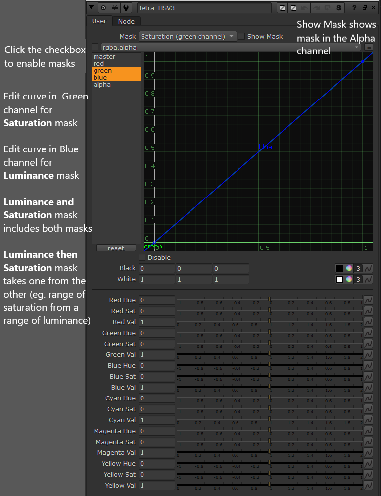
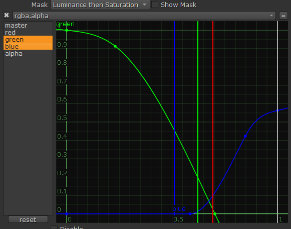
The saturation and luminance masks are actually the S and V from HSV of the input image. I’ve used this in ACEScct so the masks represent in that case saturation and luminance from the ACEScct values. In Luminance mask 0.56 in ACEScct is already above 1.0 in linear so choosing a range that covers highlights is easy. It gets more tedious if you want to cover some specific range in mid tones for example. I haven’t found the “Luminance and Saturation” mask useful but the “Luminance then Saturation” has been convenient. Like being able to choose highlights but only colors that aren’t very saturated. For example:
Anyways, this is how I chose to do it and it was mostly ok for what I wanted to do. At times I was hoping for a “slider” approach to just quickly choose a range/zone…
Good question, yes I should have specified. The working space is linear RGB. So if your working space is some log encoding, you will need to linearize before this node and invert after. Perhaps I should make an “input curve” knob for this one as well. The algorithm for the hue shift is dumb as rocks, just shifting intensity from one channel to another (but even though it’s dumb it’s pretty robust and works pretty well, at least with the images i’ve tested it on). So yeah it will work in whatever tristimulus encoding your input is, theoretically.
When I move red to yellow in highlights to make skintone look I want, saturated red objects become orange before l reach the desired hue shift in skintone.
Here is the example of what I mentioned above. Red patches on saturation chart become orange, when I make the skin tone hue shift I want.
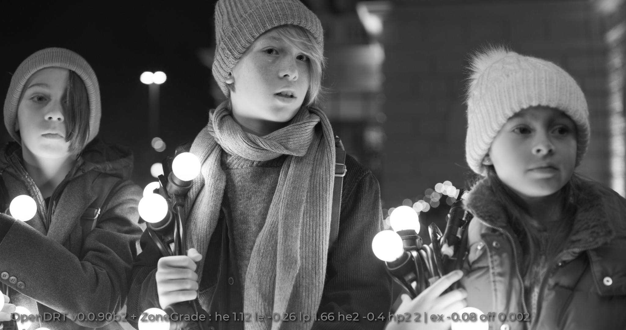
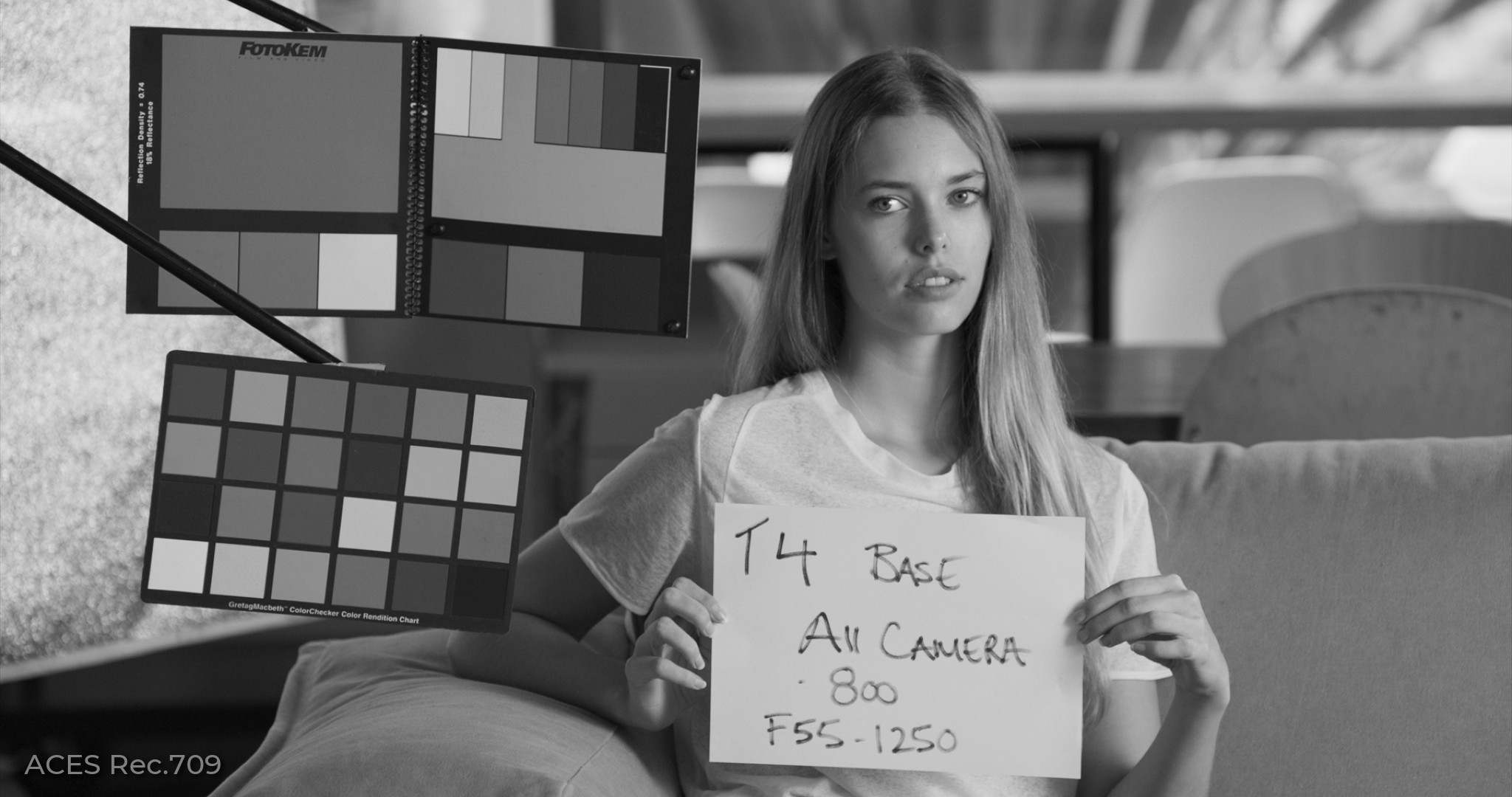
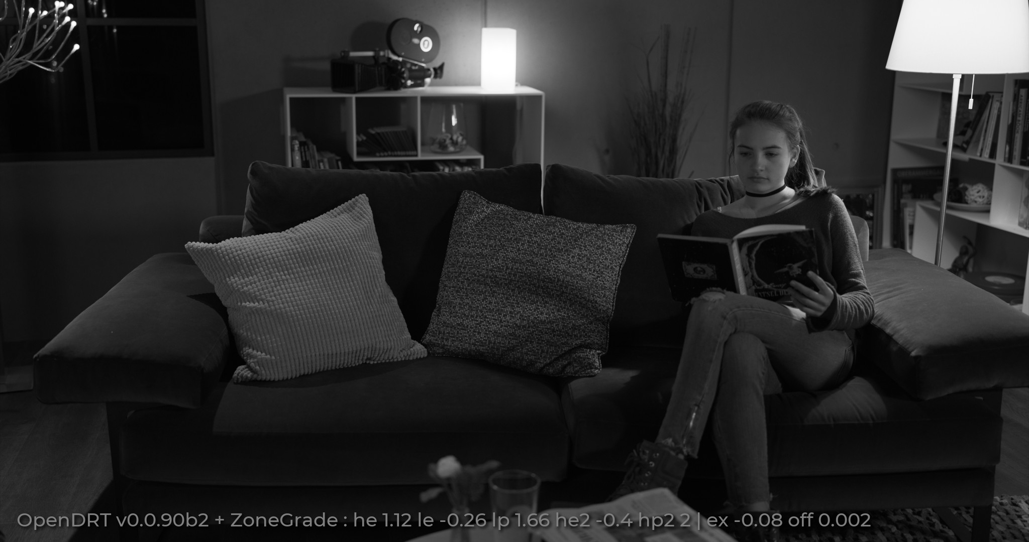
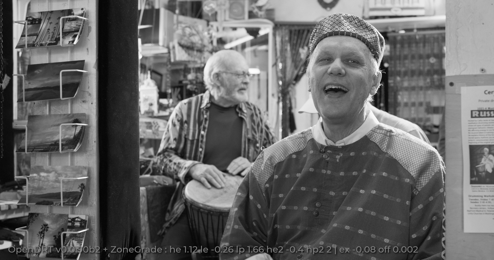
Zoned checkbox is active, zone range slider is 1.15 position and red slider is 0.313.
(By the way, I just noticed that Firefox bakes ICC display calibration result into the uploading images, so I had to change system ICC profile to sRGB, so it could upload the images as is)
Resolve Lum vs Sat curve always uses rec709 luminance weights for saturation (or at least the same as a regular saturation knob). So this kind of desaturation makes colors darker, when it’s applied to a log encoded image. Or it’s not a big deal when we are talking about desaturation of the highlights only?
UPD.
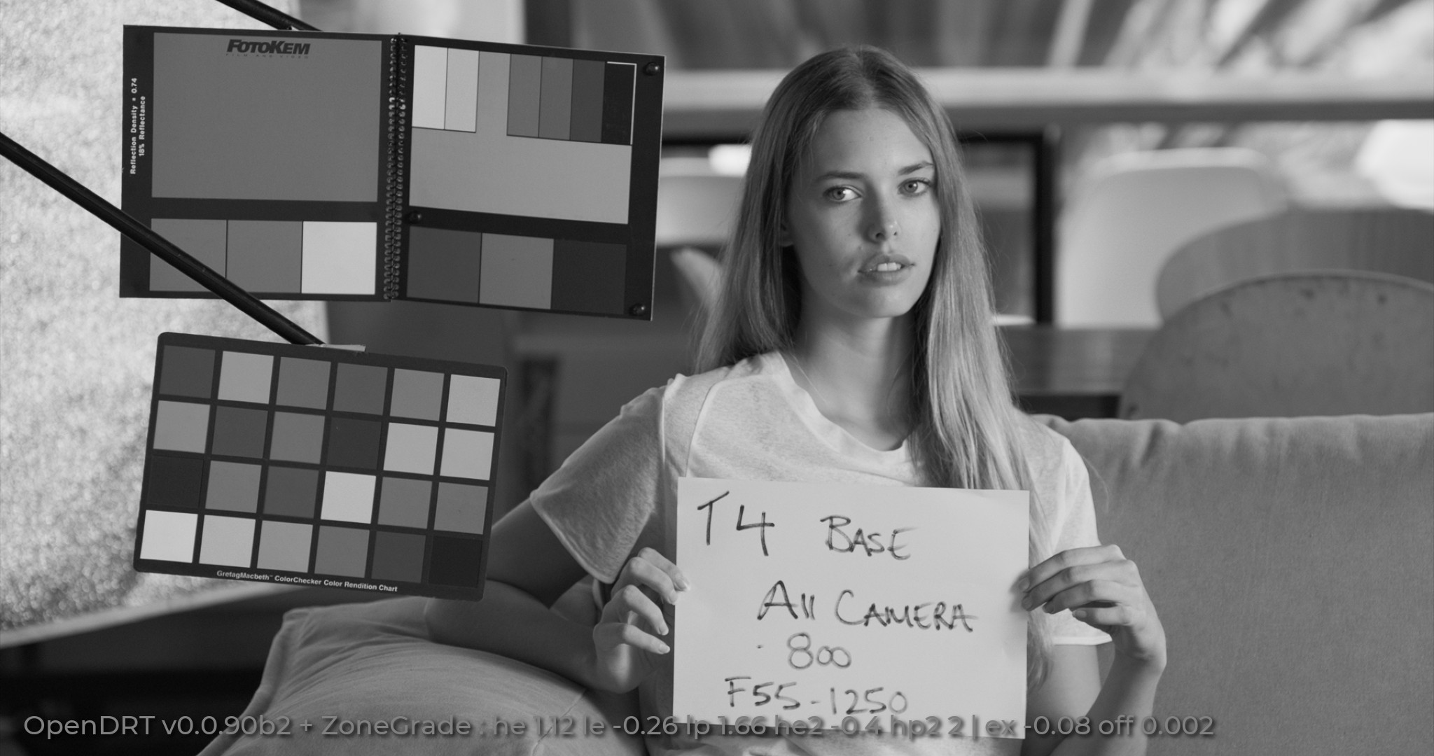
Replaced the second still and changed settings of the DCTL. Now zone range slider is set to select skin tone highlights only, but the red patches are still affected.
One thing I note about the tool like the Tetra_HSV_Masked is that it’s really easy to push colors out of gamut with that. That can be avoided with the masks but it’s something to be aware of. Dunno about the Jed’s tool, I haven’t tested yet.
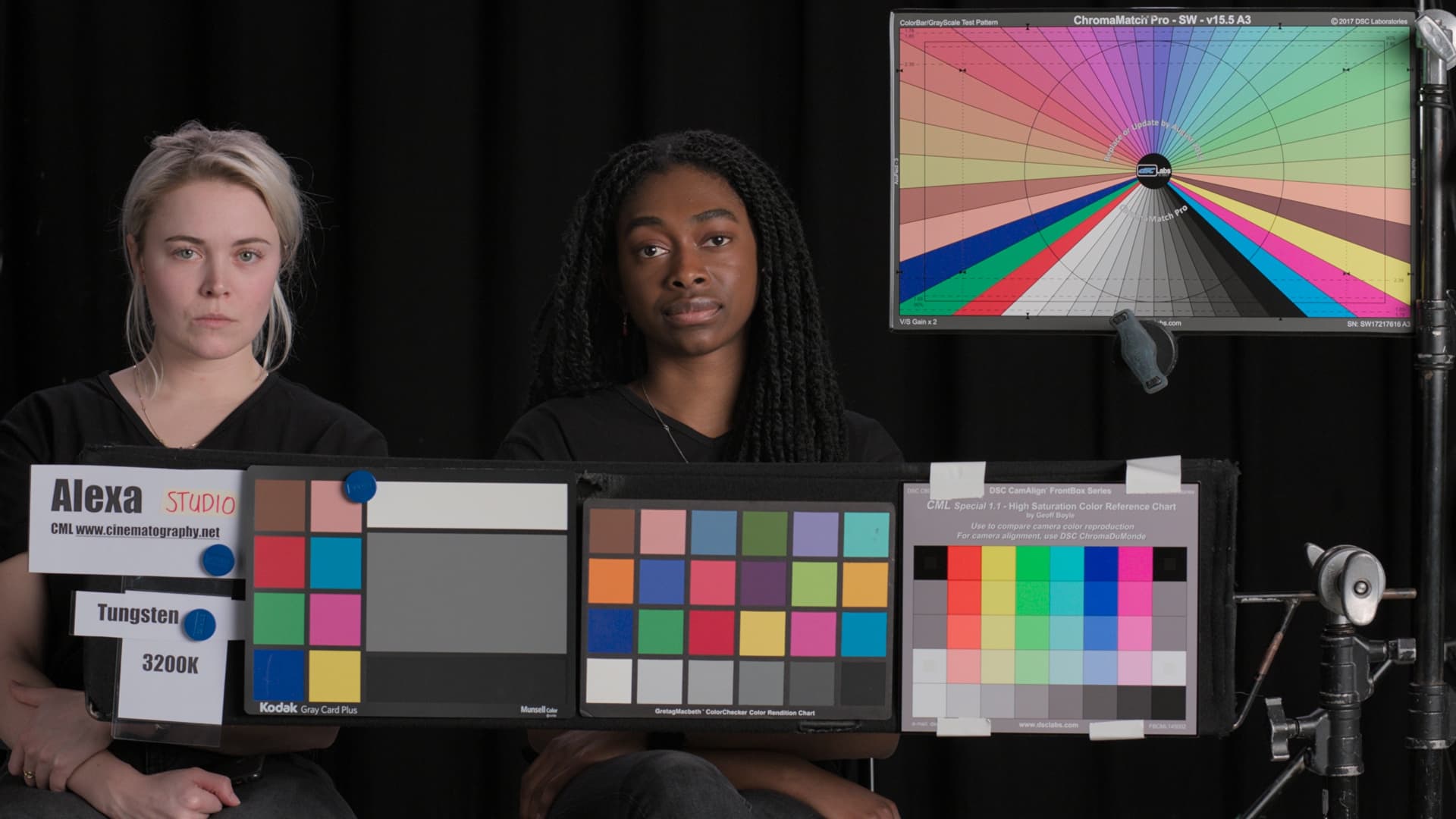
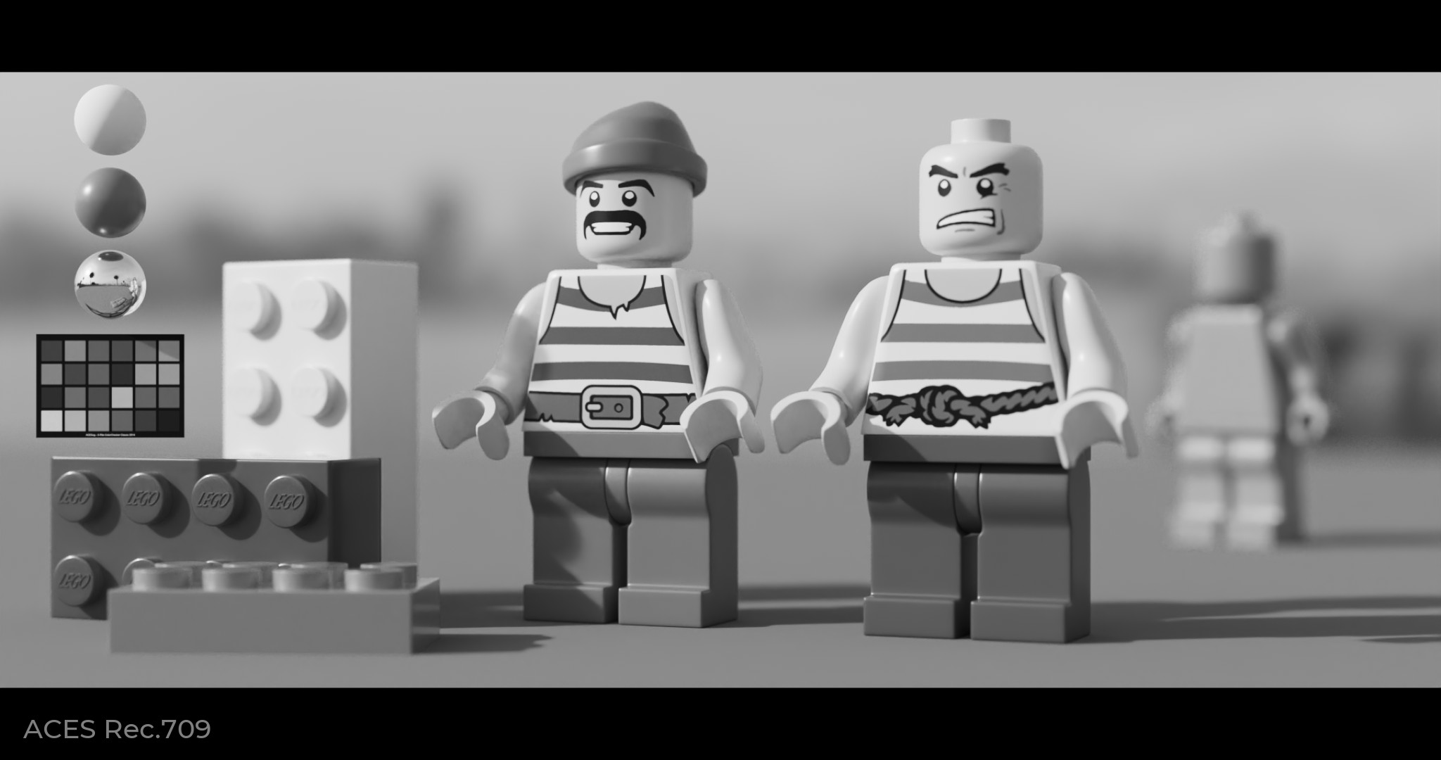
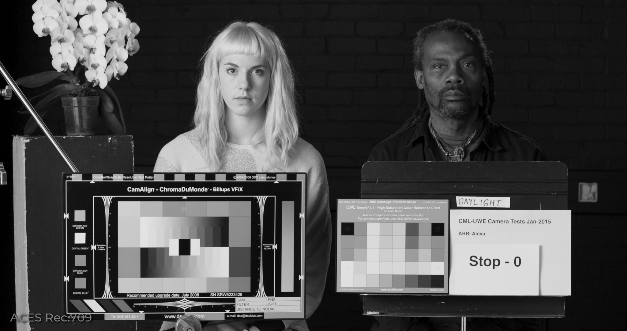
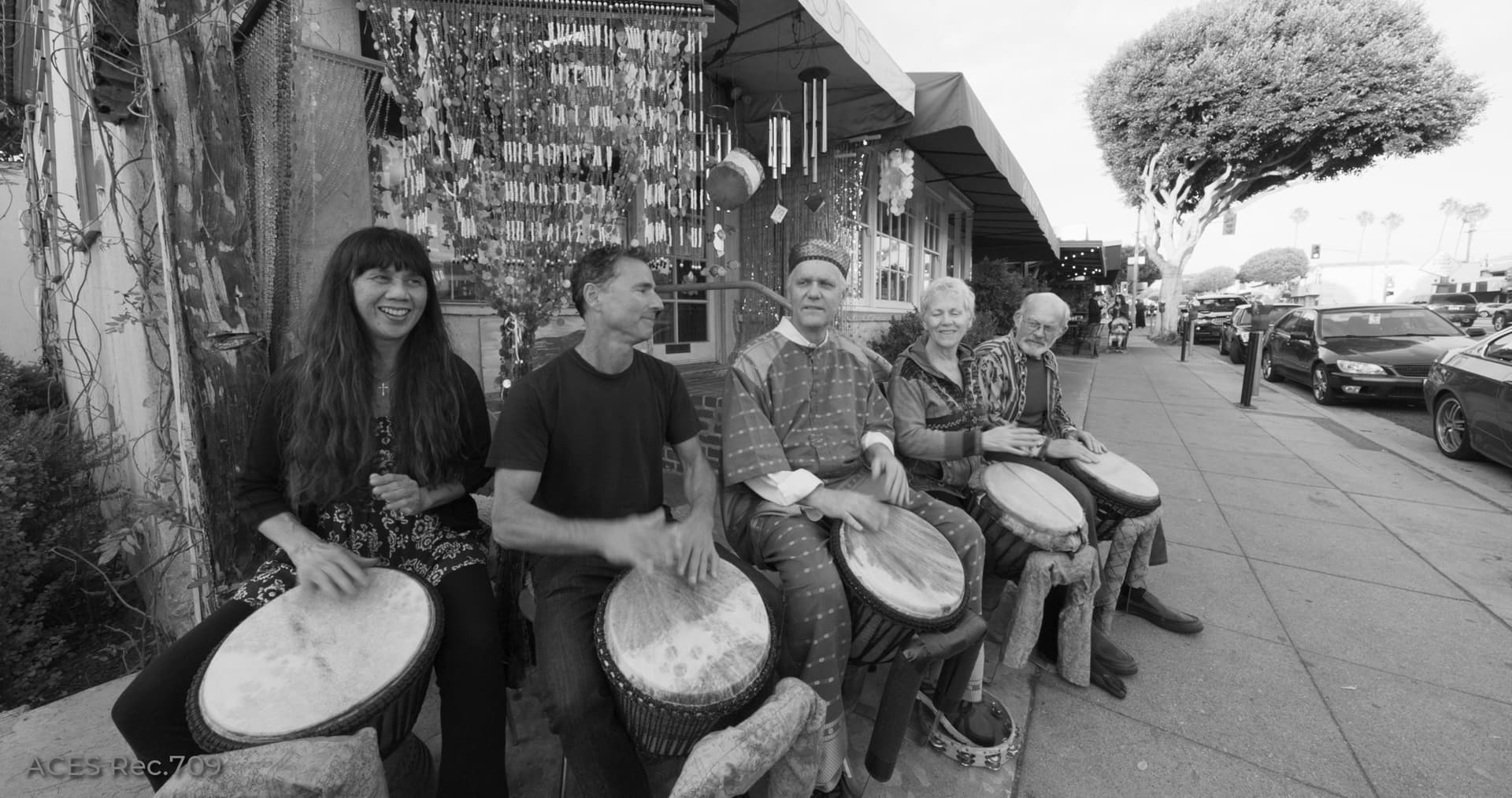
Another thing to note about the chart in that image is that it’s the CML Stress Test Chart which has the most saturated colors on the top row DSC Labs were able to print (that was Geoff Boyle’s request), and they are much more saturated (at least the red) than any other color target, AFAIK. So issues with very saturated surface colors show up in that chart first. The red in the macbeth chart gets more orange too so I assume that’s the change you’re making…
Have you tried with RRT+ODT and see what happens? I’ve noticed that OpenDRT starts to desaturate earlier than I would like, and perhaps doesn’t move towards white as aggressive as I would like, and the color that desaturates “first” is yellow. I think this is in part because of the RGB weighting used, but perhaps also the dechroma “shape” itself. I’m not sure, I don’t feel like I know enough to know what exactly to say. But I seem to find the current dechroma being the culprit for most of the issues I see. I wish there were more options to tweak how the dechroma works…
This is also what I don’t want to get. So I would like to have a way to exclude high saturated colors.
You’re talking about the current ACES 1.2-1.3 display rendering? There already are these hue skews with skin tone, my clients expect from me.
This is also what I think could be tweaked somehow better. I get noticeable transition from very bright colors to the clipped solid white. I guess this is something about preserving saturation in the brightest highlights.
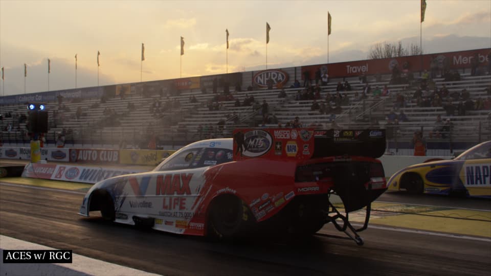
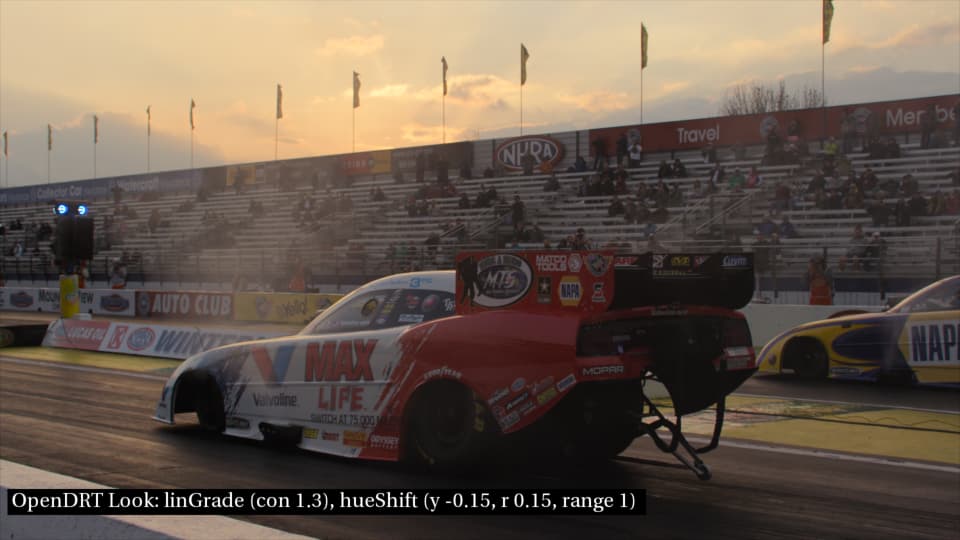
The sky changes but the red on the car is unchanged, which is exactly what I was desiring. Yay! FWIW, to get this to work I changed the zone range from 0 to 1. With it set to the default of zero I was getting hue shifts in the car and other darker parts of the image.
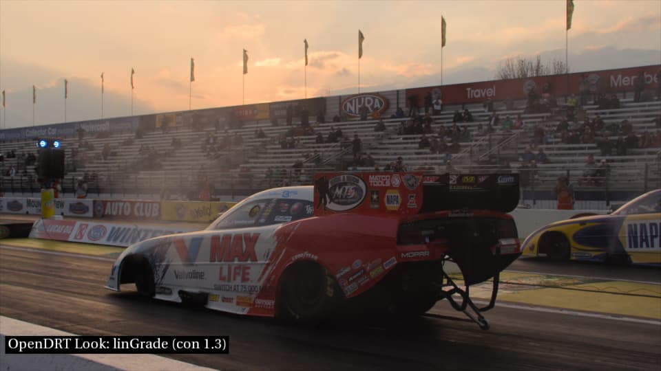
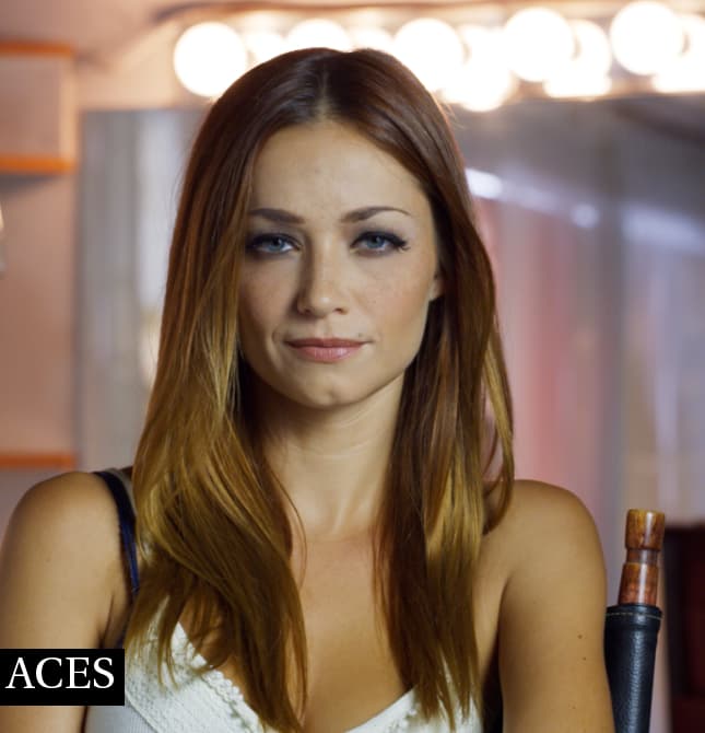
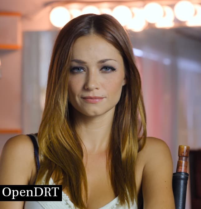
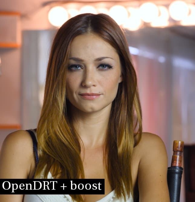
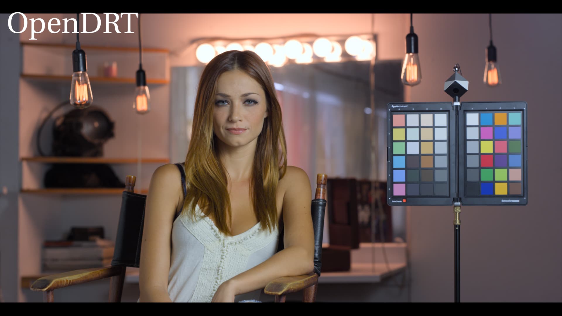
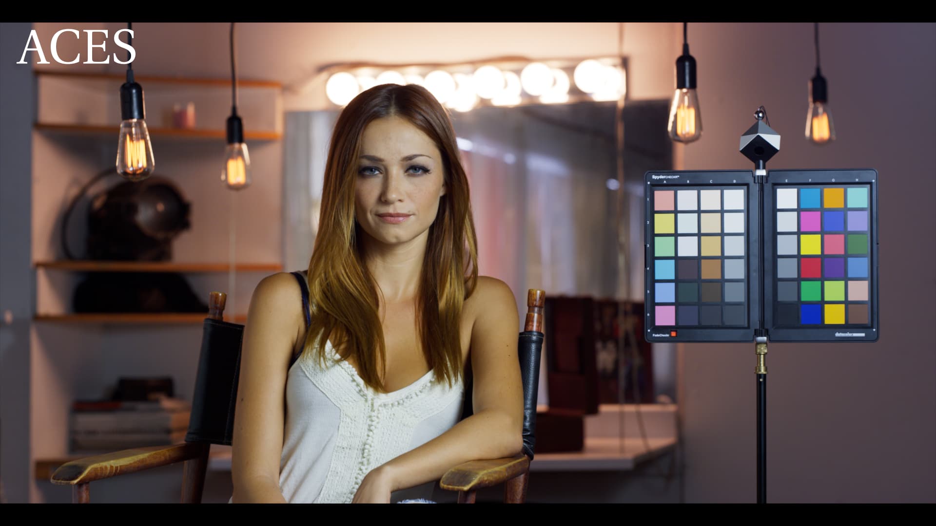
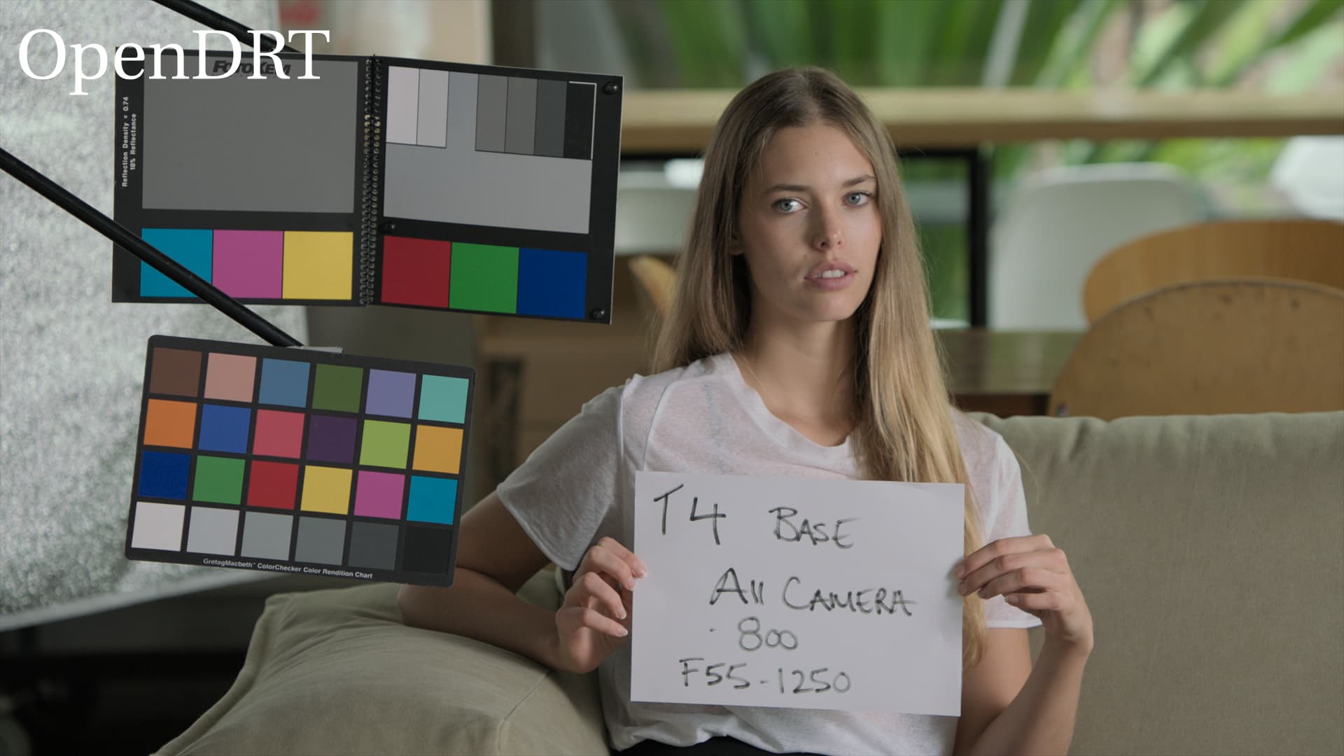
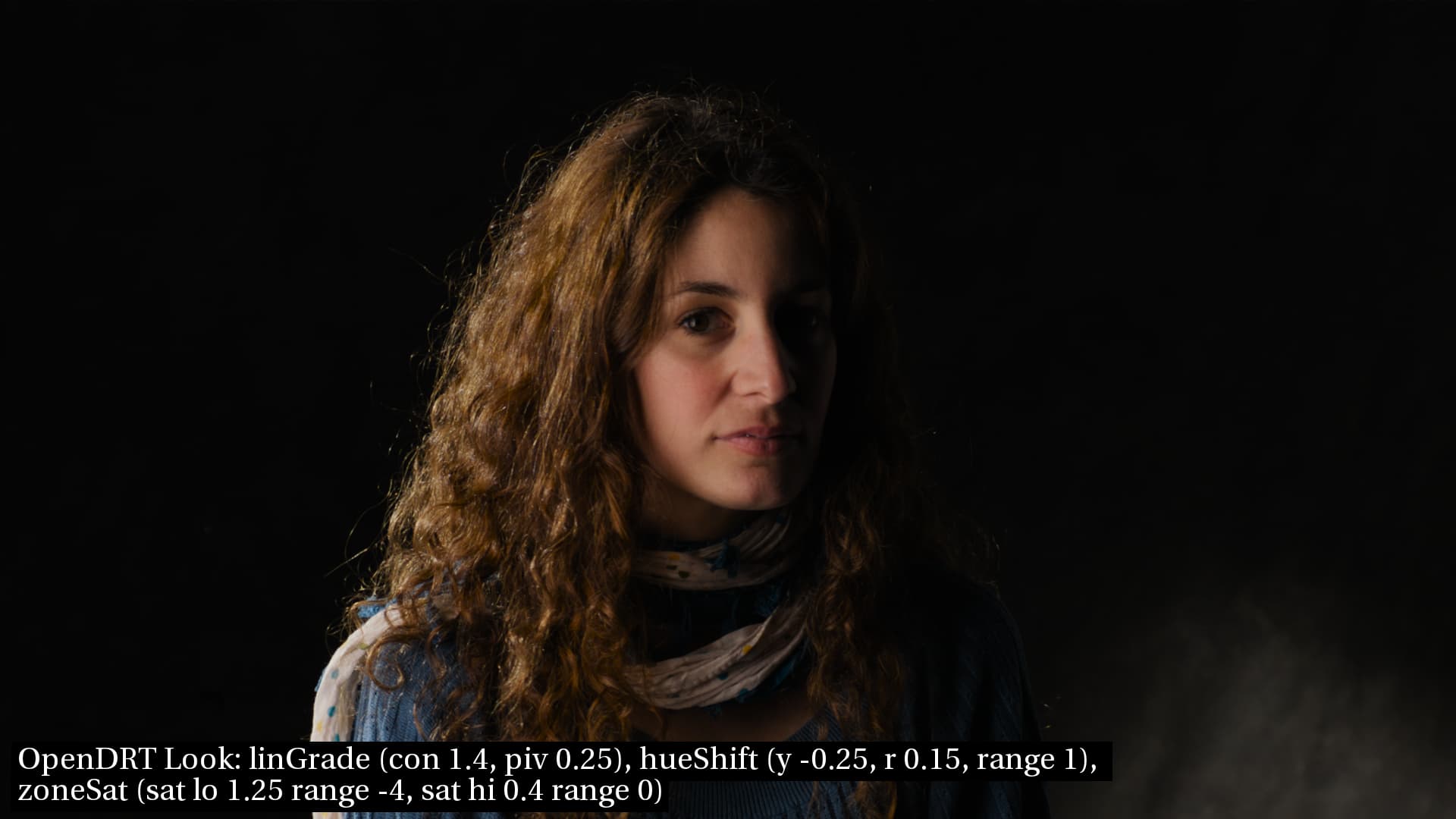
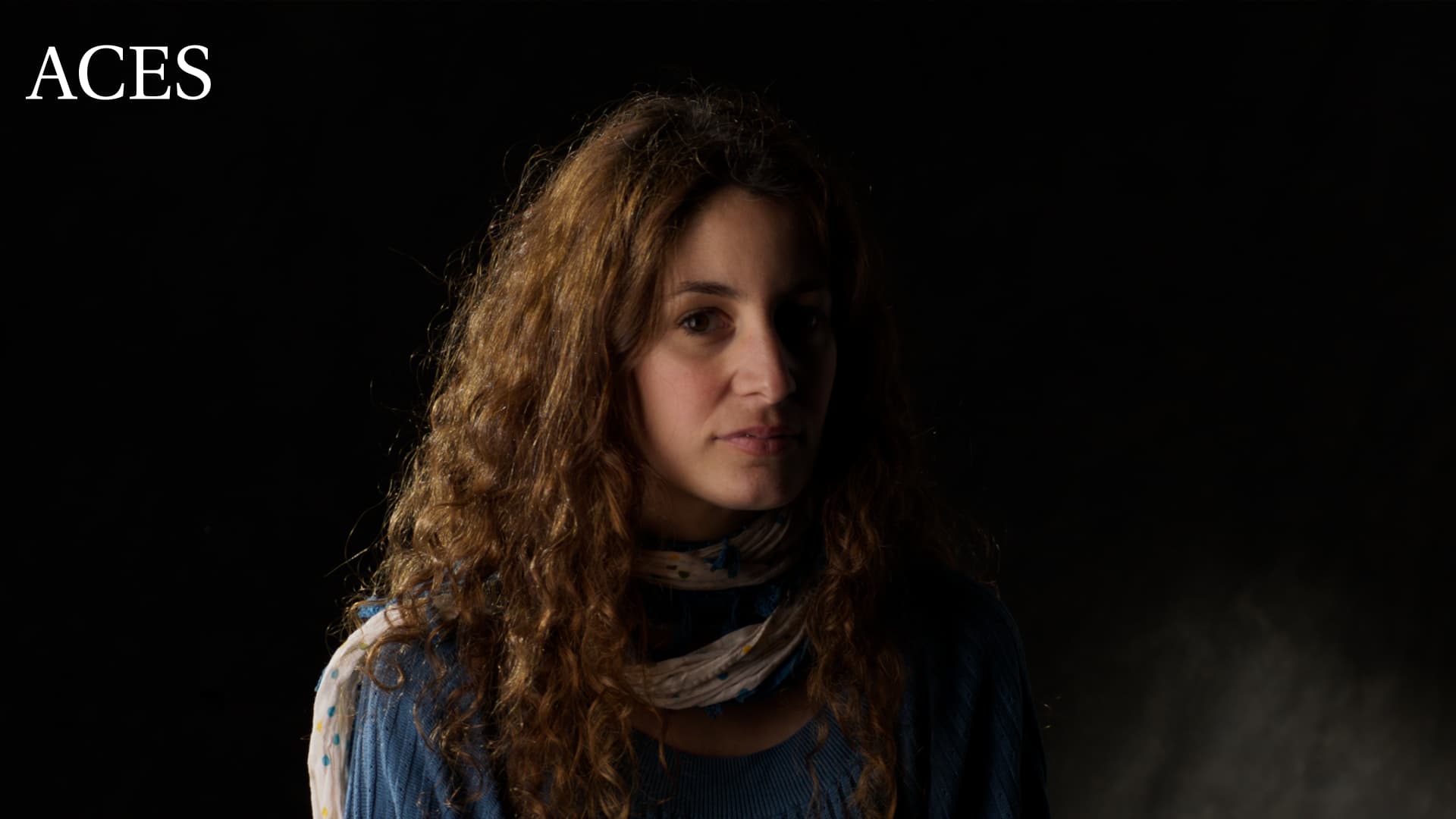
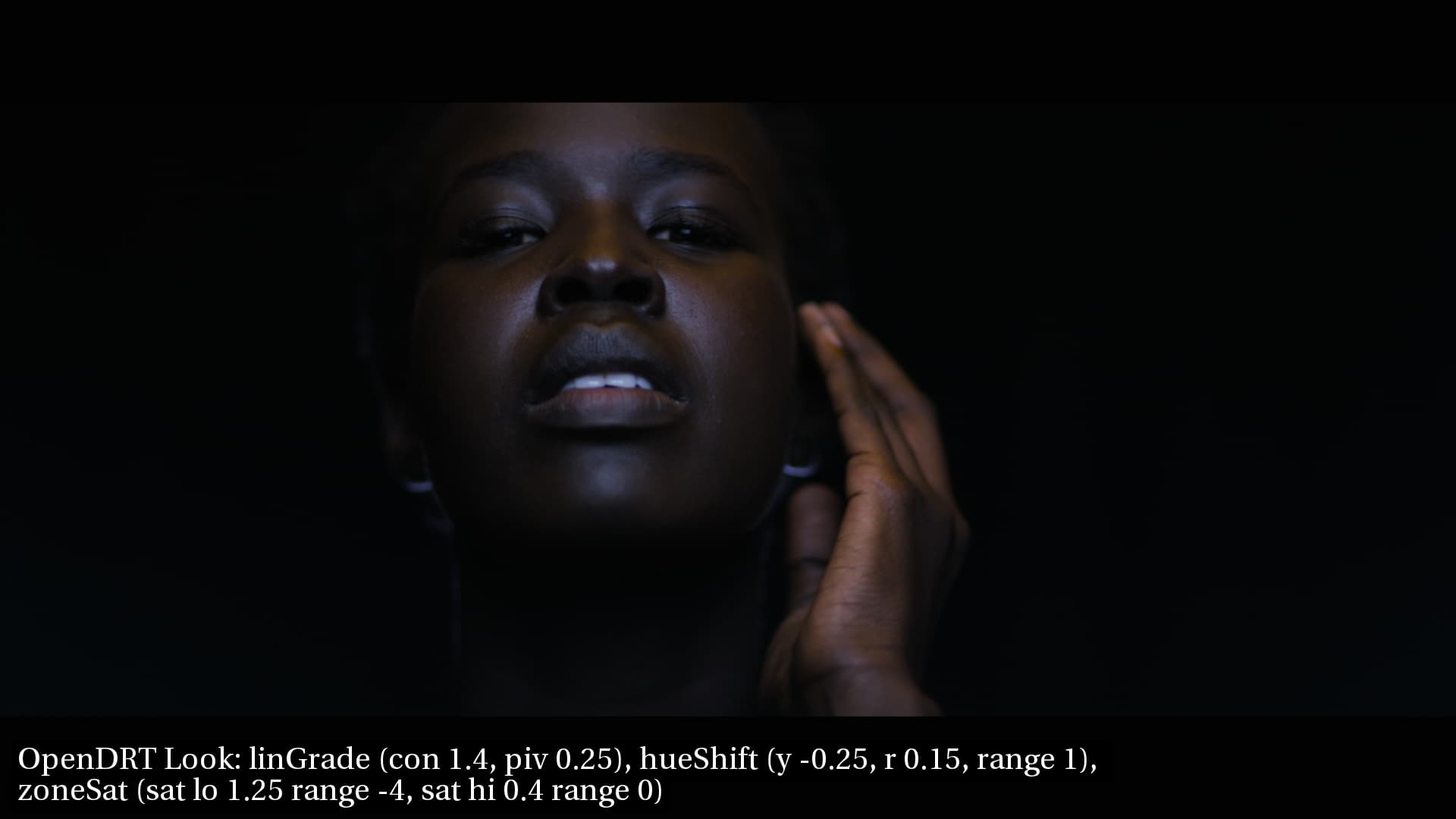
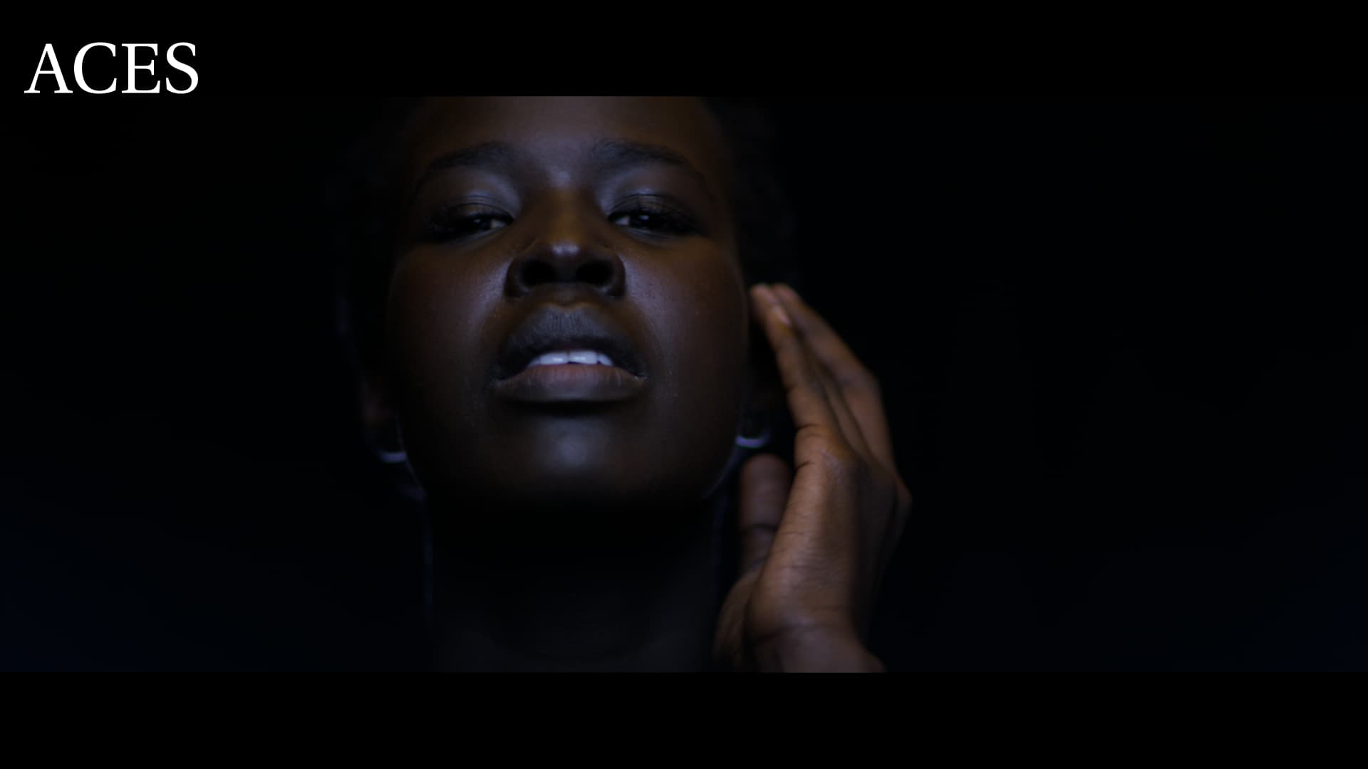
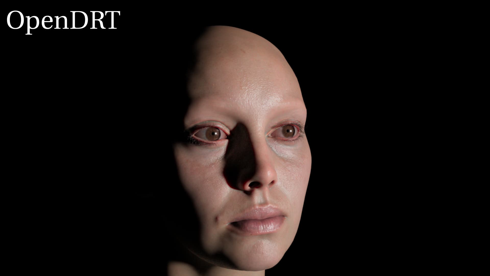
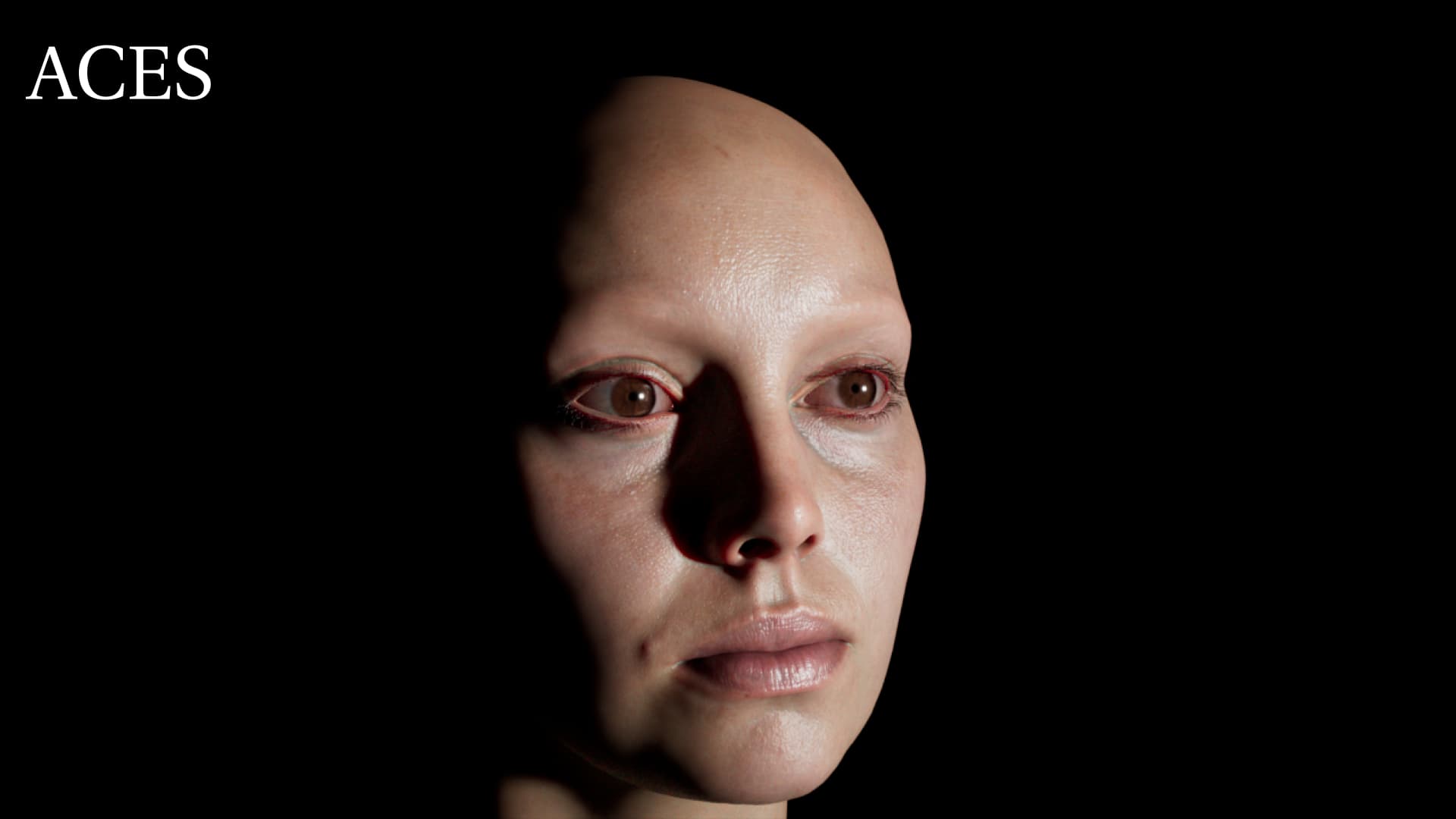
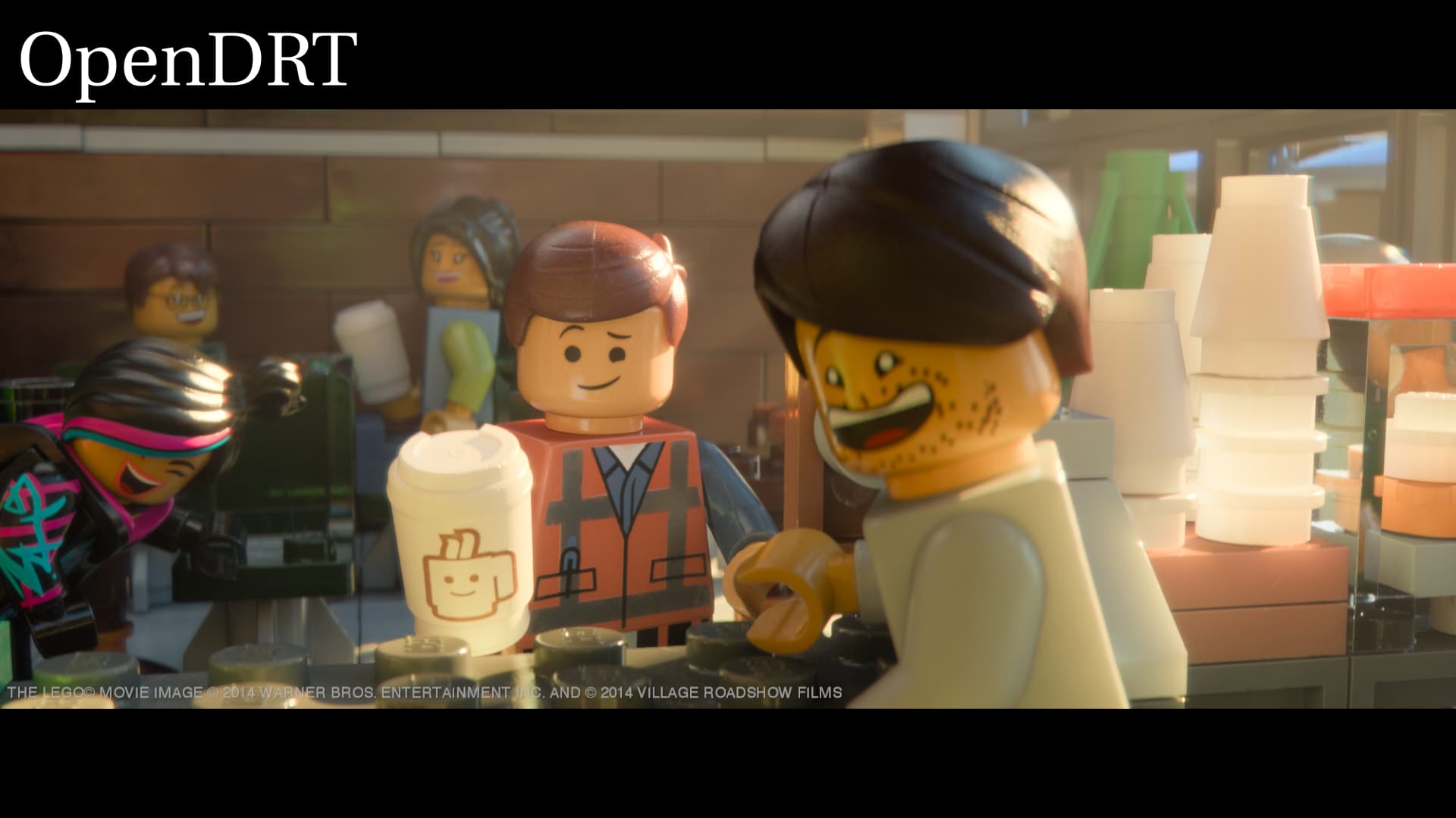
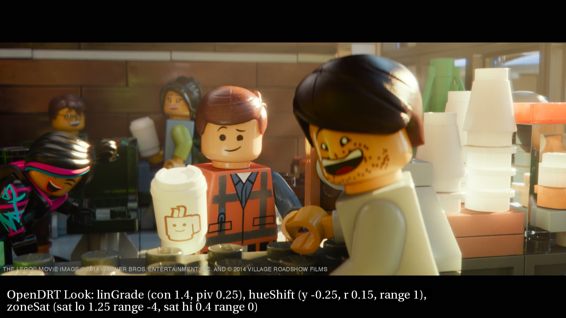
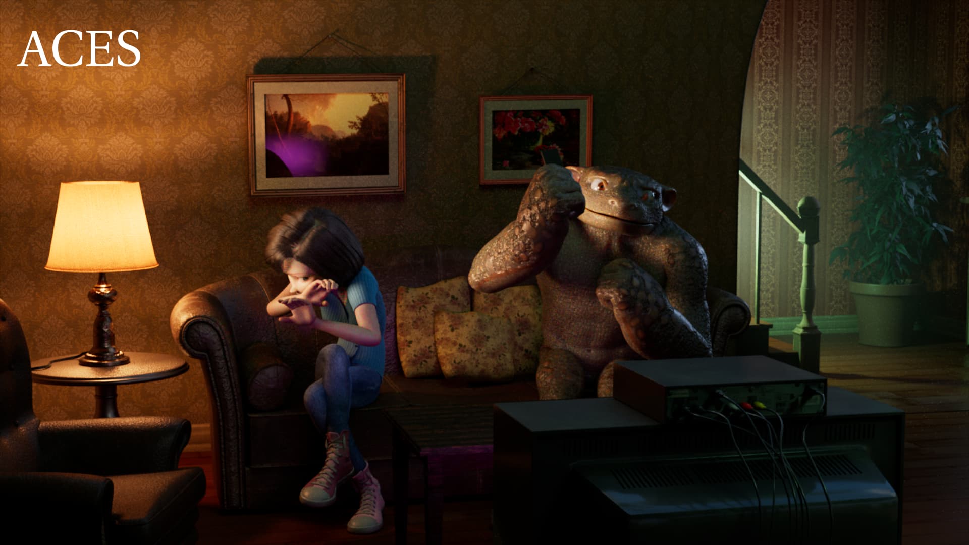
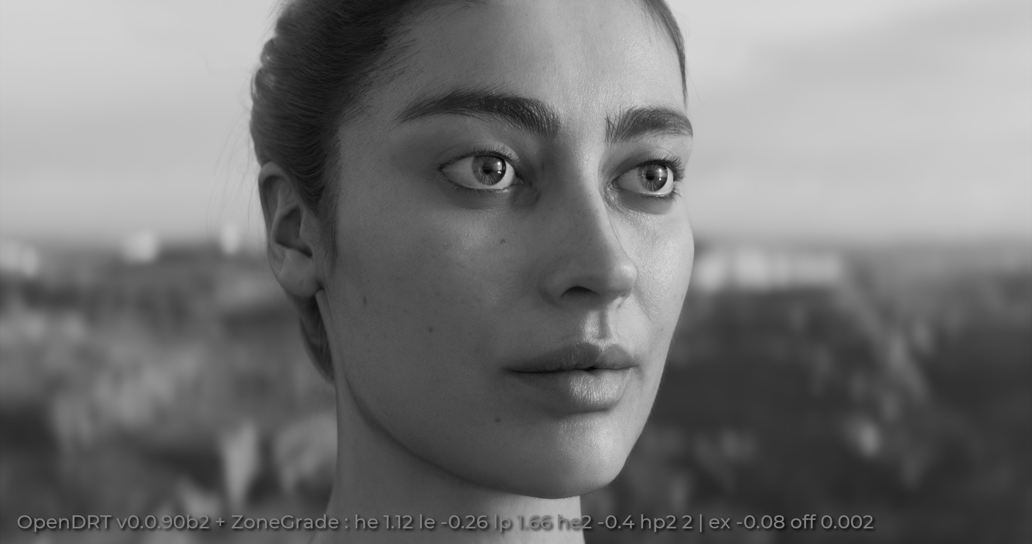
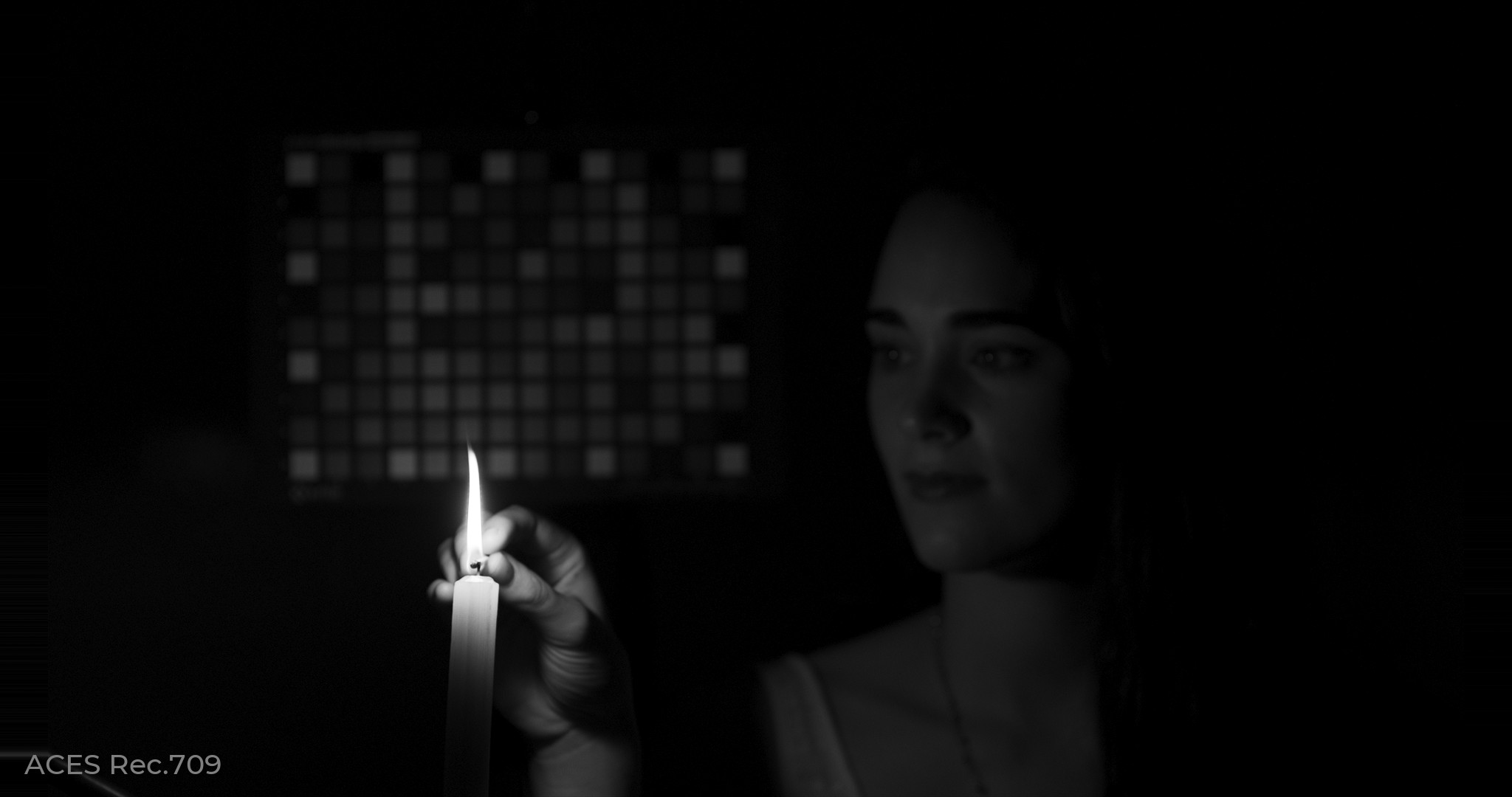
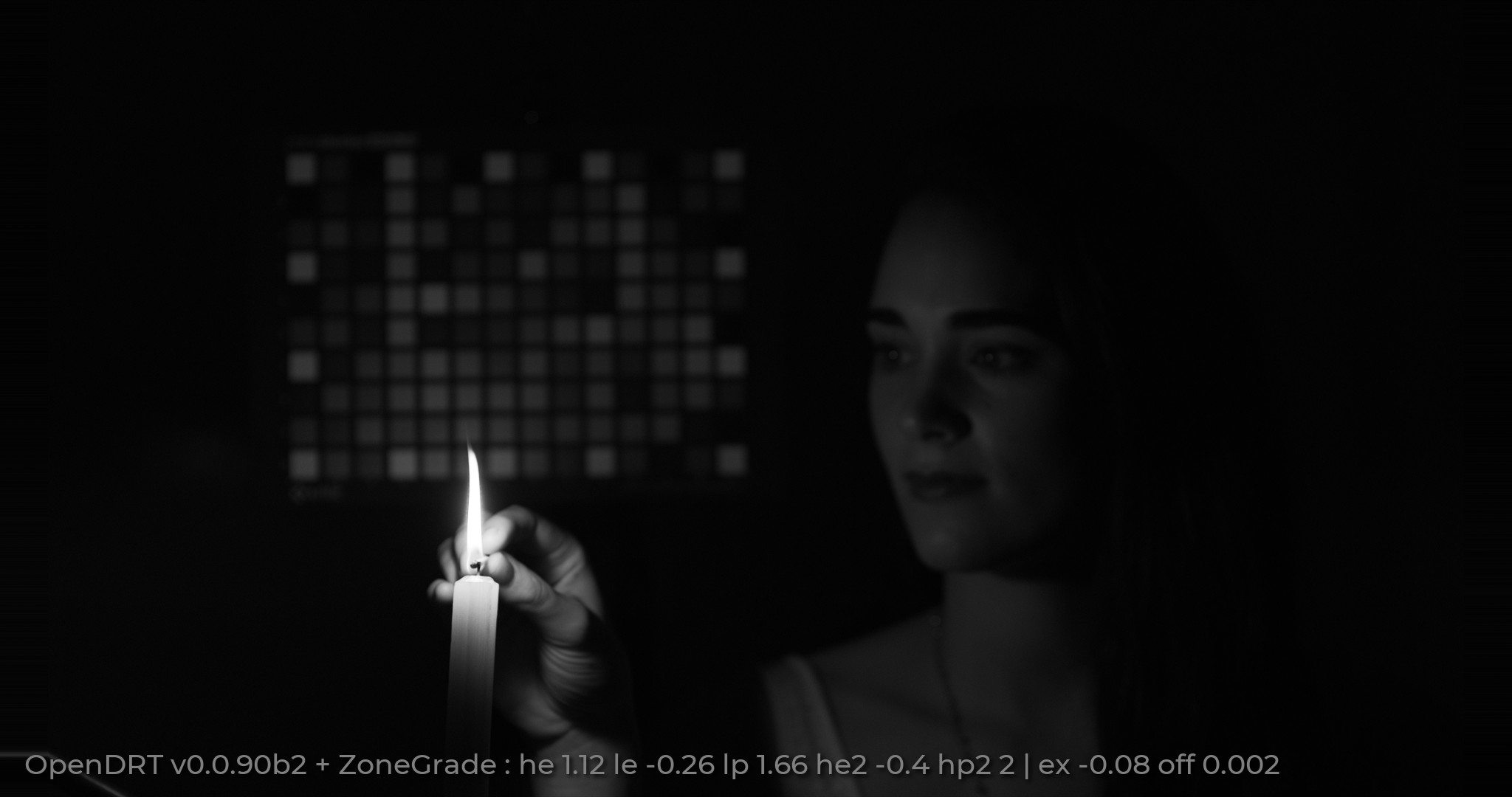
Then OpenDRT with the same linearGrade as always. Note how the face looks flat and “colorized” without tonality. I’m struggling with the vocab here, but a picture is worth a thousand words…
You can see that same “shine” in the ACES image if you carousel through the images. I did this by creating a luminance mask to affect mid-tones and raising the gain a bit. I’m not at all convinced that this is the best way to do this, and it’s a very crude implementation, but hopefully it illustrates the desired affect of getting skin to look less flat, and have more “shine” to it.
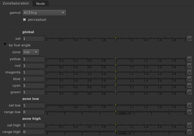
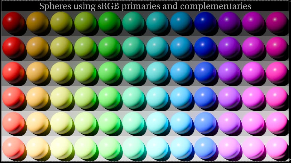
Here’s another experiment in the realm of zoned saturation controls:
ZoneSaturation: Nuke | Resolve DCTL
A zoned saturation control including per-hue angle saturation adjustments, applied in ~CIE 2006 LMS
Instead of using precisely limited “zones of influence”, I found that with saturation adjustments it works better to use a hyperbolic extraction of the input as the mix factor. So “range low” for example, is basically a bias for how much of the bottom end of the image to include in the adjustment. Higher values include more of the top end.
The per-hue angle controls are by default limited by the “low” zone, but you can switch it to none or high.
Sorry for the sketchy documentation… I just finished writing the dctl. This one has to link into libDTColorMath.h, so hopefully you don’t experience the same failure on windows @meleshkevich
Thanks! It works with libDTColorMath.h on my PC now.
I played with it a bit and found that it makes darker skin tone look yellowish. Almost the same happens when I try to increase saturation with a regular SAT knob with scene linear image.
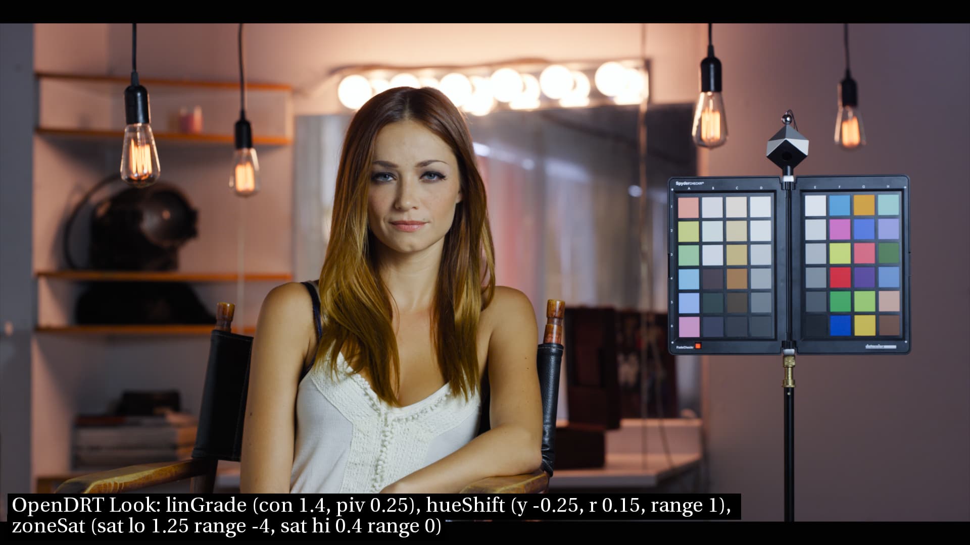
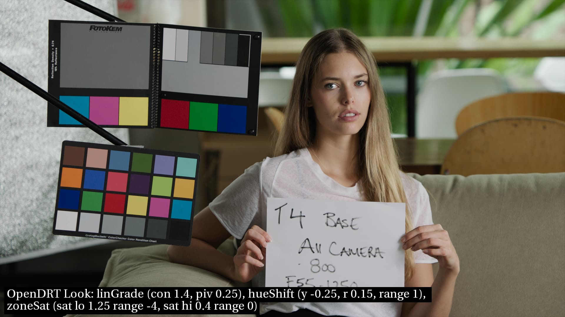
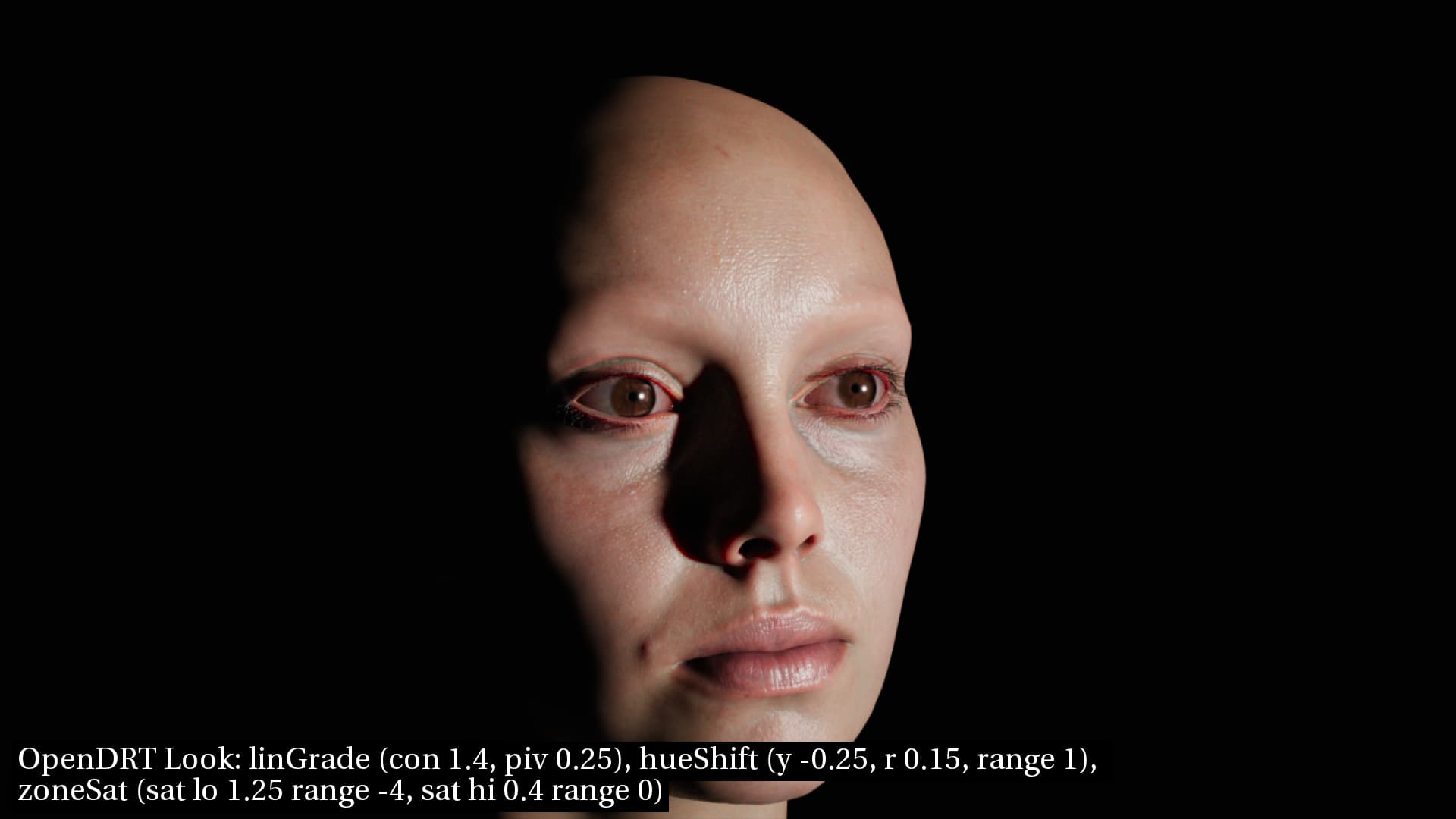
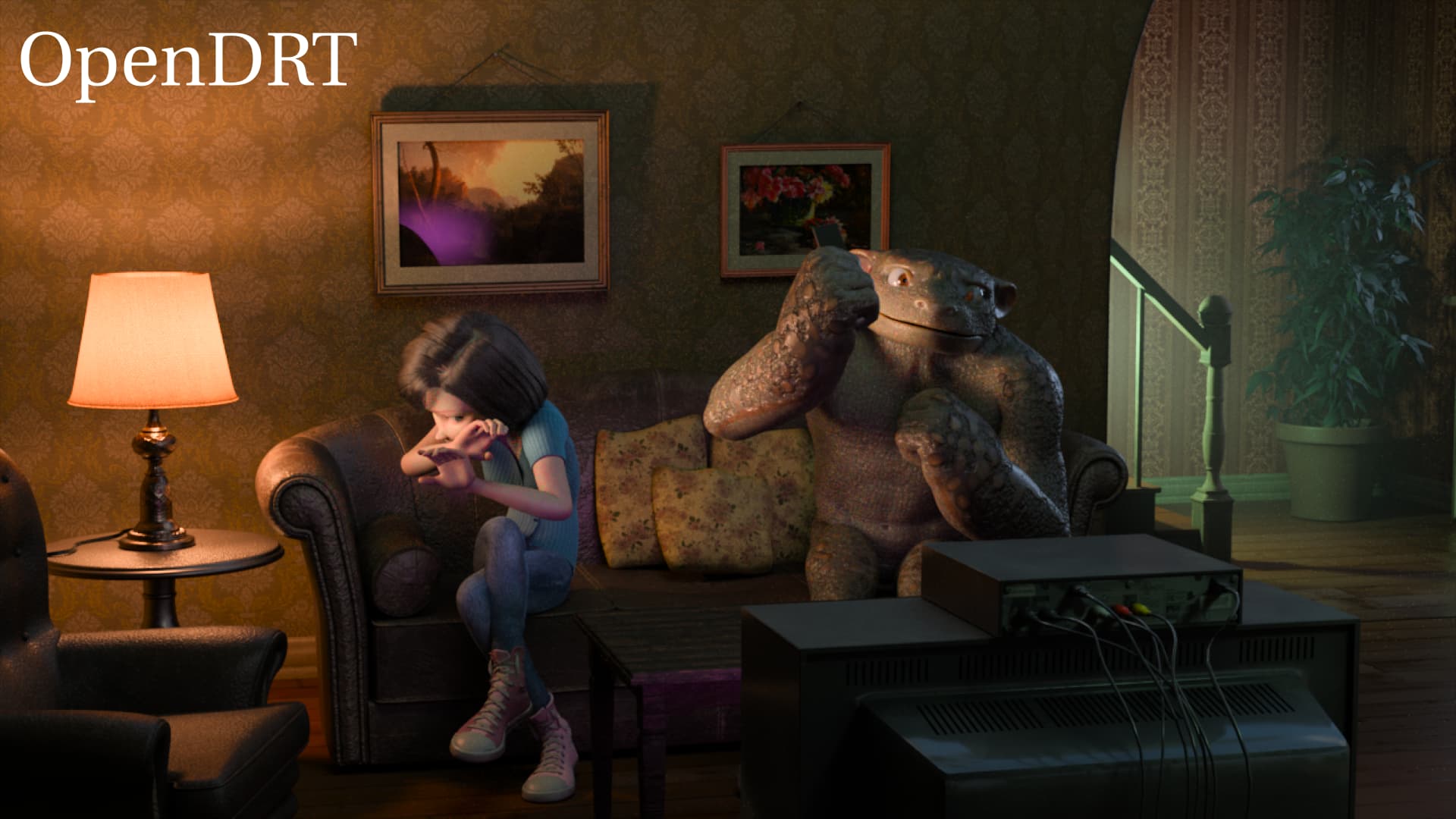
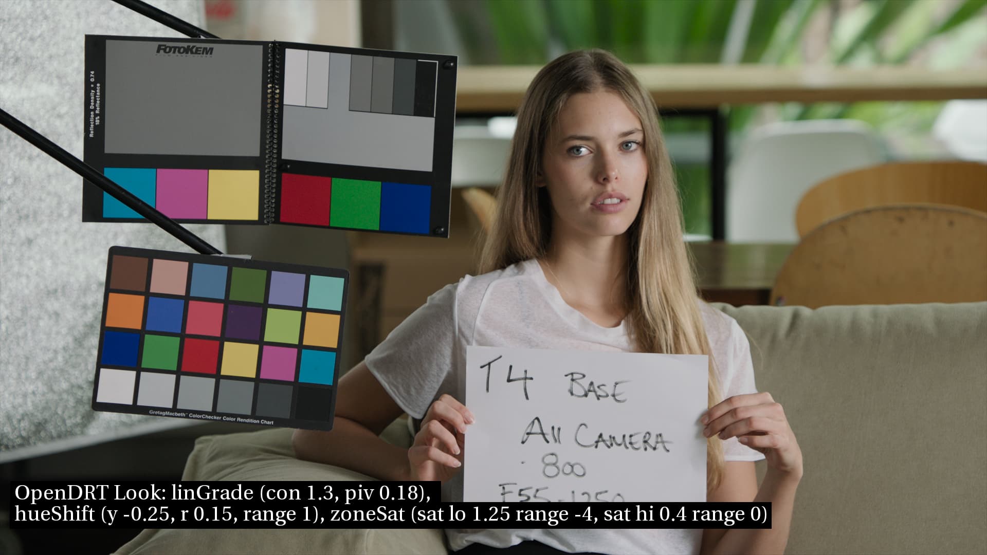
Sharing some experiments with Jed’s new ZoneSaturation tool. This is using a combination of LinearGrade, ZoneSaturation, Notorious6_hueShift. The settings for each are written in the image. In this set I’ve changed the pivot of the LinearGrade to 0.25 to get it to have a contrast closer to ACES, and thus to get faces to have a bit more “shine” in them as I mentioned in my last post.
Personally, I’m quite happy with how the look looks (ahem, pun intended). It does not have the green skin of ACES, but does have the “shine” I was missing.
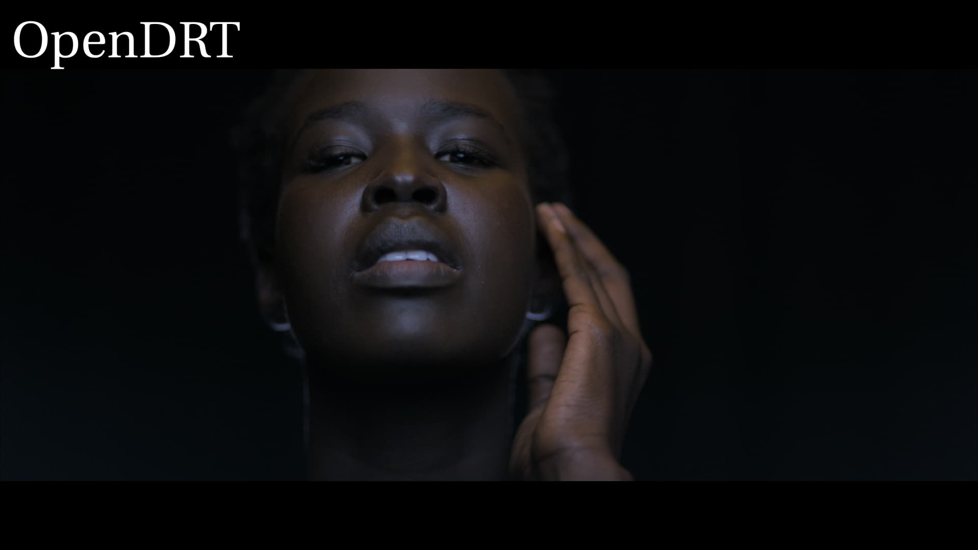
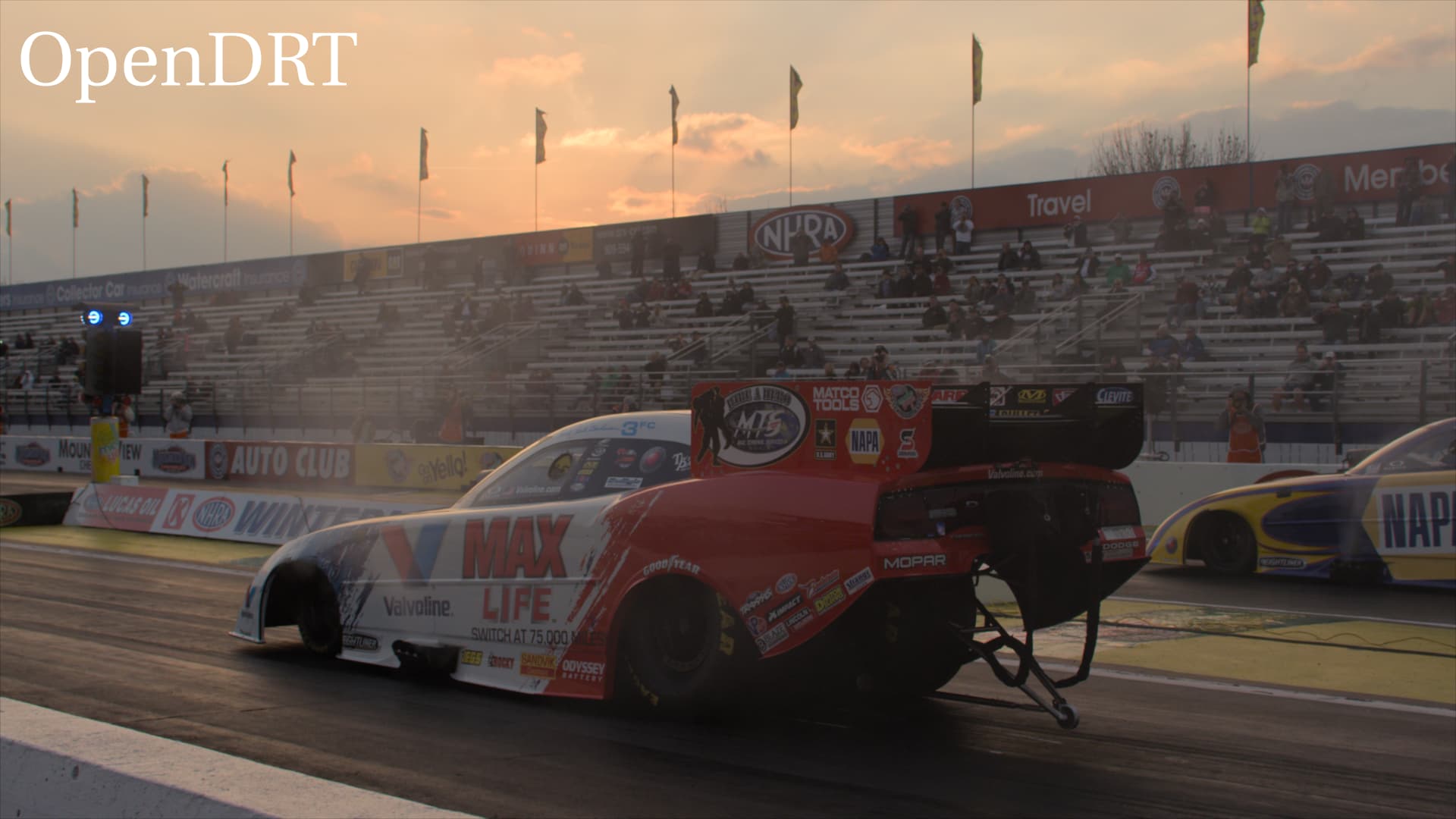
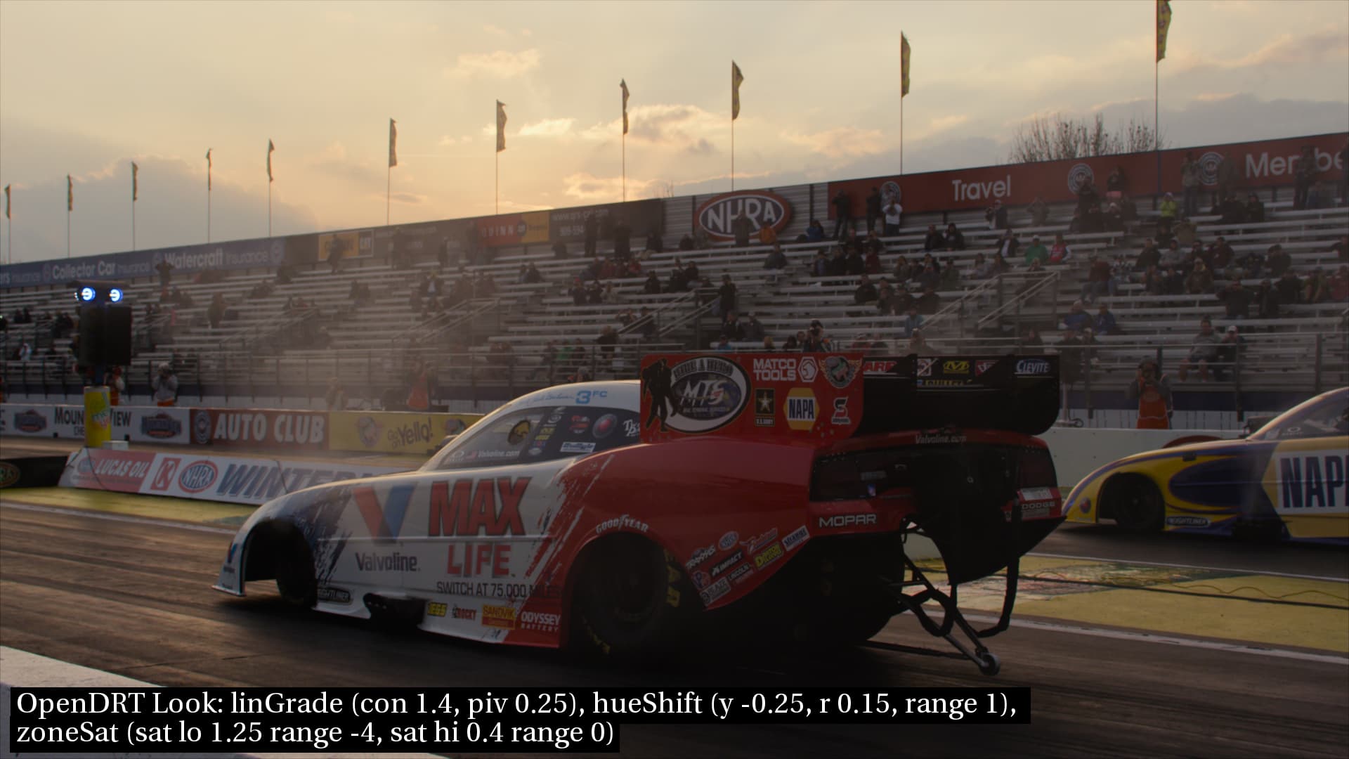
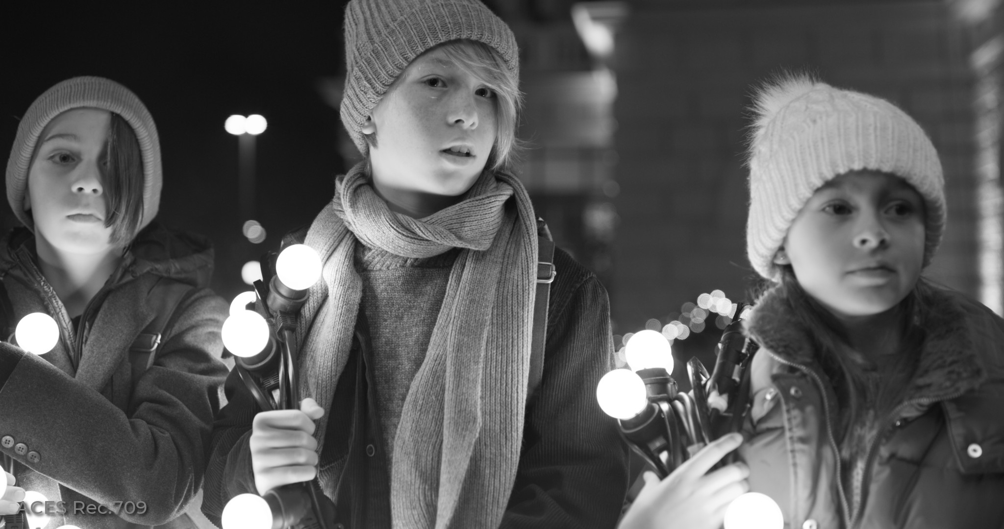
Here are some pics of luminous objects (sky, sunshine, etc) to compare how these look.
Here the affect of the hue shift is apparent. OpenDRT makes sunshine look pink, ACES makes it look lemon yellow. In the look I went for an orange-yellow which seemed to match more what my eye sees. Additionally there is the same issue in these images as there is in faces with saturation. So the sky in the car image in the “look” has blue sky with yellow clouds, rather than yellow sky with yellow clouds.
Again, I’m feeling like with these tools I’m able to get a “look” that I’m happy with. I’d love to hear if others have any issues. Here’s a pic of the settings for the “look” in Nuke.
As an aside to this, I’ve been looking a lot at these sunshine-y things in real life and notice that how it appears initially in my first impression is not how it appears as I continue to look at it. Most people don’t stare at light bulbs or camp fires, since it hurts your eyes, and so what we have is that initial impression of them. In trying to observe that (which is the bread and butter of an artist to observe), I’m noticing that my eyes adapt and these things appear different the longer I look. I understand this is called “adaptation” where our eyes balance the color temp to see white as white. As an artist I’m realizing for the first time that what the Impressionists were doing is painting how the scene appeared to them in the first moment of “wow that’s beautiful” and that they had to keep that initial impression in their mind as they painted for hours, rather than what they were seeing. I find that fascinating and wonderful.
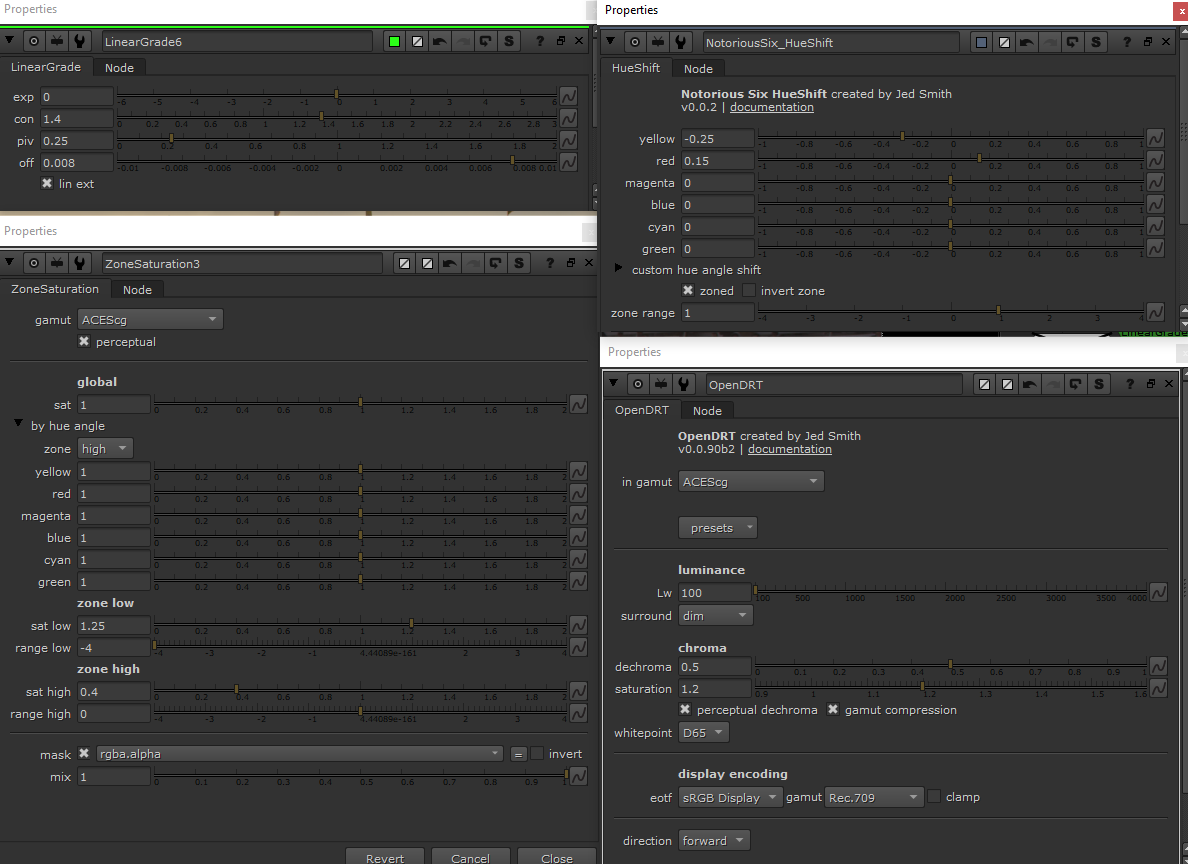
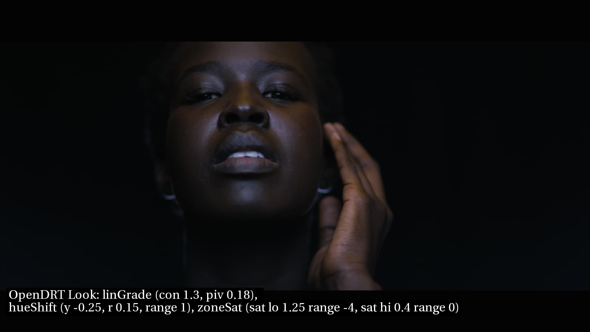
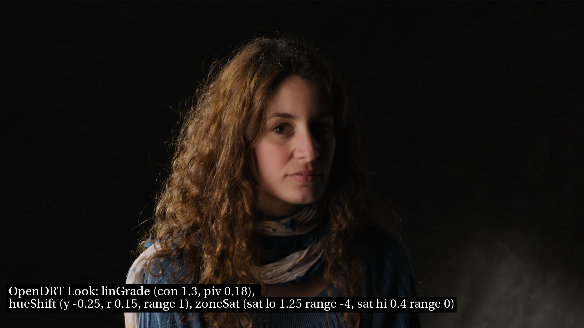
Adding in some pics with a “neutral” grade. This is changing the linearGrade from contrast 1.4 pivot 0.25 to contrast 1.3 pivot 0.18. The motivation is that one of the stated aims of ACESNext was to have “slightly less contrast” on the Output Transform. I share this desire, but was concerned that the issue of faces having "shine (i.e. not looking “colorized” and flat) might get lost if contrast was reduced. Happy to report that that does not seem to be the case, and we can have our cake and eat it too!
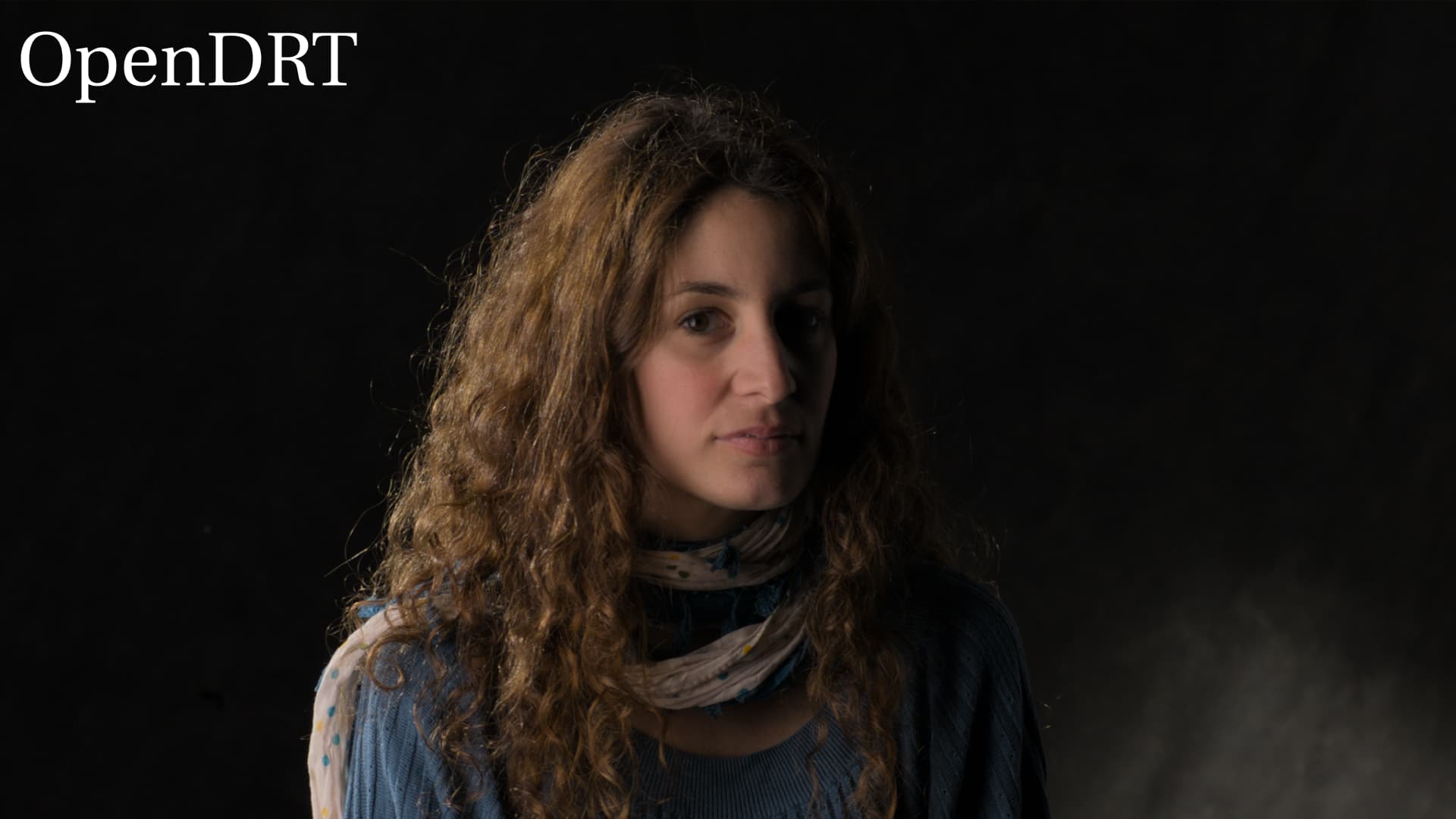
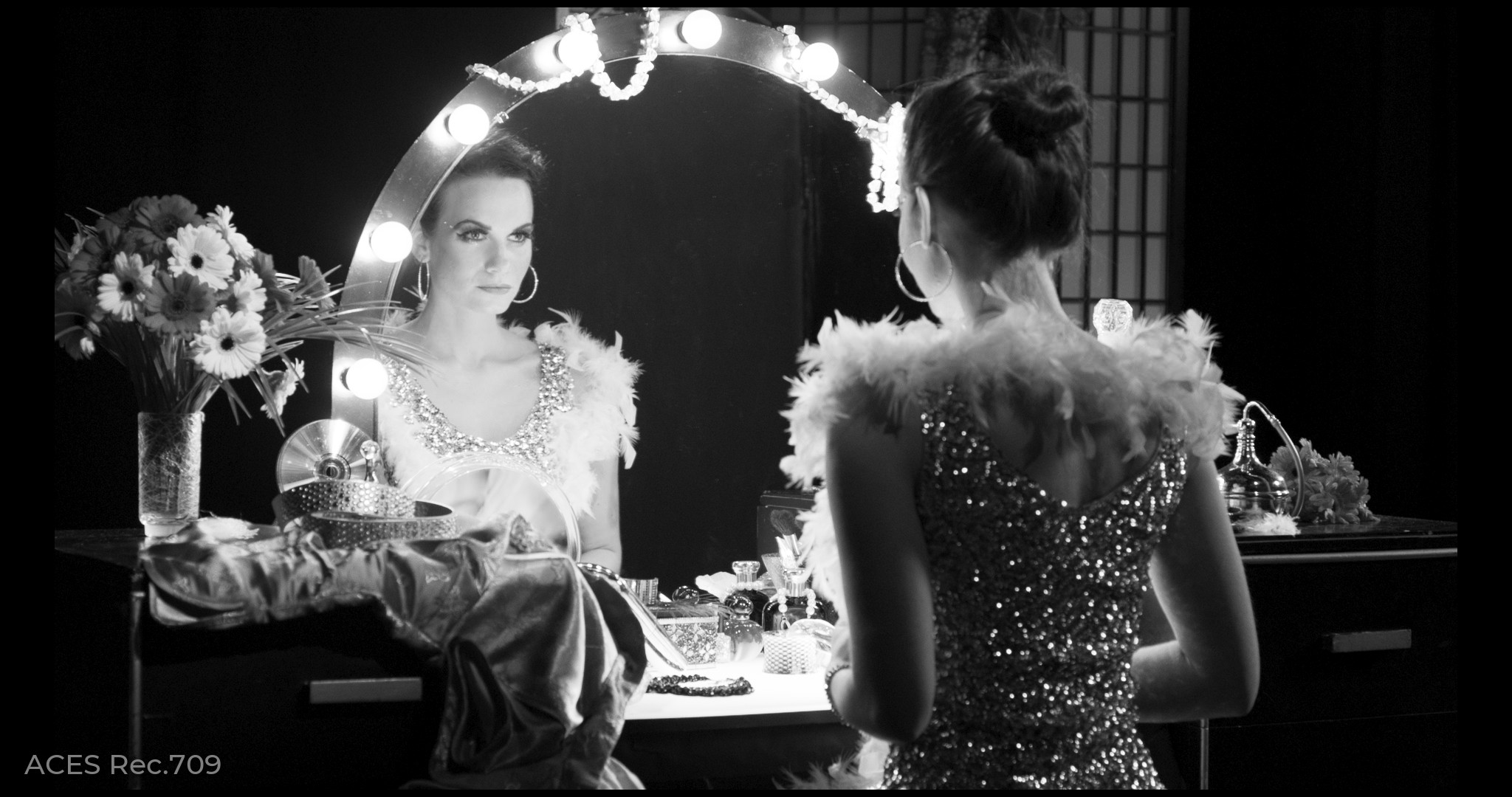
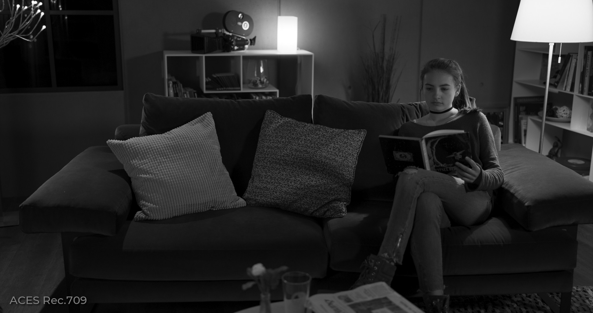
First note how in these two sets of images we can see detail in the shadow areas compared to ACES
It has some more precise control over specific value ranges in the image than my previous efforts. I spent quite a while working on the math for this one, especially the “low” zone tool. My first foray into solving cubic functions. Took about 3 and a half weeks but I learned a ton and it was a fun problem. For the “high” zone tool it is pretty similar to the quadratic compression function used in GamutCompress, but with a linear extension. I spent a little time for fun and wrote a beginner-friendly derivation of how I went about solving it if anyone is interested in the math.
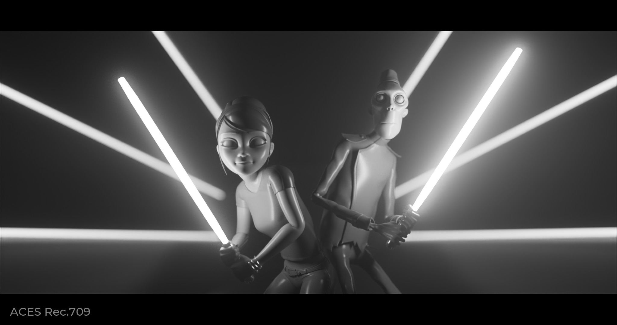
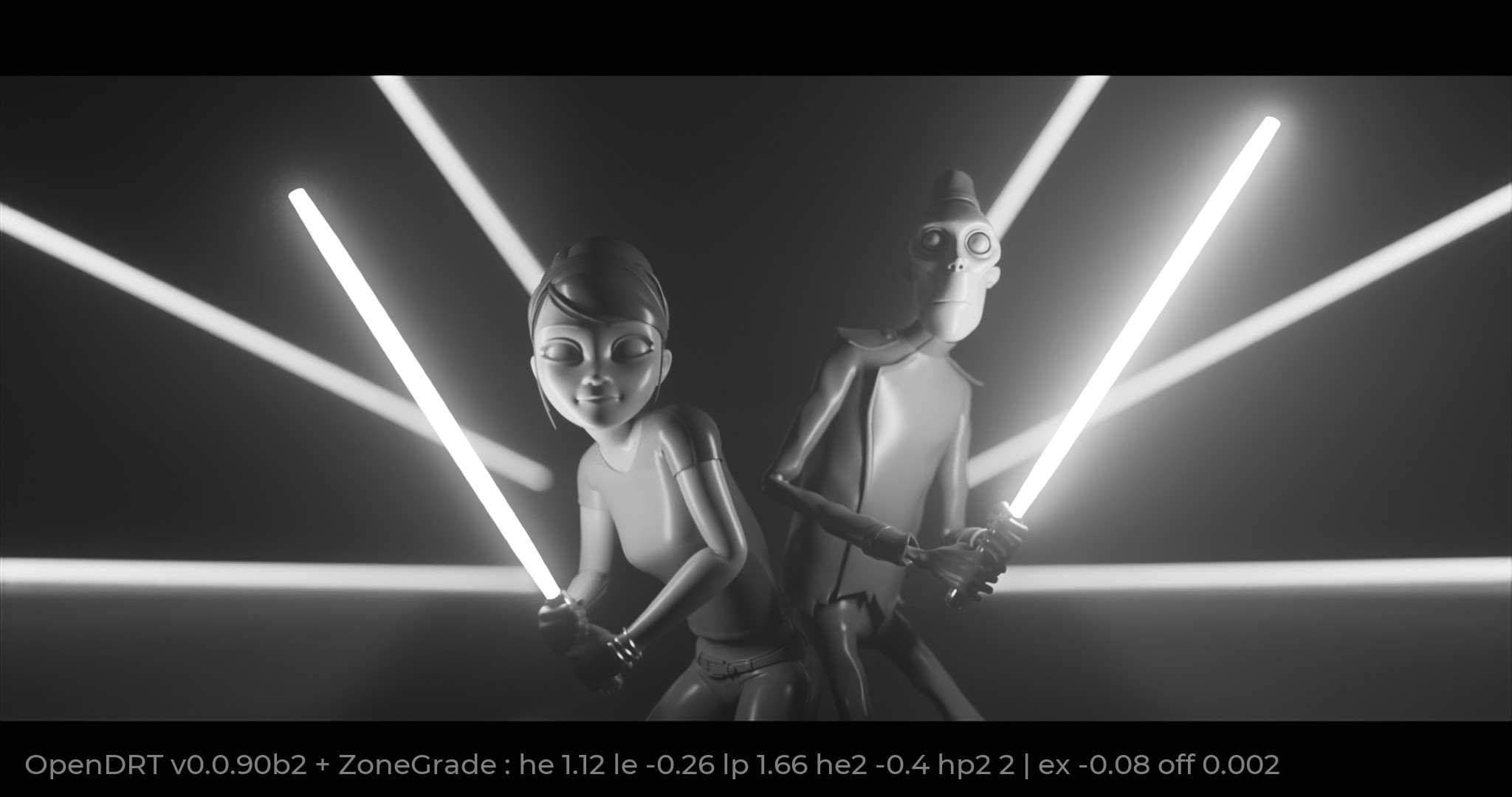
I also spent a few minutes to see how easy it was to match the contrast of the ACES Rec.709 output transform. It was surprisingly easy. Here are some images without color for comparing:
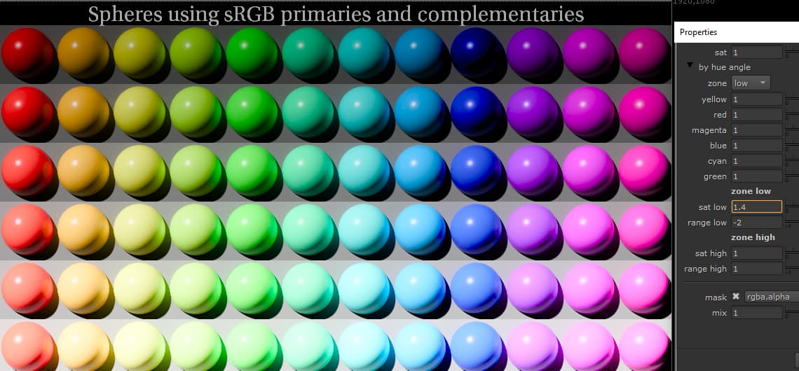
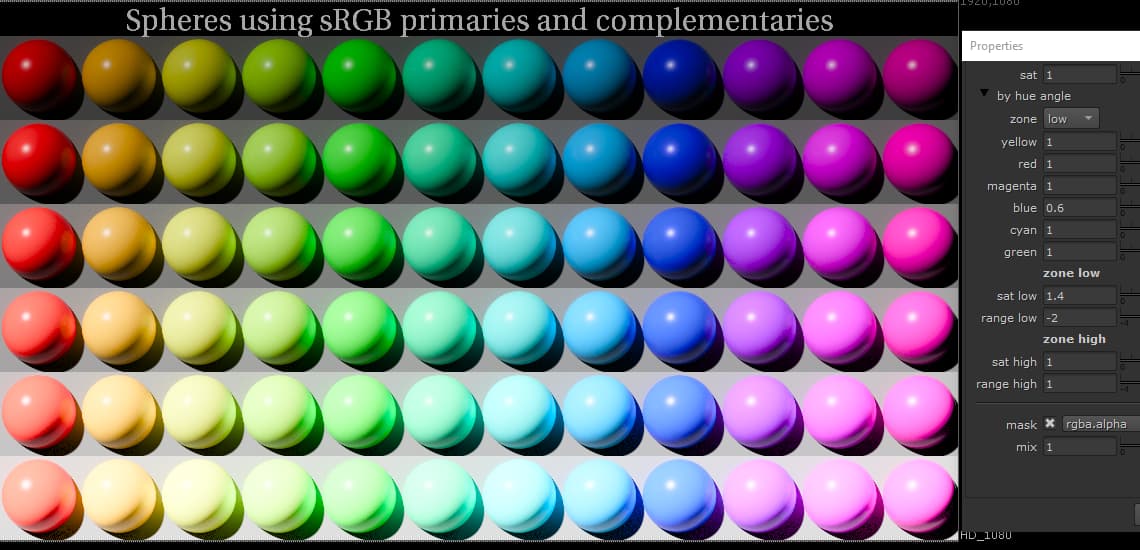
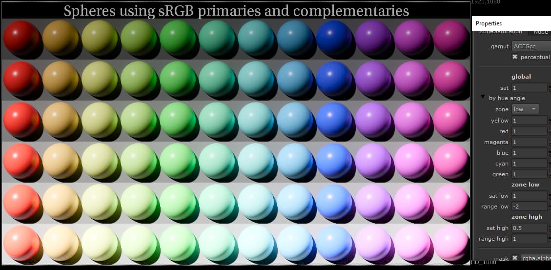
However blue is also disproportionately affected by the zone high saturation. Here the blue is losing saturation in the top row whereas other hues are not.
Wanted to bring this to your attention, and hopefully get guidance as to how best to work with the ZoneGrade and ZoneSat to account for these behaviors.
I hasten to add that these are awesome tools that give really fine control! With great power comes great responsibility, and I’m trying to be responsible with these powerful tools
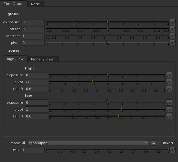
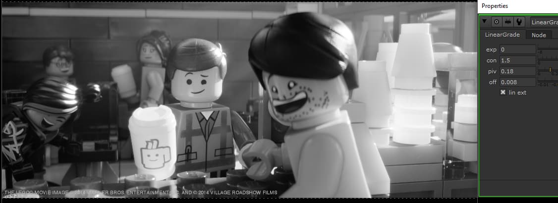
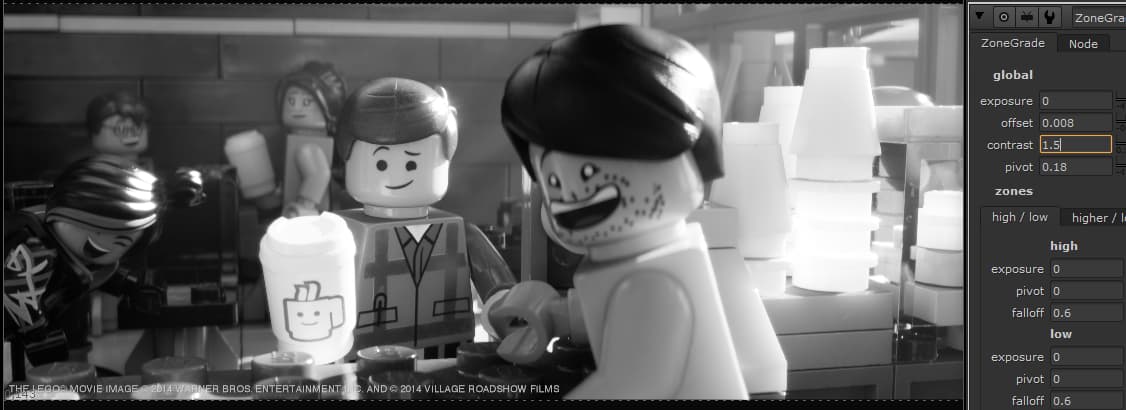
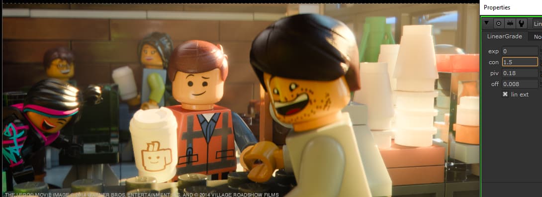
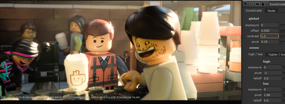
Yes judging by your screenshot, you are using an older version of the LinearGrade tool which specifies the pivot point in absolute scene-linear values. Newer versions of the LinearGrade tool, and ZoneGrade specifies the pivot point in stops +/- 18% grey.
The older version of LinearGrade you are using is per-channel. ZoneGrade is chromaticity preserving. With LinearGrade you are seeing an increase in “saturation” when you increase contrast. With ZoneGrade the colors are not affected when you change contrast. This is intentional and the intended workflow. The goal is to engineer our image with intention. If we increase “saturation” by increasing contrast per-channel, we are relying on a byproduct of an unrelated adjustment to create the image appearance. This is great if we like the result, but if we don’t like the result it becomes difficult to control.
One advantage of lower default contrast in the display transform is the additional “wiggle room” to add per-channel contrast in an LMT if desired (as you have demonstrated above).
Thanks for the feedback. Yes this is likely due to the LMS color model being used for the saturation adjustments. It’s a work in progress for sure. There are adjustments and refinements to be done for sure.
As far as I’m aware, official ACES does not include a pure “gamma” 2.2 inverse eotf. “sRGB Display” refers to the display portion of the image chain in the sRGB spec, which specifies a pure 2.2 power function forward EOTF. ACES uses the piecewise “image encoding portion” of the spec as its inverse EOTF.
With the inverse EOTF’s matching between the two renderings you should see roughly the same difference as the screenshots above. I wouldn’t say that they match perfectly however. I spent like 10 minutes setting that up. A perfect match was not my goal. I was more trying for a quick demo of how easy it was to get in the ballpark of a target “tonality rendering” using this tool. Could do the same exercise with ALF-2 or one of the RED renderings if desired…
Yes, I can get the two to match pretty easily when they are both set to sRGB Display by tweaking the knobs. Just wanted to make sure I was not doing something wrong.