You may join via computer/smartphone (preferred) which will allow you to see any presentations or documents that are shared, or you can join using a telephone which will be an audio only experience.
Please note that meetings are recorded and transcribed and open to the public. By participating you are agreeing to the ACESCentral Virtual Working Group Participation Guidelines.
Audio + Video
Topic: ACES Virtual Working Group Meetings
Time: This is a recurring meeting Meet anytime
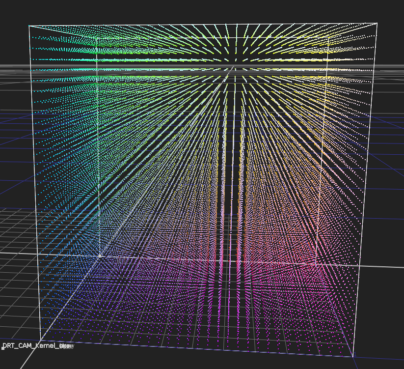
@priikone, white writing up the meeting, I was thinking about the Desmos plot you showed which modified my plot of slope against intersectJ, so it eased in to zero at peak white. Given that is a plot of slope, the ease-in means the slope gets shallower sooner. Isn’t what we want a steeper, not shallower compression for those bright, saturated colours?
I don’t seem to have a Desmos plot of the original compression vector. I think perhaps with the old version the compression slope got steeper as source M increased. With my current formulation that does happen, but perhaps not as aggressively as it did previously.
How early the easing happens, or the projection becomes entirely horizontal, certainly matters. If it’s too early then it may desaturate too quickly. If it’s too late (or very slow), then colorfulness may linger at high intensities perhaps longer than expected (for example, light sabers might be colorful rather than almost white). Ideally we could control it, to have darker colors with steeper projection, but then desaturate quicker to white so that colorfulness doesn’t linger (like those light sabers). The old mapper wasn’t perfect, but it had more control regarding this than the current one.
The desmos plot I don’t think is how the old mapper works. In the plot I used it as the slope gain. In the old mapper the focusDistanceGain was used as is to multiply the focus point and move it further behind the achromatic (making the projection shallower).
I had forgotten that v28 had separate adjustable controls for the focus point for above and below the cusp. It had the ability to have adjustable projection for bright and dark colors. That’d be nice to have…
And the v28 inverse looks perfect, despite being approximation. It’s better than v052 (with the magenta missing a bit). Here with inverted linear cube and going forward through the transform:
Hope it’s okay to throw my simple judgment here. Purely based off of these few comparison images I lean towards v028’s rendering.
The things that came to my mind:
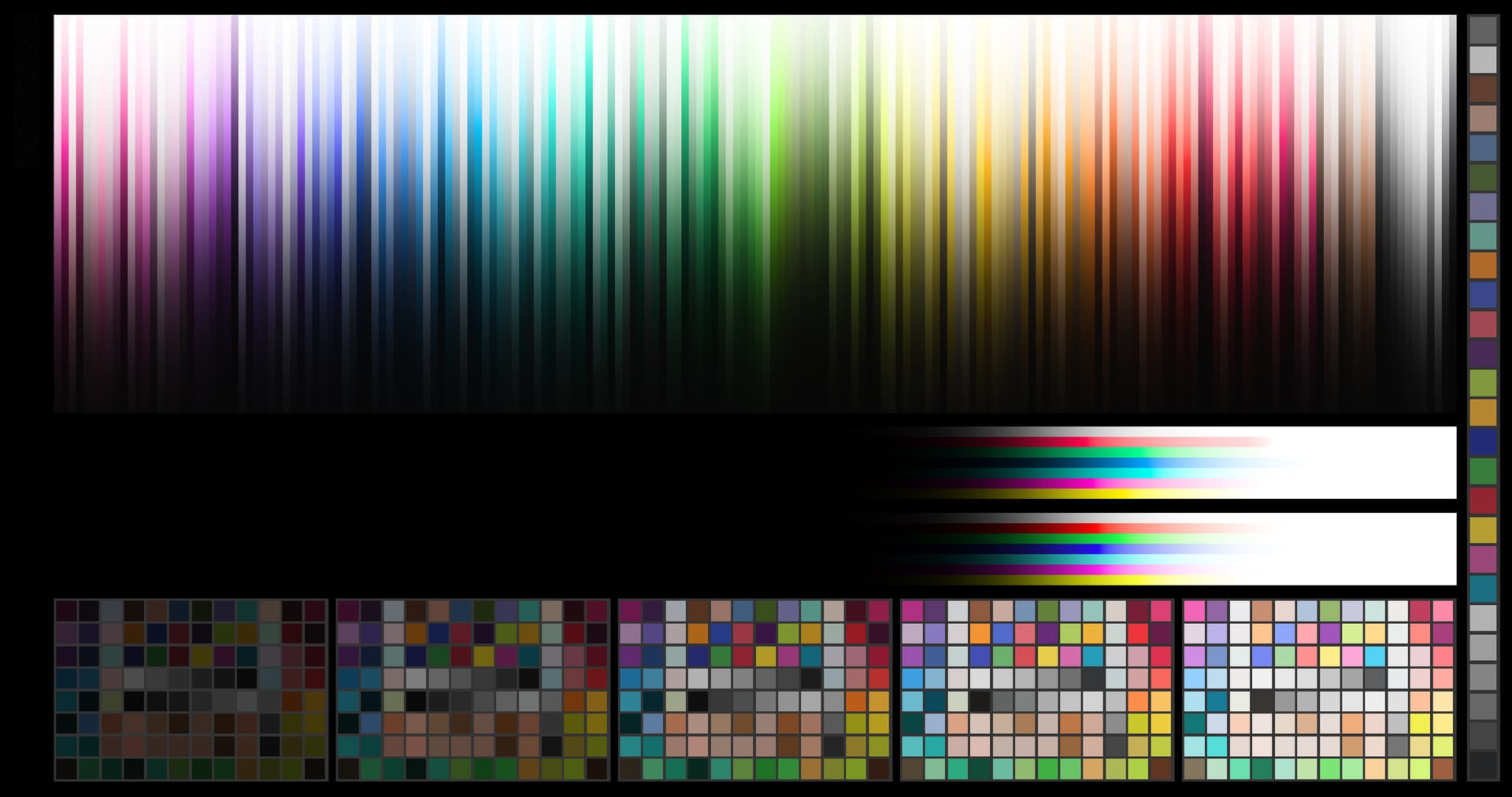
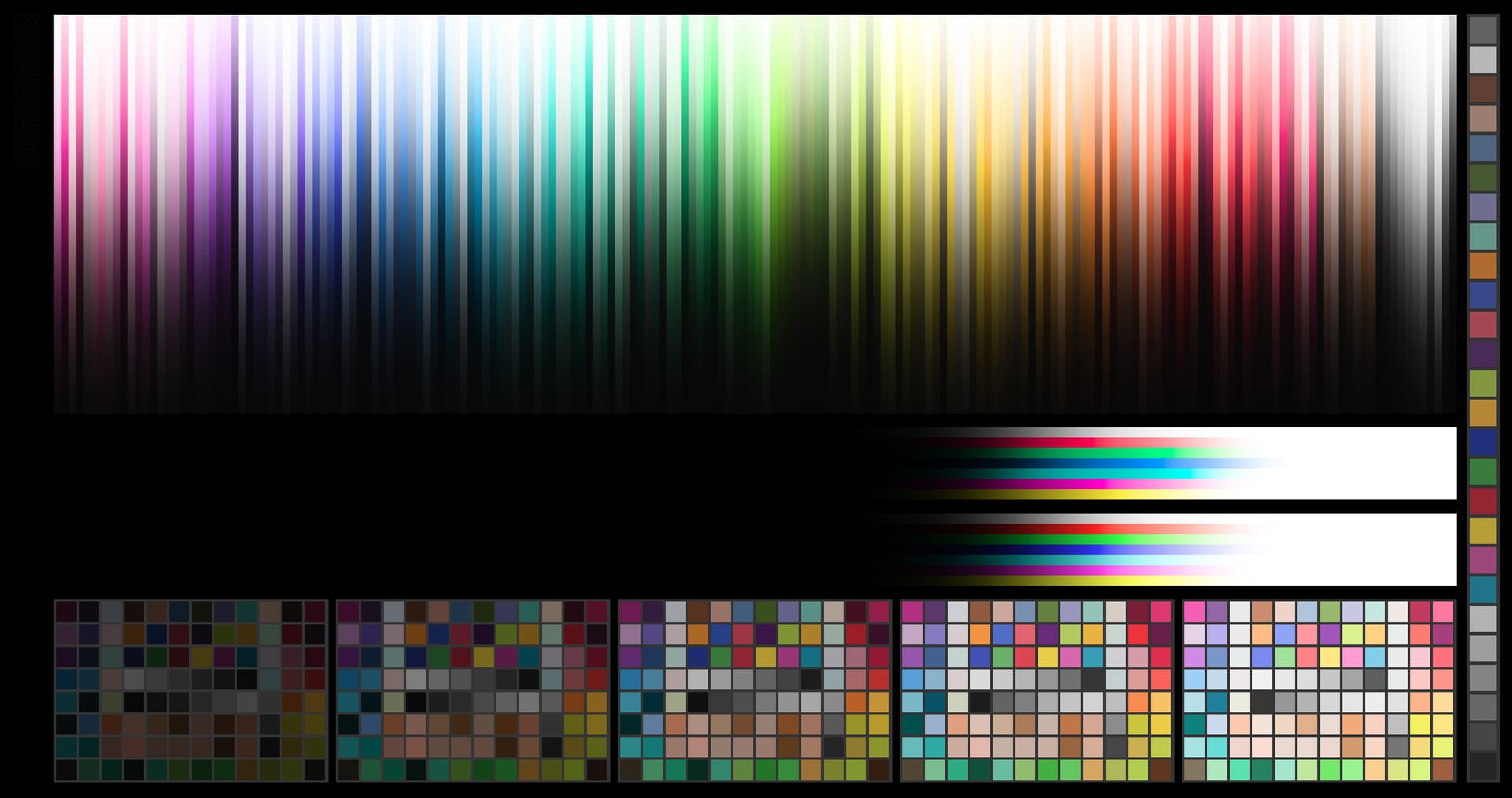
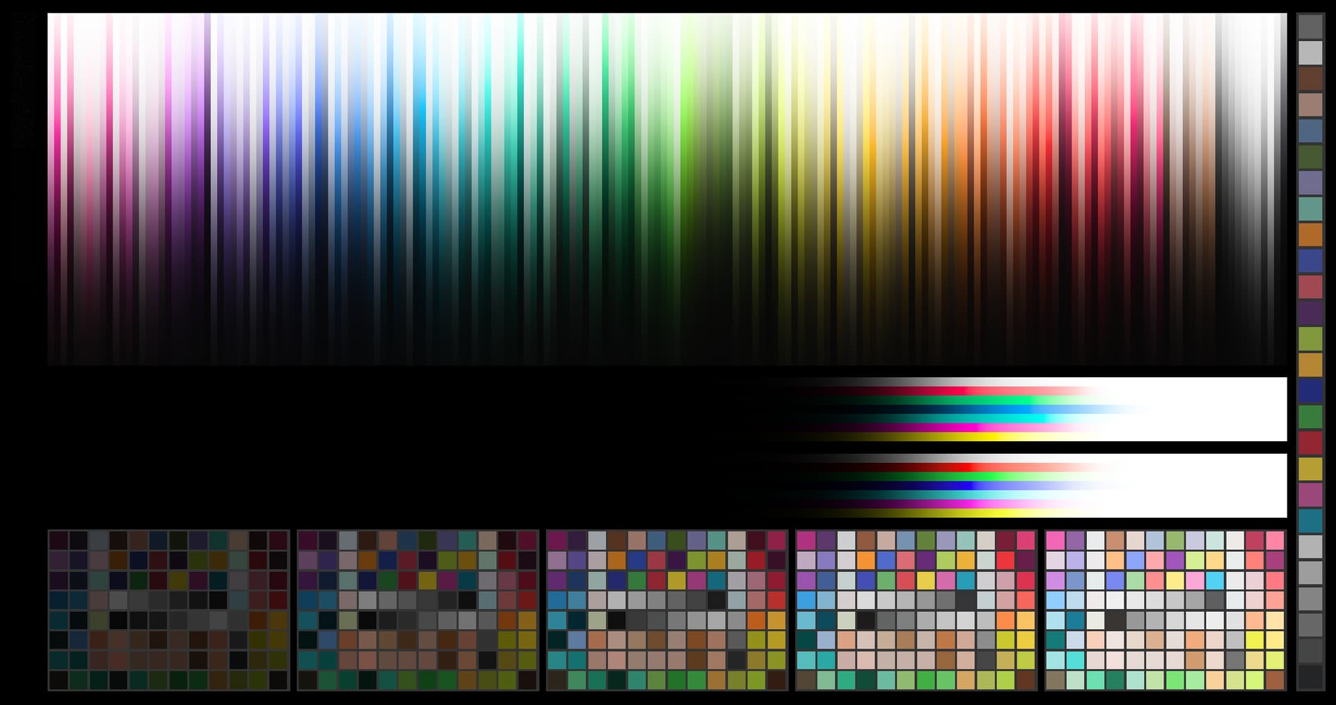
Synthetic chart:
The vertical gradients look smoother and hold more saturation
The horizontal r/g/b/c/m/y also look smoother but the top set’s red doesn’t reach as far? I know those go incredibly high though and I don’t know what color space that is. Perhaps at that range it doesn’t even matter anymore? 028’s transition to white of that color seems to be smoother though.
Arri bar:
I really like the fact that the fruits and the red ball on the right side of the lady retain enough color information on v28 which I find difficult sometimes grading against a DRT for it.
On the flipside, the shelves with bottles feel flat and the preservation of brightness actually feels preferred here. Mostly because labels become more readable through the transparent glass. But personally I would accept the trade-off in favor for color and I would assume that the readability would also be diminished in the HDR presentation and comes down to “this does look more like how it’s actually preceived”
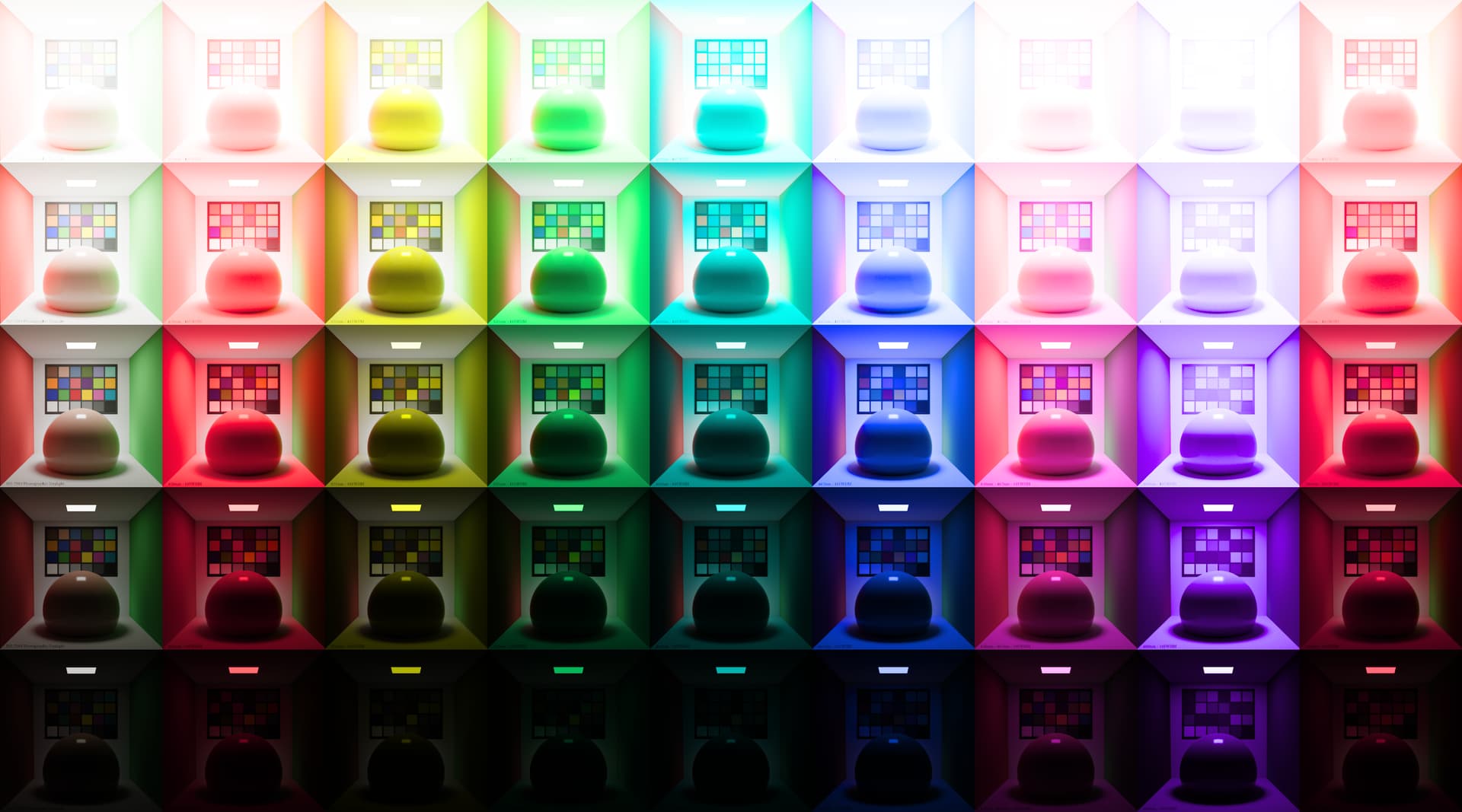
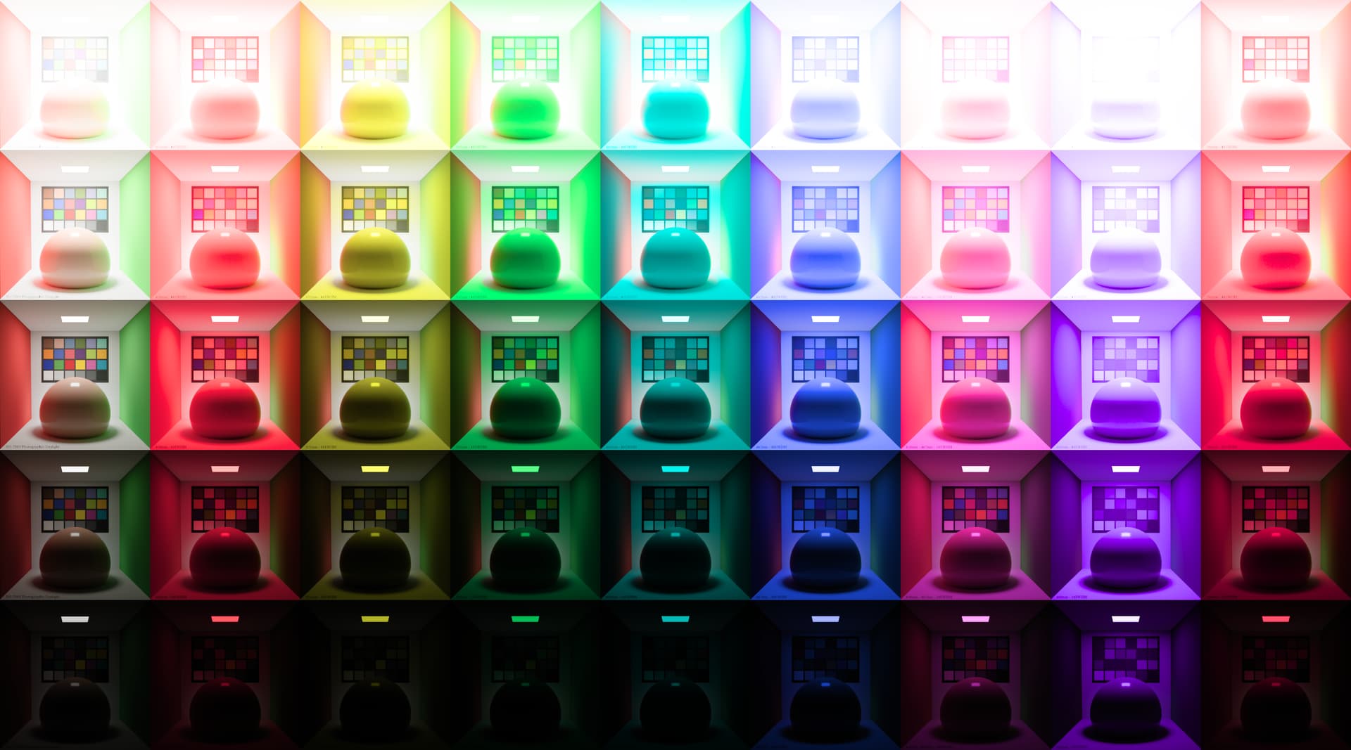
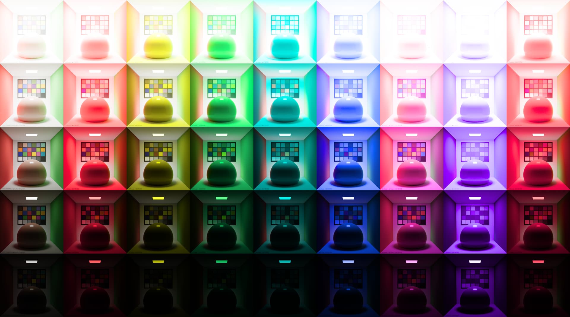
Cornell boxes:
Column 1 row 2: the red checker patch remains darker than the wall which feels more logical judging by it’s presentation in lower exposures.
The ‘appearance distribution’ accross the different rooms feel more balanced but the point that was brought up in the meeting about what should it actually look vs spectra and it’s luminance like makes me have no feeling of right or wrong. But v028 would still have my preference for sake of saturation prersevation.
In the meeting, very briefly the question on ACES shipped LMTs was brought up again. I’d be curious to know if a more saturation preserving default would be preferred by most colorists and the other with stronger desat become a potential optional LMT.
I implemented the desmos plot that has smooth gradients to display white and black in the gamut mapper. It’s available for testing in my repo under the name CAM_DRT_v052_pex_gc.nk.
The inverse of this mapper is a three round approximation for the original J and is practically identical to v052 inverse, which was a nice surprise. This would work in place of the current mapper.
The forward direction in this example is now slightly darker for better SDR/HDR appearance match, and crucially the forward direction now has the freedom to change things without worrying about the gradients. It has separate adjustment for dark and bright colors (but not the same as the old mapper, though that could be added to this as well).
v028 had much slower saturation roll-off in the highlights than all the more recent versions. That is just a slider adjustment away if people want that. It wouldn’t affect highly saturated colors (which is this whole issue with the gamut mapper) but would affect less saturated colors, including skin tones and how they roll-off. v028 had more saturated skin tones as well. But part of those gradients definitely are affected by the mapper as can be seen in above examples.
v052_pex_gc to me looks like a nice improvement under these example images. The color information in brights doesn’t quite reach the fruits on the right in the bar scene compared to v028. But I assume this is not a bad thing, as like you said, at a certain point it would affect skintones which presumably would become less pleasing.
How are some of the other more challenging frames rendering? Like the jade dragon or the blue bar.
Would love to give it a spin myself but only have nuke nc here so I’ll have to wait for an ocio bake if this gets merged.