OT Candidates discussion (split from other thread)

I don’t know too much about the specifics of each candidate. Perhaps someone more closely involved can comment on that.

Awesome! Do you think something can be done about the salmon colored fire as well? I seem to recall that there was something in the Zcam model that addressed that in one of its incarnations.

I’m still doing some testing but overall I think this branch looks quite beautiful. It has a bit more saturation than A but not so much that you think it’s overdone for a DRT. The blues and reds sit in a much nicer place. On some stills it’s a bigger winner for me than Can. A!

Some quick examples screengrabbed from Nuke UI in order:

Can. A // DRT_ZCAM_IzMh_v12_deriv // Can. C


I’m not sure if a closer match to Can. A is even necessary. What would be it’s purpose if they look the same? Maybe if Can. C in return translates better to HDR I’d understand. I haven’t tested grading under it yet but my main points on Can C rev009 are addressed in this version (DRT_ZCAM_IzMh_v12_deriv) already. Maybe fire still renders slightly red-ish but at least it doesn’t feel as ‘salmony’ as the current Candidate C.

[edit] I was pointed out that on the DRT gamut compression was meant to be checked which in my tests wasn’t the case invalidating my findings/opinions.

In per-channel transform you get the orange and yellow because of the skews. In DRT ZCAM you don’t. So why is the fire salmon color then? I could be wrong, but to me this is about color accuracy. For some reason the DRT doesn’t render exactly the accurate color, and skews have nothing to do with it. If the color was more accurate, it would (and should) look fine. But it’s important to look real photographs of fire, and not only renders. Thomas’s fireplace is a nice example picture. I forget if he posted a version of how he perceived it…

I have a feeling that people preferred Candidate A in SDR because it’s less saturated and thus more of a good starting point, while Candidate C was already kind of a finished look. But, let’s wait for the full survey results.

Personally, I would lower the saturation of Candidate C in SDR approximately to the same level as Candidate A and then we don’t need Candidate A :sunglasses:

Yes, he does here (spoiler it’s not salmon):
Output Transform Tone Scale - #137 by Thomas_Mansencal

What are your thoughts about having a hue shift to engineer those “happy accidents” of the per-channel? Perhaps in a default LMT. Here’s for example the Zcam deriv with a shift from red to yellow using @jedsmith’s n6HueShift gizmo. The tricky part is the danger of having this make faces look jaundiced. I think if this was zoned so it only affected highlights that could solve it.
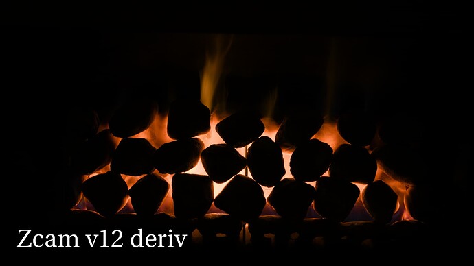
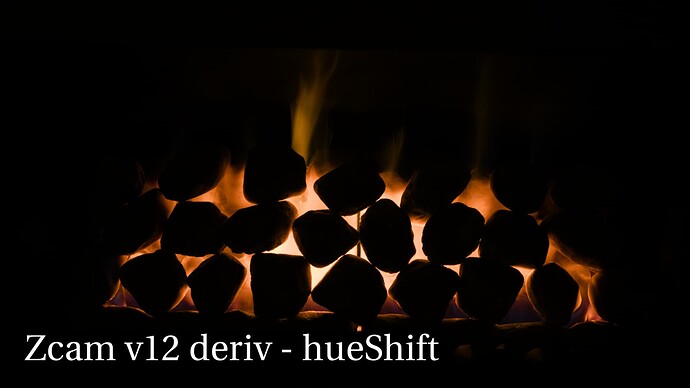
Wow the blue skies are really looking much better in the Zcam Deriv, especially notable is the night sky no longer being teal!

Again, I think it’s more about color accuracy (and again, I could be wrong). I also don’t think trying to skew it towards yellow is actually correct thing to do. If you look at the “reference” image of how Thomas perceived it, I would think you’d actually want to darken the reds and skew them towards magenta instead (ie. they’ve been rendered too bright and too orange). As for the bright middle part of the image, it would be interesting to see how it renders in HDR. Other thing to keep in mind is that the DRT has lower contrast and saturation than Thomas’s ground truth image, so it’s not supposed to render identical.

I don’t think that’s correct actually, it’s not supposed to be that different. @Shebbe might have wrong input primaries.

Discussing the Candidates during the evaluation defeats the idea of blind testing.
Your posts could bias other testers.

1 Like

I don’t think we’ve ever considered the testing to be genuinely blinded. The meetings are public and recorded, and the Nuke script to generate the candidates is in a public GitHub repo.

1 Like

Please tell me if these settings were correct? (Viewer set to Raw).
Sorry for the confusion if they weren’t. Don’t think I touched any of the other parameters exposed on the node.

The gamut compression is disabled, it should be enabled by default. It makes the difference with blues.

Ahw snap, thanks for pointing it out. I will re-evaluate the earlier images I posted when I have some time. Added an edit to my post for clarity.

Thanks, that’s a helpful perspective. One thing worth noting in regards to color accuracy is that the “salmon” color of fire in Candidate C is only present in the SDR, not at all in HDR. So it seems that as far as fire goes, the match between SDR and HDR seems better in Candidate A than it does in Candidate C.

That’s interesting. The color of that fire changes a lot if the gamut compression is disabled (in SDR).

First with gamut mapping, second without:

First with gamut mapping, second without:

It seems it’s perhaps compressed too much.

Edit: updated the chromaticity diagrams without clamping and higher exposure to see clearer. Clamping doesn’t change much in the images themselves.

1 Like

Compression was also the culprit with blue as well for C, right?

The gamut mapping contributes to the sharp transition from dark cyans to blues, yes, and because of the ZCAM model, blue values outside the spectral locus skew more towards cyan also during the mapping.

One thing again to keep in mind is that the DRT has lower contrast and saturation than the ground truth image, so the question is also can you color grade that fireplace to place where it looks more “correct” by increasing saturation? Here’s very simple grade in Resolve:

I’m only increasing global saturation (in HDR wheels) and lowering highlight exposure a little bit. So, yeah it may be over compressed a bit, but it’s easy to get it to something more familiar looking. This was with ACEScg as working space rather than ACEScct.

More worrying thing is the mismatch between SDR and HDR out of the box.

Interesting. When I was watching the latest output transform meeting I heard that according to (limited) feedback people were overall happier with Can. C in HDR tests because it also matched to SDR better. Is it still far of? Or is it more/less with your version of the model?

The grade does make it look a lot better but it’s also lowered in exposure right? Can you achieve the same result without altering exposure?

Even if presented darker, I still feel a certain amount of ‘monotone-ness’ compared to A where you have a nice gradient from reds to yellow ‘for free’. I’m just really uncertain if this is the same case when viewed IRL or if having this in a DRT can have issues elsewhere. It is also fair to say that if I’d be represented with this graded C image I wouldn’t have any problems with it’s appearance.

Gain on both set to 0.20, Can. C extra corrector with some efforts to match look.

Can. C left, Can. A right

Close up

I’m also a bit hyperfocusing on this particular image now without ground truth knowledge so I don’t think we should take my opinions super seriously :slight_smile:

Coming back to my mistake of having the gamut compression disabled on the DRT_ZCAM_IzMh_v12_deriv node, perhaps the compression can be finetuned to be less aggressive for the sake of better dark blues and reds? I still think having it of gave better results out of the box in a lot of scenes that may not have needed as much.

I personally felt that when I toggled between HDR and SDR like you can with the comparison website from Alex that Candidate C did feel overall to be a better match. However no one is going to have two TV set at home side by side. They will watch one or the other, and so what needs to match is the impression or memory of HDR and SDR.

For example when I look at skin in candidate A in HDR and SDR I am at first really struck by the difference. The skin looks weirdly goulish in SDR. But then if I get up and get a snack and then come back to the SDR image the skin looks completely normal and lovely to my eye.