Output Transform Tone Scale

Exactly, but not only, when you juxtapose such different images it is an even deeper rabbit hole than just adaptation. You start losing what is an illumination source vs reflectance in the image which has plenty of cognitive consequences.

Indeed, and I’m actually questioning the usefulness of the experiment at the scaling factor involved for the 600 nits variant.

Yes but you have same effects when you show a real 600 nits peak image next to a 100 nit one.

If you have a monitor with peak at 300 nits (pretending it is a 600 nits monitor) than SDR is at 50 nits.
So everything is just a stop below the real thing. Which is easily adaptable.

But of course there are other aspects like quantisation and contrast which do not match.

Ideally you do you experiments on a proper HDR monitor if you have one.

Well, more or less, as you mentioned contrast, I will take the opportunity to point out that our colour perception has a strong non-linear relationship with absolute luminance levels, c.f. Barten (1999), Kim (2020). Relative appearance is not a sliding window that can be linearly moved around luminance levels while expecting that it will be preserved. This thread is a good example :slight_smile:

Cannot agree more!

Agree on all, but a relative slide of one stop is something we can easily slip around I would say.

I would even go so far to say that half a log step is something not to worry about which would be roughly factor of 3. As long as all parameter keep same ratios of course.

1 Like

I wanted to circle back to the Kelvin temp discussion earlier in this thread. Here’s another comparison of kelvin temps zooming in on the light bulbs from this RED Dragon test image to draw out the difference in how the various output transforms render the warm Edison light bulbs.

@Troy_James_Sobotka was speaking of earlier of how

I’m guessing that by “gaudy” yellow Troy means the high saturation yellow of the light bulbs in the ACES transform above. I wanted to therefore clarify that when I express the desire that the OpenDRT should “go to yellow” for Kelvin temps, I definitely do not mean yellow like in the ACES transform, but rather the warm yellow seen in the IPP2 or TCAM here. To my eyes the ACES is too saturated in the yellows. This is not what a warm Edison light bulb looks like to our eyes.

I’m guessing that this is why Troy refers to this as an “aesthetic” and “look” as does @jedsmith

In other words, if one wants the “look” of high saturated yellow light bulbs or fire, like we have in the current ACES output transform, this would be possible and the place to achieve that look would be in the LMT. One can hate or love that look, but I think we can all agree that it is a look.

What I wanted to clarify is that I am not wanting that “look” when addressing Kelvin temps. Rather, I am wanting kelvin temperatures to behave like they do to my eyes so that fire and light bulbs feel warm. The IPP2 and TCAM appear to be doing that, getting that natural warm yellow that the eye sees in an Edison bulb. The OpenDRT is very close, but it stays reddish, never quite getting to the warm “golden” tungsten yellow. Here’s another example from my render of a lampshade where I the difference is hopefully more visible:

I apologize that I have no idea whether what I’m asking for is relatively simple or impossibly hard. I do know that as a CG look dev and lighting artist it would be a highly desirable behavior to have light temps working in a natural way (the way they look to our eyes). It’s particularly important in software that require the color for pyro effects is determined by the kelvin temperature and do not give the option of manually picking the color. Would you agree that this would be a behavior that would be appropriate to handle in the output transform, rather than a look?

1 Like

Hi,

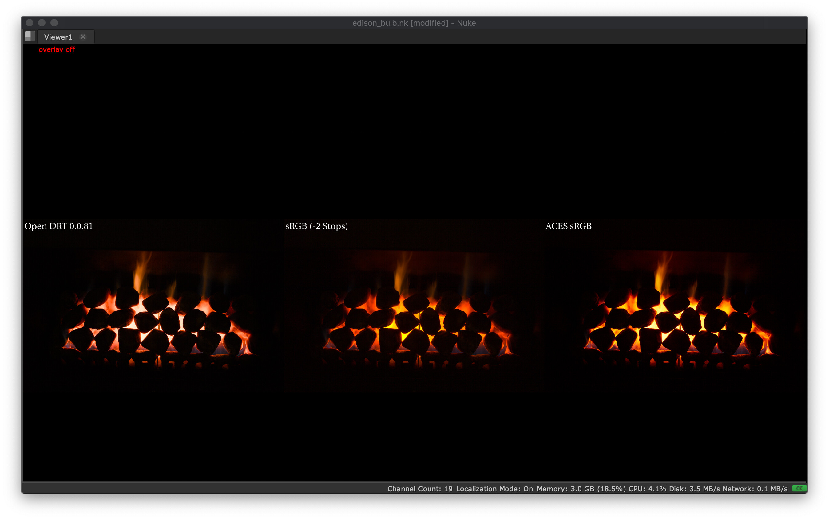
@Derek : I tend to agree with you, and decided to shoot some ground truth data tonight, it is x20 stacked with x20 dark fields, processed with Raw to ACES using the spectral sensitivities of my camera and at D60 to remove the white-balance of the equation. What I see with my eye is very close to the center column.

Edison Light Bulb

Fireplace

Took that opportunity to poke at Jed’s latest, some cool stuff here, probably too much aesthetics tuning for my taste but certainly good building blocks, it is trivial to slot the SSTS in also.

Cheers,

Thomas

PS: The files are available if you click on the section headers!

1 Like

Thanks for the ground truth data @Thomas_Mansencal. I have played with the footage tonight and I cannot reproduce your results unfortunately. Am I missing something obvious ?

This I what I get :

  • On the left, OpenDRT out-of-the-box. Seems ~orange.
  • In the middle, ACEScg → Utility - Rec.709 - Display (with -1 stop). Seems ~orange.
  • On the right, Output - Rec.709 (ACES). Seems ~yellow.

I have downloaded the footage from the Dropbox and loaded it in Nuke as ACES - ACES2065-1. I cannot get the yellow look on the centered one like yours (even with 2 stops down). Here is the Nuke script : comparison.nk (36.5 KB)

I was curious about this footage. So I had a look at it through TCAMv2. Seems ~orange.

RED IPP2 (from the VWG OCIO Config). Seems ~orange.

OpenDRT (Bt.1886 EOTF - Rec.709 primaries exposure sweep). Seems ~orange.

ACES - Output rec.709 (exposure sweep). Starts ~orange and ends up ~yellow.

BT.1886 EOTF - Rec.709 primaries. Starts ~orange and ends up ~yellow.

I am seeing here the “usual pattern” from our previous experiments, right ?

  • TCAMv2, OpenDRT and IPP2 maintain “hue” on their path to white.
  • ACES, and even the BT.1886 EOTF, will collapse values toward one of the notorious 6 (in this case, yellow).

But to me, the most interesting point is at -3 or -2 stops, they all look “approximately” the same (~orange). It is really on their path to white and when they reach the display’s limit that their behaviors differ.

Hope I didn’t miss something obvious as it is past midnight here,
Chris

Haven’t checked your script but the imagery is encoded using ACES2065-1 so you need to account for that. Worth noting that my middle sRGB columns are actually the baseline and I exposed +2 stops the other ones, so relatively center is -2 stops, sorry I should have made that clearer by pasting the script!

There is a tendency toward pinkish in the path-to-white that is certainly not how I perceived those illumination sources when I shot them.

I suspect this is because the bulb filament is a single kelvin temperature so it’s just one color. That’s just a guess. Regardless, if you look at @Thomas_Mansencal’s fire, there you can see the full Kelvin range from red, to yellow-white, and even blue at the base!

Here’s a TCAM, OpenDRT, and IPP2, with a cropped section of Thomas’ fire:

Next I do some global adjustments to bring out the detail. I raise gamma to 1.5 and gain to 1.25:

Then I do some adjustments to balance the images a bit. I raise the saturation on OpenDRT and IPP2 to 1.1 and lower the gain on IPP2 to 0.65:

Here’s the Nuke script with all of the above:
Kelvin_fire.nk (35.9 KB)

Now for the observations. In the colder parts of the fire, all are showing orange:

But in the hotter part TCAM and IPP2 are showing yellow, while OpenDRT is showing light orange.

Here are those colors blurred and sampled and put into swatches.

As I understand it (and I’m sure I understand these things the least of anyone here!) the Planckian locus is not a simple “path to white” for a single color, but rather is a path through a color space that (quoting from Wikipedia) “goes from deep red at low temperatures through orange, yellowish white, white, and finally bluish white at very high temperatures.”

1 Like

I took the photographs on purpose not too long after I ignited the fireplace so that it did not have too much time too heat and still had some blue. It seems contradictory but this is far from being a pure Planckian Radiator thus the colour is also very much correlated to what burns, i.e. natural gas. In this case, blue is surprisingly pertaining to lower temperature, indeed, upon ignition the flames are blue for a couple of dozens of seconds.

As I was just writing, my fireplace does not really behave like a pure Blackbody so it is not really comparable. Also, conceptually the path-to-white is not related to the Planckian Locus, it is required to produce pleasing images mostly because our displays do not have enough dynamic range to form scene images properly.

2 Likes

Thanks for that @Thomas_Mansencal! Super fascinating stuff!

Thanks guys ! Interesting conversation !

Totally ! But that’s not the point of OpenDRT, right ? I think what Jed has been trying to achieve (in a rather successful way I may add) is to get a neutral Output Transform. Without any perceptual facet or aesthetics involved.

It is full chromaticity linear / hue linear (except for the chroma compression in highlights if the perceptual checkbox is active).

I think that keeping these two things separate is critical :

  • Neutral Output Transform.
  • Any perceptual facet or aesthetic could be implemented in a LMT (hopefully ?).

I see many pros for doing things this way :

  • No debate about aesthetics/perceptual regarding the Output Transform.
  • Different LMTs available to serve different purposes/taste/projects.
  • It would allow a strong/“ground truth” foundation for the Output Transform while giving flexibility to the image makers.

If we have a glimpse at our past projects at IMG :

  • A movie happening in the seventies (Minions).
  • A movie happening in a fantastic land (Grinch).
  • A movie happening in early 2000’s NYC (Pets).

We could use the same Output Transform for each project but a different LMT to give our directors the look they’re aiming at (PFE of an old Kodak print, Vibrant colours like a videoclip, Teal & Orange…).

I’m afraid that if we stick to per-channel, we will never have this strong foundation and flexibility. Here is a plot of sRGB primaries’ path to white through the P3D65 (ACES) Output Transform :

Please note :

  • The “gaps” between the hue paths that actually prevent reaching some values when going towards the achromatic point.
  • The hue distortions because of the convergence to the Notorious 6 (RGBCYM).
  • This does match our workflow : working space in linear_srgb, rendering in acescg and display in P3D65 (ACES).

One may like this behavior (like the fire/bulb examples above) but it doesn’t give a choice, right ? It should be easier to start wit straight lines and bend them to someone’s taste through a LMT ?

“Path to white” and “pleasing” do not necessarily go hand-in-hand, right ? Like the “tendency toward pinkish” you had in your examples. I try to keep these two concepts separated, otherwise it is too complicated/tangled.

Thanks !
Chris

I would argue that there is some aesthetics and personal preferences involved and that there is perceptual modeling. There is a “perceptual” dechroma box to try to compensate for Abney Effect :slight_smile: There is also a saturation parameter that is used to do either aesthetics or Hunt Effect compensation. This shows that there is a limit to “Without any perceptual facet or aesthetics involved.”

One of the goal is for imagery to fall right out of the truck. The OpenDRT is not based on any analytical analysis of a process, e.g. film rendering nor it is based on any psychophysics experiments. This does not mean it can not work, I think it does to a large degree but then what is the proposal to tune the parameters?

At this stage, it seems tricky to escape subjective tuning, it already happened effectively.

Chris,

If I am understanding Thomas correctly, since

we should not expect fire to go from orange to yellow with an increase in exposure. That would be a path to white. Orange fire with increased exposure would go to white, yellow fire with increased exposure would go to white. I believe that OpenDRT, TCAM, and IPP2 all do that.

What determines the color of the fire or light in the first place is the temperature (kelvin). That’s where we get that parts of the fire are orange and other parts are yellow (or blue). That color is not a look or aesthetic choice, rather it is based on faithfully reproducing the scene information. How saturated that color is could be said to be an aesthetic choice.

So I do not think we need to choose between path to white and the path of kelvin colors. We can have both. TCAM and IPP2 both do.

I suspect that the issue with “salmon colored” fire and light bulbs has to do with the red being too dominant somehow in OpenDRT. So a mix of RGB that would appear as yellow in another OT (for example the color of 3200 Kelvin) appears as reddish in OpenDRT. I’ll try to post some examples later of this.

yeah, that’s true. @Thomas_Mansencal Hopefully I can develop a bit further…

I think OpenDRT is a work-in-progress experiment. The perceptual checkbox and saturation slider are indeed attempts of addressing the Abney and Hunt Effects. But I guess they are not necessarily meant to stay in the final version of OpenDRT (and rather go in a LMT) ?

But I guess this leads to the question of :

  • What would go in the Output transform itself ?
  • What would go in a “default” LMT ?

Jed did an interesting list already of the different modules in the Output Transform :

  • Input Conversion
  • Gamut Mapping
  • Whitepoint
  • Rendering Transform
  • Display Gamut Conversion
  • Inverse EOTF
  • Clamp

I’d be curious to know if everybody agrees with this list/structure. Furthermore you already listed some of the CAM “Effects” here (back in February ! Thanks for that !) :

Now that we have opened the can of worms, shall we talk about colour appearance modeling?

  • Surround/Viewing Conditions
  • Stevens Effect
  • Hunt Effect
  • Abney Effect
  • Bezold-Brücke Effect
  • And the remaining ones of Advanced Colorimetry

I have also read your answer about the Hunt Effect saturation slider and I thought it was really great ! I’d be of course quite interested if you have some kind of solution/hint for each of the “Effects”…

As you can you probably tell, I have a thing for listing stuff. It helps me to think. And hopefully it would help to see on which point the VWG agrees/disagrees (per-channel, chromaticity linear…) so we can keep moving forward.

Chris

Sorry @Derek I did not mean to go through your answer.

I have written a presentation about black bodies and kelvin temperatures (with the help of most of the amazing people present on AC such as Thomas, Jed, Kevin, Troy, Sean…) and I could share it with you at some point (if you’re interested).

I personally try to remove Kelvin temperatures from the (rendering) equation because it adds a layer of complexity. And I’m not smart enough to tell what is right/wrong.

I am trying instead to focus on getting chromaticities faithfully to the display. That’s hard enough !

Chris

Hey Chris, I appreciate this as personal working strategy as a CG lighting artist. However, there are two difficulties with this in terms of ACES. First, while we can do this in CG, we obviously cannot in the real world, as Thomas’ photo demonstrates. The scene data for that fire color is the scene data. Secondly, if we are aiming to do physically based rendering we will likewise want to work with those scene data colors in CG.

Me too!

UPDATE: I changed the sweep to go from red to yellow.

Here’s a sweep of RGB values going from red (1,0,0) to yellow (1,1,0) viewed through OpenDRT, IPP2, TCAM and sRGB.

Then I raised the exposure to see how each color’s path-to-white looked.
Exposure of 1:

exposure of 2:

exposure of 3:

1 Like

Colour appearance is directly driven by the viewing conditions and thus it cannot be part of an LMT, i.e. the Scene. If you were to do so, you would be creating a Display-Referred constraint to the Scene-Referred section of the ACES diagram, essentially nullifying any of the benefits of the separation between the Scene and the Display and the design principles of ACES.

Here are the sweeps with OpenDRT saturation set to 1 (lowered from 1.2). This helps to draw out the issue I am observing in OpenDRT, which I would describe as a dominance of red.

I think that this “red dominance” is related to the path-to-white, meaning that red seems to hold on with increased luminance while other colors dechroma. This does not appear to be an issue at non-luminous levels. Thus the sweeps look similar at 0 exposure and only diverge in how the same RGB values are displayed with increased exposure.

exposure 0:

exposure 1:

exposure 2:

exposure 3:

1 Like