I don’t see how this is relevant or makes my comparison invalid?
Not to be completely pedantic and distract from the point … but your math there is not the whole picture.
All of the HDR Output Transforms in ACES 1.2 have stretch black = true, which sets Y_{min} to 0.
linCV is not scaled by Y_{max}, it is scaled by the ratio of Y_{max} and peak display luminance, which for PQ is 10,000 nit. So the equation you pasted above is only the first part of the normalization. The second is in the PQ Inverse EOTF. Both parts combined simplify to linCV * \frac{Y_{max}}{10,000}, which if I’m not mistaken is exactly what I did above.
This is true, but with directions to boost display brightness as much as possible with whatever SDR device people have access to. My intent is to show the “rough relative appearance difference” between the “look” of the hdr rendering, and the sdr rendering with different display transforms.
So a question then, since I’m assuming you do have access to an HDR display device: Do you see an appearance different between HDR and SDR that is different than my tests above when you do the same test on an HDR display device? I would be curious to hear the answer to this question.
The relevance is that you modify the SDR imagery, preventing its highlights to reach display peak luminance by dividing them by 6 while the normalised HDR imagery highlights are allowed to reach peak luminance. Then you are asking for a meaningful comparison that requires people to extrapolate really hard from that basis where in reality no one will ever see the imagery like that. Hope it makes sense!
Ah! Considering that Y_{min} is 0.0001 it is pedantic, but then I have said exact, so point taken!
PQ is an absolute EOTF and always normalizes the luminance input by 10000, it is a constant that never changes.
I have certainly never seen anything that makes it look like the imagery is clipped and quantized like on your example, which prompted my original reply and trying to understand how you came about it. Trying to simulate HDR appearance on an SDR display does not really work, we would not have created HDR technology in the first place if it did.
Edit: In case it’s not clear the above two videos are HDR Rec.2020 ST-2084 PQ, and intended to be viewed on an HDR device. If you view them on an SDR device you will not be seeing them as intended, though surprisingly youtube’s HDR->SDR conversion is pretty good and you may get the idea even on an SDR display.
Isn’t that kind of what Apple EDR does, that recent Resolve and Nuke builds for macOS make use of? It’s certainly not true HDR, but on my 16" MacBook Pro I can flip between a reasonable looking SDR image, and then an EDR image that shows more highlight range and detail.
Obviously an iPhone video of the laptop screen does not show it brilliantly!
What is your Macbook peak Luminance though? The 16" 2019 model is above 400nits, it is x4 times that of a typical SDR display, and thus has much more headroom. My iPhone 11 Pro is 800nits… EDR only came recently because Apple displays are brighter than before and are surfing at the entry door of proper HDR.
Extending Jed’s process to simulate a 1000 display would result in images that are totally defective when presented on an SDR display. This is especially true if compared by juxtaposition because you are comparing them in relation to each other and leave no chance for the HVS to decide what is actually white. You effectively impose the simulated HDR white to be the reference and everything becomes judged with respect to that then.
Looking at Jed’s latest videos, the only thing I see on my SDR display is a comparison between soft-clipped images and their non-soft clipped variant, nothing that reproduces the appearance of HDR in any meaningful way.
Meta Edit: Please, partially, disregard my previous paragraph in the light of Jed’s Edit: the videos were originally posted without context and I assumed, incorrectly, that they were direct follow-up of what is currently being discussed. I, however, still maintain that if there is still the idea to convey HDR look on SDR, it does not work.
The place where you scale does not really matter as long as it is linear light. We do pre EOTF scaling all the time.
Jed was assuming in his first example that your monitors peak white is 250 nits. And then he produced a 100 nit peak image within the 250 nits peak monitor Vs a image going all the way up to 250 nits.
In SDR, with factors that reduce the signal peak by 6 or over? No way…
In his second example which is the one I reacted to, i.e. 600 nits display, he was talking about a normal computer display which normatively, here, is 100 nits, not 200, not 400 or 600. Reproducing the appearance of HDR at 600 nits on a 100 nits display simply does work but if people think it does, then all good
Comparing SDR and HDR as the same time is questionable anyway because of adaption.
I hope everybody understood (at least I did) to take it with a grain of salt.
I still think it shows the point (and I can say that the skews in the RGB tonemapping looks very similar to Jed’s simulation).
Exactly, but not only, when you juxtapose such different images it is an even deeper rabbit hole than just adaptation. You start losing what is an illumination source vs reflectance in the image which has plenty of cognitive consequences.
Indeed, and I’m actually questioning the usefulness of the experiment at the scaling factor involved for the 600 nits variant.
Yes but you have same effects when you show a real 600 nits peak image next to a 100 nit one.
If you have a monitor with peak at 300 nits (pretending it is a 600 nits monitor) than SDR is at 50 nits.
So everything is just a stop below the real thing. Which is easily adaptable.
But of course there are other aspects like quantisation and contrast which do not match.
Ideally you do you experiments on a proper HDR monitor if you have one.
Well, more or less, as you mentioned contrast, I will take the opportunity to point out that our colour perception has a strong non-linear relationship with absolute luminance levels, c.f. Barten (1999), Kim (2020). Relative appearance is not a sliding window that can be linearly moved around luminance levels while expecting that it will be preserved. This thread is a good example
Agree on all, but a relative slide of one stop is something we can easily slip around I would say.
I would even go so far to say that half a log step is something not to worry about which would be roughly factor of 3. As long as all parameter keep same ratios of course.
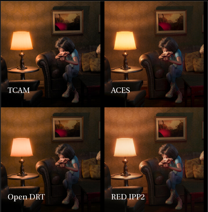
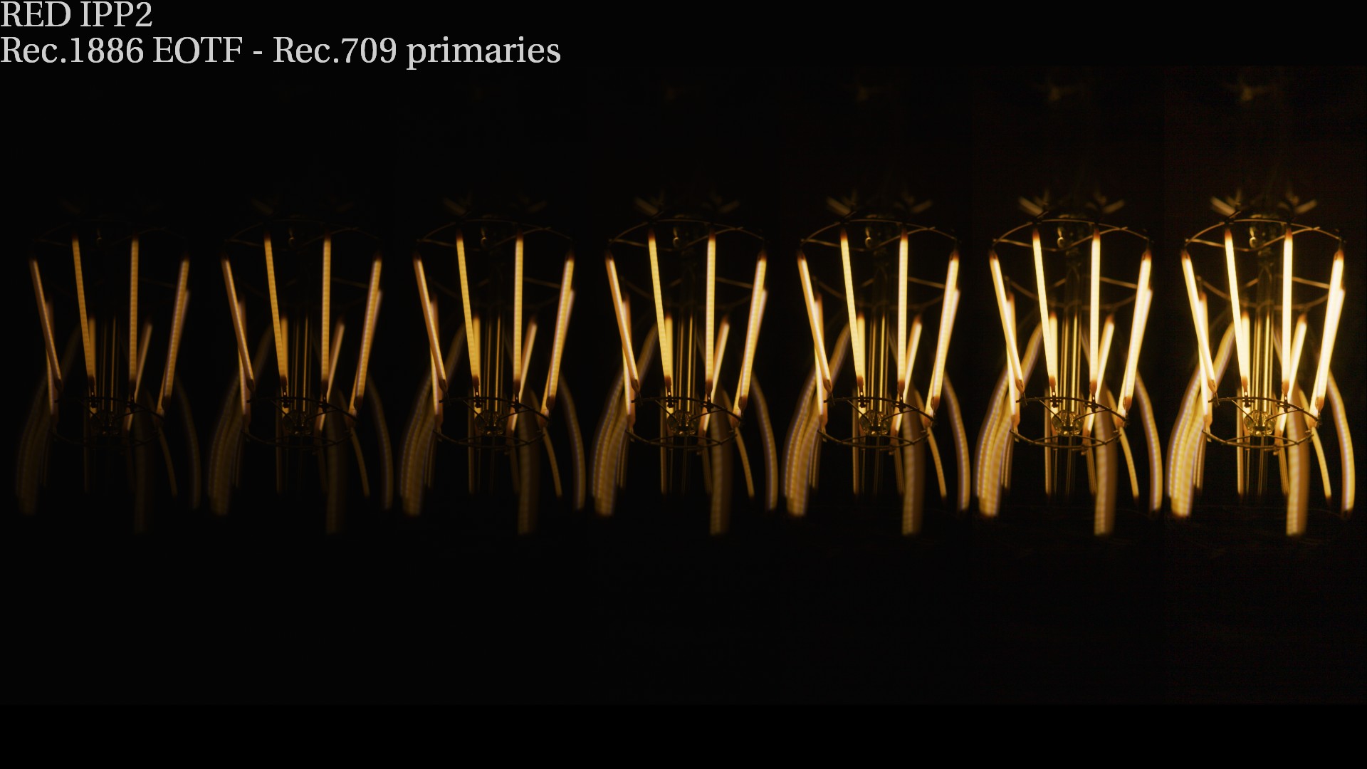
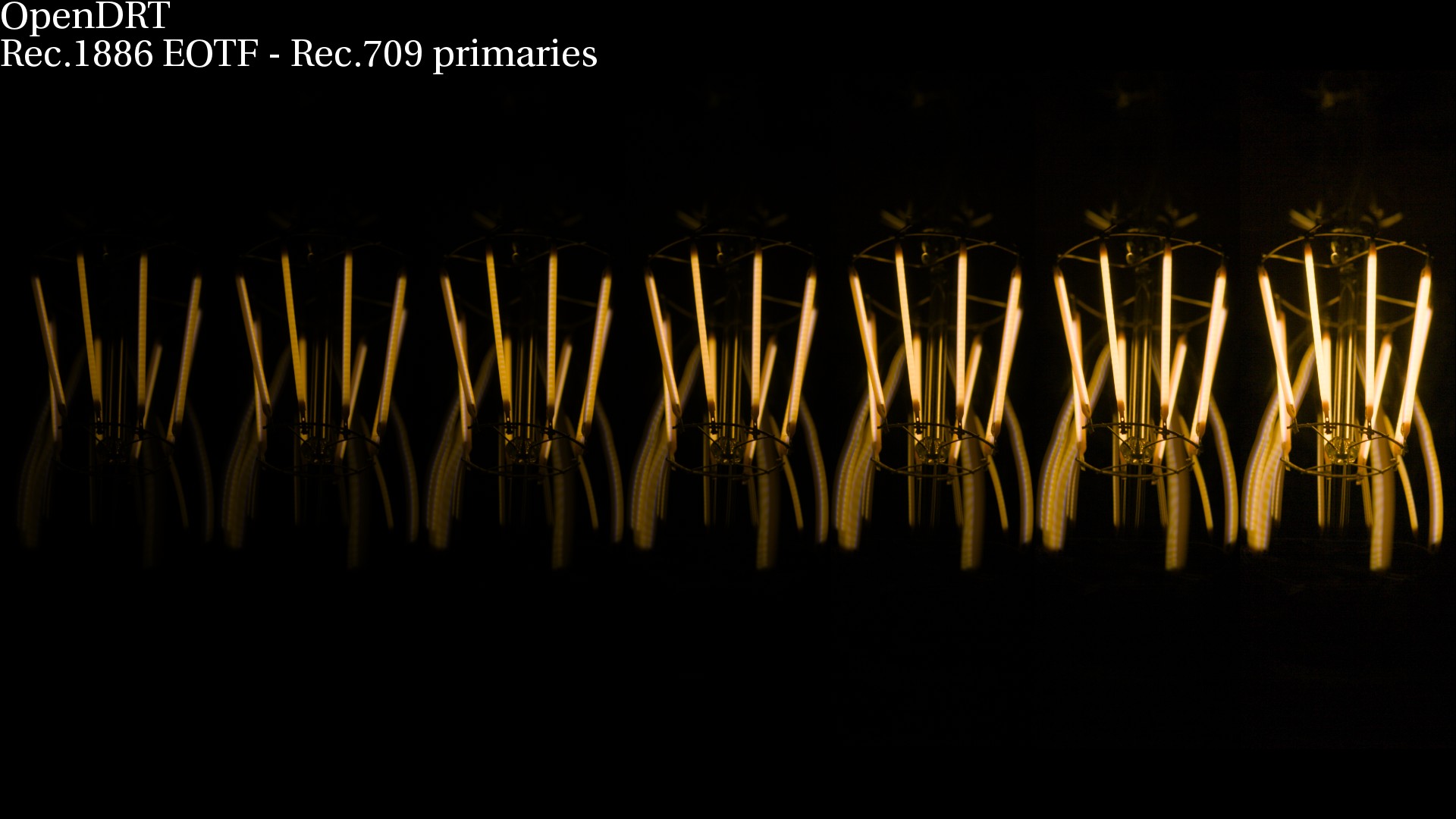
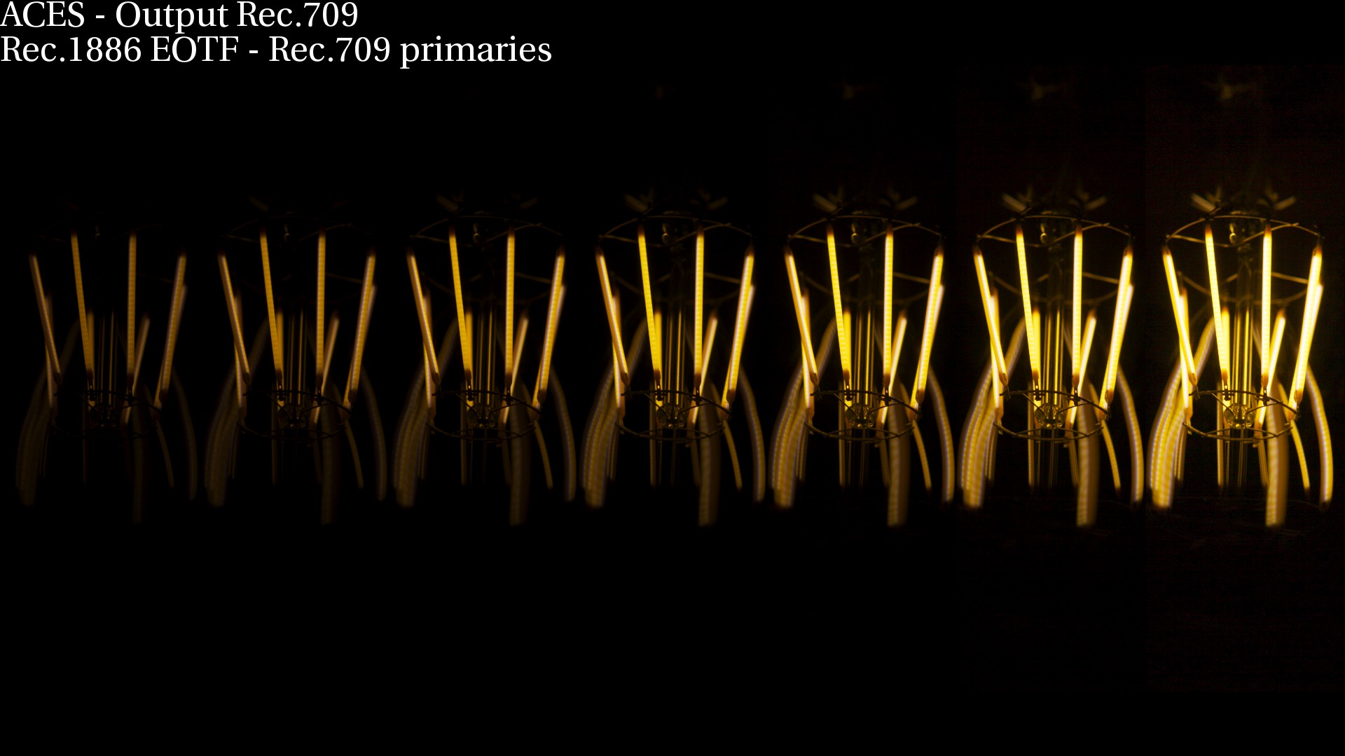
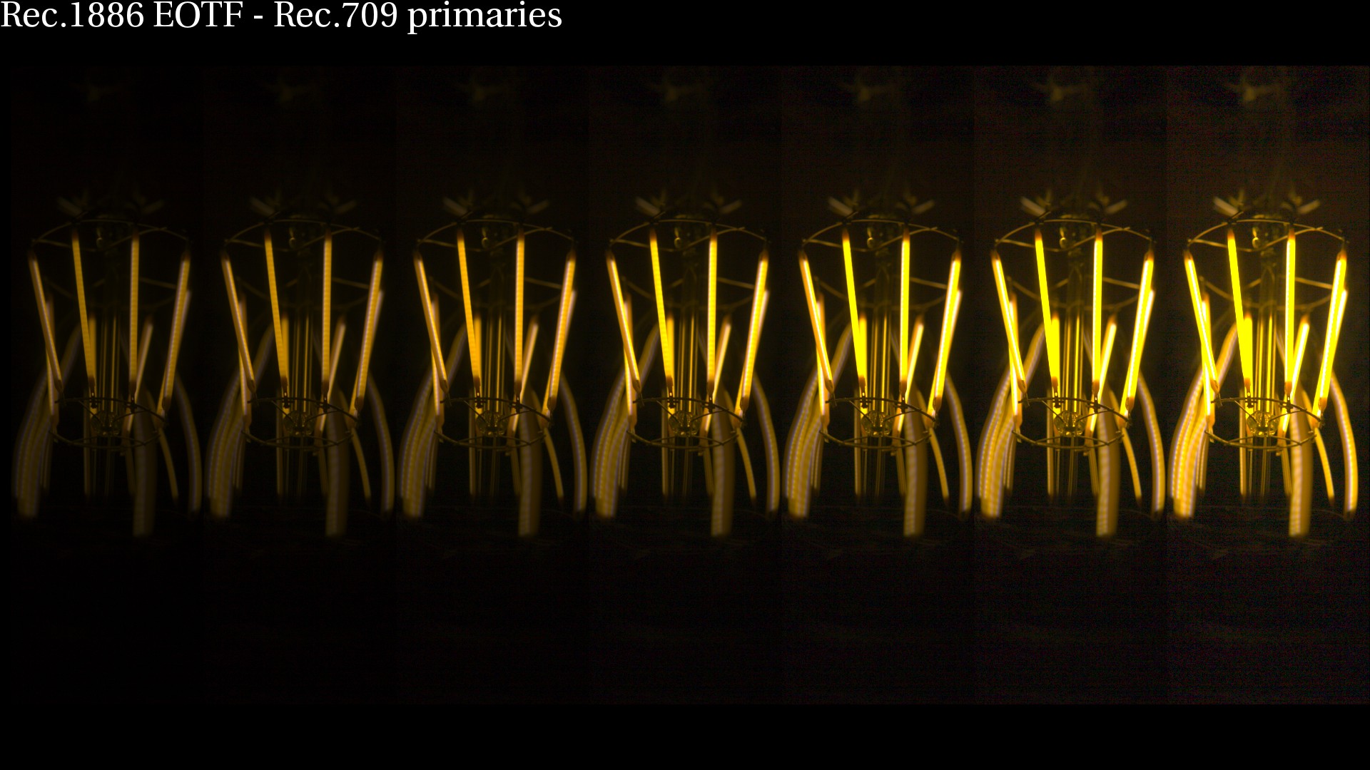
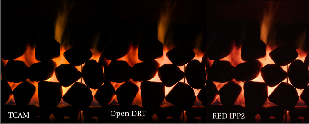
I wanted to circle back to the Kelvin temp discussion earlier in this thread. Here’s another comparison of kelvin temps zooming in on the light bulbs from this RED Dragon test image to draw out the difference in how the various output transforms render the warm Edison light bulbs.
I’m guessing that by “gaudy” yellow Troy means the high saturation yellow of the light bulbs in the ACES transform above. I wanted to therefore clarify that when I express the desire that the OpenDRT should “go to yellow” for Kelvin temps, I definitely do not mean yellow like in the ACES transform, but rather the warm yellow seen in the IPP2 or TCAM here. To my eyes the ACES is too saturated in the yellows. This is not what a warm Edison light bulb looks like to our eyes.
I’m guessing that this is why Troy refers to this as an “aesthetic” and “look” as does @jedsmith
In other words, if one wants the “look” of high saturated yellow light bulbs or fire, like we have in the current ACES output transform, this would be possible and the place to achieve that look would be in the LMT. One can hate or love that look, but I think we can all agree that it is a look.
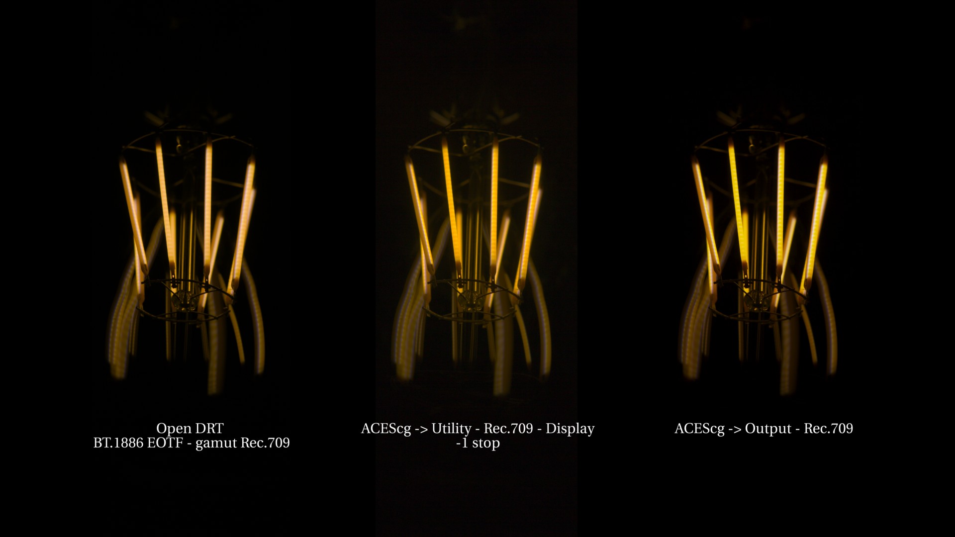
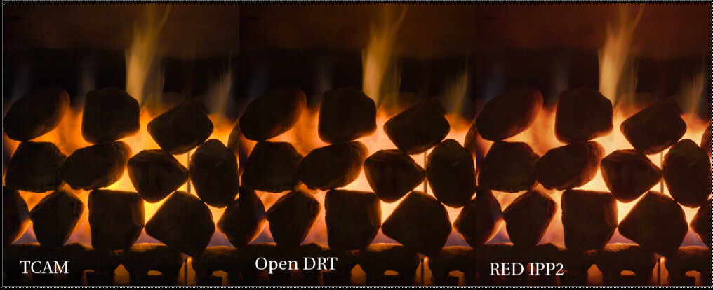
What I wanted to clarify is that I am not wanting that “look” when addressing Kelvin temps. Rather, I am wanting kelvin temperatures to behave like they do to my eyes so that fire and light bulbs feel warm. The IPP2 and TCAM appear to be doing that, getting that natural warm yellow that the eye sees in an Edison bulb. The OpenDRT is very close, but it stays reddish, never quite getting to the warm “golden” tungsten yellow. Here’s another example from my render of a lampshade where I the difference is hopefully more visible:
I apologize that I have no idea whether what I’m asking for is relatively simple or impossibly hard. I do know that as a CG look dev and lighting artist it would be a highly desirable behavior to have light temps working in a natural way (the way they look to our eyes). It’s particularly important in software that require the color for pyro effects is determined by the kelvin temperature and do not give the option of manually picking the color. Would you agree that this would be a behavior that would be appropriate to handle in the output transform, rather than a look?
@Derek : I tend to agree with you, and decided to shoot some ground truth data tonight, it is x20 stacked with x20 dark fields, processed with Raw to ACES using the spectral sensitivities of my camera and at D60 to remove the white-balance of the equation. What I see with my eye is very close to the center column.
Took that opportunity to poke at Jed’s latest, some cool stuff here, probably too much aesthetics tuning for my taste but certainly good building blocks, it is trivial to slot the SSTS in also.
Cheers,
Thomas
PS: The files are available if you click on the section headers!
Thanks for the ground truth data @Thomas_Mansencal. I have played with the footage tonight and I cannot reproduce your results unfortunately. Am I missing something obvious ?
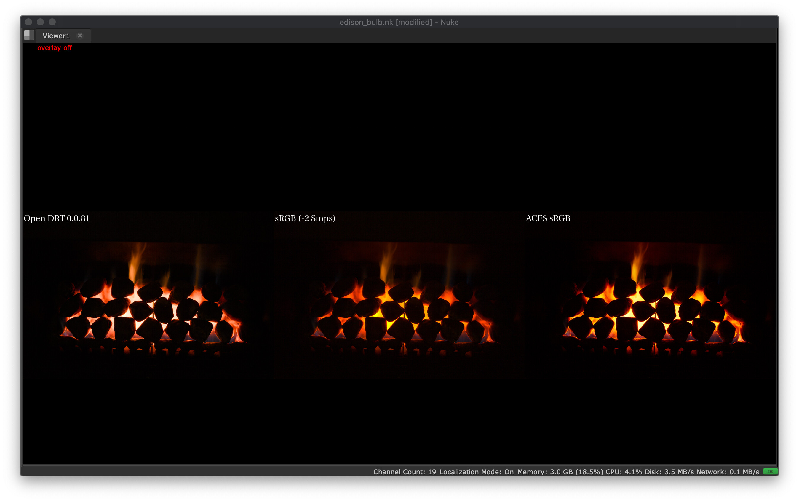
On the left, OpenDRT out-of-the-box. Seems ~orange.
In the middle, ACEScg → Utility - Rec.709 - Display (with -1 stop). Seems ~orange.
On the right, Output - Rec.709 (ACES). Seems ~yellow.
I have downloaded the footage from the Dropbox and loaded it in Nuke as ACES - ACES2065-1. I cannot get the yellow look on the centered one like yours (even with 2 stops down). Here is the Nuke script : comparison.nk (36.5 KB)
I was curious about this footage. So I had a look at it through TCAMv2. Seems ~orange.
I am seeing here the “usual pattern” from our previous experiments, right ?
TCAMv2, OpenDRT and IPP2 maintain “hue” on their path to white.
ACES, and even the BT.1886 EOTF, will collapse values toward one of the notorious 6 (in this case, yellow).
But to me, the most interesting point is at -3 or -2 stops, they all look “approximately” the same (~orange). It is really on their path to white and when they reach the display’s limit that their behaviors differ.
Hope I didn’t miss something obvious as it is past midnight here,
Chris
Haven’t checked your script but the imagery is encoded using ACES2065-1 so you need to account for that. Worth noting that my middle sRGB columns are actually the baseline and I exposed +2 stops the other ones, so relatively center is -2 stops, sorry I should have made that clearer by pasting the script!
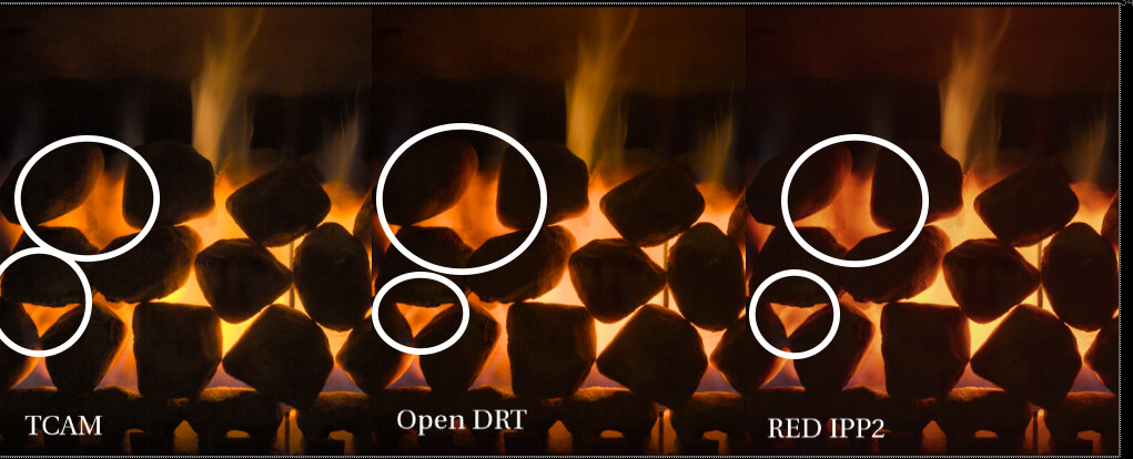
There is a tendency toward pinkish in the path-to-white that is certainly not how I perceived those illumination sources when I shot them.
I suspect this is because the bulb filament is a single kelvin temperature so it’s just one color. That’s just a guess. Regardless, if you look at @Thomas_Mansencal’s fire, there you can see the full Kelvin range from red, to yellow-white, and even blue at the base!
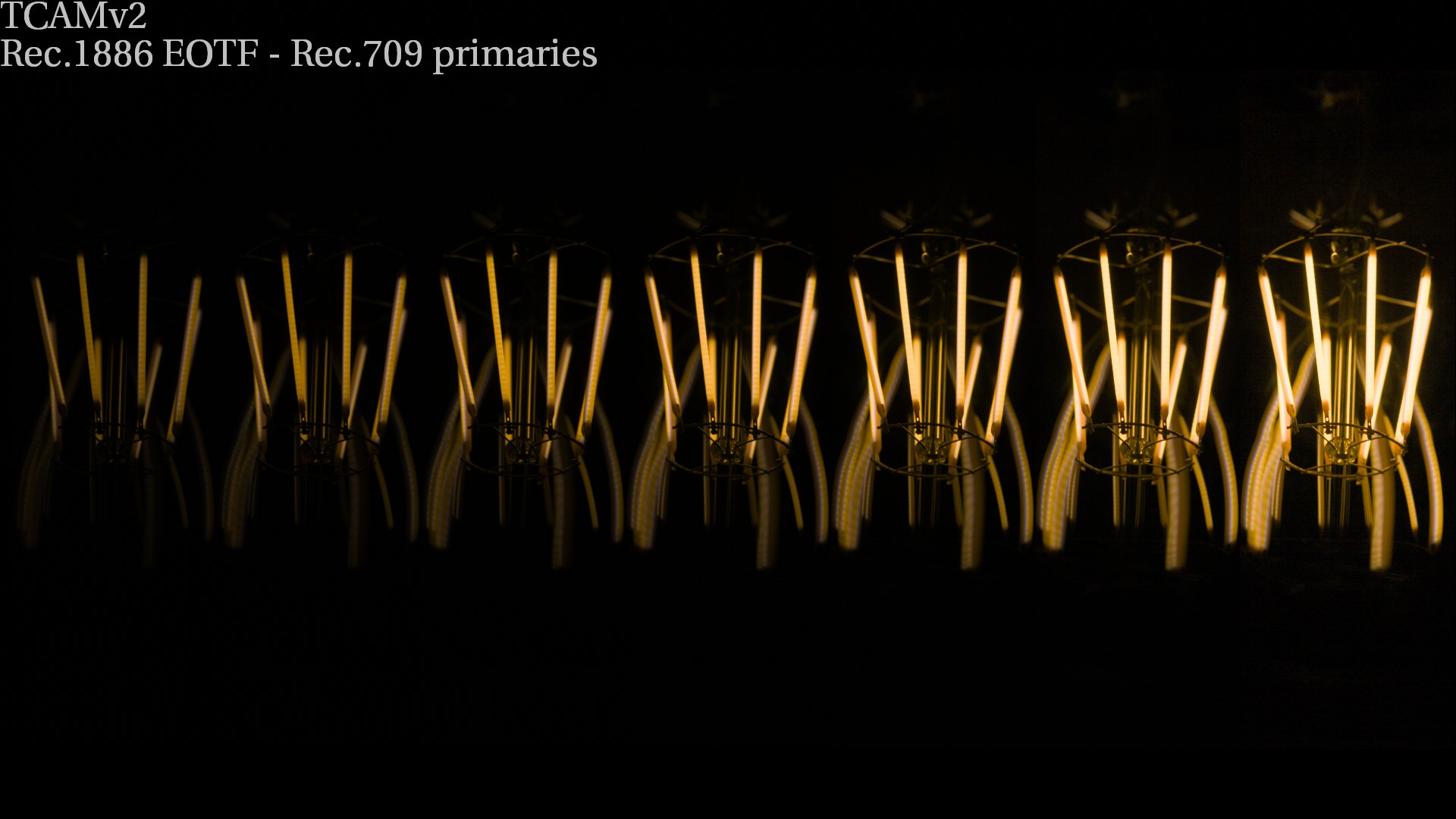
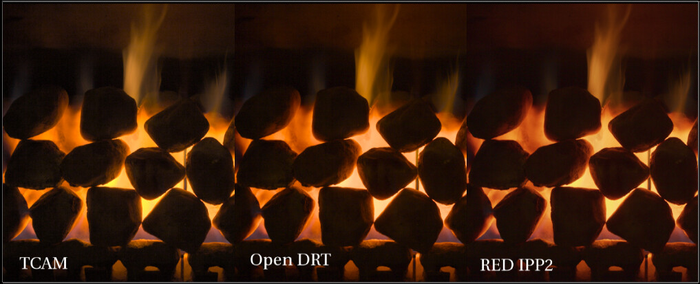
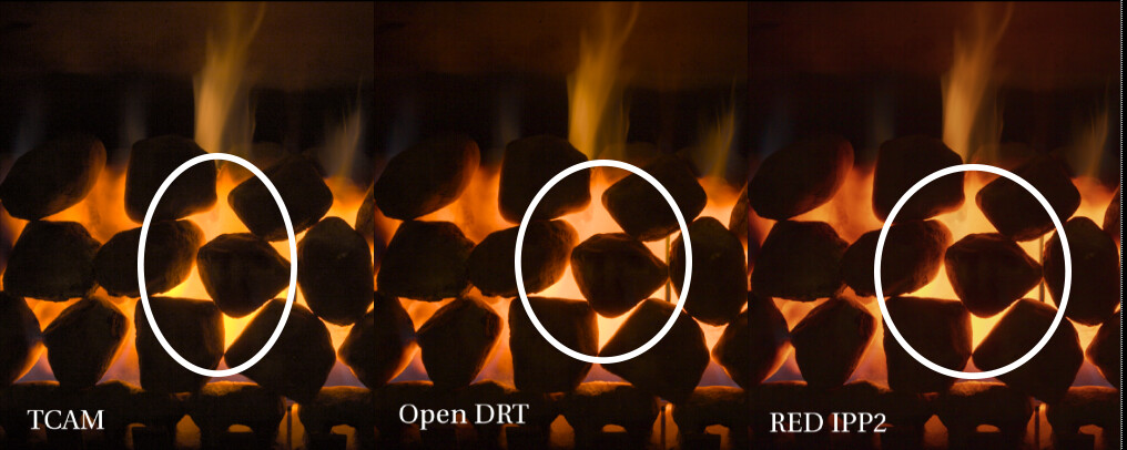
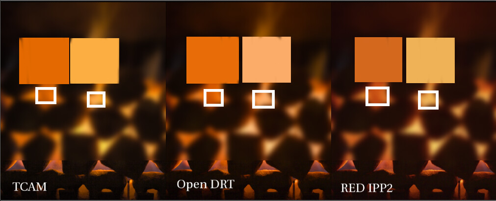
Here’s a TCAM, OpenDRT, and IPP2, with a cropped section of Thomas’ fire:
As I understand it (and I’m sure I understand these things the least of anyone here!) the Planckian locus is not a simple “path to white” for a single color, but rather is a path through a color space that (quoting from Wikipedia) “goes from deep red at low temperatures through orange, yellowish white, white, and finally bluish white at very high temperatures.”
I took the photographs on purpose not too long after I ignited the fireplace so that it did not have too much time too heat and still had some blue. It seems contradictory but this is far from being a pure Planckian Radiator thus the colour is also very much correlated to what burns, i.e. natural gas. In this case, blue is surprisingly pertaining to lower temperature, indeed, upon ignition the flames are blue for a couple of dozens of seconds.
As I was just writing, my fireplace does not really behave like a pure Blackbody so it is not really comparable. Also, conceptually the path-to-white is not related to the Planckian Locus, it is required to produce pleasing images mostly because our displays do not have enough dynamic range to form scene images properly.


