Output Transform Tone Scale

Thanks guys ! Interesting conversation !

Totally ! But that’s not the point of OpenDRT, right ? I think what Jed has been trying to achieve (in a rather successful way I may add) is to get a neutral Output Transform. Without any perceptual facet or aesthetics involved.

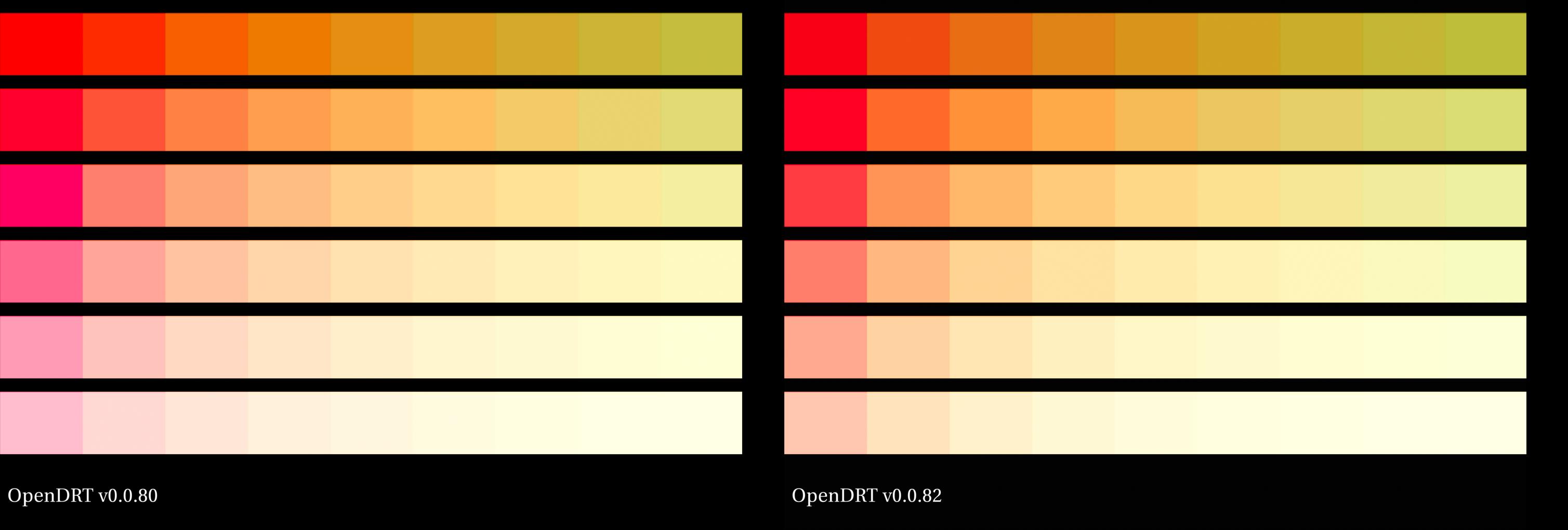
It is full chromaticity linear / hue linear (except for the chroma compression in highlights if the perceptual checkbox is active).

I think that keeping these two things separate is critical :

  • Neutral Output Transform.
  • Any perceptual facet or aesthetic could be implemented in a LMT (hopefully ?).

I see many pros for doing things this way :

  • No debate about aesthetics/perceptual regarding the Output Transform.
  • Different LMTs available to serve different purposes/taste/projects.
  • It would allow a strong/“ground truth” foundation for the Output Transform while giving flexibility to the image makers.

If we have a glimpse at our past projects at IMG :

  • A movie happening in the seventies (Minions).
  • A movie happening in a fantastic land (Grinch).
  • A movie happening in early 2000’s NYC (Pets).

We could use the same Output Transform for each project but a different LMT to give our directors the look they’re aiming at (PFE of an old Kodak print, Vibrant colours like a videoclip, Teal & Orange…).

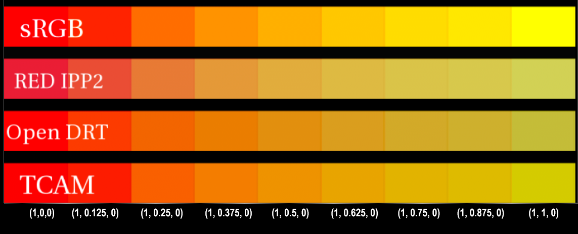
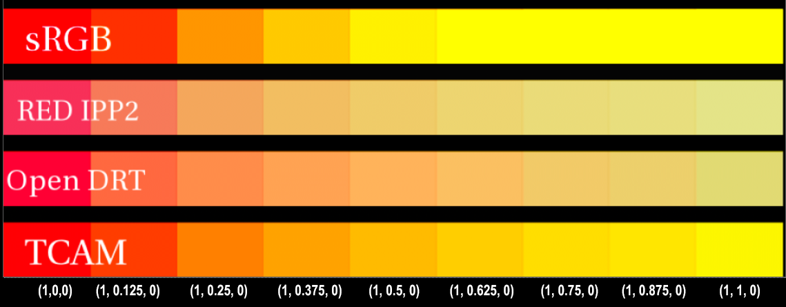
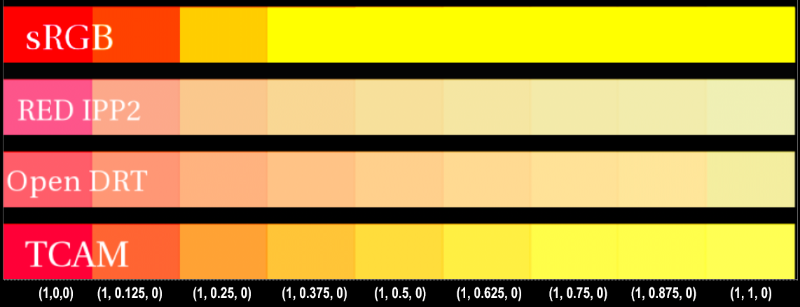
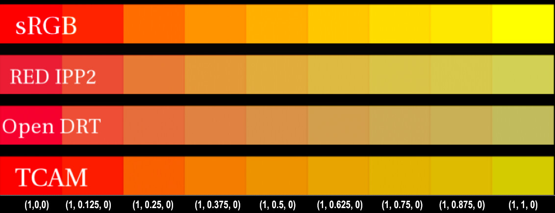
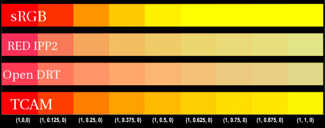
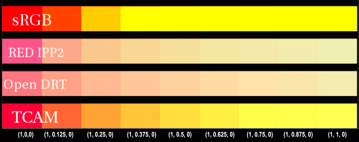
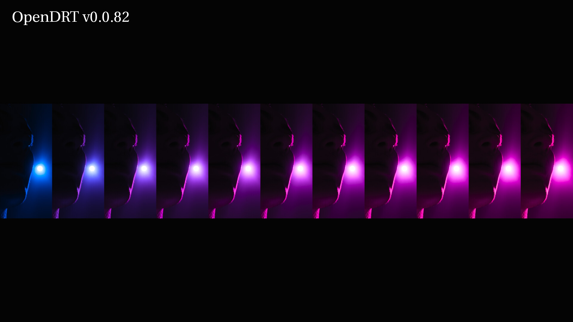
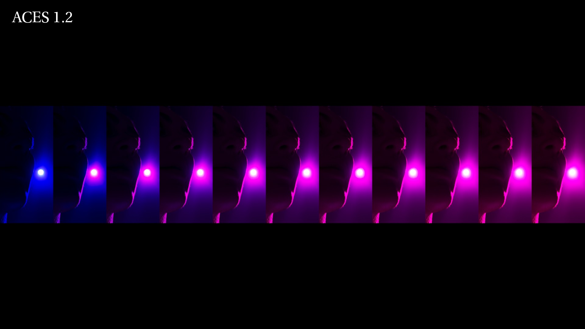
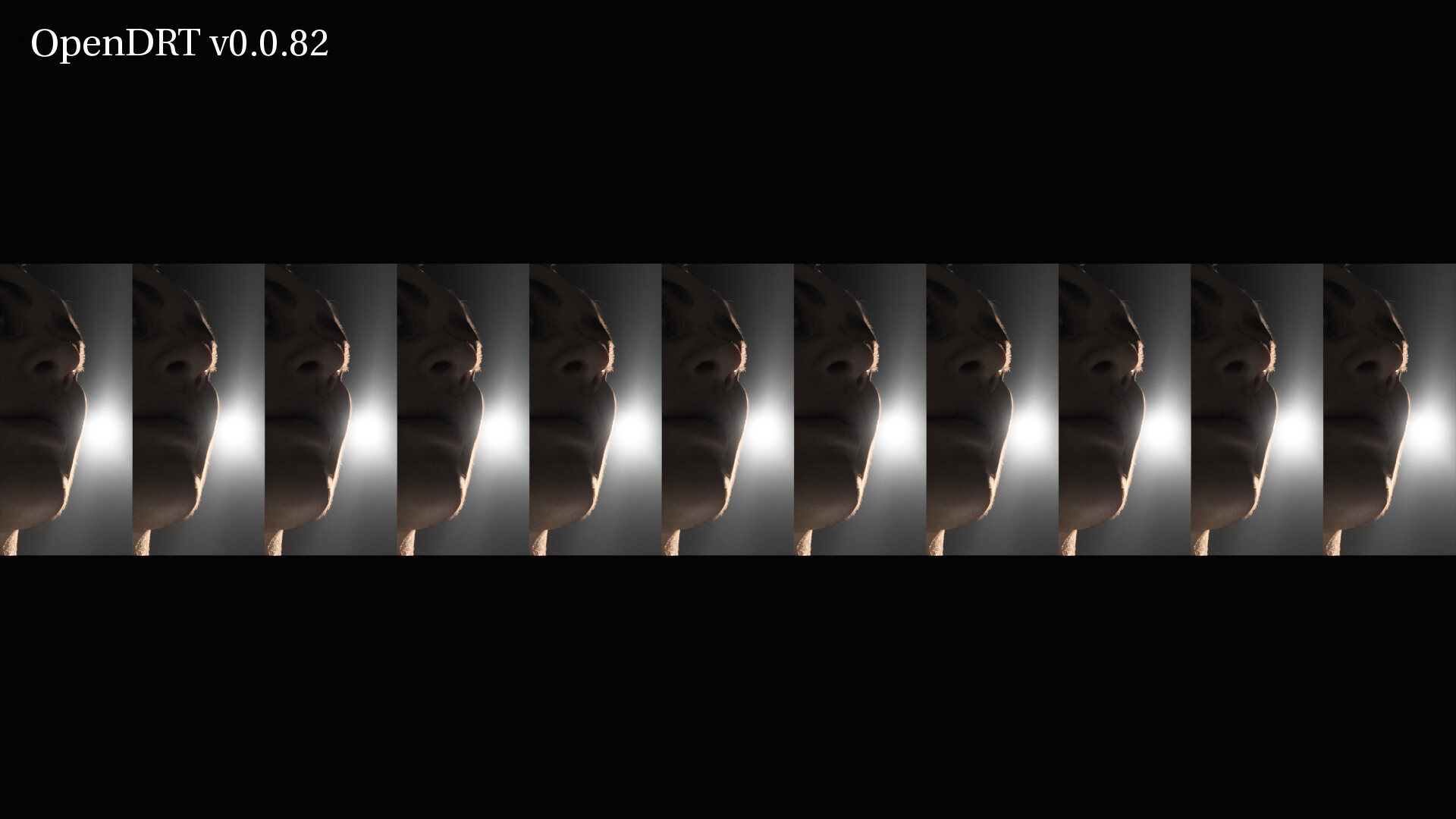
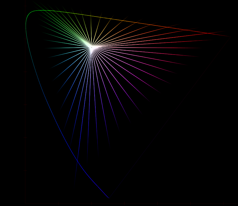
I’m afraid that if we stick to per-channel, we will never have this strong foundation and flexibility. Here is a plot of sRGB primaries’ path to white through the P3D65 (ACES) Output Transform :

Please note :

  • The “gaps” between the hue paths that actually prevent reaching some values when going towards the achromatic point.
  • The hue distortions because of the convergence to the Notorious 6 (RGBCYM).
  • This does match our workflow : working space in linear_srgb, rendering in acescg and display in P3D65 (ACES).

One may like this behavior (like the fire/bulb examples above) but it doesn’t give a choice, right ? It should be easier to start wit straight lines and bend them to someone’s taste through a LMT ?

“Path to white” and “pleasing” do not necessarily go hand-in-hand, right ? Like the “tendency toward pinkish” you had in your examples. I try to keep these two concepts separated, otherwise it is too complicated/tangled.

Thanks !
Chris

I would argue that there is some aesthetics and personal preferences involved and that there is perceptual modeling. There is a “perceptual” dechroma box to try to compensate for Abney Effect :slight_smile: There is also a saturation parameter that is used to do either aesthetics or Hunt Effect compensation. This shows that there is a limit to “Without any perceptual facet or aesthetics involved.”

One of the goal is for imagery to fall right out of the truck. The OpenDRT is not based on any analytical analysis of a process, e.g. film rendering nor it is based on any psychophysics experiments. This does not mean it can not work, I think it does to a large degree but then what is the proposal to tune the parameters?

At this stage, it seems tricky to escape subjective tuning, it already happened effectively.

Chris,

If I am understanding Thomas correctly, since

we should not expect fire to go from orange to yellow with an increase in exposure. That would be a path to white. Orange fire with increased exposure would go to white, yellow fire with increased exposure would go to white. I believe that OpenDRT, TCAM, and IPP2 all do that.

What determines the color of the fire or light in the first place is the temperature (kelvin). That’s where we get that parts of the fire are orange and other parts are yellow (or blue). That color is not a look or aesthetic choice, rather it is based on faithfully reproducing the scene information. How saturated that color is could be said to be an aesthetic choice.

So I do not think we need to choose between path to white and the path of kelvin colors. We can have both. TCAM and IPP2 both do.

I suspect that the issue with “salmon colored” fire and light bulbs has to do with the red being too dominant somehow in OpenDRT. So a mix of RGB that would appear as yellow in another OT (for example the color of 3200 Kelvin) appears as reddish in OpenDRT. I’ll try to post some examples later of this.

yeah, that’s true. @Thomas_Mansencal Hopefully I can develop a bit further…

I think OpenDRT is a work-in-progress experiment. The perceptual checkbox and saturation slider are indeed attempts of addressing the Abney and Hunt Effects. But I guess they are not necessarily meant to stay in the final version of OpenDRT (and rather go in a LMT) ?

But I guess this leads to the question of :

  • What would go in the Output transform itself ?
  • What would go in a “default” LMT ?

Jed did an interesting list already of the different modules in the Output Transform :

  • Input Conversion
  • Gamut Mapping
  • Whitepoint
  • Rendering Transform
  • Display Gamut Conversion
  • Inverse EOTF
  • Clamp

I’d be curious to know if everybody agrees with this list/structure. Furthermore you already listed some of the CAM “Effects” here (back in February ! Thanks for that !) :

Now that we have opened the can of worms, shall we talk about colour appearance modeling?

  • Surround/Viewing Conditions
  • Stevens Effect
  • Hunt Effect
  • Abney Effect
  • Bezold-Brücke Effect
  • And the remaining ones of Advanced Colorimetry

I have also read your answer about the Hunt Effect saturation slider and I thought it was really great ! I’d be of course quite interested if you have some kind of solution/hint for each of the “Effects”…

As you can you probably tell, I have a thing for listing stuff. It helps me to think. And hopefully it would help to see on which point the VWG agrees/disagrees (per-channel, chromaticity linear…) so we can keep moving forward.

Chris

Sorry @Derek I did not mean to go through your answer.

I have written a presentation about black bodies and kelvin temperatures (with the help of most of the amazing people present on AC such as Thomas, Jed, Kevin, Troy, Sean…) and I could share it with you at some point (if you’re interested).

I personally try to remove Kelvin temperatures from the (rendering) equation because it adds a layer of complexity. And I’m not smart enough to tell what is right/wrong.

I am trying instead to focus on getting chromaticities faithfully to the display. That’s hard enough !

Chris

Hey Chris, I appreciate this as personal working strategy as a CG lighting artist. However, there are two difficulties with this in terms of ACES. First, while we can do this in CG, we obviously cannot in the real world, as Thomas’ photo demonstrates. The scene data for that fire color is the scene data. Secondly, if we are aiming to do physically based rendering we will likewise want to work with those scene data colors in CG.

Me too!

UPDATE: I changed the sweep to go from red to yellow.

Here’s a sweep of RGB values going from red (1,0,0) to yellow (1,1,0) viewed through OpenDRT, IPP2, TCAM and sRGB.

Then I raised the exposure to see how each color’s path-to-white looked.
Exposure of 1:

exposure of 2:

exposure of 3:

1 Like

Colour appearance is directly driven by the viewing conditions and thus it cannot be part of an LMT, i.e. the Scene. If you were to do so, you would be creating a Display-Referred constraint to the Scene-Referred section of the ACES diagram, essentially nullifying any of the benefits of the separation between the Scene and the Display and the design principles of ACES.

Here are the sweeps with OpenDRT saturation set to 1 (lowered from 1.2). This helps to draw out the issue I am observing in OpenDRT, which I would describe as a dominance of red.

I think that this “red dominance” is related to the path-to-white, meaning that red seems to hold on with increased luminance while other colors dechroma. This does not appear to be an issue at non-luminous levels. Thus the sweeps look similar at 0 exposure and only diverge in how the same RGB values are displayed with increased exposure.

exposure 0:

exposure 1:

exposure 2:

exposure 3:

1 Like

I think you cannot find a solution by just looking at SDR images.
If you like the orange going to yellow on its path to white, that’s fine - your choice. You might be pleased by that. (I am too btw.)

But you cannot have a system that goes from orange to yellow in SDR but stays orange in HDR (or becomes yellow on a much higher luminance).
Then you would have pleasing SDR and unpleasing HDR. Or in other words a continuum from pleasing to unpleasing as you move up to HDR.
I cannot see a way how to avoid this in a per channel DRT.

The argument that in HDR more of the shift to yellow is actually happening in the eye (as supposed to on the display) and somehow counteracts the hue shift compared to SDR does not hold for my own experiments.
But I would be happy to see a prove or a small psychophysical experiment.

8 Likes

How might one engineer such an orange-yellow-white skew with an (otherwise) chromaticity-preserving approach in a way that approaches “pleasing” for both HDR and SDR?

I imagine one could bias the skew as a function of the highlight compression itself, which seems like something that would work nicely with something like Daniele’s and Jed’s adaptive tone mapping algorithms above…

Intuitively, it doesn’t seem like the kind of adjustment that can (or should) be made in an LMT under a single output-agnostic RRT. And if that is indeed the case, we’d have a couple of design decisions to make:

  1. Would we want to “hardcode” this kind of aesthetic adjustment into the DRT itself?
  2. If so, would that require per-master DRTs?
  3. If not, are there other alternatives for implementing pleasing HDR and SDR skews that wouldn’t violate the single-nongraded-archival-master paradigm?
5 Likes

I wanted to differentiate between two things for sake of conversation:

(A) an orange-yellow-white skew

and

(B) the desire for orange to appear orange in it’s path-to-white.

The first (A) is the desire to change from one hue to another (orange to yellow), and the other (B) is the desire for a color appearance model that perceptually has hues not change.

Currently ACES does (A) a skew from orange to yellow because of clipping. Some may like this “happy accident” and it does sound reasonable to have an LMT that allows one to go back to the previous look of an ACES version, including ACES 1.2.

I do not wish to invalidate that if it is something that artists want. However, I do want to clarify that the desire for colors of fire etc. to not look salmon or pinkish is not an issue of desiring colors to change from one hue to another (orange to yellow), rather it is the desire to have orange stay orange and not appear to shift to red (or pink as light red is commonly known) as it moves towards achromatic white. This is, I’d say, a matter of the ideal color appearance model which is perceptually hue-preserving.

I can see that (A) clearly is problematic for HDR. On the other hand I do not believe there is anything in (B) which is inherently problematic for HDR and SDR.

TL;DR: there are valid arguments for artists to desire both (A) and (B), but hopefully it is useful to differentiate between the two aims.

As a follow-up to the discussion here on fire, light, and kelvin temps, I wanted to post some comparison pics showing where OpenDRT was and where it is now. It’s looking really amazing!

Let’s begin with the ground-truth image of file that @Thomas_Mansencal made. I’m comparing the current version (0.0.82) with 0.0.80 because the improvements are most noticeable making it super satisfying to compare as a before/after “wow”:

Zooming in to see better we have tangine-salmon on the left and a lovely golden fire on the right:

Increasing the exposure to make it look hot:

and adding in saturation to get that ACES-fire-look lots of folks like. The v82 fire looks great, but the v80 fire is looking quite unnatural:

Let’s look at some CG stuff. First is kelvin temperatures on lights, shown here on the lamp shade:

Here’s CG pyro:

Notice that in both versions the “happy accident” of orange going to yellow is not happening (by design). However, on Thomas’ ground-truth fire photo we do see different hues of orange and yellow. Not because it’s clipping, but because the real fire scene data actually has those different colors. To get those same complex hues in CG fire/pyro one can use a ramp with different kelvin temperature values. The current Houdini pyro shader works this way. No need for clipping. Orange is orange, yellow is yellow. This approach would then not present a conflict between HDR and SDR, just as a photo of fire would not.

Finally, to get an overview of how these color’s path-to-white looks here are sweeps, the rows (left to right) go from red to yellow, and the columns (top to bottom) are incrementing these by 1 exposure stop.

As an artist, I’m super excited about this! Hats off to @jedsmith for some truly amazing work!

3 Likes

Haven’t tried the latest but that fireplace certainly looks closer to what I perceive :slight_smile:

v0.0.82 is worth poking at. I think it’s Jed’s best work so far. It includes a very interesting feature :

Update perceptual dechroma to use ICtCp colorspace. This biases the chromaticity-linear hue paths of the highlight dechroma and gamut compression, along perceptual hue-lines, resulting in more natural looking colors and better appearance matching between HDR and SDR outputs.

From the tests I have been doing, it gives a very nice span of values. This is a sweep from an ACEScg blue primary to magenta. It goes like this :

  • 0/0/1 - 0.1/0/1 - 0.2/0/1 - 0.3/0/1 - 0.4/0/1 - 0.5/0/1 - 0.6/0/1 - 0.7/0/1 - 0.8/0/1 - 0.9/0/ - 1/0/1

Same render displayed with ACES 1.2. My range of values got collapsed into two.

Thanks,
Chris

PS : If you’re wondering what you’re looking at. I don’t blame you. This the CG model EiskoLouise lit by an Area Light. This is the render with achromatic values :

1 Like

Yes indeed. ICtCp is a very important part of getting perceptual right for HDR. It’s better than OkLab for this specific purpose although it has worse hue prediction in the SDR range.

1 Like

It’s been pretty quiet here lately.

I will share here a couple of new developments in my thinking about tonescale model. (Every time I write the word tonescale I hear @Troy_James_Sobotka 's voice in my head echoing “But it doesn’t really map “tone” does it?” But unfortunately I don’t have a better commonly understood term to use so I’ll just keep using this one).

Since @daniele posted his initial model I have torn it apart and rebuilt it many times, each time understanding it a bit better. I moved all the pieces around, solved for different parts, tried to constrain output middle grey and peak. Eventually in my last post above I settled on a constraint for middle grey, so that the user effectively controls display peak luminance and display grey luminance.

But the added complexity always bugged me. In the end the grey constraint didn’t really solve anything. We still had to create a model for changing the curve over different display peak luminances. Instead of creating a model for the grey intersection point, why not just scrap the intersection constraint entirely and just make a model for the 4 core parameters of the function:

  • input exposure
  • output normalization
  • contrast
  • flare

With this in mind I started from scratch again, from the simplest form of the function.
The simple compressive hyperbola / Michaelis-Menten equation: f\left(x\right)=\frac{x}{x+1}

This function (or the Naka-Rushton / Hill-Langmuir variation of it) has been shown to describe well the response to stimulus of photoreceptor cells in the retina.

In the above form the asymptote as x approaches infinity, y approaches 1. If the hyperbola is plotted with a log-ranging x-axis, it forms a familiar sigmoid shape.

If we replace the 1 with a variable f\left(x\right)=\frac{x}{x+s_{x}}\ , we can have control over input exposure. As s_x increases, input exposure decreases.

Then we can add a power function for contrast, and another scale for output normalization: f\left(x\right)=s_{y}\left(\frac{x}{x+s_{x}}\ \right)^{p}.

This gives us 3 variables to adjust: input exposure, contrast, and output normalization. We also want some way of controlling flare or glare compensation, so we add an additional parabolic toe compression function f\left(x\right)=\frac{x^{2}}{x+t_{0}}, where t_0 is the amount of toe compression.

Here is a desmos plot with the above 4 variables exposed for adjusting: Michaelis-Menten Tonescale - The math can be abstract so I find that it’s good for us normal humans to fiddle with parameters and watch how they change.

Cool. So that leaves us with the task of coming up with some model to describe how to change these 4 parameters based on varying display peak luminance values.

I’ve done some quick models using the desmos nonlinear regression solver, based on a few data points from the previous behavior of OpenDRT: Michaelis-Menten Tonescale

However would be very curious to do some tests with the OpenDRT Params version, which I have recently modified to expose the above 4 parameters. I only have access to a 800nit peak luminance OLED tv, so I am taking a shot in the dark for HDR settings above that realm. If there’s anyone reading this who is curious and has access to something like a Sony X300…

3 Likes

Seems worth interrogating?

What is the input abscissa here? It certainly can’t be random radiometric-like RGB stimulus? Given that a near UV or near IR response at the cone level will be radically different to say, 555nm, the choice of input domain stimulus seems absolutely critical. Random ass RGB feels bunko here.

I’m guessing that with the proper input domain stimulus, the output would be roughly something in the relative “brightness” domain on the ordinate output, assuming the input stimulus is properly chosen. That output would in fact correlate to a sensation-like response, and sure feels a helluva lot closer to sensation of “tone”.

Contrast seems odd here, no? It isn’t like our virtual observer’s cellular / psychophysical response would be shifting in contrast in the proper stimulus domain?

If Naka Rushton is a reasonable approximation, the weighting and shape seems critical in much the same way L* is. Shouldn’t a “contrast” adjustment, being sensation, be applied to a sensation domain?

Finally, if we focus less on the “mapping” component and more on the implicit idea of “contrast”, it would seem feasible to deduce how much dechroma must be applied to achieve a metric of contrast?

BT.709 blue carries a whopping 7 nits (HKE bunko flicker photometry deep questions aside, which are helluva important of course) at maximal emission. As we can easily recognize, post compression via a virtual observer has zero chance to convey the sense of contrast if we are trapped in the 0-7 nit range.

This is the fundamental difference between crappy emissive stimulus mapping and subtractive media; the range of contrast is greatly expanded in the latter, while the former is hopeless.

As a result, if we get a sense of the contrast via the virtual observer, we can use the extended display range, via dechroma, to represent that contrast more accurately at the display perhaps?

4 Likes

I think that makes sense. From the experiment I’ve done trying to line up multiple master targets with as little manual trimming as possible, blues and purples need to be equalized with the other hues in order for the scene for feel consistent. It is especially jarring with very emissive blues — say (5, 5, 15) — when compared to a very emissive green — say (5, 15, 5). To do so, one can tweak the norm, the saturation or the amount of dechroma. I get the feeling that the ideal parameters for dechroma are hue and target-device dependent. See Björn Ottosson’s post about chroma clipping.

1 Like

Not sure, what thread is the most suitable for this.
I have a proposal for Inverse ODT “IDTs”.
For now they clip signal below 0 and above 1. This is expected of course as they are inverse ODTs. But a lot of Rec709 footage from camera (phones, DSLRs) have useful information below and above legal levels. It often lets bring back clipped sky for example. And this is impossible to do with current Inverse ODT (and with current version of OpenDRT). So if I get some shots in rec709 from a phone or DSLR camera, I have to put some softclipping before Inverse ODT. This is impossible to do if I would use built-in ACES in Resolve. There is nothing I can put before IDT.
But even soft-clipping is far from a perfect solution. I think, the most natural way for preserving these illegal values would be interpolating (un)tone-mapping curve of inverse ODT.
This probably can’t be named Inverse ODT. But I think this is an important thing, as for now ACES can’t preserve all the information from a camera rec709 source. I know, camera manufacturers are responsible for this and place useful information into illegal range instead of tone-mapping it.
But if this is a matter of a few lines of code to implement this, it would be awesome :slight_smile: