Re-Framing and Clarifying the Goals of an Output Transform

Well it’s not possible to recreate the exact same sensation, but the goal should be to create the same sensation as much as we can given the limitations. And path-to-white is quite a proven go-to strategy for doing this among many subtractive media throughout the past centuries–drawing, painting, and film.

Yes, exactly :slight_smile: this is my point

1 Like

Agreed, I don’t think anyone is challenging that idea, however, given that:

  • The dynamic range of drawing, painting, paper or SDR, e.g. 1000:1, is orders of magnitude smaller compared to HDR, e.g. 10000000:1.
  • The gamut of HDR being wider than SDR.
  • The quasi mutual exclusivity between being able to reach full display gamut volume and having a pleasing path-to-white transformation.

I’m mildly annoyed by the idea of a systematic blanket path-to-white transformation because it removes a lot of creative control in fixed system like ACES. It is important to know where you are coming from in order to know where you go and I’m confident that SDR will disappear, the same way CRT or PAL and NTSC did. With that in mind, and the profusion of highly chromatic stimuli IRL that do not cause HVS bleaching, I find it backward to systematically apply something that inhibits the potential of our new display technologies.

Something great about @jedsmith’s Open DRT is the fact you can tune the chroma reduction relatively easily. For me it always come back to creative control, everything should be simple but complex stuff should be possible. To give an example, I rolled a custom DRT for a show last year because our chroma reduction was affecting too much some yellow light fixtures and their reproduction on the LED Wall / Camera. I had to punch a hole for that particular hue angle so that the yellow hit display maximum capabilities while preserving the appearance of everything else. You obviously cannot do that with a fixed DRT that has a strong path-to-white transformation.

Cheers,

Thomas

Hi, I just wanted to chime in here to highlight something that may be apparent in some people’s minds but hasn’t explicitly been mentioned.

Path-to-white is not a goal. Path-to-white is a by-product of taking values which are not representable in the target gamut, and making trade-offs which overall achieve the ‘least visual difference’ from the input (this allows for the fact that if the target gamut encompasses the source, no transformation is required). I think we can all agree that having the correct sensation of brightness in the resulting image is more important than having the correct amount of saturation, said in another way, differences in brightness cause a large perceptual ‘error’ in comparison to differences in saturation.

I have built a system which allows you to tune the weight of saturation error and brightness error, and have validated the idea that faithfully representing brightness is far more important than faithfully representing saturation (though what I’ve landed on is not weighted purely by one or the other). Though the relative weights of these error metrics is subjective, I’m yet to come across someone who thinks an image which retains saturation at the expense of brightness looks more similar to the source than one which does the opposite.

If we had a target gamut which didn’t have a more luminous white than the primaries, there would be little benefit in desaturating in a ‘path-to-white’ manner. The fact that we are displaying this content with devices which have a specific gamut shape (namely that achromatic light can be represented with more luminosity than coloured light) is key in deciding what the transformation does. I think this is the reason why Troy is hammering home the point that you must keep in mind the destination gamut when crafting this transformation.

5 Likes

Hello Christopher,

thanks for this wonderful explanation. This is great to have you here ! Welcome to ACESCentral !

I have followed your work last year, especially the spectral rendering implementation into Blender.

Any chance to access this system ? Or see your results ? I am curious.

Best wishes for 2022,

Chris

2 Likes

Yes, I think this was one of the main points I was (trying to at least) make in my original post in this thread, and in some of the subsequent ones :sweat_smile:

This is an interesting fact that I hadn’t directly thought about before but after mulling it over I think I mostly agree that the fact that most gamuts we care about have brightest values along achromatic axis taken together with your note about caring more about brightness provides a high motivation for path to white… however, there are some other benefits about path to white in that even in a theoretical gamut with higher brightness in primaries, there would still come a point at which that extra brightness would run out and you still need to be able to represent a higher range… pushing everything towards the brightest primary doesn’t make sense as it completely changes the color intent and balance in a display-dependent way. Note that this still fits with the motivation for path to white not as a good thing itself but as a means to end like you mentioned above.

In any case, thanks for your post, I think it was well-said!

Thank you for the welcome.

I will see if I can share an image of mine passed through it with a sweep from high brightness error weighting to high saturation error weighting. It was designed for a different purpose than HDR>SDR mapping so isn’t directly relevant in this context, but there might be some insights to glean from it.

1 Like

I was mulling over this last night. In a space which looks like for example sRGB, but white is only 0.7 times what it is normally, the green primary is brighter than the brightest achromatic stimulus, which would certainly lead to some confusing results. I think the key thing here is that I personally consider differences in hue as ‘not an option’ so any input value would be constricted to the plane of equal hue (changing brightness and saturation). In this situation, if there was a very bright, moderately saturated green, I think it would make sense to increase saturation in order to represent higher brightness.

Going back to traditional media, this would be like giving a painter a black canvas, lots of bright, saturated paints, and a grey, but no white. It would be interesting to see what sorts of artworks come out of that - I have a feeling many might use the saturation (which carries with it the ability to express brightness) moreso than if they had access to white paint.

I also agree that even when achromatic isn’t brighter than any particular primary, there may be benefit in desaturating, but I think at that point we’d be leaning heavily on learned aspects of image production. If a bright red light goes dark grey in the middle, as compared to being a flat red, one thing we gain is greater ability to express tonality (variation in brightness, in this case specifically in regions outside of the target gamut) since we have a new axis to vary on (red to grey), but we have to rely on the viewer to understand that the dark grey means ‘brighter than the red’.

Fortunately with additive colour we’ll never need to account for such a space.

As much as display-dependent is a naughty word here, there is a certain aspect of this that necessarily has to be display (read: output gamut) dependent. Take the overly-aggressive desaturation of yellow. This is caused by the blue primary adding very little to the luminance of the resulting signal - said differently, red + green is very nearly as bright as white in spaces where the blue primary is not very luminous. Yellow feels like it desaturates aggressively because for 100% of the saturation of the original colour, you only receive a tiny amount of additional luminance. Where does display-dependency come in here? If your display has an unusually luminous (too green, not saturated enough) blue primary, then the desaturation of yellow becomes less aggressive, and counteracting for it in a fixed way would cause the opposite problem.

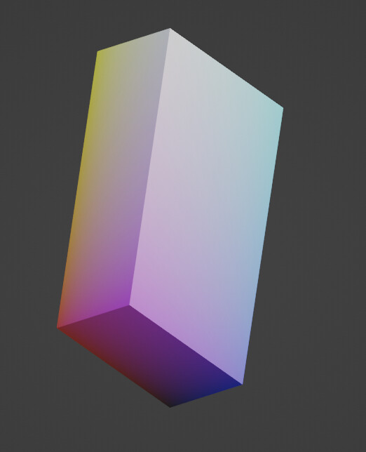
To illustrate, here is a side view of a rec.709 cube where each primary is scaled by its luminance and rotated to have the achromatic axis point straight up. Here you can see just how close yellow is to white in terms of luminance. Just be aware I threw this together now so it almost certainly has some problems.

2 Likes

Welcome @christopher.cook!

Yes, the HVS is more sensitive to brightness changes compared to chroma changes, this is the basis of chroma sub-sampling, YUV, Y’CbCr, YCoCg & co.

This sentence is interesting because depending how you read it, it is incorrect: In theory, if you design a system where the stimuli are generated in an “ideal” perceptually uniform space, e.g. “JzAzBz”, “CAM16L-LCD” (putting quotes because they are not perfect), the difference of some delta units along the lightness axis should be perceptually equivalent to the difference of the same delta units along another axis. Actually not matter the vectors, provided they have the same length, an observer should not be able to perceive a pair as being more different than the other.

Goes back to what I just wrote, which metric is being used for your system?

Agreed! Unfortunately, in our case, the white luminance coming from the display will always be that of the luminance summation of the primaries, so unless we limit peak white artificially, the primaries will always have less luminance.

On a very much related topic, Samsung engineers are trying to leverage the Helmholtz–Kohlrausch effect to increase brightness of displays while reducing power consumption: A New Approach for Measuring Perceived Brightness in HDR Displays

Is there anything making it like that the VWG does not keep it in mind? I could be wrong but I certainly don’t have the feeling that the transforms produced so far or last year discussions have ignored the rendering medium. Irrespective of whether they do it successfully or not, all the current ACES ODTs acknowledge the destination gamut, they are purposely targeting a specific device. Sure gamut mapping is crude, i.e. clipping, and colours are skewing, but they have not been engineered without thinking about a target device.

Cheers,

Thomas

1 Like

Thanks for the welcome @Thomas_Mansencal!

This is a good point - in the technical sense, the ‘amount of difference’ can be equal regardless of the axis of the change depending on the space you’re in. My thought here is that I’m not sure whether this is exactly the right context in which to be making the decision regarding image formation. While designing the system I’m working on currently, my concept of ‘error’ was regarding how similar or different an image looks (is perceived, rather than how the screen emits light) from the source, which includes the context of surrounding areas of the image. In this context, I feel like the greater importance of brightness representation over saturation is even more prominent. At the extreme, greyscale images make sense and are easily interpreted by the brain, whereas an image which only varies in chromaticity takes a significant amount of work to read.

The purpose of the system I’m working on is only to move values from near the target gamut (L not greater than destination white, and chromaticity not far beyond the destination gamut footprint), so I found the specific metric I used didn’t make a considerable difference as long as it has reasonable hue uniformity while desaturating and a reasonable prediction of luminance. I’m currently calculating error metrics in OKLab. One aspect that I have noticed is that it treats saturated reds and blues unfavourably, likely due to the un-accounted-for HKE contribution to brightness.

No, there is nothing that indicates that this isn’t the case - I don’t follow ACES very closely so forgive the ignorance there. My intention with this statement was just to reiterate its importance when making decisions like this.

2 Likes

I enjoy reading this. It is a very good summary of some of the key aspects.

There are a few things I’d like to comment on:

Brilliance vs Brightness

In the discussion often brightness was used interchangeably with brilliance. I think it is very important to keep those dimensions clearly separated. The issue with brilliance is that its scale is very much threshold-based and extremely context-dependent. I know it is hard but I guess it is worth the effort to keep them separated in the discussion.
http://www.huevaluechroma.com/103.php

Stimulus

The term stimulus is very narrowly defined, I find it hard to follow arguments that use the term with other meanings. In digital image processing, we do not have access to nor produce colour stimuli. Finally, only the display produces a stimulus again, but we cannot simply derive the stimulus from a pixels code value without knowing the spd and psf of the display. And I am not sure if this helps us by any means.
https://cie.co.at/eilvterm/17-23-002

Contrast gain controls

It was stated that we cannot “simply” produce the same perception on lower dynamic range monitors in many situations. I think this view is too simple because it keeps the observer variable as a constant. But quite the difference is true.
The human observer can adapt or enhance contrast and chroma easily, but we cannot easily invent signal modulation. So maintaining modulation is normally (not always) the best gamut mapping strategy.

Diverse DRTs

I think the discussion, over all of the disagreeing arguments of implementation details, clearly shows that there is not a single approach to display rendering.

I hope some of this makes sense.

8 Likes

Great points, definitely very important to use terminology correctly when discussing this stuff. Today I learnt that brilliance has a name :grinning_face_with_smiling_eyes:

I’m not sure I agree on this point. An RGB-style color encoding system is attempting to encode, to quote the linked definition, " visible radiation entering the eye", either, in the case of display-referred code values, the specified display’s emitting wavelengths (of course a simplification that doesn’t work exactly in reality, but that’s what they attempt to do), or, in the case of scene-referred code values, as the intensity of the specified color space’s primaries wavelengths as captured by a (virtual or not) camera in an ideal scenario, in an ultimately flawed-but-works-good-enough way of compressing the total SPD that would be hitting the eye/camera into only 3 buckets using, essentially, importance sampling which is guided by knowledge of the HVS but is ultimately still (attempting to) encode radiation intensity. That’s the point of saying it’s “stimulus information” – it’s attempting to encode radiation values either into the idealized specified observer or from the idealized specified display. Which is very different from trying to encode the visual sensation.

1 Like

Thanks for replying to this one! I wanted to disagree with Daniele (for once!) and forgot…

Beyond RGB and as a foundation, CIE XYZ, aka Tristimulus Values, we might have reached the rhetorical and pedantic penthouse though :slight_smile:

I guess I disagree on this one.
The whole idea of tristimulus values is that we do not need to know the stimulus anymore because we can group stimuli in metameric groups or metamers.
And exactly here is for example the first pitfall of IDTs, because different observers do not share the same metameric pairs.
https://cie.co.at/eilvterm/17-23-038

And this exactly is the point I am trying to make:
There is a big difference in saying I can modify the stimulus vs I can modify the tristimulus.
Maybe my first comment was not precise enough. I am sorry.
There are some fundamental limitations we cannot easily overcome when working with “relative” tristimulus values.
And I would also be careful when talking about primaries in the context of cameras or observers in general. An observer does not have “primaries”.
It is also trivial to say that a light-sensing device is capturing “stimulus information”, sure it does. The question is what kind of information is lost.

I am going to quote myself here:

Maybe this discussion is really watering the whole core of this threat as @Thomas_Mansencal has pointed out. I just wanted to point out to use the correct terms.

2 Likes

Ah, I do agree with this :slight_smile: Hence why there’s still advantages to rendering in true-spectral vs. tristimulus encoding (I’m sure there’s an equivalent in color correction/grading/handling, I’m just most familiar with the rendering part as that’s what I work on in day job :stuck_out_tongue:).

That said, I do still think that the difference between true stimulus (i.e. a true SPD encoding) vs. tristimulus data, different though it is, is still much closer (with tristimulus arguably attempting to replicate true stimulus data) than either of those are to any actual sensation-based data.

Here’s another thought I’ve been bashing around in my brain today without a satisfying result yet and would love to hear all of your thoughts on:

According to data presented in this very interesting presentation ColorImpact 2020 which I came across indirectly from @daniele’s link to brilliance above, our brains are wired to perceive varying lightness with constant hue and constant saturation (where saturation very specifically means the ratio of chroma vs luminance) as belonging to the same object. Hence, it seems to make sense to me that it would be desirable in a display transform to try to as much as possible retain constant saturation, not necessarily chroma , as we do the main luminance/brightness compression map (i.e. “tonescale”). And then from that base, perform the chroma compression to bring out-of-gamut colors back in to gamut reasonably. Thoughs?

vs lightness, it is defined from other perceptual correlates:

Saturation s is the “colourfulness (M) of an area judged in proportion to its brightness (Q)”, i.e., s = (M/Q). It can also be defined as the chroma of an area judged in proportion to its lightness, i.e., s = (C/J). It is an open-end scale with all neutral colours to have saturation of zero. For example, the red bricks in a building would exhibit different colours when illuminated by daylight. Those (directly) under daylight will appear to be bright and colourful, and those under shadow will appear darker and less colourful. However, the two areas have the same saturation.

17-22-073 Saturation is thus technically constant at all luminance levels, within reason.

This image from Bruce McEvoy is helpful:

Columns have constant chroma, rows have constant lightness.

To your question, and with the previous image in mind, there are for example many ways to do gamut mapping, which is what we are doing here to a large degree, it becomes subjective rather quickly:

Cheers,

Thomas

5 Likes