Re-Framing and Clarifying the Goals of an Output Transform

Hi,
Having binged a lot of the content on this forum as well as a few of the meeting recordings and chatted with troy a bit, I thought I would try to synthesize some core goals in a way that might clear up some common threads of “disagreement” (which I think is ultimately a bit of talking around each other rather than real disagreement :smiley:) that I’ve seen.

First, defining a couple of terms just for posterity as I might be misusing them or others might not know completely

  1. Stimulus - I think @Troy_James_Sobotka gave a quite good definition of this in another thread which I’ll use here:

Everything based off of the CIE XYZ chromaticity diagram is essentially a stimulus specification. When dealing with the three vectors such as RGB, it’s three discrete stimuli that sum to a cumulative singular stimulus. Note that this should not be conflated with observer sensation or appearance of the stimulus, but rather the singular stimulus specified via the original colour matching experiments.

2 - Sensation: This is the set of feelings or experiences that we actually have once a given stimulus is passed through the complexity of the human visual system (aka HVS). As a side note, sensation is what CAM systems are attempting to model, basically.

A key thing to realize on these definitions is that both the input and output of our DRT will be stimulus information. The input is unbounded, scene-referred stimulus while the output is a bounded, display-referred stimulus.

Building on that, to me, the goals of an ideal DRT are:

  1. Insofar as a display is capable of producing the exact stimulus requested by the ground truth, produce that stimulus.

  2. Insofar as the display is not able to produce the ground truth stimulus, create a well-defined, consistent mapping from out-of-bounds stimulus to in-bound (of display device) stimulus so that it doesn’t just happen by device-dependent accident

  3. Exploit properties of the human visual system when devising the above mapping such that the sensation, given HVS peculiarities, that the original intended stimulus made would have made, is mimicked as closely as possible for any stimulus which falls out of display range and therefore must be mapped back into display range

Now… this is not quite so simple, as goals 1 and 3 are in some ways diametrically opposed to each other – due to HVS peculiarities, exact mimicry of ground truth stimulus in one area of an image may, indeed, destroy any chance of replicating the sensation that an out-of-bounds stimulus intended to create in another part of an image.

So, there is an inherent tradeoff to be made between exactly replicating ground-truth stimulus and creating a sensation-based mapping such that out-of-bounds stimulus still feels correct from a sensation perspective upon final output from the DRT.

As has I think been correctly but not strictly identified in the past in the (now somewhat legacy) term “tone mapping”, and more recently explicitly laid out in this thread On Brightness (Fry-ZCAM / Jed-JzAzBz Image Formation), I think it can be agreed upon that brightness, and more specifically, relationships between brightness throughout the image are of the highest importance in terms of mimicking sensation given an inability to replicate stimulus. This should come as no surprise, as it’s a technique that’s been used and taught in art fields for at the very least decades and in reality hundreds of years… ask any AD, painter, photographer, and they’ll tell you that (at least as the terminology was taught in my program) “value structure” is the most important piece of an image to get it to “look right”… what they mean by “look right” is, as I now interpret it, a simple way of saying “replicate the sensation we desire given the inability to replicate the exact stimulus which we are trying to depict.”

And, as hinted at in the above-linked thread, this is a way to justify the oft-cited as wanted “path to white” or “highlight chroma compression” which @jedsmith has done awesome work attempting to engineer… not as a creative “flair” but as a core mechanic of mimicking the desired sensation given the inability to mimic the stimulus… we’re choosing mimicking the sensation of brightness as most important, and then exploiting the fact that a less-colourful chroma creates the sensation of higher brightness to create the sensation of more brightness than is really available on a particular display in a well-defined way, rather than leaving it up to display-dependent chance.

Now, as for exactly how to do this… I don’t have the solution x( It’s a hard problem, in my view one of the hardest given that it so directly straddles the line between stimulus and sensation – usually, you’d want any operation you apply to stay strictly on one side or the other of that barrier. But, the goals outlined above necessitate doing both at the same time, or at the very least blending between them.

I do think the CAM-model idea is a very interesting path for this, as in many ways, it’s exactly the purpose of a CAM, as was outlined by @Alexander_Forsythe… to take input stimulus, extract the sensations it evokes, and retarget those sensations into a replacement stimulus that mimicks the sensation as much as is possible.

6 Likes

Hey @gray,

Something you do not mention above but that is super important and fully influences the way we perceive a stimulus are the viewing conditions, i.e. the surround. Even if the display was able to reproduce the scene Tristimulus Values (and discounting observer metamerism), you would still be required to match the scene surround to produce the same sensation. This is where CAMs help because they model viewing conditions change, it is effectively one of their core design purposes and where I found the main appeal is with them.

Cheers,

Thomas

1 Like

Hello and Welcome to ACESCentral @gray !

I have been wanting to reply to you for the past few days but got caught up in Christmas and all. :wink:

Only to say that basically, your post is one of the best I have read in the past year and to thank you for taking the time to think this through and write it down. I don´t think I would have been able to write it myself (I don´t have the knowledge basically), so it is very refreshing and stimulating to read it over and over again.

Looking forward to more thoughts and posts in the coming year !

Chris

1 Like

Hey Chris,

Thanks for the welcome and I’m glad you found it helpful! Your writing has been an awesome resource for me over the past few years so thanks for all you have done! :smiley:

Hey Thomas,

Thanks for the reply! That’s absolutely a good point. It’s also probably the piece of the puzzle that I’m the least familiar with, so probably why it didn’t come to the forefront in my formulation of the issue.

In my (as I said, unfamiliar and probably ill-formed) view, the transform needed for a changing surround seems a significantly simpler (in practice at least) problem to solve than the stuff I focused on, though I could be underestimating the scope of the problem there for sure, haha. Do you think the previous methods that have been used to solve this have been very inadequate?

In any case thanks for your thoughts!

Thanks ! A few random thoughts :

I think this answers quite nicely Alex Fry´s question :

The question there is, which matters more? The colour of the light, or the quantity of the light?

I used to think like a year ago that the colour of the light (and its purity) should be maintained at all cost. But I have changed opinion on this specific matter, mostly because of the examples from this thread.

I also think your explanation about “path-to-white” (or “path-to-maximal-brightness”) is right on point. It reminded of this thread from almost a year ago (time flies) ! And it ties up nicely with what @paulgdpr hinted six months ago in this thread :

Most notably, I believe it makes the path-to-white an inevitable consequence of the constraints: it does not need to be “engineered” nor needs to be parameterizable.

This is why I am not a big fan of the expression “highlight desaturation”. I think it makes this mechanics looks like a creative thing when really it should not be ?

Finally, I found this quote to be quite mind-blowing :

we’re choosing mimicking the sensation of brightness as most important, and then exploiting the fact that a less-colourful chroma creates the sensation of higher brightness to create the sensation of more brightness than is really available on a particular display in a well-defined way, rather than leaving it up to display-dependent chance.

I am still a bit unclear/fuzzy on how to create a sensation of brightness that “exceeds” the display capabilities. But I think it ties up nicely with these two videos :

The same Seurat charcoal example is used in both videos to illustrate your point. Fascinating !

Update : this is very last point somehow corresponds as to what I described on my website as “Counterchange” or “Checkerboard Lighting”. I defined it as “a lighting technique of alternation of lighting and shadow areas to create depth”. I should update the definition to add that it is used “to maximize the sensation of brightness in any medium.

I hope it helps a bit,
Chris

1 Like

Poignant quote from Bevil Conway talk (around 50 min)

“As soon as you start prioritizing color you flatten the world”

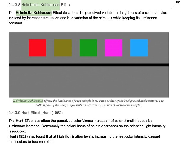
I don’t think that systematically reducing saturation is the silver bullet, if anything saturated stimuli tend to appear brighter than less saturated stimuli at the same luminance. The perception of brightness depends on the stimulus geometry and what is around it, i.e. it is a spatial relationship. Objects memory also plays a role.

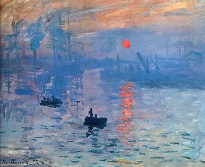
Monet does not need to paint the Sun white here and yet, it appears bright to me:

image

Very true. I’d add that it’s not ultimately a matter of the quality of any particular color in and of itself (in this case of its saturation), rather its has to do with it relationship or juxtaposition to the colors around it that makes it appear to be brighter.

In other words, as @gray put it:

What strikes me as critical is the “path” that this takes. I find that the approach @matthias.scharfenber’s ZCAM takes to this “highlight desaturation” looks to have some rather effective results at capturing the appearance of brightness to my artistic eye. I’d love to see more discussion of why this is.

Hm, I’m not sure I’d agree. Well, I totally agree that

however I’d very much disagree that

I think @Troy_James_Sobotka put it quite well with this quote

[Typically], for non spectral based stimulus, the peak brightness range will rest along the achromatic axis of a medium. Chroma laden primaries or paints will almost always achieve a lower “brightness” at maximal emission / reflectance of stimulus.

In terms of the Monet, the sun is not white and yet it appears bright, surely… in reference to the rest of the image, as @Derek said. Yet, it doesn’t appear as bright as the sun would have appeared had we been standing next to him as he painted it. He’s made the decision that this isn’t important for him – he cares more about evoking the emotion that the fully chroma laden color does than about making our eye see the sun as brighter. There’s nothing (if we get it right) preventing someone from making the same choice even with a DRT that does use a ‘path to white’ – if the artist chooses to make the same tradeoff, there’s nothing stopping them from grading with a Look that severely caps the luminance of the sun down to a level that will be able to be directly displayed on their reference display (in which case the DRT shouldn’t affect its chroma, unless later retargeted on a less capable display).

Actually, this segues into a topic that I’ve been trying to wrap my head around enough to post about it in a comprehensible way, which is the topic of how to evaluate transforms.

Something that I think has been a little bit looked over as of yet has been the casual nature by which we’ve evaluated the proposed methods… basically it’s just been a matter of taking some raw scene-referred footage and passing it through and then evaluating the subjective/preceived ‘beauty’ of the result. I think that this is actually quite an ill-formed method of comparison/evaluation though. Troy posted a tweet thread today that I’ll ‘unroll’ here as it directly relates and finally connected the dots to make this fully comprehended in my brain:

When we have a stimulus encoded in data, no matter what we do, we are going to have that stimulus rendered in a medium like a display. We have no options; it will always come out as something. The idea that we can somehow ignore the limitations of the medium is what yields broken looking imagery. We must, at all times, start with the medium and work backwards to form an image. Why? Because again, whether we like it or not, every single stimulus encoded piece of data will be forced out as something. Either we can control that, and form it into an image, or we can ignore it and it will be formed into an image for us. This is not optional.

What does this mean? Well, it means that in evaluation we need a “ground truth” which is itself a fully formed image… i.e. an image which we don’t feed through our DRT but to which we can compare the fully-formed image output of the DRT. I’m honestly not sure of the best way to create this ground truth reference, though, which is an important piece of the puzzle. But the point, as said by Troy, is that this ‘reference formation process’ is a non-optional piece of the picture. By ignoring it, as we are now, we’re just leaving it up to chance, but it’s still ‘happening’–“doing nothing” is still a rendering transform, just one that doesn’t have a well defined output… so we should instead actually think about and actively form that process instead.

2 Likes

Hey Gray,

The Helmholtz–Kohlrausch and Hunt effects and most especially the former, are defining what I said earlier:

Cheers,

Thomas

Hey @gray,

we discussed these terms in this thread. There is some very good info from Cinematic Color 2 and Wikipedia if you hadn´t a look already.

I agree on these two points (thanks for writing them so clearly !) :

  • There’s nothing preventing someone from making the same choice (than Monet) even with a DRT that does use a ‘path to white’.
  • Something that I think has been a little bit looked over as of yet has been the casual nature by which we’ve evaluated the proposed methods…

I know that Daniele has suggested several times that the Academy could shoot a little scene (with like several iconic objects in it such as Macbeth chart…) and evaluate the scene and its display rendering at the “same time”. I cannot think of a better method to be honest. I have shared many CG examples to evaluate the DRT but yeah, that does not make it an “objective” test neither. Even if with CG we remove any “secret sauce” or clipping from a “real” camera ?

The “path-to-maximal-brightness” seems like such a fundamental mechanics when it comes to “tonality” :

If you keep the chroma yeah you don´t see the tonality of it anymore. If you can’t tell light from dark anymore, the image doesn’t look as natural anymore, right?

This is an interesting quote from Mathias in the last VWG meeting. I was pretty pleased to hear it since it directly connects with the “loss of tonality” that a few folks have been describing on this forum. I thought it was worth pointing it out.

Chris

1 Like

Sure, I agree (or I guess I should say, I know of that effect given it’s not exactly an opinion ;p)… I guess there’s some nuance here, though, in that I think we can also agree that if we are at a max luminance high colourfulness color on a particular display and then we create a gradient in the center from that high chroma version of a color to a less chroma-laden version of it (i.e. towards white), that we create the sensation of increasing brightness towards that white. No?

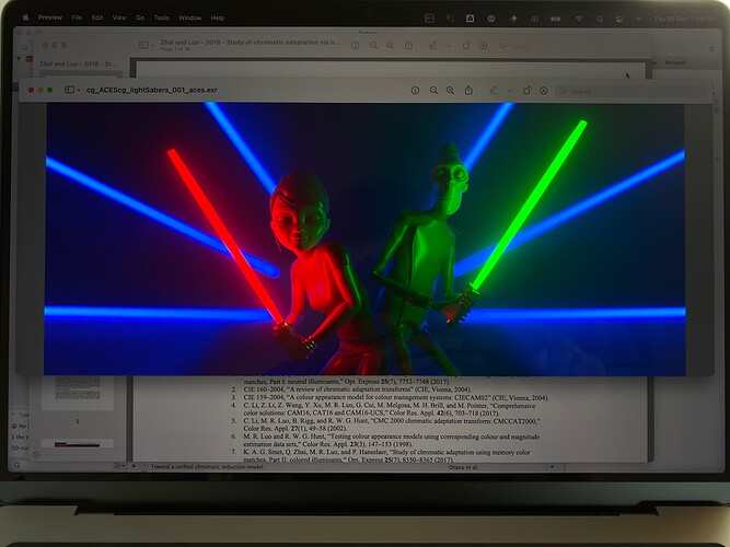
Yes, which goes back to something I was saying a while ago: if your display has a high peak luminance, e.g. 1500+ nits , you do not really need to desaturate anything to produce a red or a blue that appear bright. It is hard to convey with a photograph but your lightsabers appear damn bright on my screen (or LED Wall) and without desaturation or anything:

Could their core be white to make them more light saber-like sure, my point is white does not necessarily means bright. Using a DRT that implements path-to-white, I actually find the saturated light sabers to appear brighter, especially the red one that really pops!

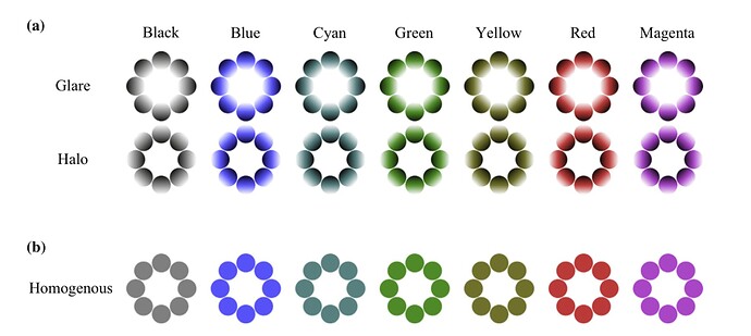
Sure, that would be akin to modelling glare which is a visual cue for bright sources:

Which rows are brighter? This certainly goes back to the importance of the geometry of the stimuli and their spatial relationships. The DRT cannot add glare if it is not present in the image, it can shape it to a degree though.

Cheers,

Thomas

1 Like

Another quote from last meeting from @Troy_James_Sobotka is also worth bringing up:

So it makes sense to sculpt the curve that can hit the corners and characteristically curve inward from the corners.

And @jedsmith’s great post about how chroma compression works in OpenDRT. I still think this whole topic deserves a dedicated thread of its own. This “sculpting” (ie. engineering the shape) is critical, I think.

Like this post maybe ?

Update : Sorry I have written this in a rush and should have given more context. I have recently bought a laptop with an OLED HDR Display. The “reds” look incredibly bright to me, I was very surprised by that. So when I was shared this tweet and thought of this thread, I thought it would be worth mentioning.

Update : Ok. I can only imagine how bright it goes, since my display “only” goes to 500nits and my eyes are already burning. These HDRs display gamut volume can still be represented as a cube, right ? What happens to the red Light Sabers values if they don´t go to white ? Do they collapse on the gamut boundary ?

Chris

Sure, right, I agree with this statement alone for sure. If the “golden reference” is this very bright red image, which your display is capable of producing, then there’s no need for any desaturation at all and indeed the DRT shouldn’t desaturate. To quote myself (;p),

However, if we want to capture the same sensation when displaying the image on a standard SDR display which is simply not capable of that, then we need a well defined transform into something that the SDR display is capable of.

Or, indeed, if that rendering was changed so that its sabers were even brighter, we still need a well-defined transform into something that the 1500 nit display can show without leaving it up to chance. i.e. to prevent

But for every display. Hence what @Troy_James_Sobotka has been hammering home,

… whether we like it or not, every single stimulus encoded piece of data will be forced out as something. Either we can control that, and form it into an image, or we can ignore it and it will be formed into an image for us. This is not optional.

Even on a very high dynamic range display, there’s still some possible stimulus that may be encoded in scene linear values which will not be displayable (in fact it’s still quite easy to do so). So, we still need a well defined mapping for every value into the displayable range/gamut.

1 Like

LOL, you’re not kidding! My display goes to 1600 nits and I had a serious migraine after a few hours. Not fun. Raises questions too for me about whether or not HDR really is the “perfect” display. I know you’re supposed to suffer for art, but is the audience supposed to suffer too? :wink:

As hard as you try, no amount of path-to-white will help producing the same sensation. It is simply not possible and if so, we would not have HDR displays in the first place. What is possible to a limited degree is to change the viewing conditions, hoping that for example the HDR content was seen with a brighter surround so that you can reproduce the content on a display with a lower peak luminance in a darker surround.

Certainly but isn’t it the objective of the DRT, i.e. mapping an unbounded domain to a bounded range while reproducing the scene faithfully or at a bare minimum, pleasingly?

Both adjectives carry varying degrees of subjectivity, maybe the underlying question of the thread is how could we make that process objective?

Ha! :slight_smile: This is contextual, put your display outside and it will look like very disappointing! :wink: The content should be mapped appropriately as a function of display capabilities AND surround, i.e. viewing conditions.

1 Like