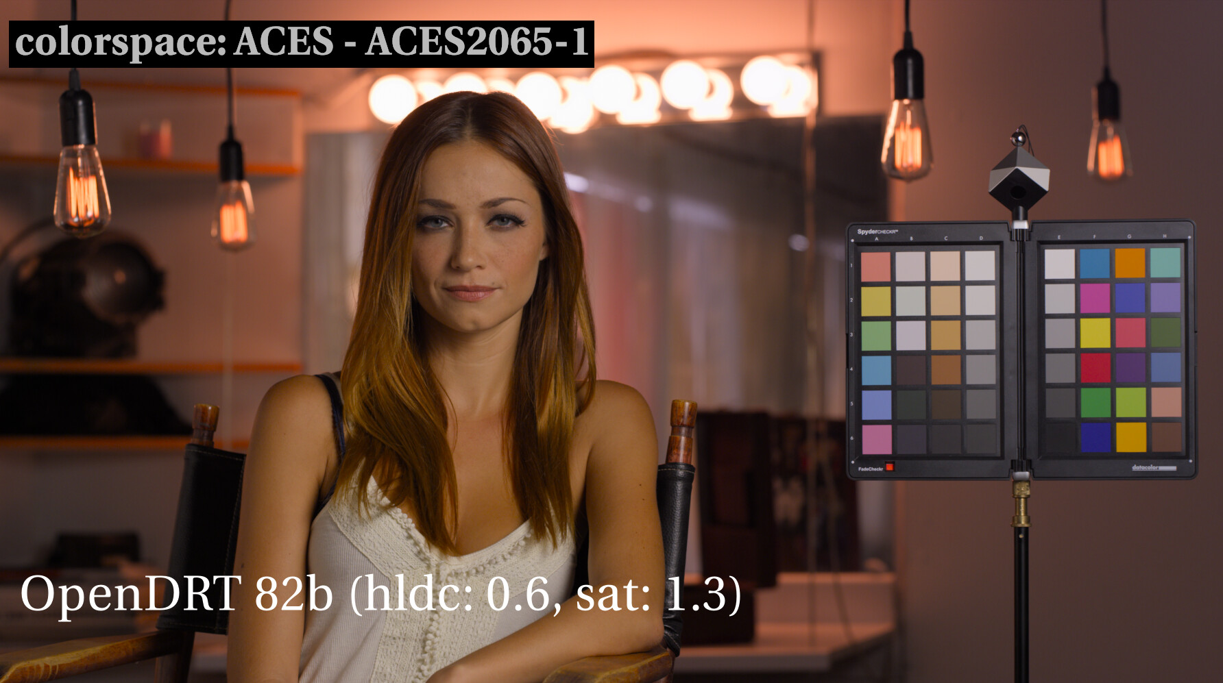
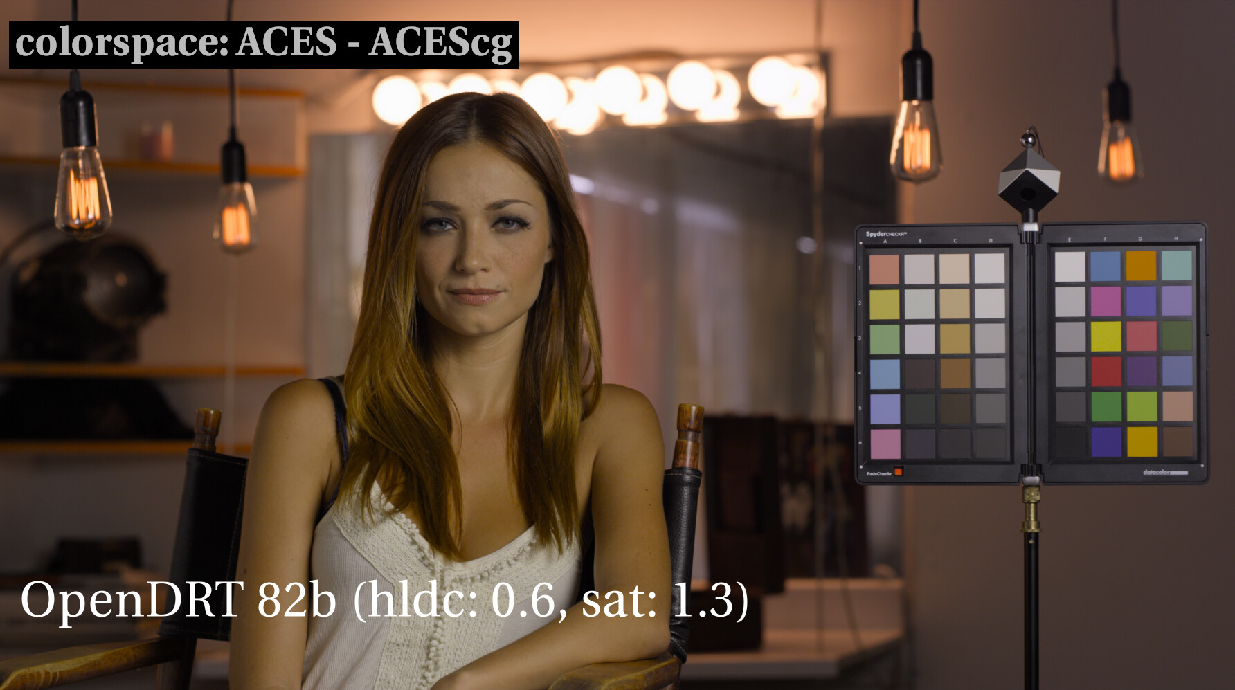
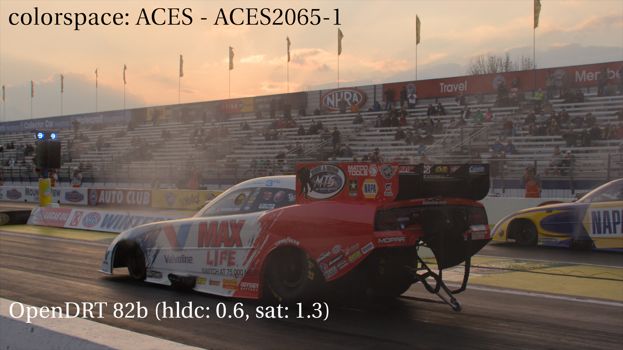
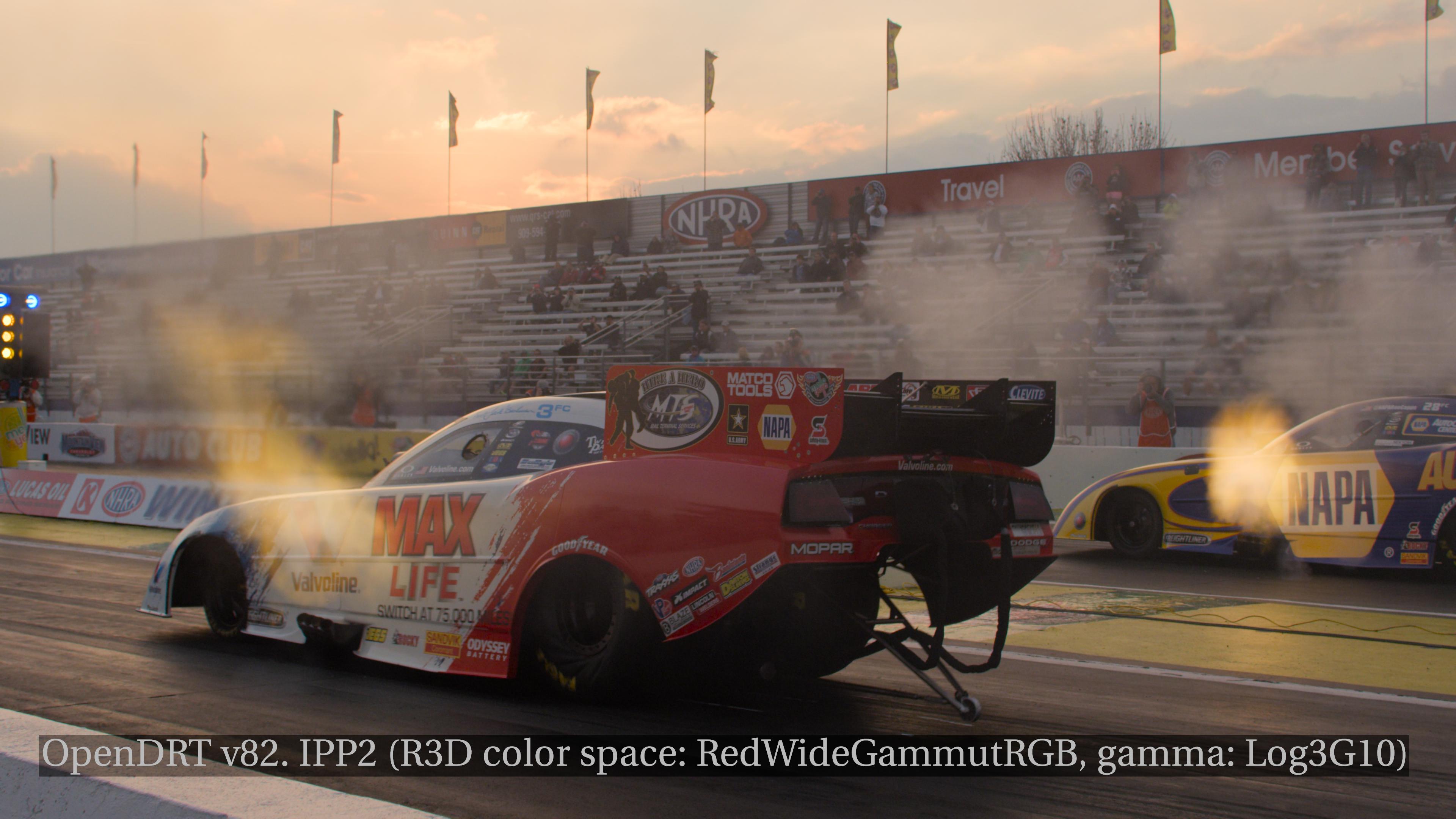
I think that the RED test footage for ACESnext may be in ACEScg (AP1) rather than in AP0 (spoiler: it is not). This is particularly noticeable in two images when viewed through OpenDRT.
DRAGON 6K S35
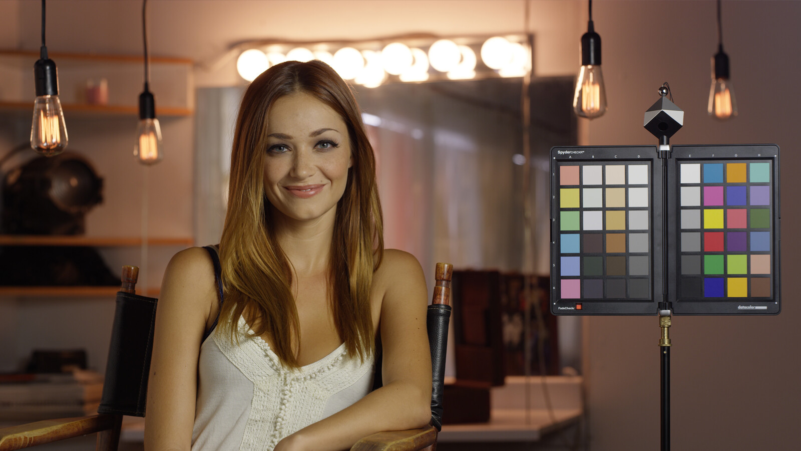
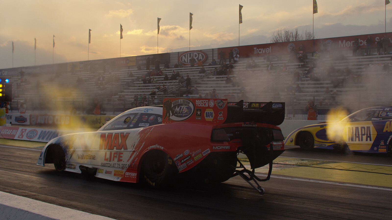
First here is the JPG from the RED website as a reference for how the image should look
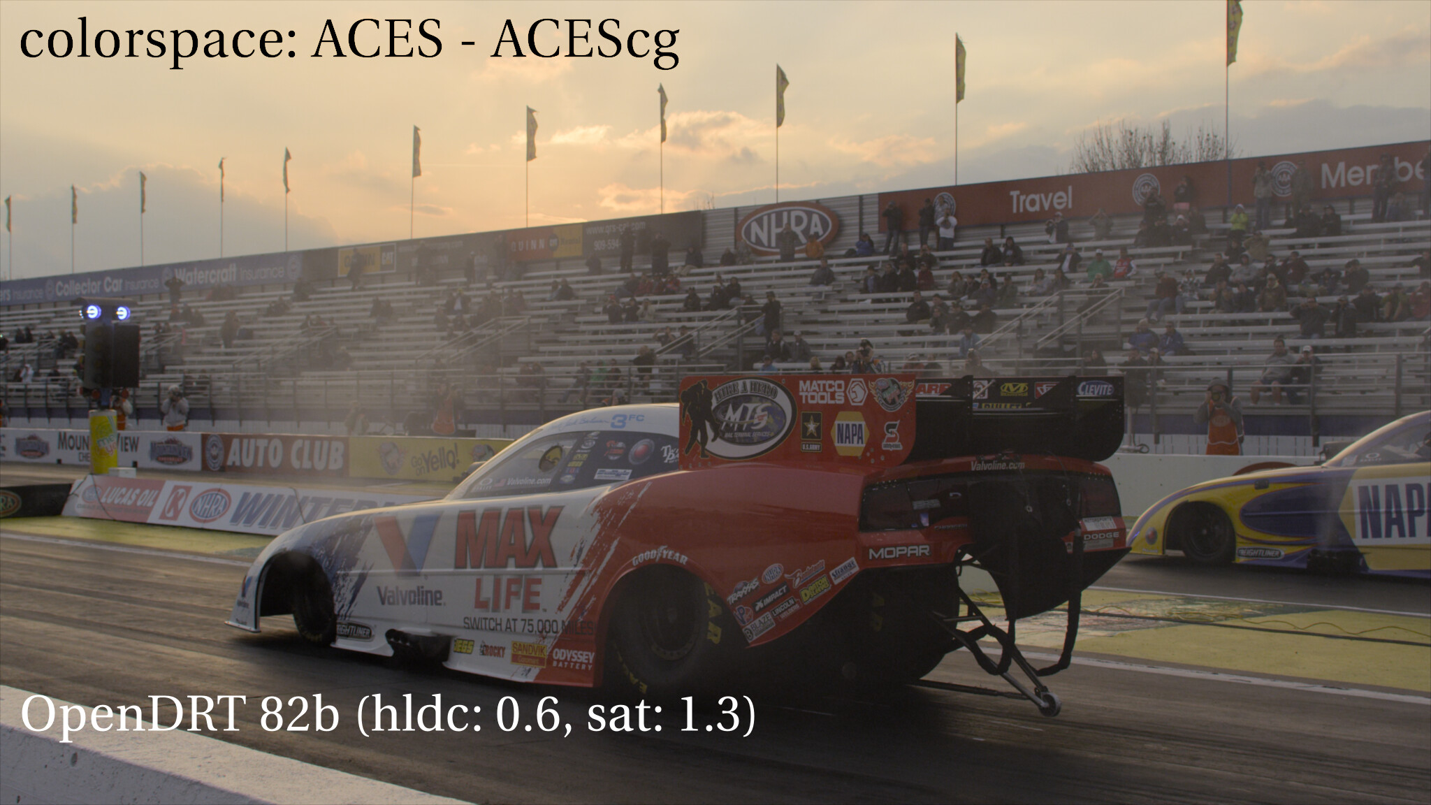
The AP1 looks much closer to the reference, while the AP0 has more red in it, most noticeable on the back wall. This lead me to suspect that the image may have been mistakenly output in AP1 color space, rather than AP0.
As a test/experiment I downloaded the R3D and made a new EXR in AP0 while viewing it through OpenDRT.
I was not able to tell visually whether the other RED footage was in ACEScg (AP1) too, but strongly suspect these two images are. Wanted to flag that as I assume they are supposed to be in AP0.
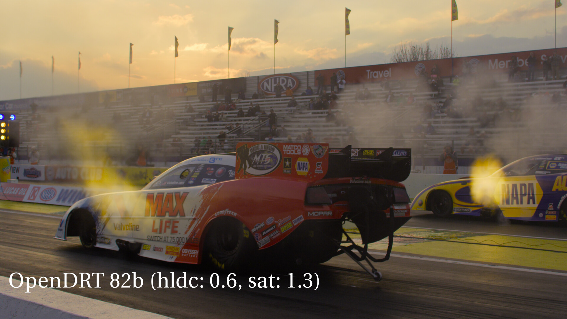
The two images above are called A016_C001_02073O_001.aces.0.exr and RED_Weapon_W001_C005_1014V3.aces.1.exr
I understand that the images are not expected to match the reference exactly. At the same time, if an image is viewed in a different color space in the IDT than it was written in this will of course affect how it displays, which I think may be happening here. So I’m hoping that someone more technical than I could check this to see whether I am correct that these images may have been inadvertently written in AP1.
It’s an interesting approach pushing dechroma and saturation higher. These settings somewhat mimic the behavior of per-channel renderings, which have stronger shoulder desaturation while simultaneously increasing midtone saturation.
I’m not sure that the marketing images from the Red test footage website qualify as any sort of reference for anything. Based on the exif metadata of the racecar jpeg, it looks like it was retouched in Photoshop…
I double-checked the images in that dropbox link against the raw r3d files, and they are encoded with the correct chromaticities as described in the filename (ACES 2065-1 AP0). It’s possible you got lured by a red herring here! When the image (encoded in AP0) is rendered assuming AP1, effectively you are desaturating green and blue while keeping red pretty similar:
And I guess the retouching artist decided that the image was too red (pun intended) and adjusted to compensate, achieving something similar looking to our accident here.
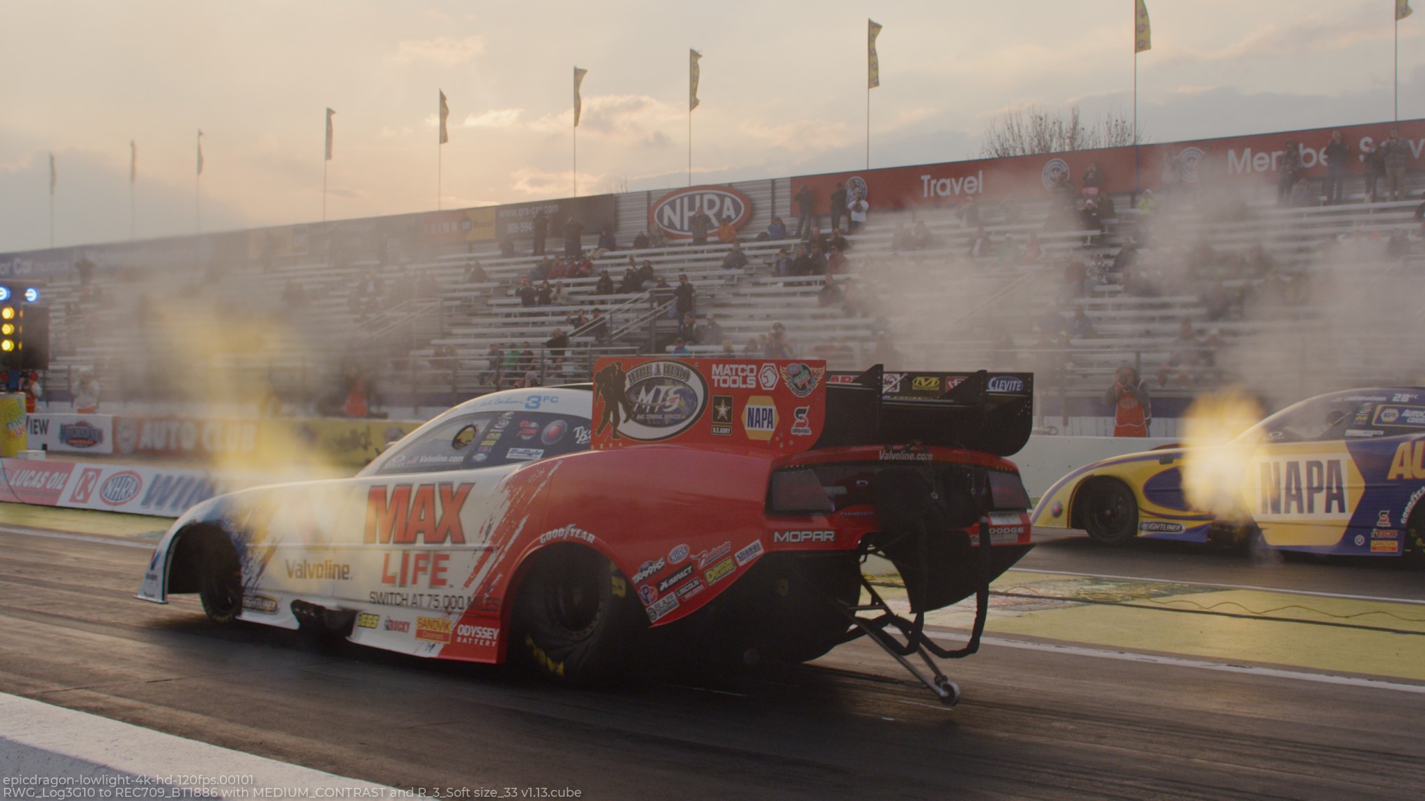
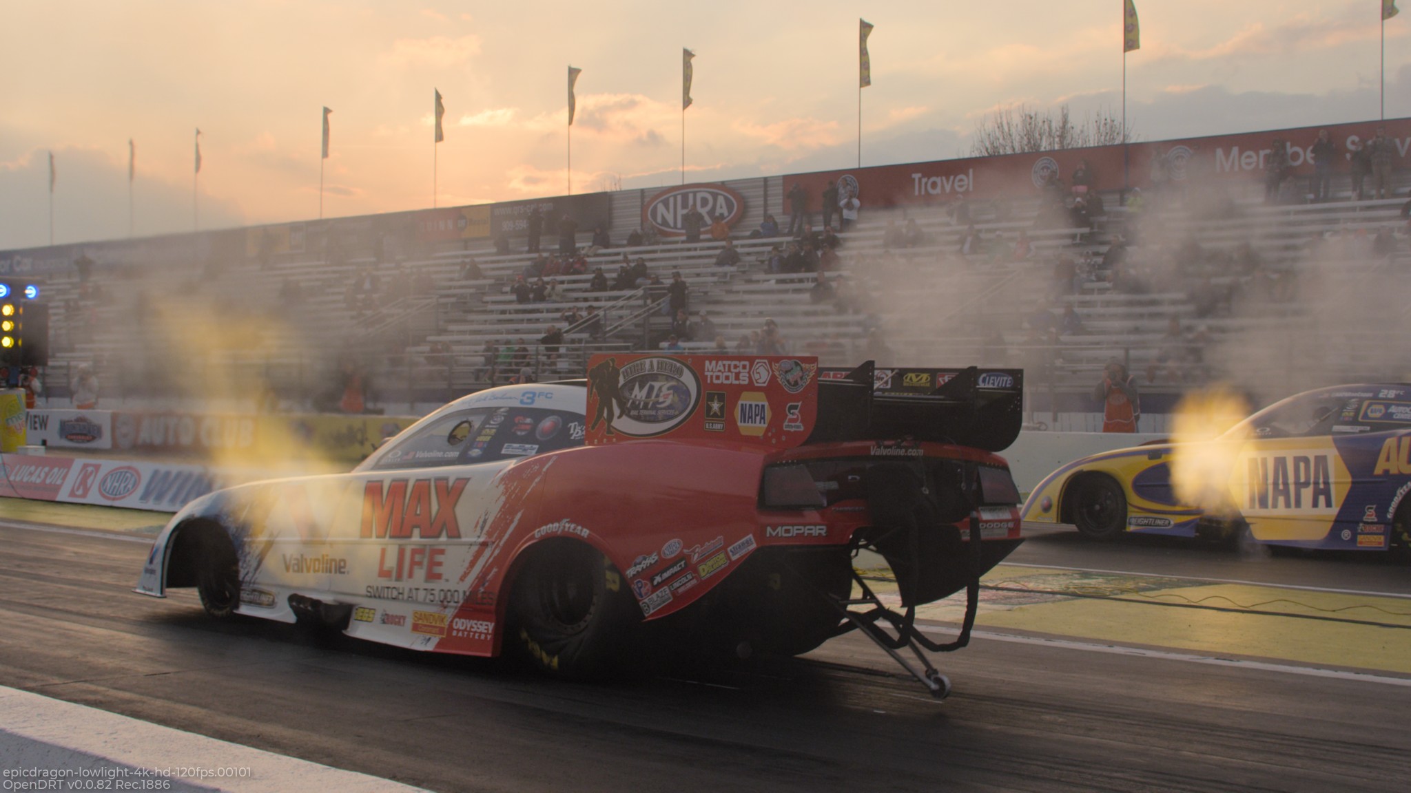
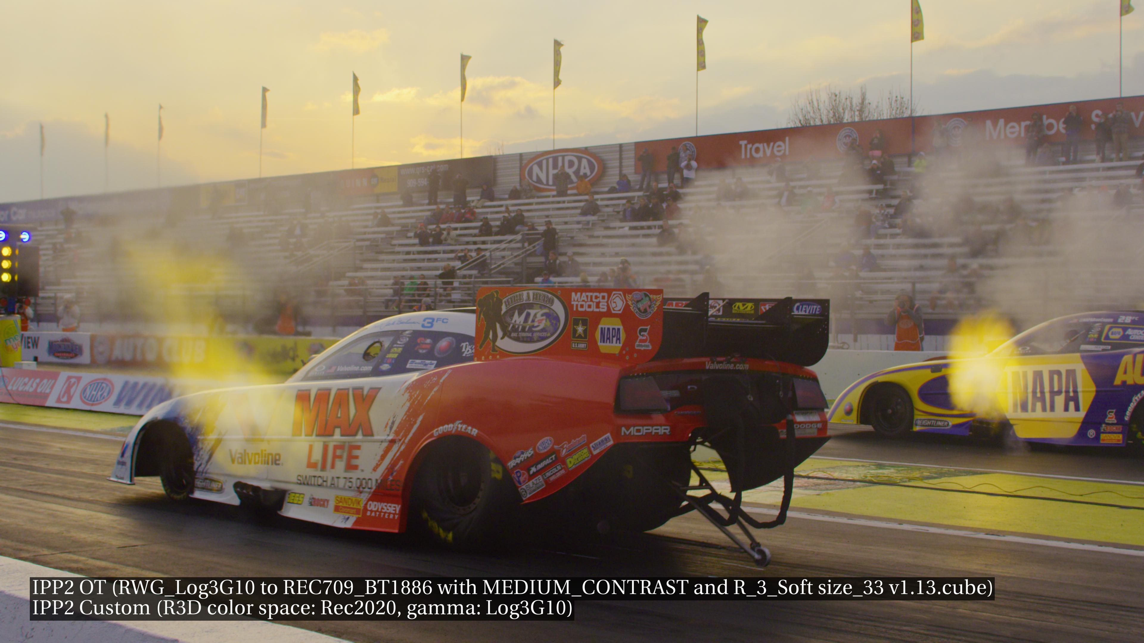
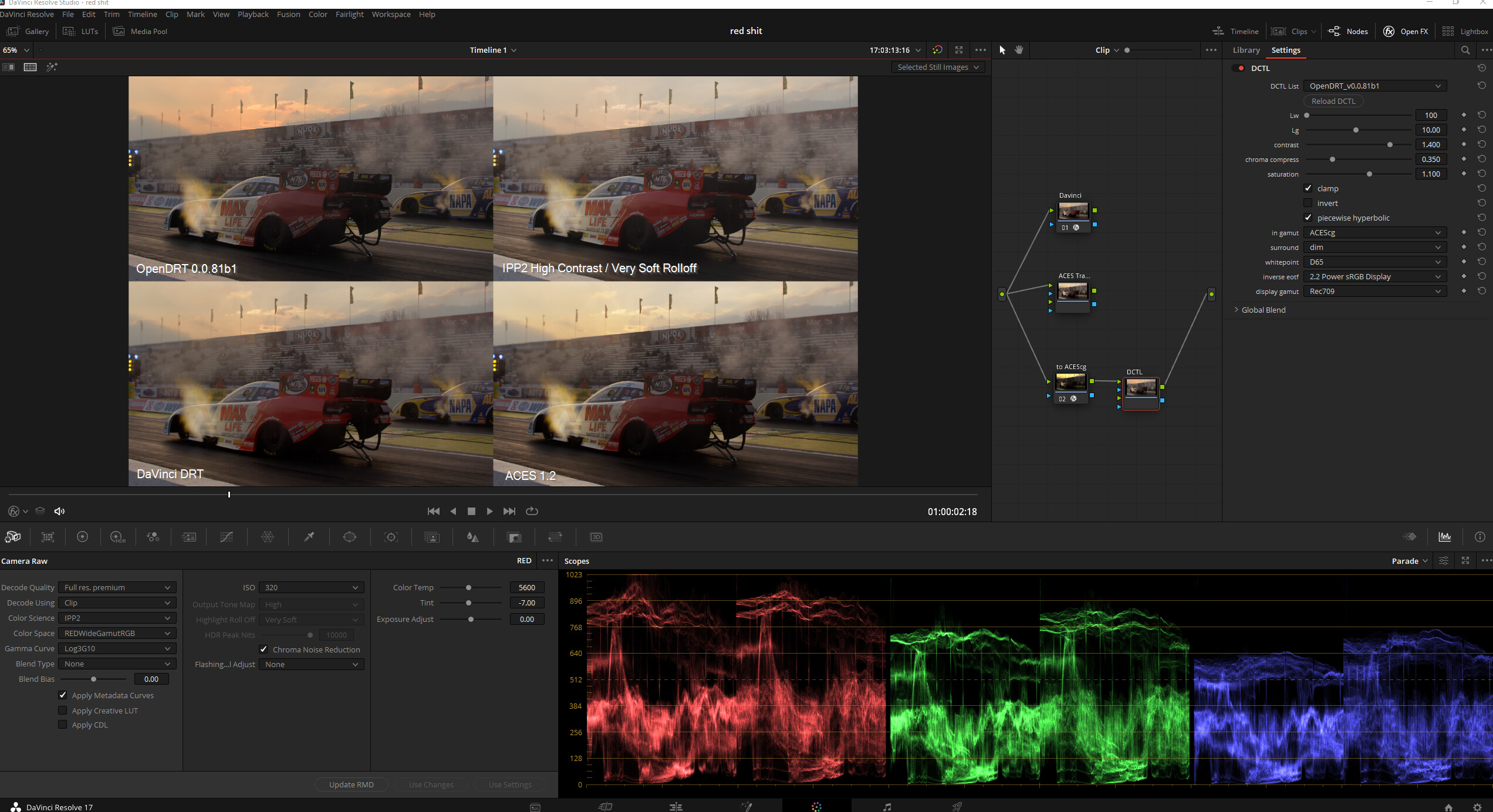
For fun, here are the same two frames rendered through OpenDRT v0.0.82, and through one of the Red IPP2 luts ( RWG_Log3G10 to REC709_BT1886 with MEDIUM_CONTRAST and R_3_Soft size_33 v1.13.cube )
But again, I’m not really sure what this comparison is meant to achieve, because as I have stated many times, OpenDRT is not intended to render a pleasing image, or to really have a “look” at all. It is meant to render a neutral, faithful representation of the input chromaticities, to have some measure of similar appearance between HDR and SDR, and to be a good starting point for grading.
Thanks Jed, that’s really helpful. I’m sure your right that the images are indeed in AP0, and very much appreciate you taking a look!
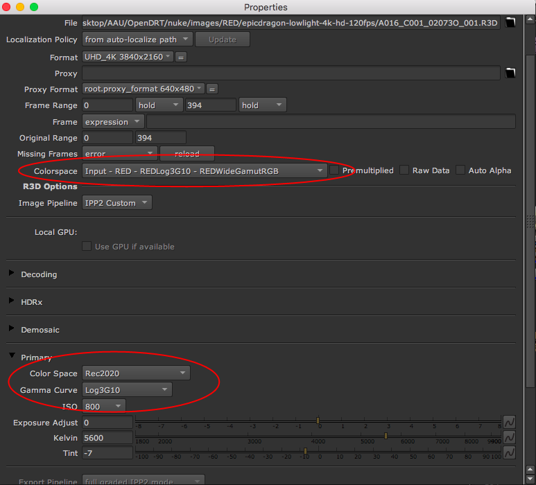
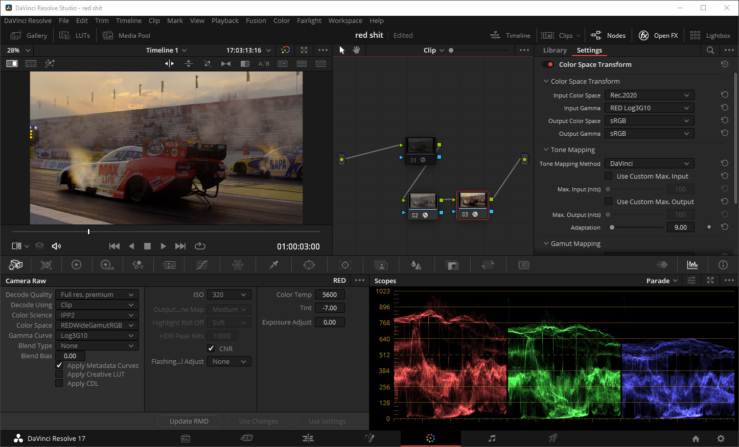
I can also confirm that I also get the same results as you are on the R3D file when it is set to IPP2 in the Read node image pipeline. This locks the color space to RedWideGammutRGB and the gamma to Log3G10. Here’s what I get:
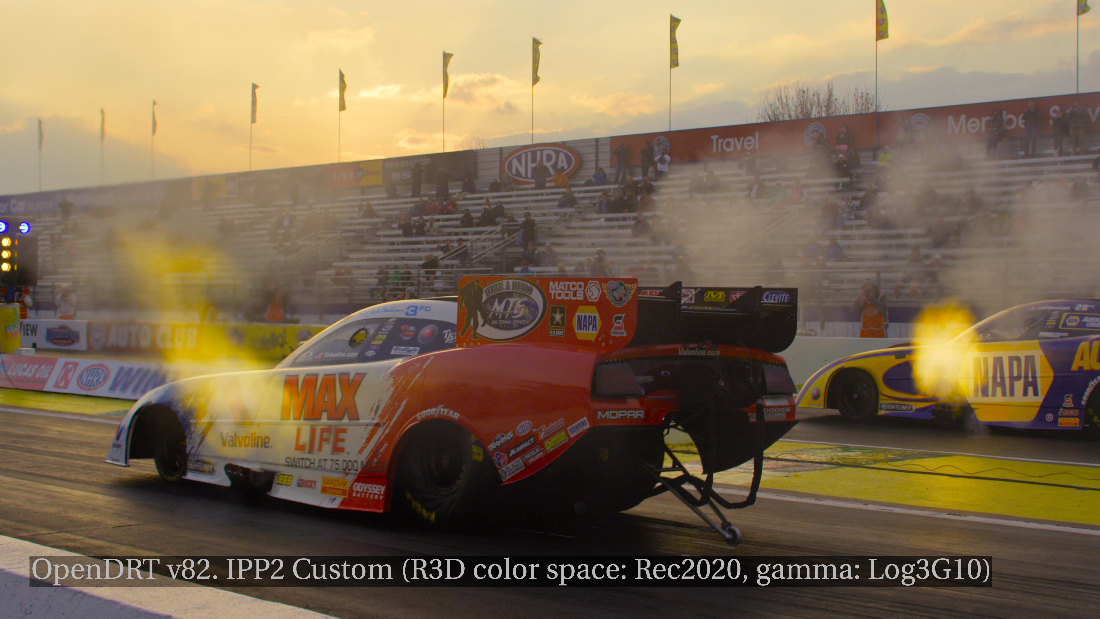
If you’ll indulge me though with a further experiment… I see in the file metadata that it says “R3D/Color_space: Rec2020” and when I set it to Rec2020 like this:
These look a lot like the website image, and more importantly a lot more like the sky does IRL. So I’m wondering if having it set this way, matching the metadata, is in fact a more faithful representation of the scene chromaticities?
Were you there at that time? A sky can have a wide amount of colors and apearances.
It’s not intended to use transforms designed for a particular colorspace and gamma on a source that is something else.
Liking the visual result of it is an artistic opinion at that point and shouldn’t exist in the color management side of the job.
So setting the R3D file to rec.2020 instead of RedWideGamut but use the RWG transform lut is technically incorrect even if you might think the result is more true to life.
Personally I’m not super fond of IPP2s display mapping as I feel it’s neither neutral or look biased. It just looks a bit too lifeless but I base that off my experience with the RED Gemini with rec709/sRGB deliverables.
Our workflow is simple and we usually don’t have a lot of time to give color some love so getting a vivid base transform is preffered. I might want to look into the OpenDRT to create some luts for editing, I hear and read nice things about it!
I played with the Red IPP2 LUTs too during the weekend and I found out that the High Contrast R_4 Very Soft is closer to OpenDRT rendering. Add a node to tweak contrast after conversion from AP0 Linear to RedWideGamutRGB Log3G10 and before the RED Lut and you’ve got a pretty close match (although with more even reds and blues). For OpenDRT, I also add Jed’s latest version of Gamut Compression from his github as it improves some highlights on the reds and the blues. I put the two versions with and without the gamut compression in the screenshots.
@ChrisBrejon Which of these would be closer to the intended rendering?
Edit: yes I am aware that those are not originally designed for IPP2 luts but you can make anything compatible with them with a simple colourspace conversion to RedWideGamutRGB + Log3G10. The advantage of them is that they are CG images so they really show what the transforms do to colours.
Edit 2: the Red Lut screenshots above have a higher contrast tweak than they really need because I forgot to uncheck “Apply Inverse OOTF” on that colourspace conversion node. Also, I have to mention that skin tones with OpenDRT are spot on while IPP2 has too much contrast even without the contrast tweak when rendering the Louise model. However, IPP2 seems to do far out primaries at the boundary of AP1 much better.
Yes for sure. I do want to clarify that my intent in not to make the image look aesthetically pleasing, but to make it as true to the scene data as possible. I set it to Rec2020 not because I thought it looked good, but because it was in the metadata giving a clue.
Of course metadata is a notoriously imperfect source. With that in mind, perhaps the best approach would be to use the settings in the RMD sidecar file. I’ll post some images of that later when I’m in front of my computer.
I also want to clarify that my intention in showing IPP2 and OpenDRT was not to compare the two, but rather to show that what I was seeing is happening in both, demonstrating that the difference is not with the output transform, but with the input (ie the R3D settings).
Yea, we also sidetracked a little bit in the convo I guess.
In regards to the R3D settings…
What do you mean by this? If you use a R3D file you can “overwrite” the raw settings but that doesn’t change the interpretation. It’s rather a conversion to that colorspace or gamma. There is never a need to set them to something specific in relation to what camera it was shot on if that is what you mean.
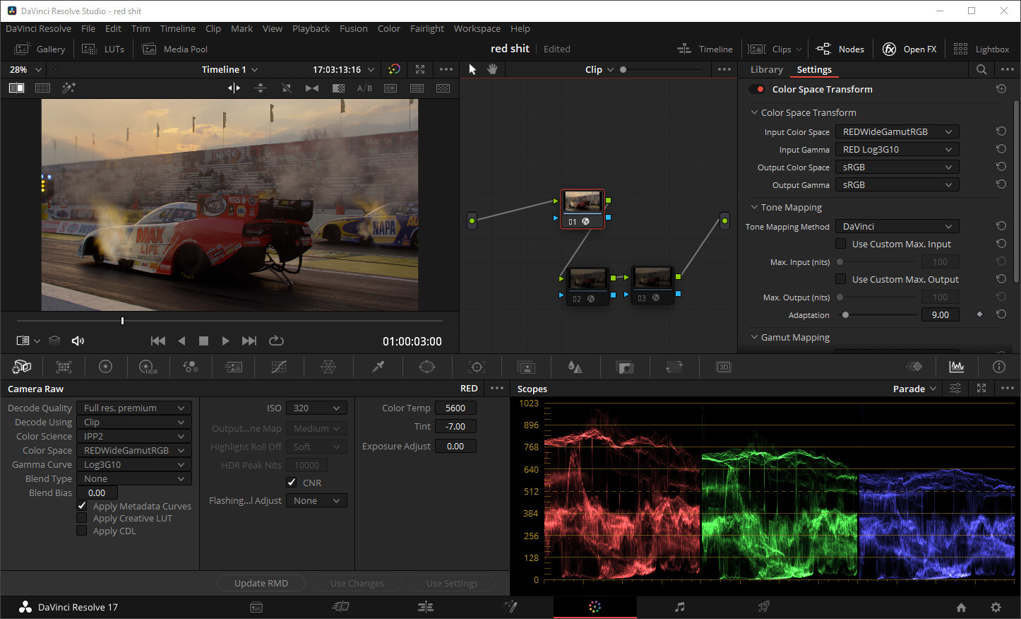
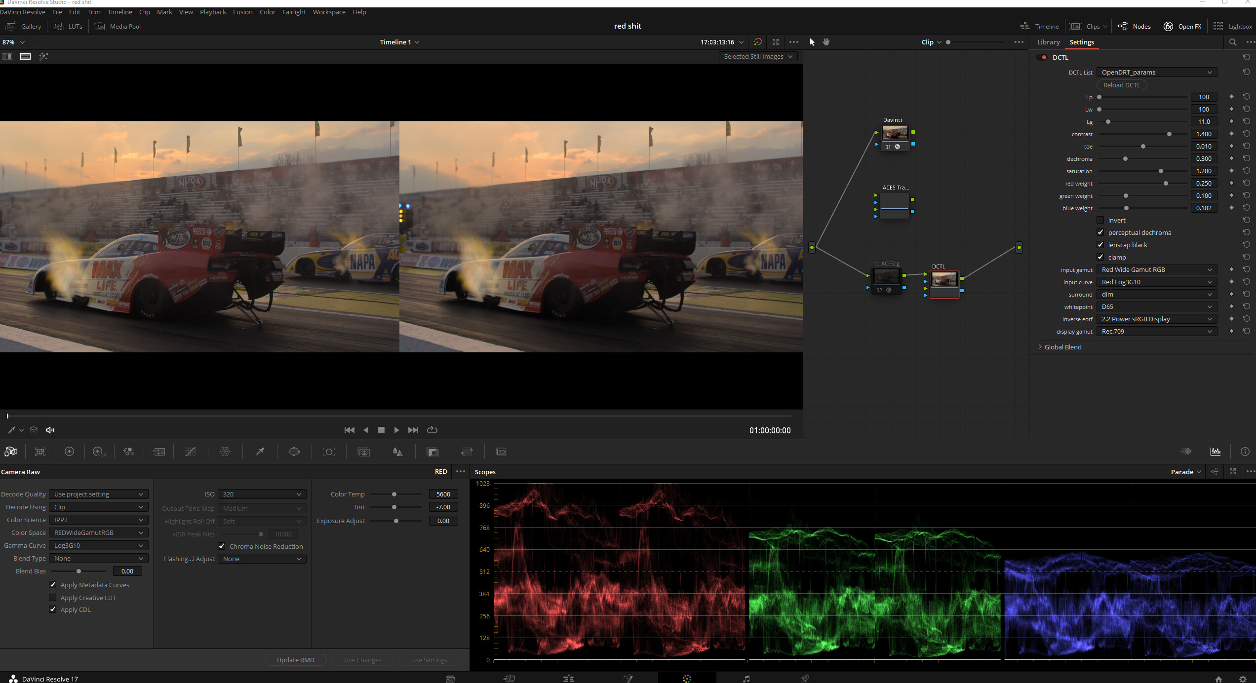
Below is a R3D frame set to decode to RWG/Log3G10.
Thanks @Shebbe it’s helpful to see that in Resolve. The look you are getting is what I am expecting to see. I am in Nuke so obviously the workflow is not 1:1 with resolve.
When you say you are viewing in sRGB, do you mean ACES sRGB output or is this without color management with daVinci “vanilla” sRGB? In Nuke I get the same result if I use the RMD sidecar settings (as opposed to IPP2) and view it in Nuke default (i.e. not ACES), so I’m trying to get apples-to-apples.
Can you post what you get when you view this through OpenDRT?
I was using the DaVinci DRT on testing. Had to scour a little bit but found a working OpenDRT dctl. Never really tried it yet but I have to say I’m quite pleased with what I’m seeing even though I don’t know what the image should look like compared to the true scene.
I don’t know what that car paint red color should look like. It might as well be a color that falls outside of sRGB in real life. But the difference in sky definition is very obvious and for a sunset feels more sensible that it neither skews to yellow or desaturates to white. This is why I don’t like IPP2 so much. It’s path to white feels the most aggressive. You could still grade to any direction but a great starting point can make the process a lot nicer.
It does feel a little weird however that the red car paint in OpenDRT becomes so dark / less saturated when the overall chromaticity feels more balanced / intact across the luminance range and I feel that there is better separation across all the captured ‘colors’.
For sure will try to experiment with OpenDRT some more.
Aggressive it definitely is. It creates very harsh unnatural lighting when using it on the Louise model (as harsh of ACES on this scene actually but without the hue skews). I stand by the fact that it does make the reflections on the red character in Chris’ lightsaber scene look more correct.
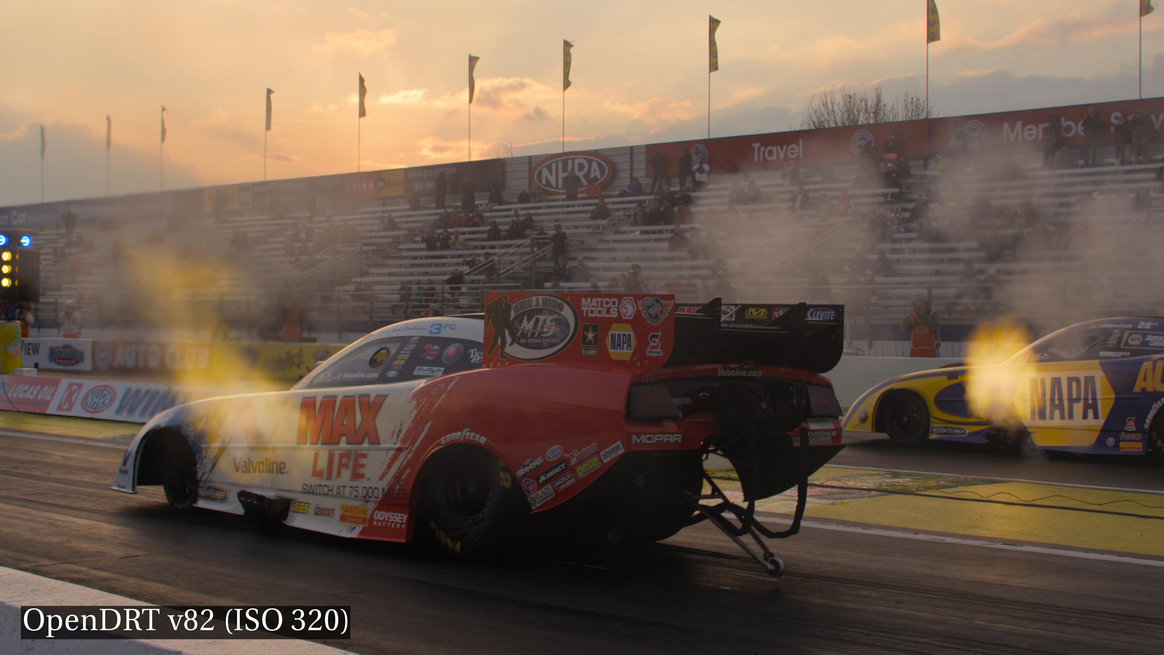
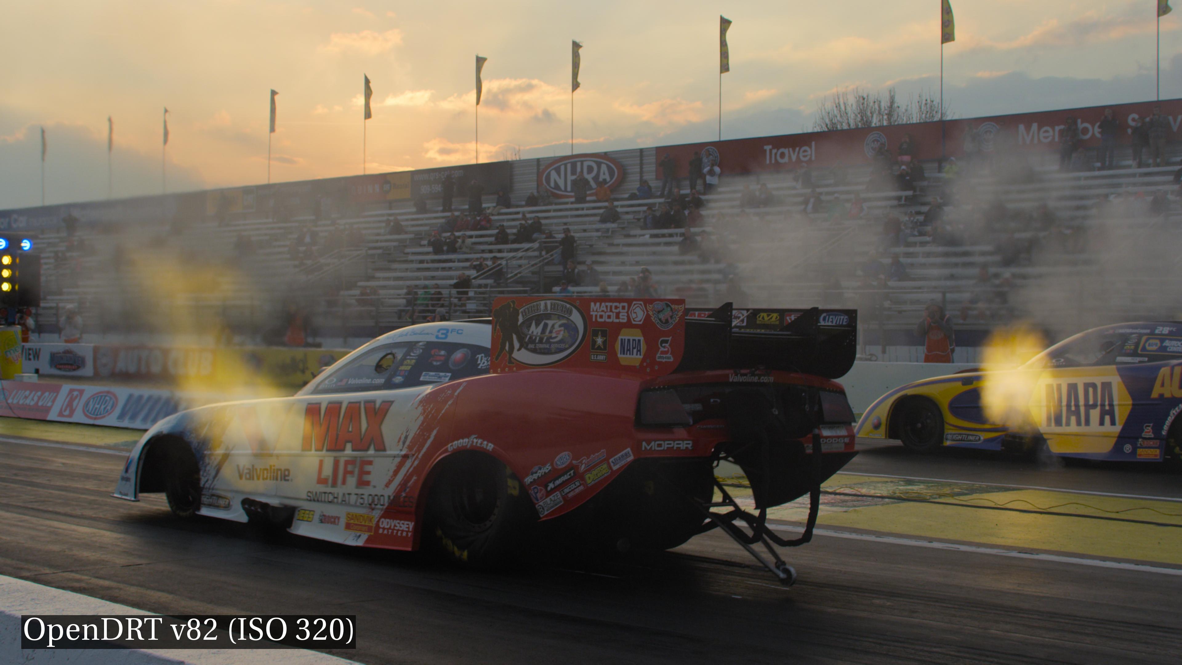
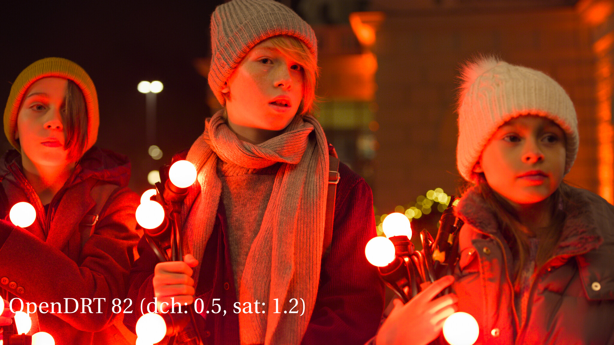
Here’s the image in Nuke with OpenDRT, looking similar to yours. The clouds have a bit better detail, which I believe is one of the things that improved in v82 from v81.
Thanks!
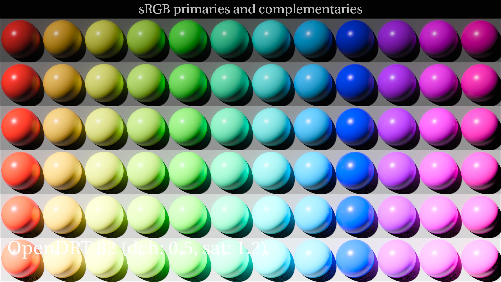
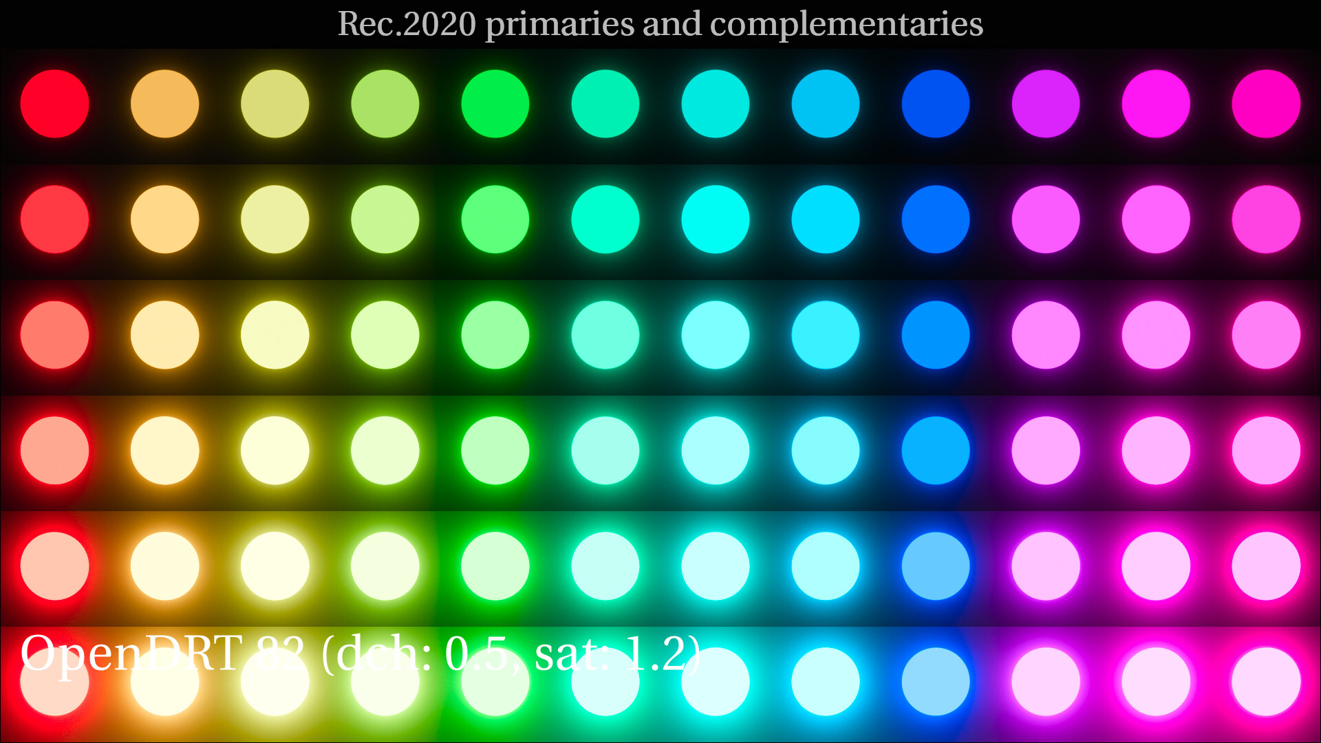
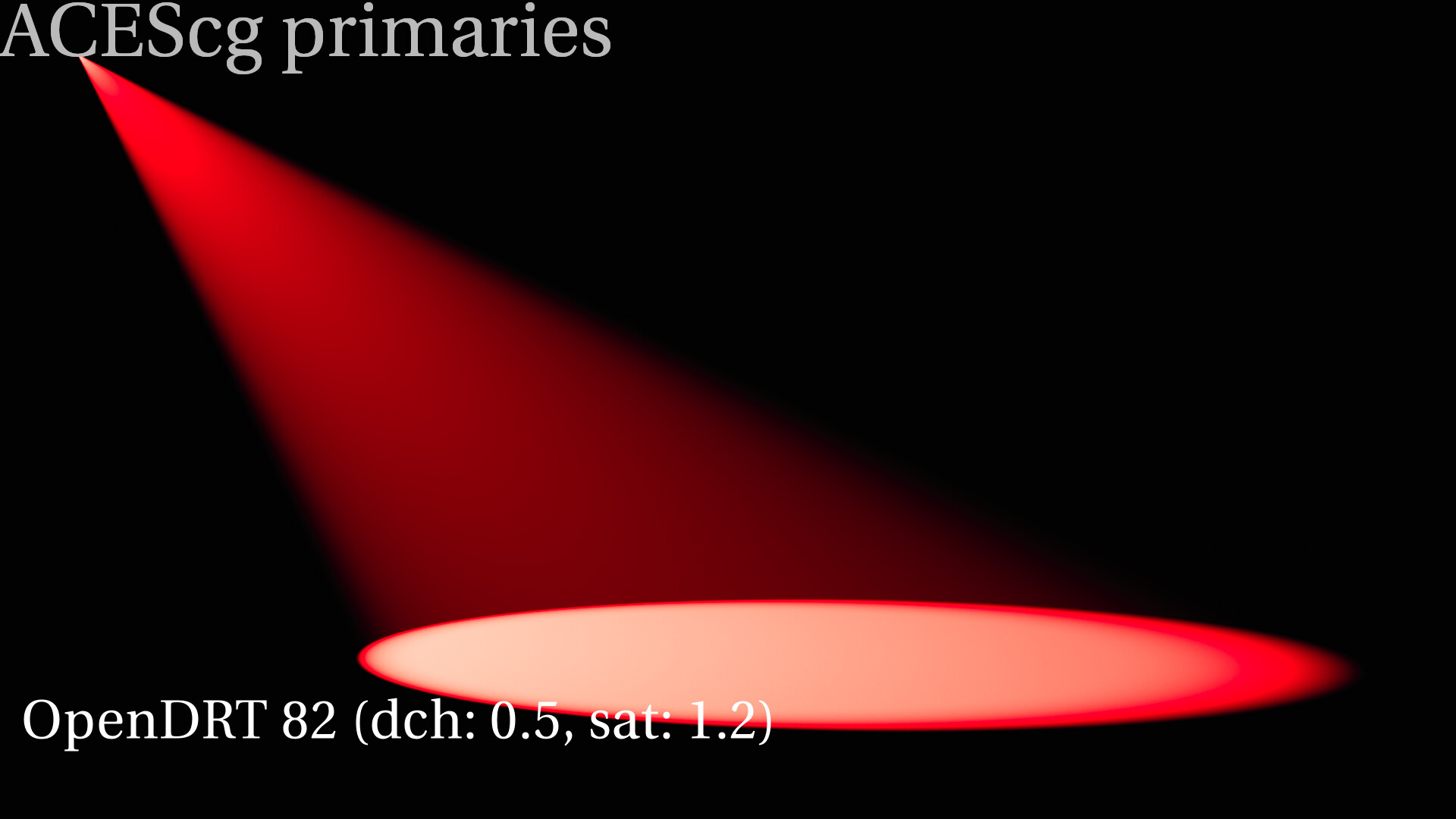
I see the paramters have been revised in v82. Will look into it some more when I have time.
Interesting to see the differences. It seems v82 matches the other display mappers a little more now and I think the default dechroma is changed from 0.3 to 0.5.
In isolation judging to taste on a single frame I like v0.0.81b1 more but obviously nonsense to judge it like this. I like that some parameters are exposed to the user to a certain degree.
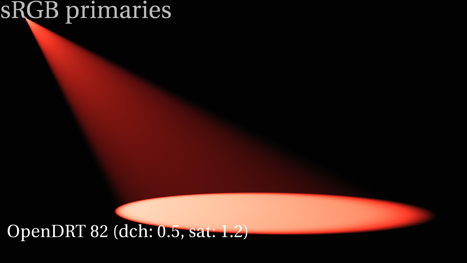
(v82 left / v0.0.81b1 right)
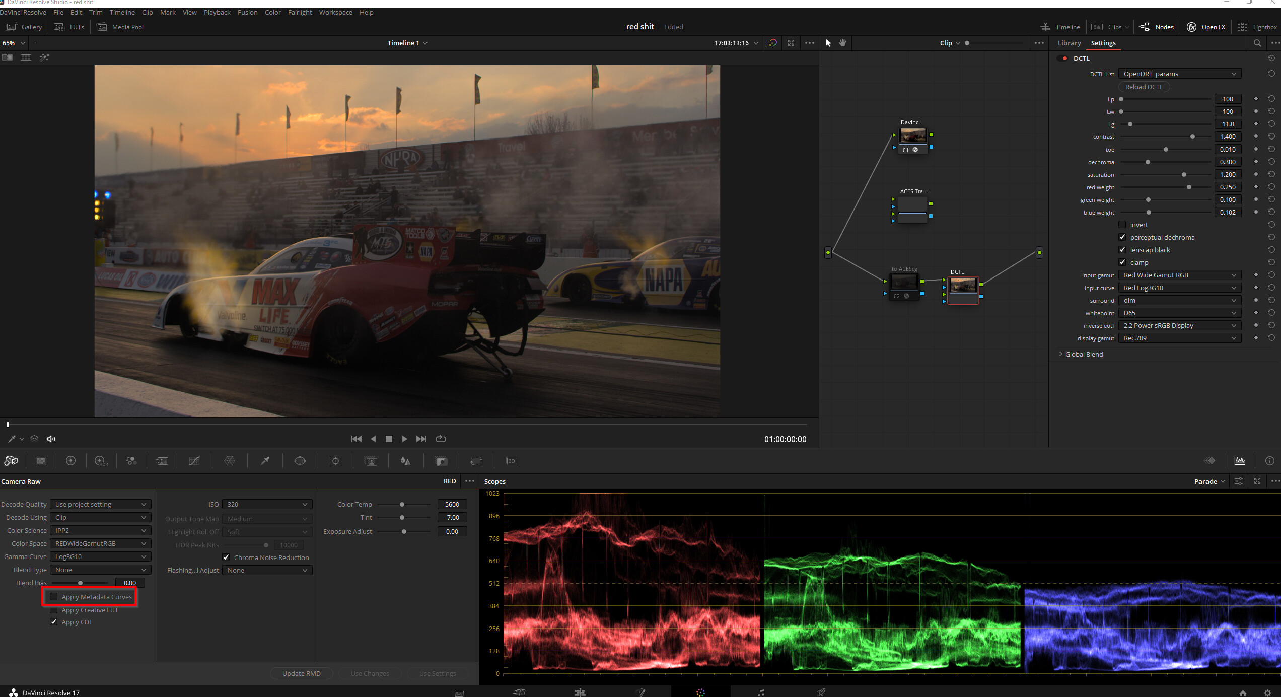
I think the reason for the difference in your Nuke and my Resolve is that Nuke doesn’t bring in the metadata curves which I did have enabled in Resolve.
I get this when I disable it. So yea makes sense to want to boost exposure a bit.
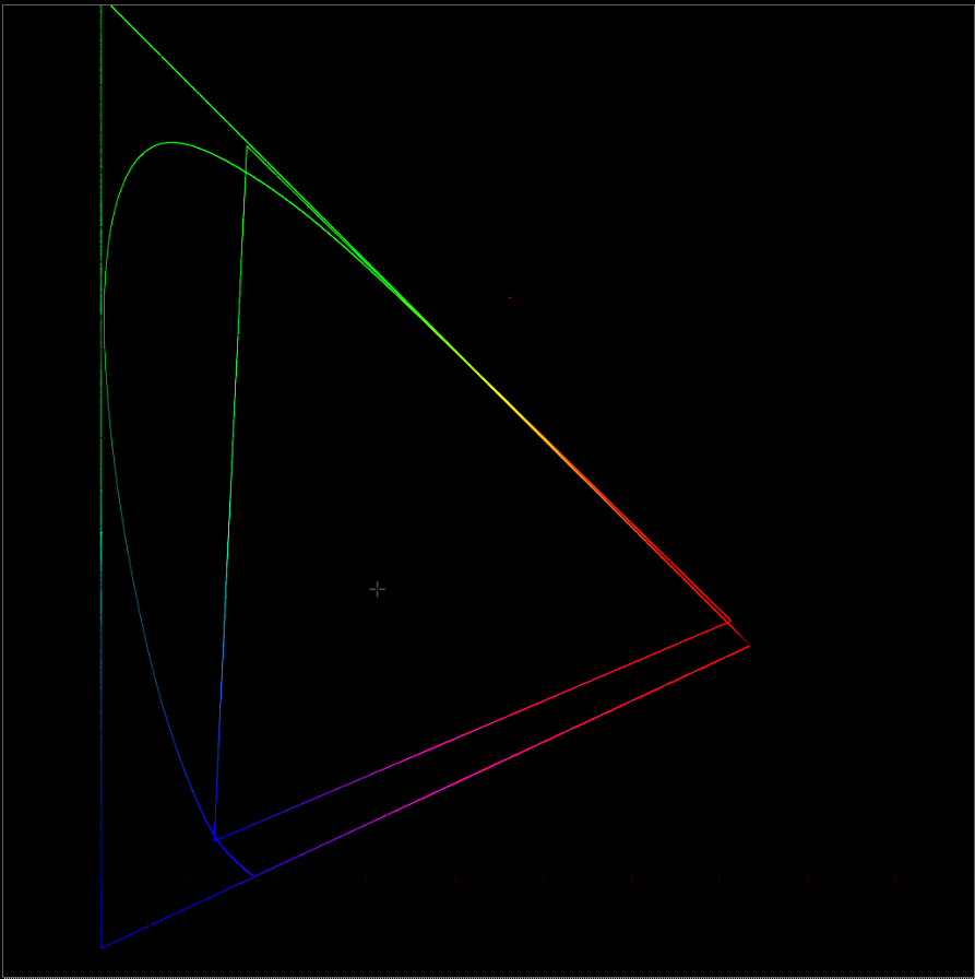
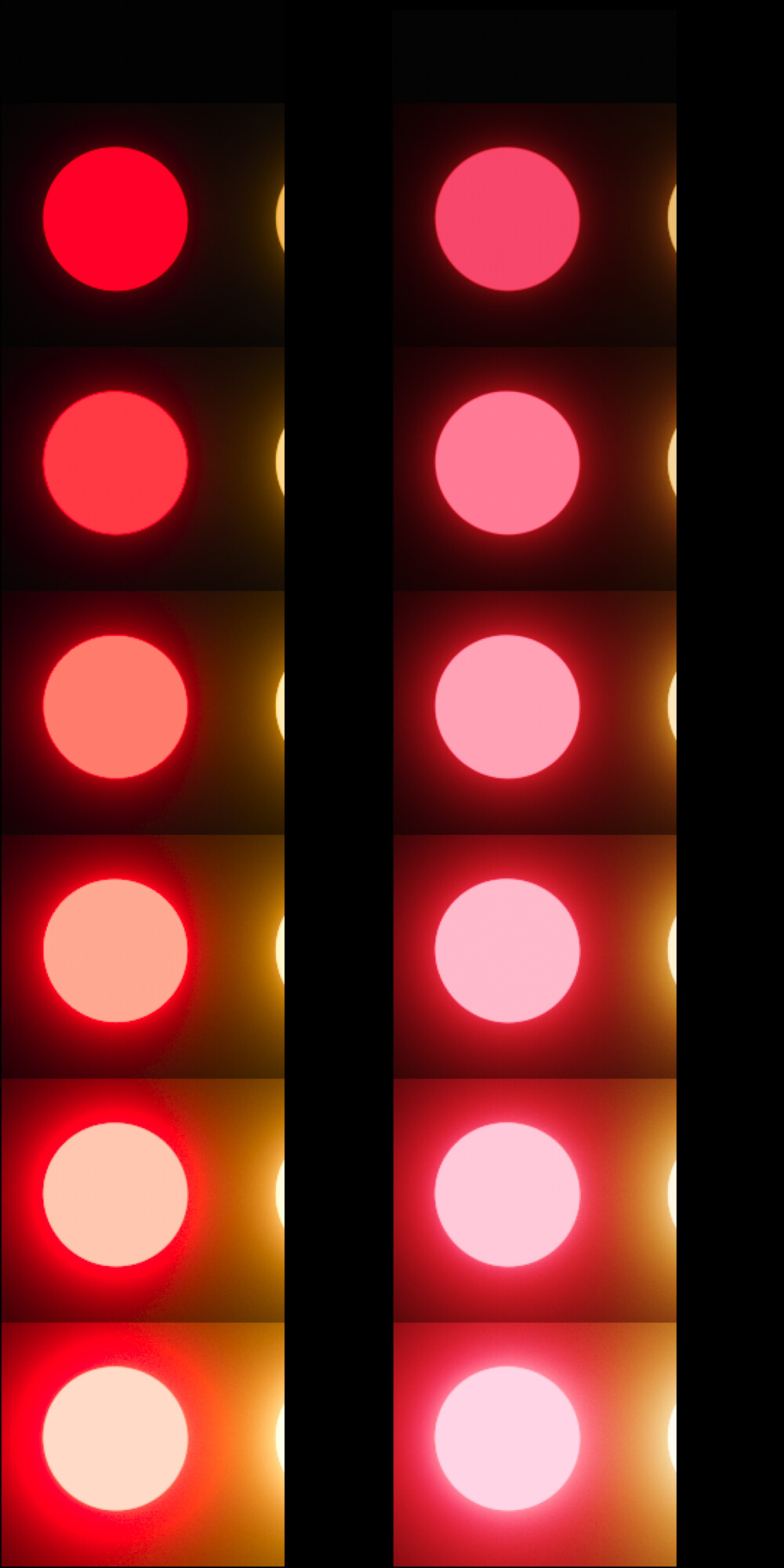
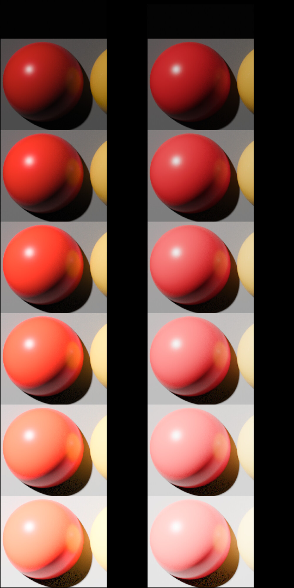
IPP2 desaturates red into pink, while OpenDRT maintains the red saturation longer, going into orange before it goes to white. Note the red column in these images by @ChrisBrejon:
Both of these are of course approximations of what out eyes see with luminous red. However, I’d argue that the approach of OpenDRT of maintaining saturation is a better approximation of how our eyes see luminous red than the approach of IPP2 to go to pink/pastel. To me pink does not look bright. YMMV.
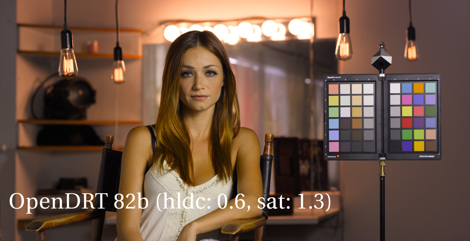
Yes. FWIW, I’ve been raising it even higher to 0.6 which I find gives nicer results. I’m on the fence on that one though, fluxuating between 0.5 and 0.6. Having it lower than 0.5 results in clipping currently.
Agreed! But the line between making red orange or trying to stay ‘linear’ is super thin within sRGB/709. I often have trouble deciding how bright red should look in a scene compared to the rest that scene within such a limited gamut at 100-150nits. I often find myself making red too orange in the end.
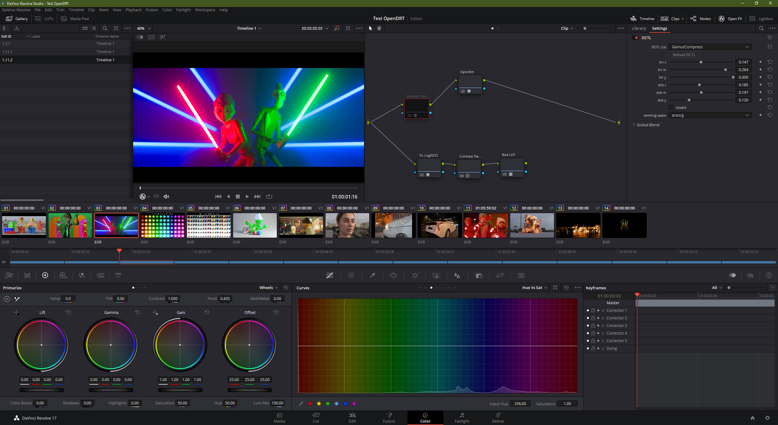
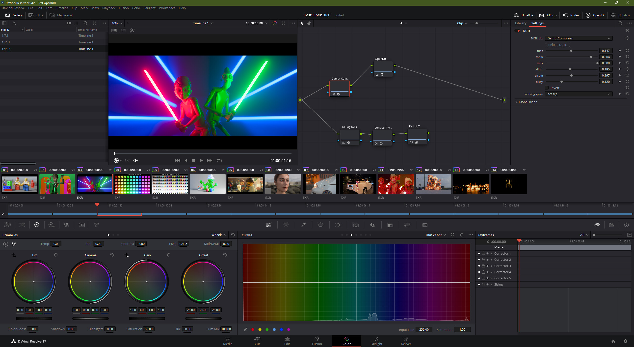
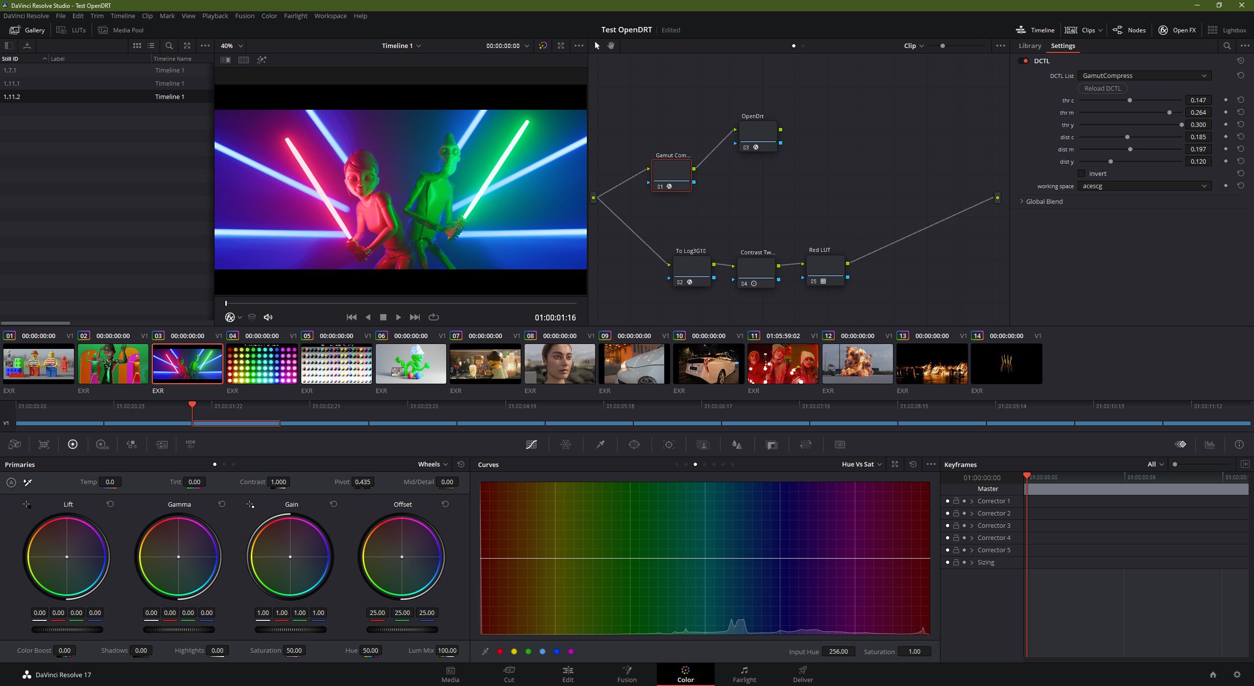
I grabbed Chris’ lightsaber scene to have a look myself.
While I do agree that the tonal range feels more correct on the red side with IPP2. I have trouble judging the green side. With OpenDRT you get a much better sense of the lightsource on the characters face compared to IPP2. Mostly because the specular line almost shares the same amount of ‘whiteness’ as the saber suggesting more brightness for my brain.
The light sabers is looking better in resolve than in Nuke. I think there is currently a temporary hiccup with gamut mapping in Nuke that I recall @jedsmith mentioning. @shebbe could you post Red Xmas? I’d be interested in seeing how that looks in Resolve.
Nah. That’s the expected result under OpenDRT sRGB target for Red Christmas. Add the gamut compression operator from Jed’s github which is available either as .nk or as DCTL if you want it to look correct. Once you have that, you can finish fixing it by adding some extra grading nodes.


