This is based heavily on @Thomas_Mansencal’s excellent work, and is frankly just a minor tweak on his views of the data.
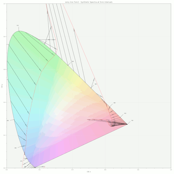
There has been quite a discussion about “data” with respect to cameras and their capturing. I thought it would be informative to plot the camera’s native response to the spectral locus with respect to how the values end up after processing via a naive set of three virtual camera primaries.
As we can see, the idea that the camera captures “data” is only relative to the constrained selection roughly around the solved set of swatches in question, and even then, it deviates. This seems like an unavoidable subject when determining a parametric or otherwise approach to gamut mapping, as the procedure would inevitably be mapping non-data.
Although the spectral responses are varied, the overall trends are perhaps striking.
absolutely, also the space virtual primaries span is not filled fully filled with achievable values (similar to XYZ being larger than the physically achievable colours). But I need to raise the this is an IDT subject buzzer here ;-). Out of Gamut Colours can have many causes and camera profiling is just one of it.
But this all cements the claim that the spectral locus should not be seen as a sharp border. We need to gradually lower or trust in data the further we move away from the centre.
Well, we’ve had that experience, right? Stuff doesn’t look necessarily as the probe says it should… and on thop of that would be interesting to compare with the influence of perceived contrast vs perceived saturation…