Agreed, now, something that kind of
annoysdisturbs me is that we are currently mainly using ZCAM as a perceptually uniform space where it is much more than that, i.e. viewing conditions compensation.
I agree here, and I think it is worth noting that even if you end up using the viewing condition bits of ZCAM, you don’t necessarily have to use the full model in the final implementation. It will probably be fairly simple to produce a simplified model that models that particular part if its behavior at lower computational cost and with better behavior outside the visual gamut (if required).
Regarding hue lines
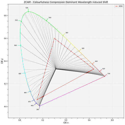
It is correct for the lines to not line up here though. All models designed to model the perception of hue are explicitly designed to not have straight lines in chromatically space due to model the Abney effect. For the attributes to not be correlated perceptually, they have to have some correlation in linear space.
Regarding the blue primary → 1:1:1 interpolations:
Hue and lightness not being accurate for colors far from the experimental data used to derive models (and in case if AP0 beyond real colors overall), is of course a part of the problem, but I don’t think it is the only reason for problems in those plots.
I think this plot by Alex Fry is a great way of showing why gamut mapping along straight hue lines to the exact boundary of RGB gamuts is problematic in general:
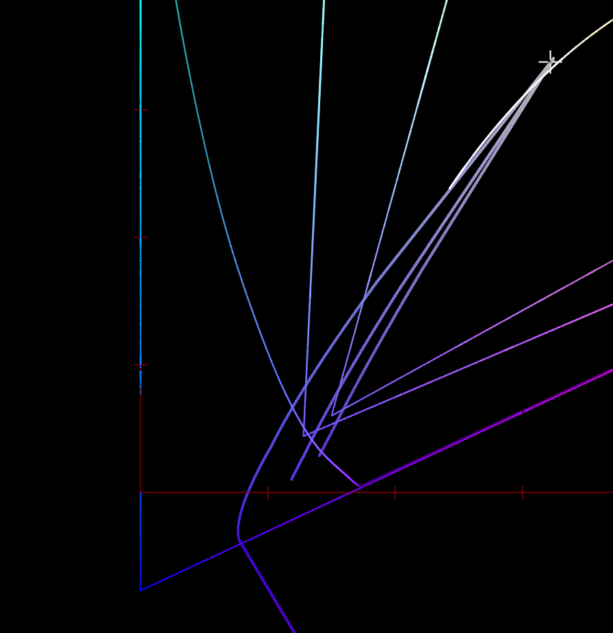
In all these cases the original line is a smooth line of increasing chroma. As the line gets projected to the RGB gamut, the deep blue lines follow a model of a perceptual hue line, which takes a path through cyan to model the Abney effect. When compressing that to the RGB gamut, the large change in available gamut between blue and cyan results in the line bending in backwards, preserving hue, but resulting in a really strong distortion to Chroma.
This is with Rec2020 to sRGB and with Oklab, since that is what I had setup, but it behaves very similarly in this case.
First image is gamut compression to a smooth approximation of the gamut, followed by soft clipping to RGB. Second image is compression in straight hue lines.

The first example will have more hue distortions, but does not get the strange chroma reversal. Arguably, maintaining a smooth curve and avoiding chroma reversals like this at the expense of perfect hue preservation is the better choice in cases like this.
Maybe a bit more clear in this blue to purple gradient: