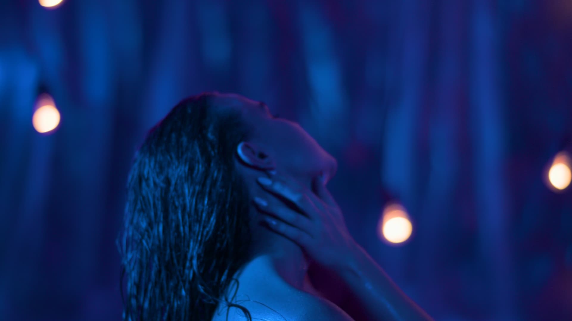
Funny but I actually prefer the steely blue of ZCAM DRT for these shots ![]() Nice job, @meleshkevich
Nice job, @meleshkevich
1 Like
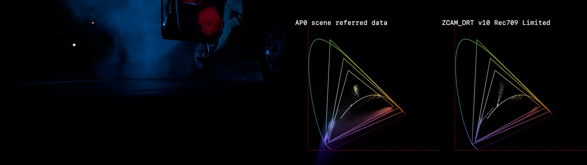
This is really useful data, and great that you’ve gone into detail as to how the pixel were generated.
My main thought look at this frame is what do we think should be happening here?
The data for the blue smoke is clusted in a position that’s not on, or line line with the 709 blue primary, and sits on a hue line that intersects the gamut boundary at a position a fair way along the border towards green.
1 Like
Just formulating this out loud here, trying to piece this together in my brain… So if what was seen with eyes on set is blue, but what is in the raw file is cyan. However as far as “what we expect to happen” I think we expect to see on screen what we saw on set, and see that on every screen. As Thomas put it:
So with that in mind, we are trying to figure out what’s going astray in zCAM from scene to screen. I know folks were wondering of it might be in the IDT. Does the data from Anton help to isolate if that’s the culprit?
Just trying to follow along. This is a fascinating ride!
1 Like
Yeah, I’m still trying to get it my head around it too.
The goal is defintely to have a system where if it looks blue on set, it looks blue on screen. The question at the moment is “is the shift coming from the DRT, or the camera/IDT?”
We think the DRT is doing what it should be doing, but we have green Fairy dish soap, and extreme blues that are coming out in ways that read as wrong to lots of people. So is the underlying data wrong in a way that’s simply been masked by hard gamut clamping in the past? Hard to know without hard measurments.
It would be great if we could measure the gels you’ve used with a spectro, to give us some hard data about what colour the light in that scene actually is. (easier said than done I know)
Same goes for the LED strip you used. Do you have any information on them? Sometimes spec sheets for LEDs have spectral distribution data included.
1 Like
For this camera there is impossible to know what is the correct way of interpreting its data until BM will fix tons of bugs in their Gen3 Raw. But I doubt this will ever happen since there is Gen5 now in their cameras. And Color Space Transform and ACES Transform have different matrices for URSA 4.6k Gen3 primaries.
So it’s not only IDT affects the original hue, but for this example we don’t even know what would be at least vendor provided “official” IDT.
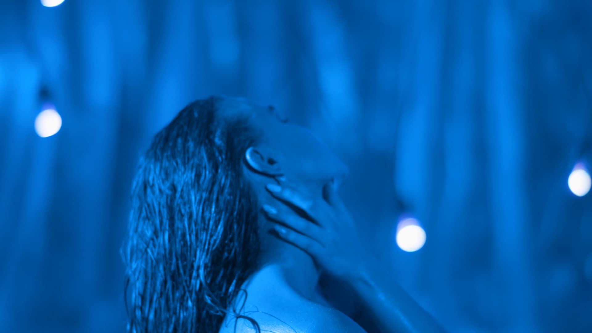
However, I found one thing that still makes me think that ZCAM DRT is unintuitive to work with with blue colors. If I take footage from the same location, which by lucky coincidence looks closer to the bluish blue that was on set, and change temperature in Raw into something really cold like 2000K setting, the blue becomes cyan. Probably this is how it should be and correct. But it doesn’t feel expected. It feels like grading under something very non-linear like print emulation LUT. If I want make it even more blue and push it into blue with a trackball, it becomes more cyan. Probably we just should get used to it. I don’t know.
Both pictures are ZCAM DRT with RGC.
6500K in Raw:
2000K in Raw:
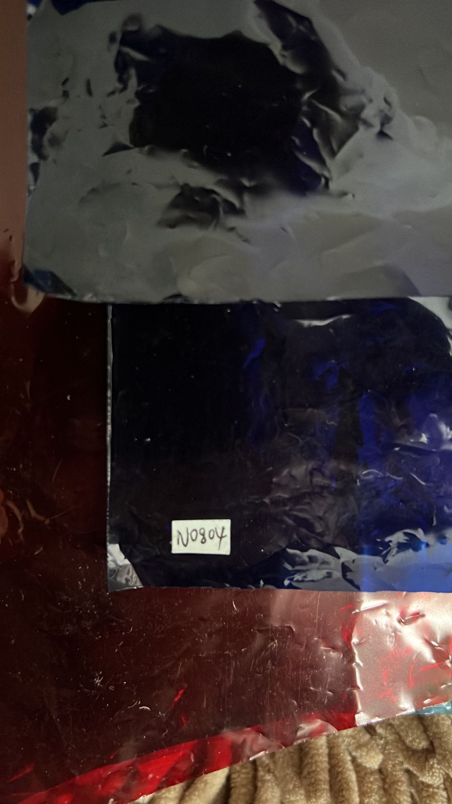
Unfortunately I don’t have a spectro. The only thing I got regarding the gel is this photo shot on iPhone by my friend who gave us this gel.
I asked him to look for it, he said he tried to find it but he couldn’t unfortunately. I also asked him to look for it in a history of purchases on his ebay account, but he said it disappeared from there because it was purchased about 3 years ago.
EDIT:
Replaced the images. I forgot to turn on RGC at first.
2 Likes
So I got to take some measurements today.
Never really taken measurements of translucent detergents before, so open to suggestions on the approach here.
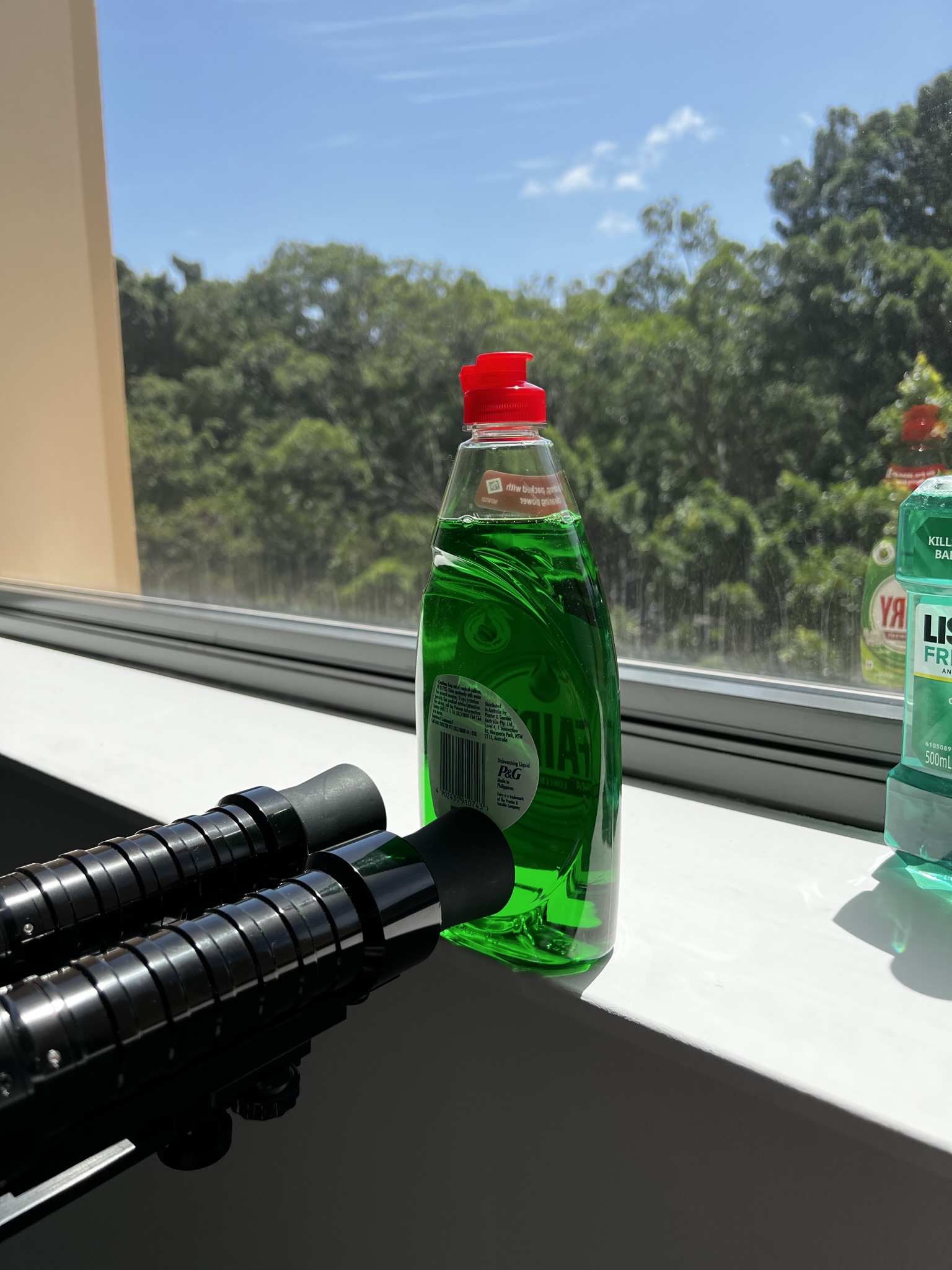
With a bottle of Fairy, and Listerine Freshburst, which in reality has a cyanish green similar to some of the Fairy renderings we’ve seen.
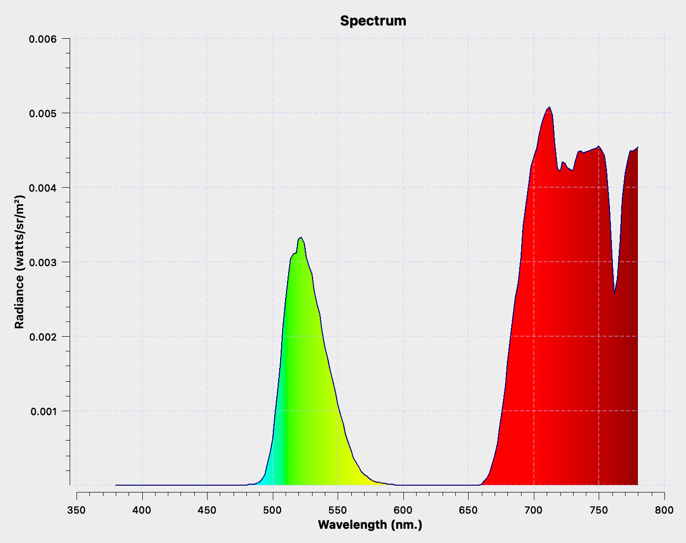
Turns out Fairy is extreemly green:
Whilst this is the plot for Listerine looks like:
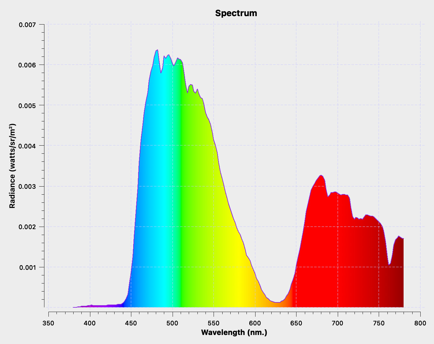
CRIApp measurements can be downloaded here: FairyAndListerine_20220214.chroma
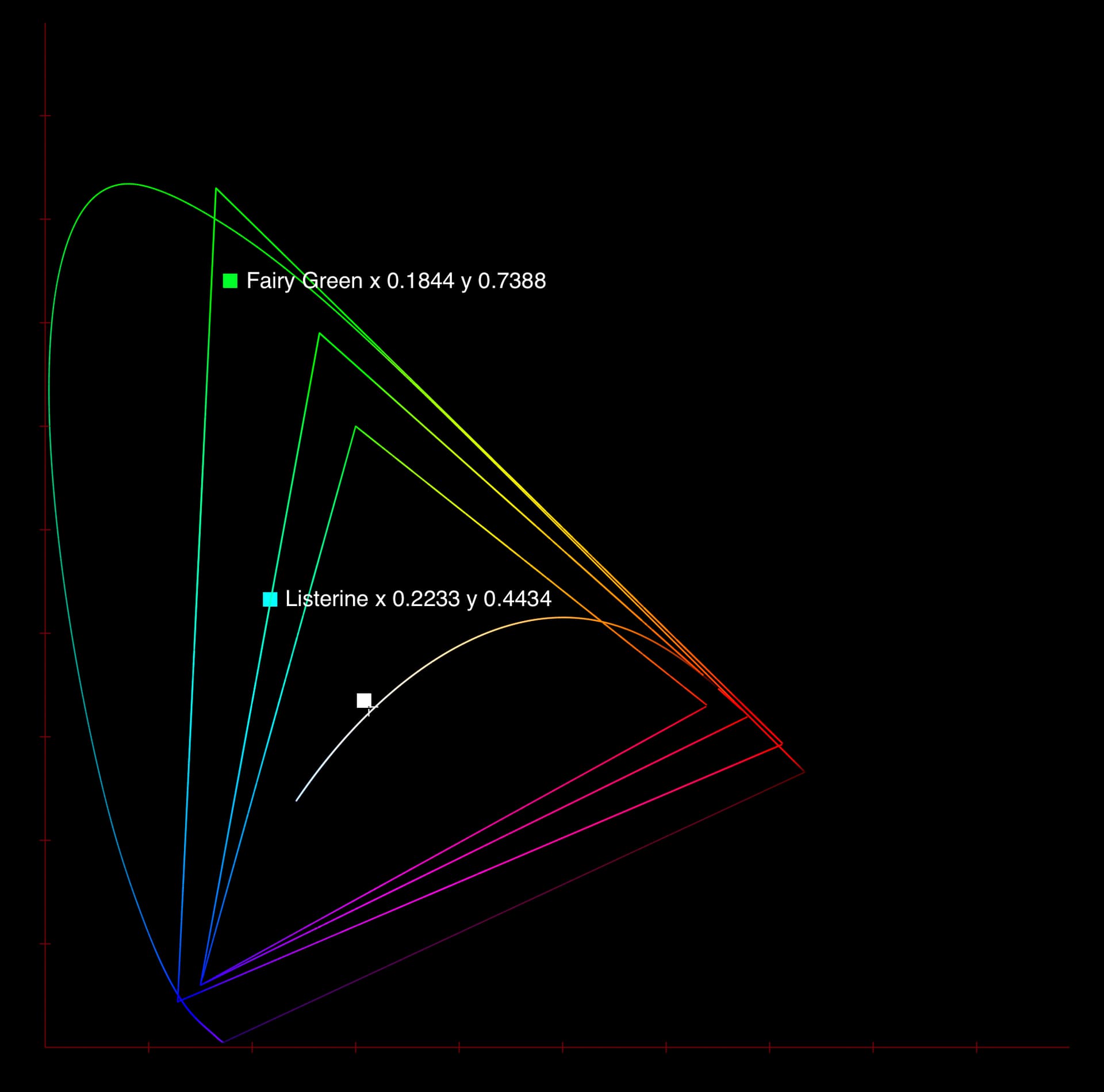
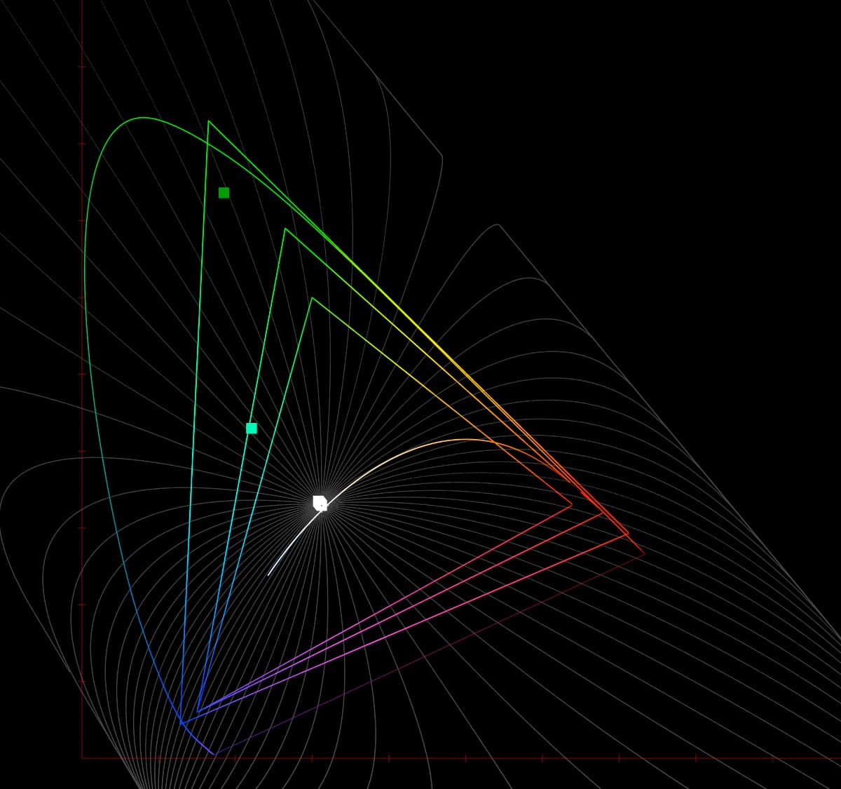
We can see that in Yxy Fairy is sitting waaaay out near the edge.
I’ve created a couple of patches to run thorugh the ZCAM DRT, along with some slightly sketchy reference images taken at the same time. Now this gets a bit handwavy, as I didn’t have a DSLR with me at the time. But I’ve taken them on an iPhone 13 Pro in RAW mode, and debayered them in dcraw to ACES. But looking at a plot, clearly the data isn’t truely RAW sensor data, and is already partially rendered to a P3 intermediate state of some sort (fits way too perfectly inside P3 to be sensor data). So on the two fairy examples I’ve done some matrix noodling to yank the data over to sit more or less inline with the position supplied by the spectro. doesn’t sit out as far obviously, but should be on basically the right angle.
AP0 EXR can be found here: FairyAndListerine_xyAndPhone_v001_AP0.exr
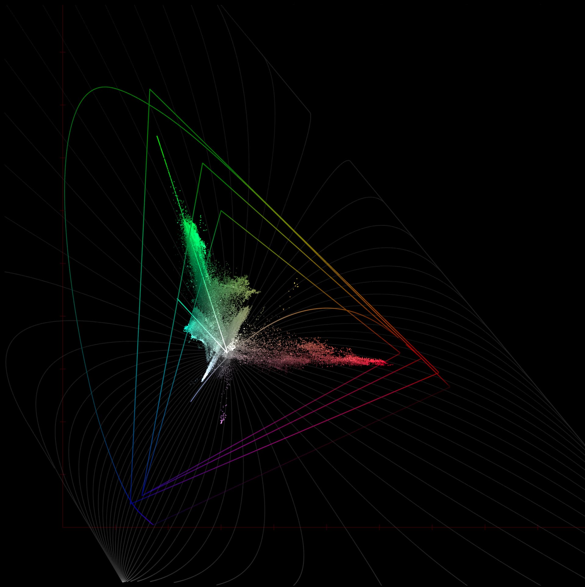
When rendered through DRT_ZCAM_IzMh_v10_Blink to sRGB we get this:
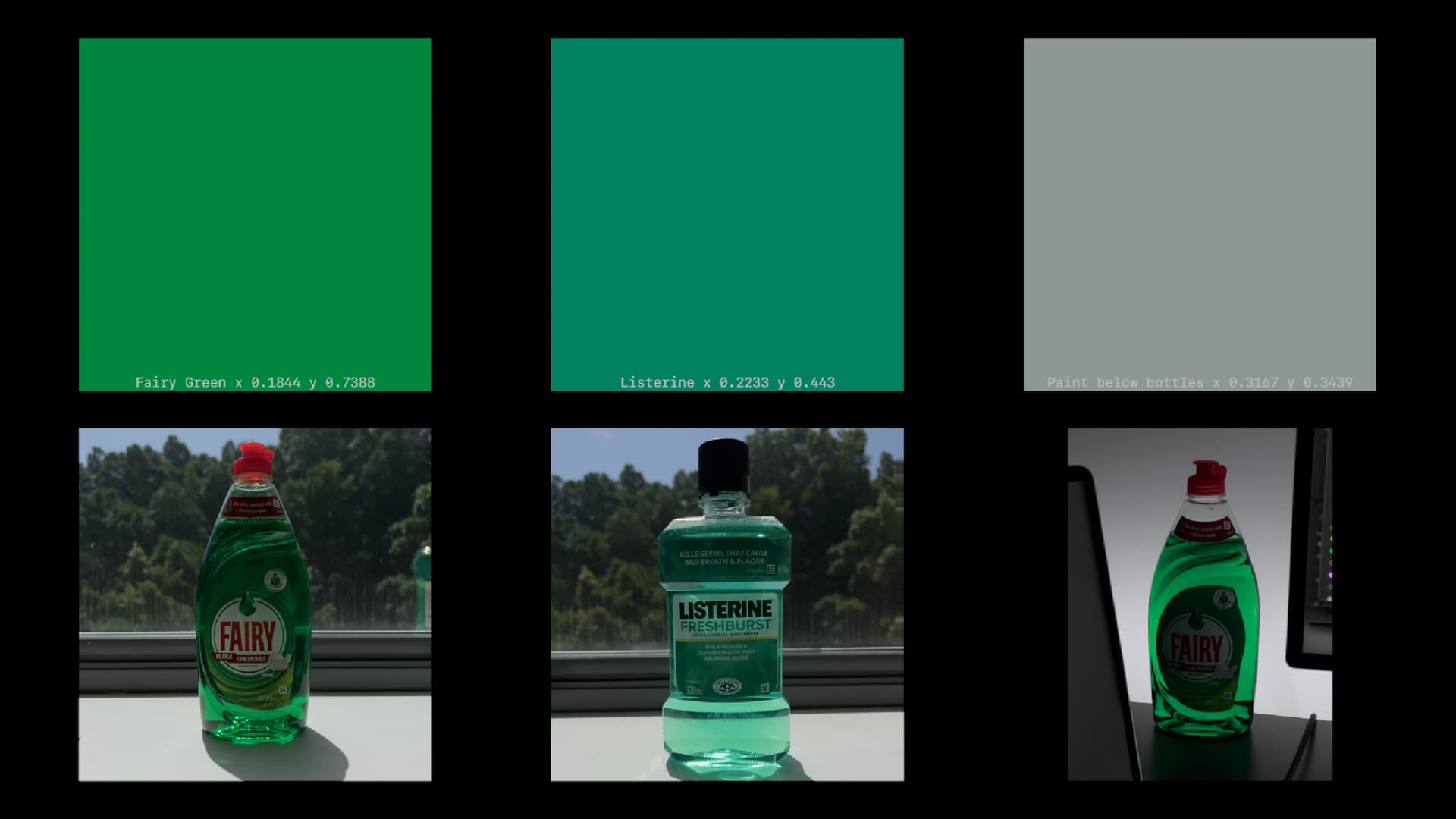
Looking back at forth at this and the bottle on my desk (the view on the bottom right, backlit by D65 medialight LEDs), the big big difference is the intensity of the colour.
Sometimes when I look at a rendering that pushes closer towards the display primary (709 or P3), I prefer that rendering, because it feels more colourful in absolute terms. But if I try and focus on the hue, it feels like the hue is more accurate when rendered in a hue preserving way, despite it being soo much less intense than the real bottle.
The image below is the fairy green, compressed via ZCAM to within sRGB. Whilst the middle section is a full sRGB green (at the matching Y value).
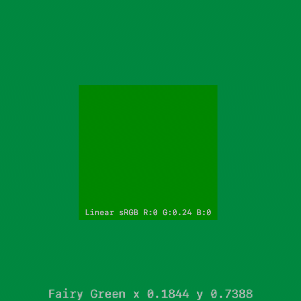
The patch in the middle may well be the wrong green, but it’s defintely the most green…
2 Likes
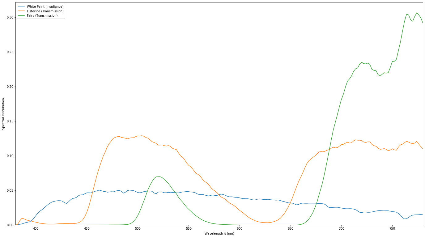
You seem to have the Fraunhofer lines baked in here, so you might also be measuring the scene irradiance.
Ideally, you want to perform the measurement against a uniformly and broad spectrum lit white surface, at the simplest:
- Measure the white surface alone, i.e. irradiance.
- Measure the same spot with the bottle, without moving the spectro-radiometer, i.e. transmission.
- With the two spectral distribution obtained, divide the transmission by irradiance.
Let us know! I haven’t had a chance to do anything on my end 
Cheers,
Thomas
1 Like
I think for Alex’s experiments leaving the lightsource in is ok.
But it would be handy to have the lightsource too, so we could simulate the appearance for other illuminants.
I did angle the probe down at the white paint of the window sill and took a measurement of the bounce off that. Which is in the CRIApp project file.
Yes exactly, you could then produce the actual tristimulus values under D60.
Ah cool! The plotted chromaticity is your direct measurement though right?
Correct. I take take another pass at it tomorrow though.
1 Like
I just quickly put up a notebook before the Valentine Duties  !
!
Things might be wrong…
Relit under D60 which is close to the ACES whitepoint:
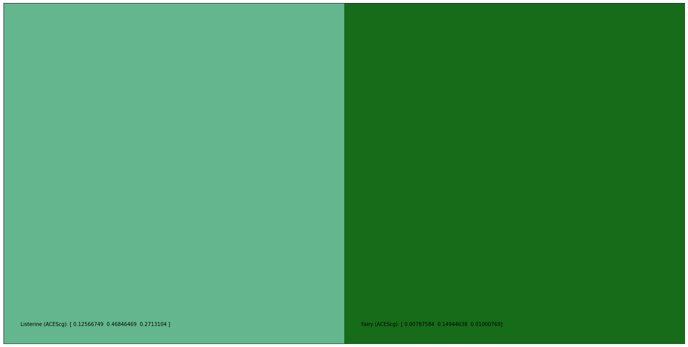
Listerine (XYZ):  [ 0.03767755  0.07291288  0.05509004]
Listerine (ACEScg):  [ 0.0251335   0.09369294  0.05426208]
Fairy (XYZ):  [ 0.00535969  0.02068401  0.00213598]
Fairy (ACEScg):  [ 0.00157517  0.02988928  0.00200154]
2 Likes
This is great @alexfry and @Thomas_Mansencal! That way way out there green is very very green to our eyes, but when compressed along the hue lines, becomes more cyan in Rec.709. So, are the green hue lines wrong after all? Or are we saying that the more cyan green is actually the same hue just less colourful? Or is this just because the primaries are misaligned? Should that not be taken into account? I think there was resistance to this idea in one of the meetings (it wouldn’t be hue preserving then I guess).
1 Like
This is what I was trying to think about when I was looking at the physical bottle on my desk, and on screen at the same time. The clamping renderings give a stronger sense of saturation, which in some ways can feel more like the real bottle, but they were also more yellow to my eye than the real thing.
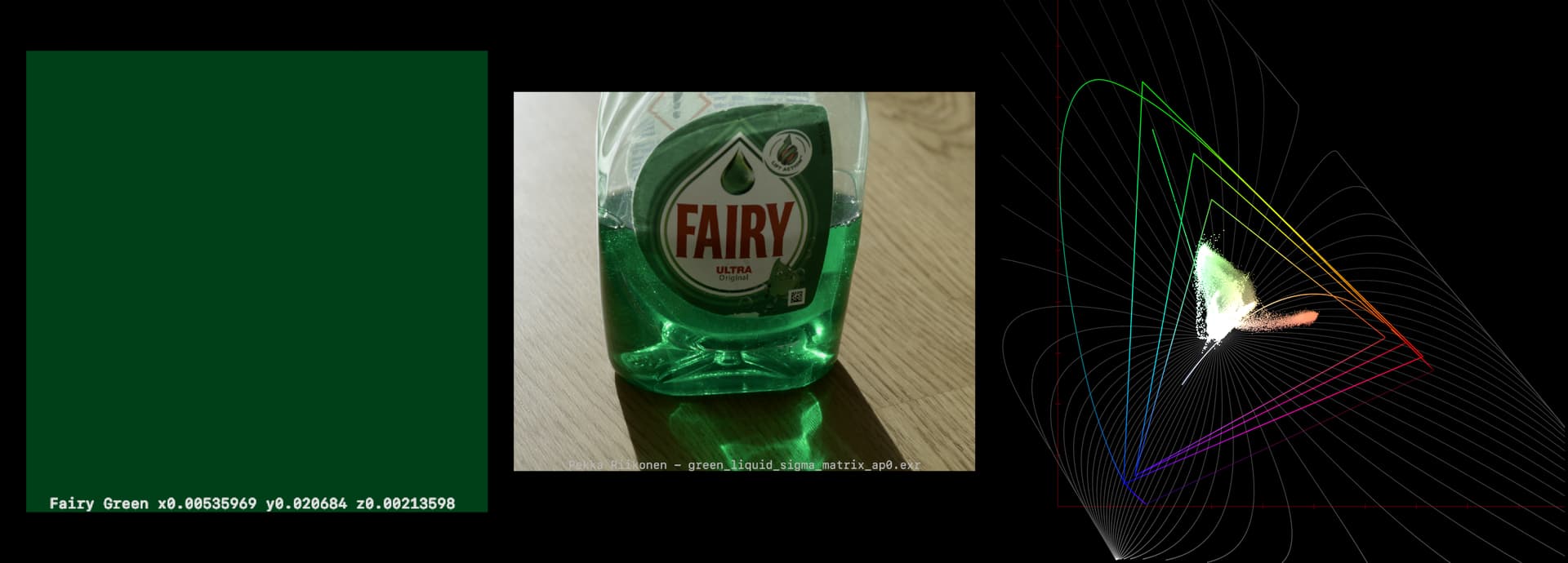
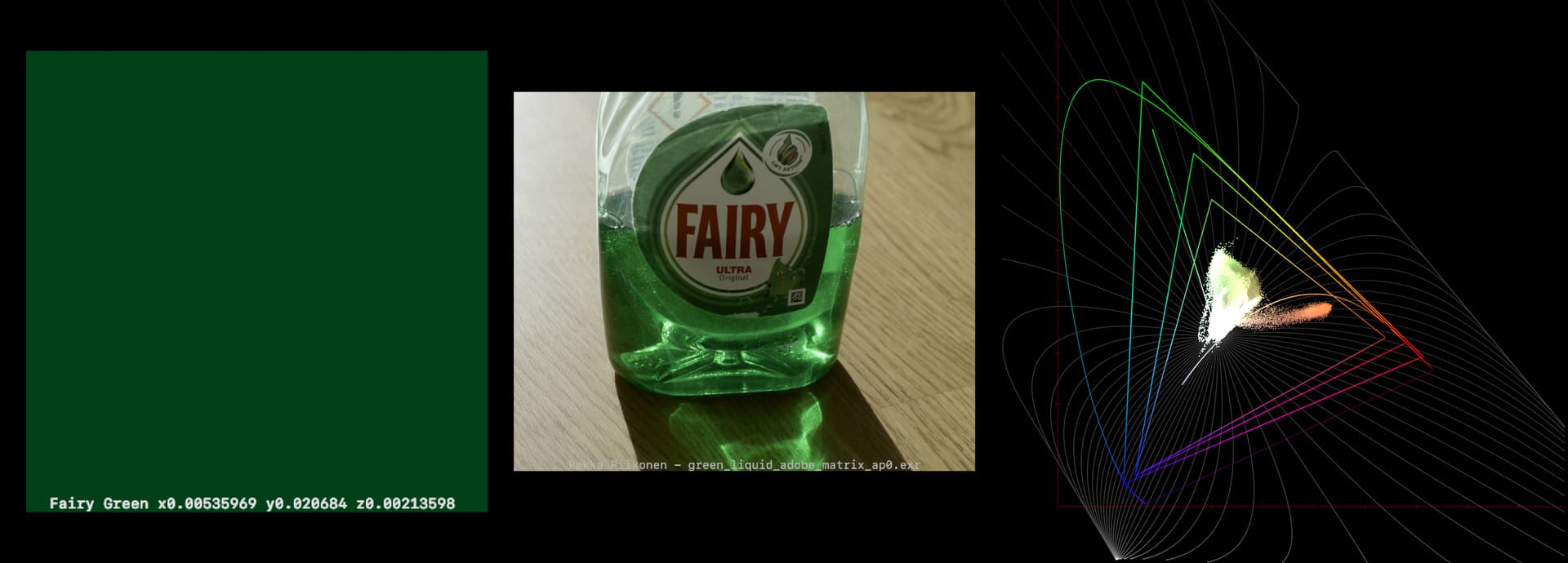
Looking at your frames, the sigma matrix seems to be pointing close to the right direction. But neither of them are anywhere near saturated enough.
(Patch is from Thomas’s data)
Sigma:
Adobe:
1 Like
Truthfully in a darker ambient light the liquid does look a bit bluish green to my eye (or I’ve convinced myself of that), but then in a direct bright light there’s no hint of blue or cyan in it that I can see.
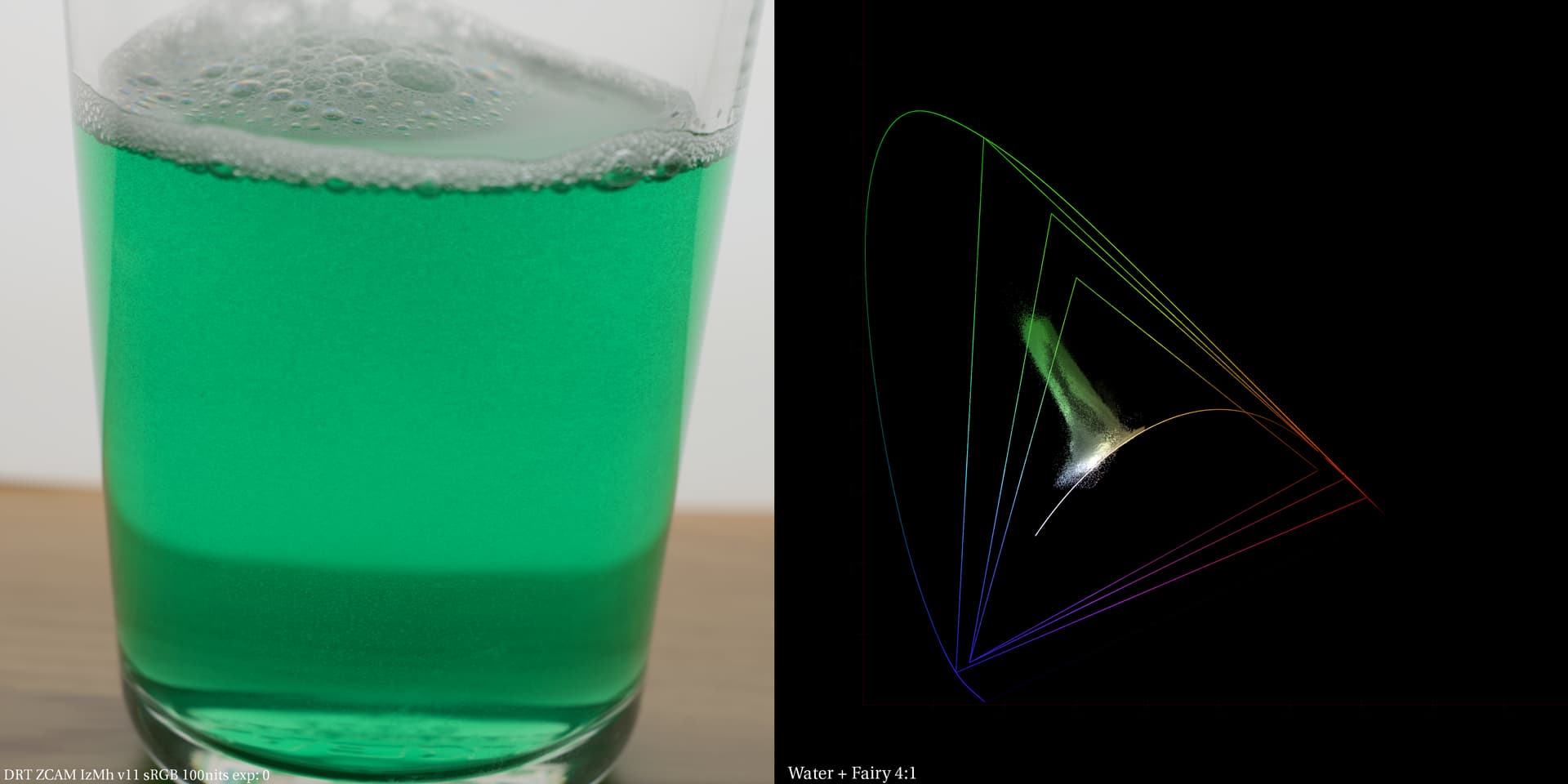
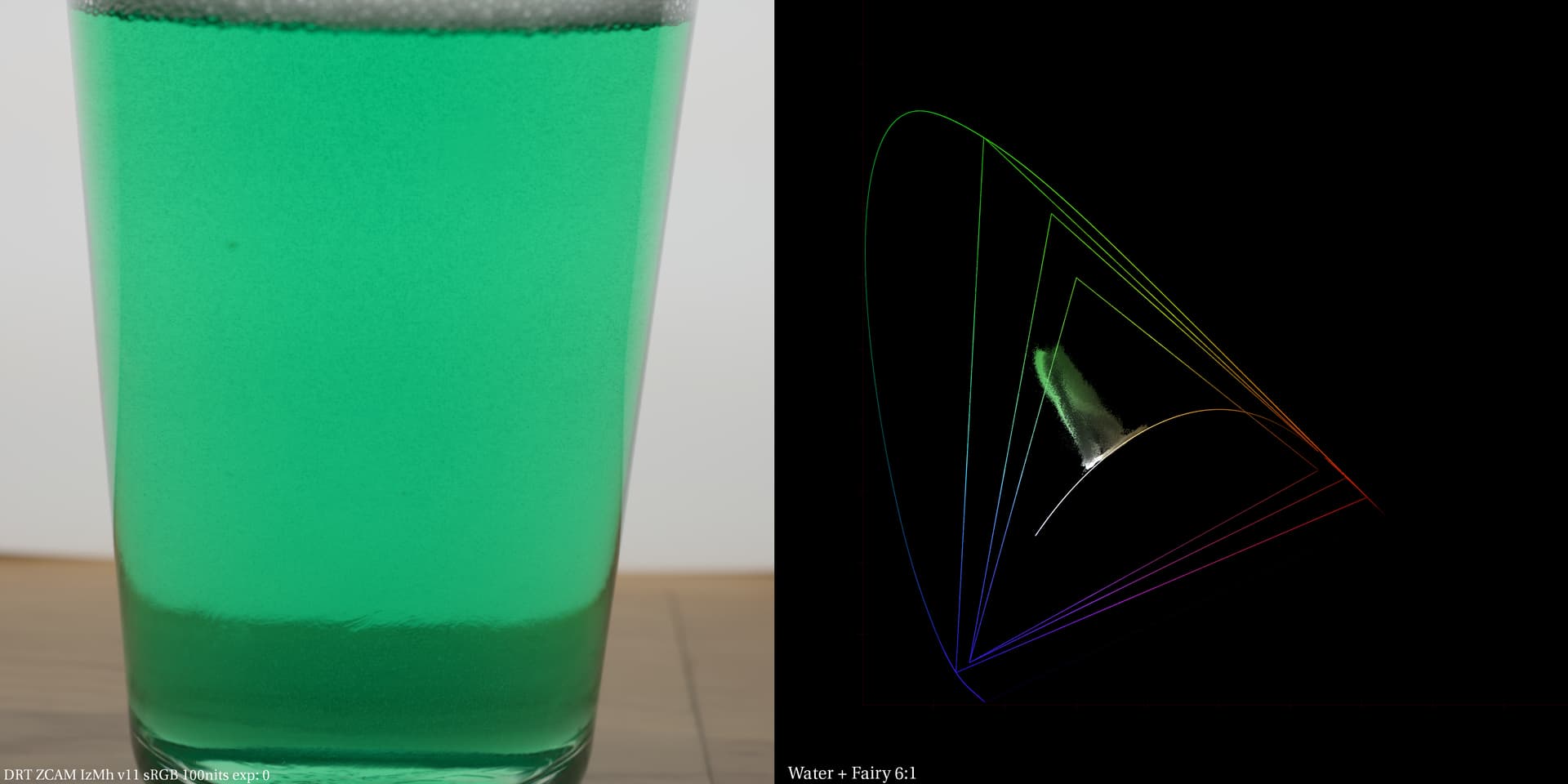
This is starting to get out of hand, but I wanted to see how that liquid looks when diluted with water. I would say it is kind of cyan green to my eye. Here’s with DRT ZCAM from 2:1 ratio to 6:1 ratio (approx.).
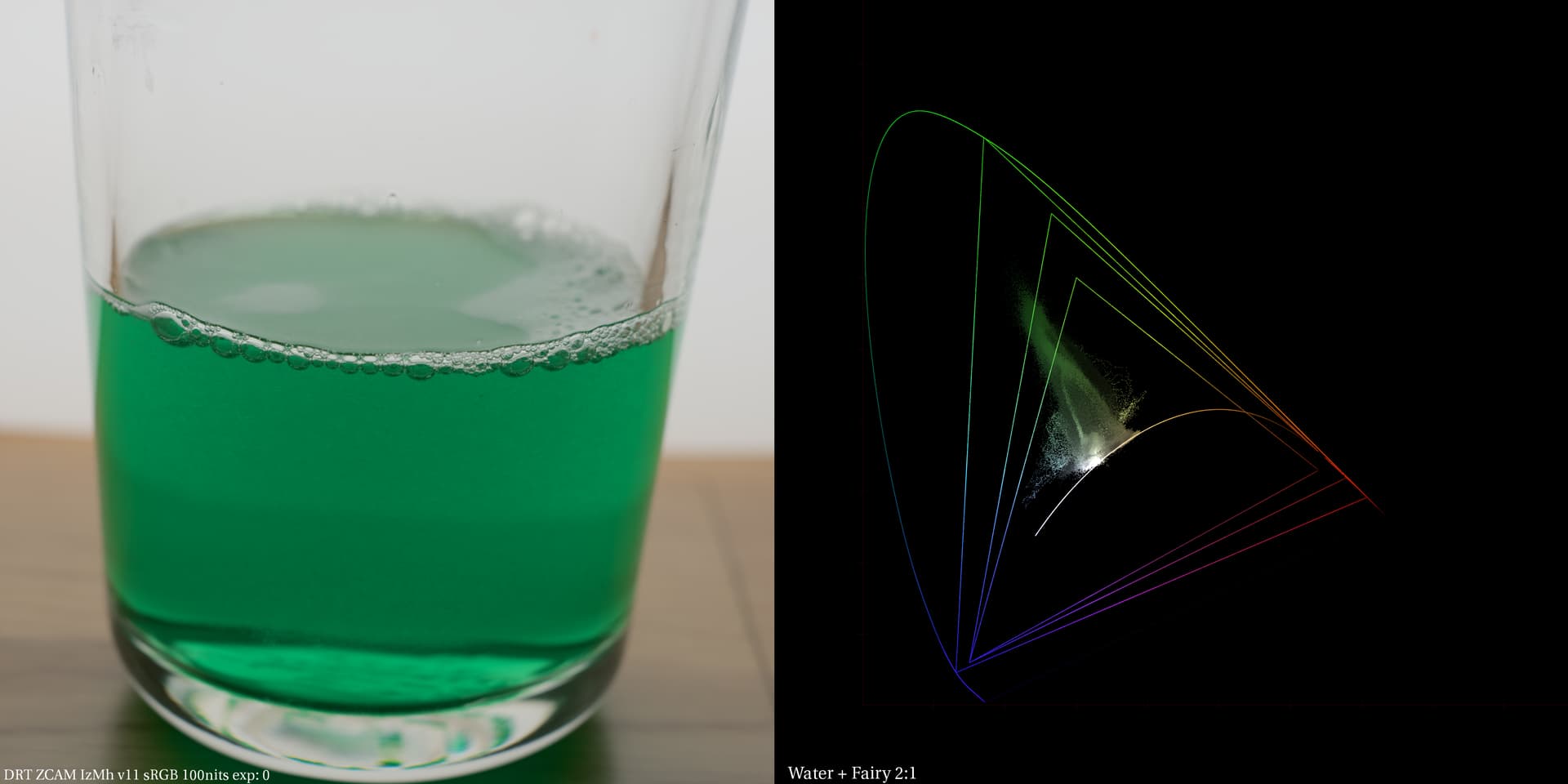
I’d say this was quite close to what I saw… It was maybe a bit more green…
2 Likes
Now I’m curious if there is some kind of Abney effect with “desaturating” blue colored liquid by water and what path to ̶w̶h̶i̶t̶e̶ transparent there would be.

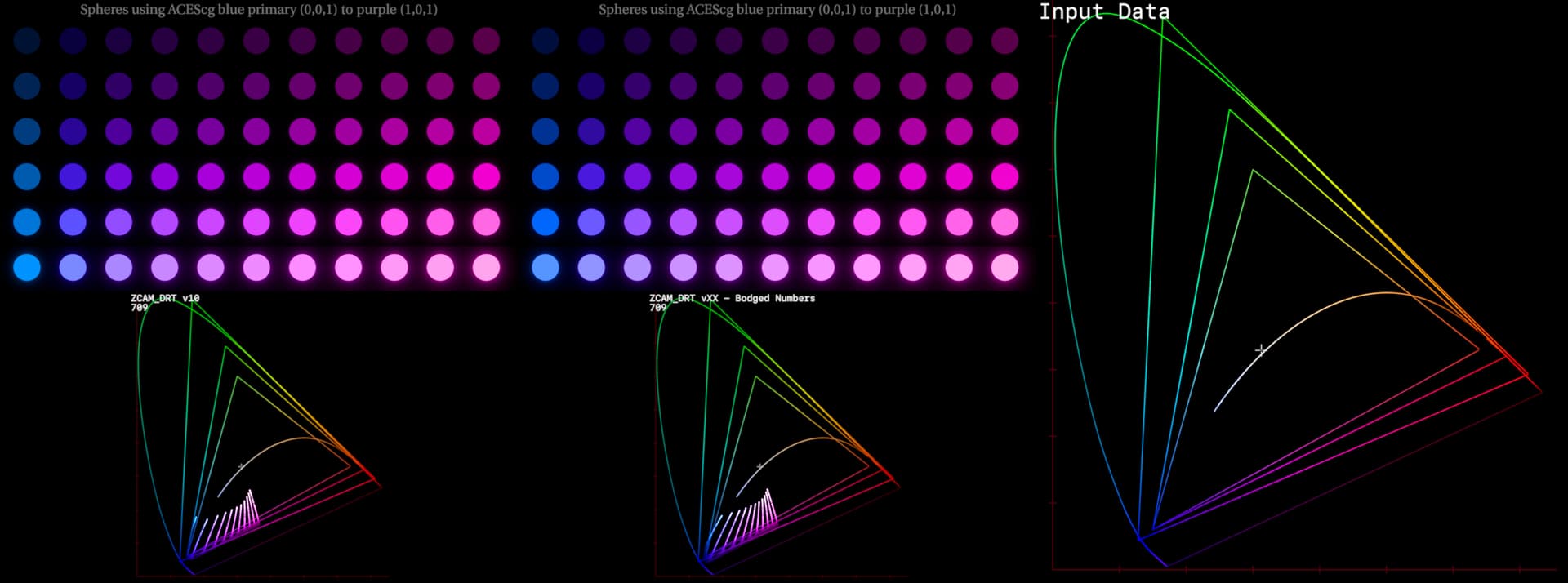
I’ve been tinkering with the idea of trying to relax the hue lines to get things away from the “all roads lead to cyan” problem.
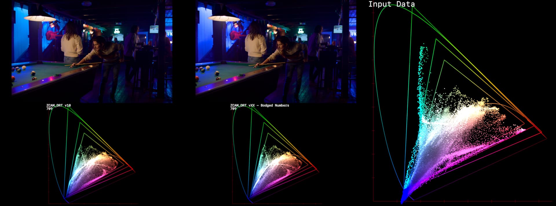
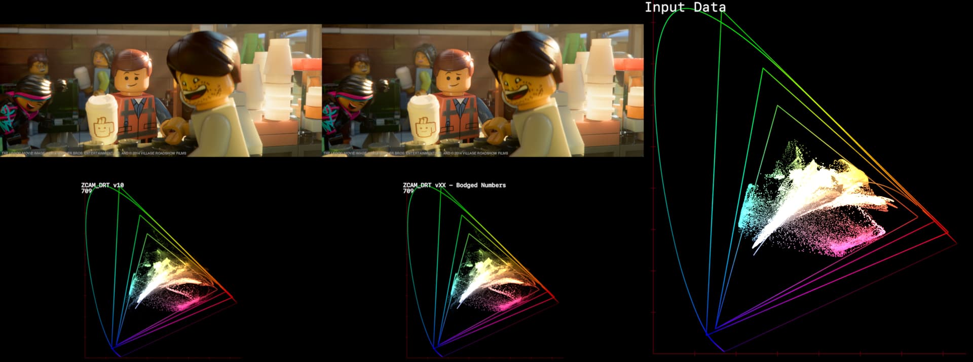
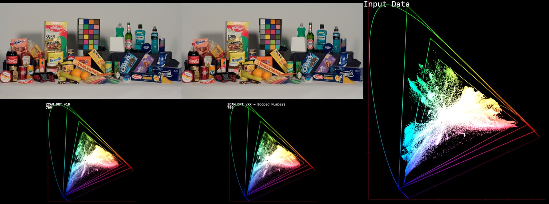
The idea is simular to what Matthias was doing with Abney’s Abyss, but I’m just randomly swizzling numbers in the XYZ_to_LMS_ZCAM matrix to keep as many of the hue lines in the same place as possible, whilst relaxing the curves around blue. The main goal being forcing the focal point to be outside of both AP0 (Red) and AWG (Yellow).
In this diagram:
Cyan = Real ZCAM
Red = My hand bodged numbers
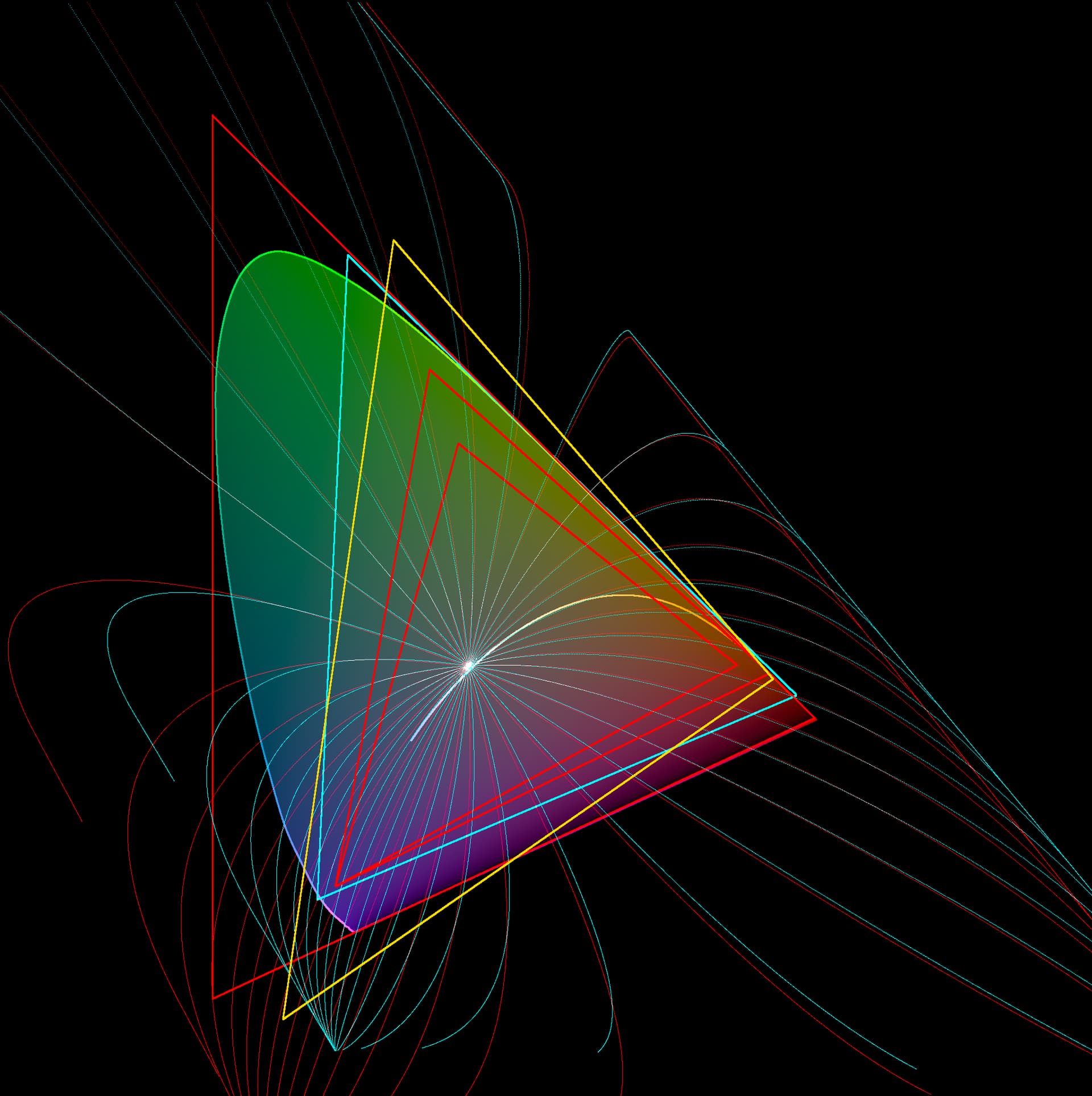
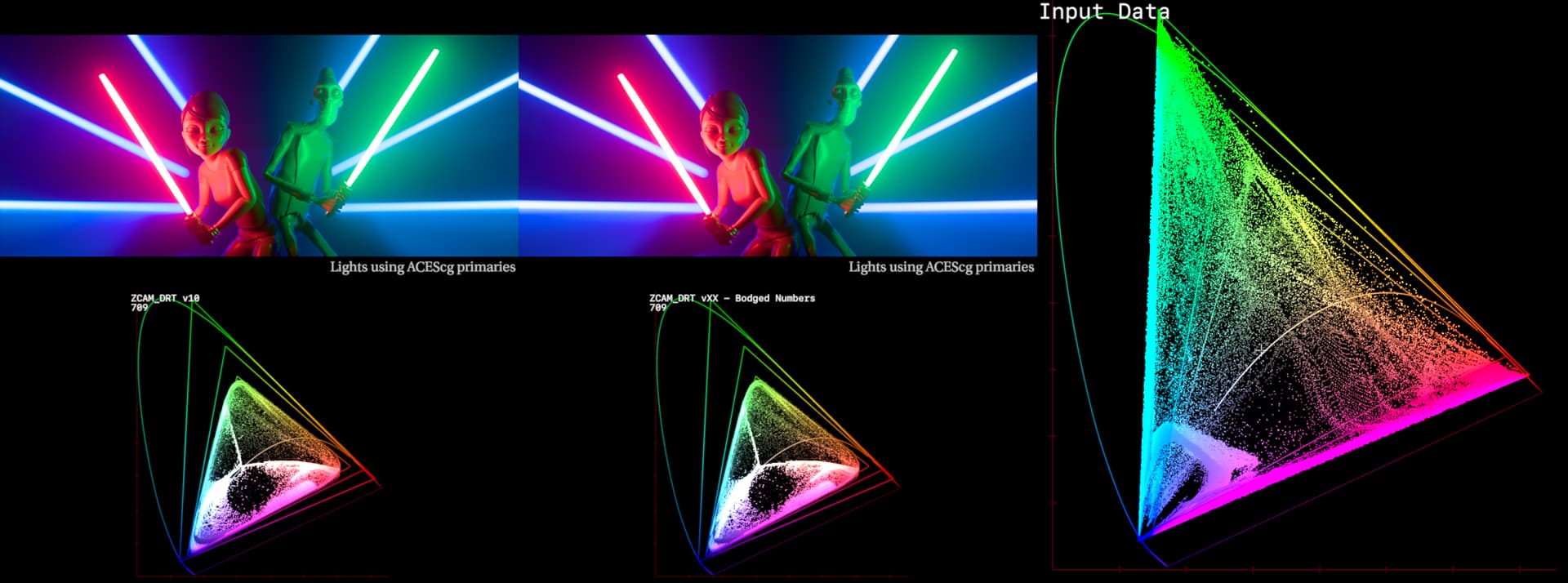
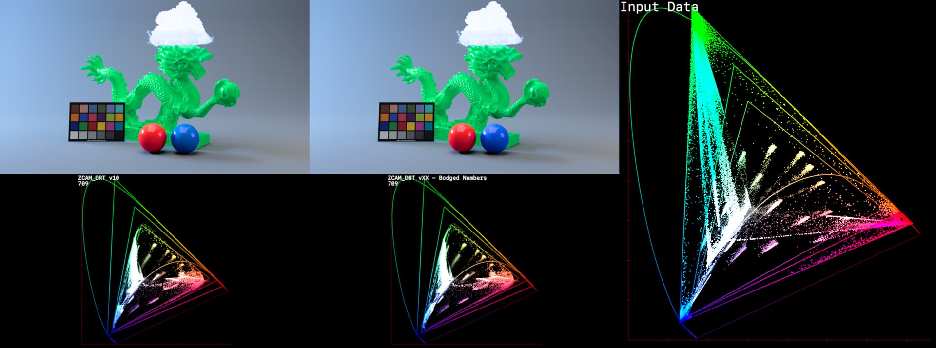
A few examples below of what the change looks like.
First some where it does make a meaningful difference:
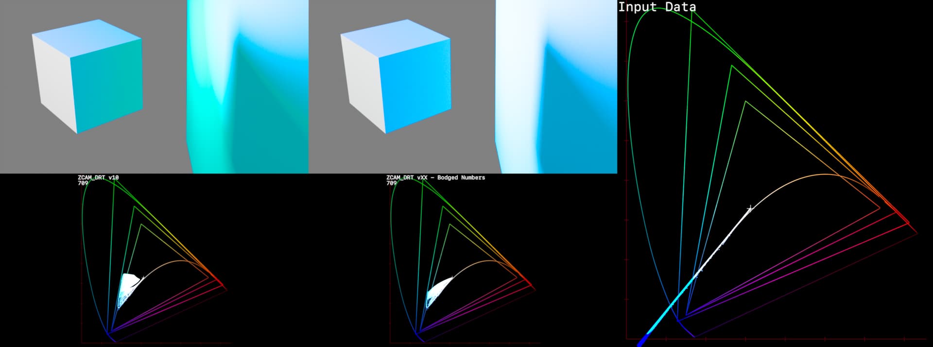
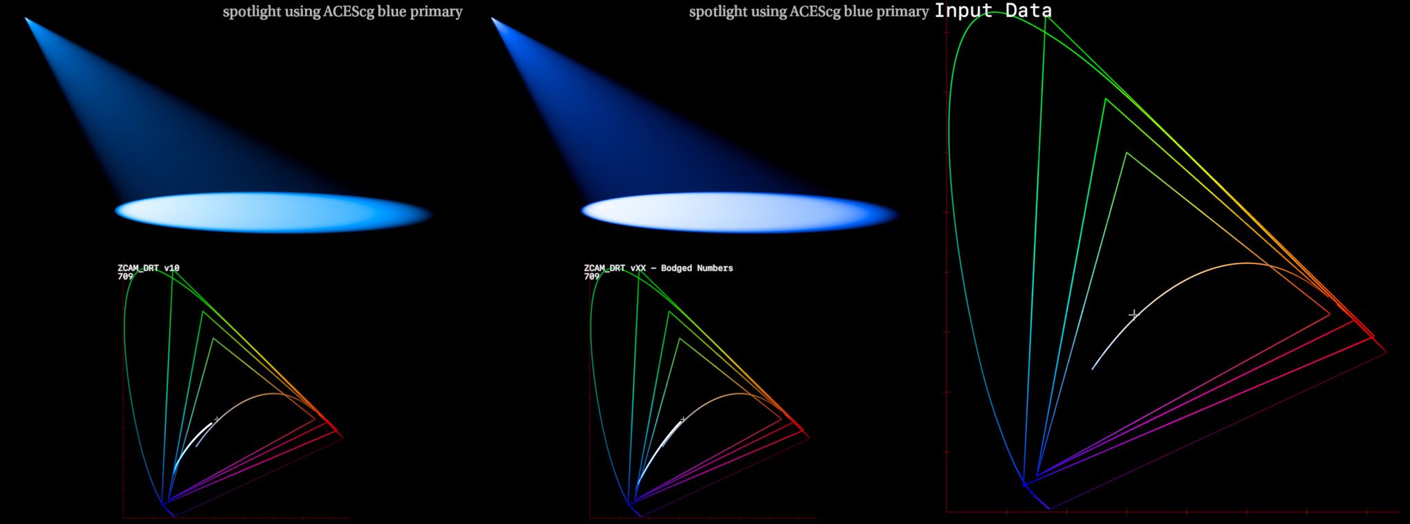
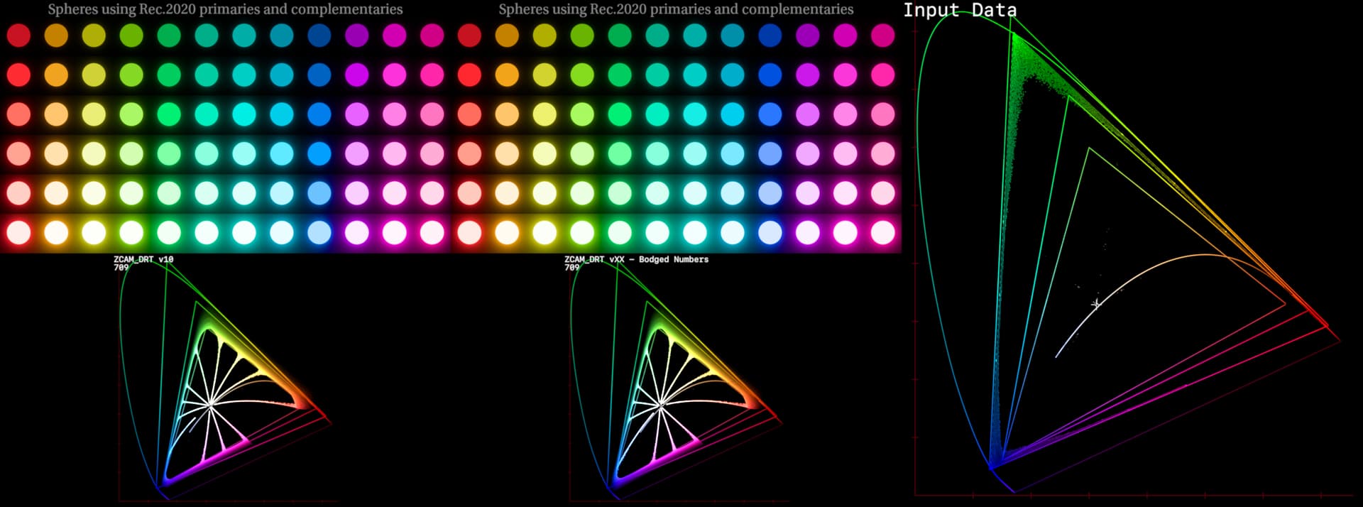
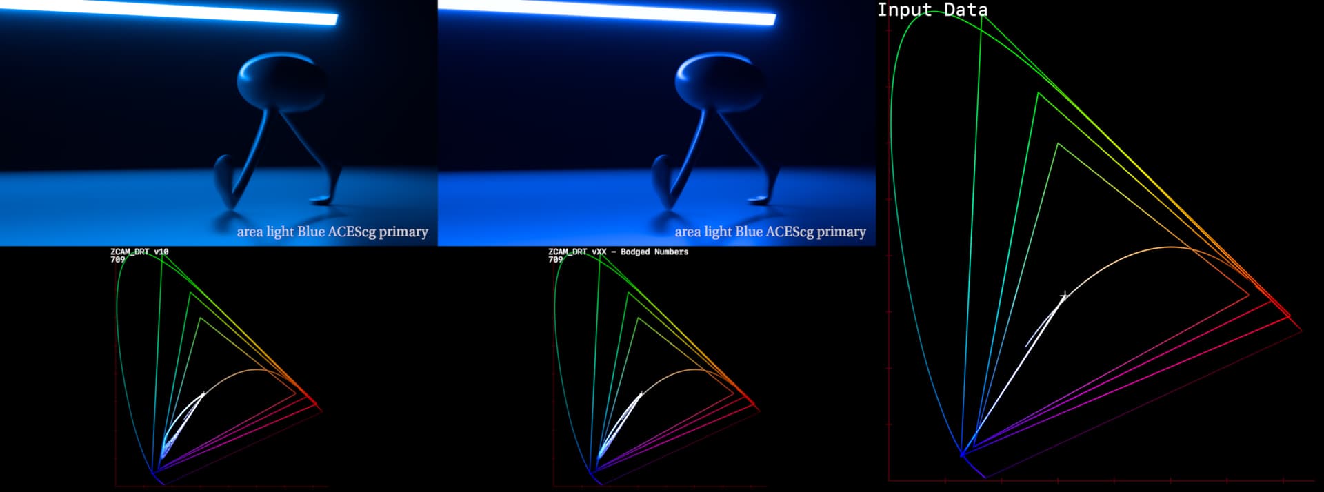
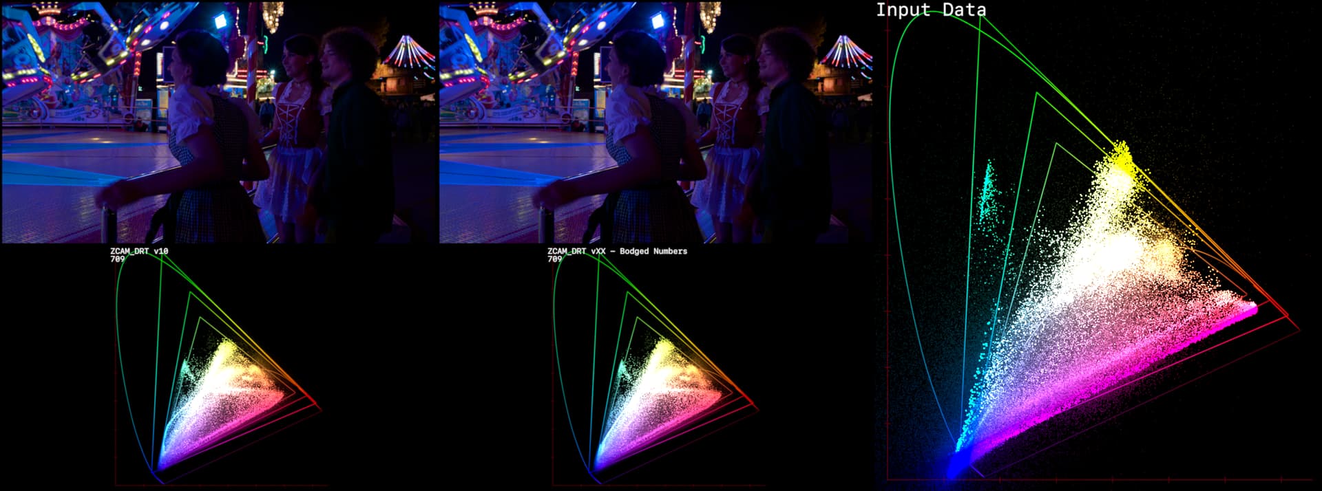
And some where it doesn’t as much:
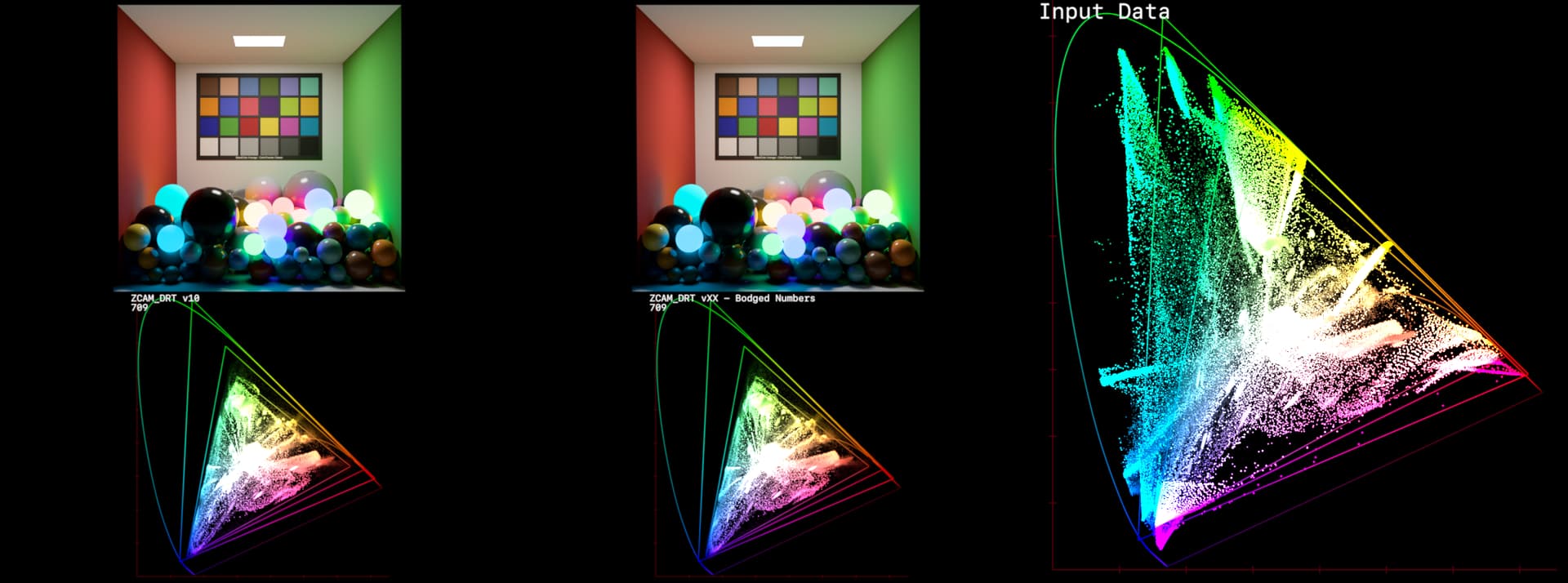
I’ll just re-iterate here, there is no science here, this is just me swizzing the numbers so I end up with a plot I like, and then seeing how images look afterward.
This is no longer ZCAM in any real sense.
4 Likes