About issues and terminology

Hello guys, here is a very long post about some questions that were raised last week.

Following the OT VWG from the 13th of January, it looks like we go down the road of “fixing the OT issues” which is great. As Carol put it nicely, let’s clean our own house first ! As you know, this is the naive point of view from a lighting artist with a growing interest for ACES and Color Management in general. :wink:

It can be tricky sometimes to name these issues and track them down properly. One advantage of checking Full CG renders is that we can remove half of the equation by being IDT independent : simply render with constant colors and no textures.

On the other hand, these images may be a bit too abstract to judge an Output Transform properly : do we know what a sRGB sphere should look like ? Or an ACEScg light saber ?

So, I have tried to provide these “pure” AP1 renders/images, with no negative values, nor any IDT involved and which may show perfectly the issues we’re trying to fix here. I generally use CC24 values on the assets and ACEScg primaries in the lights. Even without any geometry, a spotlight with a volumetric may be enough to highlight some issues I think.

Of course, these images are “limited” and I am not saying here that they are enough to improve the current Output Transforms. But they do have this one quality that makes them useful I think.

Another thing that is important to take into account is that we are not really using the Gamut Compress as intended if we use it on full CG footage for the following reasons :

  1. The algorithm distance limit is based on digital cinema cameras.
  2. Full CG renders are in AP1 and we are compressing to AP1. It’s just a side effect.
  3. A “clipped” render like my light sabers is not sampled properly (by definition) and from the tests I have been doing, any attempt to fix it in post would reveal the noise.

Hence the conclusion I have reached : we need the Output Transform to do the job, not a scene-referred step after rendering (unfortunately). The bullet point 3 is debatable as it would depend on the render engine used and the way it samples. I am taking here the example of a render engine which would sample using the ODT as a convergence criteria (or threshold).

So full CG artists may be in a position where positive values within the AP1 Gamut, such as strong saturated lights, will generate all kinds of issues. I just want to emphasize the fact that It does not only happen on live footage (from different cameras/IDT issues) and cannot be properly solved by the gamut compress algorithm (as far as I know).

So the purpose of this post is :

  • To accurately define these issues.
  • To make sure that these artifacts are real and not a brain construct : do we see the same thing ?
  • To try to identify where these issues may come from (with the little knowledge I know).

Hopefully this post will succeed in my attempt to share images showcasing and demonstrating each offending issue. :wink:

About the renders :

  • All the exr will be uploaded to dropbox next week as AP0 exr files.
  • All the images from this post are 8-bits tiff using Rec.709 (ACES) burnt-in.
  • All these images have been processed using ctl render.

As @nick has stated, we do of course have the issue that many of us are viewing the images on computer monitors that are 8-bit or less. So there may be “posterization” visible in the displayed image, when it doesn’t exist in the image data.

Friendly warning : there are no negative values in AP1 but there are in the shared AP0 exr files. I believe it is due to the 16 bits half float limitation from the “aces compliant exr” checkbox on the Nuke write node.

Hue Skews/Shifts

I was not able to find a definition of Hue Skews or Hue Shifts online. So I came with this one.n A Hue Skew is a shift of perceived color on the path to white. We can observe a shift of hue when increasing the exposure on different spheres here :

  • On the blue sphere towards purple
  • On the red sphere towards orange
  • On the green sphere towards yellow

In this render, I used sRGB primaries on the spheres, rendered in ACEScg and displayed in Rec.709 (ACES) using ctl render. Each row has a one stop increase.

By hue here, I mean both a color and a shade of a color. Here is a close-up to avoid any ambiguity :

It seems that per channel lookup is the main responsible here, as these animated gifs from @nick show :
hue_skew_bl

Please note that these two gifs are not exactly the same as the ones from the original post. The new ones are rendered in Nuke using Baselight 5.3’s shader based implementation of ACES, rather than OCIO’s LUT based one. The exact numbers are different, but the visual result is essentially the same as the old version.

So far the workaround has been to add a bit of green to compensate for the hue skew. This is far from ideal as the chromaticities from the scene are modified.
hue_skew_fix_bl

I do believe that the creative intent from the scene should be displayed in the most faithful way.

Here is an example of that this render could/should look like (using Colorfront) from my original post :

Some plots have also been doing using colour-science to study the path to white of sRGB primaries :
image

If we look at the blue primary’s path to white, we can see that it skews wildly towards purple. I believe these lines should neither be straight but somewhat less curved. From my understanding, there is no consensus on what perceptual hue paths should be.

Hue Skews not only appear with sRGB primaries but also with ACEScg primaries. In the following render, I did a sweep from blue (0,0,1) to purple (1,0,1). We can observe a really significant Hue Skew when increasing the exposure : each row has a one stop increase. Think of each sphere as an individual light source on a mid gray plane (0.18).

I find the down left corner to be very intriguing. Here is a close-up :
image

We go from blue directly to pink on the sphere itself but the illumination from the spheres on the plane stays blue. I thought it would be worth mentioning.

An alternative technique we could try is to apply the tonescale on max(RGB) rather than per channel (R, G, B).

Clipping

Gamut clipping occurs when colors that are different in the input image appear the same when displayed. Clipping in some color channels may occur when an image is rendered to a different color space and when the image contains colors that fall outside the target color space.

I have been asked what the goal of the image was. Short answer is I want to be able to light with a red saturated color with no clipping nor skew.

  • If I limit the gamut of color selection to sRGB, my light saber will skew to orange and I want it to be a true saturated red.
  • And if I use an ACEScg red primary, the render will be very clipped and I think it is an issue.

In real life, lasers are Rec.2020 primaries and I personally like to have a real world reference. I did have a look at a Star Wars (Empire Strikes Back) reference to do this scene. :wink:

I think this render using ACEScg primaries in the lights looks clipped and flat. Especially the face of Mery (left-screen character). Would you agree with this statement ? It may come from the hard clip in all the display gamuts, and/or the clamp right at the first step of the RRT. There is also a hue skew on Mery’s shirt (looks like magenta in the red).

What should this render look like ? Some tests have been done using Colorfront of this render (with a perceptual OT) and I was pretty pleased with the result. The only “issue” I have noticed is that the pixel values for the green light saber went from “170” to “7” in the green channel. I would have preferred to keep the same amount of energy here.

Since I did this render myself and know the values used in the scene, I believe the Display Rendering Transform from Colorfront to be more faithful to the scene I created than the ACES Output Transform.

I also did a test with the Gamut Mapping Algorithm to compare with the Colorfront result. I am using here the gamut compress algorithm as a side effect.

Here is a closeup to remove any ambiguity of the issue we’re seeing :

In CG, we generally want at the same time saturated values and shaping on the faces, which makes the left render unacceptable for our movies. I personally consider the two examples (Colorfront and Gamut Compress) to be a reasonable target for the next Output Transforms. Obviously more testing should and will be done.

I also did these three renders to show different issues with only one light and one chromaticity for more clarity :

  1. A red ACEScg primary in the light → Gamut Clipping
  2. A red ACEScg primary in the light + Gamut Compress → Clipping and Skews
  3. A red ACEScg primary in the light → Hue Skews (red gets orange)

We also did a plot to study the path to white of ACEScg primaries. I think the clipping can be seen when the values are stuck along the border of the gamut.
image

I believe some sort of Gamut Mapping/Compress for the Output Transforms would fix the issues.

Mach Band

Mach bands is an optical illusion named after the physicist Ernst Mach. It exaggerates the contrast between the edges of slightly differing shades of gray, as soon as they contact one another, by triggering edge-detection in the human visual system.

This one I quite tricky but I may have found an example in the following render :

Here is a close-up of the last row :

I do see some weird bands around the red and pink spheres which may be related to edge detection and Mach bands. Here is the same exr render displayed with Colorfront (you may notice the blue sphere’s hue skew is also gone with Colorfront) :

If we focus on the bottom row, I find it to be less disturbing visually :

I hope this summary (sorry for the long post) will remove any ambiguity on the issues I was trying to point out. Apologies for not having used the right terms in the first place. This post is just an attempt to clarify these concepts and start a conversation. I am more than happy to discuss all of this with you and I am looking forward to meeting#4.

I will add three descriptions below (polarization, solarization and banding) just for the sake of it, even if I was not able to observe them on my CG renders using ctlrender.

Posterization

Posterization implies a lack of precision in the signal via quantisation. Here is the Wikipedia definition :

Posterization or posterisation of an image entails the conversion of a continuous gradation of tone to several regions of fewer tones, with abrupt changes from one tone to another. This was originally done with photographic processes to create posters. It can now be done photographically or with digital image processing and may be deliberate or an unintended artifact of color quantization.

This phenomenon is sometimes referred to as “banding” because it creates bands of the same color in graduations. Posterization has multiple flat areas due to quantisation, resulting in visual “bands”. Posterization is a loss of smoothness in gradients, akin to quantisation of the signal, you basically reduce the signal quality.

As @KevinJW explained :

Banding and Posterization can look the same, but the cause is what distinguishes them in my book. e.g. clipping can produce areas of flat colour due to a limit of range being ‘hit’, posterization can also have areas of flat colour, caused by a reduction in variation of adjacent pixels, typically due to discrete values clumping together for precision reasons, […] emulsion break down can result in the density curve bending the other way, which can I suppose look similar in some circumstances.

A great analysis of posterization has been done by @Thomas_Mansencal in this post.

Solarization

While solarization may, like posterization, manifest as areas of flat colour, it is not the same issue. Historically solarization referred to an effect caused by extreme overexposure of photographic film. In digital imaging it is used to refer to parts of the image becoming flat due to clipping.

While the analog photographic origin of the term solarization may be a more complex effect, in digital images I would use it to refer to an area of the image going “flat” due to clipping.

Banding

Colour banding is a problem of inaccurate colour presentation in computer graphics. In 24-bit colour modes, 8 bits per channel is usually considered sufficient to render images in Rec. 709 or sRGB.

However, in some cases there is a risk of producing abrupt changes between shades of the same colour. For instance, displaying natural gradients (like sunsets, dawns or clear blue skies) can show minor banding.

This issue is called “color banding” and it happens when values within a gradient get pushed so much that there is no color/value in the file to actually represent the mathematical change you’ve applied with a tool. Banding is the visual result of posterization of a gradient.

As @KevinJW explained :

I think people use the term banding because they see bands (stripes) in graduated areas (like the sky) as the discontinuity in intensity becomes visible but that is a special arrangement of pixels, you can still posterise without seeing explicit bands.

--------------------------------------------------------------------
I sometimes wonder if the complexity of the Output Transforms could be improved here and hopefully this post allows us to do some nice experiments.

I would also like to thank @nick for reviewing this post.

Thanks,

Chris

6 Likes

Lots of great stuff there. Thanks @ChrisBrejon.

I will have to look back at how I generated those animated GIFs, as I think they were done in Nuke using OCIO. So the hue skew may not be truly representative. I’ll see if I can regenerate them with a more accurate OT. [DONE]

Regarding the Colorfront rendering, to my eyes although it creates a more pleasing result on the faces, it completely ruins the light sabers. In attempting to preserve saturation, it has created something that no longer looks like lights to me. They are just pale red and green sticks with haze around them! I personally think that the gamut compressor creates quite a nice result, although as you say it is an accidental side effect.

2 Likes

Thanks Nick. Yeah I agree on the Colorfront examples. I was quite pleased with the faces indeed. I remember that @llamafilm (who kindly did the tests on these images) told me that he used the default settings for the LMT generation. It would be interesting to see if tweaking some of these parameters would allow for better light sabers.

image

This also makes me wonder if these light sabers tests are actually valid. It would be worth debating if :

  • Using ACEScg primaries for lighting is a reasonable choice.
  • And if ACEScg primaries should go to white when overexposed.

I don’t have the answers to these questions unfortunately. I have always thought as ACES as an ecosystem and that having access to these ACEScg values for lighting/rendering should create a pleasing render, no matter what the exposure.

After Meeting#4, I thought it would be interesting to test ACES 0.1.1 out of curiosity (since the first Lego Movie was done with this version) and I have to say I was indeed quite pleased with some of the results.

I have done these sweeps of my light sabers (from blue to purple in ACEScg) :


From red to yellow in ACESg :


From green to cyan in ACESg :


I am not sure if this helpful and I am certainly not saying we should go back to 0.1.1… It probably got discarded for valid reasons, such as complexity and lack of invertibility. Which got me thinking about design requirements and how complex it is to come with a proper list (other than it should look good).

Following a quick conversation on rocket chat, I thought I’d start a list here, just to gather some thoughts (all credit is due to @Thomas_Mansencal and @sdyer ) :

  • invertibility (since it has come up again and again as a problem with v1.x)
  • easy to work with, i.e. no strong look
  • easy to extend, i.e. good framework (targeting new displays should be easy for examples)
  • simple, fast, performant and invertible by a closed form

I have always thought the main goal for the Output Transform would be to do a kick-ass transform to be honest, with some perceptual gamut mapping (if that means anything). As you are all aware, gamut clipping and hue skews are my main concerns. But I agree this is probably a very limited and narrow point-of-view from a lighting artist.

In the end, I always come back to these Colorfront questions that really intrigued me (some of them are not necessarily related to output transforms but rather color pipelines in general) :

  • Does it support the common master workflow ?
  • Does it handle both SDR to HDR, and HDR to SDR ?
  • Does it support camera original and graded sources ?
  • Is it based on LUTs created with creative grading tools ?
  • Do they break with images pushing the color boundaries ?
  • Does it support various input and output nit levels ?
  • Does it support different output color spaces with gamut constraints ?
  • Does it support various ambient surround conditions ?
  • Will SDR look the same as HDR? Is the look of the image maintained ?

Regards,
Chris

3 Likes

Just replying to myself to share further tests. :wink:

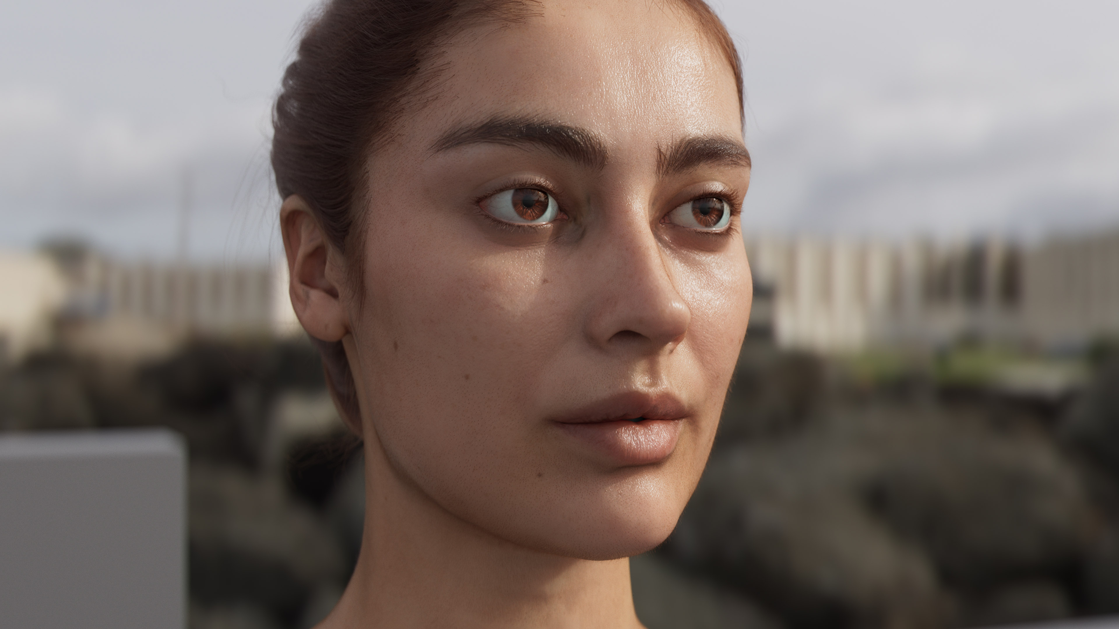
I have tried to come up with the most photo-realistic model I could do in full CG. After a few tests, I finally chose to go with the Eisko Louise model.

I have tried to tweak the least possible the “raw” data to be as “accurate” as possible, even if I totally acknowledge this model and my lookdev work should not be taken as some ground truth.

Here is an ACEScg render, displayed in Rec. 709 (ACES) using ctl. Only one Envlight with the treasure island HDRI was used.

And below is what I do for a living : lighting CG assets. :wink: This is an ACEScg render, displayed in Rec. 709 (ACES) using ctl. I have used 4 area lights with ACEScg primaries (red and blue) to recreate a concert atmosphere. This render has not been comped whatsoever, this is straight from Guerilla Render after 17 hours of rendering.

I have tried several DRT on this render and the one I was most pleased with was the RED IPP2 from the GM VWG OCIO Config.

Hopefully these tests will be able to show properly the two issues I am after : gamut clipping and hue skews.

All best,
Chris

Hello again,

since this thread is about terminology, I thought it would be interesting to describe some terms that were used in a series of posts by @Thomas_Mansencal. I hope it will help this group, in order to achieve a new Output Transform.

Please note that I am only here pointing at some documents made by much smarter people than me. :wink: And I am happy to add any source that you may find useful or correct any approximation on my end.

First of all, a book : Colour Appearance Models by M. Fairchild as pointed out by Thomas on Rocket chat. Some proper definitions can also be found in the excellent from Cinematic Color 2. It is also interesting to see that there are approximately four types of color appearance phenomena :

  • Contrast appearance
  • Colorfulness appearance
  • Hue Appearance
  • Brightness appearance

Surround/Viewing Conditions

From Cinematic Color 2 :

The elements of the viewing field modify the color appearance of a test stimulus.

Contrast appearance

Stevens Effect

From Cinematic Color 2 :

The Stevens Effect describes the perceived brightness (or lightness) contrast increase of color stimuli induced by luminance increase.

Simultaneous contrast :

From Cinematic Color 2 :

Simultaneous contrast induces a shift in the color appearance of stimuli when their background color changes.

Colorfulness appearance

Hunt Effect

From Cinematic Color 2 and Wikipedia :

The Hunt Effect describes the perceived colorfulness increase of color stimuli induced by luminance increase. Conversely the colorfulness of colors decreases as the adapting light intensity is reduced. Hunt (1952) also found that at high illumination levels, increasing the test color intensity caused most colors to become bluer.

image

Hue appearance

Abney Effect

From Wikipedia :

The Abney effect describes the perceived hue shift that occurs when white light is added to a monochromatic light source.[1] The addition of white light will cause a desaturation of the monochromatic source, as perceived by the human eye. However, a less intuitive effect of the white light addition that is perceived by the human eye is the change in the apparent hue. This hue shift is physiological rather than physical in nature.

image

Bezold-Brücke Effect

From Wikipedia :

The Bezold–Brücke shift is a change in hue perception as light intensity changes. As intensity increases, spectral colors shift more towards blue (if below 500 nm) or yellow (if above 500 nm). At lower intensities, the red/green axis dominates. This means that the Reds become Yellower with increasing brightness. Light may change in the perceived hue as its brightness changes, despite the fact that it retains a constant spectral composition. It was discovered by Wilhelm von Bezold and M.E. Brücke.

image

Brightness appearance

Helmholtz-Kohlrausch effect

From Wikipedia :

The Helmholtz–Kohlrausch effect (after Hermann von Helmholtz and V. A. Kohlrausch[1]) is a perceptual phenomenon wherein the intense saturation of spectral hue is perceived as part of the color’s luminance. This brightness increase by saturation, which grows stronger as saturation increases, might better be called chromatic luminance, since “white” or achromatic luminance is the standard of comparison. It appears in both self-luminous and surface colors, although it is most pronounced in spectral lights.

Lateral-Brightness Adaptation

From Cinematic Color 2 :

Bartleson and Breneman (1967) have shown that perceived contrast of images changes depending on their surround: Images seen with a dark surround appear to have less contrast than if viewed with a dim, average or bright surround.

image

I haven’t listed all the phenomenons but you will find a more complete list in Cinematic Color 2 Advanced Colorimetry. And if you think it would be useful to list all of them, let me know. I’d be happy to do so.

Hope it helps a bit,
Chris

3 Likes

Observer Metamerism

That really deserves a dedicated section in Cinematic Color 2

Context

Displays with different primaries are known to introduce perceived colour mismatch between colour stimuli that are computationally metameric for the CIE 1931 Standard Observer. They produce variations of the perceived colour difference of metameric colour stimuli among observers.

How bad is it?

TLDR: Pretty bad, if your flames are turning from red to yellow or pink and, you are confident that you have a calibrated display chain, have an awesome DRT that handles all the fanciest appearance effects, it could be the cause!

Asano (2015) and Asano and Fairchild (2016) have produced a thorough Observer Function Database.

The 151 Colour Normal Observers provide a good insight into the variability of the HVS:

Worth noting that the 3 Standard Observers are relatively well-bounded by the database, implying that a change for one to another is a lot of trouble for potentially not great benefit, closing the parentheses.

With those CMFS, one can plot chromaticity diagrams:


Simulating Observer Metameric Failure

We can also do some simulations, for example, spectrally simulate the metameric failure of the 151 Colour Normal Observers watching the same ITU-R BT.2020 display.

Given a virtually calibrated laser display with ITU-R BT.2020 primaries and a whitepoint with the chromaticity coordinates of D65, we can produce a metamer to the sRGB primaries, i.e. by spectrally adjusting the R, G, B mixture, we can produce 3 spectral primaries producing the colorimetry of sRGB under the CIE 1931 2 Degree Standard Observer, i.e. the transparent grey dots here showing that the system works:

Now let’s plot the 3 spectral primaries for our 151 Colour Normal Observers:

Keeping in mind that the colours are only for illustration purposes because sRGB cannot encode them, put another way, it would be much worse on a WCG display!

Google Colab notebook is available as usual!

I also did some quick tests isolating the two extremes for red and gamut mapped them to sRGB using a mix of clipping and the VWG gamut compression, the pink one is not trivial to map properly but anyway:

An extension would be to test the same observer with sRGB-like phosphors against the ITU-R BT.2020 lasers.

Cheers,

Thomas

5 Likes

Thanks Thomas !

I think it has been brought on Slack that a proper definition of the Notorious 6 would be interesting for this group. So I have tried to come up with a definition and some examples.

The “Notorious6”

Let’s see if we can start with the definition given by Troy and elaborate from there :

The “six” are the inherent skew poles all digital RGB encoding systems skew to; pure red, green, blue, and their complementaries of red + blue magenta, green + blue cyan, and red + green yellow. As seen with camera clipping at the high end to the compliments, and to the primaries on the low end. So as emission increases, all mixtures skew to the gamut volume of the device, but towards compliments of whatever the working / device range primaries are. As emissions decrease and exceed the floor, they skew toward pure primaries.

The best example I have seen so far (not only on this forum but also in the whole wide world) is this video by Jed Smith.

Some may call it mind-blowing, some others may not… But I personally think it is simply the best way to show the Notorious 6. :wink:

You start with a whole range of colors/mixtures :

image

And you end up on the path to white with only 6 of them (aka The Notorious 6) :

image

You can clearly see 6 spikes on the path to white in the image above : red, green, blue, cyan, magenta, yellow. If I understood correctly, any curve that asymptotes at 1 will have this unfortunate behavior.

The following plot is also quite useful to visualize them (ACEScg sweep of values on their path to white through the P3D65 Output Transform) :

On the path to white/achromatic axis, we can clearly see a trend towards 6 mixtures : three primaries and three complementaries. This is why by only doing these sweeps we can really appreciate the issue.

A render that shows clearly one of the notorious 6 (magenta) is the following one :

image

We start with a sweep from an ACEScg blue primary to a magenta complementary. And on the path to white, we end up with one mixture : magenta ! (Well, actually two, but you get my point.)

What this render should look like in my opinion ? Possibly this :

On their path to white, hues are respected/preserved rather than going towards a single colour/mixture. This is actually a big deal because per-channel actually prevents us from reaching certain chromaticities at certain levels of exposure and forces us into one of the notorious 6.

Which is put much more nicely by Troy this way :

As in as we move toward the vast majority of unique mixtures, per channel makes it virtually more and more impossible to hit them.

I also think it would be important to add (from Troy again) :

Anyways, primaries and compliments are the worst demo. Because the skews are for all other mixtures. As in the least distortion happens along those axes. The most heavy distortions come from all other mixtures.

Just for fun, I have plot the same sweeps with sRGB primaries under different DRTs :

Nuke_default : sRGB eotf

spi-anim OCIO config : Film (sRGB)

ACES 1.1 OCIO config : Rec.709 (ACES)

TCAM v2 OCIO config : Rec.1886: 2.4 Gamma - Rec.709

I hope these several examples and definition clarify a bit what are the Notorious 6. And if we want to dive a bit deeper in the topic, two of them already have nicknames :

  • Cyan hell ® (typical of overexposed skies for instance)
  • Rat piss yellow ® (typical of lamp shades shot at night)

In summary, the notorious 6 are the values hit at display on their path to white by any system using per-channel (or any curve that asymptotes at 100% display) and are a direct consequence of the hue shifts.

I am barely an image maker trying to point out stuff/issues that could/should be improved. Sharing and learning is at the core of this community. So if anyone could reply to this thread explaining what is a Jones diagram, how do you read it and why it is important to this OT VWG, that’d de much appreciated. @Alexander_Forsythe maybe, since you were the one who brought up this on Slack. :wink:

Regards,
Chris

2 Likes

Hello,

I was interested to group in one place information about colour appearance phenomena. This is barely a collection of information shared in different threads, that I will try to update whenever possible.

About appearance modeling :

About the “Hunt Effect” :

  • Interesting answer posted here by Thomas :

Something to keep in mind though is that while a global colourfulness tweak tend to work fine, because the Hunt Effect is driven by the display Luminance increase, itself modulated by the tonescale, the tweak should be weighted somehow, e.g. shadows and midtones require different strength than highlights.

About Lightness and HKE :

[…] to me the “right” way to tonemap involves moving away from the per-channel compression schemes that our industry is fond of, and instead towards better hue preservation (and separation of grading from compression) via mappings more akin to what Timothy Lottes described in his presentation Advanced Techniques and Optimization of VDR Color Pipelines, and Alex Fry in his presentation HDR color grading and display in Frostbite.

About Luminance and Lightness :

  • Some interesting informartion is mentioned here. This is a Siggraph talk from 2018 by James Ferwerda and David Long.

Human beings perceive lower contrast (Stevens Effect) and lower colorfulness (Hunt Effect) when stimuli luminance is reduced. The display environment is almost always less bright than the original scene in motion picture applications.

Hope it helps a bit,
Chris

Thanks @ChrisBrejon !

Thought it interesting that this was actually a different Alex Fry than @alexfry ! Here’s a link to the video for that talk which is also worth a watch:

That’s amazing! Thought it was the same person as I only read the slides before. The genius is in the name I guess :wink:

1 Like

Gary Demos says in this talk that Abney means we get curved lines on the path to white. Yet a hue-linear model gives us straight lines. Could someone explain this? Does this mean that the straight lines are addressing the Abney effect, giving us a perceptual path-to-white for a monochromatic color so we want straight lines? What about other color appearance phenomena? That is, would we expect non-linear in order to address color appearance phenomena? Just trying to process Gary’s talk, and I’m afraid I’m in way over my head! Thanks!

1 Like

I raised this point in yesterdays call, but I’ll repeat here for posterity. We’re being a bit too loose with our terminology for some of these transform descriptions.

With regard to the path-to-white methods, the group has been calling “hue-linear” or “chromaticity preserving” to mean straight lines in chromaticity/ratio space, which is definitely the wrong term to use. I was proposing to use the terms “dominant wavelength preserving” or “white-light-mixing”, since the method more correctly adheres to those behaviors.

The main point of confusion for me was that we’re simultaneously discussing a tonemap/tonescale operator which is truly chromaticity preserving in the correct technical sense. So we should be distinct in the differences between the two.

@Derek to address your points a bit…

I’d be a bit careful to focus on “straight lines” themselves, but instead it should be qualified that we’re discussing “straight lines in the chromaticity domain”.

The isoline (invariant line) of stimuli which produce a constant sensation of hue, but vary in chroma tend to be curved in the chromaticity domain. Remind ourselves that straight lines in the chromaticity domain can be produced by the combination of any two (non-equal) light sources, e.g. colored and white in Abney’s case. It was his experiments which showed that this situation (a straight line to adopted white in chromaticity domain) does not produce a hue isoline.

The term “hue-linear” describes the desire for color models to predict/model these curved hue isolines. So the base data is the curved hue isolines from various experiments, and the desire is for a color model (like Lab* or ICtCp) to transform these curved lines to straight lines in their domain. So in the chromaticity domain, hue isolines will be curved, in the ideal/perfect color model hue isolines will be straight. Which would basically just mean that we’ve isolated the perceptual “hue” attribute of the experimental dataset, and it is decoupled/orthogonal to the other lightness and chroma dimensions.

So in judging the quality/performance of a color model we discuss the “linearity” of its hues, or its ability to make hue-isolines straight as a sign of its predictive/descriptive capability.

For example, this is a plot from the Dolby ICtCp White Paper…

All that to say, in the chromaticity domain hue isolines are generally curved. In the idealized color model domain hue isolines should be straight, curves are sign that the model is less predictive of that dataset.

4 Likes

A thousand times this. This is the fundamental basis of all transforms using 3x3 linear matrices, and is essentially complimentary light mixing, yielding chromaticity linear straight lines with respect to the CIE chromaticity model.

This approach in my mind is absolutely critical for a number of reasons:

  1. Historical and forward looking reasons; all DCC tooling is based around grabbing an RGB ratio for keying, despilling, “hue” control, etc. and changing this would throw a bone into the mix.
  2. It’s how all render engines will process the light data. If adjustments are required post-image formation, that becomes potentially more acceptable. The light data isn’t an image until the image is formulated after all.
  3. It is an aesthetic flourish, subject to the creative choices. The creative choices should be via the creative application of grading the image formed, not in the fundamental mechanic. We wouldn’t expect our sRGB displays to magically do secret sauce perceptual mumbo jumbo, so the basic image formation pass should not either likely.
  4. Chromaticity linear additive light approaches are the sole way to avoid gamut volume voids in the destination, that effectively significantly destroy the output gamut volume.

I would perhaps caution against mixing wavelengths with chromaticities, as the former are absolute and the latter are subject to stimulus models. Might be wiser to be a term relative to the underlying three light RGB and ultimately XYZ model?

Its in line with the definition of Dominant Wavelength (17-23-062 | CIE), but I confess it is a bit of a mouthful and isn’t as intuitive for colors along the line of purples.

It could also potentially be described as a “purity” transform (17-23-066 | CIE), e.g. “at higher luminances we reduce the (colorimetric excitation) purity”…

But this really is bikeshedding…

With regard to the vanilla default rendering transform, I’m of two minds about this. Yes it is good to keep the creative choices “choices”, but what aspect of fixing a blue light from turning magenta for example is “creative”? Hue linearity is an admirable goal, but the more critical aspect is generally “hue category constancy” to me. That is to say, objects should generally retain their hue category (red stays red-ish, blue stays blue-ish) but small deviations are generally acceptable, and even welcomed in some scenarios (pull in the red->orange fire debate here*). To completely cast aside a humans perception of hue or hue category constancy is kicking the can of perceptual corrections down the road to artists.

I would be curious to see a middle road. One in which we don’t create the umpteenth color appearance model, nor force the hand of artists to try and make their own.

If this is produced by a LMT + RRT combo, that’s fine too, I’m only talking about the “fall off the truck” version.

1 Like

I think that the group is referring to the underlying model on top of which you build the path-to-white. I’m hoping that it is well understood that desaturation will affect chromaticities as it is its job in the first place. It is certainly what I’m alluding to when I talk about chromaticity-preserving in this context. The lines can be straight in chromaticity space because some of the models are effectively chromaticity preserving at their core, separating chrominance from luminance.

White-light-mixing does not really tell much about the path taken by the chromaticities when colours are made achromatic, I much prefer dominant-wavelength-preserving here.

To be complete and pedantic, we should probably say something along the lines of a chromaticty-preserving based model with a dominant-wavelength-preserving chrominance-reduction-transform or something along those lines :).

We agree that this has nothing to do with perceptual issues, and everything to do with channel clipping?

Agree. Hence why chromaticity linear results in the most “patterned and predictable” behavior for the fundamental mechanic component?

See also “creative flourish”; something exterior / post of the fundamental?

I am not suggesting having a proper perceptual correction negotiation as a punt, but rather discussing the formalities of position of the flourish.

Specifically, if we think in terms of film emulsion-like terms, we calculate how much we need to correct the dechroma, based on the open domain light data. Once we have the corrections for the tonality, we can easily, as already demonstrated by Jed, evaluate the two linear light domains (open domain, pre image formation, and closed smaller domain, post image formation) and provide any hue constancy via whatever model desired.

That Abney-corrective aesthetic flourish could be selectively applied, as required; it is a perceptual negotiation between two radically different light transport domains, in accordance with simulated perceptual models.

This also would nicely firewall the need to say, despill / key pull / “hue grade” etc.

I believe firewalling as above allows for flexibility to swap out as newer models or developments happen.

Except it is in a stimulus chromaticity space. Imagine something further built atop of some idea of “wavelength” and then this moves into 2021 and everyone uses 2006 instead of the less than optimal 1931. Now the wavelengths have potentially changed.

1 Like

Can you clarify what you mean by this? Are you saying the Abney effect is a matter of aesthetics, rather than a matter of human perception of color?

Also isn’t the Abney effect currently addressed in Jed’s OT via the OKlab color model so that the path-to-white maintains “hue category constancy” as opposed to (for example) blue in CIELAB where blue appears to go into magenta in its path-to-white?

Nice interactive visualization of this here:

I’m saying that not every creative decision will want this potential flourish, and as such, it should not be considered a default flourish. Further still, if folks are using image referred tooling, all of the things like keying, despilling, “hue” grading selection / manipulation, albedo calculation evaluations etc. will all become vastly more challenging with this as a default, and as such, the flourish should be considered a post-image formed state flourish, where access to the underlying non-perceptually warped variant may be desirable.

Would help it if folks were to analyze why this “white” thing exists in the first place, and what the fundamental mechanic is behind it “working”. I still haven’t seen anyone appear to vocalize what it does, and as such, it would seem that there’s no mechanic driving the code to dechroma the light mixtures.

Thanks Sean, that helps tremendously.