ACES 2.0 CAM DRT Development

I repeat myself saying that the choice doesn’t have to be between not doing lightness mapping at all (preserve original lightness == horizontal projection) and the current projection. There’s a whole world between those two. Doing horizontal projection below the cusp I think is perfectly reasonable. Less so above the cusp as it can desaturate colors too much and make them appear clipping when there’s no reason to do so. I think @bottosson says it well in:

One challenge with preserving lightness though is that all colors … get projected to a single point, and that highly saturated colors can become almost completely desaturated if light or dark enough, even though sacrificing just a small amount of lightness would have resulted in a much closer match.

Björn’s page is a good read obviously. I’ve implemented most of those mappers previously and the one I like the best is Adaptive L hue dependent one. I have a blink version of that somewhere but the behavior with dark colors doesn’t make it suitable for this DRT, was my conclusion.

Here’s few images comparing v035, v035 horizontal projection and ARRI Reveal (for state of the art third party comparison), in that order. I’m showing here what I would consider over desaturation that happens with horizontal projection above the cusp:


Here’s just an example with RED christmas of v035 and v035 with an LMT that changes contrast. One thing to keep in mind is that the rendering out of the box is less contrasty than ACES1, so if we assume people are going to increase contrast it’s good to check how it looks (I’ve been doing this throughout the DRT development). This is still less contrasty than ACES1 but much closer. Make what you will of it.


But, the problem at hand was that the the ARRI bar cyan-green appearance match was less than perfect between Rec.709 and P3. My feeling is we should primarily address that issue rather than revamp the whole rendering. The Rec.709 rendering, with its darker mapping, is a result of developing the SDR/HDR appearance match, and I can take the blame for it. Obviously we could do it the other way around and match HDR to SDR instead. Horizontal projection would create more of a mismatch for SDR/HDR.

So, I think we should first do what we did in the meeting, which is to bring the projection on the same trajectory in different gamuts. That should make it a little bit better. If that’s still not good enough appearance match for Rec.709 and P3 (SDR), then we could think about matching the lightness also between the gamuts. And that then opens that whole world of possibilities between the horizontal projection and the current one. I assume the biggest discrepancy in the match between Rec.709 and P3 comes from the brightness of the color, so it would then make sense to test how they look when the lightness mapping is identical for all the gamuts.

But, personally, I consider the less than perfect appearance match between different gamuts less of an issue compared to following:

Correct. The mapping is not smooth. I’ve tried to bring this up a few times. It seems doing the compression along the constant hue lines results into discontinuities in the final mapping. This is what we should address - somehow.

Here’s those three example DRTs again in same order.


Anyway, these are my thoughts on this particular issue…

5 Likes

Cool. Thanks Pekka for the insight !

I can share with you two examples (red xmas and blue bar) which I thought to be good attempts at smoothness.


I agree this should be looked into.

Regards,
Chris

Hi @ChrisBrejon, thanks for keeping the conversation going. I just want to çlarify the intent of the two pictures you posted… are you proposing these as examples of an acceptable rendering?

Yes, exactly. If you look at blue bar, I find the example very compelling, probably a better starting point for an Output Transform.

In the CAM DRT prototype, those areas look concerning or “wrong” :
image
image

Troy might call these two screenshots “cognitive dissonant”. Now the challenge is to define precisely what and why it looks “wrong”.

Chris

Those images look very much lifted and not in the right RGB colourspace. What DRT did you use to produce them?

Hello,

to avoid any confusion, I re-generated the image, encoded for BT.1886 display. And a version also with an LMT so it does not look lifted.


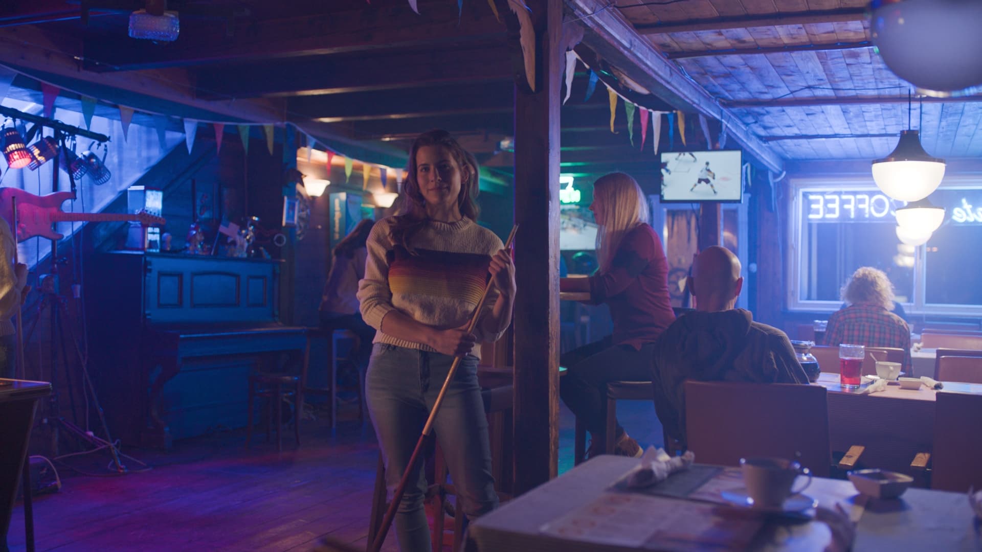
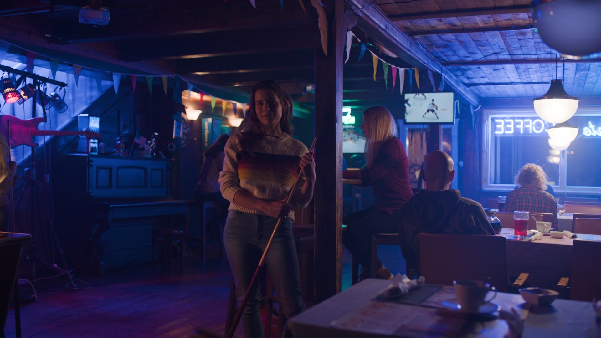
But what I was hoping to discuss are those “kinks” I can see here and there :

image
image
image

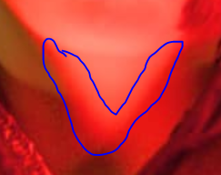
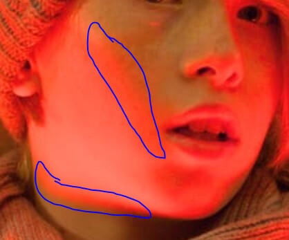
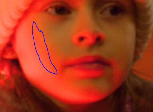
I am wondering if they are similar to what Alex Forsythe pointed out a month ago as Mach bands in the diver image. For the past week or so, I haven´t stopped thinking about Christopher´s sentence :

We don’t absolutely need to know how the human visual system works. We only really need to know how to make pictures work!

And I think he is right on. Since none of us were present in the blue bar or red xmas shoot, maybe we could focus more on the picture´s quality and less on the scene and “what our eyes saw” ? And to me one of the most important aspects of a picture is the smooth tonality. So what are those kinks from ? Are they similar to the ones present in those ramps ?

And what is happening in those screenshots of blue bar I shared in my last message ? Is there some kind of threshold (g0 ? brilliance ?) that makes these areas look “wrong” ?

My tuppence,
Chris

Might be helpful to look at how these things appear in RED IPP2 and ARRI Reveal as a point of comparison.

1 Like

ARRI Reveal would be interesting to look at because beyond the Output/Display transform there’s also some transformation done as part of ACE4 (Arri Color Engine 4) to handle clipping of certain colors, like blues. I wonder if it’s similar to the reference gamut compression?

image


Source: https://www.fdtimes.com/pdfs/free/115FDTimes-June2022-2.04-150.pdf

1 Like

Posting some comparisons of CAM DRT v35 and ARRI Reveal.

RED

In this first one I’m noticing that the reds in the CAM DRT seem more “lit” and “punchy” (I think this has always been the case with ACES and reds). The red on the Sunkist raisin box in ARRI Reveal looks more true to life to me.

Same could be said for the orange jump suits on these astronauts.

which brings us to how this impacts skin.

Red in these swatches appears more magenta in the CAM DRT than in the ARRI Reveal, and goes quicker to white (AKA pink) while the ARRI Reveal holds the red longer.

Finally for red we of course need to see Red Christmas

BLUE

Now some observations about blue.

Looking again at the blues in the color chart in this still life, and comparing this to the blues in the color chart in my hand, I’d say the CAM DRT looks closer to what I see.

However the blue in these swatches in CAM DRT seems to be going a bit magenta.

also here in the blue screen

note blue here, including on the woman’s face. Going magenta in CAM DRT.

The ARRI Reveal appears to lift the blue a bit, compared to CAM DRT. For example on the blue glass on the table in this image

or on the blue bottle here

and of course Blue Bar

Hope that’s useful.

1 Like

Let me add one more comparison. Compare the red and blue spheres, which illustrates many of the things I noted above.

In addition you can see here in the dragon that the ARRI Reveal appears to be desaturating darker colors. At least that’s what I believe is happening. I feel I see that on this fruit still life, which gives it that “filmic” look. I suppose one could argue this might be more appropriate in an LMT.

1 Like

Following on from what @priikone said last meeting, it is fairly simple to make it so the compression slope gets steeper instead of shallower as the cusp gets more saturated. This Desmos simply changes the expression for the slope control variable to:

\;\;\;\;g=\frac{50J_{max}G_{dist}}{M_{cusp}}

instead of:

\;\;\;\;g=G_{dist}M_{cusp}

Since g is effectively a constant in the equations, the quadratic solve still works exactly as it did before (I was initially worried I would have to redo that maths, and it might break!)

The factor of 50 and J_{max} (Hellwig J value for display peak) are to get the resulting values back up into the same kind of range as they were previously, and also scale with the larger cusp M values in HDR.

This did make me think about what happens currently in HDR. Because M_{cusp} is larger for HDR, g currently ends up larger. So the slope may be steeper in HDR. Of course the whole cusp is larger in HDR, so I’m not sure what the net effect actually is. It certainly merits consideration.

1 Like

I think it’s interesting to see that ARRI Reveal shows quite more (perceived) noise in the frame labeled 050 and CAM DRT v035 is much cleaner in the bottom end. Too clean perhaps? The odd thing about CAM DRT v035’s rendering is that the table and other black objects look much more magenta-ish where on Reveal it’s quite neutral.

image

2 Likes

On closer look it seems to me that ARRI Reveal is rendering darks a bit darker making the color difference less noticeable resulting in less of a cast. Here I took a look at it with two other renderings. I used v034 because I didn’t install v035 yet but I don’t think the rendering changed there in that regard? In any case I do like how CAM DRT is rendering the bottom end.

(images were scaled up for comparison, not 1:1 pixel)


Derek, have you also compared ARRI Reveal with CAM DRT v35 in HDR? If so, are the comparisons similar in their differences between SDR and HDR, or what are the differences?

Also, does ARRI Reveal only work with ARRI Wide or can it be applied to DaVinci Wide from Braw? And where did you get ARRI Reveal to apply to the sample frames? The ALEXA 35 Supporting Tools & Software page indicates that Reveal is supported in DaVinci.

Shebbe, I am glad you are looking at comparing various ‘renderings.’ Same questions.

Thanks

What I did for comparing was using ARRI’s AWG4/LogC4 to Rec.709 conversion LUT with a pre-conversion for the ACES exrs to LogC4. I’d imagine you could do the same for .braw files in that regard.

I quickly implemented this and have been looking at some images. I would say it works well, and in some respects perhaps better than the previous one. It visibly lightens gamut mapped blues and magentas, but I don’t consider it any real improvement when it comes to issues with blue, just a lighter mapping.

It does desaturate mapped yellows faster than before, and perhaps a tad too fast (in comparison to older versions, or in comparison to ARRI Reveal), which I think happens because darker yellows get projected with shallower (or more upward) angle now.

But the interesting question will be whether this makes the SDR appearance match closer with different gamuts when it comes to images like the ARRI bar image.

There is of course infinite possible variation within this approach. The simple inversion I have done means that as well as steepness changing between gamuts, depending on the M value of their cusps, the change of steepness within an individual gamut happens in the opposite direction. So the slope is steeper for hues with larger cusp M values, whereas previously it was shallower for them.

This would explain the yellow behaviour you describe, and if it is not desirable we could try something different.

For example, we could still multiply by the cusp M value, as we did before, but divide by an M value which is a single global value for the gamut. Perhaps something like the M value of the green primary, for example. You would then need an appropriate multiplier to get things back to the previous order of magnitude, and may or may not need to include J_{max}.

Indeed, and this is all good work, Nick. I think it’s good to get more control for the gamut mapper and especially for the projection. I’ve felt that there isn’t enough control at the moment. For the yellow with the high cusp, and similarly for cyan, it’s not far and probably small adjustment is going to make visible difference. And with more control we can probably get the matches between different gamuts closer as well.

ARRI Reveal looks great, but it also has a look built in. Their colors match the old transforms really well, they seem to have a built in look for skin tones, and they do interesting stuff in shadows. CAM DRT has more saturated reds and probably overall a bit more saturated look out of the box. If people prefer less saturated look for CAM DRT that is an easy adjustment to make. Personally I would lower the saturation a bit. The other things, like darker red, darker green, lighter blue, they can be done in LMT.

Here’s CAM DRT v035 with a simple LMT with HSV adjustment for blue hue and value:

And here’s CAM DRT v034 with the alternative compress mode and an LMT for the blue:

And ARRI Reveal:

2 Likes

No one asked, but
A bit of info regarding how DaVinci DRT works:
It uses per-channel tone mapping. But flare compensation (which, in DaVinci DRT, is most likely identical to rec709 EOTF linear segment near black) is undone after tone mapping and prior to primaries conversion, and then added after again. Unlike, for example, K1S1 where linearization of the tone-mapped image is done by using display EOTF (gamma 2.4 for example), keeping flare compensation unchanged at the input to the matrix multiplication.

3 Likes