ACES 2.0 CAM DRT Development

thanks Jpzambrano9, that seems to have taken care of it

Good catch. Thanks. I’ll push that change to the repo.

I had only tested on M1 and M2 Macs.

3 Likes

Hello again!

Some more thoughts I have regarding the blues…
I had a look at last week’s meeting, thank you for briefly discussing my points! I think Kevin came with some good questions and tests of what happens with it in the DRT. How much of blue should appear close to/or max blue? How much of that should be considered “that’s just how it renders” or “it’s wrong it should look different”?

I find myself looping in two main thoughts about it …

  1. ACES 2.0 ‘brands’ itself as CAMDRT, which to me in simple terms means ACES 2.0 holds a color appearance model, which in turn should present an image as close as it can appearance-wise to how the captured data actually was when observed on the spot by a human within the defined display’s capabilities/limitations.

I think I can understand that within that subject there are a lot of subtleties, and different mechanisms can serve as being a part of color appearance. But to my mind, the most important one should be that any light emitting a certain amount of energy in any visible light wavelength, and any surface reflecting that light should have a certain falloff. If the DRT is unable to represent that falloff with just one color(range) (in SDR mostly), how much can we validate that the DRT is working as intended/desired?

  1. I don’t know how valid it is to view one output channel post DRT but when I look at v055 (even DCTL maths version) green channel, this awkwardly tight range of sudden saturated blue is very visible. When I look at other DRTs I have at my disposal, none of them show this issue. In the darker blue area with the piano some others do clip/fall to black but this is visually imperceptible to me in the RGB image.

Below are a bunch of DRTs I threw in to compare.
Top left = v055 (white border). The others: custom params AgX, JzDRT, IPP2, OpenDRT, DaVinciDRT


In the closeup you can really see that it’s also dark at the edges and bright within. I’m not a super technically skilled colorist but it feels wrong what happens here. Perhaps it can be analyzed and/or explained.

Last points about the other feedback I had regarding appearance of blue in the night scene, I can live with the idea that if the captured scene data/IDT put the information there more in cyan/green region, that’s how the DRT renders. This is very trivial and subtle to adress in grading if needed. I actually like the idea that you can discriminate such ranges while looking at the rendered image. Controls would be tighter but more 1:1 with where you are actually moving the colors to.

To conclude, to me personally I think overall the ACES2.0 CAMDRT is really almost there and looks very pleasing to work with in general. It’s just that last bit of blue that feels like a technical issue for which once adressed, you could say that the DRT is finished.

I would be sad if ACES 2.0 releases and I still have to say “this is ACES, but… you’ll need this to fix it”. :slight_smile:

2 Likes

Some more non-scientific tests I did. I noticed that v055 shows a “sticky” area below the blue primairy. While some other DRTs show similar behavior, most stick on the actual blue primary axis. Some a bit of both. I don’t know if this directly relates to the ‘kink’ I keep talking about.

That issue is somewhat perceived actually in some other DRTs but much less so, to a degree that I find the rendering good and am able to grade it in a way that doesn’t produce too awkward results moving around in those ranges.

I also found that the ones that didn’t stick at all, look the smoothest.

1 Like

I put an EXR file of Lapis and color chart into my Dropbox. Please copy before the end of the month with the following link:

Photographed with Blackmagic Designs URSA Mini Pro 12K with Zeiss Otus 28mm in direct sun with no filter. EXR file made in DaVinci Resolve in AP0 linear.

1 Like

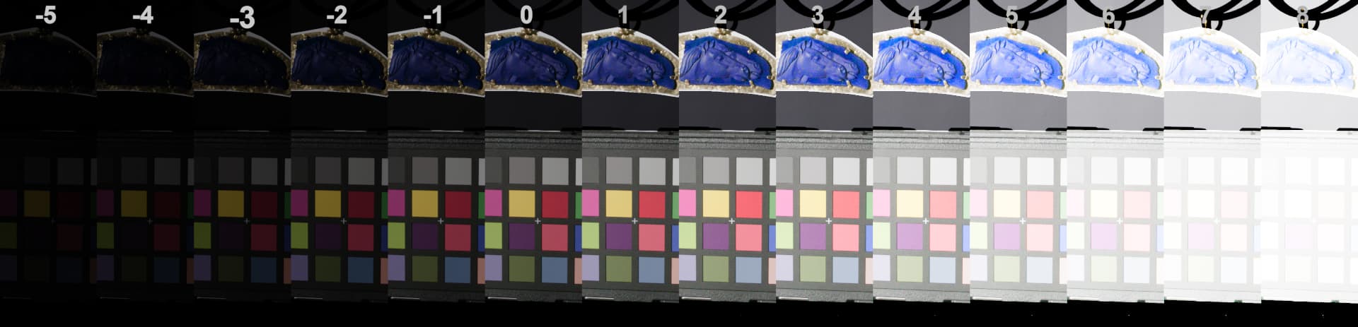
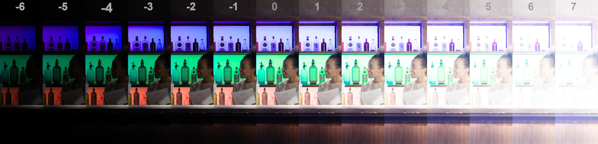
The Lapis image in CAM DRT v055 and ARRI Reveal in various exposures:
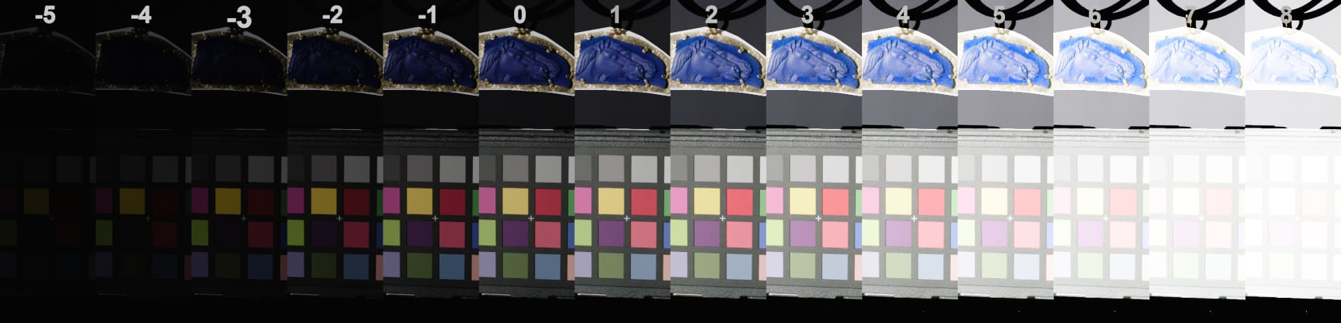
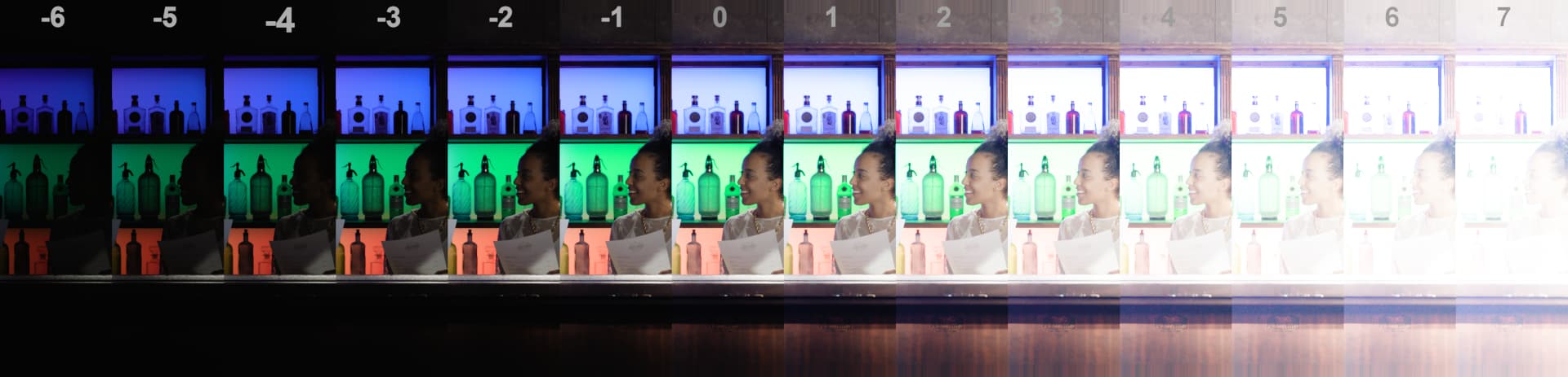
CAM DRT v055:


ARRI Reveal:

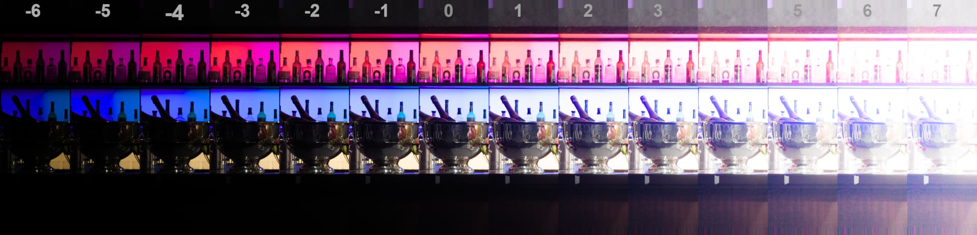
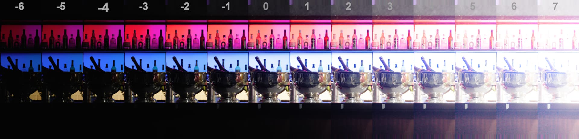
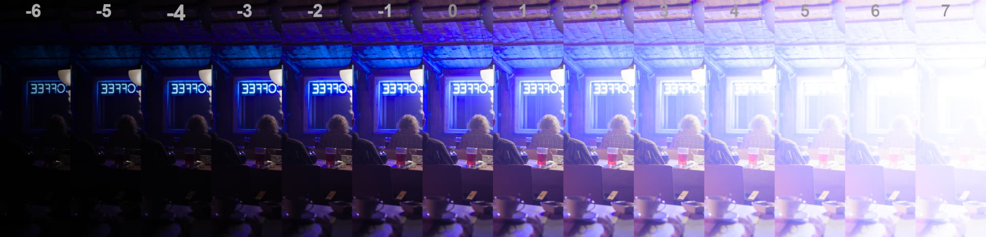
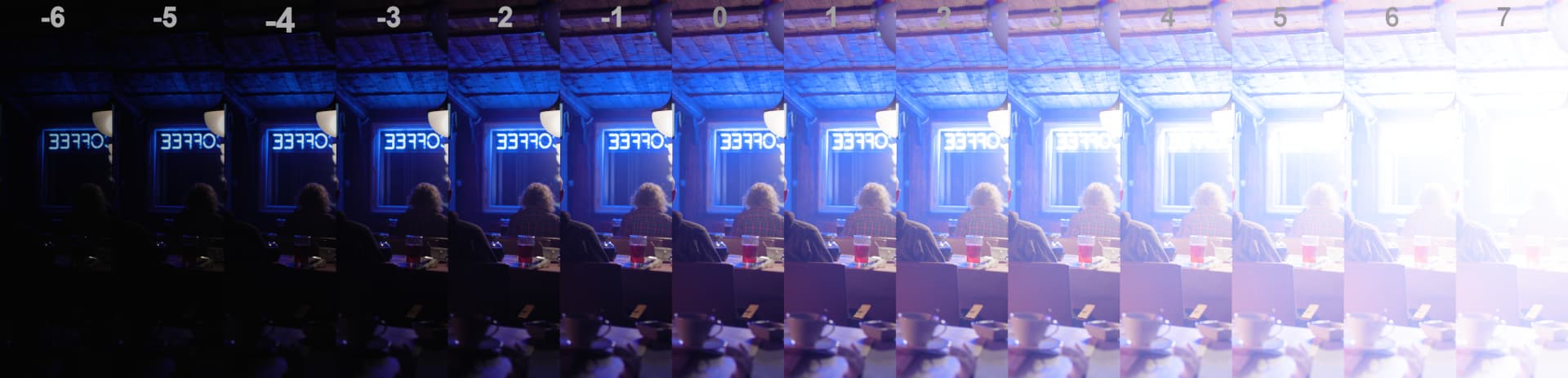
And few other strips:

CAM DRT v055:


ARRI Reveal:

CAM DRT v055:

ARRI Reveal:

CAM DRT v055:

ARRI Reveal:

1 Like

It’s a bit hard to observe, but in your blue bar coffee sign example I have the feeling that the darker exposures drift towards green. Could that be the same phenomena I pointed out in the night exterior with red frontier sign? (where I felt that the entire sky looked too green compared to other DRTs or to what you’d expect). It also feels like higher exposure drift towards magenta, as if the axis/curve those colors travel along when exposing up/down are not perceptually consistent?

It seems that the Magenta and Reds seem more persistent as exposure increased, maybe more so for rev055 than Reveal. Maybe this is similar to what Shebbe finds with the darker drifting toward green.

The Blues in Reveal seem to be more Cyan than rev055. The Lapis Blue seems to be a bit more saturated and seems to “go to white” faster in rev055 than Reveal with the increased exposure.

Since the Lapis was photographed at a much higher resolution I put a 4-times 1080p enlargement in Dropbox (with the color chart cropped out.)

if the last Dropbox link does not work please try this one:

Is the objective now to match the Reveal rendering?

2 Likes

I do not think that this is the goal. The goal should be to fix the “blues” I hope.

I picked up dev055 and rendered again the ACEScg primary and secondary
“logo-stars on a solid color” with ACES 1.3, ACES 2.0 (dev055) and ARRI REVEAL Rec.709.

Left ACES 1.3 Rec.709
Center ACES 2.0 Rec.709
Right ARRI REVEAL Rec.709

Although I am aware that this a purely theoretical exercise, it could happen that someone (like me right now :slight_smile: ) sends these values through the different “DRTs”.


Unless I did something wrong it’s nice to see how the ACES 1.3 clamped values in Rec.709 are now having a softer transition with ACES 2.0.
ARRI REVEAL I rendered and plotted just to have another comparison.

But what happens to the center image and the center plot with ACES 2.0?
Blue stars at “cyan”, then moving to "blue and changes the direction on the way to yellow!

The file in question is here:
https://my.hidrive.com/lnk/OP0rFwEm

Best

Daniel

I have a question. In principle the CAMDRT/ACES2.0 DRT is aiming to at least render an image completely contained within AP1 without any unexpected/undesirable results right?

I tried to simplify the issues I percieve with blue and created a ramp in ACEScg from 0, 0, 1.0 to 0.18, 0.18, 1.0. In the waveform these odd shapes becomes very visible.

Is it valid to say, while for a moment completely ignoring comparisons to any other DRT, that this should not happen?

Below animating hue shift effect on top of the ramp (before ODT).

[edit]
This rant is invalidated because of human error as discovered further down the thread. The DCTL math based version does not show the kinks seen in this test that used the LUTs instead.

1 Like

Hello,

following my post from May 2023, I would like to propose an acceptable rendering for the “blue singer” image.

Here is the latest v055 CAM DRT:

Here is the “proposal”:

I think that “last” time we discussed issues with blues (almost a year ago), the potential solution was a LMT. But I think the artifacts are too visible to be fixed in a LMT, correct ?

Regards,
Chris

PS: just editing my answer to add the link of the meeting#143 where this image has been discussed.

2 Likes

What is a “better” proposal?

These are literally the exact same subject Daniele just published the video on additivity about I believe.

Uttering the term “Display Rendering Transform” is part of the problem in my estimation. The mechanism is not “conveying” the “stimuli” of the open domain colourimetry given that the pictorial depiction is a separate entity.

It would seem the question is precisely the same as @ChrisBrejon’s below. But we are all skirting around the harder question as to analyzing why there is a problem. Nothing to do with “clips” or “gamuts” or any of that nonsense, as our visual cognition system has no agency to those abstract human ideas. We are only cognizing the fields of energy, and as such, we probably need to figure out what is going on there?

“Hue” is a cognitive computation. It does not exist in the stimuli, and as such, it is erroneous to try and evaluate the “hue” without consideration of the spatiotemporal articulation.

Here’s an example of what is commonly referred to as “Gamut Expansion” and “Gamut Contraction”1 of the “instantaneous computation variation. Note how the discs, despite being identical stimuli, will generally have a higher probability of being “greater chroma” in the low frequency articulation versus the higher spatial frequency articulation swings:

Solid example that cuts to the chase of the foundation, Chris. It’s the elusive question that no soul in the forum seems able to answer without resorting to numbers and terms that don’t mean anything relative to our ability to parse the pictorial depiction.

Why is the pictorial depiction in the second example vastly more acceptable than the first?

1 EG: Ratnasingam, Sivalogeswaran, and Barton L. Anderson. “The Role of Chromatic Variance in Modulating Color Appearance.” Journal of Vision 15, no. 5 (April 29, 2015): 19. The role of chromatic variance in modulating color appearance | JOV | ARVO Journals.

1 Like

I would not say so. How did you create your proposed image? If it was a grade in conjunction with the v55 rendering then it is effectively an LMT.

I was certainly able to obtain a similar result with an LMT consisting only of a matrix. The matrix was specific to that shot, but for extreme images like that one, this may frequently be necessary.

Thanks for your answer !

This was not a grade in conjunction with the v55. This is a complete different image formation chain. A similar one than the one I used a year ago for the blue bar.

If you feel this image is an edge case that should be solved on its own with a matrix or such, then we´re good I guess. If you feel like there is more to this example than meets the eye, well maybe we should re-visit a couple of stuff. :wink:

Regards,
Chris

Thanks for your to me sophisticated reply. What I attempted to illustrate is that a ramp between two colors in ACEScg renders pretty ‘wonky’ when starting from a pure blue ramping to pure blue and a bit of equal amount red and green. Shifting aways from that with hue shows that the bumpy road smoothens out in both directions indicating that this undesirable effect only happens somewhere in the blue corner.

What I expect/hope to see is some form of continous change in chrominance and luminance. In my mind it shouldn’t raise, lower, raise again etc. Is that expectation ill informed? It feels like most other DRTs have this reasonably locked down.

At roughly what point can we classify an image to be extreme? Circling back to my initial question:

I created a random CG scene with a pure blue and pure red light lighting a neutral object in Blender. Would this also classify as an extreme image? To me an extreme image in context of ACES’ DRT would be one containing data outside of AP1.

First: v055 (noRGC), rest = bunch of other renderings.

I would love to know/understand why it’s happening in the first place whilst other renderings are smooth(er)?

1 Like

The “bumpy” is indeed hugely problematic, although it would probably be prudent to pinpoint what the “bumpy” means.

We know that the spatiotemporal articulation will impact the continuity of cognized forms, for example, we can see that the fields interact with each other in a manner similar to magnetic fields.

Given we can’t impact this from the vantage of a per pixel picture formation chain, what we have to be cautious of is making matters worse. That is, this effect is very much related to the energy levels in relationship to the neurophysiological signals.

I suspect the rather foolish idea of a “CAM” or any of the other “UCS” myths are unfortunately bending the energy levels in a way that is exacerbating the problems. This is evident from looking at the “double upped” mountainous region when projecting a balanced wattage / current sweep series away from R=G=B. We can expect all sorts of wild folds and contortions as the metric is bent out of whack with respect to signal energy.

This is a particularly bad thing if it is happening. Polarity is of hyper importance in visual cognition. We know conclusively that polarity modulations from positive to negative yield “lustrous” sensations1. While not exclusive to polarity flip flops, it’s a huge warning flag. Can you show any specific polarity flips in terms of luminance or something “odd” you may have noticed?

It is very likely caused by the many deforming bends and contortions of the Hunt inspired model. It at least seems to be what is fundamentally a quantisation issue, allocating the bits at the formed picture incredibly poorly.

In the end, it feels like the problem surface is effectively one of balancing quantisation against density, and I suspect the legacy of Hunt’s rather bogus ideas around a Colour Appearance Model, which is largely an extension of the “Stimulus-As-Colour” world view propagated by Kodak, is making this problem worse.

I’d be keen to see if this is not the case.

Do you have a demonstration?

It does seem that the demarcation line between “extreme” is somewhat ill defined. Perhaps colourimetry is the problem here?

I have been forwarded these demonstrations, one of which was version 55.


We can of course discuss the complexities of “aligning” two pieces of footage, but I’d hope that the idea of “extreme” is somewhat elusive given that of the above samples, one is a very complex model and the other is literally doing nothing colourimetric to the FPGA quantal energy catch counts, and rolling through a sigmoid from a log encoding.

I suspect that a blind choice would be a no contest, and one of the options is all of about a dozen lines of script?


1 Many pieces on this subject. This is a reasonable newer summary that is useful from Faul of Ekroll and Faul fame. Wendt, Gunnar, and Franz Faul. “Binocular Luster – A Review.” Vision Research 194 (May 2022): 108008. Redirecting.

3 Likes

I must say I see this type of renderings quite often, meaning incredible saturated colours.
3D artists who worked in a linear sRGB working space for years and years and “suddenly” the software is now ACES, but they punch in the same RGB values in lights and shaders as always.

In your case I assume your red and blue lights in Blender act like a “laser light source” and this is maybe not what the “3D artist” actually intended to do.

I think RGB sliders in ACES-DCCs should have maybe added a “meaning” of the values you put in?
You select a full red and the colorpicker tells you, this color will be even outside of Rec.2020 or so?

In any case I think ACES 2.0 must be able to make sense of AP-1 values and render them without artefacts.
When I look at the blue highlight on the Blender monkey I see the same flip to cyan where should be “pure” blue like in the “star” example some posts above.
All the other renderings seemingly do not hit the blue display primary, right?

I hope there can be a fix for this issue.

1 Like

That is a reasonable solution for SDR only when you don’t have the requirements we have for the ACES 2.0 transforms. It’s essentially what the K1S1 transform does. But it does not tick any of these boxes, which we need to tick:

  • Create a “family” of transforms for different HDR and SDR display targets which viewers will perceive as being “the same”, while also making use of the extended capabilities of more capable displays;
  • Be able to produce any value within the display gamut, at least for Rec.709 and P3 SDR;
  • Be invertible such that applying the transform in the reverse direction prior to the final forward direction is able to reproduce the result of any other rendering (for a given display).

It’s the image directly below my statement.

1 Like