ACES 2.0 CAM DRT Development

Thanks for the reply Pekka!

Yes, using the HDR 1000 nit transform. If you try to match what the bluescreen shot looks like under ACES 1 using ACES 2 v053, it’s not straightforward. The image very quickly breaks in ACES 2.0 as you are fighting the aggressive compression built in to ACES 2.

In your post below this comparing v053 and v054_pex1, you can see on the “Rec.2020 primaries and complementaries” image that there is a strong change in the reds (column 1) and blues (column 9) almost immediately in v053. That problem in v053 is also apparent in HDR, not just SDR.

There are a certain number of projects where the answer to this would be “Yes, with many nodes” and another number where the answer would be “No, the compression is too limiting”.

I do understand that compromises need to made to best fit the mast majority of projects. For most projects, the gamut compression wouldn’t be a concern. Though I do think the chroma compression would be. I am just concerned that certain projects become boxed in by ACES 2 and that the starting point for ACES 2 seems off for certain colours (red and especially blue). While I can’t say for certain what either the bluecreen or Frontier Casino shot are supposed to look like, when I look at both of them in ACES 2 them seem very off (relative to ACES 1, Trulight CAM v3, RED IPP2) where I would expect them to land.

1 Like

Still haven’t found a good moment to fully evaluate the current 2.0 DRT but over the course of the last meetings I do see some of my concerns being discussed. I think it’s heading in the right direction but since I feel that feedback is a bit scarce I will throw out some of my personal findings. Please be mindful that I’m just one sample of opinions :smiley: .

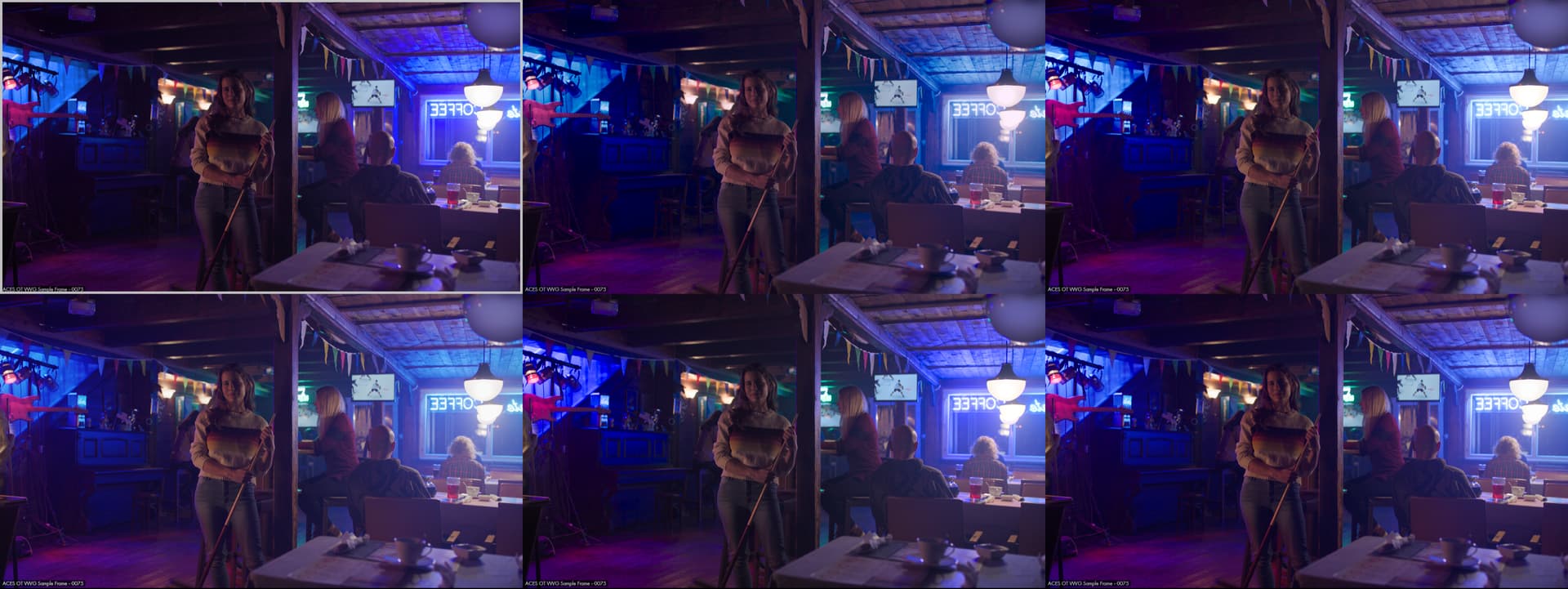
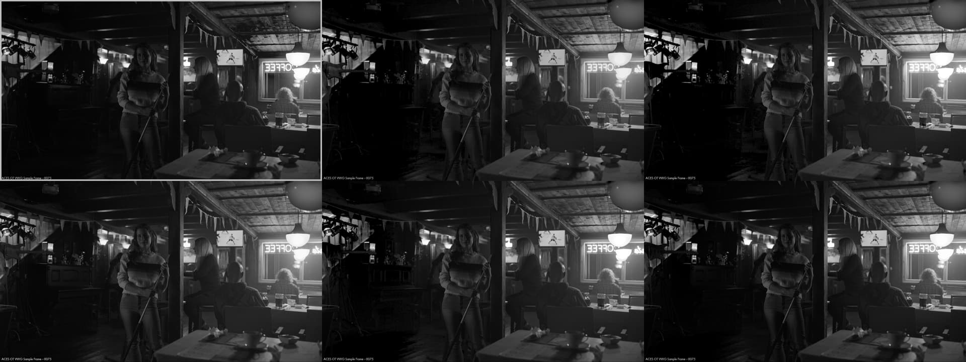
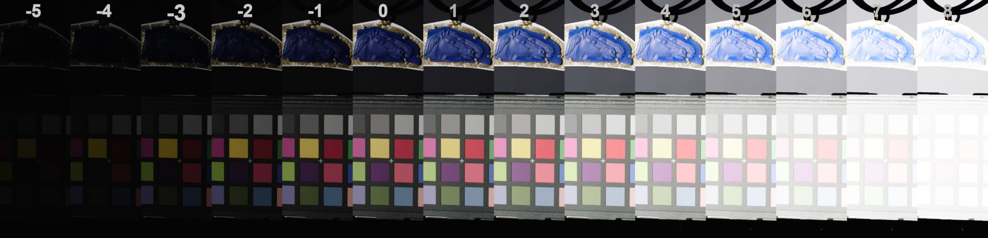
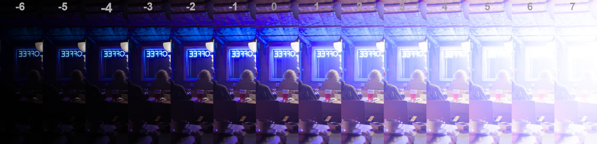
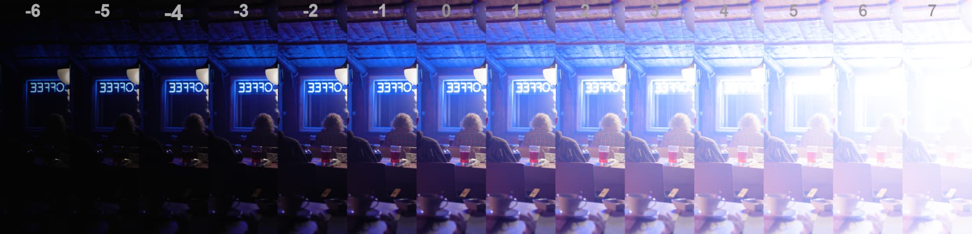
These are all based on v055 SDR Rec.709.
Screengrabs always have v055 in the middle (second image).

Overall SDR:
I think the rendering is very pleasing and feels quite ‘neutral’ compared to some other DRTs which I find the most desireable to start grading.

Overal HDR:
Can’t comment yet until I’ve evaluated it properly. But I do have a Resolve setup prepped. Don’t have a fancy grading suite but I do have a PA32UGC and dimmable room which should be good enough.

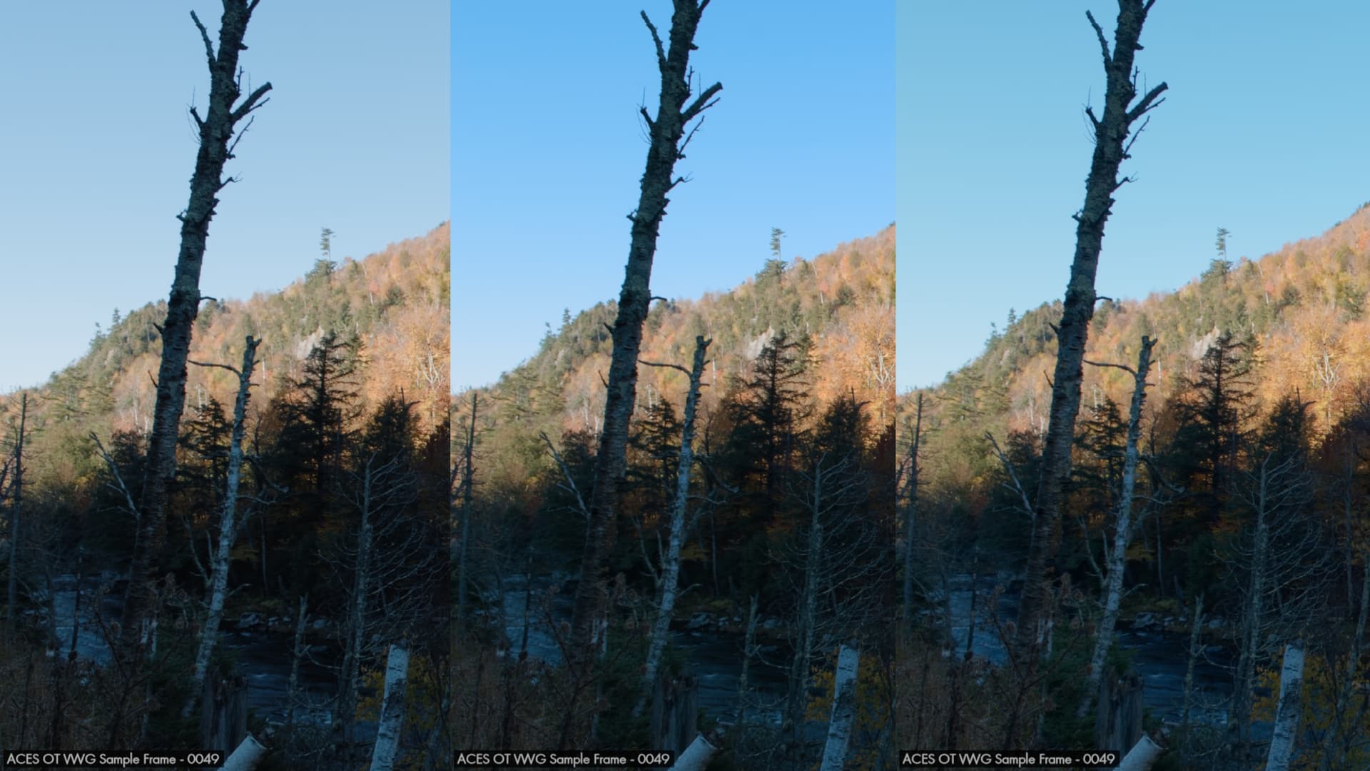
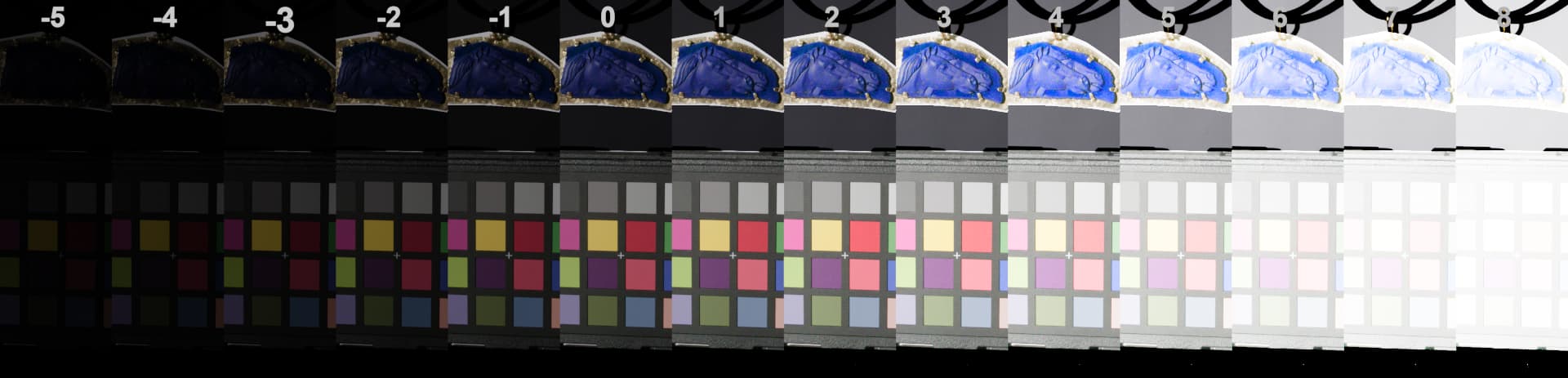
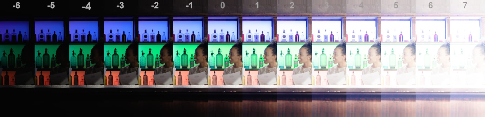
01: ‘normal’ blues SDR
I feel that blue renders slightly too dark or too saturated, or a bit of both. This is very visible when comparing to other renderings but even in isolation I feel that they stand out from other colors too much. My reasoning behind that is that clear skies look quite colorful when objects lit by sunlight look quite desaturated in relation. This ratio looks more sensible in other renderings.

I think that this could be slightly more balanced so that a colorist doesn’t have to worry about always having blues more intense than any other color when wanting to push saturation in a look for example.

Grading: easy to correct.

Examples: (v055 middle)
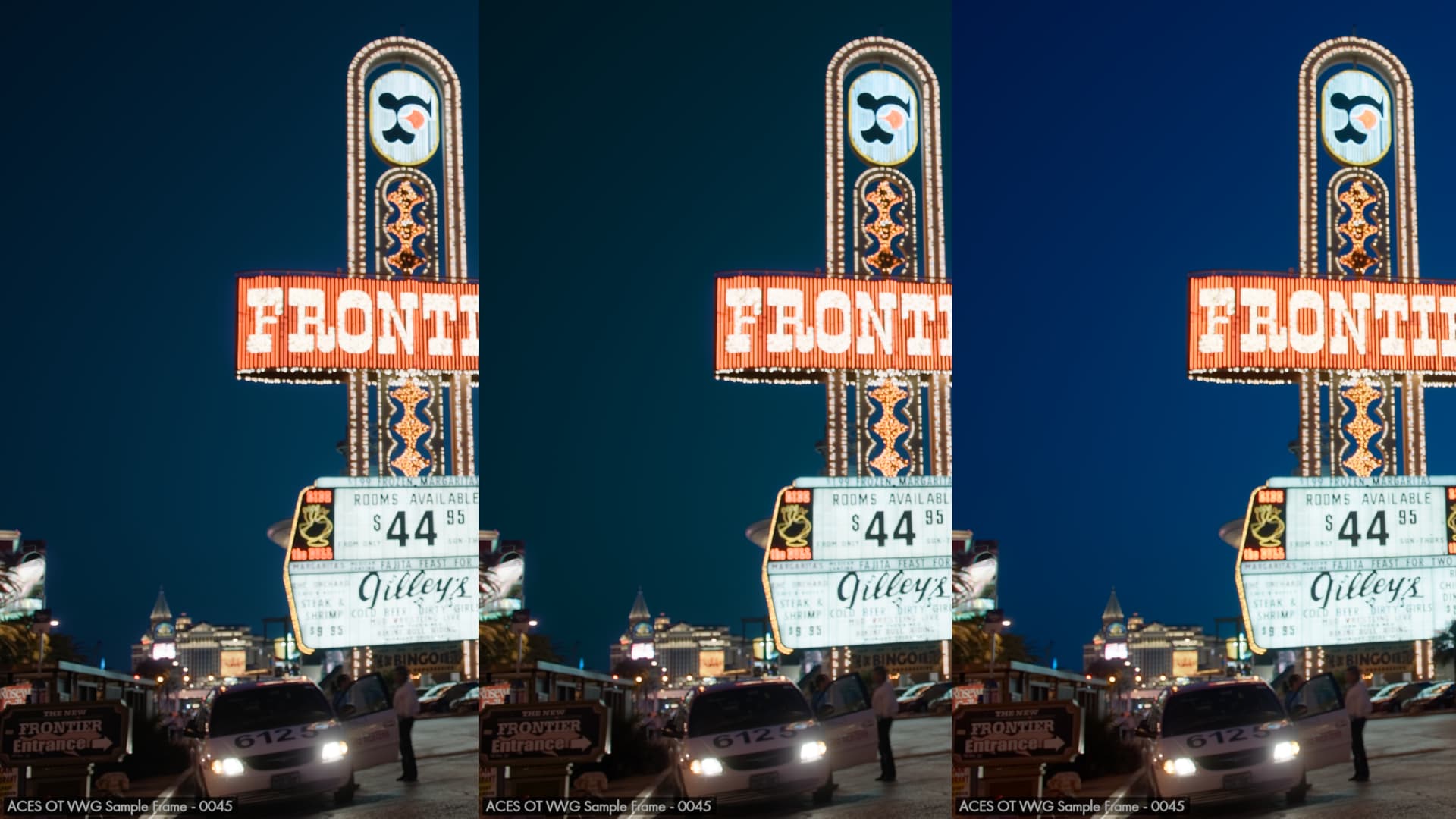
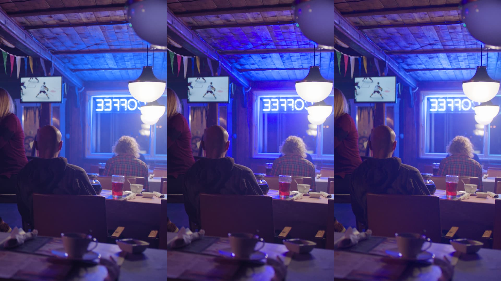
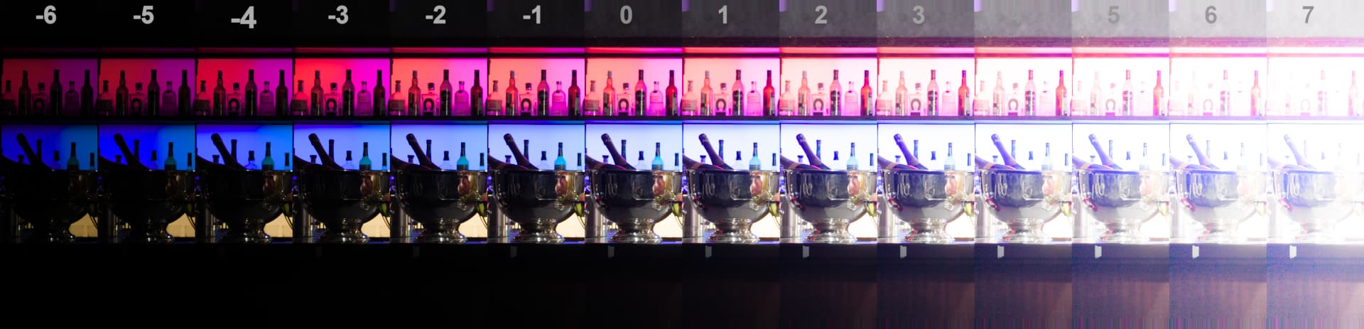


02: night sky blue
There is one particular image that stood out to me.
The blue sky feels slightly greenish for some reason. I don’t know if this is the same situation as with the notourious blue screen image regarding where the actual data sits… but for this one it just feels ever so slightly off. Perhaps there is a way to ‘justify’ or explain why this is.

Grading: very easy to correct.

Example: (v055 middle)

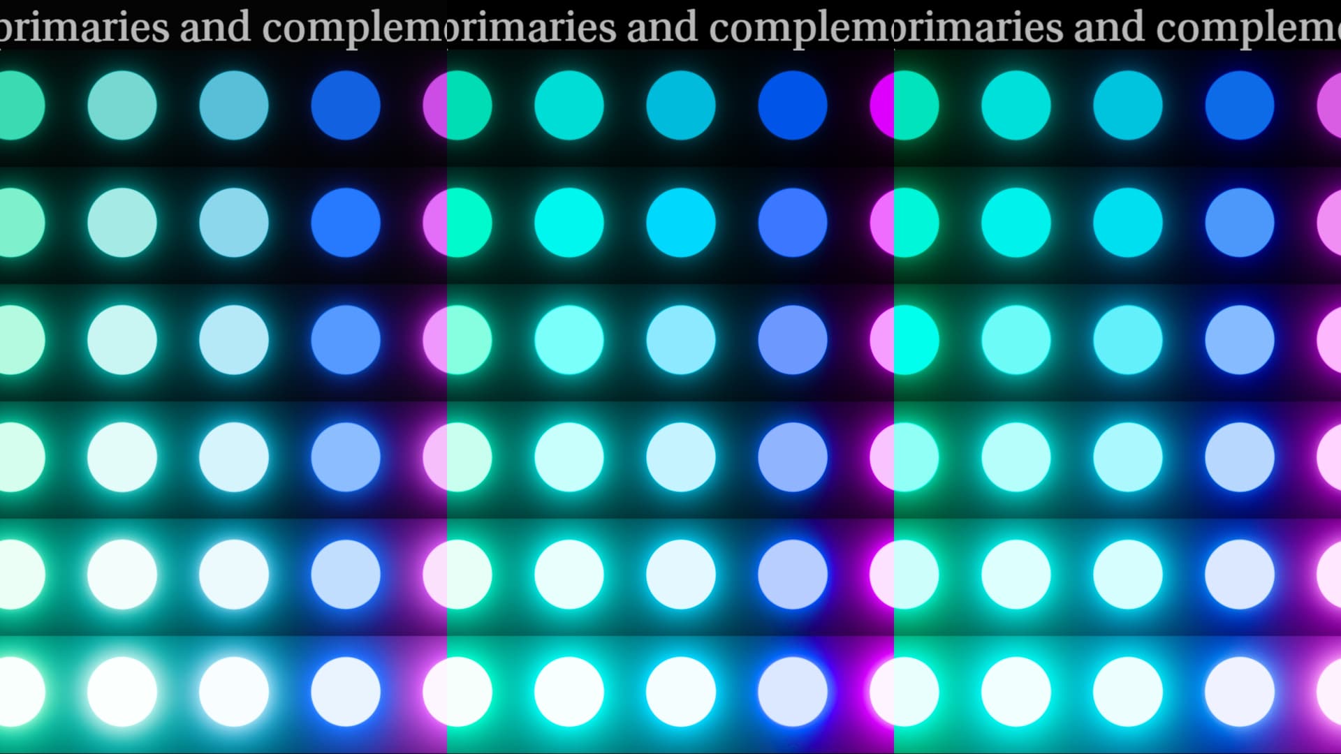
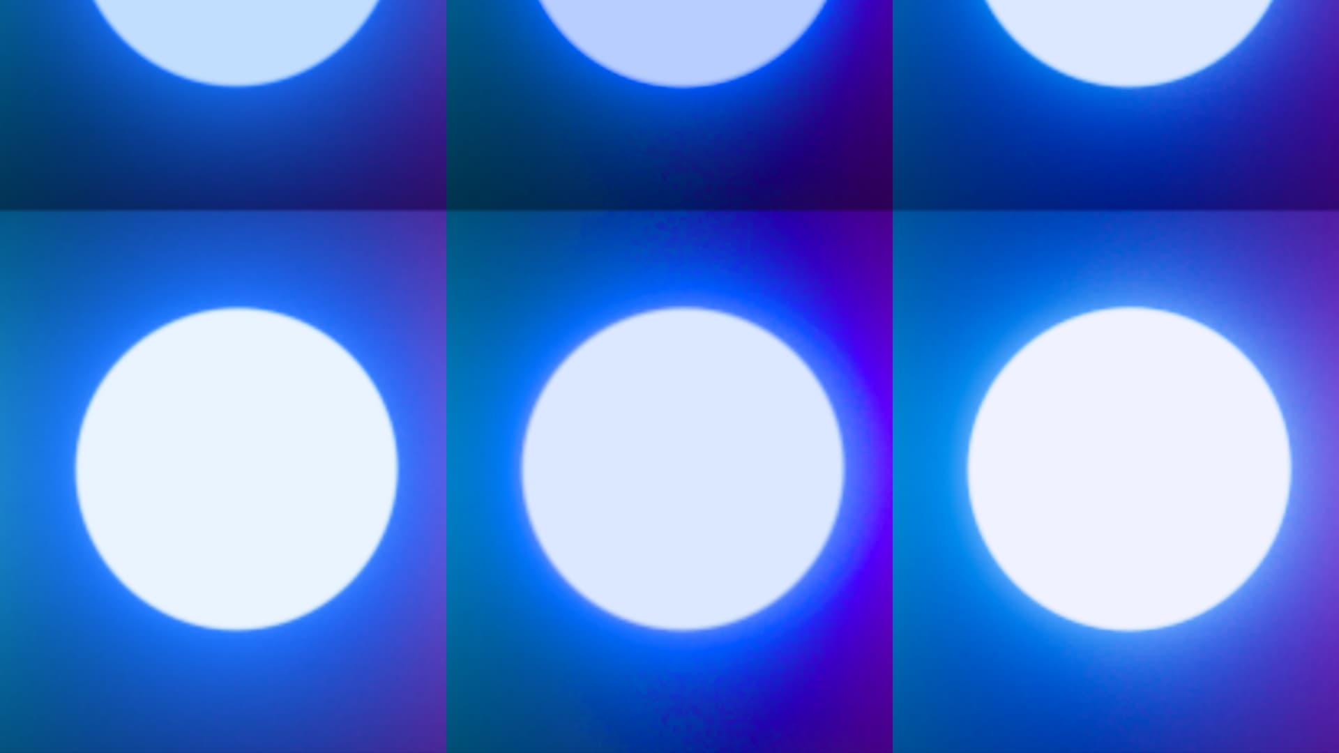
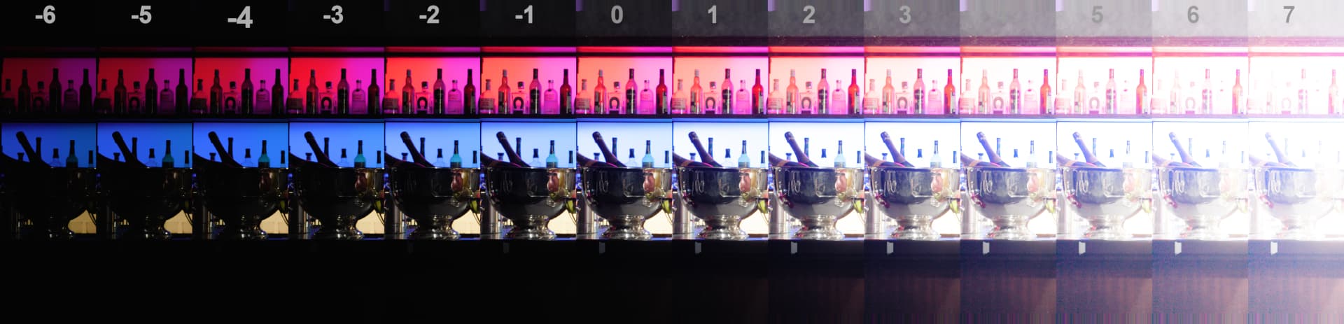
03: high saturated/emissive blues
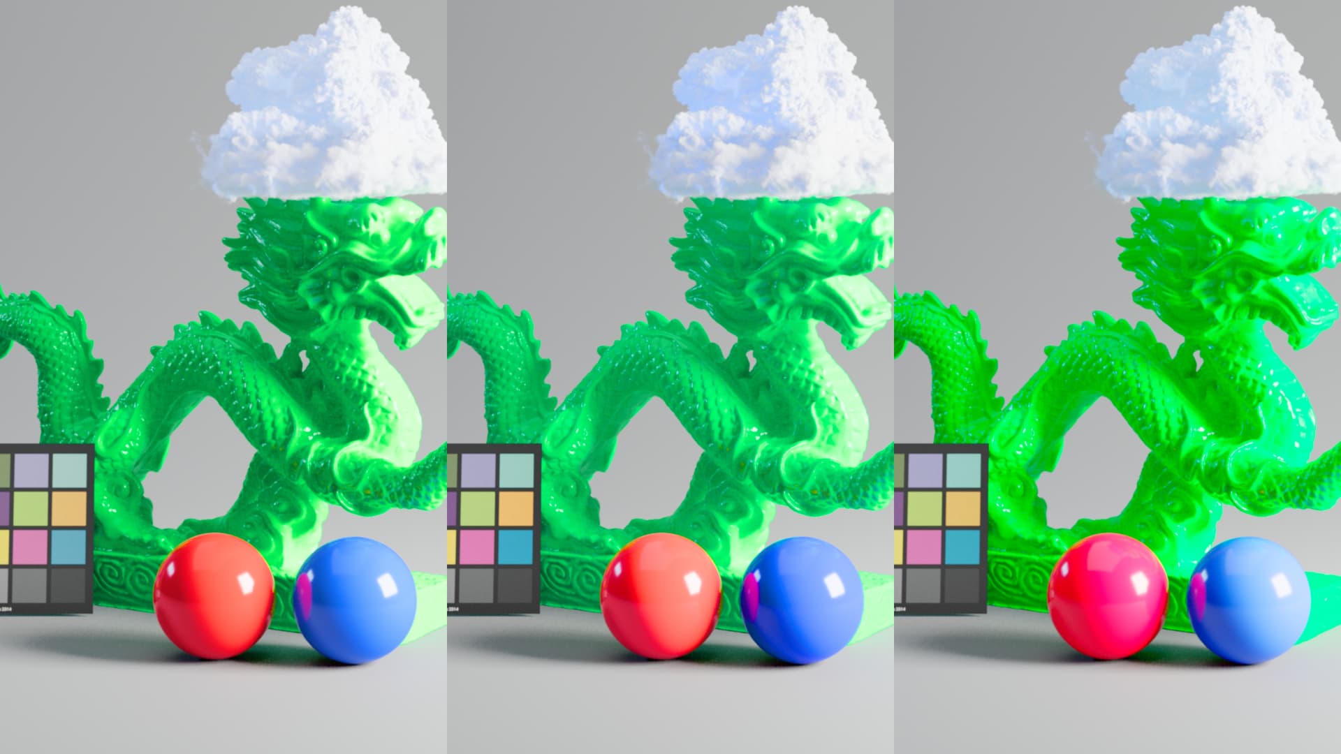
While I think improvements have been made to this, I feel that the biggest issue with how blue looks has to do with the transition/gradient to white and probably less with how long it retains color or how dark it is in general. When looking at for example the Rec.2020 spheres you can still see that there is a sort of ‘fold’ in the gradient that in my mind should be smooth. Same can be said for the ‘blue bar’ and the CG dragon with red/blue spheres.

What I found interesting when messing with Resolve’s color warper was that on blue bar, the rendering can very quickly ‘snap’ into a better look by moving the blue outer point slightly towards cyan. Then I found the same tactic also worked for the other problematic images. It feels like there is a point in the DRT that once information sits there it either becomes full blue primary, or becomes desaturated cyan, or jumps to purple. But the range where this happens feels incredibly tight.

I could give myself the argument that I can always grade such images to correct the rendering but it feels odd to me that other renderings don’t suffer from this. When I slide that blue point up and down in the two other DRTs I tested the colors don’t break at that small range I mentioned above.

Grading: what I mentioned above did improve the appearance but it is quite tricky and finicky to manage and make look good so I wouldn’t accept this as part of a colorist’s task and try to aim for a better behaving rendering.


Here is also a video example of what I did.

It’s also worth mentioning that I didn’t use RGC anywhere. I found that RGC didn’t contribute anything to v055 regarding this issue. It only desaturated colors a bit more but didn’t improve gradation. Perhaps different settings are required or a different type of RGC all together for this new DRT instead of the current reference implementation?
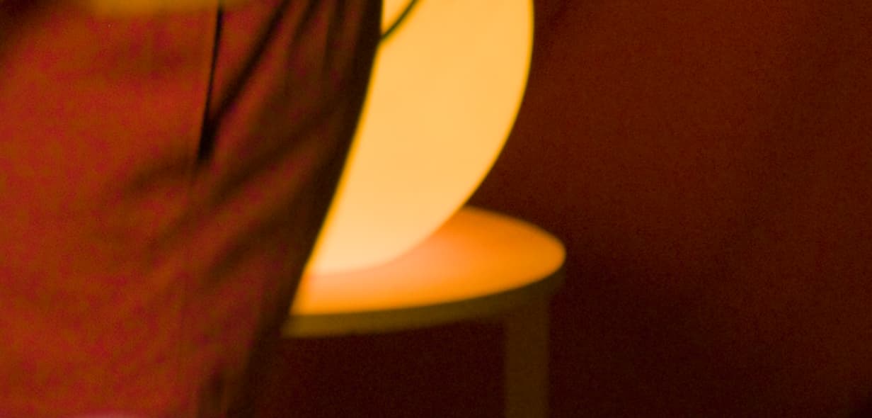
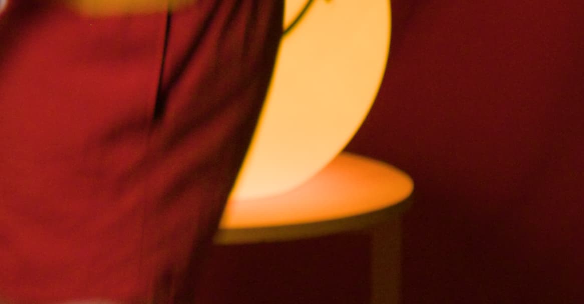
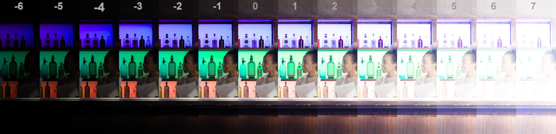
04: red noise
I have an image of which you may argue that it’s from a less relevant camera in today’s cinematogrpahy, EPIC-X. But I found it to have a lot of noise on deep red cloth compared to other DRTs. This however is totally diminished and cleaned up when RGC is applied. So I don’t see this as a huge issue but perhaps as an image it’s something interesting to look at. I could probably share this frame with censoring/or crop for internal testing for those of you actually developing it, so if you’re curious let me know.


That’s all I have for now. Hope it’s useful!

1 Like

Shebbe: As to the “jumping”, “breaking”, “tight range” of blue: Could this be due to using a LUT? Just wondering because I have been dismissing adjustments “breaking” to a LUT (or still maybe precision) and looking forward to the math DCTL.

As to the darker blues as you indicate, I can agree. But they are far better than in previous versions. Maybe it is just that the tweak made can be backed off just a bit. The skies in your 2nd and 3rd examples, of the left, seem weak to me. In 4th example, the right sky looks too much saturated. In your Blue-Bar examples the blue in v055 middle seems best to me, even if a bit dark as you point out. Again, maybe backing off the tweak a bit.

The reds could be a bit dark as well, similar to the blues but not as much. I seem to recall that Pekka also mentioned such in the meeting and was considering further refinements???
Only having worked with the two from Pekka, I just got the ver055 put up yesterday so still need to look them over. But I do plan to add another bit to the opinion pile.

Hey Jeffrey, good call. I haven’t looked at Nick’s DCTL implementation yet but I don’t know if that’s already up to v055.

I also agree that the rendering of v055 is better than previous iterations but I didn’t want to compare too much to older versions of the same and rather judge things from where they stand at the moment :slight_smile:

I agree that it looks mostly desirable over the other two, except for the fact that there are harsh jumps which you can also see in those spheres. I think if that can be solved the rest is up to taste parameter tweaking wise.

Just a quick note as to the latest rev055 ODT. The HDR PQ1000 and PQ500 seem to be a good match with the SDR rec.709. >>> However the rec.2100-rec.709sim is way off in both luminance and saturation. (sort of a high contrast, over saturation and clipping)

The P3D65 SDR seems to somewhat match the rec.709 SDR although there is less saturation in the reds of P3. (only a quick look - this is also evidenced on the Vector Scope)

I am viewing these on my M2 iPad Pro in reference mode which can do both SDR and HDR. Keep in mind that having only one of these devices I can only switch between modes and not view side by side. Later I will try comparing with LG OLED TV through a Decklink on my AMD system - keeping in mind that calibration differences may obscure some things. (Also keep in mind that to use the transforms on the iPad, the first line of the DCTL must be commented out and then used in Resolve-for-iPad as a DCTL. This is because Resolve for iPad still does not recognize new “xDT” files from the ACES Transforms folder.)

I just had a rough look and didn’t see a different rendering in v055 2100 709sim over v053 2100 709sim apart from the actual version updates. Didn’t have a second setup handy for comparison to normal 709 though but it looked normal to me.

/////

Out of curiosity I looked at the blue sky again in two images. This time in Rec2100 P3 lim 1000nits and 2100 709 sim. Monitor was PA32UGC in forced HDR PQ clip mode, local dimming enabled, coming from DeckLink Mini 4K HDMI on Windows.

The OT candidate exr in-image labeled 0012 with palm trees felt like a really good match. But the red letters on the vertical sign felt a bit ‘luminous’ in 709sim. Reds overall in that image in 709sim felt slightly ‘salmony’? Not sure how to put it but not as muted red as it presented itself in v055 HDR in relation to the rest of the scene. I think REVEAL (SDR) handled that slightly better but at the same time I also think that reds in REVEAL are incredibly dark, to the point that it feels like a look to me…

REVEAL ------------------------ v055

The OT candidate exr in-image labeled 0049 with mountains. Weirdly the REVEAL P3 1000nit sky felt like a better match to v055 709sim where v055 HDR was a bit too saturated.
Going by what I said in my earlier SDR based findings this perceived mismatch would be increased even more, unless the effects of changing it (making it slightly less saturated) would be counting perceptually equal for SDR and HDR rendering. In any case, wouldn’t want them to be further apart than they are now.

A very quick last comment about the high saturated/emissive blues in HDR, they actually looked totally fine to me. The blue bar still looked very slightly ‘clippy’ on the edges of the window and right next to the core white of the blue text object but that’s somewhat to be expected I guess with such an intense lightsource presenting itself in P3 1000nits. At least it looks as blue as it can be and can be massaged by the user.

Don’t want to say or evaluate much more for now regarding HDR until some other improvements have been made to SDR or some more parameters are locked in.

As to the rec.2100-rec.709sim candidate, I downloaded again and copied to iPad and it does work as expected.

I think what I may have done in my haste is use the P3D65 (Rec709 sim) instead of the Rec2100 (Rec709 sim). I checked the P3D65 (Rec709 sim) and it behaves as the P3D65 also showing less saturation in reds compared with Rec.709

Unfortunately I do not yet have a mathematical DCTL implementation of v55. It’s a lot of repeated work to track each version’s changes in the DCTL.

I hope things are pretty locked down now, and any future changes will just be parameter tweaks, which will be simpler to update in the DCTL. So I will work on having a v55 (or v56) DCTL soon.

2 Likes

Hi @Shebbe what is on the left and right in this post? You mentioned v055 is in the middle. Apologies if I missed the description somewhere else

Hi @swcolour ,

I deliberately didn’t specify the others in my initial post because I felt that naming them may create a certain bias. I also mostly tried to compare them in relation to how they present various tones each within their own and not cross check them too much if that makes sense. But left is REVEAL and right is DaVinci. In the example video you can also see me testing in that same order, the DRT nodes are visible there :slight_smile: .

I just pushed a set of v55 mathematical DCTLs.

They appear to match the results of the Blink, but are only minimally tested and do not yet include all @KevinJW’s recent speed optimisations. I thought I would post them for people to try, and then work on the optimisations.

Like my previous DCTL implementations, they expect linear AP0 input, and are designed to be used in the DCTL OFX, so you have access to a small set of parameters.

If you wish to use them in the actual ACES Transforms folder, you will need to add the appropriate first lines as used in @alexfry’s DCTL.

UPDATE:
I just pushed an update which adds @KevinJW’s speed optimisations, and also added a set of versions for the ACES Transforms folder.

5 Likes

just gave Nick’s new ver055 DCTLs a try.

All look to work well on my M2 iPad Pro… and are consistent with the LUT ver055.

However, none of them are working on my AMD system.
following from error log:
[0x00001de4] | DVIP | ERROR | 2024-03-13 09:47:05,807 | DaVinci CTL compilation failed.

[0x00001de4] | DVIP | ERROR | 2024-03-13 09:47:05,808 | Failed to build program.
Build Status: -2
Build Options: -w -DDEVICE_IS_OPENCL -DCOMPILER_IS_DVIP_RT -DKERNEL_TYPE_IS_DCTL -DVENDOR_IS_AMD -cl-mad-enable -cl-fast-relaxed-math
Build Log: In file included from T:\Users\JDM\AppData\Local\Temp\OCL19712T10.cl:3551:
C:\ProgramData\Blackmagic Design\DaVinci Resolve\Support\LUT\DCTL\ACES2\ver055\hellwig_lib_v055.h:900:32: error: unexpected type name ‘float2’: expected expression
float2 JMboundary = float2(nickBoundryReturn.x, nickBoundryReturn.y);
^
C:\ProgramData\Blackmagic Design\DaVinci Resolve\Support\LUT\DCTL\ACES2\ver055\hellwig_lib_v055.h:901:32: error: unexpected type name ‘float2’: expected expression
float2 project_to = float2(nickBoundryReturn.z, 0.0f);
^
2 errors generated.

you need to change those 2 lines into this:
float2 JMboundary = make_float2(nickBoundryReturn.x, nickBoundryReturn.y);
float2 project_to = make_float2(nickBoundryReturn.z, 0.0f);

thanks Jpzambrano9, that seems to have taken care of it

Good catch. Thanks. I’ll push that change to the repo.

I had only tested on M1 and M2 Macs.

3 Likes

Hello again!

Some more thoughts I have regarding the blues…
I had a look at last week’s meeting, thank you for briefly discussing my points! I think Kevin came with some good questions and tests of what happens with it in the DRT. How much of blue should appear close to/or max blue? How much of that should be considered “that’s just how it renders” or “it’s wrong it should look different”?

I find myself looping in two main thoughts about it …

  1. ACES 2.0 ‘brands’ itself as CAMDRT, which to me in simple terms means ACES 2.0 holds a color appearance model, which in turn should present an image as close as it can appearance-wise to how the captured data actually was when observed on the spot by a human within the defined display’s capabilities/limitations.

I think I can understand that within that subject there are a lot of subtleties, and different mechanisms can serve as being a part of color appearance. But to my mind, the most important one should be that any light emitting a certain amount of energy in any visible light wavelength, and any surface reflecting that light should have a certain falloff. If the DRT is unable to represent that falloff with just one color(range) (in SDR mostly), how much can we validate that the DRT is working as intended/desired?

  1. I don’t know how valid it is to view one output channel post DRT but when I look at v055 (even DCTL maths version) green channel, this awkwardly tight range of sudden saturated blue is very visible. When I look at other DRTs I have at my disposal, none of them show this issue. In the darker blue area with the piano some others do clip/fall to black but this is visually imperceptible to me in the RGB image.

Below are a bunch of DRTs I threw in to compare.
Top left = v055 (white border). The others: custom params AgX, JzDRT, IPP2, OpenDRT, DaVinciDRT


In the closeup you can really see that it’s also dark at the edges and bright within. I’m not a super technically skilled colorist but it feels wrong what happens here. Perhaps it can be analyzed and/or explained.

Last points about the other feedback I had regarding appearance of blue in the night scene, I can live with the idea that if the captured scene data/IDT put the information there more in cyan/green region, that’s how the DRT renders. This is very trivial and subtle to adress in grading if needed. I actually like the idea that you can discriminate such ranges while looking at the rendered image. Controls would be tighter but more 1:1 with where you are actually moving the colors to.

To conclude, to me personally I think overall the ACES2.0 CAMDRT is really almost there and looks very pleasing to work with in general. It’s just that last bit of blue that feels like a technical issue for which once adressed, you could say that the DRT is finished.

I would be sad if ACES 2.0 releases and I still have to say “this is ACES, but… you’ll need this to fix it”. :slight_smile:

2 Likes

Some more non-scientific tests I did. I noticed that v055 shows a “sticky” area below the blue primairy. While some other DRTs show similar behavior, most stick on the actual blue primary axis. Some a bit of both. I don’t know if this directly relates to the ‘kink’ I keep talking about.

That issue is somewhat perceived actually in some other DRTs but much less so, to a degree that I find the rendering good and am able to grade it in a way that doesn’t produce too awkward results moving around in those ranges.

I also found that the ones that didn’t stick at all, look the smoothest.

1 Like

I put an EXR file of Lapis and color chart into my Dropbox. Please copy before the end of the month with the following link:

Photographed with Blackmagic Designs URSA Mini Pro 12K with Zeiss Otus 28mm in direct sun with no filter. EXR file made in DaVinci Resolve in AP0 linear.

1 Like

The Lapis image in CAM DRT v055 and ARRI Reveal in various exposures:

CAM DRT v055:


ARRI Reveal:

And few other strips:

CAM DRT v055:


ARRI Reveal:

CAM DRT v055:

ARRI Reveal:

CAM DRT v055:

ARRI Reveal:

1 Like

It’s a bit hard to observe, but in your blue bar coffee sign example I have the feeling that the darker exposures drift towards green. Could that be the same phenomena I pointed out in the night exterior with red frontier sign? (where I felt that the entire sky looked too green compared to other DRTs or to what you’d expect). It also feels like higher exposure drift towards magenta, as if the axis/curve those colors travel along when exposing up/down are not perceptually consistent?