ACES 2.0 CAM DRT Development

if the last Dropbox link does not work please try this one:

Is the objective now to match the Reveal rendering?

2 Likes

I do not think that this is the goal. The goal should be to fix the “blues” I hope.

I picked up dev055 and rendered again the ACEScg primary and secondary
“logo-stars on a solid color” with ACES 1.3, ACES 2.0 (dev055) and ARRI REVEAL Rec.709.

Left ACES 1.3 Rec.709
Center ACES 2.0 Rec.709
Right ARRI REVEAL Rec.709

Although I am aware that this a purely theoretical exercise, it could happen that someone (like me right now :slight_smile: ) sends these values through the different “DRTs”.


Unless I did something wrong it’s nice to see how the ACES 1.3 clamped values in Rec.709 are now having a softer transition with ACES 2.0.
ARRI REVEAL I rendered and plotted just to have another comparison.

But what happens to the center image and the center plot with ACES 2.0?
Blue stars at “cyan”, then moving to "blue and changes the direction on the way to yellow!

The file in question is here:
https://my.hidrive.com/lnk/OP0rFwEm

Best

Daniel

I have a question. In principle the CAMDRT/ACES2.0 DRT is aiming to at least render an image completely contained within AP1 without any unexpected/undesirable results right?

I tried to simplify the issues I percieve with blue and created a ramp in ACEScg from 0, 0, 1.0 to 0.18, 0.18, 1.0. In the waveform these odd shapes becomes very visible.

Is it valid to say, while for a moment completely ignoring comparisons to any other DRT, that this should not happen?

Below animating hue shift effect on top of the ramp (before ODT).

[edit]
This rant is invalidated because of human error as discovered further down the thread. The DCTL math based version does not show the kinks seen in this test that used the LUTs instead.

1 Like

Hello,

following my post from May 2023, I would like to propose an acceptable rendering for the “blue singer” image.

Here is the latest v055 CAM DRT:

Here is the “proposal”:

I think that “last” time we discussed issues with blues (almost a year ago), the potential solution was a LMT. But I think the artifacts are too visible to be fixed in a LMT, correct ?

Regards,
Chris

PS: just editing my answer to add the link of the meeting#143 where this image has been discussed.

2 Likes

What is a “better” proposal?

These are literally the exact same subject Daniele just published the video on additivity about I believe.

Uttering the term “Display Rendering Transform” is part of the problem in my estimation. The mechanism is not “conveying” the “stimuli” of the open domain colourimetry given that the pictorial depiction is a separate entity.

It would seem the question is precisely the same as @ChrisBrejon’s below. But we are all skirting around the harder question as to analyzing why there is a problem. Nothing to do with “clips” or “gamuts” or any of that nonsense, as our visual cognition system has no agency to those abstract human ideas. We are only cognizing the fields of energy, and as such, we probably need to figure out what is going on there?

“Hue” is a cognitive computation. It does not exist in the stimuli, and as such, it is erroneous to try and evaluate the “hue” without consideration of the spatiotemporal articulation.

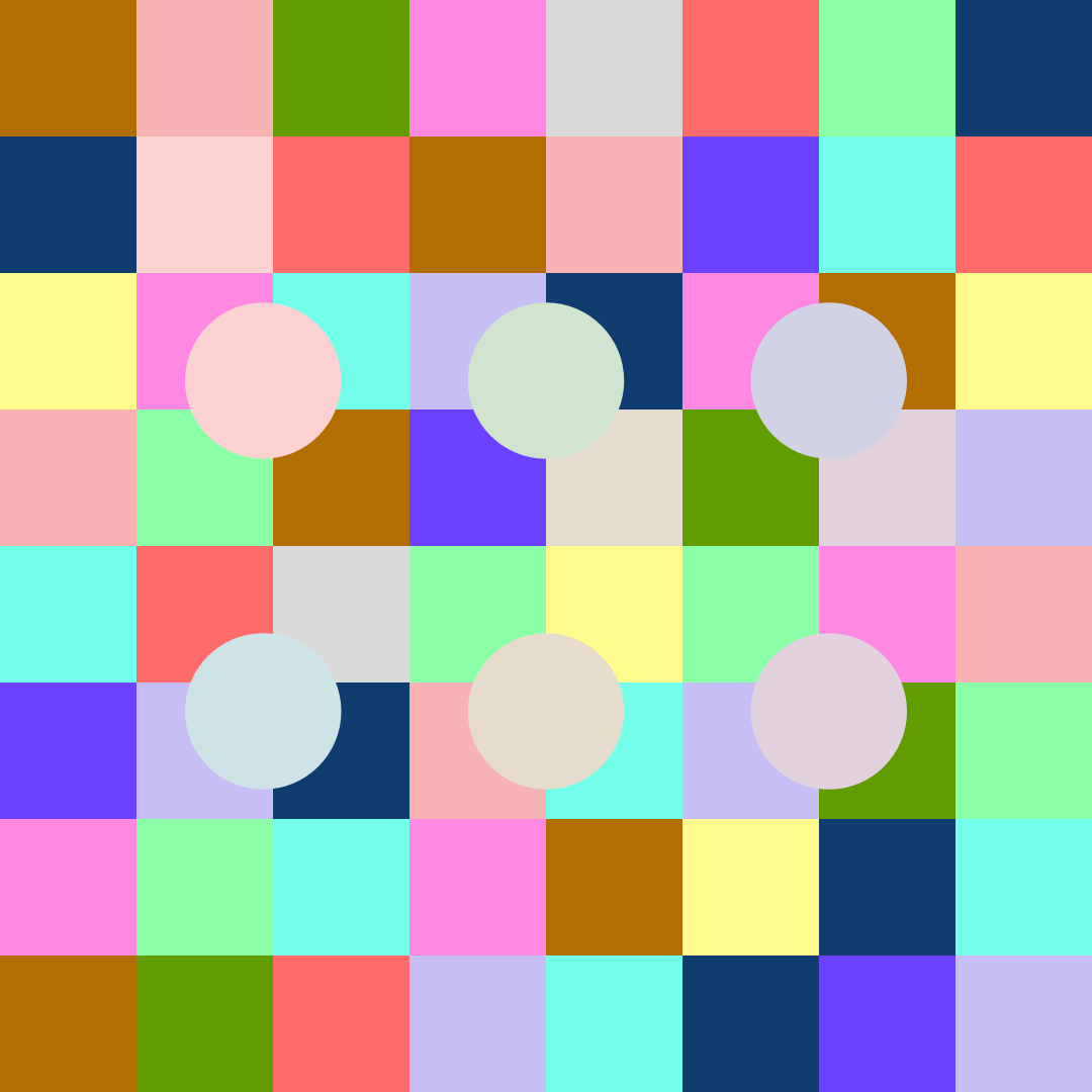
Here’s an example of what is commonly referred to as “Gamut Expansion” and “Gamut Contraction”1 of the “instantaneous computation variation. Note how the discs, despite being identical stimuli, will generally have a higher probability of being “greater chroma” in the low frequency articulation versus the higher spatial frequency articulation swings:

Solid example that cuts to the chase of the foundation, Chris. It’s the elusive question that no soul in the forum seems able to answer without resorting to numbers and terms that don’t mean anything relative to our ability to parse the pictorial depiction.

Why is the pictorial depiction in the second example vastly more acceptable than the first?

1 EG: Ratnasingam, Sivalogeswaran, and Barton L. Anderson. “The Role of Chromatic Variance in Modulating Color Appearance.” Journal of Vision 15, no. 5 (April 29, 2015): 19. The role of chromatic variance in modulating color appearance | JOV | ARVO Journals.

1 Like

I would not say so. How did you create your proposed image? If it was a grade in conjunction with the v55 rendering then it is effectively an LMT.

I was certainly able to obtain a similar result with an LMT consisting only of a matrix. The matrix was specific to that shot, but for extreme images like that one, this may frequently be necessary.

Thanks for your answer !

This was not a grade in conjunction with the v55. This is a complete different image formation chain. A similar one than the one I used a year ago for the blue bar.

If you feel this image is an edge case that should be solved on its own with a matrix or such, then we´re good I guess. If you feel like there is more to this example than meets the eye, well maybe we should re-visit a couple of stuff. :wink:

Regards,
Chris

Thanks for your to me sophisticated reply. What I attempted to illustrate is that a ramp between two colors in ACEScg renders pretty ‘wonky’ when starting from a pure blue ramping to pure blue and a bit of equal amount red and green. Shifting aways from that with hue shows that the bumpy road smoothens out in both directions indicating that this undesirable effect only happens somewhere in the blue corner.

What I expect/hope to see is some form of continous change in chrominance and luminance. In my mind it shouldn’t raise, lower, raise again etc. Is that expectation ill informed? It feels like most other DRTs have this reasonably locked down.

At roughly what point can we classify an image to be extreme? Circling back to my initial question:

I created a random CG scene with a pure blue and pure red light lighting a neutral object in Blender. Would this also classify as an extreme image? To me an extreme image in context of ACES’ DRT would be one containing data outside of AP1.

First: v055 (noRGC), rest = bunch of other renderings.

I would love to know/understand why it’s happening in the first place whilst other renderings are smooth(er)?

1 Like

The “bumpy” is indeed hugely problematic, although it would probably be prudent to pinpoint what the “bumpy” means.

We know that the spatiotemporal articulation will impact the continuity of cognized forms, for example, we can see that the fields interact with each other in a manner similar to magnetic fields.

Given we can’t impact this from the vantage of a per pixel picture formation chain, what we have to be cautious of is making matters worse. That is, this effect is very much related to the energy levels in relationship to the neurophysiological signals.

I suspect the rather foolish idea of a “CAM” or any of the other “UCS” myths are unfortunately bending the energy levels in a way that is exacerbating the problems. This is evident from looking at the “double upped” mountainous region when projecting a balanced wattage / current sweep series away from R=G=B. We can expect all sorts of wild folds and contortions as the metric is bent out of whack with respect to signal energy.

This is a particularly bad thing if it is happening. Polarity is of hyper importance in visual cognition. We know conclusively that polarity modulations from positive to negative yield “lustrous” sensations1. While not exclusive to polarity flip flops, it’s a huge warning flag. Can you show any specific polarity flips in terms of luminance or something “odd” you may have noticed?

It is very likely caused by the many deforming bends and contortions of the Hunt inspired model. It at least seems to be what is fundamentally a quantisation issue, allocating the bits at the formed picture incredibly poorly.

In the end, it feels like the problem surface is effectively one of balancing quantisation against density, and I suspect the legacy of Hunt’s rather bogus ideas around a Colour Appearance Model, which is largely an extension of the “Stimulus-As-Colour” world view propagated by Kodak, is making this problem worse.

I’d be keen to see if this is not the case.

Do you have a demonstration?

It does seem that the demarcation line between “extreme” is somewhat ill defined. Perhaps colourimetry is the problem here?

I have been forwarded these demonstrations, one of which was version 55.


We can of course discuss the complexities of “aligning” two pieces of footage, but I’d hope that the idea of “extreme” is somewhat elusive given that of the above samples, one is a very complex model and the other is literally doing nothing colourimetric to the FPGA quantal energy catch counts, and rolling through a sigmoid from a log encoding.

I suspect that a blind choice would be a no contest, and one of the options is all of about a dozen lines of script?


1 Many pieces on this subject. This is a reasonable newer summary that is useful from Faul of Ekroll and Faul fame. Wendt, Gunnar, and Franz Faul. “Binocular Luster – A Review.” Vision Research 194 (May 2022): 108008. Redirecting.

3 Likes

I must say I see this type of renderings quite often, meaning incredible saturated colours.
3D artists who worked in a linear sRGB working space for years and years and “suddenly” the software is now ACES, but they punch in the same RGB values in lights and shaders as always.

In your case I assume your red and blue lights in Blender act like a “laser light source” and this is maybe not what the “3D artist” actually intended to do.

I think RGB sliders in ACES-DCCs should have maybe added a “meaning” of the values you put in?
You select a full red and the colorpicker tells you, this color will be even outside of Rec.2020 or so?

In any case I think ACES 2.0 must be able to make sense of AP-1 values and render them without artefacts.
When I look at the blue highlight on the Blender monkey I see the same flip to cyan where should be “pure” blue like in the “star” example some posts above.
All the other renderings seemingly do not hit the blue display primary, right?

I hope there can be a fix for this issue.

1 Like

That is a reasonable solution for SDR only when you don’t have the requirements we have for the ACES 2.0 transforms. It’s essentially what the K1S1 transform does. But it does not tick any of these boxes, which we need to tick:

  • Create a “family” of transforms for different HDR and SDR display targets which viewers will perceive as being “the same”, while also making use of the extended capabilities of more capable displays;
  • Be able to produce any value within the display gamut, at least for Rec.709 and P3 SDR;
  • Be invertible such that applying the transform in the reverse direction prior to the final forward direction is able to reproduce the result of any other rendering (for a given display).

It’s the image directly below my statement.

1 Like

Interesting experiment. Thanks for investigating.

If you plot on a chromaticity diagram the results of that hue rotation (assuming you are just applying Nuke’s HueShift node) although the ramp is initially entirely within AP1, the hue rotation takes it entirely outside AP1 after a few degrees, where it remains until the last few degrees of the 360. Most of the time it is entirely outside the spectral locus.

So because our rendering does not claim (or attempt) to gracefully render input outside AP1, the distortions you see are unsurprising. We did initially hope to produce a rendering with reasonable output for the majority of possible camera input. However we found that was an impossible task, given the constraints I list in my previous post. Therefore the RGC, or some other form of gamut mapping is still needed for some images. As @daniele says in his excellent video a custom 3x3 matrix for a particular image may often be preferable to a generic non-linear solution like the RGC. That is what I attempted to do in my above demonstration, although it was a very “quick and dirty” test, and I don’t claim in any way to be a colourist.

1 Like

I did the test in After Effects with a BorisFX Saphire HueSatBright effect (native AE didn’t have a keyframable hue). No idea what their underlying math is but I couldn’t spot any negative values meaning it stayed inside AP1 right?

More importantly, where the ‘bumpy road’ is most present is actually the unaltered state of 0, 0, 1.0 to 0.18, 0.18, 1.0. (The moment where I paused at 3sec.)

Here’s another test I did after doubting the Gamut Compress inside the DRT. I disabled it in the DCTL and applied parametric compression (to taste) right before the DRT rather than the input stage pretending it’s sort of part of the DRT.

I’m able to get a smooth rendering with just this quick test on this image. Perhaps it’s worth looking at the gamut compression currently in place and see if this is (part of) the issue. I’m totally not an expert at this but maybe the first question could be is the stage or space the compression is applied the right one? Should it happen earlier or later? And the second would be is the algorithm itself doing what we want it to do for all values in AP1?

Hope this helps.

Curious what this means?

This is not correct. The above “do nothing” will never shred the way colourimetric scalars do. It’s a different line of thinking to abandon Kodak’s scalar colourimetry altogether.

The sole point is though, that doing nothing and arriving at a vastly superior pictorial depiction should be cause for pause. The problem surface:

  1. May be poorly defined.
  2. May have a poor conceptual framework.

Does this make reasonable sense?

Imagine taking the pictures from Star Wars: A New Hope and suggesting that folks go back to the stimuli in front of the camera to remake the pictures. Imagine suggesting for a moment that Darth’s lightsaber should be the familiar attenuated purity one that is part of the “canon” in one picture, and in another somehow be less attenuated in another picture?

If that is the premise, doesn’t it make sense to outline a protocol such that authorial intention can control that prior to engaging in forming the pictorial depictions?

If the goal is to outline a protocol whereby authors are creating their authored pictures, this protocol should have been fleshed out to facilitate the authorship. I suspect the vast majority of authors author a singular picture. If a cinematographer puts a white ultra bounce outside of a window, they are purposefully making the picture such that the ultra bounce is not seen.

If there are going to be decisions made in forming the picture, doesn’t it make sense to empower the authorship by providing them with a mechanism to choose whether they want their picture to be re-authored? I am trying to imagine Deakins with a one click “SDR” picture, and then a fundamentally different “HDR” picture? Surely he should have an authorial choice in this matter? What is the parameter space that can exert control over the “type” of HDR facets?

Given the visual system appears to do a dynamic normalization of sorts, which leads to the aforementioned Gamut Expansion and Gamut Contraction, what is the meaning of this? What’s the goal? We don’t cognize the stimuli, but the relational field, and the computed colour that emerges from the computed field is very different to what we think we are looking at.

For example…

Most reasonable folks think that the colour of the lightsaber is in the picture. What folks discover however, is that no such singular stimuli leads to a satisfactory match of the cognized and computed colour.

Given that cognitive computation of colour is happening, what do display medium gamuts mean in this?

The photographic Apex Predator - chemical film - is not invertible from the pictorial depiction. Nor is the entire genre of black and white photographic films.

For the case of specific workarounds requiring fast hacks to energy, would it have not made more sense to engineer a specific approach to solve the energy back projection instead of placing the constraint on the All-In-One Kitchen Sink? Given that the energy fields will be very different based on creative choices made in any given picture, no back-projection “inverse” will be correct to begin without a selection of energy gradient options.

This looks like the “Blue Light Fix” and is cognitively beginning to shred in the upper region, no? The purity is creating a fission mechanism that is shifting the depiction of “illumination” to being “in front of” or “ripped through” the offset haze. It’s a mess, no?

Maybe it’s just my myopic view, but the picture formation mechanism seems problematic?

sphere with colored lights in v55, all values within AP1 (no negative and 0 values).

at some point on the exposure ramp, the yellow shadow part went above and beyond and appeared “lustrous”.

1 Like

I wish it would be possible to have two ACES 2.0 “looks”, one that comes without these problem areas and creates a mostly pleasing image that is then not invertible.
And a second look that is called “invertible” for everyone who wants to bypass the RRT&ODT at some point anyways.

Perhaps. I haven’t given it much thought but implementation wise that would mean one would live as LMT inside the other? There is always the global rendering + ODT that needs to be enabled. If that has some form of compression there are two compressors limiting the possibilities of the first? So the default, no look applied rendering would have to use no compression and look really bad? How would it work when you have to blend the two? Say a logo on top of footage.

I always have trouble fully understanding the inversion requirements. Maybe in some ways this management principle is based on suboptimal approaches and/or software limitations? If you color manage manually you can decide when an output transform is applied and layer stuff on top of it. With that approach you don’t even need an inverse for sake of logos/graphics.

On archival side I also struggle to understand this. Wouldn’t it be practical to archive a master without any overlayed graphics? And full titled master archive as is in the deliverable spaces, rather than an ACES2065-1 version?

Regarding compositing would we really need to have an exact inverse because we need to adapt the source image to the scene we are trying to place that in with compositing tools.

But tbh, I’m too distant from full ACES workflows to understand the benefits/downsides since I haven’t had the need to for any of my projects. For us it’s only grading camera images to Rec.709 and then it leaves the ACES world already.

1 Like

Can’t help but like Daniel’s concept, but I would not call them “looks”… rather two color management schemes.

Also a critical aspect for me is to get consistent management of the various HDR and SDR. Obviously they will differ (as the tone scales do,) but I really appreciate a simple and minimal trim pass between them.

Another possibility with dealing with “extreme” colors can be to treat them as a secondary correction… isolate and fix. Perhaps this is like Shebbe’s “layer stuff on top”.

(not a professional grader myself, but wishing to get the best print (display) from my work)

Also Satrio’s video will not load/run for me - just spinning circle.

(Sorry if I totally misunderstood what you mean)

I used to color grade mostly commercials during the last few years. And if there is a screen replacement of a filmed smartphone / TV - half of the time the added footage comes not as camera source files, but already graded display referred video provided by a phone / TV brand. And it not always should behave like it was really there on set and to receive the same amounts of lens flare, atmosphere fog and other artifacts. On the last project, I keyframed color grading of the composed screen according to a night club stroboscope lighting. But not in a very realistic way, otherwise it would look too dark and flat (realism rarely looks good in a commercial). So I tried to find a balance between the realism and a good looking black level of a smartphone in the frame. Or sometimes it has not to have the look of the surrounding shot scene. Or any other weird case.
And sometimes VFX guys do the chromakey after color grading, right on top of the display referred graded image. While it is completely wrong from a pipeline point of view, sometimes it’s more cost-effective for the client.
So there are all kinds of strange and “wrong” ways of using the tools. And while I agree that using DRT inverse is strange and kind of a bad thing, it still seems to be required. Too much different and weird things happening when it’s not a movie, but a quick commercial with remote post production with workers from different cities or sometimes countries. So it’s better to have a lot of various tools, including the inverse.