ACES 2.0 CAM DRT Development

I’ve had some success with my previous vague musings about limiting the gamut compressor to the spectral locus, and uploaded an experimental v037 that demonstrates some of these ideas.

Up until now, the gamut compressor (The part of the system that does the final compression down to the target display gamut (not to be confused with pekka’s chroma compressor) has always pulled from a proportion of the target gamut.

For example, if it’s set to 1.2, it reaches out to a poin in JMh space 1.2x the M limit of the target gamut at that position. This has worked pretty well, but always concerned me a little bit, as different target gamuts reached out to different points in the input space, and some sides of the target gamut have differing distances to what can be thought of as plausible input values.

This image shows the reach of the gamut compressor in the proportional mode:

The image below shows the locus limit sweeping up in J space, forming what I’ve been sort of referring to as the locus hull. This is pretty sketchy terminnology, but I’m not sure what else to call it at the moment.

From that hull, I’m sampling a set of values at a fixes J of 100, and reshuffling them so they’re evening spaced as 360 samples of h, and then declaring that as a fixed list in the blink code as LocusLimitMTable

Note: becasue this is prebaked externally, any changes to the model parameters will invalidate the location of the locus in JMh, so really this needs to be brought into the main blink init step.

This value is then scaled down with J, and a power of 0.86. which seemed to be an reasonable inital approximation of the curve we saw in last weeks meeting. (This needs improvement, but it’s a start)

Then, when we call the getCompressionFuncParams function, rather than getting a fixed value above a below the cusp, we now get the ratio difference between the surface of our target gamut, and the locus hull at that specifc J and h combination.

This shows it in locus mode:

And some others angles.


I’ve also been tinkering with a simpler chroma compress mode, just to make this exercise a bit cleaner, as the existing one in v035 pushes some values outside the locus hull during the tonemapping/chroma compression stage. So currently the SimpleCompressMode just applies a very basic M = M * ( tonemappedJ / origJ)
Looking at the results, I can see why @priikone needed to add some additional complexity to keep less saturated values in a good place. But so far I’ve been mostly just looking at extreme (but plausible) values as my input.

Also, please note, this is all a bit experimental, I’m almost certain I’ve made some errors in here. Just not sure where yet.

Image below is sRGB encoded

2 Likes

May I ask, is there any progress regarding this issue expected in the future or it’s more or less the final state? I’ts a little bit better in more recent candidates, but still visible. Wouldn’t the sacrifice of highly saturated colors be too significant if it’s going to be fixed by gamut compression? From what I’ve read about this in another thread, it’s either not reaching the corners, or not being “chromaticity linear”.

1 Like

Hi,

Alexa (ALEV 3) variant here: Spectral_Cornell_Boxes_ALEXA.exr - Google Drive

Note that the IDT is computed with Colour for D60; because there is no knowledge of the white-balance gains, the vendor matrices cannot really be used.

Some good negative stuff in AP1:

Cheers,

Thomas

3 Likes

Hey team
Bit last minute, but…

I’ve got a v038.
It’s the same as v037, but with some new diagnostic modes that make it much easier to run in a broken out way in Nuke.

The script: display-transforms/nuke/CAMDRT_breakout_v001.nk
shows how to string it together.

Hopefully this will make it easier for people to play with the data in those intermediate steps, and try out ideas wihout having to full dive into the code. Please note that the nodes are not currently linked in anyway, so it’s up to you to keep settings in sync between them.

4 Likes

Nice work @alexfry!

I’m not sure what the purpose of the “extra” input is. As far as I can tell it is used to pass the original RGB image data to the forwardTonescale function, as well as the JMh data. But the function then appears not to use that data.

I have been experimenting with a Blink conversion between Hellwig J and achromatic luminance, as discussed in the last meeting, to reduce the conversion to a simple 1D function in both directions, to go back and forth to the luminance domain for Daniele tone-mapping without needing to use the whole Hellwig conversion. It is available in my repo as hellwig_ach.nk.

I have plugged that into the “breakout” version of the DRT and can use it in place of the existing J tone-mapping step. With a couple of extra nodes I can also match the “simple chroma compression”. The breakout version is great for this kind of experimentation.

1 Like

I’ve hacked back in a limited version of the iterative gamut compression system.
Not as a long term solution, but as a tool to help me understand the differences between the approximation vs actual boundry hulls. Otherwise v039 is functionally the same as v038.

2 Likes

I grafted up a quick demonstration to showcase why the picture formation is generating cognitive dissonance for me.

I’ve hacked Kingdom’s House1 as a minimal form based picture to demonstrate how the spatiotemporal differential gradients seem interlinked into what could be considered a cognitive “layer” decomposition. I lack any more useful terminology here other than to suggest that I have been leaning toward this cognitive “layer” decomposition as a critical facet in pictures, and how we reify meaning from the reading of the components.

Specifically, Kingdom’s House is unique in that despite the demonstration being “achromatic”, the differential field relationships carry a specific set of thresholding constraints. For example, it is incredibly challenging to reify the “walls” as being a deep blue, or deep red. That is, the differential field relationships interact at the cognitive level in a unique probability constraint formation.

If we look at the formed pictures using the model in the VWG, we can see some specific differential fields formed that could be read as leading to a cognitively dissonant result. For example, if we tile Kingdom’s House, and continue forward with the “layering” framework, it should be noted that for each increment, new differential constraints are formed. The idea of a “blackness” relative to each for example, is elevated into a new blackness anchor. Within such a framework, the general hypotheses as to the chromatic potentials of the walls holds; it remains incredibly challenging to reify the cognition of a deep red or blue on the walls, and within that, deep red or blue would have a “layer” position relative to the differential gradients presented. It would seem that an entirely different cognition would arise if we were to suddenly interject a tone from the far left thumbnail 1 into the far right thumbnail 4.

Following this general observation, I was trying desperately to understand why I was experiencing cognitive dissonance in the “spectral” Cornell pictures.

And here’s a simple “greyscale” formation:

Following the Kingdom’s House example, and using a basic dechroma to make the case, it strikes me as impossible to cognize the yellow vertical strip as yellow; contrary to the Kingdom House differential articulation, columns 3, 4, and 5 appear to lean toward a cognition of a deeper chromatic construct. Conversely, the higher luminous chromatic hues would be viable only in the lighter reified columns2.

In the end, it would at least seem reasonable that the reification / cognition decomposition of the fields differentials is leading to a cognitively dissonant vantage using the current model’s picture formation chain.


1 Kingdom, Frederick A.A. “Lightness, Brightness and Transparency: A Quarter Century of New Ideas, Captivating Demonstrations and Unrelenting Controversy.” Vision Research 51, no. 7 (April 2011): 652–73. DOI.
2 It should be noted that column 8 is the most egregious, but can be considered a byproduct of a clip for example. Given that the particular region of the formed colour is often incredibly low luminance for such a colourimetric coordinate, a clip will increase the luminance artificially typically. Doubly so when considering camera quantal colourimetric fits, whereby the blue channel is often coaxed into nonsense negative luminance positions to achieve fittings. Clipping negatives here then, will inadvertently increase the luminance of these more deeply colour cognitions.

Hello,

I would not pretend I understood everything that you wrote. But if I got that clearly :


When we look at the image of the house, even if it is “achromatic”, none of us would say that the walls are possibly dark blue nor red. That´s point number 1.

And when you look at the cornell box in “greyscale” :
image
you have a feeling that yellow should be the column 8 and not the column 3 ? Did I get that right ?

I think that it is an interesting observation and I would say that I agree.

Regards,
Chris

2 Likes

Hi Chris,
I played around with the rendering too yesterday, but I got different result than @Troy_James_Sobotka. Still, I don’t really understand what it tells me either :slight_smile:


I recognize Troy’s rendering likely being v039, which doesn’t have the full chroma compression enabled, no path-to-white, and the gamut mapper is an experimental one. So v039 out of the box is very much “use at your own risk” version. I recommend using v035 for testing for the time being.

1 Like

I am curious as to how the achromatic images were formed from the original Cornel Box frame(s) and if this can lead to various outcomes. Are not there several ways to accomplish such calculation? And even several ways to determine a perceived luminance?
Thanks for any clarification.

Check my first image, the screenshot of the nuke node graph. Troy told me the order that I should try. First ODT, then desaturate with the Rec.709 weights.

Correct.

There appears a cognitive probability “heuristic” derived from the differentials that leads to some rather incredible effects. A good example is how our cognition “decomposes” various chromatic relationship fields into “meaning”. Some of the cognitive evidence appears to be gleaned from the underlying differential field relationships. While publicly available differential system mechanics are not well documented, we can at least consider luminance as a very loose approximation. Very loose because ultimately we cognitively derive “lightness” from the field relationships, hence no discrete measurement of anything gives us any indication of “colour” qualia.

100%.

This is probably a deeper issue than it appears at first blush given how sensitive we are to differential field relationships.

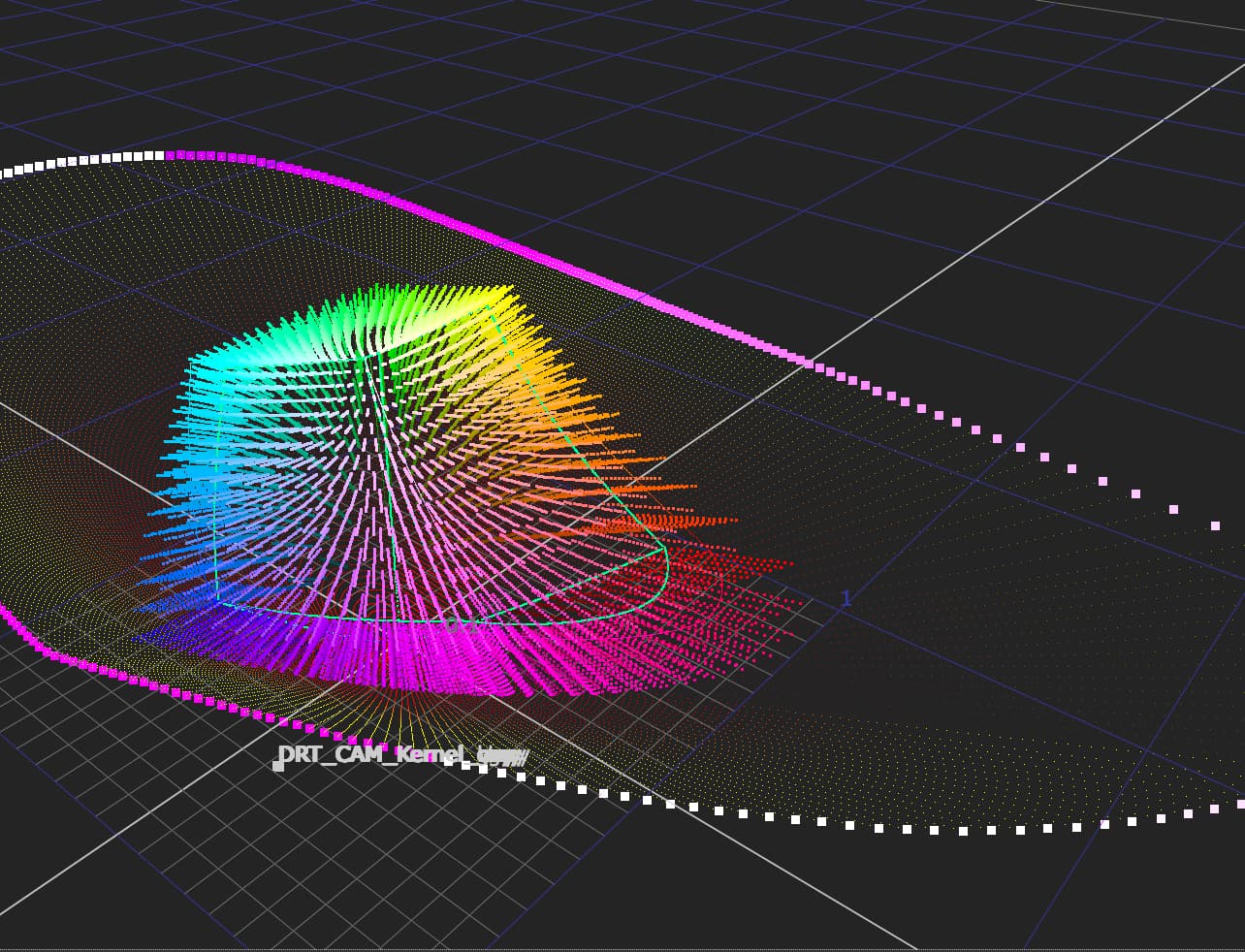
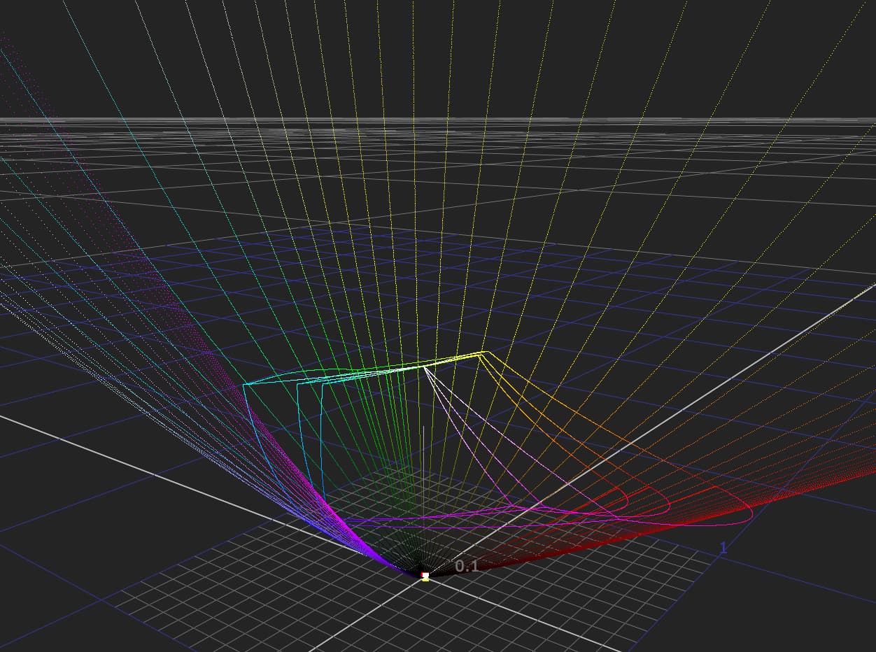
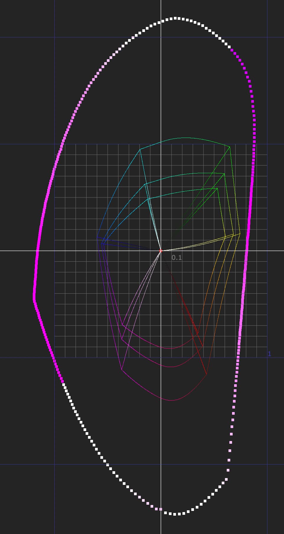
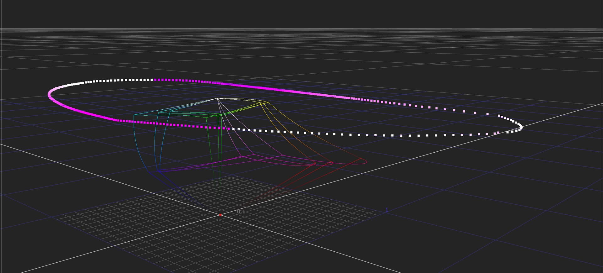
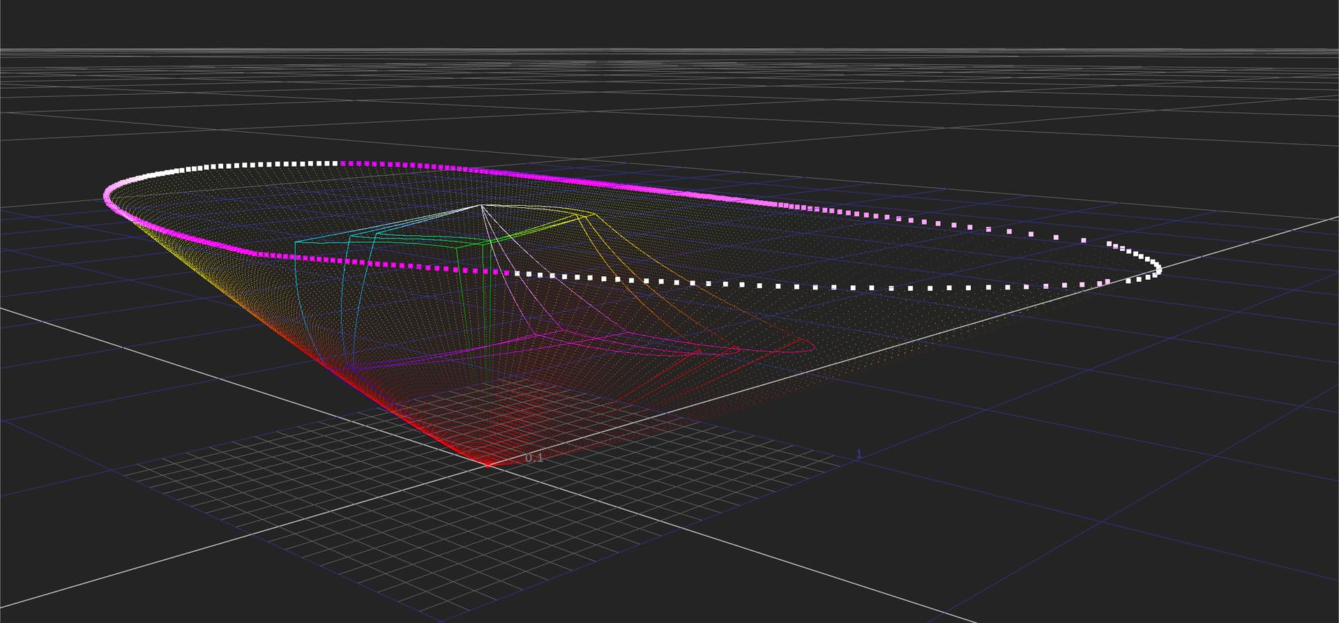
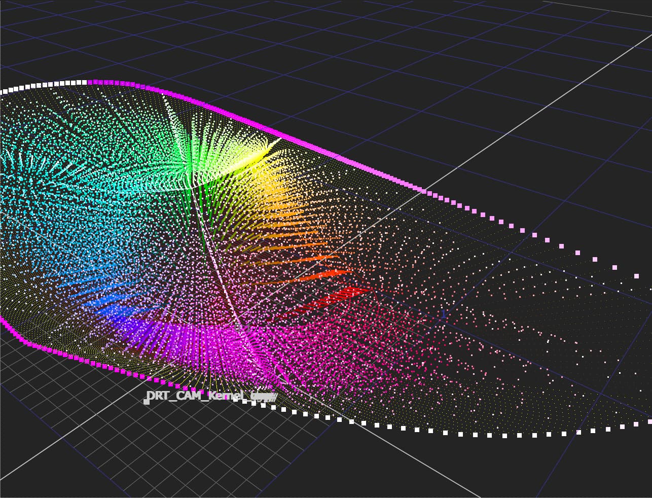
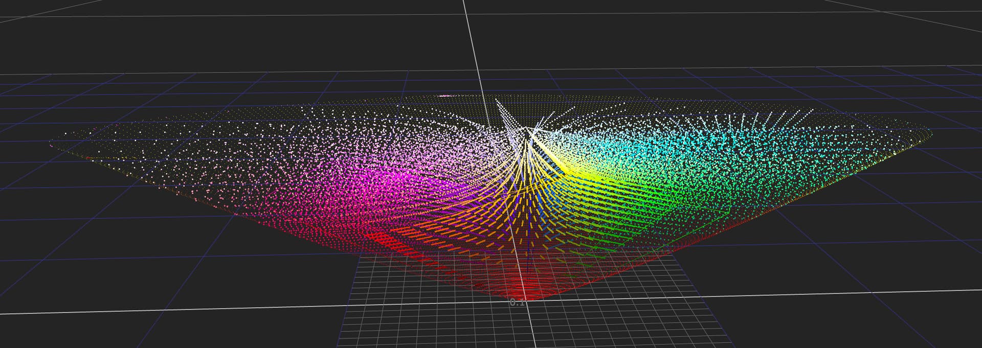
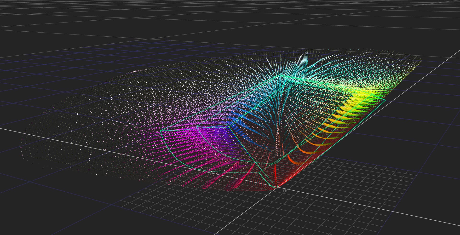
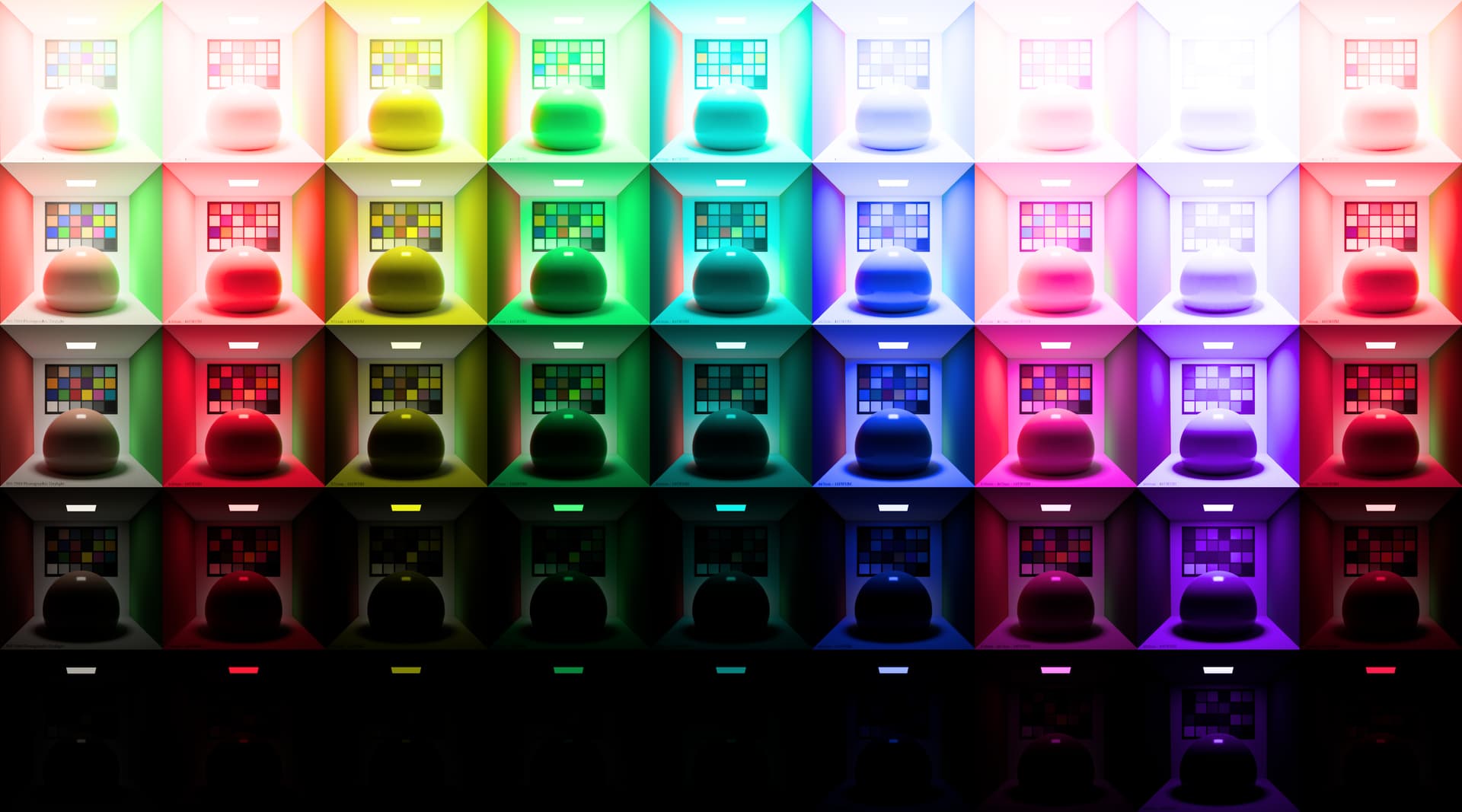
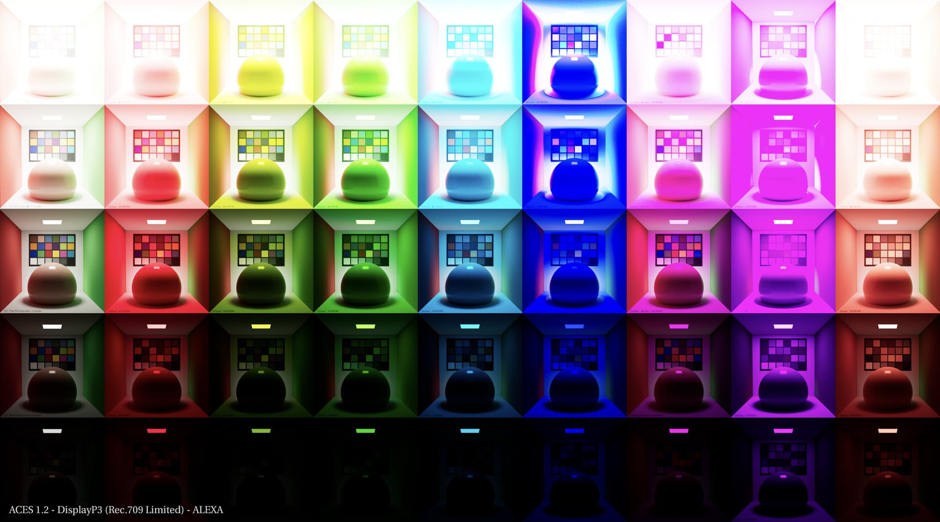
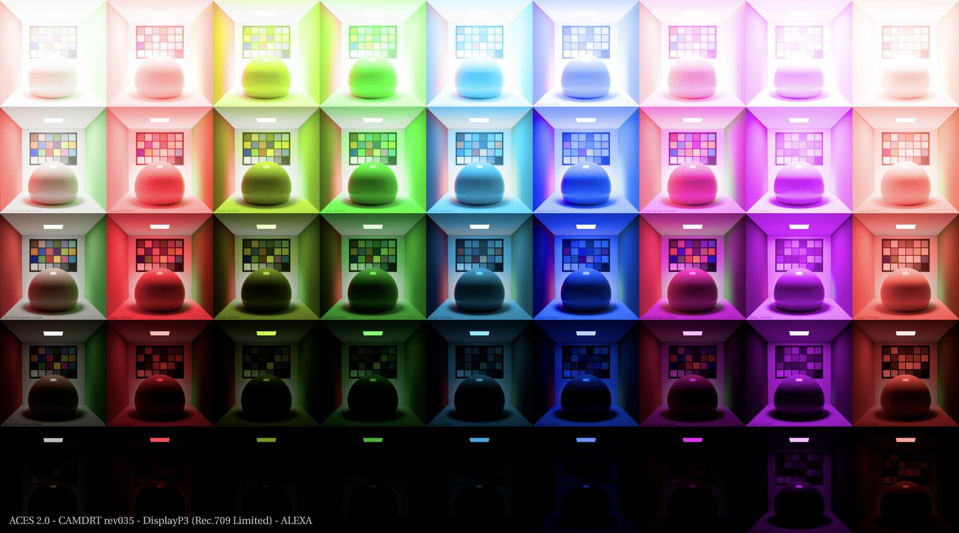
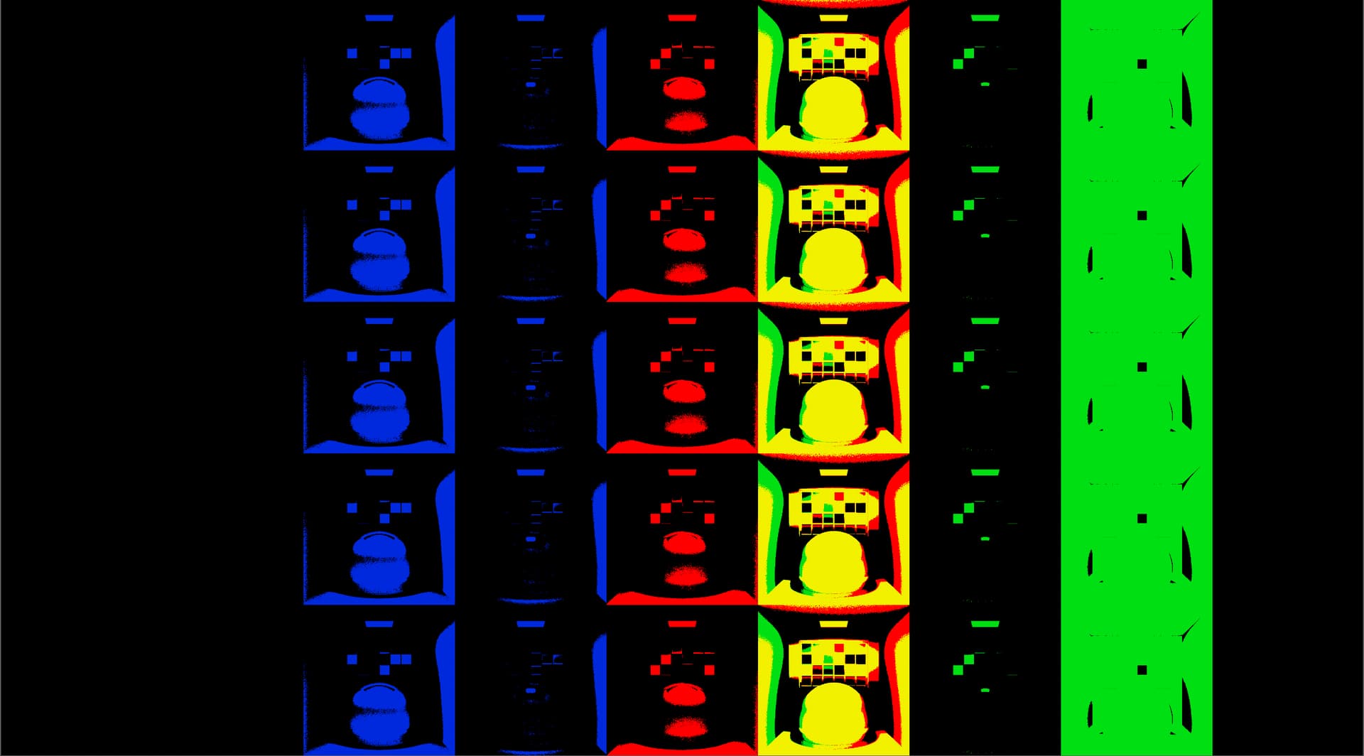
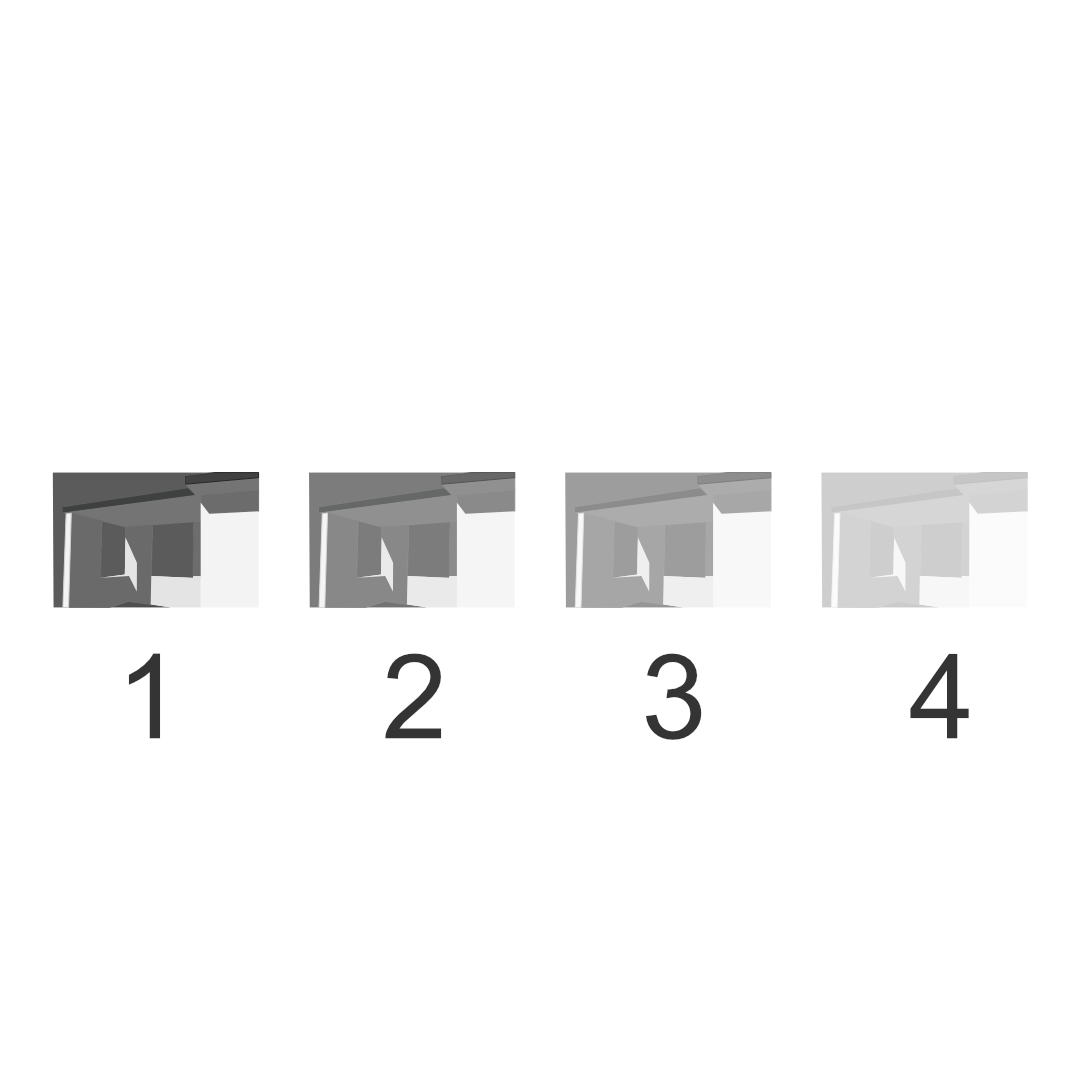
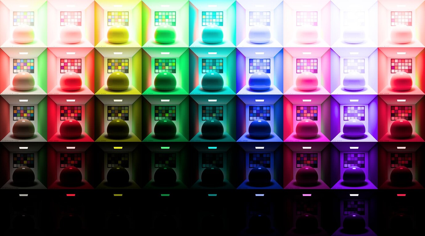
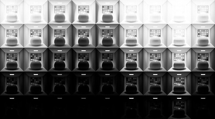
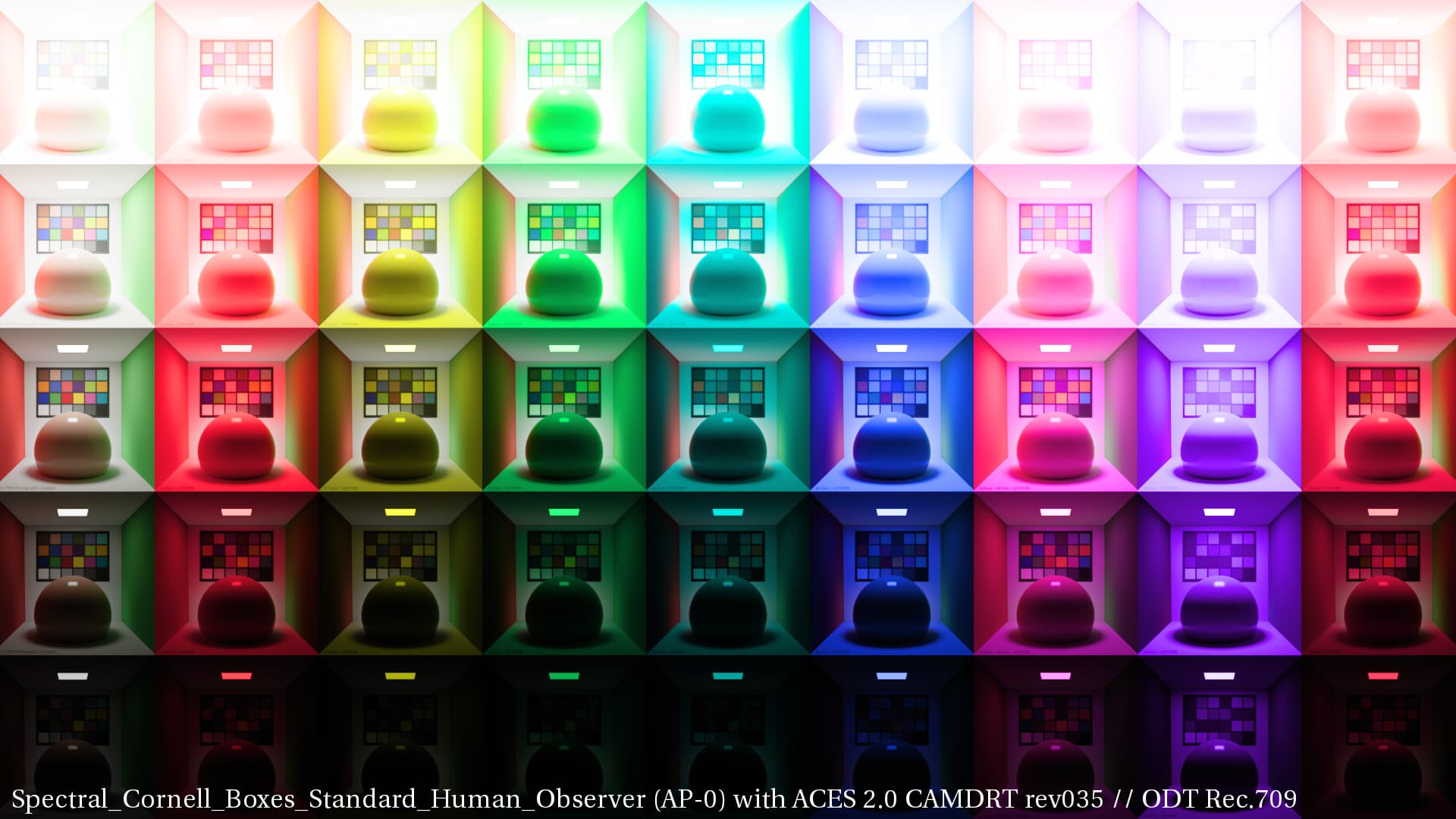
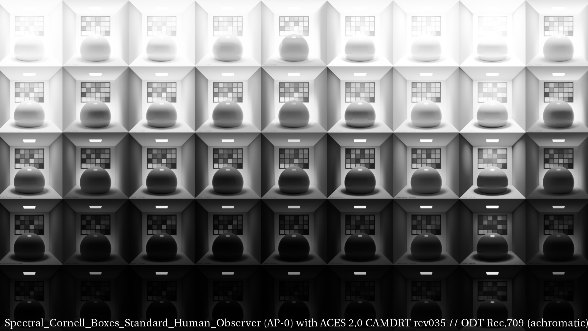
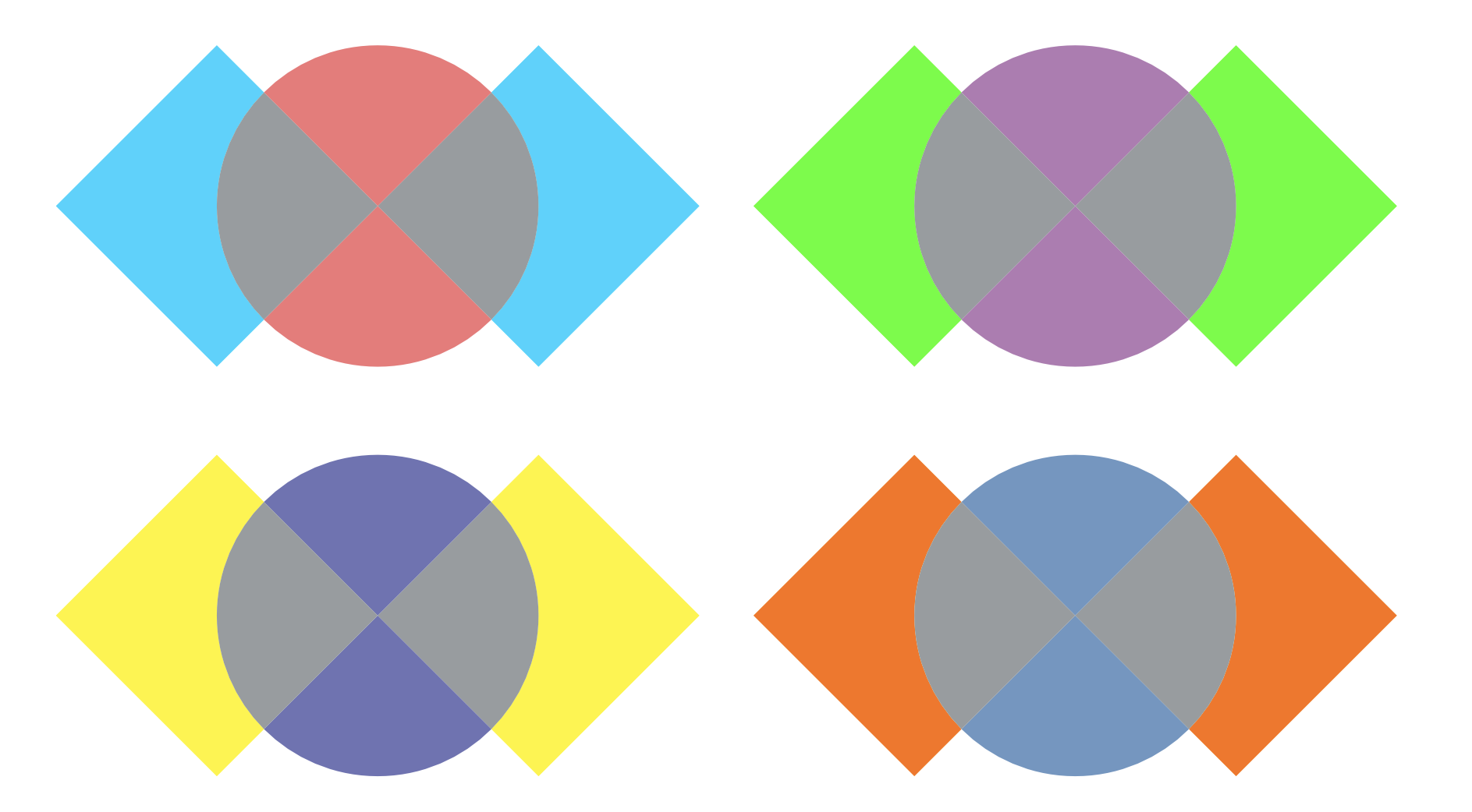
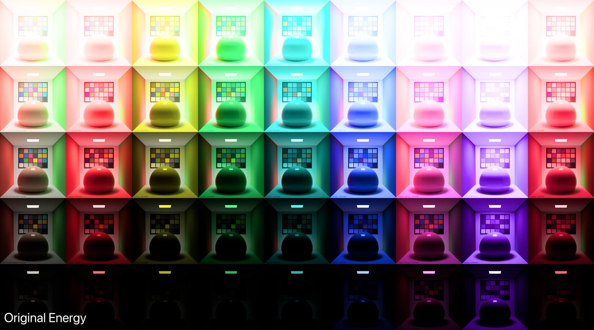
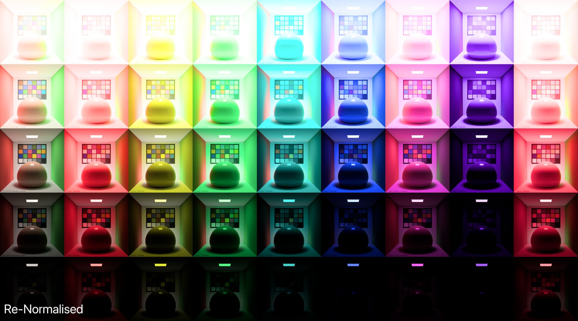
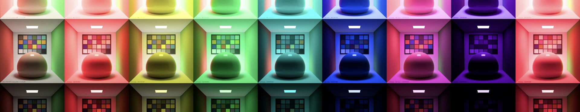
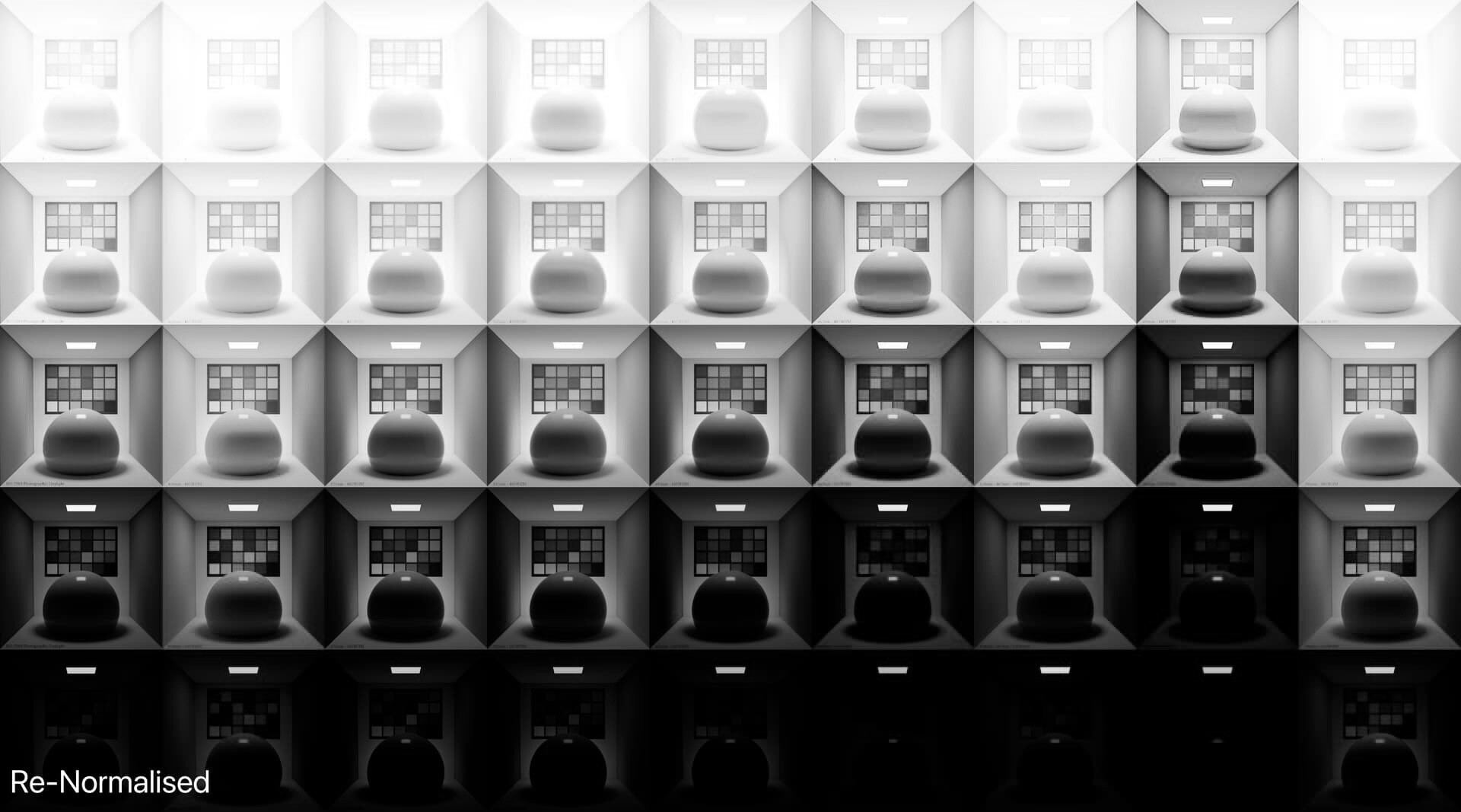
I am confident someone can design a Caplovitz-Tse1 or Anderson-Winawer2 inspired test that has layered transparency. I suspect it will reveal that as the exposure sweeps increase, the cognition of layered transparencies may fall apart. I farted around a little bit sampling from the “spectral” picture in an attempt to identify the cognitive pothole, and would suggest that the model is cross warping the “luminance” along the scale. For example, we can get a very real sense as to how sensitive our cognition is to the differentials between values. Making a swatch too pure can totally explode these relationships. The following shows partial spheres that are “null” R=G=B in each of the read “overlapped” regions. When the fields are of a certain differential, the cognition of layering and the underlying cascading cognition of chroma is different for each.

A tweak of the purities can completely blow up the picture-text.

TL;DR: Chasing higher purities by farting with the signal relationships can lead to weird picture grammar.

I don’t think it matters between the versions? I think the “model” and the picture forming mechanic is doubling up the neurophysiological signals.

That is, imagine for a moment we take BT.709 pure “blue” and evaluate along some “brightness” metric. For the sake of argument, let’s use “luminance” because it’s rather well defined. Now imagine we deduce that the luminance of the value at some emission is 0.0722 units. So we “map” this value, which would broadly be corresponding to the J mapping component. Knowing it’s low, we map it low.

The problem with this logic is that it’s a complete double up on what we are doing. The BT.709 “brightness” is only 0.0722 units when balanced for the neurophysiological energy stimulus of the stasis of the three channels of the medium. That is, it’s only 0.0722 units when we are at unit 1.0 relative to the complement, which means we ought to be mapping unit 1.0, not the “apparent brightness”. If we map the “brightness” down, we end up potentially mangling up the relationships.

In the most simple and basic terms, it is utterly illogical that, when balanced for an achromatic output, the higher luminance neurophysiological stimuli (EG: “Yellows”) are mapped to a lower luminance than the more powerful chromatic strength signals (EG: “Blues”). It is very clear that the chromatic strength, or chrominance, of a given stimulus, is inversely proportional to the relative luminance.

I’ve been trying to put my finger on why the pictures have some strange slewing happening with respect to the formed colour, and I can only suspect it is a result of this fundamentally flawed logic, and is reflected in some of the layering / transparency pictures I’ve experimented with. I’d be happy if someone were to suggest where this logic is incorrect.

It should be noted that both creative film and the more classic channel-by-channel curve approach happen to map the “energy”, and the cognitive impact related to chromatic strength of the colours is interwoven into the underlying models themselves. For example, when density layers in creative film are equal, following the Beer-Lamber-Bouguer law, the result is a “null” differential between the three dye layers in terms of cognition, aka “achromatic” in the broad field sense. This equal density equals achromatic holds along the totality of the density continuum.

Indeed, there’s no such “singular function” as per Sharpe et. al3, given that the “lightness” is determined by the spatiotemporal differential field, not discrete signal sample magnitude. It doesn’t really matter in our case as any weighting will hold the relationships uniformly.

This plausibly means that the broad luminance differential relationships are incredibly important in the formed picture. If we pooch the “order” through these sorts of oversights, we will end up with things that can cause cognitive dissonance to the reading of the picture-text.

image

1 Caplovitz, Gideon P, and Peter U Tse. “The Bar — Cross — Ellipse Illusion: Alternating Percepts of Rigid and Nonrigid Motion Based on Contour Ownership and Trackable Feature Assignment.” Perception 35, no. 7 (July 2006): 993–97. https://doi.org/10.1068/p5568.
2Anderson, Barton L., and Jonathan Winawer. “Layered Image Representations and the Computation of Surface Lightness.” Journal of Vision 8, no. 7 (July 7, 2008): 18. https://doi.org/10.1167/8.7.18.
3Sharpe, Lindsay T., Andrew Stockman, Wolfgang Jagla, and Herbert Jägle. “A Luminous Efficiency Function, VD65* (λ), for Daylight Adaptation: A Correction.” Color Research & Application 36, no. 1 (February 2011): 42–46. https://doi.org/10.1002/col.20602.

3 Likes

I’m going to side step the serious cognition issues for now (still absorbing them).

But I will point out that @Thomas_Mansencal’s spectral cornell box image has radically different levels in each box, which might be having an effect on what we’re seing here, especially when talking about the yellow column vs column 8 for instance.

This is Thomas’s original rendered through CAMDRTv040:

And this is a variation where the middle light panel in the ceiling of each column has been averaged out to a value of 100 in AP0. Higher and lower in each channel, but (r+g+b)/3 = 100.0.

Column 8 is the near UltraViolet band, and presumably needed a big boost to make it visible through the Standard Observer in Mitsuba.

1 Like

This row is dissonant?

This doesn’t make any logical sense?

Our base unit is luminance across the standard observer. The “relative luminance” is effectively the “unit of the step” across Cartesian X, Y, and Z.

If it requires more energy in Mitsuba “to be seen”, why is it the first to blow out? This feels like an oxymoron?

We should expect it to require more energy to trigger a neurophysiological differential, which in colourimetric terms would be a low quantity in XYZ.

Assuming we plop equal “energy” across each band, we should expect precisely the sort of “extremely broad ballpark” cognitive tracking outlined above?

The general result fixes 8, but the others are still whack?

Keep in mind each box also has white light illumination behind the sphere which is contributing to the overall luminance.

The side walls of the Cornell box will also absorb/reflect some wavelengths more than others so unless they are a spectrally flat grey the total illumination in the box will vary.

I also played around with “re-normalisation”, but there is not just one obvious choice, since each narrow band source appears to have a different intensity relative to the back light.

The top light is good choice, but the spectral highlight on the sphere, the middle grey patch on the color checker or even an average of the scene all work, but of course give very different results.

I don’t think this image was rigorously designed to be used as a test of luminance/color appearance or gamut mapping….

…but, if we find that it could be useful for such purposes (I think it is/can be) it might be worth making a few adjustments to the output so that we are comparing apples to apples.

Matching the backlight to the top light might be a start, but it will render each color checker essentially monochromatic (as it does in column 8).

I do think this image is great as is, as long as we don’t make too many assumptions about what we are comparing. (why is this color/column clipping before the other? for example)

A shorthand for RGB to Luminance is often cited as roughly 20% Red ,70% Green, 10% Blue.

Anywhere in the 20%-30% Red, 60%-70% Green, and 5%-10% blue range should give good approximation of luminance for most “normal” RGB encodings.

The great thing about the spectral Cornell box is we don’t even need to debate the black and white formula. In theory you could choose your favourite black & white film or sensor and render the image using the spectral sensitivity of that emulsion/device.

Here is Eastman Double-X 5222/7222

Yes, the emission sources are normalised to have the same luminous flux, it does not necessarily produce the same brightness.

Depends your definition of rigorous, one needs to choose an intensity for the light sources, you can either produce the irradiance spectrum and:

  1. Do nothing and have things all over the place.
  2. Optimise them to produce the same brightness in a model that accounts for HKE for example but then you bias toward the Standard Human Observer as a function of that model.
  3. Optimise them to have the same luminous flux.
  4. Scale manually to what appear to produce the same brightness but then the images are bound to my vision and authoring viewing conditions.

I chose to do 3, rigorously.

Thomas

As a broad ballpark for “lightness”, given that the discrete samples are not correlated to “HKE” or any of that nonsense, this is exactly the point; the entire process is doubled up. There is a mapping happening against a bogus model, that is trying to map “brightness”, and then there is the actual neurophysiological response.

It’s a double up. Hence why “yellows”, “cyans”, and, “greens” are darker than the rest. It’s an error in logic.

Looks uncanny as hell.

This is a good choice.

I should probably at least correct my comment regarding Camera response, as this is in fact the correct way to measure.

I was also referring a little to the Cornell box in general, but this multispectral version is potentially very useful, as long as it is not “misused” to demonstrate something that may not be appropriate.

My main concern is if we are using it to compare/evaluate the clipping/compression of a specific Hue vs another Hue from the DRT without considering the varied luminance.

I think the white light from behind the cube is also contributing to unexpected visual results, but again not a problem as long as it is understood and no assumptions are made regarding how it “should look”.