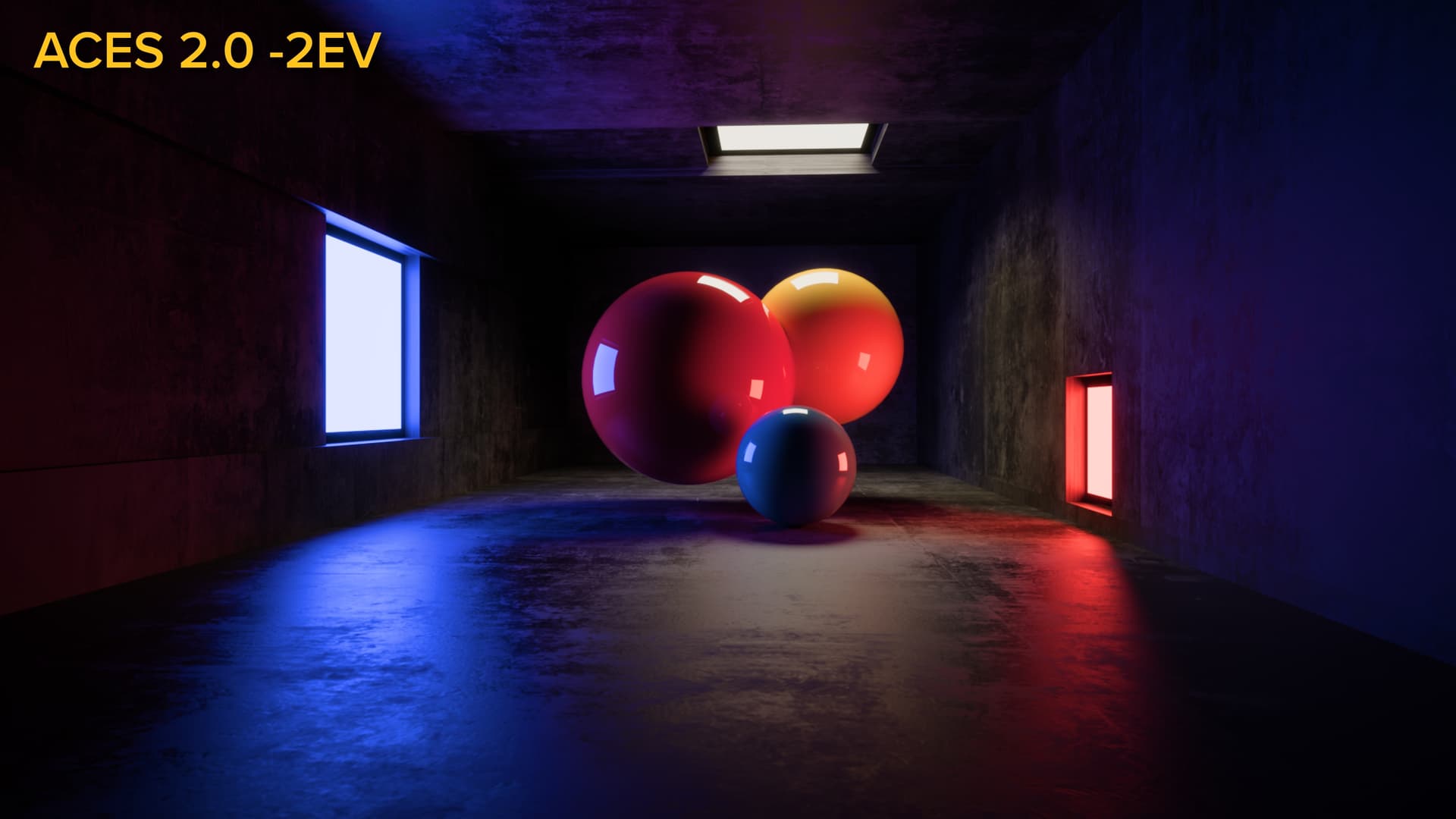
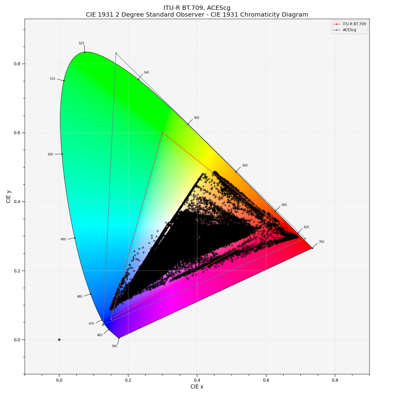
I’ve been testing ACES 2.0 quite a bit now that it’s included with Resolve 20 Public Beta. I threw an old example image at it and was a little surprised at the results.
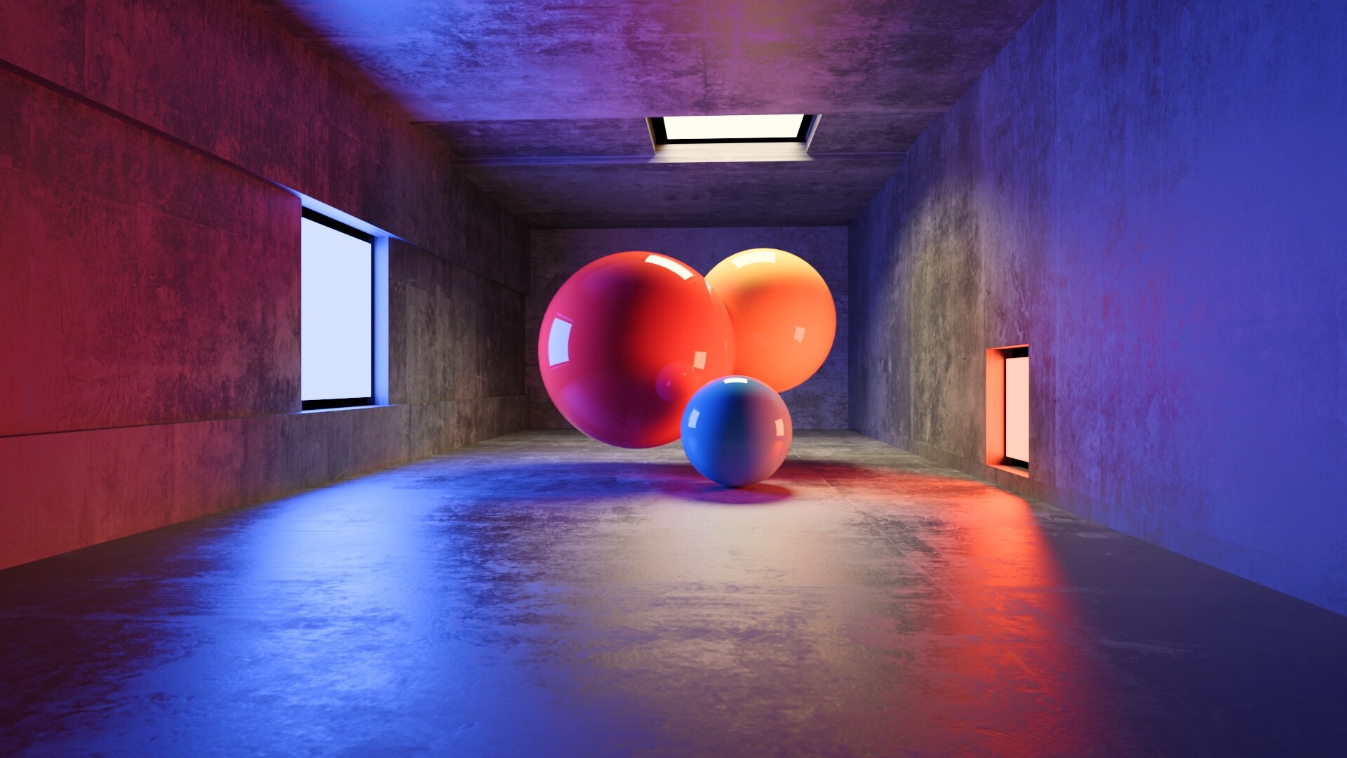
The image is an ACEScg EXR rendered in Redshift, and it’s certainly designed to be a somewhat tricky case.
Here it is transformed to Rec. 709 using ACES 1.2:
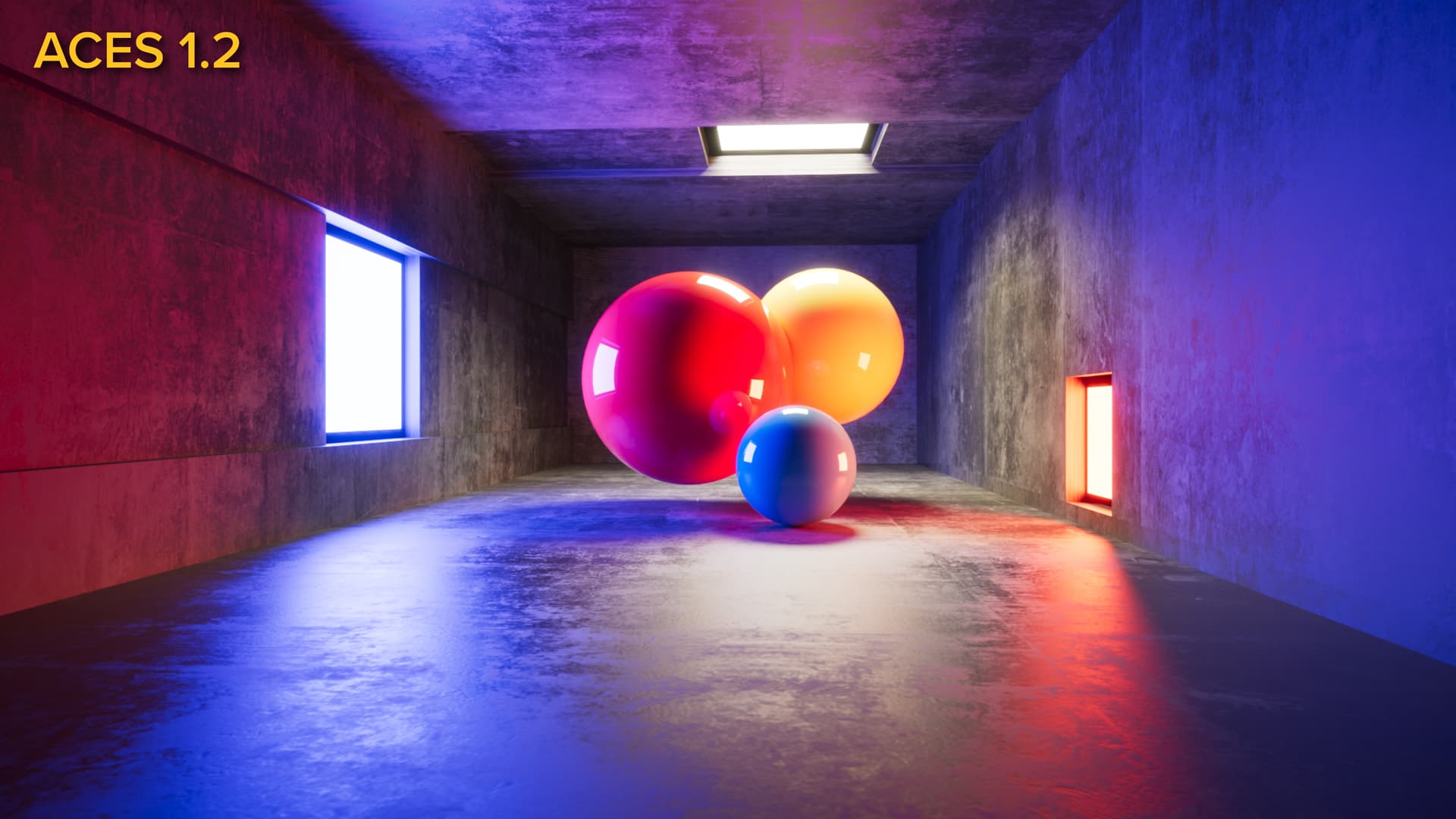
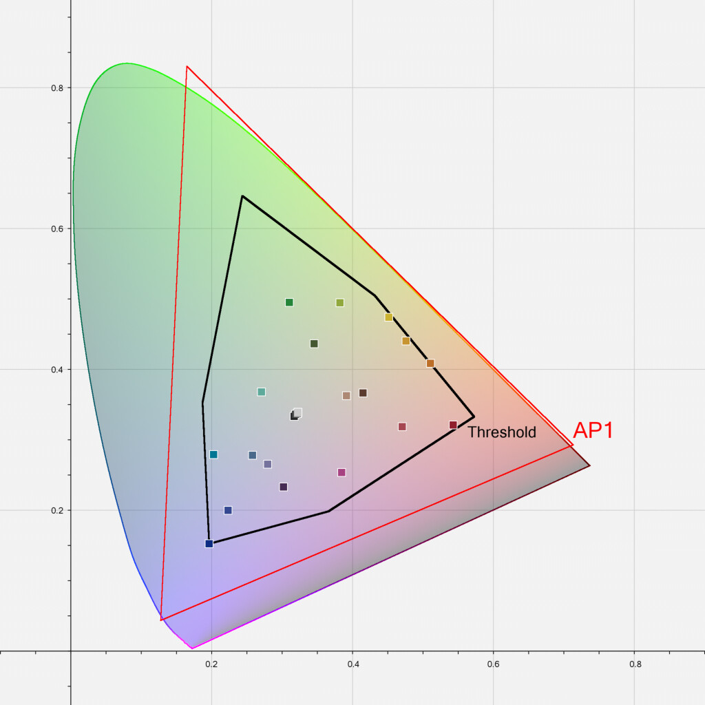
The red ball is lit with a blue light on the left. A red light on the right illuminates the blue and yellow balls. The light above is neutral. I used this image to show how rendering in ACES AP1 helps with more accurately portraying the color cross-talk in situations like this.
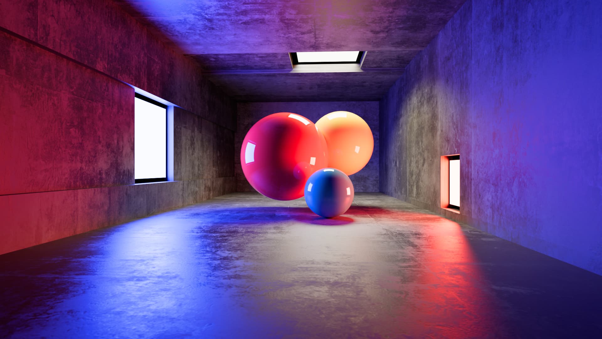
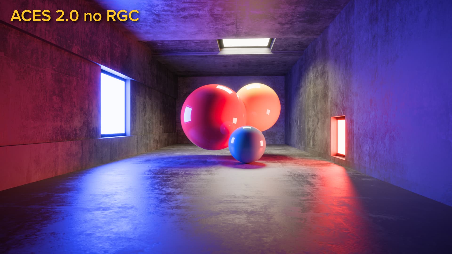
Here’s the same image in ACES 2.0, ACEScg to Rec. 709 with reference gamut compression:
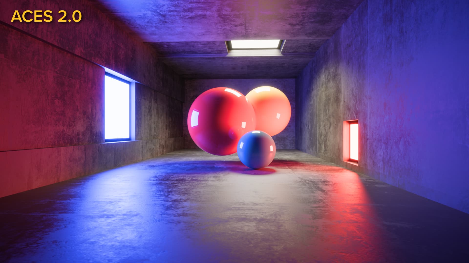
I can see things here that seem to align with the stated goals of the Output Transforms team: less hew bending in highlights, less subjective contrast, and of course substantially less posterization. But I was surprised to see the yellow ball exhibit almost no yellowness.
Just for fun, here’s the popular 2499 DRT DCTL at its default settings:
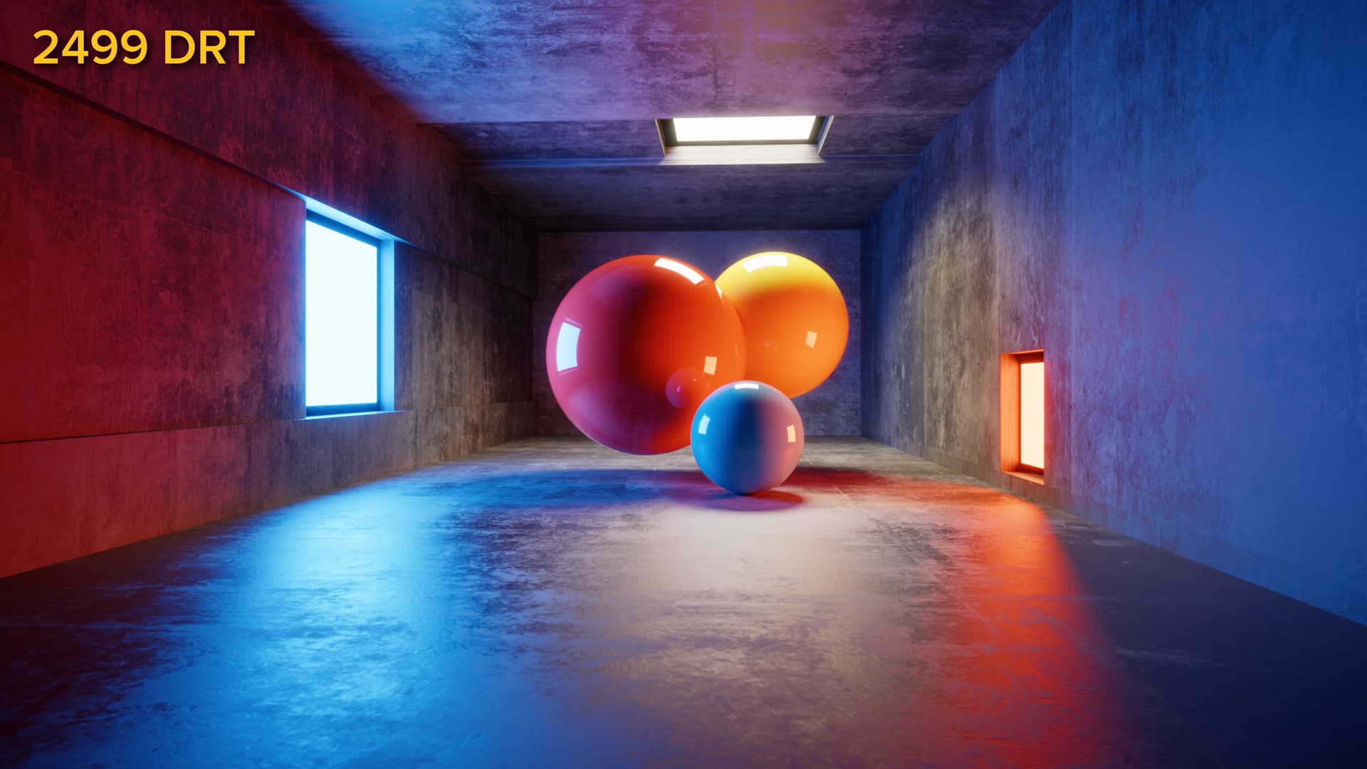
So much about this is subjectively adjusted that it’s barely a comparison — the colors are quite liberally modified in ways that align with modern look development tastes. That said, you sure can tell what color the yellow ball is supposed to be.
Here’s a Dropbox link to the EXR if anyone would like to have a go: acesDemo_05_aces_i4.0000.exr
So many asterisks here: I designed this shot under an ACES 1.x view transform, so I lit it to look good there. Maybe this is one of those cases where the “yellow” ball really isn’t yellow at all in RGB terms, I just happen to know that it’s yellow because I built it. Does the red-lit side of the ball only look yellow for the same reason that the core of the floor reflection from the red light also looks yellow? Do I happen to like it when red lights blow out through orange and yellow? Is it fair that ACES should consider that a creative look decision rather than an in-built characteristic of a dispassionate view transform?
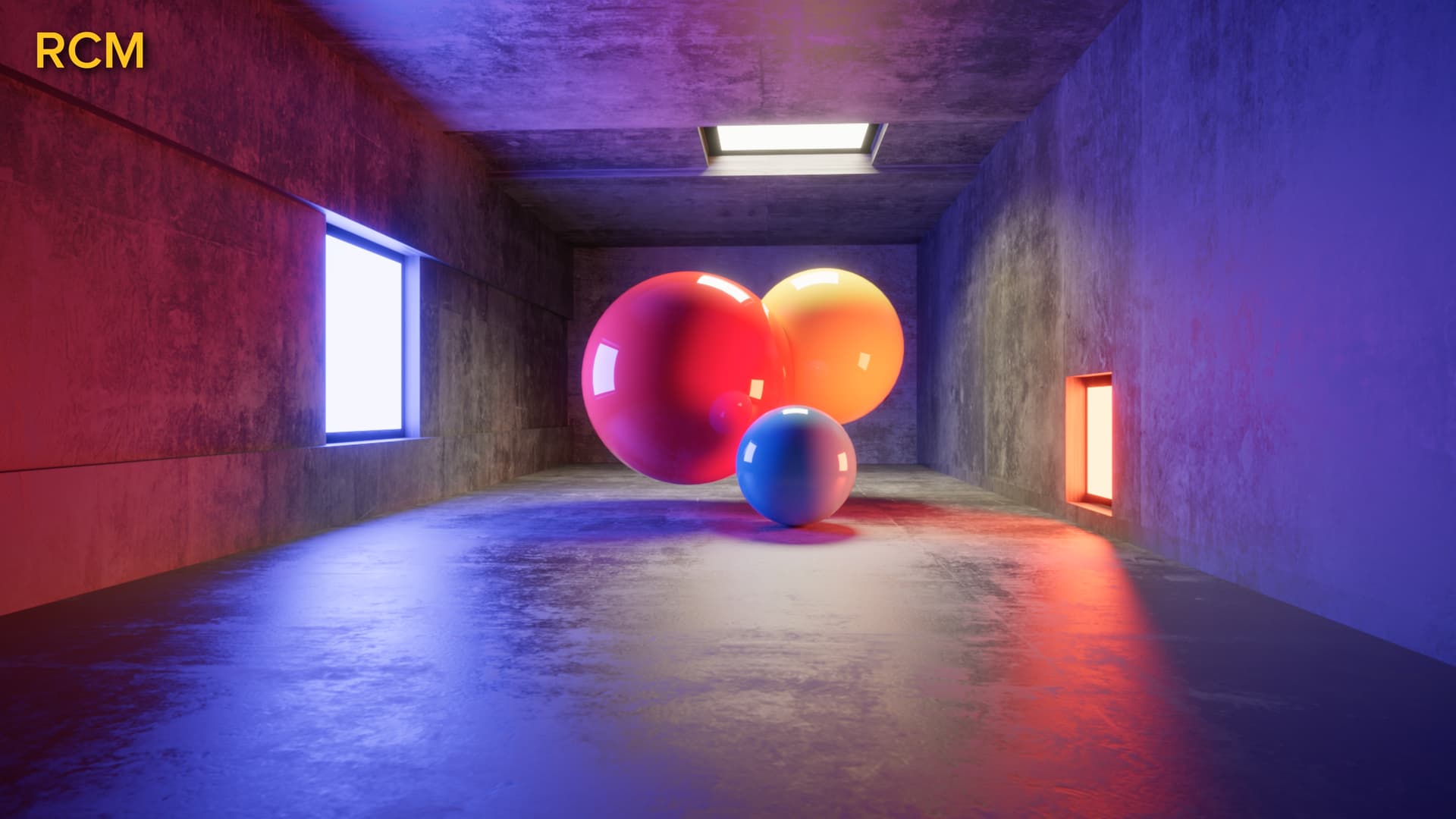
One more image for good measure: Here’s the ACEScg to Rec. 709 conversion done using Resolve’s CST node. Default settings for DaVinci Tone Mapping, default settings for Saturation Compression Gamut Mapping:
Would love any thoughts from folks on this comparison.
-Stu