Back in April 2024, for the Version 2.0 developer release 1, @sdyer wrote:
New core rendering algorithm:
New tonescale function with a lower default contrast and adaptability to produce output for any peak luminance between 100-10000 nits.
A hue-preserving rendering transform, applying luminance mapping mostly independent of color adjustments.
Gamut mapping to mostly avoid undesirable clipping but still allow for reaching the edges of the display gamut volume.
Invertibility up to at least P3 gamut
This week, upon the release of Resolve 20 beta 1 with ACES 2.0 support, I gave it a go for the project I’m working on.
First impressions immediately revealed a different feeling when operating on a well known scenario, Sony S-Log3 S-Gamut3cine to Rec709 gamma 2.4.
The most notorious difference is the tonal transformation in the high end of the scale. In 2.0, the highlights are reproduced much lower in the scale, compared to 1.3, resulting in an apparent poorer separation when displayed in Rec709.
Can you please elaborate on this difference, referring to the “new tonescale” alluded by @sdyer ?
I also found what seems to be a Resolve implementation bug. The Color page timeline does not display the thumbnails with the final grading transformation, even after manual update. They’re shown in a “linear” state, as if they were just the result of the internal ACES processing.
Looking forward to diving deep into 2.0.
Thanks!
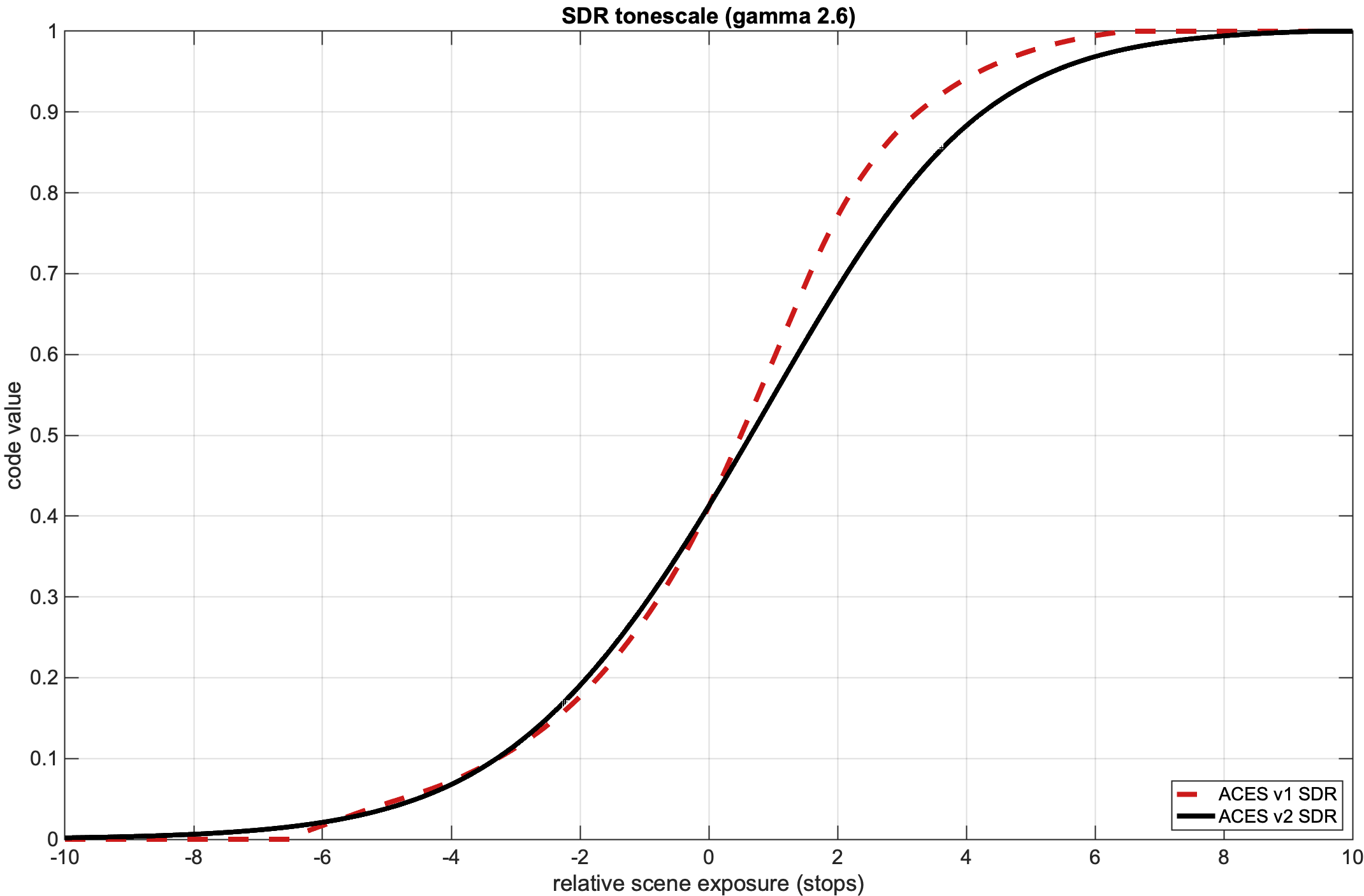
New tonescale function with a lower default contrast
The difference you seeing is by design. This design was in response to requests made by many users of v1 who wanted less contrast by default: a slightly lower mid-slope contrast and softer highlight roll-off, to preserve more detail and not need to pull highlight detail down so often. This was one of the top items of feedback collected on the v1 “listening tour”.
With these requirements in mind, the working group spent months and months just trying to settle on a neutral tone scale rendering. A number of proposals were made by participants of the group. After settling on the final settings used, the group was also able to justify where we landed by comparing to some “average” data from real productions of their final neutral tone scales, and v2 was far closer to following that data than v1 tonescale.
You can see the difference in characteristics in the graph, less contrast in the middle of the S-curve and a softer shoulder.
Thanks @sdyer for your detailed reply.
My first impressions are consistent with this new tonescale design. From now on, as I go deeper into v2.0, I’ll keep this in mind to better assess the new behaviour of ACES and progressively adapt to it.
Another aspect that becomes evident with first tests is v2.0’s chromatic shift, compared to v1.3. The famous ACES “vanilla” seems more neutral now. Skin tones, for instance, are clearly away from the typical yellowish ACES tone.
Also by design, right?
Yes, a key design goal was to minimize hue skews across the exposure range for a region of same “hue”. Yellow items, skin tones, and fire are all common pictorial things with scene chromaticities that fall in the region between the green and red corners of a display gamut. In traditional S-curve renderings that do not attempt to preserve hue, these chromaticities will typically skew toward one or the other primary as exposure increases. In many cases, this behavior was actually deemed “preferable” because it tended to keep Caucasian skin tones from looking “ruddy”. It’s akin to how rendering has worked for decades (in broad strokes at least).
However, when one expects an item to remain the same exact color and it doesn’t (such as a synthetic render of a yellow sphere), then people think the rendering is flawed. This was frequent feedback to ACES v1, although it is not the only rendering that does this (but the results are perhaps more noticeable due to our higher default contrast). ACES 2.0 attempts a different approach and adds gamut mapping to preserve the original hue of a color, sometimes at the expense of lightness and/or chroma.