Aesthetic intent - human perception vs filmic reproduction

Few more random thoughts: consideration for other use cases outside of motion pictures like video games, AR/VR, LED walls (used as backgrounds during filming), live broadcast, what else?

I would think (I could certainly be wrong) most of these would prefer something that renders closer to the human visual system instead of a more film emulation approach.

Another consideration might be which is the more flexible goal, and can/should certain aesthetics (e.g. highlight desaturation/path to white) be part of a LMT?

We can’t remove the mechanism of “human perception”. It always happens, so trying to add on “perceptual” ideas seems like a feedback loop, no?

I see what you mean, sorry for the confusion (this may have been what Scott was referencing as well).

By HVS as the goal I meant maintaining the captured scene (to the extent possible) as opposed to injecting some kind of filmic response to the data.

The whole concept of “scene-referred” data is to capture photometrically exactly what the scene was, correct? If you had a theoretical display that could reproduce all of the captured values then you would have a virtual copy of the actual scene that would look identical to actually being there (3D/spatial issues aside).

We obviously don’t have any such displays, but what I’m getting at is this: are we are trying to faithfully reproduce the scene itself, or are we trying to reproduce the scene as film would have captured (and/or displayed) it?

Sure. Explain what that means.

Let’s take a single axis of concern such as the dynamic range.

The scene has a wider dynamic range than the display, so how does one compress this aspect down? If we compress the emission down, now we’ve immediately lost the sensation of the scene, right? And what about the values that are even more intense? Just leave them stuck at the maximal value?

Remember, everything is ultimately rendered as a radiometrically linear output from some display, and values escape that range, even potentially frame to frame.

1 Like

I fully understand that you have to apply some kind of tonescale to map to the display, but how are you determining the effectiveness or success of that operation? You have to have a target to say “that looks correct” or “expected”, but what is that target?

Currently it is “this is how a film camera would reproduce the image” (or I suppose “this is how photographic reproduction has looked in the past”), but I’m questioning if that is the correct target. We’re working from a preconceived notion of how a visual representation should look based on a (flawed) chemical process; it is not wholly representative of the physical scene that it captured.

It’s a source gamut volume and a destination. I’m open to hearing what ideas are out there. Practically, we can reduce this sort of mental exercise down to a simple portion of the issue. If we map middle grey to say, 8 bit code value 121 or so, that leaves 134 code values for our use, with a bias toward the lower values in terms of distribution.

So what should we do? Ignore “correct” or other semantics. Work through what is a viable option here. Anything.

We need to go past questioning to answering. I believe most folks are open to any practical solution, so try one. Here is an even reduced complexity example…

Imagine we have a BT.709 red primary. It goes to some very high emission at the camera / render that exceeds the display range. A simple, single chromaticity, at some intensity.

Explain what to do? Any ideas?

Ignore film. Ignore semantics. Focus on the simple example. What are your ideas? This is as simple as it gets.

Respectfully I disagree to an extent. Why expend the effort on a solution to something that doesn’t need to be solved?

It’s entirely possible we are on the right track already and that a look that matches with current visual expectations is what everyone wants, in which case end of discussion. I am merely asking a “bigger picture” question so we know why we have certain expectations and goals.

With a single chromaticity and no relationships to maintain, presumably it would just map to display max (255,0,0).

Now of course what happens when you add different chromaticities at different luminance ranges both within and beyond the display range? If you are attempting to keep scene “intent”, then in my mind it should be chromaticity-preserving with compression of the luminance only. Because scene luminance is potentially unlimited (especially if computer generated), you would have to specify an upper threshold/clamp to keep a realistic ratio of the values under the clamp, which also gives you a ceiling to map all values equally. Looking at the “red christmas” example from Chris’s post it appears this is more or less what the current ACES transform is doing: it is trying to respect the chromaticity of the scene-referred data. However, it is clamping too quickly and just clipping a lot of potentially useful data.

The “naive drt” and other transforms like IPP2 instead of being chromaticity-preserving follow a “path to white” where high luminance colors instead “burn out” to white to mimic what happens with film. It’s generally a pleasing look and what we are all used to seeing in film, but it’s also not realistic.

There are plenty of cases where aesthetically pleasing can trump “technically correct”; I’m just trying to have the conversation.

Here’s a quick sample from a commercially available CMS that is closer to what I’m talking about:


There’s still some color clipping happening, but it is obviously an improvement over the ACES render while keeping what I would consider the “scene intent”. This went from R3D to Red Wide Gamut (RWG)/Log3G10 to 709.

First of all, thank you for having this conversation. ACEScentral is exactly meant for this kind of exchange, as a sharing community.

This is exactly what we are trying to do here, going from scene to display in the most faithful way. If a colour cannot be displayed (because of limitations), let’s try to pick the closest one.

We are trying to reproduce faithfully a scene by taking in account the display limitations. The effectiveness of this method will mostly rely on the quality of the gamut compression. Lars Borg explained that during meeting#5 if I recall correcly.
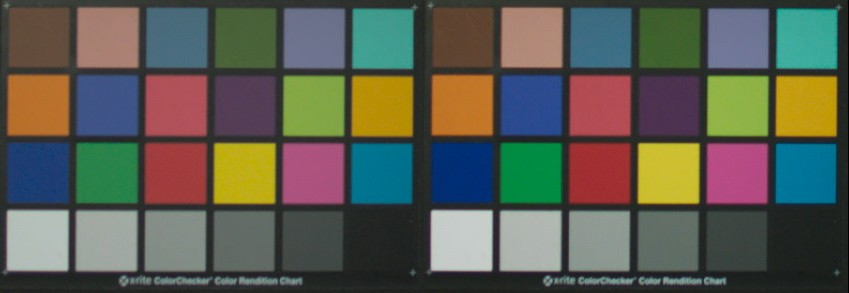
What is tonescale ? :wink: Let’s have a look at two mac beth charts. Which one looks closer to the actual data scene ?

Is this really what we are doing here ? There was a beautiful reaction by Alex Fry about Jed’s experiment :

I am not sure that Jed’s experiment can be qualified at reproducing a flawed chemical process but rather acknowledging that we are dealing with gamut volumes. The core question in my opinion.

I am pretty sure that everyone would agree that “something” needs to be solved. It is the core reason of this group.

If I may, there are so many expressions in your answer that it is hard to follow :

  • what is chromaticity-preserving ?
  • what is filmic ?
  • what is realistic ?
  • what is tonescale ?
  1. How could an output transform deal only with compression of the luminance ? We need to go to from one volume to another volume, right ?

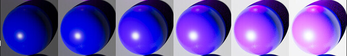
  2. How could the current ACES Output Transform be chromaticity-preserving if an overexposed blue goes purple ?

image

Animated gif from Nick :
hue_skew_bl

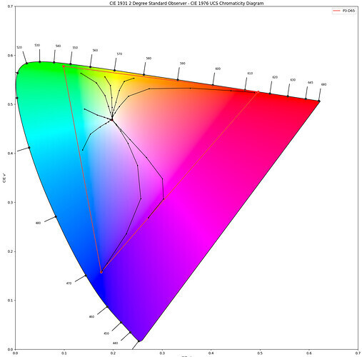
Per-channel lookup is not chromaticity-preserving. Or hue-preserving ? At this point I am not sure which is which. :wink: We have done some plots of the ACES Output Transform :

image

I don’t know what realistic is but I do know that displays have limitations and that we cannot display 120% of red emission… I don’t think we are trying to mimic anything yet but rather take in account gamut volumes. And this issue is so complex (for me at least) that we need to break down into simple questions, just like Troy did :

I am more than happy to follow this conversation and provide examples if needed. Thanks Garrett !

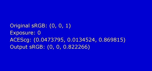
PS : About the example you provided, it is great to show images. It makes the conversation much easier. But I am not sure what your point is by decreasing the exposure of 2 stops ? Do not hesitate to put as much explanation as you can when you provide an image so it is obvious to others when comparing.

Update : You see in your example the bulbs have reached the peak display white (they are not red hard clipped) with their faces being red. Hence the question :

Regards,
Chris

I’m sorry that I can’t seem to be able to communicate clearly the question(s) I’m putting forth. I also don’t necessarily have the answer of how to accomplish a goal once we choose it (that’s kind of what the group is for), right now I’m just trying to ask the question of where we are heading and make sure we’re all on the same page.

THIS is what I’m trying to get at. I would strongly argue that having a high luminance saturated color follow a path to white is not faithful to the scene. It never does that in nature, that is strictly a result of the film (chemical) process.

I don’t know how to describe it any other way: are we attempting to be as faithful to the scene as possible, or are we attempting to be follow how a film capture of the scene might look?

Gamut and dynamic range issues aside for the moment (we’ll get there), which one are we trying to do?

Except there are literally no options. Working through the basics reveals this. The value must be dealt with.

There is no “nature”, just light.

  1. If a clip is applied, we are right back where the core problem is right now; broken rendering out of the display.
  2. If we have scaled the value down to 100% maximum display, what happens when the value goes up higher in the next frame such as with fire?
  3. If we scale, what happens where a brighter version enters the frame?

This implies a solution exists or one does not see the problem.

The underexposed sample:

  1. Is not remotely akin to what someone would see “perceptually”.
  2. This image is underexposed with respect the image taker’s intention of the given exposure.
  3. The bulbs are not red. What happened here? Why?
  4. The expression at the display is not remotely akin to what the “scene” intent is; it has lost the entire ratio range of tonality of what would have been in the radiometric-like domain.

Again, the display is limited. If we had an unlimited display that could output discrete spectral emissions, and we had a camera capture in that form, and we had an unlimited camera capture range, we could then output whatever this “realistic” is.

But we don’t.

That means that we are forced to take the convention of the camera capture and render that convention under the convention of a limited display or print.

Again, and I can’t stress this enough, all we can do is emit light from a display or reflect light off of a printed page.

1 Like

I can only speak from my (perhaps somewhat limited) understanding, so corrections happily accepted:
-Chromaticity-preserving (I think this was talked about some in meeting #6) means for example on a CIE xy plot, regardless of the luminance of a color it occupies the same point in the chart. In 8-bit values for example 1,0,0 and 255,0,0 would occupy the same spot (fully saturated red). One is higher luminance, but they are the same color (think also of 0,0,0 (black) and 255,255,255 (white) which occupy the same point). 255, 128,128 I believe could be considered “hue preserving” as it moves red towards the achromatic axis (grey/white) without influencing it towards green or blue, but it no longer occupies the same spot on the chart (because it is no longer fully red).
-“Filmic” in the context of this conversation I am mainly referring to the “path to white” and how colors “blow out”
-“Realistic” meaning what happens in nature, in the natural world. Not in a photo-chemical process, or inside a computer, or how a given display technology works, but what is physically occurring.
-Tonescale I guess I think of more specifically as “luminance scale”, how you are compressing scene-referred dynamic range down into a display’s dynamic range.

It depends on what the display’s gamut is, but yes, practically speaking some kind of gamut compression will need to happen to get to the display color space.

It can’t. The overall transform will never be truly chromaticity-preserving because the source gamut is larger than the display gamut. I don’t know if there is such a thing as “relative chromaticity”, but theoretically something that is fully saturated blue in say P3 space, when converted to 709 will still be fully saturated blue, and likewise something that was “half saturated” (128,128,255) in one space would be that way in another. There are undoubtedly many reasons why a simple transform like that wouldn’t hold up visually, but that would be the basic idea. I think many of us are on board with it being hue-preserving, though; that blue shouldn’t become purple.

That was not entirely intentional. The image was created with a 3D LUT and when creating the LUT I had to specify an exposure range based on peak luminance percentage. The first once I created (using the max value) was incredibly dark. The sample image I posted was a second attempt using a value of 800% peak luminance, which was jumped into my mind about some HDR transforms, but may not have been correct. It produced a reasonable looking image and at least got the point across of what I was trying to convey, so I uploaded it without doing much comparison to other renders.

Difference being the bulbs are white in the raw camera exposure; there is no color information to begin with (the camera never saw them as red so it will never clip to red). The faces are red in the camera exposure. Now we’re dealing with the limits of a camera’s (and/or recording medium) dynamic range. An “idealized” camera would have recorded the light bulbs as high luminance red also, but in this case it was beyond the capabilities of the camera so that information is lost before it ever gets to us.

In all honesty maybe I’m just late to the party. If people have already been down this road and everyone is comfortable saying there is no other option, then we proceed with high luminance colors following a path to white. As long as we can all agree on that, that’s fine, I just want to be sure everyone’s on the same page and we know why we chose that route (and maybe that’s because it was the only feasible option).

  1. Personally I disagree. I think it looks reasonable for what I might see outside at night being lit only by (presumably) colored light bulbs.
  2. Probably true, which is a problem. However, unless one of us was the image taker, we can’t know for certain.
  3. Answered above (after you posted), but the information was never there to begin with. This was a limitation of the recording device/medium.
  4. Luminance ratios appear to be incorrect yes, but chromatically the ratios should be close?

I will also caveat this with saying that image was not intended to be a fully formed reference, but was a quick sample to show an alternative approach to the “path to white” of the naive drt.

Not at all. Think about the levels and what ends up at the display. Completely different. And how do we reconcile the camera capture?

If there were a “brighter” red available at the display, how can we generate it? Should we make it greener? Or bluer?

Given we can’t scale values down per image, not only from the unacceptable underexposed demo but also the oscillating problem, what is another option?

That is, if we went from maximum 100% to 101%, what should the red look like at the display?

Thanks for the reply Garrett. I think this kind of conversation is exactly what this group needs. Thanks for being here and answering my silly questions.

I can relate to your question because the first question I ask every year to my students is : is your short film going to be lit like a camera or an eye ? We do full CG short films and I like to have this clear distinction when talking about lighting with them.

There is a great pdf by Dave Walvoord (from Dreamworks Animation) who speaks about camera vs eye for full cg lighting and working with Roger Deaking. And also the website Cambridge in colour has this article about Camera vs The Human Eye. I really like the image with the sea in the article and the concept of mental image.

Anyway I digress completely here. But this is such an interesting topic. :wink:

I think our fundamental difference is that :

  • I see the path to white as a way to deal with display limitations.
  • You see the path to white as a filmic response.

Would that be a fair summary ?

Thanks for the definitions. I think it helps to make this thread a bit clearer. I also think we agree that the current ACES Output Transforms are not hue-preserving and making the new ones be would be an improvement.

No worries for the underexposed image but it kind of caught me off guard. I wondered what was the point you were trying to make. The actual person who took the red xmas lights is present on acescentral. @martin.smekal We could eventually ask him to look at his image through the ACES Output Transform and through the naive" DRT to see which one would respect better the scene intent.

Indeed, the bulbs are clipped to white which is quite disappointing and makes me love my full CG renders even more. :wink: I always tell my students : an overexposed sky is actually blue if you decrease the stops. And by doing this, the lens effects (such as glow) will react much better and get the proper colour. There was a shot on a short film we did where the overexposed sky was just an overexposed grey. The glow was “neutral” and looked weird/wrong.

I have made these two renders just to show the difference between ACES and the naive DRT :

What would you expect to see here ? To be “stuck” on full colour emission rather than going to white ? I don’t think I am able to express it better than Troy honestly :

[…] we are forced to take the convention of the camera capture and render that convention under the convention of a limited display or print.

Finally I guess you have watched Jed’s videos where he shows how the values collapse on the display limit and how he scales the gamut to avoid it. It literally blew my mind since it is so easy to see and comprehend (in Nuke’s viewer).

That’s my tuppence,
Chris

PS : We had a one hour meeting at the studio looking at the images and examples Jed provided. We are 100% on board with the hue-preserving DRT. Can’t wait to see it complete ! And that’s the official answer from the studio. :wink:

No, everything is still up for debate, and all options are open. This is people exploring ideas. The Naive DRT is getting some much deserved attention because Jed & Co have put mouse to node graph and put together a real working prototype, but there is absolutely not a consensus around it at this stage.

I’d encourage anyone who has other ideas to please play around with them, and if possible, create working examples. It’s much easier to talk about this stuff when you can point at a picture.

3 Likes

Thank you for starting some discussion on this topic! I think this is great. For me the best part about the ACES Virtual Working Group style of development is the open nature of it. Having development and discussion out in the open and public for anyone to participate and engage with is fantastic. I’ve learned so much over the last year being a part of this community it’s crazy.

Could not agree more. I’m actually surprised and a little saddened that the aptly named Naive Display Transform is the only prototype implementation that’s been contributed to the group so far. I know Christophe thinks it’s 1/3rd done, personally I think it’s <1/4 of the way to something that might even be considered for image making. As I’ve said a few times in my posts it is just an experiment to better understand the problems at hand when using a chromaticity-preserving display rendering approach. Given all of the knowledge in this group, I know we can find better solutions to the problems we are facing.

In other threads I am advocating for a chromaticity preserving approach, but I do not think it is the only valid approach. I think the reality in 2021 is that viewers are more used to seeing the look of per-channel rgb tonemapping than film.

I believe, based on the admittedly basic and naive examinations I’ve done, that most digital cinema display rendering transforms use a per-channel rgb approach, perhaps with some additional gamut mapping. Red IPP2, Arri Classic, Sony Venice. The differences between them seem to be the “rendering gamut”, and proprietary gamut mapping. It’s actually pretty interesting to look at the results of the Sony SGamut3CineSLog3_To_LC-709.cube lut on the gamut mapping virtual working group images. It handles all of these images really well without many hideous hue shifts and clipping. I’ll throw up some pictures here, since this particular display transform hasn’t really been included in the test images we’ve seen here before.


It’s all speculation of course, but I believe part of this is due to the wider rendering gamut of SGamut3.cine, and part of it is gamut mapping.


There’s a screenshot of SGamut3.Cine

I think it would be a useful (and very easy) experiment to put together a per-channel-rgb prototype as well, maybe using a wider rendering gamut like Filmlight E-Gamut, SGamut3.Cine, or DaVinci Wide Gamut. I think having this as a point of comparison would be useful.

I also think that the real challenge in this project and where the real complexity lies is in gamut mapping. At least for me, this is the next big topic I want to learn more about (yes, even after spending a lot of time on this already in 2020!).

3 Likes

Thank you for pointing that out and helping make the distinction clear. While they may yield the same result, they have different intentions and it’s important to separate them; I know I’ve been guilty of lumping them together in some of these conversations.

Assuming the source colors were intended to stay fully saturated, just at increased luminance, hypothetically the right side would land at the display max, and everything in-between would get remapped between that and the darkest chip. This strategy of course falls apart if the brightest chip is 1,000% of the dark one and you can’t represent the ratios appropriately.

Just talking out loud here (or typing out loud?): I’m trying to wrap my head a bit around if or why color luminance should be treated differently than achromatic luminance (greyscale; what we typically define as dynamic range: black to white). We have strategies for how to map luminance to both standard and high dynamic range displays: there is some form of gamma curve and eventually the values get clipped at a pre-determined level. When dealing with black and white, we knowingly accept that some values (especially high luminance) will get clipped. With color, however, I guess the issue is that any clipping usually looks bad? Looking at the ACES render of the blue pub/bar, the entire staircase area turns into just a blue blob. I really don’t think anyone will say it looks good OR that it looks like the original scene. But then I wonder if it could have been graded out/back to maintain the detail. I don’t know.

Another thing I had rattling around in my head today is if part of our perception of white being brighter than a color has to do with current display technologies (and even print). With most current displays it’s an additive mix of red, green, and blue. So yellow (a mix of red and green) will be brighter than either of the single colors because you basically have two lights on instead of one. White is the combination of all three, so it is the brightest. However, there is some newer technology like WOLED that has a discreet white light source. In that case white is not a mixture of colors, so feasibly fully saturated red could have the same luminance as white. Would we still choose a path to white if it is no brighter than a color?

You need to have a defined maximum value at the input, with everything above that clipping. From that defined maximum you map it to the display, just like greyscale. The problem with this approach of course is these clipped values. Frankly, I don’t know what to do with them, other than to grade them back “into range” before you ever hit the transform. Is it feasible? Does it look good? I have no idea at this stage.

I’ll argue with myself here for a moment. What if we had a magic camera that could actually capture these incredibly luminant (spell check tells me that’s not a real word, ha), but very saturated light bulbs? How would we ever hope to display that correctly? Right now we couldn’t. In the case of (relative) chromaticity-preserving, do they just become red circles? What about the rest of the red in the image? Does it stay brilliant/saturated like it is, or should it be lowered to help preserve the ratio of how bright these bulbs are? Do they take a path to white? These are also questions I don’t have answers to.

Likewise! Makes me wish I had Nuke AND knew how to use it.

I would highly recommend that you watch this awesome talk by @daniele which goes into the spectral characteristics of reflective surface colors, and explains the physics of why a surface color with more color purity appears darker.

All of the nuke setups I’ve posted work fine in the free Nuke Non-Commercial. Knowing how to use it is another challenge! :slight_smile: I will say you don’t need to know the full software to be able to compare images and play around with view transforms though.

2 Likes

Thanks Jed for the explanations ! 100% agreed on gamut mapping and its importance.

Interesting to observe that the term “gamut compression/mapping” is nowhere to be found on the paper dropbox from the Output Transform VWG. Is this intentional ? :stuck_out_tongue:

I double-checked in the aces_rae pdf from 2017 and the term is indeed present (in the D. Artifacts paragraph) :

Gamut compression or mapping based on IPT or ICtCp color spaces would be a fruitful research axes to overcome these issues.

On the other hand, the term “gamut mapping” is mentioned in the Background Information Dropbox paper :

This is a simple, fast gamut mapping algorithm. It maps RGB values onto the 0 to 1 cube using line/plane intersection math which has been optimized to take advantage of the fact that the planes are the [0,1] cube faces. Out-of-gamut points are mapped towards a value on the neutral axis. If the RGB values are linear tristimulus values for arbitrary RGB primaries then the algorithm preserves dominant wavelength on a chromaticity diagram. It also preserves hue in the HSV sense. Light out-of-gamut colors are darkened as they approach the gamut, while dark colors are lightened (i.e. some lightness is traded off to preserve chroma). There are certainly many more sophisticated algorithms for gamut mapping, but this is simple, fast, robust, and useful as a point of comparison.

Maybe it would be nice to see how this algorithm handle our dataset ?

Garrett, at this point, I don’t have anything to add further to the debate. So I’ll just watch Daniele’s video and try to learn something. :wink: Thanks for your answers and patience !

Update : sorry, this is too interesting ! Minute 16:25 of the video :

Film produces the colours very much in a similar way than nature does it.

Boom, my mind just exploded ! :wink: I’ll keep watching !

Regards,
Chris