Hi Derek,
thanks for downloading the images and use them for further tests.
Before your post you asked me this:
“Am I understanding correctly that the issue you are observing (Red spheres appearing less bright than white ground) is with the renders not with the RED footage? If that is correct are you able to reproduce the same with a camera?”
I was thinking about for some days how to answer to that question.
In my post I used a very simple and graphical 3D generated example that shows an issue:
Although I raise the exposure of the overall image, the red spheres are appearing darker than the surrounding at some point. And this feels odd.
At first I did not like this simple rendering, that’s why I created the other rendering with the red bulbs. This result looks more similar to the image of the Red XMas footage. But the image has also more detail that is distracting the viewer (and myself of course) from the issue. It is less obvious.
Next, you suggested to avoid some very pure and intense values in 3D animation to avoid the image results that you are seeing in the red spheres example. It’s true, I think such intense pure primary colors you could only achieve with a laser.
The red spheres example I set up in such a simple way so that I don’t get distracted. If you just take the Red XMas footage and examine it, there is so much going on in the image and the process, how it was captured and now displayed, that you might miss what is going on. I certainly did.
I needed this simplified example to realize that there is maybe something else going on that I was not aware of.
Still thinking about how to answer your question:
Friday morning on the way to work I crossed a street and saw a gas station with red colored LED lights for the gasoline prices. I pulled out my iPhone and made some photos with a manual exposure override in the default photos app. In know, there is a lot of processing happening in the images from an iPhone but I still gave it a try. I made four photos, simply by raising the exposure slider in the app. Later I aligned the photos in Affinity Photo so that they are more easy to compare.
Inspect the red lights of the gas prices:
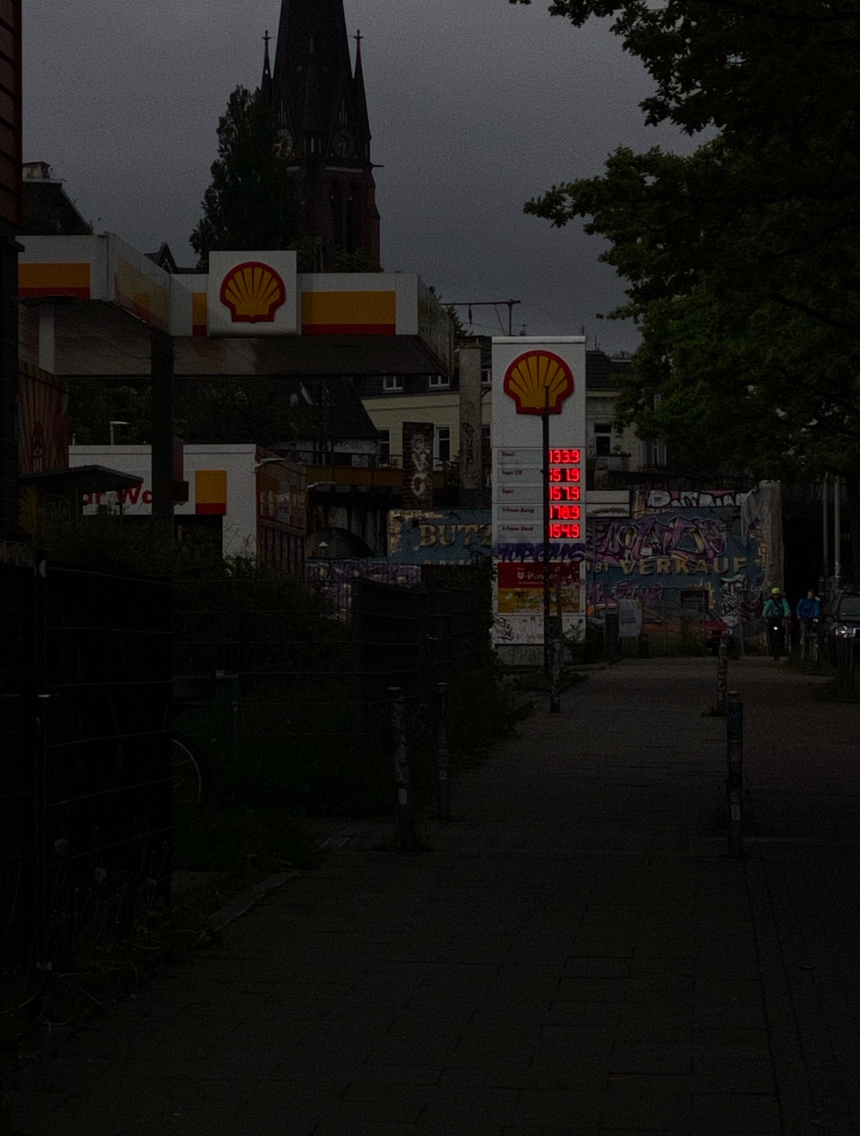
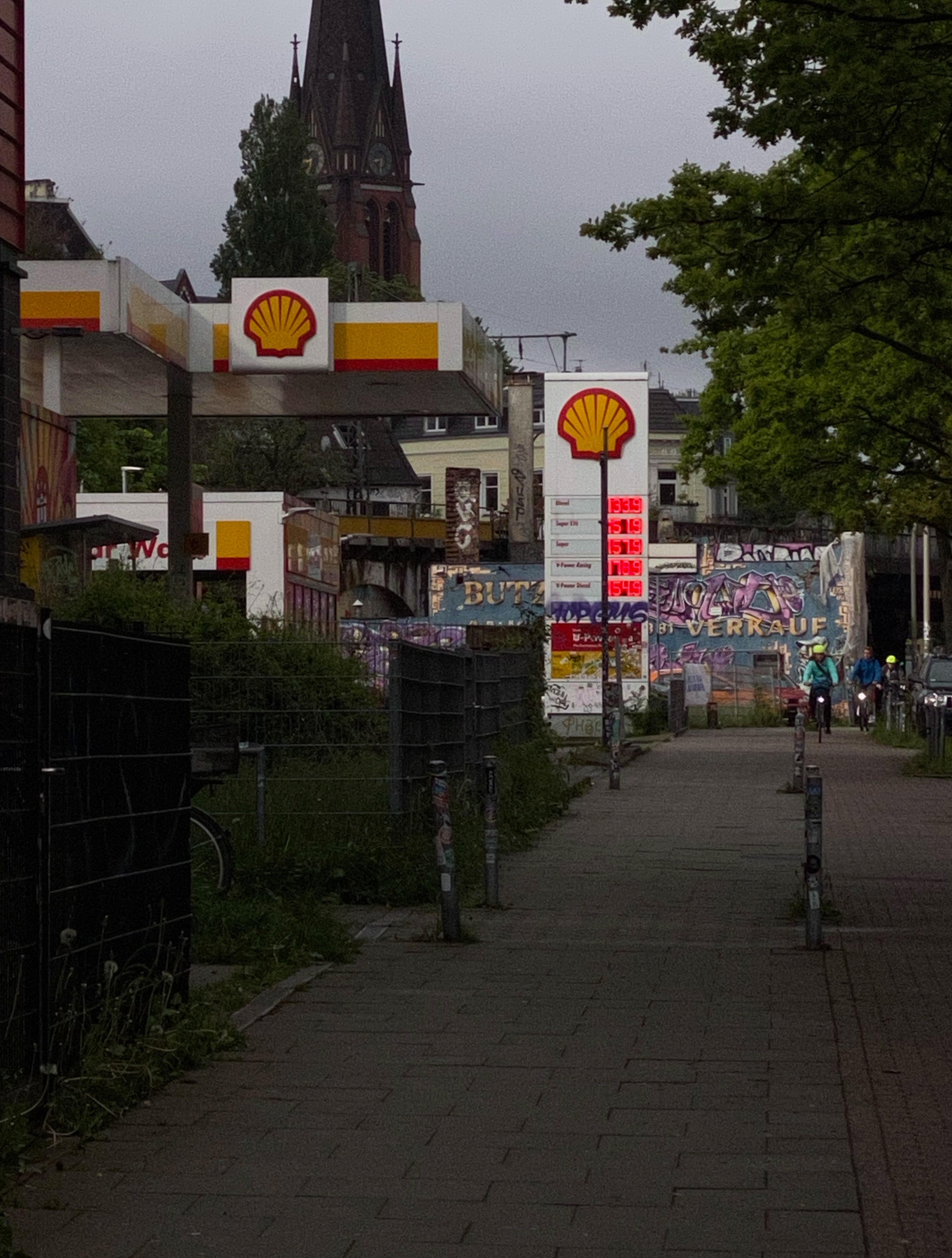
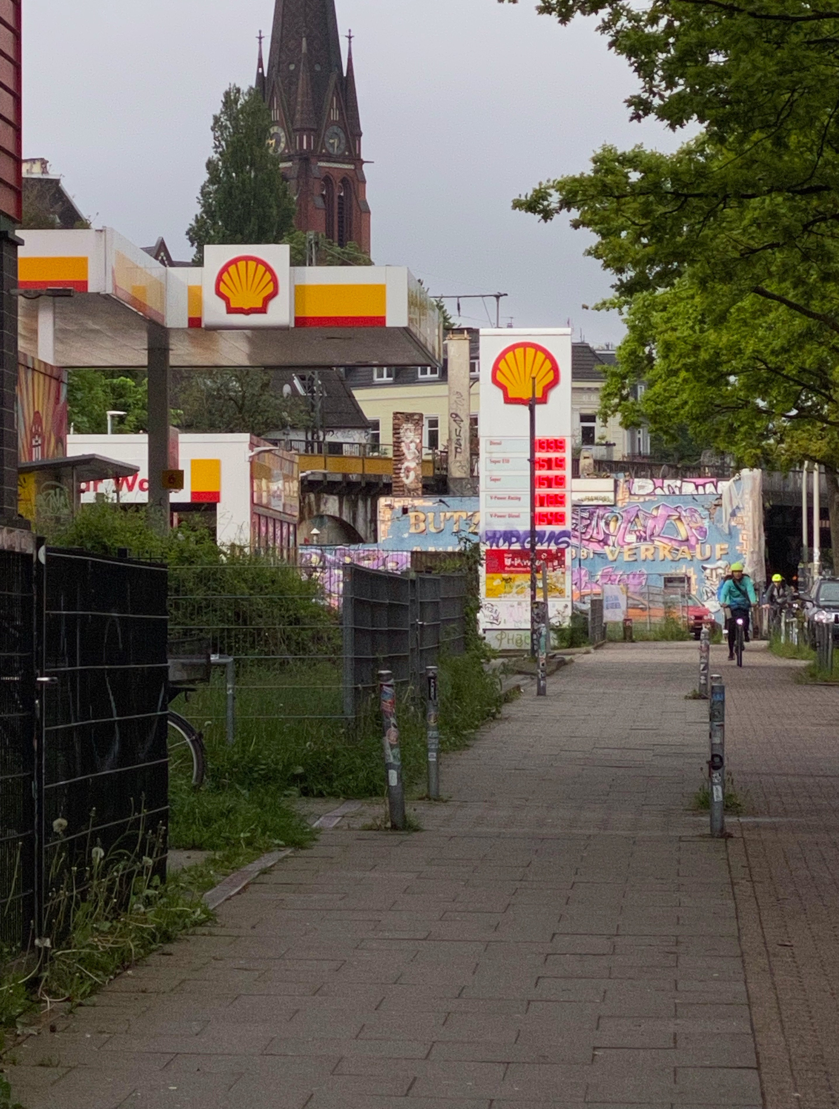

I guess in this images there is happening the same as in the red spheres rendering:
- In the darkest exposure the red numbers appear to be the brightest element in the photo.
- In the second exposure I could argue that the bike lights are feeling brighter than the red numbers already.
- The third exposure feels to me to be kind of a normal exposure how I saw the scene at this morning, but the numbers are not feeling to be the brightest element in the photo anymore like in the first two exposures. Although to my eye I clearly saw them as the brightest element in my view. Thats why I took these photos!
- And in the brightest exposure I could argue that the red numbers appear actually darker than most of the surrounding scene. For me the yellow sign appears now to be the brightest element or the green leaves of the tree.
To answer your question. Yes, I can see the problem in other footage too.
I raise the overall exposure of a scene and at some point or a certain exposure, some colors start to appear darker than the surrounding, although as you can see in the darkest exposure, the red lights are very bright.
Maybe someone can share some more thoughts on that?
Best
Daniel