Could you post a link to the EXR of the footage of the bulbs on the floor?
Here’s an experiment with a simpler parameterization for the tonescale component.
Based on the testing I’ve been doing, toe inversely proportional to Lw seems like a good behavioral model. And Lp can really just be set based on the inverse EOTF being used: 10000 if PQ, 1000 if HLG, otherwise equal to Lw.
That simplifies the user parameters for tonescale to
Lw = white level in nits
Lg = grey level in nits
contrast
surround (average, dim, dark)
All of which continuously vary over the range of Lw.
Pretty simple. Obviously it’s an experiment so sorry if there’s bugs and curious to know what you all think.
Also I’ve been going back and forth on which shoulder compression function to use: @daniele’s super simple pure michaelis-menten style function or a more complex piecewise hyperbolic with linear section. I added a checkbox to toggle and compare.
Note: the node expects linear input, so if you’re working space is log you’ll need to linearize before and then set your input gamut.
Just a DCTL for now… have fun.
Nuke node and dctl versions at my github project in this commit.
OpenDRT_v0.0.81b1.dctl (13.9 KB)
2 Likes
@jedsmith Am I correct that the most recent (0.80+) versions of OpenDRT do not contain gamut compression and that this needs to be added as separate node in Nuke?
This is correct. I do not have a good solution for this operation currently. I’m also questioning whether or not it makes sense to include in a minimalist no look display transform which is designed to have a look operation applied upstream. It’s possible a gamut compression operation might interfere with this. So I decided to leave it out for now. More experimentation to be done.
1 Like
@TooDee Thank you. Am I understanding correctly that the issue you are observing (Red spheres appearing less bright than white ground) is with the renders not with the RED footage? If that is correct are you able to reproduce the same with a camera?
By the way I read your write up on HDR over the weekend. Really nice stuff!
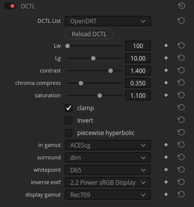
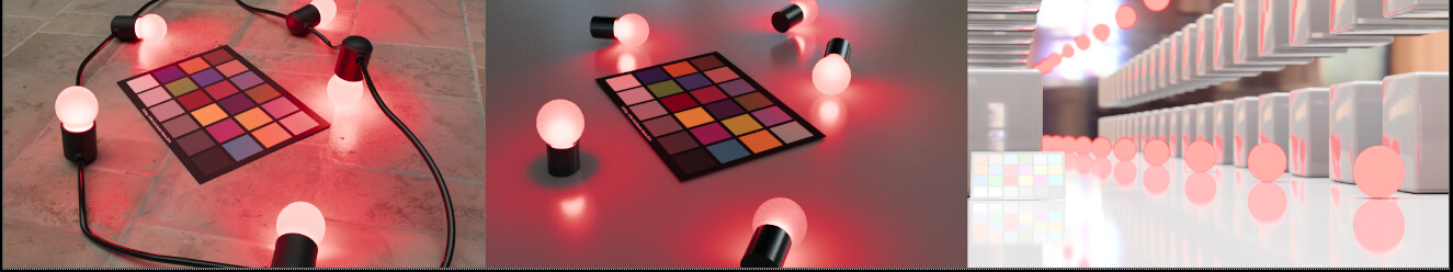
Here’s a comparison with your RED footage on the left, a render matching the lighting conditions in the middle, and your render on the right. These are all at the high exposure of 5, viewed through the ACES 1.1 RRT. As you mentioned your render is at 15 on the red spheres and around 3-5 on the ground.
I believe the reason the other two look so different is that on both the bulbs are over 100 and the floor is around 0.2 meaning the difference in brightness between the bulb and floor is much greater.
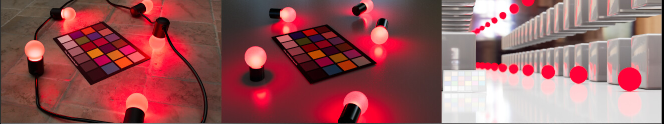
Here are the images at exposure 1. Note how the floor is nearly black on the left and middle and middle grey on the right
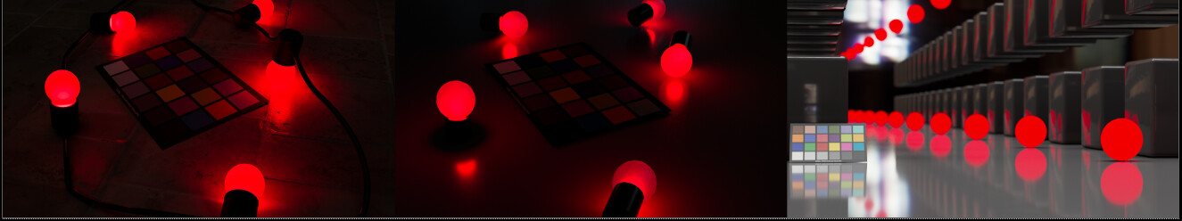
Here are the images at exposure 1, through the OpenDRT (v0.75)
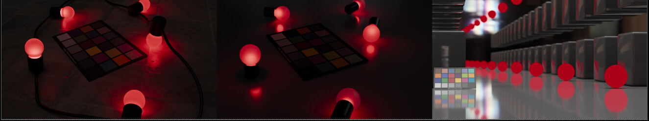
and through OpenDRT at exposure 5
FWIW, the red light in my render is at 100% saturation (1,0,0) in ACEScg primaries.
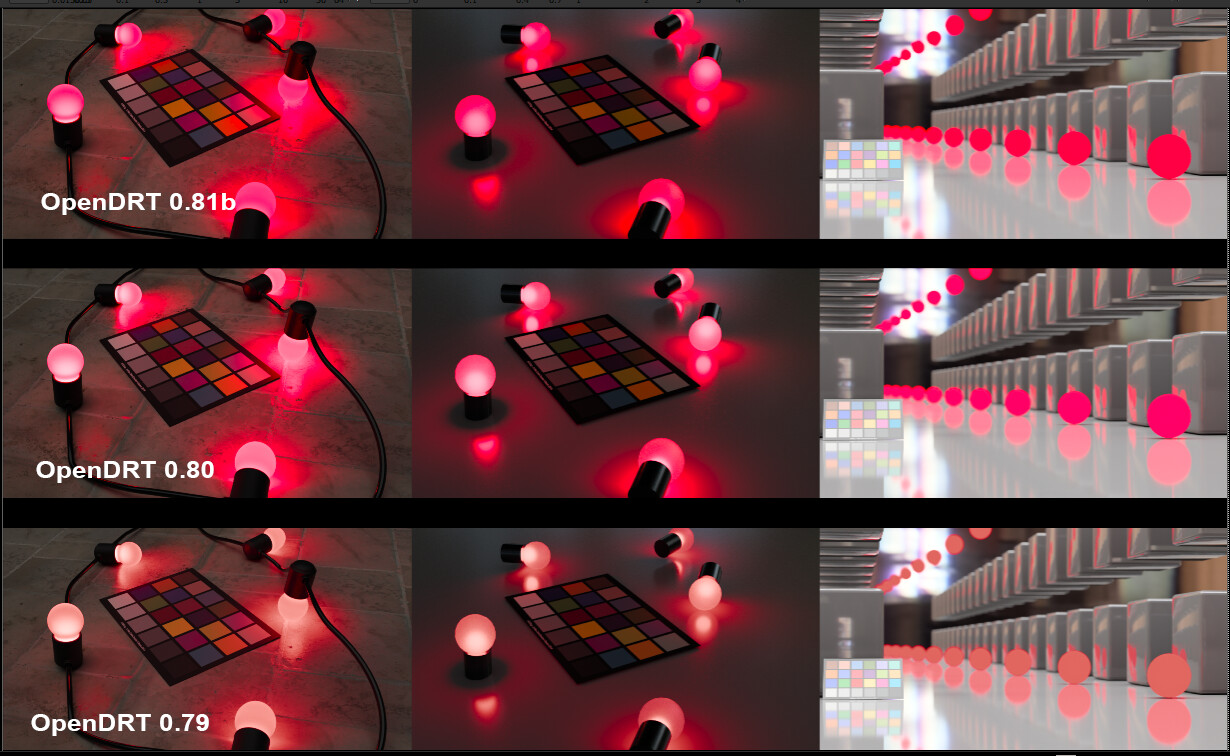
Finally, here are a comparison of OpenDRT 75, 80 and 81b. Note the red bulbs go to magenta. The difference between 80 and 81 appears to be due to the lack of gamut compression, that is, when I add a gamut compression node above the v81b DRT in Nuke it looks virtually identical to v80.
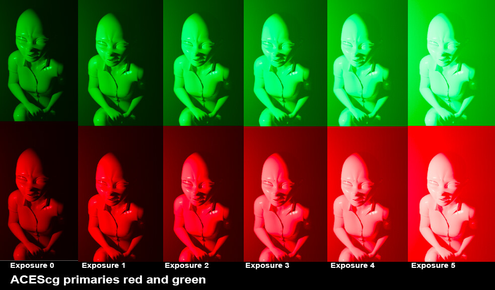
Here’s a comparison of spheres with ACEScg primaries at high exposure.
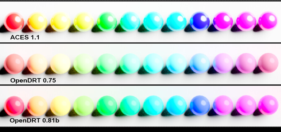
All have a path to white, which is important, but the v81b (and v80) retains its colors more in comparison to v75. I think this is a plus and this was the reason I was bringing up the issue of saturation in CG colors earlier. Most things in the real world are not at 100% saturation, but in CG it’s easy to pick that color in the color picker creating an unreal/surreal image. There may be reason to discourage artists from doing that, but I’d propose that the DRT is not the place to do that, and that instead the DRT should not limit what is possible. That’s why I’m thinking the direction of v80 and 81 is an improvement.
FWIW, we have a matrix added to the OCIO color picker role that keeps all colors (in ACEScg primaries) under 0.98 saturation, which artists can easily override in Maya if desired.
Chroma doesn’t matter.
Brightness matters.
This is why they are cognitively dissonant; the expected brightness is completely out of whack.
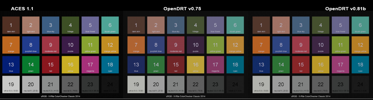
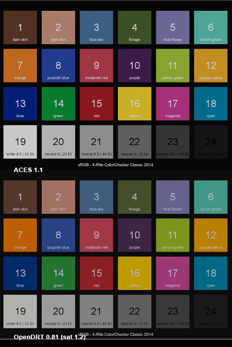
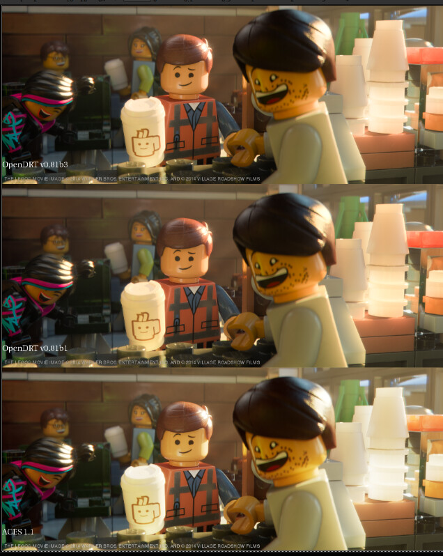
Here’s a color checker, in ACEScg color space. Note # 9 and #15 (moderate red, and red) in v0.75 in comparison to v0.81b.
FWIW, the difference in the reds between ACES RRT and OpenDRT 0.81b can easily be matched by adjusting the saturation on the OpenDRT. Here it is with saturation 1.2 for example:
Yes, that is what I was attempting to demonstrate in my above render.
Hi Derek,
thanks for downloading the images and use them for further tests.
Before your post you asked me this:
“Am I understanding correctly that the issue you are observing (Red spheres appearing less bright than white ground) is with the renders not with the RED footage? If that is correct are you able to reproduce the same with a camera?”
I was thinking about for some days how to answer to that question.
In my post I used a very simple and graphical 3D generated example that shows an issue:
Although I raise the exposure of the overall image, the red spheres are appearing darker than the surrounding at some point. And this feels odd.
At first I did not like this simple rendering, that’s why I created the other rendering with the red bulbs. This result looks more similar to the image of the Red XMas footage. But the image has also more detail that is distracting the viewer (and myself of course) from the issue. It is less obvious.
Next, you suggested to avoid some very pure and intense values in 3D animation to avoid the image results that you are seeing in the red spheres example. It’s true, I think such intense pure primary colors you could only achieve with a laser.
The red spheres example I set up in such a simple way so that I don’t get distracted. If you just take the Red XMas footage and examine it, there is so much going on in the image and the process, how it was captured and now displayed, that you might miss what is going on. I certainly did.
I needed this simplified example to realize that there is maybe something else going on that I was not aware of.
Still thinking about how to answer your question:
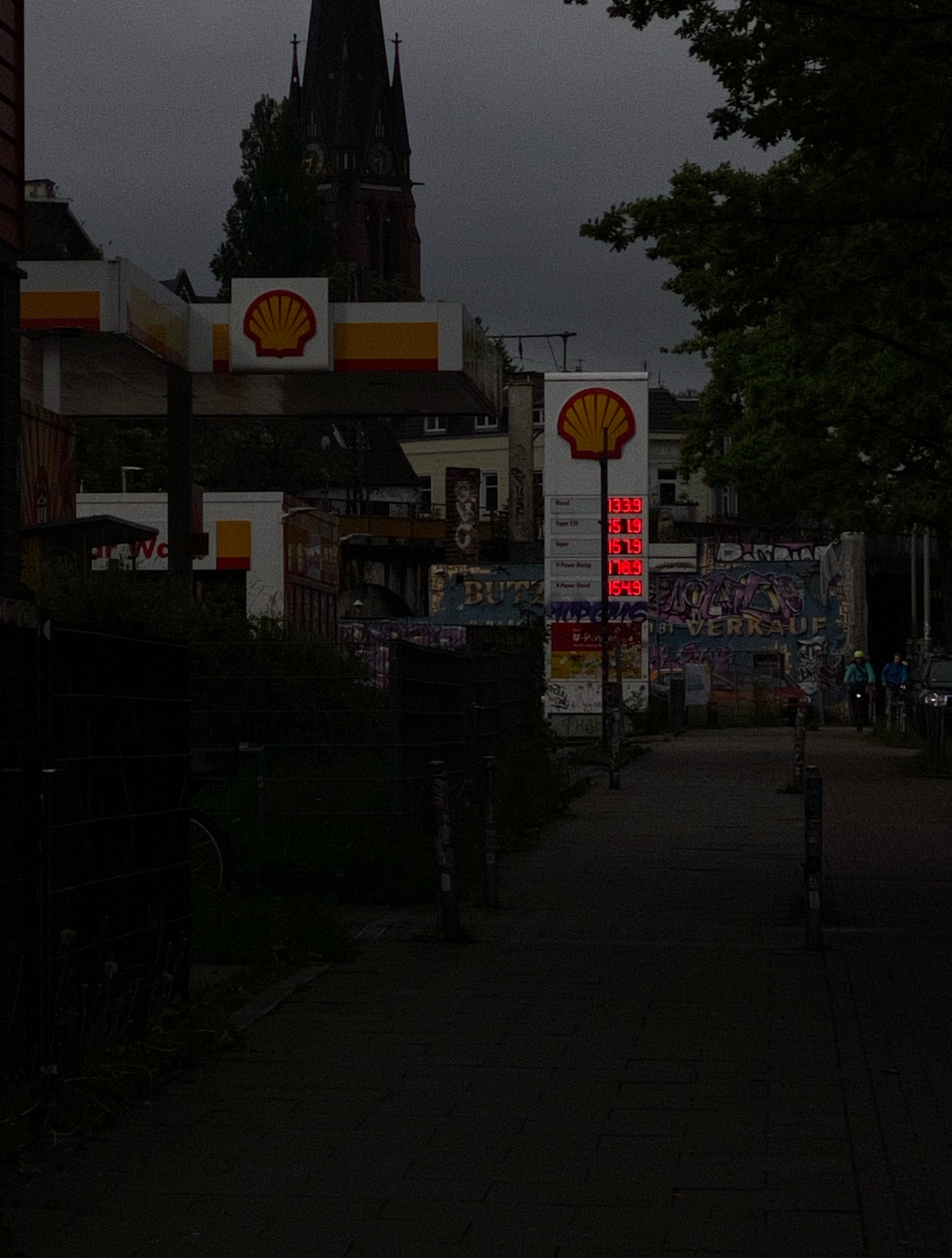
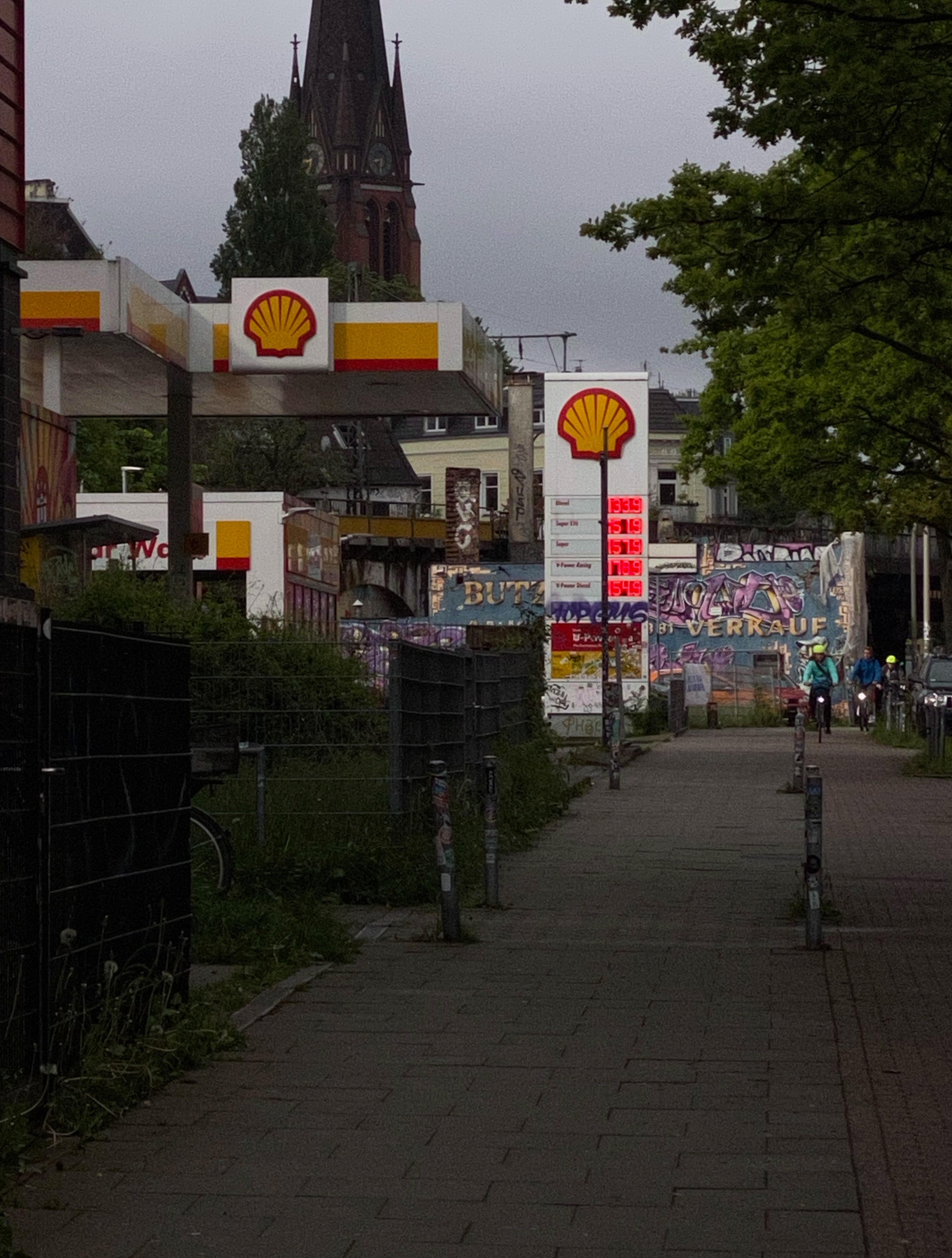
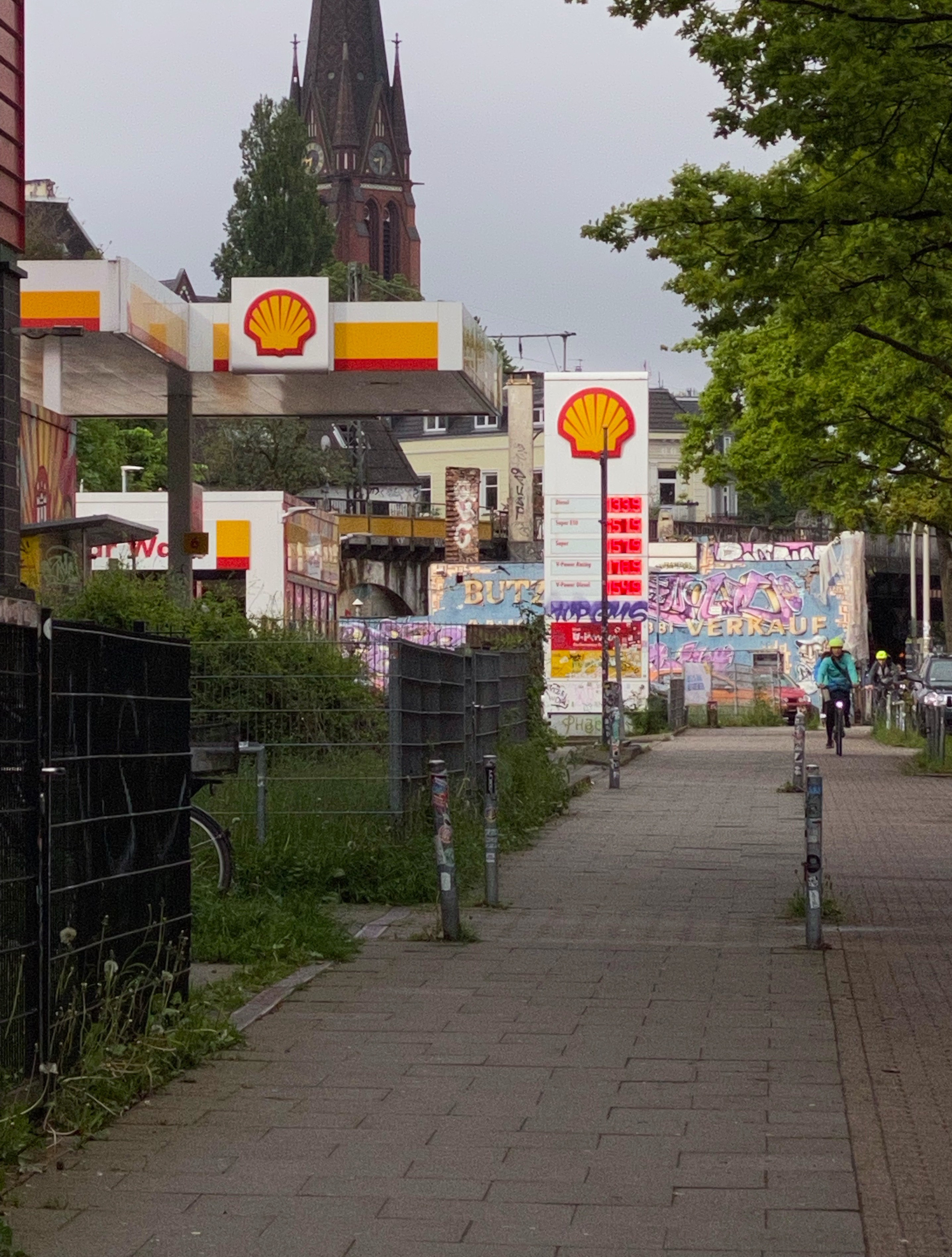
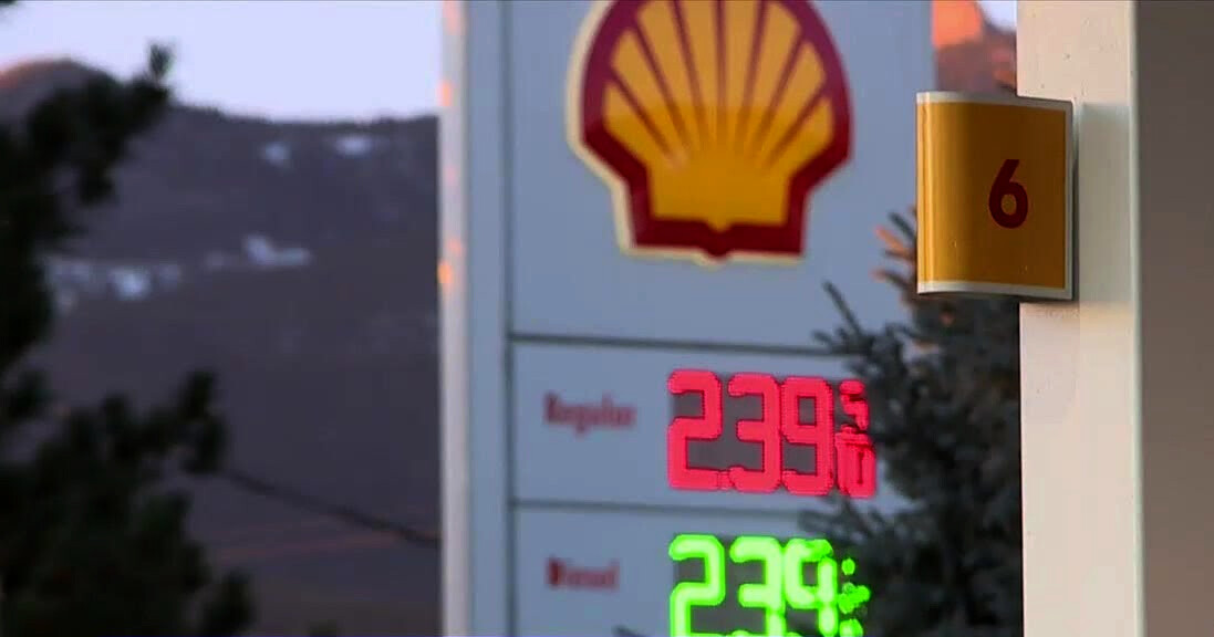
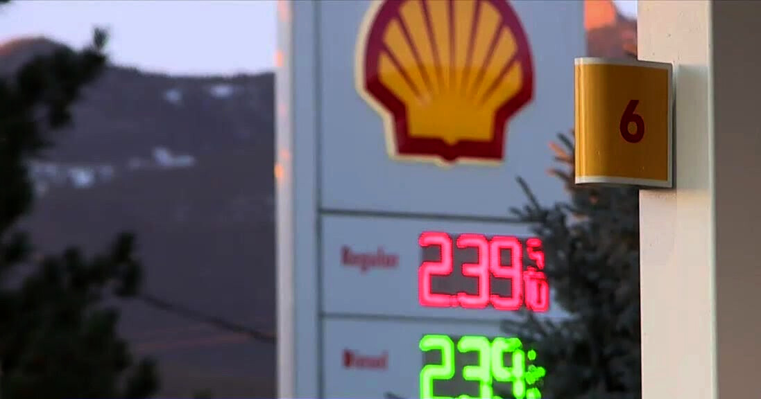
Friday morning on the way to work I crossed a street and saw a gas station with red colored LED lights for the gasoline prices. I pulled out my iPhone and made some photos with a manual exposure override in the default photos app. In know, there is a lot of processing happening in the images from an iPhone but I still gave it a try. I made four photos, simply by raising the exposure slider in the app. Later I aligned the photos in Affinity Photo so that they are more easy to compare.
Inspect the red lights of the gas prices:

I guess in this images there is happening the same as in the red spheres rendering:
- In the darkest exposure the red numbers appear to be the brightest element in the photo.
- In the second exposure I could argue that the bike lights are feeling brighter than the red numbers already.
- The third exposure feels to me to be kind of a normal exposure how I saw the scene at this morning, but the numbers are not feeling to be the brightest element in the photo anymore like in the first two exposures. Although to my eye I clearly saw them as the brightest element in my view. Thats why I took these photos!
- And in the brightest exposure I could argue that the red numbers appear actually darker than most of the surrounding scene. For me the yellow sign appears now to be the brightest element or the green leaves of the tree.
To answer your question. Yes, I can see the problem in other footage too.
I raise the overall exposure of a scene and at some point or a certain exposure, some colors start to appear darker than the surrounding, although as you can see in the darkest exposure, the red lights are very bright.
Maybe someone can share some more thoughts on that?
Best
Daniel
2 Likes
Super interesting, thanks for the images! I’m curious how much of this appearance phenomena is the software image processing that the images went through on the iphone, and how much is from the Helmholtz-Kohlrausch effect in our visual system.
Dev Update
I’ve pushed a few more changes to my open-display-transform git repo which is now at v0.0.81b3.
- Add alt version of the DCTL which has more user parameters exposed. This may be useful for expert users who wish to play around with the various parameters.
- Simplify and reduce model which allows for continuously varying adjustment of the curve based on a single parameter representing white luminance
Lw(see this post for more details). - Add quasi-perceptual highlight dechroma (as I’m now calling “path to white”) or hue-bias. This is mainly to counter-act Abney effects with blues turning magenta and reds turning pink as they are dechroma’d. It helps a little to resolve perceptual differences between SDR and HDR appearance… though it’s definitely not perfect.
- Little tweaks to the norm weights
- Remove piecewise hyperbolic compression function. The appearance is pretty similar with correctly adjusted parameters and I don’t think the extra complexity is worth it.
2 Likes
Thanks for posting these they really help to further illustrate the phenomena. I also have been wandering about with my camera looking at colored lights! This is really fascinating stuff!
If I’m understanding correctly, this is not only something that you are seeing specific to ACES per se, but really speaks to the inherent limitations of a camera to capture what our eyes see. Is that right?
More specifically, I think the issue is related to the limitations of photography to capture practical lights in film. That is, in film where there is a practical light (a lamp for instance) cinematographers will have to do lots of workarounds, putting dimmers on lights so they will not blow out and then lighting the subject with other lights off camera motivated from the practical light that is now too dim to have much effect on the subject. In other words, it takes a lots of extra lights to make an image with practical lights (a lamp shade, a camp fire) appear in a photograph the way it does to our eyes. I think that is even more the case with colored lights where it is often not feasible to put lights on a dimmer (a neon sign, or car lights in traffic) and instead the exposure needs to be darkened or the surrounding needs to be darkened. For example here in this shot from Rainman, the black surrounding of the traffic lights helps them appear bright, in contrast to the white background on your sign.
In other words, I’m wondering if what you are observing is a current limitation on cameras that one needs to work around?
I’m curious if you could create in Photoshop an image of this scene that looks the way it did to your eye? That is, is it possible to represent this on an SDR display at all? Along the same lines, are you able to find in a movie still an example of what you are wanting to see - a red light that looks brighter than its surrounding white background?
1 Like
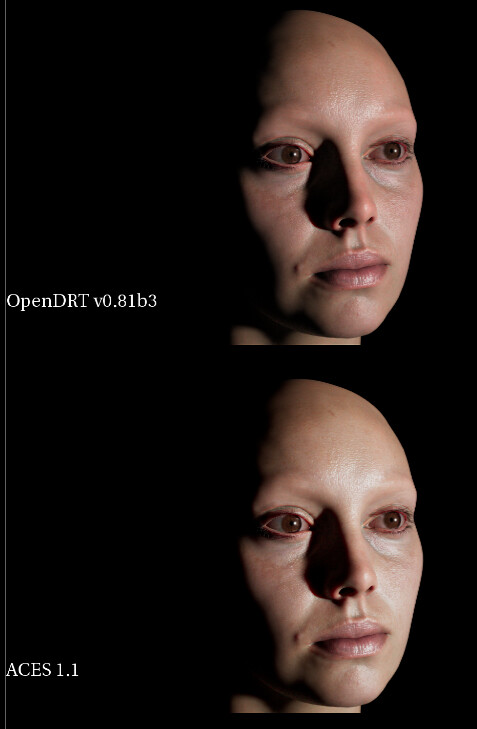
Here are some test images with OpenDRT 0.81b3. FWIW I have the saturation at 1.2 for all of these cause I like it that way. 
The highlight dechroma (cool name) looks pretty sweet.
[updated to AP0. The OpenDRT also has a gamma node before it set to 0.85]
Skin tones are looking nice in comparison to the “goulish green” skin tones of the ACES RRT. The OpenDRT feels a lot more faithful to the texture colors (in this case in sRGB primaries) as well as to the subject’s skin tone.
1 Like
Yeah you’re not wrong. I actually boosted the default saturation for SDR to 1.2 (and reduced saturation to 1.0 for HDR) in my latest commits to compensate a bit better for the Hunt Effect, which is actually quite visible in these SDR vs HDR tests that I did.
1 Like
In the tests that I was doing I saw it with inv. EOTF (“sRGB gamma”), ACES and OpenDRT. So yes, it is not specific to ACES at all.
And no, if it would be a camera limitation, then the Red XMas footage would also show “red bulbs”. But as the sensor was fully saturated, the bulbs can only show RGB maximum on the display.
I think it is important to separate the issues and look at them one by one.
1 Like
Here’s a sign showing something similar. Because of the exposure the colored numbers do appear brighter than the sign’s white background, but the green appears brighter than the red because the red is clipping.
If I draw in Photoshop something approximating what my eye sees I get this:
I’m making the red act more like the green in that it is retaining saturation, doing a “bokeh” on the edge, and a “highlight dechroma” at the core. That is, it was not doing any of these things in the photo, so I Photoshopped it.
It would appear to me that red acts differently than green or yellow. Green and yellow appear brighter, and red and blue (pure indigo blue) appear dark. If I understand correctly, @jedsmith has therefore made his DRT in its latest incarnation dechroma more for red and blue to address this, so they will better approximate what our eye sees. Here’s an example of that on red using @ChrisBrejon’s render. Note it clips and goes magenta in 81b1 but goes to white in 81b3.

Question for @jedsmith: should green also be going to white as well? The idea being that all colors would behave similarly in their dechroma?
Here is a test render with a light set to pure red (ACEScg primaries) and pure green, at different exposure values, viewed with OpenDRT v0.81b3. Is this behaving as expected/desired?
I would rather assume that the colored emissive numbers are in fact brighter than the white paint of the sign, because they actually emit light. The white sign is reflecting the environment.
I doubt a bit that you see with your eyes a desaturated core in the red numbers. I assume you saw the numbers bright red.
Your interpretation with the tools you have at hand is to add more (green & blue) emission overall to the red numbers, because the red does not appear bright enough.
Although at least on my iMac display I can read “digital” these values:
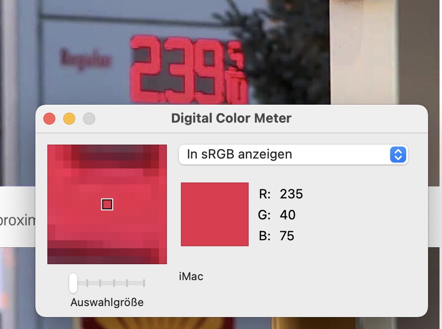
It seems the red is not clipping yet.
Picture’s worth a thousand words. Give us a picture of what your eyes see.
1 Like
It is absolutely fantastic to see this discussion, as this discussion seems critically foundational to the most simple idea of a “tonality compression”.
One minor point I’d highlight:
While this is accepted and conventional wisdom, HKE / Evans actually defies this wisdom in an almost completely inverse manner. The percentages of influence for green-yellow versus reddish and bluish.
Since some folks have fallen into this rabbit hole, there’s a really simple test that can be conducted at home using a display referred digital content creation application of your choosing:
- Fill the canvas with a middling grey value. Somewhere around 46% code value.
- Put a fully emissive BT.709 or Display P3 square on the screen.
- Place an achromatic swatch adjacent to it, with a gap in between.
- Try to match that maximal emission red with the achromatic value to create a “sensation of brightness” that matches it.
- Rinse and repeat for fully emissive pure blue light in BT.709 / Display P3.
The first glaring effect will be “Wow this is damn challenging”, which is reflected in the experiments done on this front from Wyszecki & Stiles all the way up to more recent testing. Spatial matching is helluva challenging!
However, assuming one accepts the challenge, it should end up being a rather mind popping experiment, especially if one works backwards and takes the resultant code values and calculates how much achromatic light emission is required to create an “equivalent” sensation of highly chrominous emissions.
This all nicely ties up with the idea that tristimulus “colour management” using discrete three light “mapping” via curves might not work.
It should also call into question the loose tossing around of terms like “nits”; remember that a nit is a measure of luminance and tied exclusively to the singular case of R=G=B case. That means that any attempt at compressing tonality shifts dramatically as the chrominous component deviates away from achromatic.
Food for thought.
3 Likes