A naive question: should the “path to white” for red light possibly be red > yellow > white, rather than red > pink > white?
I know that’s exactly what people have been trying to avoid (along with blue going to magenta) but I’m wondering if, following HKE, if we perceive pink as less bright than saturated yellow, the pink feels wrong?
Just to be 100% clear on this specific point. We try to avoid it as a default un-modifiable look, embedded in the output transform. We need some kind of ground truth (chromaticity linear thingy) to have a neutral base and then apply whatever look you may find suitable to your project/taste. I am very fond of this idea.
And the fact that the whole perceptual fire mumbo jumbo is typically just a bunch of device dependent hand waving rubbish that is completely ahistorical.
At best it’s an aesthetic flourish. At worst, it’s a nightmare trend due to mishandling digital RGB colour for at least two decades.
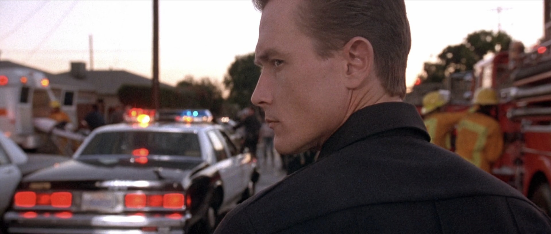
Here’s a pic, note the tail lights on the car going ever so slightly towards yellow. The visual effect is that it appears brighter than the red, while maintaining saturation. I sort of doubt that James Cameron chose this intentionally as a “look” and rather think that this is just what the camera did. It’s how the camera represents (within the limitations of the medium) what the human eye sees. Is this saturated hue shift the “right” way to represent this? Is a dechroma to pink the right way? Since its all simplifications/approximations/translations of what our eye sees there’s not really a “right” answer.
@Chris, I hear you on the need for a neutral starting point! I also think the idea of giving the image-maker control to get the image they want is a really good approach to take, and so fully agree on that point too!
Regarding the practicality of applying this “red-increases-in-perceptual-luminescence-with-a-hue-shift-before-going-to-white look” (or RIPLWAHSBGTW-look for short) it’s not really clear to me how an indy filmmaker without a color scientists would do that. Can you say more?
You sure? Is that a bad transfer? Remember that film has to be projected and then scanned by a digital sensor, which takes us right back to the start of skews.
I would not call it wisdom, just having suffered through too many digital scans.
Here is a simple example of the identical sequence, iterated / scanned / manipulated in subtly different ways. Which one represents the print stimulus that would end up projected on the wall?
yes, looks are a bit of mystery. I have posted here an example from TCAMv2 with the Look Vision applied. I think it is the best example I have seen of combining a “hue-preserving” DRT + Look. As you have certainly understood, generating such a look is a quite complex engineering task.
But if you want to play with looks yourself, you can have a look at ARRI ALF2 or RED IPP2 looks, which are downloadable for free. As a personal exercise, I have built some OCIO configs with their looks (87 of them for ARRI) to do some testing.
Here is an example of OCIO config :
displays:
  Rec.709 100 nits video dim:
    - !<View> {name: ALF2, colorspace: ALF2 - Rec.709 - 2.4 Gamma}
    - !<View> {name: 1110BlackAndWhite, colorspace: ALF2 - Rec.709 - 2.4 Gamma, looks: 1110 Black and White}

active_displays: [Rec.709 100 nits video dim]
active_views: [ALF2, 1110BlackAndWhite]

looks:
- !<Look>
  name: 1110 Black and White
  process_space: V3LogC_EI800_WideGamut
  transform: !<FileTransform> {src: ARRI_LL_1110_Black_and_White.cub, interpolation: tetrahedral}
Of course, you’d need to define colorspaces to make the config work. But hopefully you can get an idea of how looks are loaded in OCIO. I wish more softwares would implement them like Blender :
I’d also like to throw out there that as far as this being a desired “look” of an image maker, it’s a pretty safe bet to say it never is. After all, If a film maker wants a shot of a red traffic light, they don’t want it to appear to be a yellow light which changes the plot!
It’s more of what cameras just sort of do. My camera makes red lights… whether those are traffic lights, car tail lights, neon signs… all go to yellow and then white. For my eye all those lights were solid red with no yellow (or white).
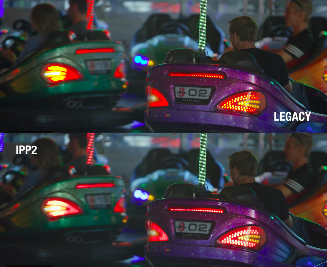
Here’s a screen grab from the IPP2 video that seems relevant. The first “enhancement” they mention of IPP2 is “challenging colors are less likely to become overly saturated near the edges of the output color space” and the example they give is making red tail lights not going to yellow and instead doing the “chromatically-linear thingy” as you put it:
Finally have 5 mins to comment on this one specifically! This is great to see, and I have been using similar numbers for quite a while now, actually probably closer to 15% but then it is not guided by any psychophysics experiments although I did play quite a bit with CIECAM02 and CAM16 at the time to get some hints.
Something to keep in mind though is that while a global colourfulness tweak tend to work fine, because the Hunt Effect is driven by the display Luminance increase, itself modulated by the tonescale, the tweak should be weighted somehow, e.g. shadows and midtones require different strength than highlights.
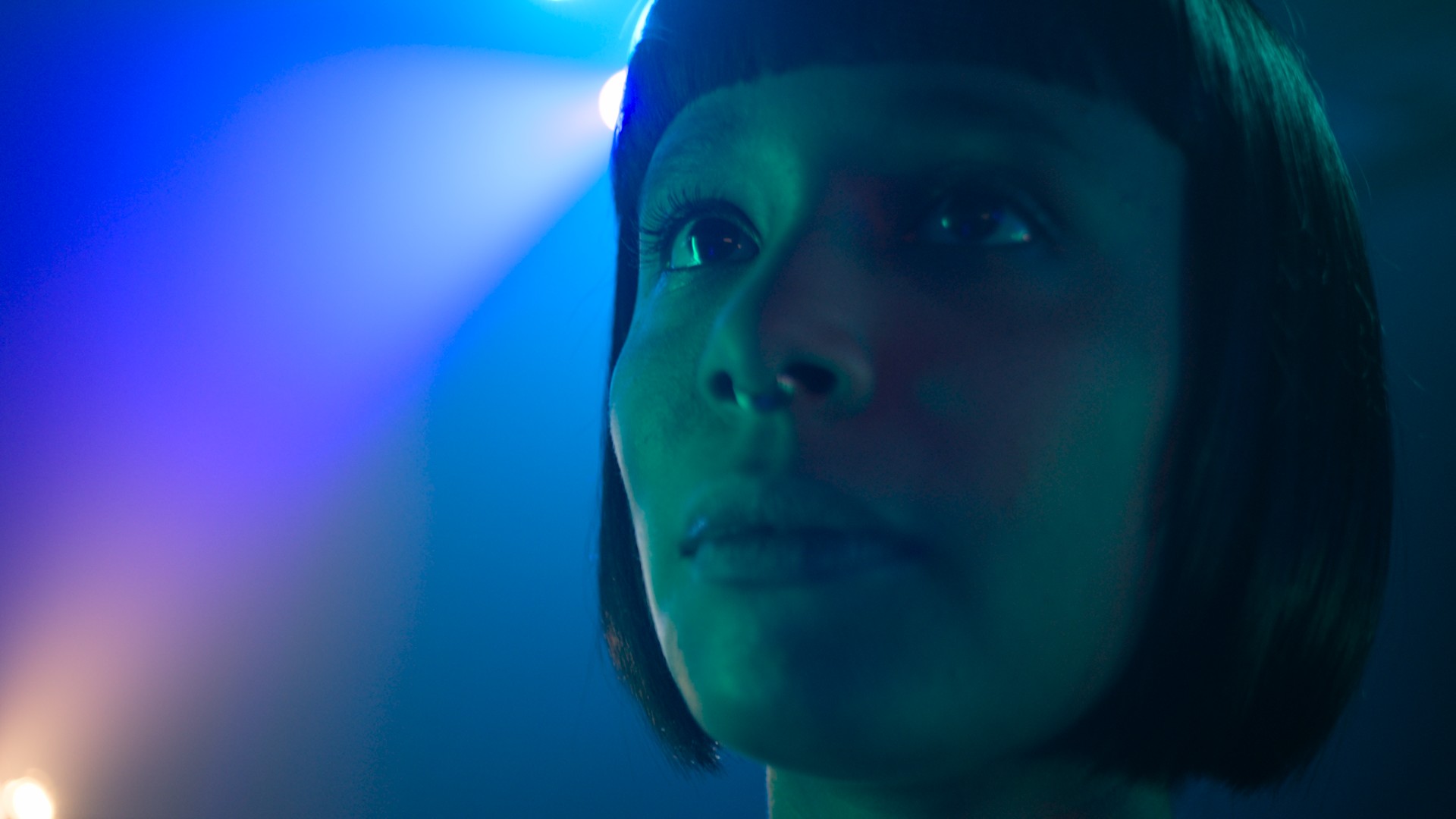
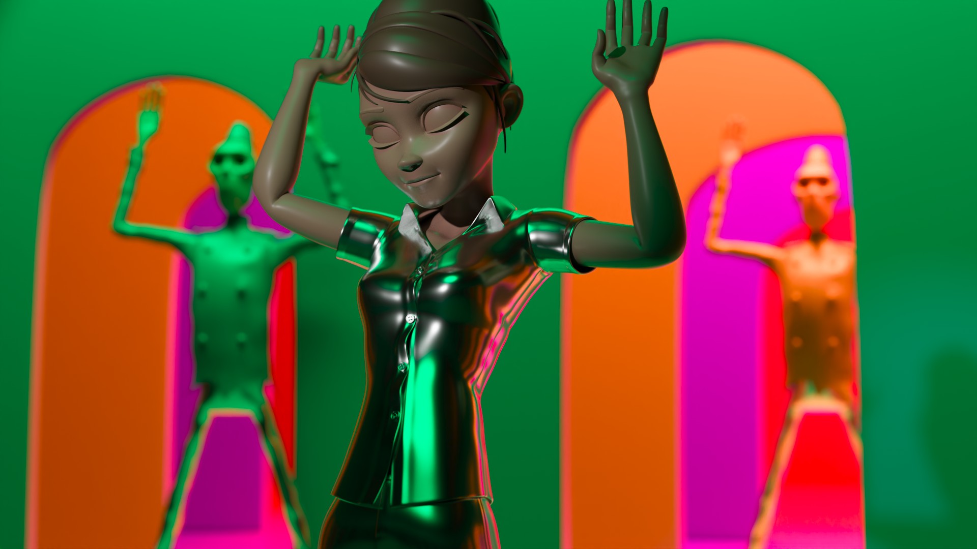
Just wanted to share some tests using the latest iteration of Open Display Transform : v0.0.81b3. I used to test thoroughly each version, then got hammered at work, lost a bit of track and finally found some time to test the latest publish. And I must say I am particularly happy with this version. I think this is the best one I had in my hands so far. Congrats Jed !
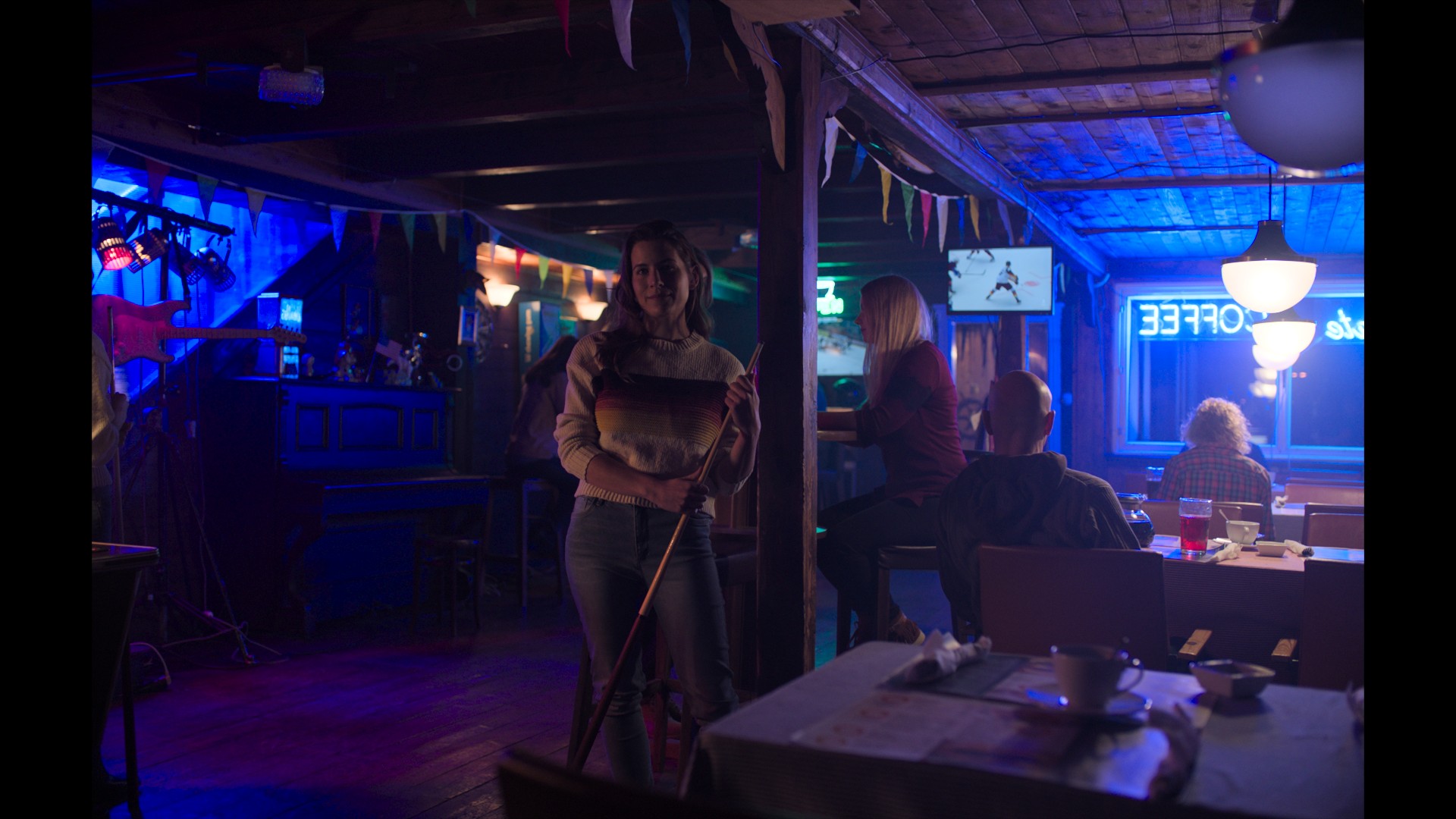
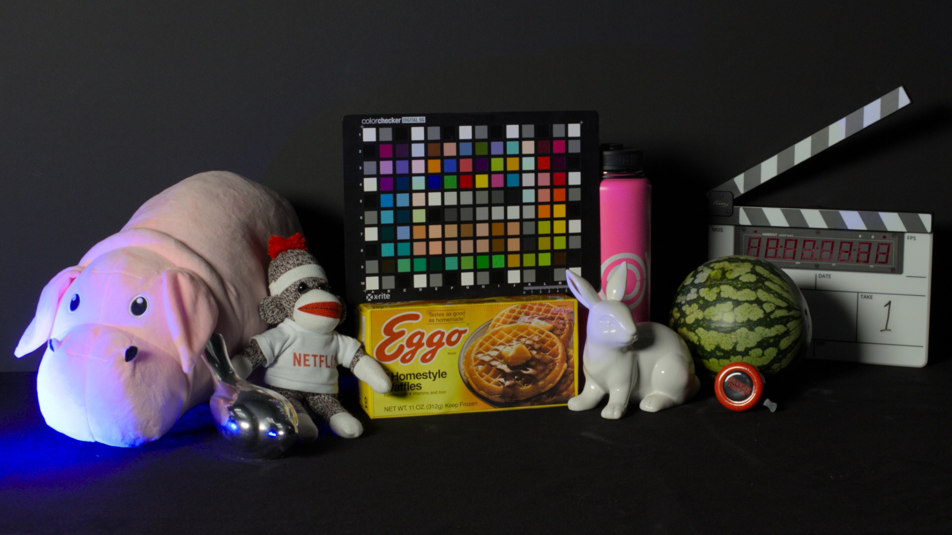
Here a few images you may have seen before using the default parameters (for sRGB display, with BT.709 primaries) :
The Nuke group looks super tidy to me (there’s like ~30 nodes in it) and the model super simple (there’s like less parameters every time). I am trying to have access to a decent HDR display (like EIZO) at work so I can compare both SDR and HDR in the same room. That’d make the review of this version even more complete.
Since the first version of the Naive DRT (back in January !), I think it has been an extraordinary effort from Jed to come with this great version. Impressive mate !
Hope you enjoyed looking at those frames like I did,
Chris
Hear! hear! @jedsmith the work you’ve done is nothing short of astounding!
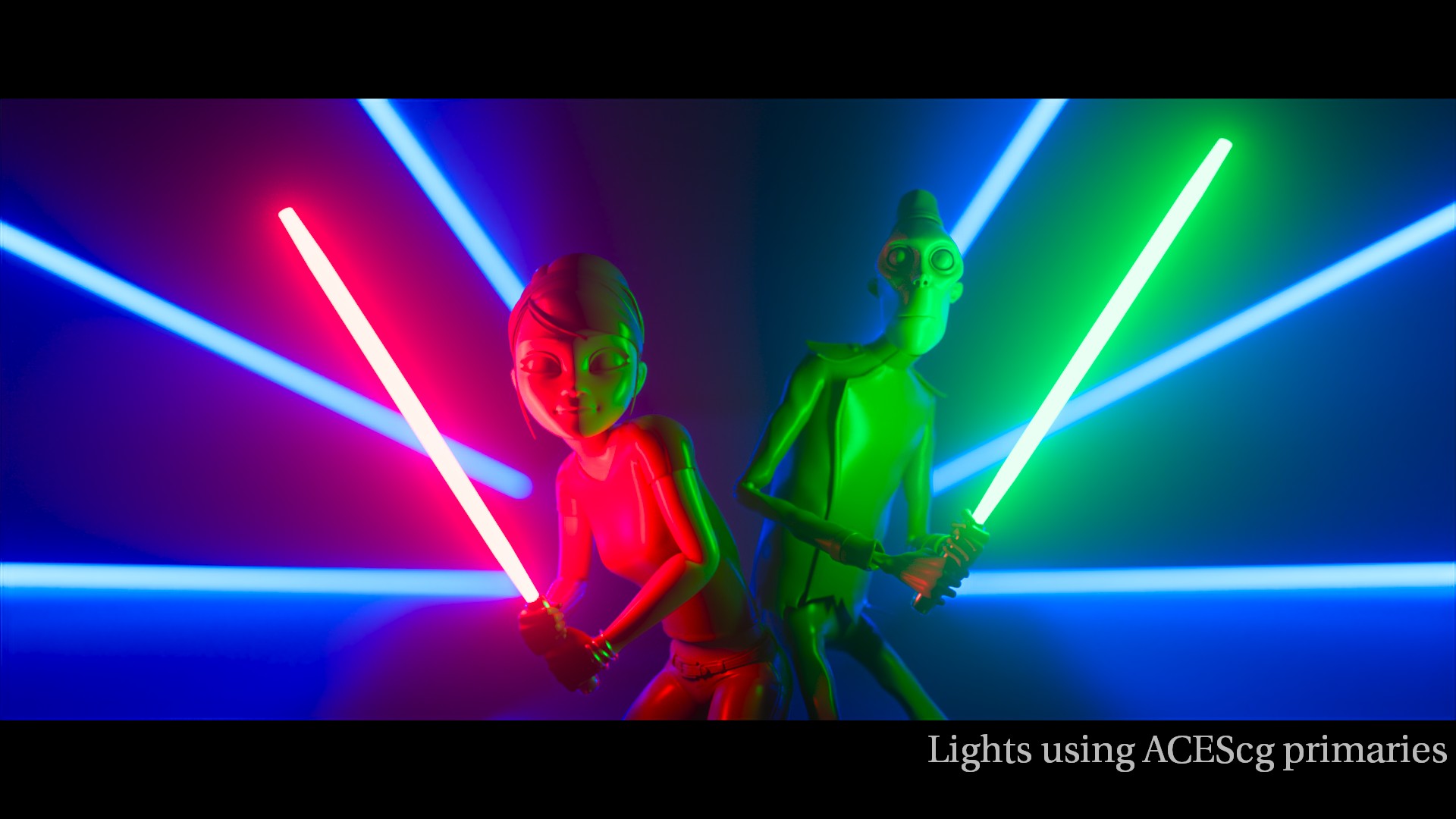
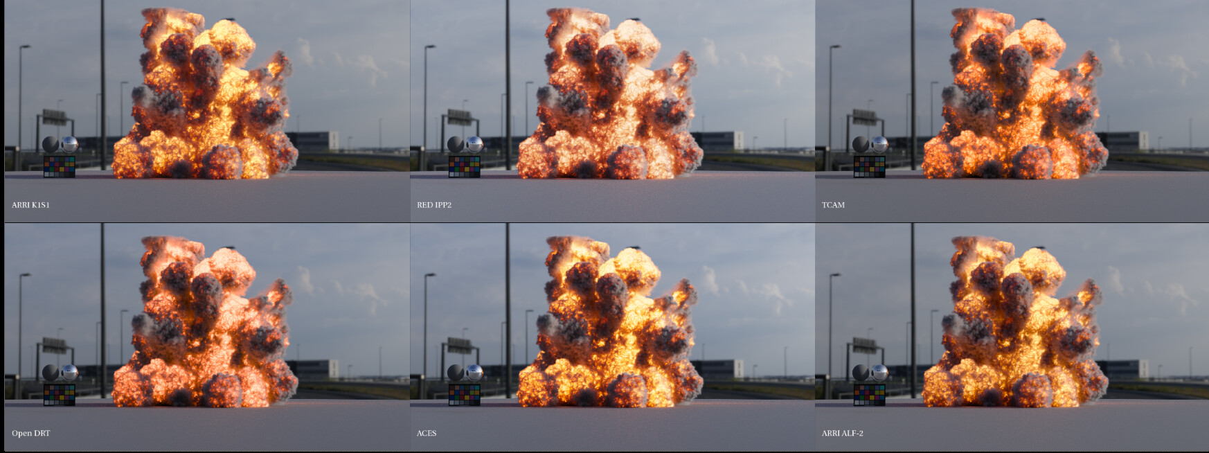
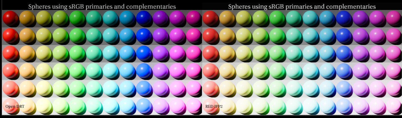
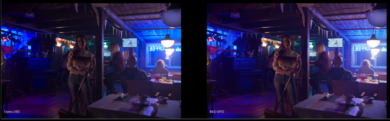
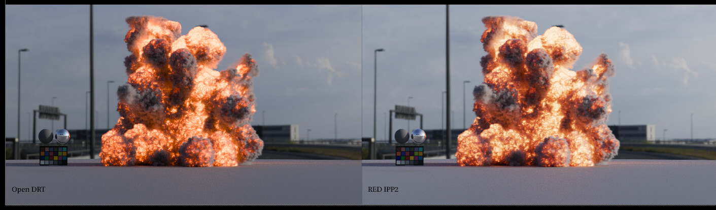
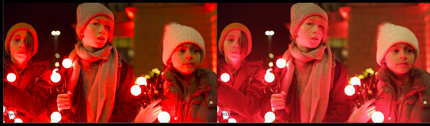
I wanted to share some tests I did on images viewed through OpenDRT, K1S1, ALF-2, IPP 2, T-CAM, and ACES. These are using the ACES 1.2 OCIO config from the VWG GM.
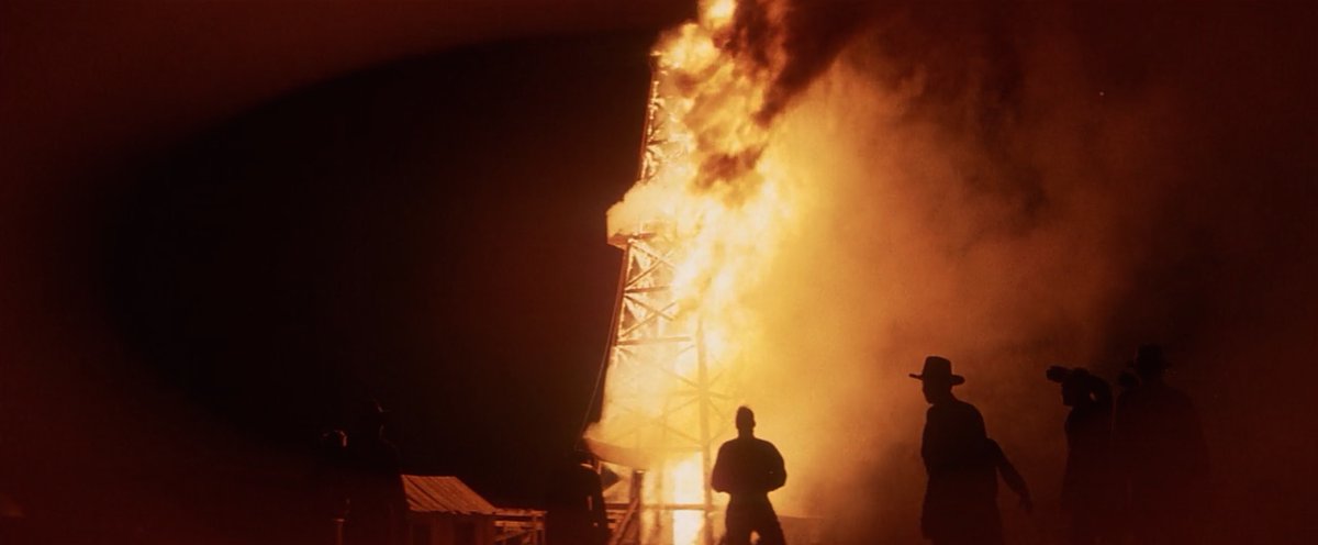
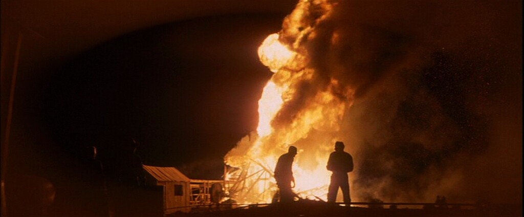
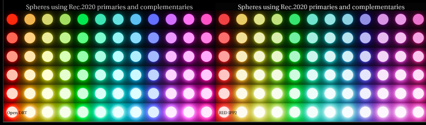
First is the explosion image. OpenDRT and TCAM stay reddish, while the others go to yellow.
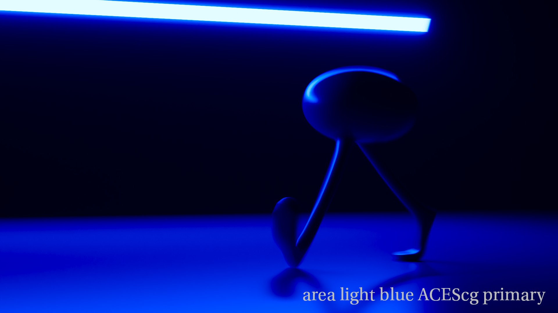
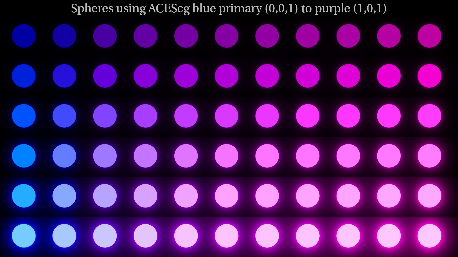
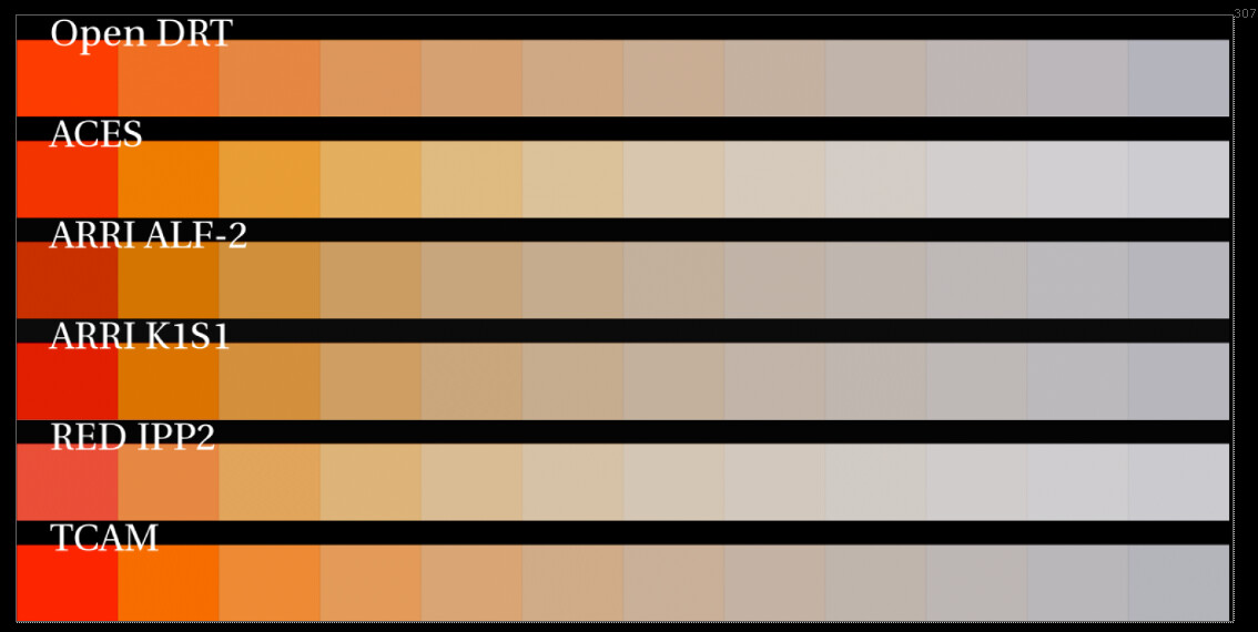
Here’s a sweep of kelvin temps in ACEScg primaries to see a bit more clearly what’s going on. Again, I’m observing that OpenDRT and TCAM appear to stay reddish, but the others move to yellow in the kelvin sweep.
The red in the ARRI K1S1 and ALF-2 are clamping. Uh oh! But the RED IPP2 looks good. In fact the IPP2 seems to behave a lot like the OpenDRT in terms of path to white. Here’s OpenDRT and IPP2 with the “Sunny spheres” looking nearly identical, with nothing notorious going on.
I’m hoping that possibly OpenDRT could be nudged to behave similar to IPP2 in regards to kelvin temps since the two seem to be birds of a feather in other respects.
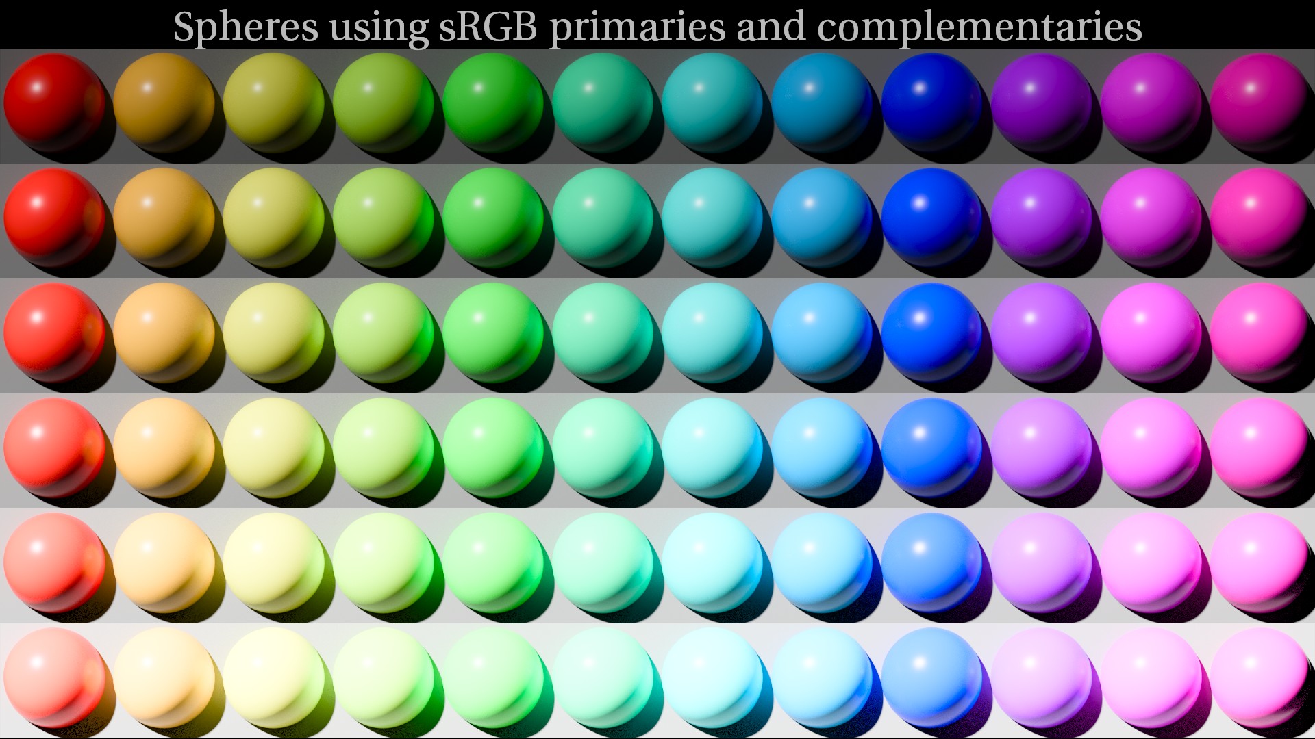
If you compare the glow on the red in the bottom row of @ChrisBrejon’s “glowing spheres” I think you can see a bit more clearly what is going on. Is that perhaps connected in some way to what’s going on in kelvin color staying reddish?
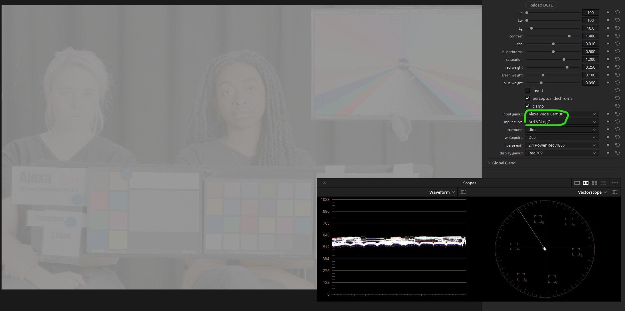
@meleshkevich I just pushed a fix which should resolve the issue – I keep forgetting that there are not supposed to be ; chars ending each line on the DEFINEUIPARAMS. Of course it works fine with or without on my CUDA Linux machine, but I hear it breaks on Metal. Give it a try and let me know how it goes!
I’m sorry! I just realized that I downloaded them in a wrong way (there was html code inside *.dctl files). So I guess the previous files were also ok! But anyway, these new dctl are working, thank you!
I’m on windows 10 (cuda)
@jedsmith
Looks like this isn’t working as it should
It’s the same for all log curves including ACEScct. Seems like only no curve (linear) works as it should.
Or probably I just use it wrong.
Also if I add 2 instances and turn on “invert” in one of them (and choose correct inputs and outputs of course) there are some differences. Is this expected at this stage of development?
Thanks for testing more than I did! You are indeed correct, the lin / log conversions were the wrong way around in the DCTLs. I’ve pushed a fix. Let me know if you see any other weird stuff!


 – I keep forgetting that there are not supposed to be ; chars ending each line on the DEFINEUIPARAMS. Of course it works fine with or without on my CUDA Linux machine, but I hear it breaks on Metal. Give it a try and let me know how it goes!