Getting the my thread back on track! ![]()
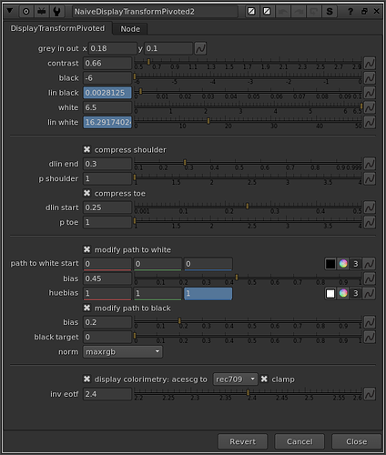
I have built an updated slightly less naive display transform which incorporates a pivoted slope adjustment and a compression curve for shadows and highlights.
EDIT - the link above points to a gist that has since been updated: here is the nuke script in question:
NaiveDisplayTransformPivoted_v01.nk (14.8 KB)
Again, this is not intended for production use, nor as a proposal for a display rendering transform. It should be treated as an experiment, and tested as such.
I’ll try to do a more in-depth video on how it works, but here’s a quick text-based rundown:
- Middle grey in → out specifies the pivot
- Contrast adjusts the slope of the linear section of the curve
- Black is stops below middle grey to map to display 0
- White is stops above middle grey to map to display 1 after compression
- The compression curves utilize the very simple power( p ) compression function.
- dlin start and end specifies where the linear section starts and ends (in display linear values)
- p for shoulder and toe adjusts the slope of the compression curve or how aggressive it is.
Path to White
I’m going to adopt the Timothy Lottes terminology here in an attempt to improve the rather unsophisticated phrase “highlight desaturation”. I will use the phrase “path to white above display maximum.” I described this a bit in my last posts. With a chromaticity preserving display render transform, when one channel clips, and the hue in question is a saturated color, we need to guide the other channels towards the achromatic axis, so that the appearance of a bright highlight is maintained. Without this behavior brightly colored highlights look unnaturally dark.
To achieve this I’m using a technique similar to what is used in the Lottes presentation: moving the RGB Ratios towards a neutral color before multiplying them back into the norm. I am calculating the factor from the compression amount. The path to white start is basically a blackpoint adjustment on that factor. The bias is a gamma adjustment on that factor. And the huebias is an additional gamma adjustment per-channel. This introduces hue skews in the path from saturated color to achromatic axis, but it is interesting to play with so I left a control there for it.
Since we are compressing shadows now as well, there is also a set of controls for desaturating those compressed pixels. One of the things that’s always bothered me about per-channel RGB renderings is how highlights get desaturated, but shadows get more saturated, leading to unnatural colors in shadow areas.
The techniques used here for Path to White adjustments are very much still in progress. Ideally I’d like to figure out how to modify the path to white based on hue without losing chromaticity invariance. Currently in my aesthetic opinion, red and blue desaturate too quickly, and I would like to be able to control this. If anyone has any ideas here please chime in.
Some Pictures
I’ve decided to upload the source images I’m using for testing to a dropbox folder. It contains 2k exr images from a variety of open sources. I thought it would be convenient for people to grab them, but I won’t submit them to the official dropbox in case there are issues with rights. If this is not okay please let me know and I’ll take them down.
I’ve uploaded 200 comparison images of the Naive Display Transform vs the ACES Rec.709 rendering here (sorry my dropbox is full so it’s a mega.nz link)
https://mega.nz/folder/7mJiyDBT#Mt1gJcgvAtRj45VNqTzRaQ
Skin tones could still use some modifications, and I think some brightening of reddish orange hues would help the fire and explosion frames. Overall I think it’s looking pretty decent. A neutral and lower contrast rendering which preserves chromaticity values.
Gamut Mapping
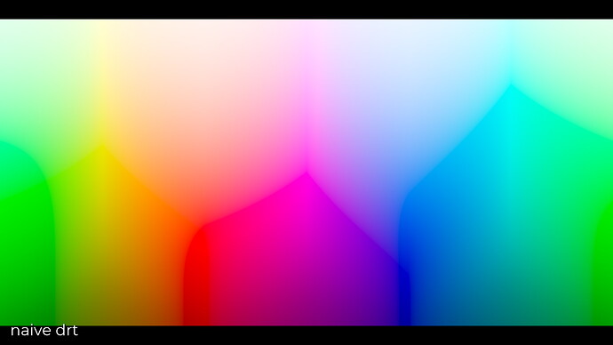
Another thing is that this transform still does not have any sort of gamut mapping. You still see artifacts from this with chromaticities that are outside of the display gamut. For example the visible lines in this hue sweep
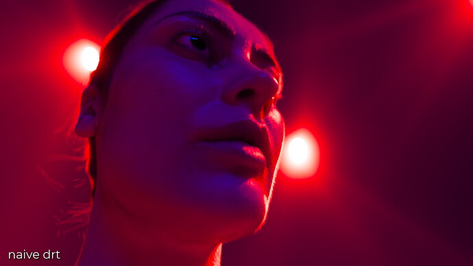
Or the dark fringing around the lights in this portraight:
Interestingly, there are also issues caused by having the 3x3 Matrix converting from ACEScg to Rec.709. This is happening in display linear after the tonescale.
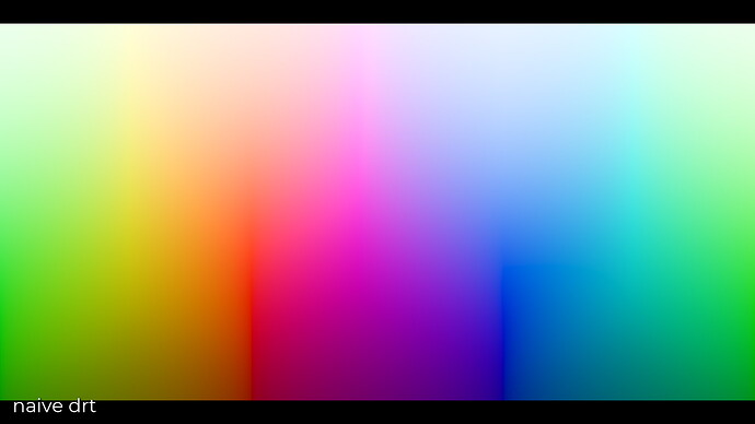
In this hue sweep, which is a sweep of Rec.709 primaries, instead of ACEScg primaries as you saw above, you can see some subtle lines and artifacting from yellow to magenta. This is because the 3x3 matrix boosts the brightness of red when converting to Rec.709, which then gets clamped. This clamping causes a hue shift towards cyan.
Should the 3x3 matrix to display primaries happen before the tonescale? Should it include some type of gamut mapping? Should gamut mapping be used instead of a 3x3 matrix? I have a growing hunch that the reason blues look a little purple and oranges look a little red in Rec.709 is because of the perceptually non-uniform attributes of a 3x3 matrix chromaticity transformation. Can a real color scientist tell me that this is “color pragmatist bullshit”? I would be very curious to know.
Happy to here thoughts and feedback!


