Possible yes … suggested, I wouldn’t. As Thomas mentioned there’s a bunch of reasons we moved past 0.1.1. I’d do a lot of testing before even thinking about it. Yes, it’s not invertible but you can also get some strange stuff happening due to the per-hue adjustments. Is the show CG only or is there any live action?
Full CG stuff. We have tried many options :
- Gamut Compress algorithm : not suitable for our needs.
- Switch ODT : we don’t have the knowledge to do that properly and may cause DI issues (HDR?)
- Use 0.1.1 : I just checked and it is lacking many stuff like ACEScg ?
Hence my multiple posts and examples in order to share what I have been through for the past two years. But don’t sweat it, I need to sleep on it and see things more clearly. At this point, I feel like I have hacked this thread in an inappropriate way. Sorry about that @jedsmith !
Thanks @Alexander_Forsythe !
Chris
Getting the my thread back on track! ![]()
I have built an updated slightly less naive display transform which incorporates a pivoted slope adjustment and a compression curve for shadows and highlights.
EDIT - the link above points to a gist that has since been updated: here is the nuke script in question:
NaiveDisplayTransformPivoted_v01.nk (14.8 KB)
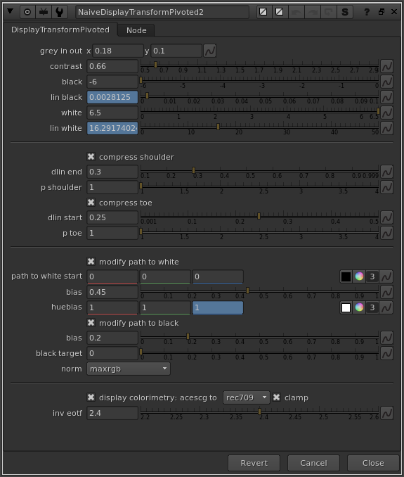
Again, this is not intended for production use, nor as a proposal for a display rendering transform. It should be treated as an experiment, and tested as such.
I’ll try to do a more in-depth video on how it works, but here’s a quick text-based rundown:
- Middle grey in → out specifies the pivot
- Contrast adjusts the slope of the linear section of the curve
- Black is stops below middle grey to map to display 0
- White is stops above middle grey to map to display 1 after compression
- The compression curves utilize the very simple power( p ) compression function.
- dlin start and end specifies where the linear section starts and ends (in display linear values)
- p for shoulder and toe adjusts the slope of the compression curve or how aggressive it is.
Path to White
I’m going to adopt the Timothy Lottes terminology here in an attempt to improve the rather unsophisticated phrase “highlight desaturation”. I will use the phrase “path to white above display maximum.” I described this a bit in my last posts. With a chromaticity preserving display render transform, when one channel clips, and the hue in question is a saturated color, we need to guide the other channels towards the achromatic axis, so that the appearance of a bright highlight is maintained. Without this behavior brightly colored highlights look unnaturally dark.
To achieve this I’m using a technique similar to what is used in the Lottes presentation: moving the RGB Ratios towards a neutral color before multiplying them back into the norm. I am calculating the factor from the compression amount. The path to white start is basically a blackpoint adjustment on that factor. The bias is a gamma adjustment on that factor. And the huebias is an additional gamma adjustment per-channel. This introduces hue skews in the path from saturated color to achromatic axis, but it is interesting to play with so I left a control there for it.
Since we are compressing shadows now as well, there is also a set of controls for desaturating those compressed pixels. One of the things that’s always bothered me about per-channel RGB renderings is how highlights get desaturated, but shadows get more saturated, leading to unnatural colors in shadow areas.
The techniques used here for Path to White adjustments are very much still in progress. Ideally I’d like to figure out how to modify the path to white based on hue without losing chromaticity invariance. Currently in my aesthetic opinion, red and blue desaturate too quickly, and I would like to be able to control this. If anyone has any ideas here please chime in.
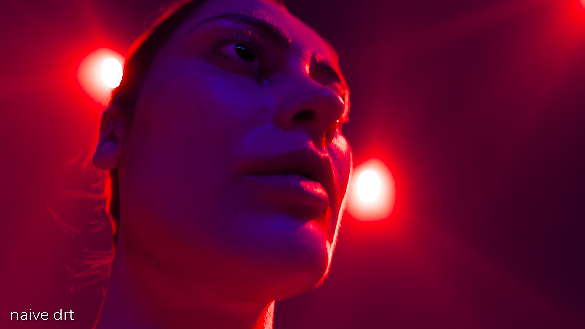
Some Pictures
I’ve decided to upload the source images I’m using for testing to a dropbox folder. It contains 2k exr images from a variety of open sources. I thought it would be convenient for people to grab them, but I won’t submit them to the official dropbox in case there are issues with rights. If this is not okay please let me know and I’ll take them down.
I’ve uploaded 200 comparison images of the Naive Display Transform vs the ACES Rec.709 rendering here (sorry my dropbox is full so it’s a mega.nz link)
https://mega.nz/folder/7mJiyDBT#Mt1gJcgvAtRj45VNqTzRaQ
Skin tones could still use some modifications, and I think some brightening of reddish orange hues would help the fire and explosion frames. Overall I think it’s looking pretty decent. A neutral and lower contrast rendering which preserves chromaticity values.
Gamut Mapping
Another thing is that this transform still does not have any sort of gamut mapping. You still see artifacts from this with chromaticities that are outside of the display gamut. For example the visible lines in this hue sweep

Or the dark fringing around the lights in this portraight:
Interestingly, there are also issues caused by having the 3x3 Matrix converting from ACEScg to Rec.709. This is happening in display linear after the tonescale.
In this hue sweep, which is a sweep of Rec.709 primaries, instead of ACEScg primaries as you saw above, you can see some subtle lines and artifacting from yellow to magenta. This is because the 3x3 matrix boosts the brightness of red when converting to Rec.709, which then gets clamped. This clamping causes a hue shift towards cyan.
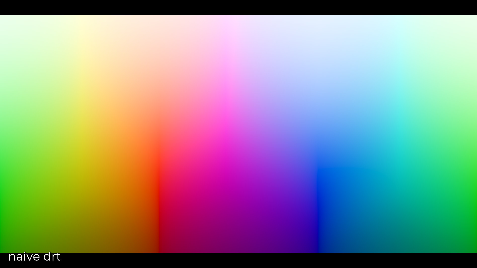
Should the 3x3 matrix to display primaries happen before the tonescale? Should it include some type of gamut mapping? Should gamut mapping be used instead of a 3x3 matrix? I have a growing hunch that the reason blues look a little purple and oranges look a little red in Rec.709 is because of the perceptually non-uniform attributes of a 3x3 matrix chromaticity transformation. Can a real color scientist tell me that this is “color pragmatist bullshit”? I would be very curious to know.
Happy to here thoughts and feedback!
5 Likes
For those who are interested in going back to the future, I’ve put together a pure Nuke node implementation of the ACES 0.1.1 Output Transform.
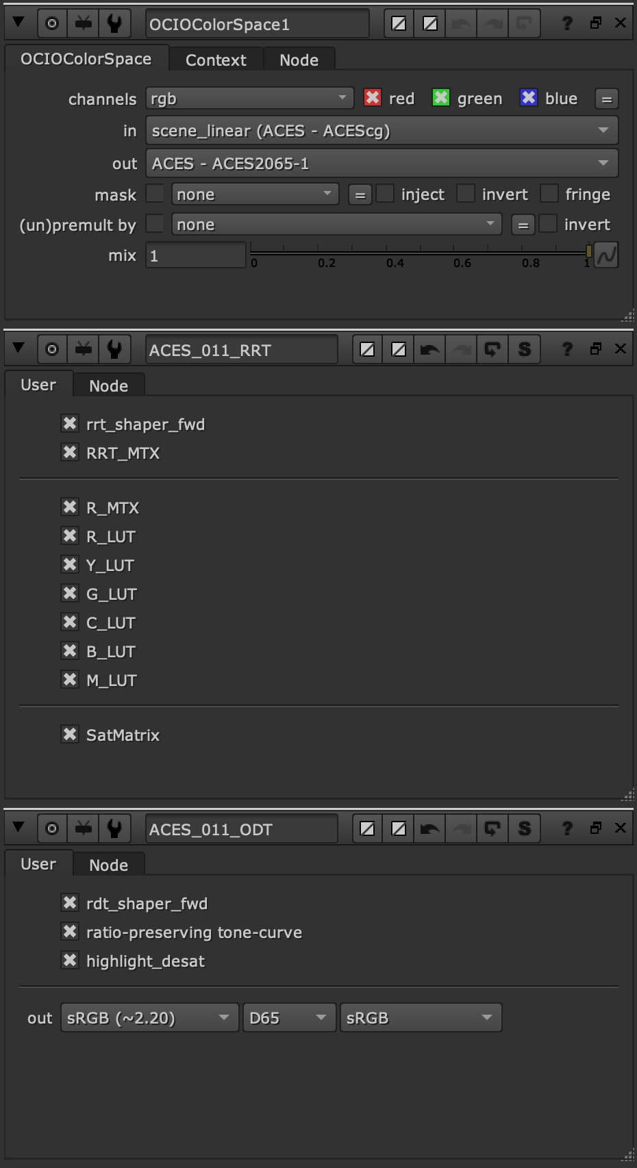
The intent here is to allow people to explore what they do and don’t like about the old 0.1.1 transform, and make it easier to compare with the newer stuff (Like running it along side Jed’s 1.0.3 → 1.2 Nuke nodes).
I’ve also exposed toggles for most of the parts of the RRT and ODT that have a material effect on the look, so you can turn them on and off to see what does what.
3 Likes
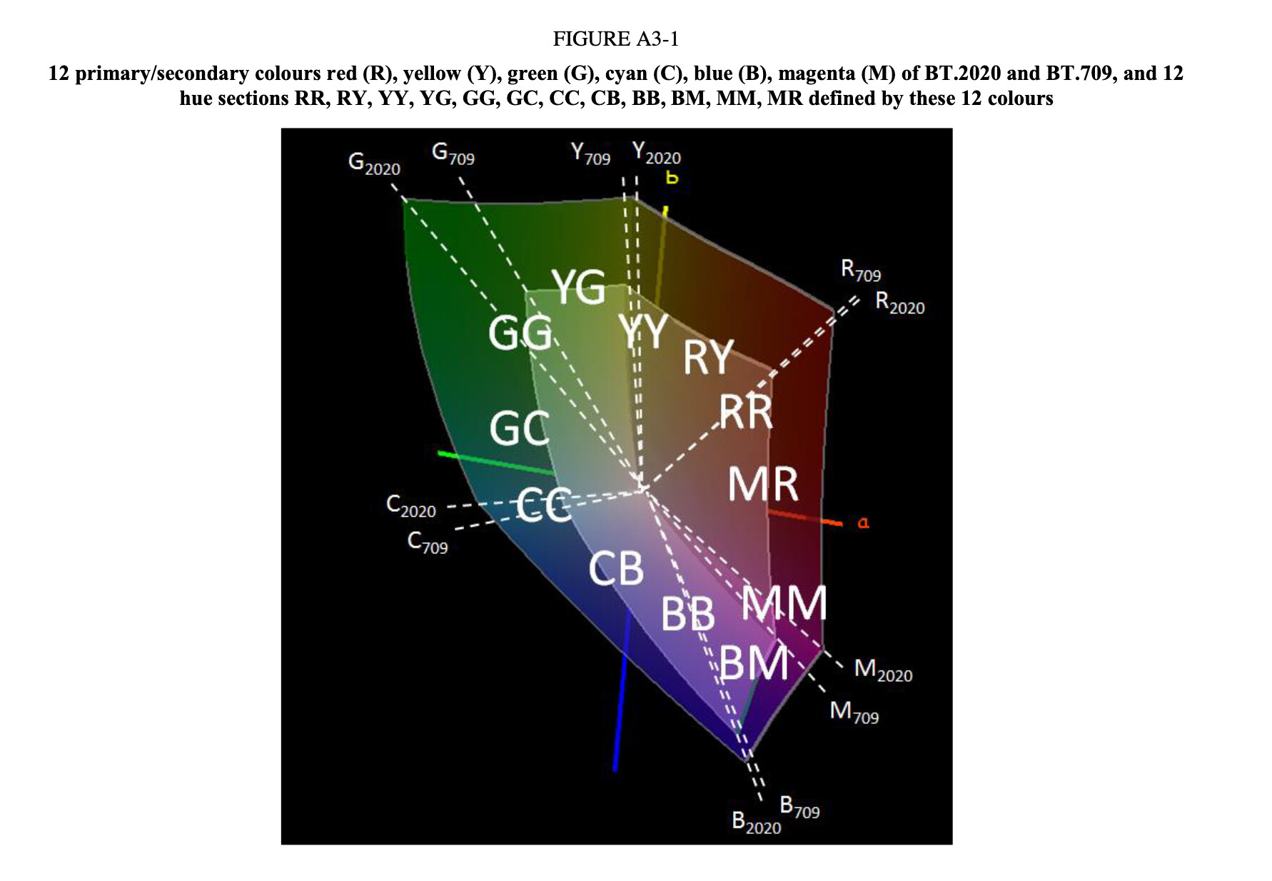
The basis of BT.2020/ACEScg and BT.709 are not aligned together, if you look at BT.2047 Annexes, great care is taken about aligning the hues together using Gamut Mapping.
1 Like
What is the destination gamut volume here?
Is the result to a target volume?
If the destination target can be generated from the source as you have here for volume results, might it be possible to lean on a perceptually uniform model as the final translation step?
Cherry-picked a few images and Juxtaposed them: https://academy-vwg-odt-compare-images-v01.netlify.app/
I would be interested to see a closer fit to ACES current SDR OT.
5 Likes
It may be worth noting that ARRI say in the Alexa LogC Curve – Usage in VFX white paper, with regard to the difference between the 3x3 matrix for “tone-mapped ALEXA wide gamut RGB” and the standard calculated matrix:
Comparing this matrix with the one given above, you may recognize that the latter generates less saturated RGB values (smaller values along the main diagonal). This deviation from the correct conversion is done to compensate for the increase of saturation produced by the tone-map curve.
I do not know if the modification to the matrix is made based on objective or subjective criteria. Perhaps @hbrendel or @joseph can comment.
thanks @jedsmith ! I personally think that this is going in the right direction and your tests are completely necessary to this group.
I will use the latest version of your DRT to test it thoroughly on +100 of renders from our movies, submit them to the supervisors and CTO and will try to provide an official answer from our studio.
Regards,
Chris
Hey,
so I ran Jed’s DRT and the ACES OT on a vast selection of frames and shots to compare. So far the general agreement in the studio is the following :
- All Cornell boxes, spheres, light sabers images look better. We are pretty pleased with the hue preservation and overall it looks more correct. Even GI (or display of the GI) looks better. This makes this prototype really promising to our eyes.
- We have mixed results on lighting/comp frames coming from our past movies. Sometimes it looks better, sometimes it doesn’t. My take on this is that all those frames/assets have been fine-tuned using a certain DRT and displaying them through a completely different transform/technology doesn’t make them magically look better.
I’ll be probably able to give an official response from the studio next week but so far, we’re still very interested by the possibility of having a hue preserving Output transform for ACES 2.0.
Regards,
Chris
1 Like
This is super interesting stuff. I’m still trying to get my mind around the algorithm and the parameters but they certainly look comprehensive.
Take this with a fist full of salt, but I did play with the defaults a bit and anecdotally found the following to be a slightly better balanced starting point based on my image set on my totally uncalibrated monitor. It also felt like a bit of saturation was needed so I tossed in a saturation node in the completely wrong place.
naive.2020.02.01_altParams.nk (16.0 KB)
Feel free the throw up on this while I continue to try to figure out the algorithm and all the nasty side effects my parameter changes probably had.
May have gotten a little ahead of myself. The parameter changes I made help some images and hurt others for sure. In general I think the direction I moved with the highlight luminance is better and restores some of the sparkle we were chatting about. Overall saturation seems to help skin tones. I may have went a touch high on the contrast though and the sweet stop on the path to white really seems image dependent.
I promise I’ll stop with the subjective play now and analyze what the heck is actually happening to the pixels ![]()
Cherry-picked a few images and Juxtaposed them: https://academy-vwg-odt-compare-images.netlify.app/
These are really interesting.
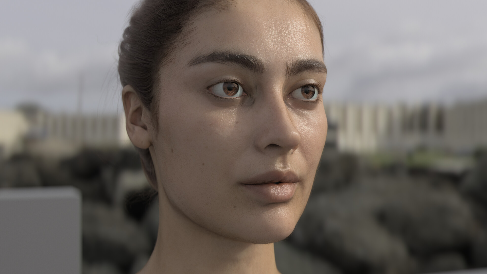
I feel the frame of the CG woman’s face looks far less ‘cinematic’ through the ‘naive DRT’, yet provides a clearer view of what’s actually going on with the asset. More true to ‘the eye’ than ‘the camera’. This feels like a win for surfacing and look-dev, where creating a robust and versatile asset is the goal, but a loss for Lighting and Comp, where ‘make my movie look like a movie’ is the unsaid note hiding under everything.
The explosion on the other hand feels far less realistic to me (take that for what it’s worth, my real world exposure to explosions is pretty limited). My assumption here is that the look was developed in a way that takes advantage of the existing RRT/ODT to give the illusion of additional colour complexity. (Would need some real world unclipped explosion frames to really know here, which are hard to come by)
Once you get to the live action stuff, I feel like the ‘naive DRT’ is generally less attractive across the board. Hurting the ‘looks good out of the box’ angle, but helping the ‘allow the LMT to do the work’ angle.
2 Likes
This echoes my current thinking looking at those images.
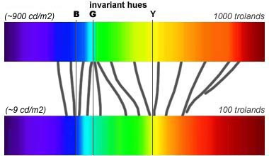
A possible explanation could be the Bezold-Brücke Effect: As luminance increases, there is a notable expansion of the yellow wavelengths roughly above 500nm and also for blue wavelengths under 500nm.
Now that we have opened the can of worms, shall we talk about colour appearance modeling?
- Surround/Viewing Conditions
- Stevens Effect
- Hunt Effect
- Abney Effect
- Bezold-Brücke Effect
- And the remaining ones of https://nick-shaw.github.io/cinematiccolor/advanced-colorimetry.html.
Cheers,
Thomas
2 Likes
Just for reference, here’s the comparison of @jedsmith naive with the default parameters vs. the parameter adjustments I made plus saturation. The nuke node is above.

1 Like
I made some progress today. I figured out a method for biasing the path to white based on hue, and adjusting output brightness based on hue using rgb ratios. This update has a lot of experimentation, including an attempt at gamut mapping out of gamut colors. I think it’s headed in the right direction, but still lots of work to do.
Here are the same test images run through the new version
https://mega.nz/folder/W65DEaZJ#9Ede0e0Ex2v8aYlB91oS1w
And here is the updated node.
3 Likes
Yeah sorry I was going to do an in-depth demonstration video of how everything is working, but I got distracted today implementing new features and experimenting. More info to come!
No worries at all. I’ll take a look at the new stuff but I think this is really doing an interesting job of merging the hue maintain tone scale with a more natural roll off in highlights.
And Juxtaposed here (with numbering trap avoidance  ): https://academy-vwg-odt-compare-images-v02.netlify.app/
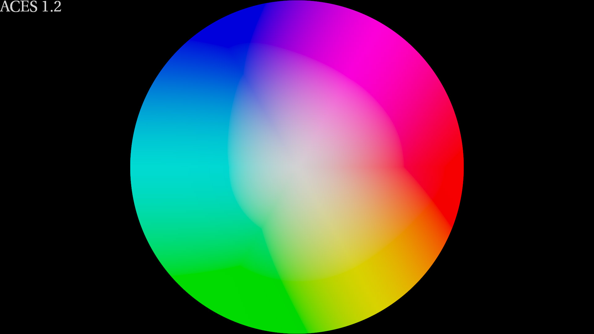
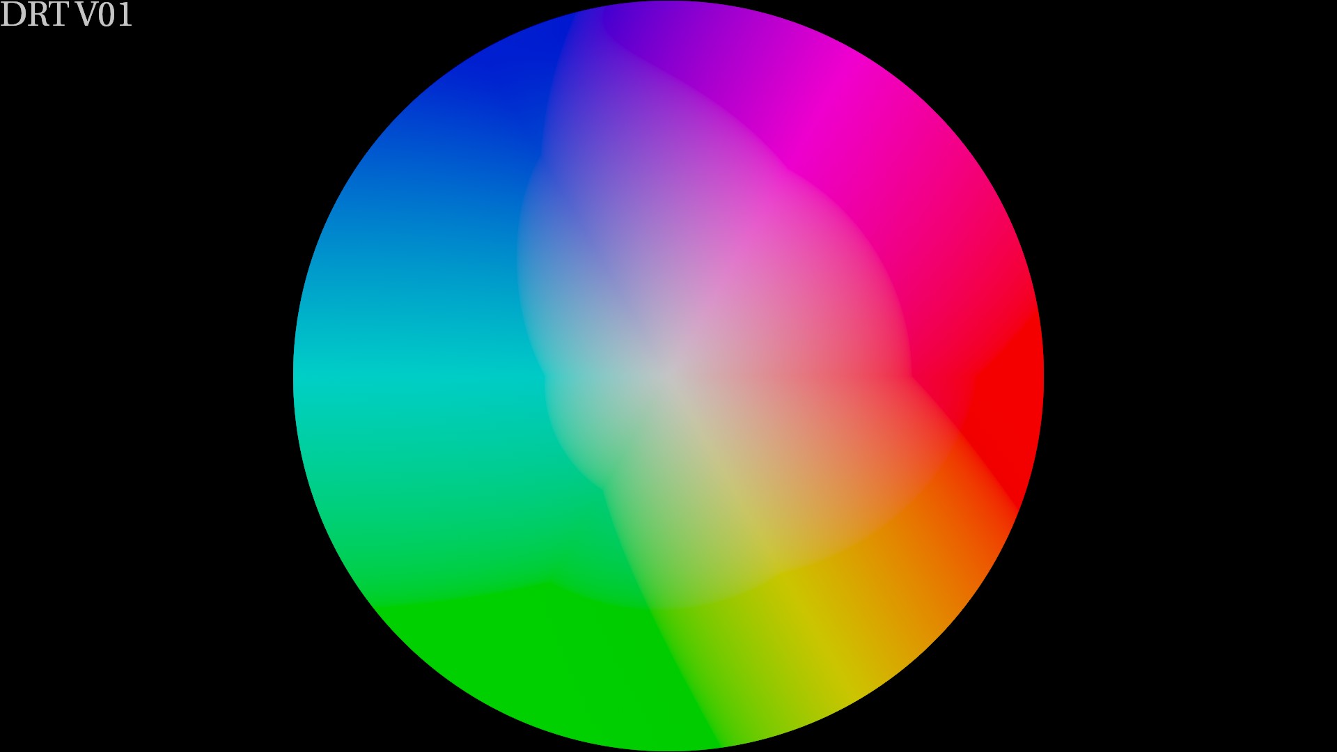
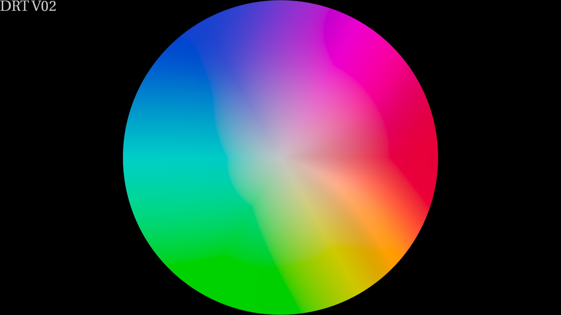
Cool ! I have done a quick test with ACEScg Colorwheels for comparison.
ACES 1.2 - Rec.709 (ACES) in ctl
Naive DRT V01 (default options)
Naive DRT V02 (default options)
So it makes me wonder :
- What should be part of the DRT ?
- What should be part of the LMT ?
- What could/should be done in grading ?
Regards,
Chris