At some low value of luminance relative to the surround, of the order of 1% or less, the color is seen as black, the exact value depending on dominant wave- length and purity. For all colors, as this ratio is increased the appearance of the color passes through a predictable series. At first the blackness decreases, then hue appears at low saturation mixed with black or dark gray. As the ratio continues to increase, gray decreases and saturation increases, until a point is reached at which the gray has disappeared. This point is usually considerably below and in some cases very much below a luminance match with the surround. As luminance is still further raised, the color becomes fluorent1 and saturation continues to increase. The saturation and this fluorence continue to increase up to and slightly beyond a luminance match with the surround. Above this, brightness continues to increase but the fluorence disappears and saturation decreases. The color takes on the appearance of a light source.1
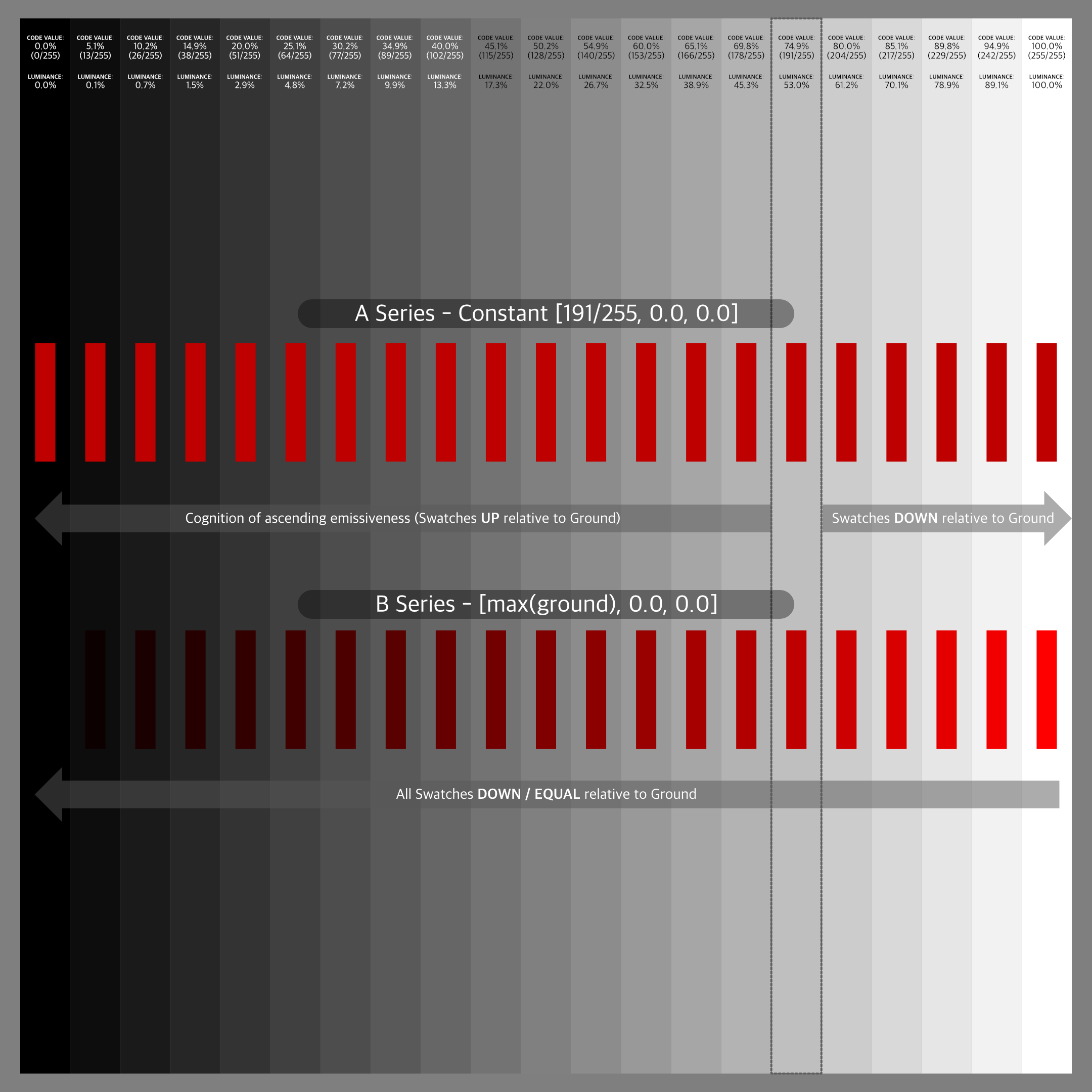
The following is a blunt force trauma scise of the upper row swatches into three distinct neurophysiological clusters:
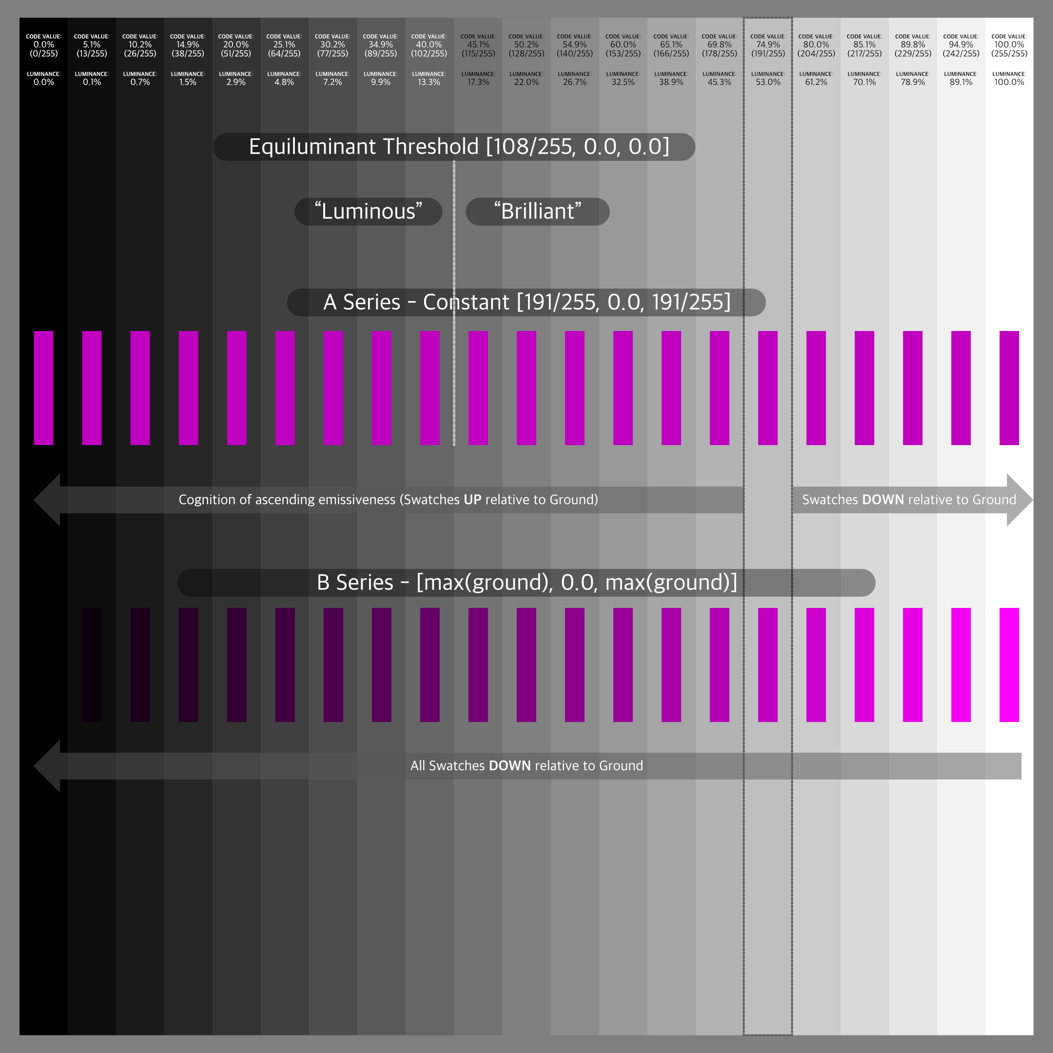
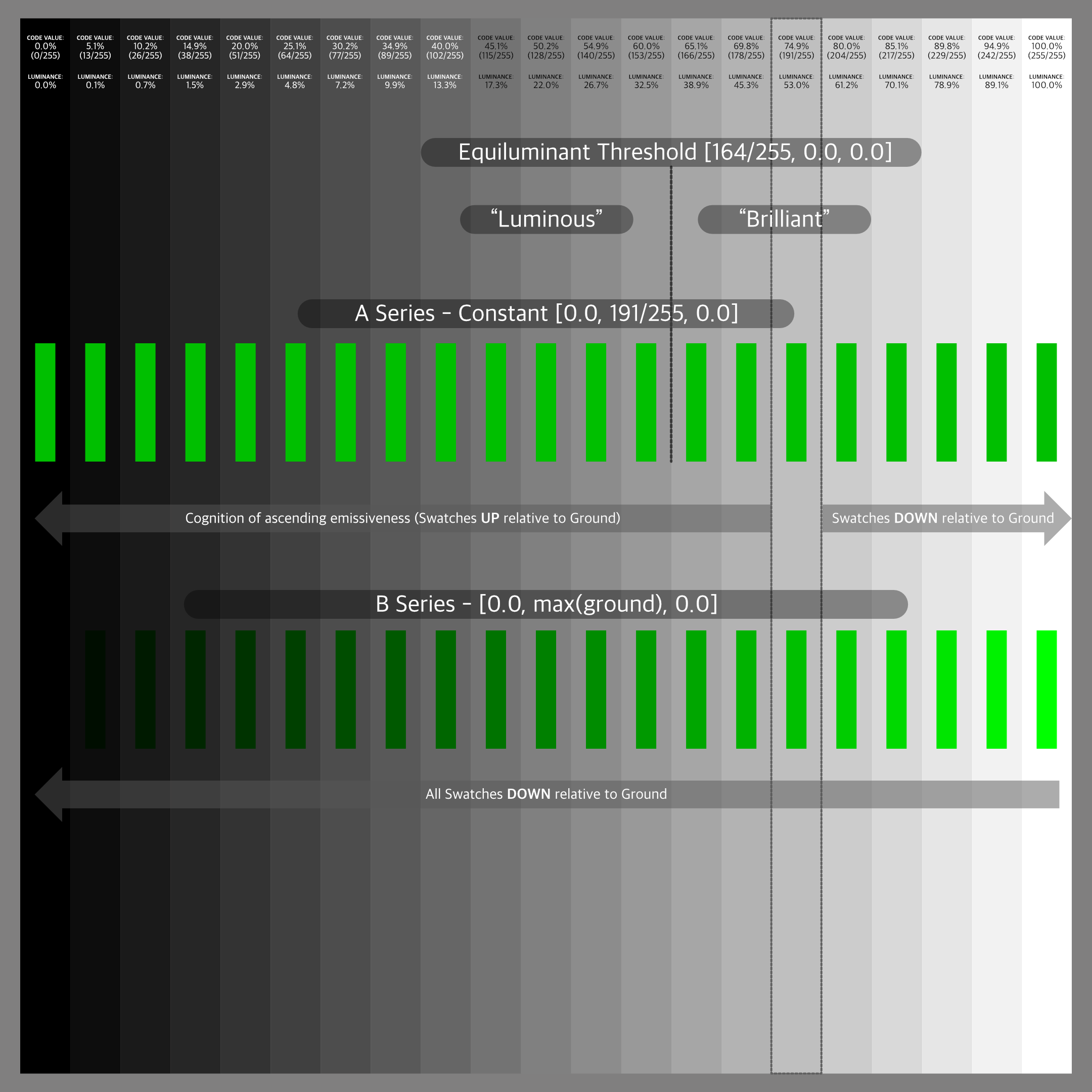
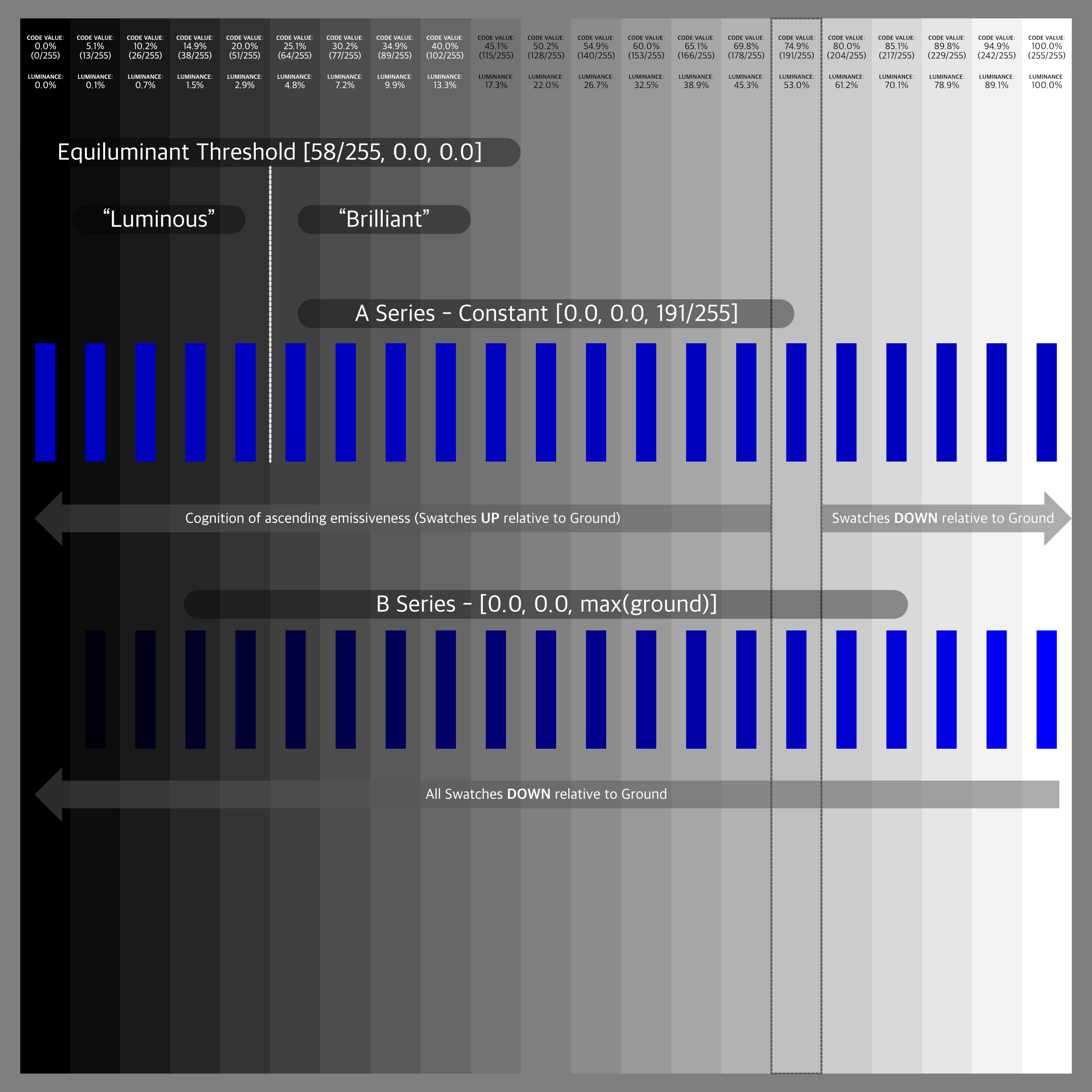
Both luminance and chrominance of the swatch “figure” are in a null or decrement orientation relative to the receptive “ground” field. This is all upper row swatches from the dashed 191/255 “ground” to the right.
Luminance of the “figure” in a decrement orientation to the “ground”, but Chrominance in an increment orientation.
Both Luminance and Chrominance of the “figure” swatch are in an increment orientation to the “ground” strip. A peculiar modulating “lustre” might be cognized somewhere along this range. Perhaps there’s another null between the twin neurophysiological signals of P-D and (P+D)-T?
1 Evans, Ralph M., and Bonnie K. Swenholt. “Chromatic Strength of Colors: Dominant Wavelength and Purity.” Journal of the Optical Society of America 57, no. 11 (November 1, 1967): 1319. Chromatic Strength of Colors: Dominant Wavelength and Purity.
Luke’s dissertation has done a pretty great job of fixing this… introducing a relationship between achromatic and chromatic pathways that produce brightness. He’s done great research in understanding the relationship between magnocelular and parvocelular pathways, and addressed some failures about the transformation from opponency to hue and chroma, mainly that the magnitude of chroma and it’s relationship to physical purity is not the same for all hues. After addressing this significant issue, it became very clear that the relationship to perceptual brightness and the physical stimuli was a simple combination of achromatic magnitude taking place in the parvocellular path and chromatic magnitude.
Although I don’t have his full model yet available, the preliminary stuff I’ve seen looks quite good at addressing the mountains the color maps you’ve shown. It will be well worth looking at once his dissertation is published (coming soon)
I’m pretty sure this is an already solved problem?
We can fix the mountains. The answer is to look at what already “works” in every single technique that balances to an achromatic equivalent illuminance level I suspect. Heck, it’s in every single display!
But as per @daniele, I suspect the “problem” begins to unfold as an ill defined one, to which only ill defined non-solutions will arise.
Ok I’ll bite.
Any such model that attempts to map stimulus to cognition is going to be one to one, goofy noodleberry Hunt-like parameterization notwithstanding, that as Hunt’s model does, breaks down the moment one tries to put it to work.
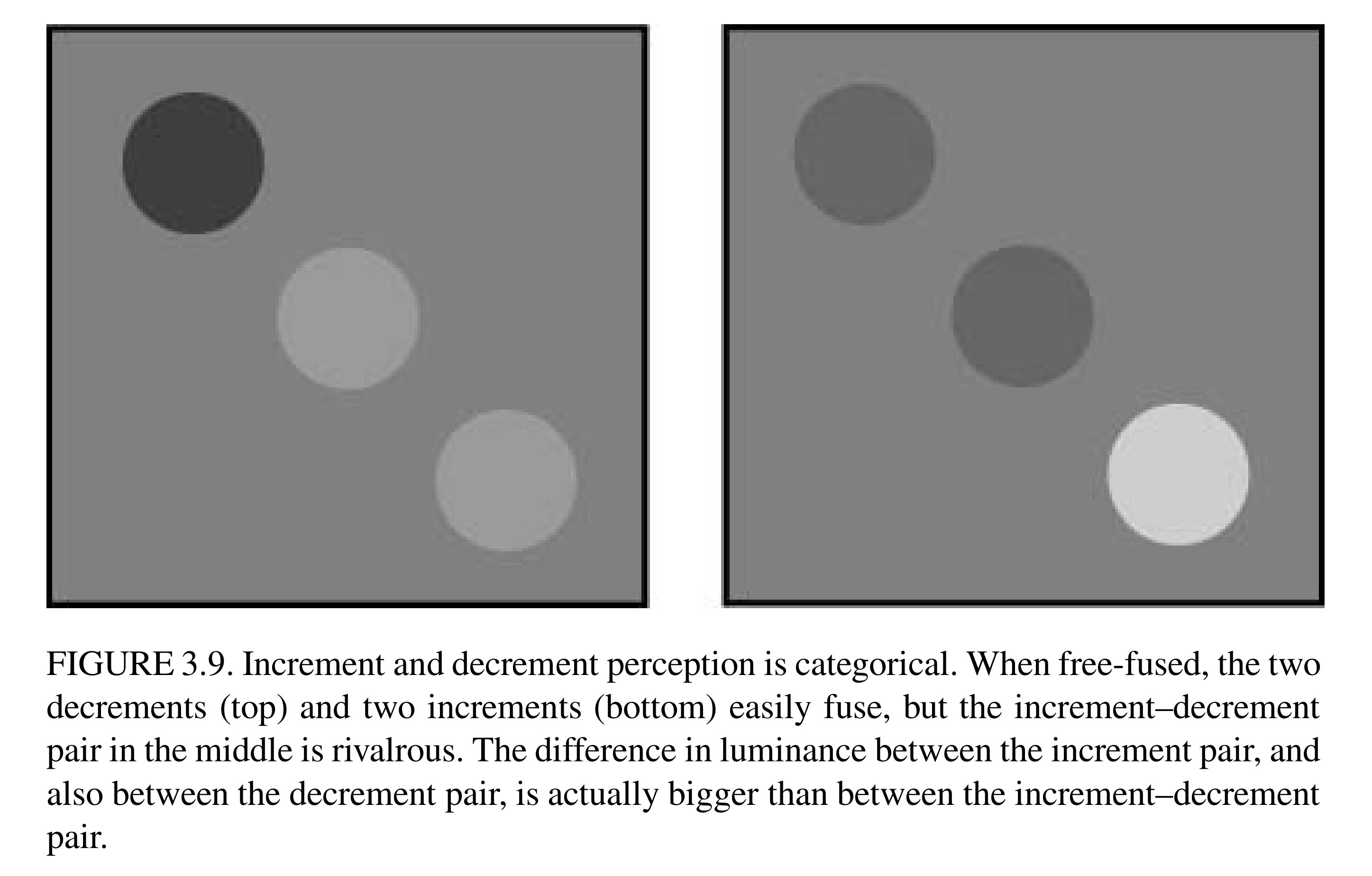
Most beautifully experienced via the Riddle of the Twin Discs.
This dilemma goes all the way back to at least Katz, and lingers as the most problematic component of “the eye as photometer / measurement device”, which all neurophysiological research points against.
For those unfamiliar, take twin discs with annuli, and set the outer annuli to minimum luminance in a display. Set the other to maximum. Set the discs to equivalent luminance. Of course, everyone on the planet knows that the cognition of the interior disc will be “incompatible”. Now freely adjust the interior disc to any achromatic value.
What will become clear is that all values will be unsatisfactory. To really appreciate this, one would be advised to try it. The setup is dead easy to try at home on any DCC.
What unfolds from that, or arguably anyone paying attention to the Hubel & Wiesel1 work, will see very quickly why such a “match” is impossible; the “optic signal” ain’t a measurement. Full stop. As best as the research I’ve looked at, the “optic signal” is strictly differential based along twin dimensions.
If someone wants to read a wonderful paper on this subject, that really tackles the centuries old “Eye as Measurement” concept, I would strongly recommend reading Mausfeld’s The Dual Coding of Color2. I have heard that Mausfeld was running the lab that the deities of visual cognition Ekroll and Faul were at during their time. It’s an absolutely brilliant paper that cuts to this twin differential signal mechanic, and along the way effectively dismantles the “Measurement Conjecture”.
TL;DR As anyone who honestly tries the twin disc situation will realize, any attempt to work on a rather archaic notion of stimulus to sensation is doomed to failure; no one to one “measurement” correspondence will ever possibly work, given that the signals are likely differential in nature, and of a duality that is never expressed in such models.
—
Munsell is not an appearance model… it’s not really mathematically defined. It’s just a color order model. So… sure I guess it doesn’t have the same problem (except it does… because it’s based on flicker photometry).
It’s not an already solved problem as far as I or several dozen other color scientists that I speak to very frequently are aware. There are no mathematical appearance models that can predict HK effect in simple stimuli. If we are wrong… I look forward to finding the survey paper explaining what we are all missing.
While some color order systems may not have the same issues, we’d still like a useful mathematical model to do the same. The thing that seems the closest to working by wide peer reviewed consenseious is CIE CAM. And yes, there are several issues that originate from Hunt… Which have been addressed in multiple papers by Hellwig and Fairchild.
Lastly, your disks demonstration of simultaneous contrast is interesting… But seems to me like just changing the topic instead of a real response. Totally dismissing CAM as useless because it doesn’t predict simultaneous contrast (which it was never designed to do) is a really defeatist and ignores other extensive modern research on extending CAM to do so (iCAM for example)
I’m reasonably sure the papers are already out there.
But first I guess I have to ask what is the Helmholtz Kohlraush effect to you? I am well versed on the linkable Wikipedia entries, the endless research papers from Nayatani, Ware-Cowan, etc., but I’m curious as to what you think the “problem” is?
Ok. And what does CIECAM (or literally any of these models, your pick) reveal of the following pictures? Can any model even bring even a sense of understanding?
I’ve seen plenty of models based on colourimetry, and I would say they are all abject failures. Doubly so perhaps given how basic this articulation is? We could even extend any of them to the simple twin disc demonstration, and I believe they are failing?
I’ll address this when we can nail down what you would outline as the problem surface of HKE. Because honestly, I don’t really know what some folks think is HKE and what isn’t, and it would do my pea sized parrot brain well to get a handle on what this specific facet is about.
(And yes, I’m totally dismissing all CAMs and “Uniform Colour Spaces” as utter nonsense, but that’s just me. So I guess that’s either me being defeatist, or totally unsatisfied with following along with the orthodoxy from the colourimetric approach.)
Wait… isn’t it? Doesn’t it have a notion of “without colour” baked into it? I’m confused as hell at this point.
There is an orientation, local CSF, and luminance based model of lightness that would predict the interesting parts of the images you’ve shared. Here but I have to ask a friend for the reference so I will need to wait until I have more information to share.
But I also want to point out that there is yet another topic / illusion switch to in your first image to metelli’s transparency illusion. There is a paper you would love in the book “illusory contours” which is saddly at my desk in NY. It will have to wait a few weeks until I can scan it in.
In this thread you’ve pointed out several different visual phenomenon that at least at some point are all related but it’s too difficult to discuss and track them all at the same time. HK effect (your rainbow mountains), failures of lightness models accounting for local contrast, transparency illusion, and water color illusion. If you took some time to really write an extensive explanation about what you think the relationship between all of these and do some mathematical modeling on them it would be well worth the time.
I think that myself and some others here would happily engage with that, but it’s just too much to try to comprehend in a few posts consisting of only a few paragraphs each and mixed with other commentary.
I am excited to read it. I have yet to see any except for one generalized approach that is satisfying. The Kanizsa / Minguzzi demonstration is a shot across the bow of inhibition theory.
When a white homogeneous surface surrounded by a black area is divided by a thin
black line, the two resulting regions can appear slightly different in brightness (see
figure 1). Since the conditions of brightness contrast are identical for the two regions,
this unexpected effect is not easily explained. In fact, it cannot be accounted for by
any simple physiological mechanism such as lateral inhibition or frequency filtering.
Metelli holds a tremendous sway over me, so I’d be very keen to have even a clue as to the title. I am reasonably decent at scrubbing up the works.
Oddly, this is exactly the reason I’ve rejected the CAMs outright. I did the manual calculations to “correct” the mountain range, as the tristimulus balancing is remarkably basic. Thank god because I’m the idiot who’s currently arguing with someone with an actual degree in colour science from RIT, which is a sure sign that they should not be listened to.
If you scroll up, you can actually see the result. It’s surprisingly underwhelming as much as I was very excited to see if I could correct them. The model we end up with has been sitting here all along.
Which is exactly why I asked for you to define the HKE effect in your terms, on your grounds.
I am very confused however.
I cannot see anything except Munsell, and all of CIE Colourimetry, indeed being an appearance model. Specifically, the appearance of a global frame of achromatic. If it were not, the notion of “Without colour” would not exist, and it seems to be central (no pun intended) to the notion of “colourimetry” itself.
So, to recap:
What’s HKE to you? If it is the mountains, I’d like to explore what you see as “wrong”.
What is an “appearance” model? I consider “without colour” or “whiteness” as an appearance dimension, but perhaps we need to have a clear definition here from your vantage.
And please don’t quote CIE term lists or Wikipedia, as it doesn’t do me any good in parsing what your vantage is, and I’m very keen on the demarcation line between what is an “appearance” and what is not.
—
1 Kanizsa, Gaetano, and Gian Franco Minguzzi. “An Anomalous Brightness Differentiation.” Perception 15, no. 2 (April 1986): 223–26. https://doi.org/10.1068/p150223.
Well to answer at least your last question, which is about all I have the energy for at this moment. A color appearance model uses some inputs about a stimuli to predict what it looks like. Munsell is not a color appearance model because it’s just a list of XYZ values under a particular illuminant (single state of adaptation) and a list of corresponding value, chroma, and hue numbers. Maybe you can interpolate within it. But it doesn’t have any adaptation model attached or describe any mathematical functions to descrive the relationship between the physical parameters of the stimuli and the appearance values.
And in your own words, and in your own examples within this thread, “CIE Colorimetry” isn’t an apperance model because the same colorimetric values can look different depending on context. Like state of adatpation or relationship to other elements in the scene.
I’m not going to suggest that CIECAM is a “good” appearance model because you rightfully point out it is missing things like simultaneous contrast and “filling in” but at least in includes luminance adaptatiom and chromatic adaptation. And is actually a “model” in that it provides some mathematical proceedures for calculating appearance correlates.
Reading through this thread again, I just want to highlight this comment here and maybe this creates a more actionable conversation. If there is some egregious failure of some regular ACES operation, like a polarity change… Maybe there are tests or models we can formalize to check these. Other “polarity” changes that I’ve seen in other non-ACES color algorithms is causing some colors to cross Key’s naming boundaries. I.e. turning green into cyan / turquoise.
I would claim that any idea of a null of achromatic does indeed have an appearance facet, as does any appearance of a “match”, which implies a cognitive evaluation. But ignoring that…
But let’s stretch the limits of good taste and pretend that all of experience is isolated stimulus against a dark surround. That too seems to be a challenging suggestion, if the escape hatch is “Well it doesn’t predict appearance”. That is, either the totality of the receptive fields play a role in varying magnitudes of influence, or they do not. This is a binary proposition.
OK! Great. “Context”. So to be an “appearance” model we need some parametric description of “context”? To what granularity? When we have a global frame achromatic tristimulus and it is cognized as “yellow”, what sort of “context” do we need to arrive at an appearance model that predicts such?
At risk of sounding like pedantry, I worry that “context” ends up being an infinite regression of an infinite ontological. Who decides what is “context” and what is not? And if we add one more sprinkle of “context”, is that within the model, or do we need another model with such additional “context”?
Yet not a single CAM or UCS can “calculate” a tristimulus correlation of the appearance of the twin discs or Adelson, or literally any of the field dependent articulations provided in this post. Not a single CAM nor UCS.
What I am getting at is that if we place any veracity in the inadequacy of a match of the twin discs and annulus, it at least points in the direction that the basic model of measurement is fraught with failure from the onset. Chasing the dragon of such a model is forever going to fail us miserably due to the wild disconnect between the elementary neurophysiological signals and the erroneous projection of “eye as photometric device”, to quote Gilchrist1, and later expanded upon by Mausfeld2.
Which is why it would seem the “force of a given chromatic signal” problem is already solved via Munsel 19073; Munsell used Maxwellian discs to estimate the relative “force” of purity of opponent colours, which ends up confirmed into the CIE 1931 system. Later, folks like Evans and Swenholt4 and Jameson and Hurvich5 further confirm the pattern.
Hence the need for your specific description of what HKE “is”?
Each of the demonstrations loop to a core construct, which is echoed in primate neurophysiology6. We can distill the demonstrations down to a most basic two foundational concepts, they would be:
That the “optic signal” is a two dimensional construct for each of the assemblies. One construct leads to an increment signal, the other leads to a decrement signal, which are strictly differential in nature.
That the increment and decrement differential signals are propagated and inhibited by way of those twin paths. This propagation of the differential varying magnitude “boundaries” can be considered the “fill” mechanic described by Grossberg and Todorović7.
Drawing this all together into how pictures are formed and why we ought to be paying attention to them, is that the increment and decrement mechanics are plausibly tied to how we scise pictures apart into cognitive assemblies. When we form pictures from measurement devices, we should be paying close attention to how we create those differentials to avoid unintended scission.
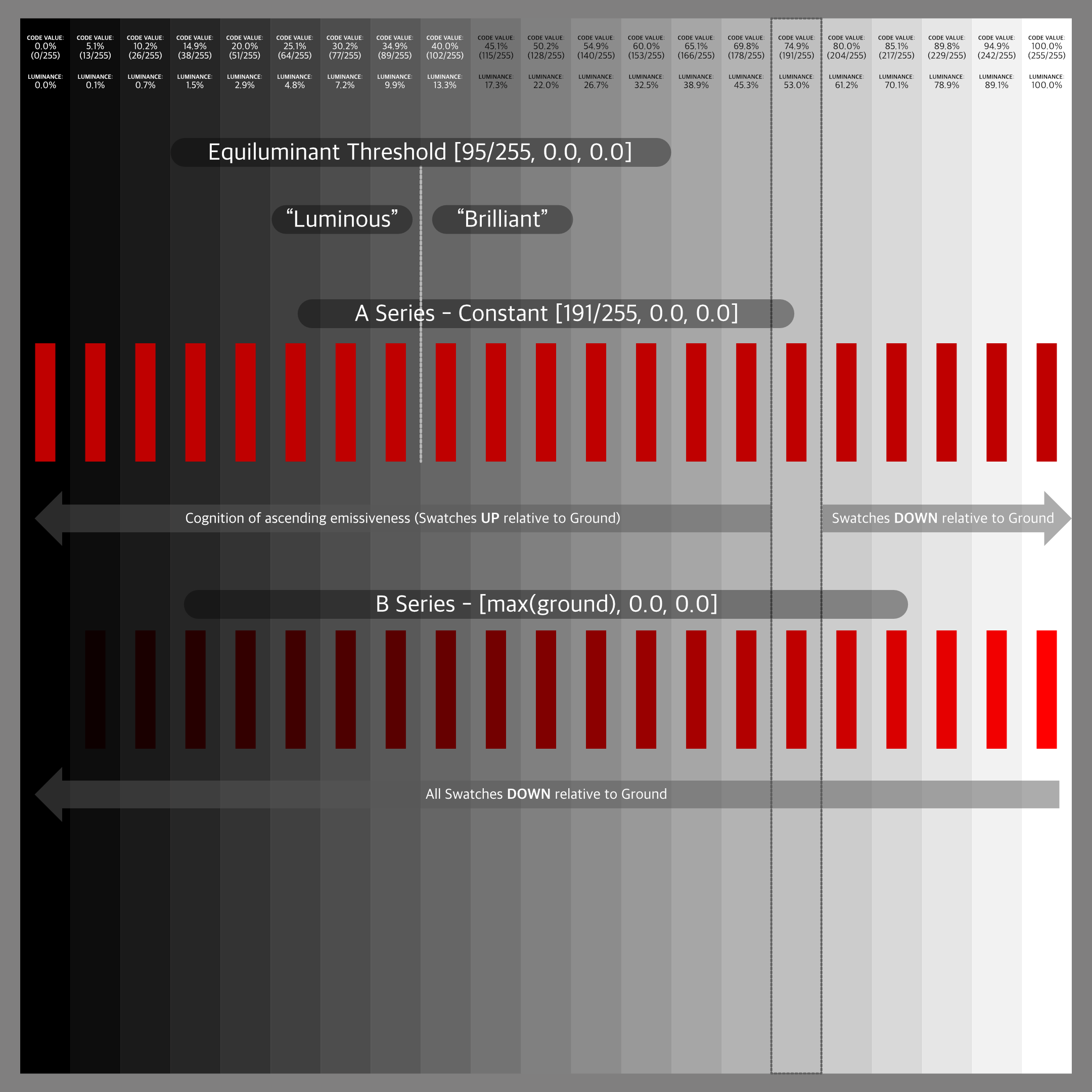
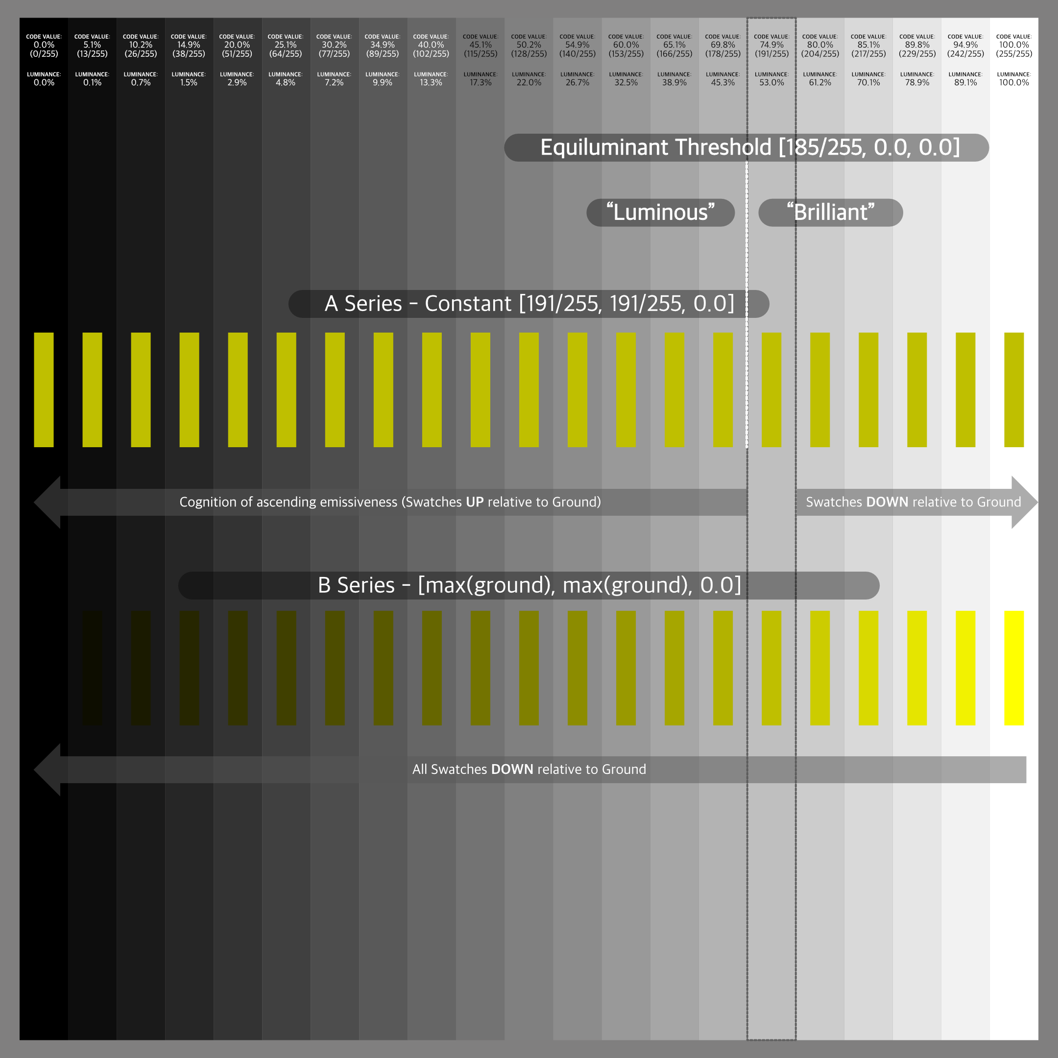
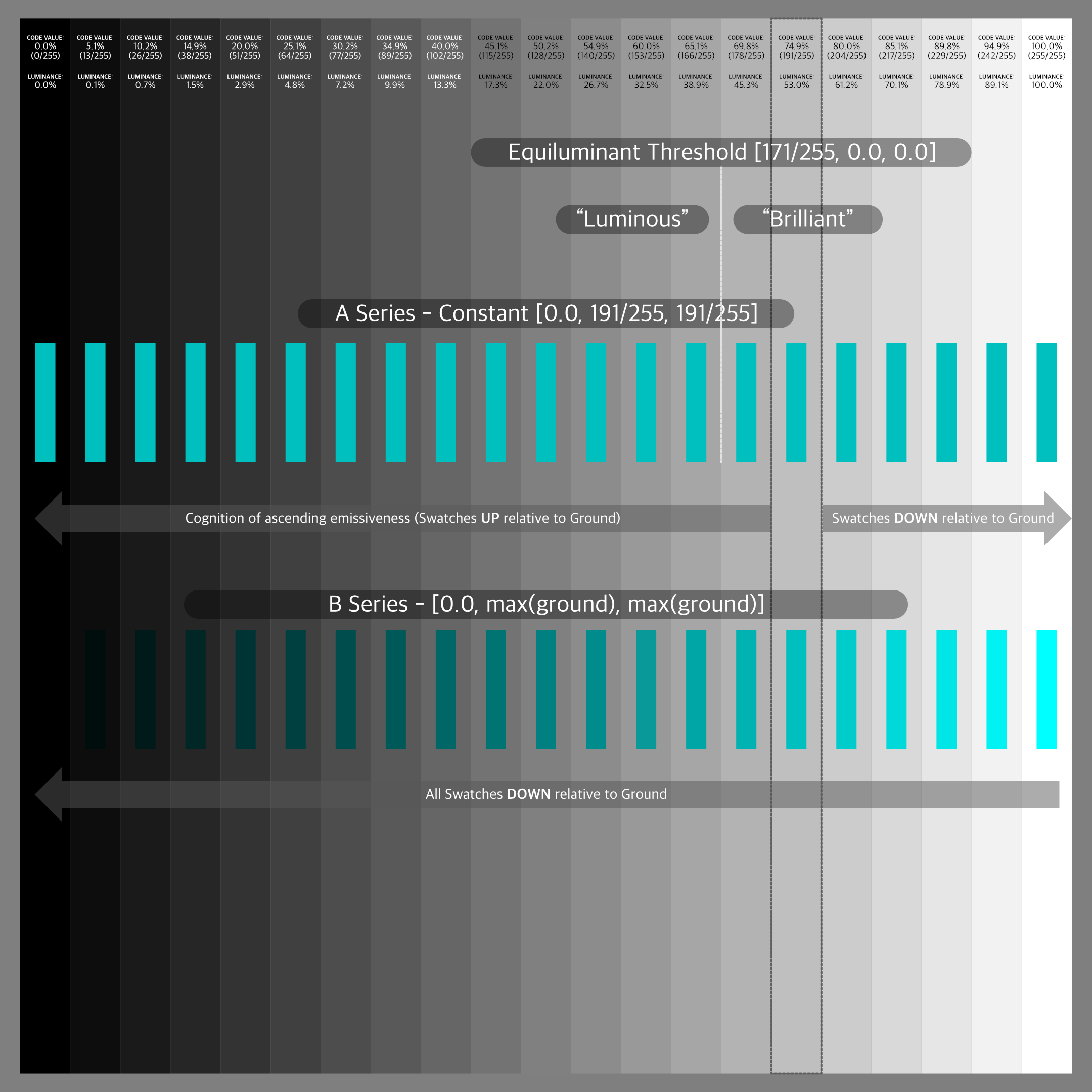
Note that I’ve loosely tried to put the terms “Brilliance” and “Luminous”, to borrow terms from Evans8, in the examples to point to an approximation of the “lustrous” effect that seems to be a biased Gaussian-like range about the fulcrum of increment to decrement at equiluminance. In the “yellow” and “cyan” cases, the labels should be considered to flag a region that isn’t expanded in the swatch demonstrations; the “Brilliance” lustre seems to be related to the global frame equivalent achromatic step point in the diagram, 191/255. The lustre also seems correlated to the chrominance of a given chromaticity angle. YMMV.
I find it interesting that the lustre is incredibly similar to the rivalrous increment versus decrement mismatch in the middle disc of Kingdom’s example9.
1 Gilchrist, Alan, Stanley Delman, and Alan Jacobsen. “The Classification and Integration of Edges as Critical to the Perception of Reflectance and Illumination.” Perception & Psychophysics 33, no. 5 (September 1983): 425–36. https://doi.org/10.3758/BF03202893.
4 Evans, Ralph M., and Bonnie K. Swenholt. “Chromatic Strength of Colors: Dominant Wavelength and Purity.” Journal of the Optical Society of America 57, no. 11 (November 1, 1967): 1319. Chromatic Strength of Colors: Dominant Wavelength and Purity.
6 Dacey, D M. “Circuitry for Color Coding in the Primate Retina.” Proceedings of the National Academy of Sciences 93, no. 2 (January 23, 1996): 582–88. https://doi.org/10.1073/pnas.93.2.582.
8 Evans, Ralph M. The Perception of Color. New York: Wiley, 1974.
9 Kingdom, Frederick A. A. “Levels of Brightness Perception.” In Levels of Perception, edited by Laurence Harris and Michael Jenkin, 23–46. New York: Springer-Verlag, 2003. Levels of Brightness Perception | SpringerLink.
I’m only going to respond to one small point because I can’t waste all my day talking in circles about this… but yeah… that would count has having an appearance facet. But XYZ values don’t incorporate that, XYZ is just the result of a simple weighted integral. You’ve taken my reply, ignored what I was actually replying to and moved the goal posts on why I would say colorimetry is not an appearance model. So once again, colorimetry does not incorporate an appearance model by itself. Some additional instructions / calculations are needed.
And as I said in my last reply, you correctly point out that CAM does not predict the appearance of a lot of the stimuli you’ve shared in this thread. And you raise another good point about how much of the context needs to be parameterized and with how much granularity.
Lastly, actually I think that CIECAM can predict the change in appearance in the twin disks example. That’s what the Y_b parameter is intended for. I’ve tested it to model some other examples of simultaneous contrast and it does that for achromatic contrast quite well.
How about you write your own appearance model and compare it to iCAM that does include spatial factors and then we’d have something to compare to and see that it is indeed better?
I won’t make you wait long. Y_b does indeed model simultaneous contrast. It’s error prone in it’s formulation, and should be improved. Or perhaps an entirely new CAM model derived from your methods would be better. But my point is just to show that there is actually a parameter for the disks example.
Here I’ve used the value 10 in place of 0, because the model is unstable and baddly formulated. And will once again use the disclaimer that I’m not suggesting it’s a good model. But the idea that there is nothing or no effort in understanding these phenomenon in CIECAM or in other maybe more “traditional” color science models is plainly untrue.
If you have a better model derived from a fully spatial image and want to analyze it against iCAM, which would actually do a better job of modeling your image I think there are many people who would be interested.
It’s well known that CAM is not perfect, and some people like myself would even call it bad. But it’s not as devoid of merit as you suggest.
The point I was making is that even if we remove the diffusion-like processing out of the equation, these “measurement” approaches are all going to deliver similar nonsense without accounting for the increment vs decrement direction.
That was my point, and I stand by it. I do not see anyone even sniffing around these sorts of mechanics out in CAM / UCS land, and I would hope that they would become more well understood. We could even make a case that the “unsatisfactory” result of the twin discs is due to the increment and decrement signals being pushed along upstream as cognitive metadata, as a flag for a different mechanic. There’s a massive amount of research here hinting that way, not the least of which is likely Anderson’s entire body of work1.
Given that it is well documented the “dipper” function sometimes manifests in increment vs decrement magnitudes of sensitivity2, but also that there are well documented asymmetries between the increment and decrement dimensions3, it seems odd that few folks in colourimetry are exploring this?
Ultimately there is a lot of debate in the color science and neuro science world about what we should be focusing on. One camp thinks that if we keep studying neurophysiology we will just eventually have a natural color appearance model. The other camp, where most of us working on implementing and creating color algorithms land, is that we should use more cognitive psychophysical methods to just figure out what works and we can move on with our problem solving.
This is the approach that gave us things like opponent color models. Prior to knowing about the neurobiology of opponency, color modeling had already figured out that it was kind of useful to explain things that way. It explained some useful things about how it felt to arrange a color wheel, and it could explain things like color blindness and lines of confusion. Later, neurobiologists were able to find a neurological explanation.
And some time after both of those things happened, Hunt developed what would later become the basis of CIECAM. Actually, CAM16 models the first few stages if “sense” and then estimates the rest of “perception” with some data fit on useful color observations. But this fitting doesn’t explain some other things, like all of the examples you’ve provided here. Those examples don’t mean that CAM is baseless or useless. But they do point out that probably more reconciliation with other V1 and V2 processes, where receptive fields covering a larger portion of the visual field lead to things like “filling in” and chromatic induction.
You aren’t wrong that there is a lot of neurological research on those topics. And a lot of color scientists do read those papers. But unfortunately they haven’t congealed into a color appearance model yet. At some point we need to answer the question “that part of the image, how much more colorful is it than this other part” and despite CAM’s many failures. It at least does a better job of that than any purely neurological model I’ve ever read.
If you think there is enough research out there focused on these fundamental neurobiology effects that you can produce a color appearance model, then please do so. A list of links and models of particular one off illusions doesn’t ultimately help move the needle on getting a model for color processing in image manipulation. Take all these ideas, and weave the thread between them that actually makes a usable model for everyone. I have no doubt that CIECAM would be better if it incorporated more neurological modeling layers. It is time again for more reconciliation between fields (the work of Michael Webster might inspire you)
But we are all waiting for someone like yourself to actually be able to do that work and show it.
Until then I’m not sure what the value of posting all these links and examples is. It’s not an interesting insight to point out that “CIECAM can’t model filling in!” “CIECAM can’t model chromatic induction!” Those are well known insights, and no one familiar with CIECAM and it’s development should claim that it can. Because quite plainly and obviously it doesn’t do those things and it was never designed to.
If a model that can include those things is necessary, then it’s time to get to work to produce that model. But it seems like quite a few people are making OK progress using some variation of CIECAM in the meantime.
All of these images are quite interesting. In each the top set shows the effect of simultaneous contrast. And the bottom set is quite a good demonstration of the HK effect, particularly the blue and red which show that even though those stimuli have less radiance and less lumiance than the achromatic bar that they are contained in, actually they can still appear to be brighter than that. (There you go… there’s my definition)
But you are invoking this third thing that has recently been written about by Hao Xie related to G0. Where you above a certain point, not only do the lower colored bars look brighter than the achromatic bar they are contained in, they also look brighter than kind of “neutral white”. They look so bright that they are glowing. Or to use another color science term, they are super-lumineous. Now the particular point at which they become super lumineous depends on other factors as well… one the HKE ratio at that hue, but more importantly other stuff in the visual field that will affect where the “neutral diffuse white” point is, in terms of luminance.
I.e. other stuff in my visual field will change what luminance level G0 holds and what “brightness” or “brilliance” level is required to exceed it and create a super luminous stimuli.
Here’s the metelli paper i mentioned earlier: Metelli, F. (1974). The Perception of Transparency. Scientific American, 230(4), 90–99.
And another paper on defining the diffuse white point that might relate to when stimuli become super-luminous: Anderson, B. L., Whitbread, M., & de Silva, C. (2014). Lightness, brightness, and anchoring. Journal of Vision, 14(9). Lightness, brightness, and anchoring | JOV | ARVO Journals
And lastly one attached paper that attempts to incorporate a spatio-temporal CSF into CIELAB. It would be reasonable to try to incorporate the same into a better model than LAB. Like Luke’s new work.
Hirai, K., Tumurtogoo, J., Kikuchi, A., Nakaguchi, T., Tsumura, N., & Miyake, Y. (n.d.). SV-CIELAB: Video Quality Assessment using Spatio-Velocity Contrast Sensitivity Function.
At the end of all this though… I’m still left with three questions: is this relevant (the answer is probably yes), is it well formulated enough to use now (no) and lastly when will there be an appearance model that incorporates all these neurological factors that you so desire?
I am moderately confident the fulcrum is a equiluminance, with a biased Gaussian-like distribution around this point regarding “lustre”. Due to the following…
I do not “desire” it. I can’t see any understanding of colour cognition without it, given the increment and decrement paths appear to cause the “swings” further up and down ala the Adelson Snake, the “hue” swing demos, the HKE beyond colourimetric swings, etc.
The articulation mechanic seems to be the driving force behind all of this.
I am past fifty percent confident that the mechanic is not “spatial” per se, but possibly linked to a field propagation inspired mechanic. Of the large number of “spatial” models I have seen, they all succumb to parameter-itus. Which loops back to the “Who decides what is context?” question.
I’ve only seen one incredibly elegant solution that reinforces the broad belief that the fulcrum is the P+D increment / decrement null. I at least suspect the other null, namely the combined vector of the twin “chromatic” signals (P-D & (P+D)-T) might have cognitive implications.
This all seems to orbit around the questions that no one yet has sufficiently answered, or even offered a conjecture as to:
Why exactly does analog creative film remain the apex predator of picture formation?
What are the neurophysiological mechanisms that the creative absorptive based mediums lean into?
There’s at least some hope we can answer these if we can get the horribly misguided and contested notions of “cone bleaching” out of the vernacular.
Pure values never attenuate except under fixation. And even if one wants to peddle this as the attenuation / amplifications of purity in a picture, it remains a juvenile and misguided notion; the amplifications / attenuations of purity that occur in pictures are at much lower thresholds than any mythical “cone bleaching” would occur at1.
Further, we can also detect a black floor threshold that appears integrated into this puzzle:
Note how the “black” is attenuated as well? If we were to carefully integrate any region of a decrement “black” into the latter picture, it would trip as “uncanny”.
—
1 If one blots the sun itself, some chromatic cognition will still occur. The idea of “cone bleaching” as a useful explanation for what happens in a picture is juvenile and lazy, as well as a conflation of the term “bleaching” with “chemical bleach of a white shirt”. It is frustrating that so much lazy thought discards the incredibly perplexing mechanic in pictures on this absurd ground.