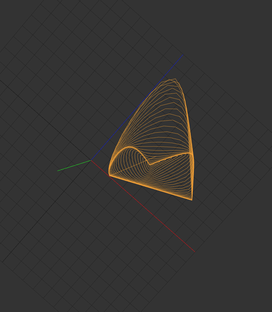
Just throwing this into the mix. I’m sharing a Jupyter Notebook where I started to explore the idea of camera-referred “hue lines”. This is specific to post-IDT gamut mapping, and since the conversation has evolved since I initially created this it is now somewhat out of scope, but I’ll share anyway.
The basic idea I was starting to explore was how we could be handling non-colorimetric (failing Luther-Ives condition) out-of-gamut values. Where the notion was, since these values are non-physical and are clearly distortions/perturbations of a platonic colorimetric ideal, should we not keep this distortion in mind while mapping values back into a “sensible” range?
The notebook introduces a simple physical correlate to perceptual hue, and follows that through the IDT process.
I’m also totally acknowledging this is a bit hand-wavy, but wanted to share it to stir up the pot a bit
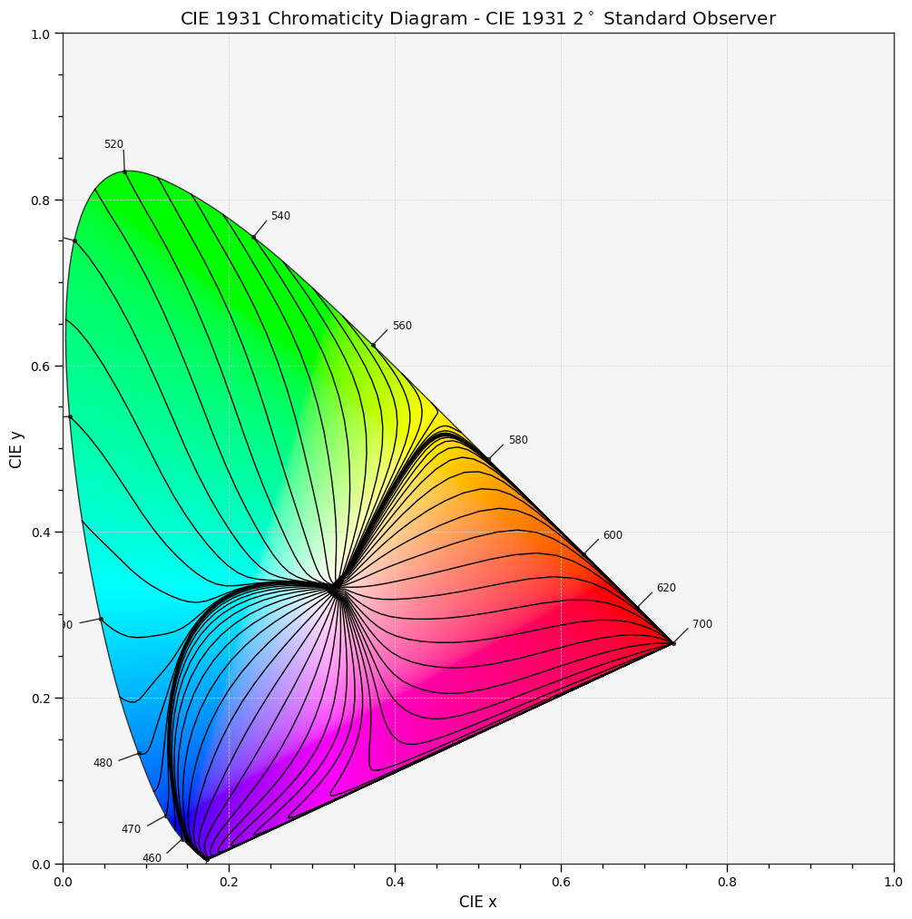
It essentially does a similar job to your optimal_colour_stimuli definition but while generate_pulse_waves is built to generate the whole surface at once, the triangle base will prevent generating the hue lines like yours.
I am not so sure we can infer psychophysical dimensions purely from spectral observation.
Especially the assumption that a box spectrum (or gaussian) which gets wider or thinner will elicit a constant hue perception. I see no reason to believe that this is happening in nature, so why would we tune in on that dimension? In nature, when we see the same object more or less pure in colour, it is because we change surface attributes like wetting the surface. Or dust on an object (mixture with unselective particles) will make it appear less pure in colour.
But the spectral toolbox is useful to elicit some physical fundamentals, for example, to define the boundary of matte, reflective colours and light-emitting colours. Here is a video where I use a similar approach to you to determine the boundaries of “natural colours”:
Skip over to 7:15min.
But your work shows nicely how things go through the roof if you throw in another observer
I was willing to parameterise the camera selection but I saw that you are using a hardcoded IDT matrix from Raw to ACES, so I would probably need to implement that first cleanly once and for good.