Some reflections and experiments

Hi everyone!

I was chatting a bit with Chris Brejon, and he thought it would be useful if I shared some reflections and experiments I have done here. For those who don’t know me, my background is in video games and I guess my biggest claim to fame is having made Oklab, which I have seen pop up a few times in discussion here. I have never really worked with any part of ACES except for the output transforms, so my knowledge is a bit lacking regarding how it fits into the bigger picture.

This surely ended up being a lot of text and certainly more than I initially anticipated! I hope you found this interesting and relevant and that this post gives some fresh perspective and some new insights. Some of it has certainly been said before here, but hopefully most of it is new or different enough.

The post is split into three topics:

  • Dealing with the sharp edges and corners of RGB gamuts
  • Finding a path to white
  • Input gamuts

Dealing with the sharp edges and corners of RGB gamuts

The shape of RGB gamuts form transformed cubes in linear color spaces (and some kind of distorted cubes in perceptual models). A consequence of this is that of you plot the hull of an RGB, you will not get smoothly varying colors.

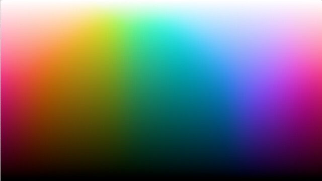
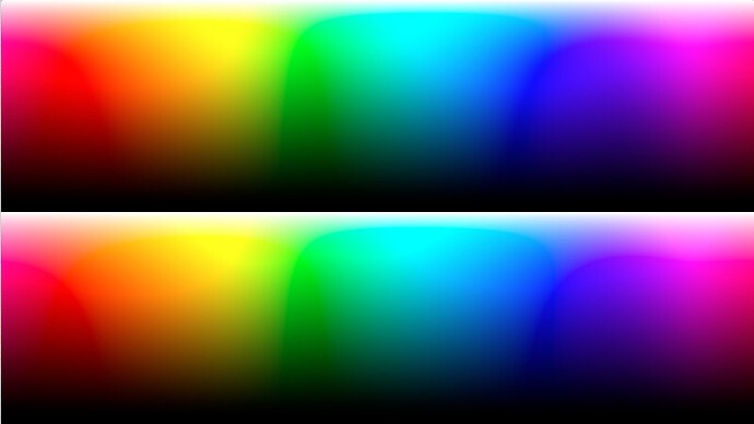
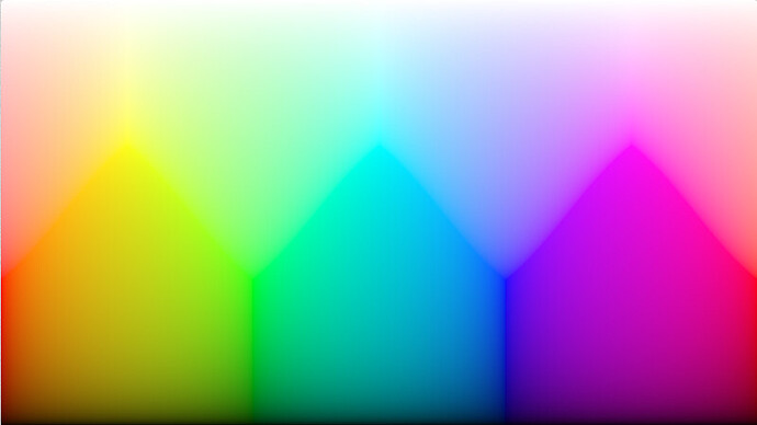
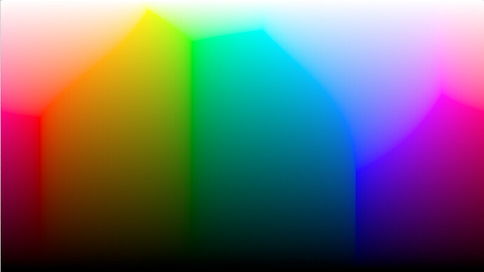
Here is a simple unwrap of linear sRGB:

The edges of the RGB volume are clearly visible as lines, meeting up at the RGB primaries and cyan, magenta and yellow.

This uneven shape poses a problem when doing gamut compression to RGB color spaces, at least if the mapping is required to reach all colors in the gamut. You end up in a situation where some smooth line in the input gamut is mapped the hull of the target RGB gamut, making the output non-smooth wherever the edges of the cubes are crossed.

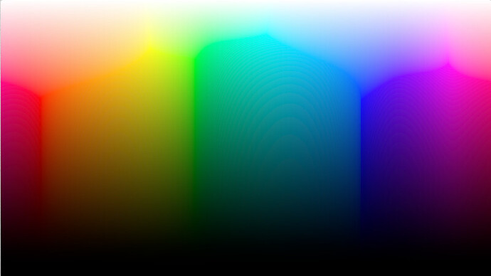
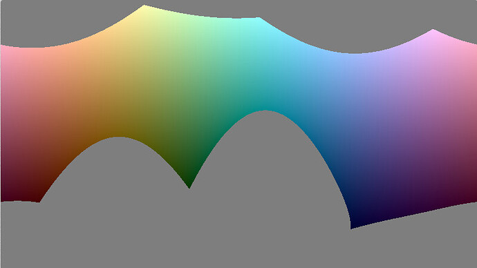
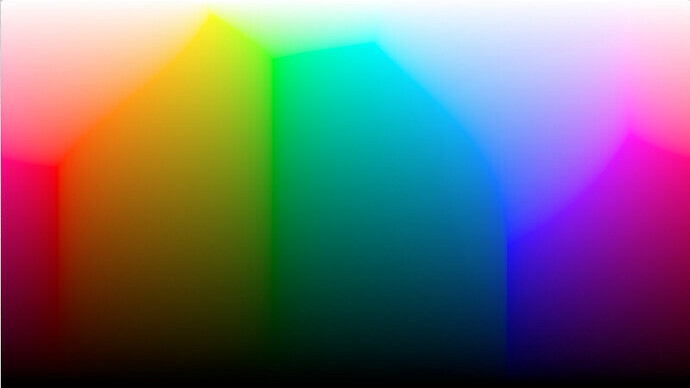
This problem is unfortunately even worse if doing projections along constant hue and lightness lines. The reason is that the faces of the RGB cube end up almost perpendicular to hue and lightness in certain cases. This is most apparent in the transition from blue to cyan. You can clearly see it in this plot. Here in Oklab, but all models matching perception of hue will have this issue, since it is a property of hue perception.

So, what are the options for dealing with this when doing gamut compression?
1. Prioritize keeping hue and lightness* constant, and accept the uneven mapping at the boundary. You can, with a lot of effort, create a mapping where this does not affect the interior of the mapping. Okhsl is an example of this, mapping sRGB to a cylinder, but it does not fix the boundary. These methods are also fairly expensive to compute, since they require computing intersections between a line and the distorted RGB cube.

2. Keep hue and lightness* constant, but give up the requirement be able to reach all colors in the target gamut. This way you can smoothen the corners of the cube to get a smaller but smooth gamut.

3. Accept hue and lightness* distortions for very saturated colors. Make a transform that distorts hue and lightness* of saturated colors to move closer to the edges and corners of the RGB cube. In a mathematical sense, this means making the edges of the gamut saddle points, allowing smooth curves the pass through the hard edge, by momentarily stopping there. Per channel tone mapping is a way of doing this, but does so very extremely (causing the “notorious six”). Other tradeoffs exist in this space which more delicately balance maintaining hues and keeping the output mapping smooth.

*) Or some other luminance/brigthness/lightness-like metric

I would argue 1. isn’t really a good option. The artifacts it causes are too large and it is also computationally expensive. If being able to produce the entire gamut is a requirement, 3. is the only option left. We need to balance smoothness and hue distortions. So what can that look like?

There are certainly other ways to achieve this, but one approach is the following:

  • Start by doing hue preserving gamut compression to a smooth gamut that is larger than the target RGB gamut.
  • In the target RGB space, perform a soft clipping step.

The smooth gamut approximation needs to be larger by enough margin that the soft clip step reaches the hull of the gamut.

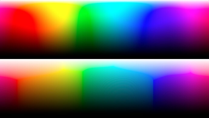
How much this mapping preserves hue and lightness depends on how close the smooth gamut approximation is to the real gamut. Here is an example with a fairly simple approximation (so, this is not the best this method could perform):

Here of course neither example is great looking, but that will always be the price for reaching the hull of an RGB gamut, the hull will never look great.

On the other hand, if backing of the hull slightly, the pure hue preserving method still shows issues around where the edges of the RGB gamut is projected, while the slightly hue distorting solution provides a much smoother result.

The code for this test is here:

And a related experiment used to derive it here:

Again, this is not the best this method could perform, it is just a quick experiment. The current gamut approximation was made to be simple enough to not require precalculating and data per RGB gamut. You with an optimization process you can definitely get a quite tight fit that is cheap to precompute (and it won’t be very expensive, just not fast enough to run per pixel).

Finding a path to white

I think it is also worthwhile to analyze a bit how and why saturation/desaturation occurs when applying tone curve per channel in RGB (and a similar but more complex process occurs in film). While per channel curves behave quite terribly for saturated colors close to its primaries, for low/moderately saturated colors they do behave quite nicely and automatically provide saturation changes that nicely match their tone curves. By analysing how this works, we can get some insight into how to generalize in a way that gets rid of the problems.

So, lets analyze this a bit mathematically. We have three linear source values: R, G and B and a tone curve f(x). If we are looking at a color with low saturation relative to the RGB primaries, all the channel will be close to some grayscale intensity I. We can then express R, G and B as

R = I + ΔR
G = I + ΔG
B = I + ΔB

Where ΔR, ΔG and ΔB are some small differences. If we apply our tone curve to this, we get:

f(R) = f(I + ΔR)
f(G) = f(I + ΔG)
f(B) = f(I + ΔB)

We can now use the property that ΔR, ΔG and ΔB are to analyze what is going on. We have that:

f(R) ≈ f(I) + ΔR f’(I)
f(G) ≈ f(I) + ΔG f’(I)
f(B) ≈ f(I) + ΔB f’(I)

where f’(x) is the derivative of the tone curve.

With this we can now see that the saturation change is primarily driven by the derivative of the tone curve, and more specifically saturation is changed by f’(x)/f(x).

Here’s an example of what this looks like for a simple test curve:

Designing a hue linear path to white

So, with this knowledge how can we design a path to white that keeps the clear relation between tone curve and desaturation but preserves hue? For this part, lets also ignore the output gamut and just look at the case where we are compressing dynamic range more freely (and then we can gamut compress the results afterwards).

Perceptual color models with good hue linearity prediction is of course part of the answer here, since we can then desaturate in straight lines in that space and maintain hue. The other question to work out is what to use for our intensity I. What we need is some sort of way to map a given color to a 1D intensity. This intensity will drive the tone curve is applied to that particular color, and how intense it needs to be to desaturate.

One possible criteria for how quickly colors should desaturate is to try and avoid the color appearing brighter than the white color we are desaturating towards. In other words, we want to avoid some intermediate color appearing to fluoresce (more technically this boundary is often referred to as g0). Or, at least it can be useful to control how much colors fluoresce on the way. There will be a balance between using the entire RGB gamut and getting vivid colors, and avoiding strange fluorescing effects.

Another option is to use something more like a regular lightness estimate or luminance, but this is problematic. Doing so results in yellows desaturating very quickly since they are considered bright, while deep blues barely desaturating at all until very bright.

So, we need some kind of metric for how close a color is to appear to fluoresce. I haven’t found detailed data or simple approximations for this easy accessible, so haven’t experimented with approximating g0 directly. A related concept though is the MacAdam limit, the theoretical limit for how bright a surface can be (without literally fluorescing, rather than appearing to fluoresce), and that is fairly easy to approximate. I set up a test for that using the excellent colour python library here to approximate it: Google Colab

With this, we now have a MacAdam limit approximation to try and use as I.

I’ve set up a little experiment using this and the gamut compression discussed here. After playing around with this, having an option to tradeoff colorfulness/fluorescence definitely makes sense, so this is something I added (in the parameter called “offset”). For anyone interested in the details, the code itself contains quite a bit more details than discussed here and at least some explaining comments.

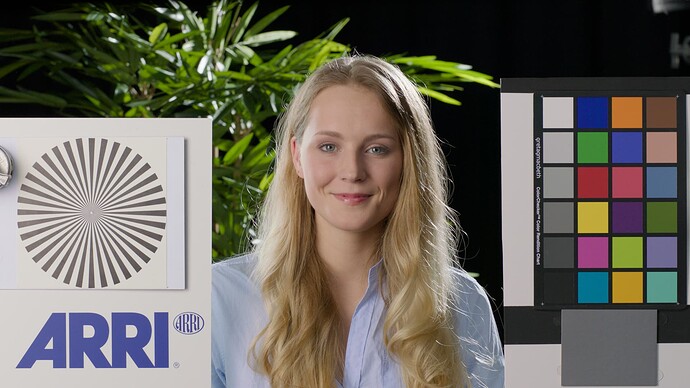
Showing this in just a couple of images is hard, but here a few teasers of what a transform like this can look like. Here are some emissive circles using blends of rec2020 primaries transformed with an sRGB output. The first image has I set to the MacAdam limit approximation, then the offset parameters is adjusted to allow more saturated colors:

The entire experiment is here:

Here is a plot of blends of sRGB primaries through this transform (using an inbetween saturation). I’ve tried to replicate the test image circulated here a few time, but the exposure scale is probably a bit different.

This is available here:

More technical details

These experiments output sRGB and use a tone curve based on a numerical fit to the ACES rec709 tone curve. I’m definitely not saying this tone curve is the right one to use, I simply used it because it was easy to get started with and to differentiate. The matrices are a bit hard coded in this example, but it is easy to adopt this transform to other output gamuts, it is just about changing a few matrices here and there. I used the LMS matrix and non linearity of Oklab, since it is easy to work with mathematically, but the ideas don’t depend on that. Also worth noting is that I think it is possible to make an inverse transform of this fairly easily (maybe except for the current RGB soft clipping implementation, but that could be changed to somethings that inverts).

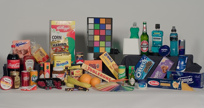
I haven’t tried this out with the test images circulating here, that would definitely be interesting to compare of course, since these artificial test images don’t say much. I did try it with some other things myself, but not yet with anything I can share.

Regarding input gamuts

I think there is one last issue worth addressing, which is the input gamut.

The gamut mapping I implemented here is able to reach all colors in the output space, but in many cases does requires inputs outside the visible gamut. This has the nice property that commonly occurring visible colors can have nice and smooth paths to white, but you can still reach bright and extremely saturated colors, by pushing the color outside the visible gamut. This is especially true for yellows more than other colors, since the difference between a single wavelength yellow and commonly occurring yellow colors is quite small, so not a lot of real colors to use.

This is not without issues though. One issue is that most (or all?) current perceptual models don’t really extrapolate gracefully outside the visible gamut, including Oklab. Another issue is that you need input outside both the visible gamut and AP0 to reach all output colors (I don’t know enough about the ACES flow overall to judge how big of an issue this is).

I can think of a few ideas to mitigate these issues, although I don’t know enough about how this would used practically to judge what is best or most feasible:

  • Have a very saturated default look. This way the boundaries can be pushed into the visible range. The big drawback of course is that to achieve a natural look you will have to desaturate the input significantly before the output transform (ideally using the same perceptual model as the color space itself to not cause distortions).
  • Similarly, you can have some kind of gamut uncompress step before the output transform. This could take the input color space into account, so that the for example boundary of AP1 maps to max saturation (this could then directly map to the same perceptual model as the output transform).
  • Take input in a perceptual model instead and specify looks with an output in a perceptual color space. I think this makes some sense, but I’d also assume this would be very hard to do in practice.

Depending on the solution, one issue will be how the perceptual model behaves outside the visible gamut. I required I think it is very feasible to make a new model that matches current models in terms of hue linearity while having much better behavior outside the visible gamut.
17 Likes

Are you certain that your conclusions are derived from proper principles here?

That is a bit of a vague question, but yes. I’ll try to elaborate more, since you seem to fault perceptual model for things they couldn’t possibly fix. Maybe this helps to make it more clear:

You can see this problem without at all looking at perceptual models, it is just a property of perception and the sRGB primaries. Or more specifically the Abney effect and sRGB primaries.

If we start by with the blue RGB primary, and start moving it linearly towards white 15% of the way, it looks like this:

Here of course we see the Abney effect coming into play, the linear path towards white looks like it is shifting towards purple.

By adjusting the path and reducing the amount of red mixed in, it is possible to compensate for this and get something closer to our perception of hue. That looks something like this:

How much of the red sRGB primary do we have to remove to compensate for the Abney effect? All of it turns out (or very close to all of it). The rightmost square here has, in linear sRGB, values (0.0, 0.15, 1.0). So, we get this strange conclusion: if we start with the blue sRGB primary and gradually add small amounts of the green sRGB primary, the result does not look more green (or more cyan), it just looks like a lighter and less colorful blue.

Only until significantly more green is added does the result start looking like a hue shift (as well as shifts in chroma and lightness). In that process though, we have also gotten a significantly less saturated color. Here is the path to (0.0, 0.5, 1.0):

So, if we start with the blue sRGB primary and want to find the closest color to it that has a hue slightly more cyan hue, we can’t just mix in a tiny bit of green, since that doesn’t affect the hue noticeably. Instead we have to mix in a lot of green, in turn also reducing chroma substantially and affecting lightness. The lightness can be corrected for, by scaling the RGB values, but the chroma is impossible to correct for since we are already on the RGB gamut boundary. The only way to achieve that would be with a stronger green primary.

What does this mean for color models trying to model hue perception? Well nothing on their own, there only is a problem when working with the sRGB gamut (or other similar RGB color space).

What happens then is that if you have a model that somewhat accurately models hue around the blue srgb primary, and try to make a plot of maximum chroma in RGB as hue changes uniformly, you will get very abrupt changes in chroma, due to the shape of the RGB gamut. This in turn results in large color differences.

This is what you see in a plot like this:

You can of course change the lightness calculation in various ways to see how it affects things, but it won’t get rid of the large difference in chroma and the discontinuity that is simply a result of the interaction between the sRGB primaries and the Abney effect. For example like this with a different metric for the y-axis, blue is looking less fluorescent, but the edge still remains:

Of course, if you don’t need to reach the edges of the sRGB gamut, you can get a much smoother plot (here smoothing the RGB cube somewhat, but the chroma is still varying significantly through the image)

image

If you plot constant chroma instead, you can get a very smooth result, but of course many colors escape the gamut quite quickly:

5 Likes

This is related to hue, which is nonuniform with respect to tristimulus angle. I do not believe this is a problem in the quote I cited, which is related to assumptions of perceptual sensation.

I do not believe this is the problem with “what we are seeing” in either of your first two plots.

In your “uniform” plot, brightness is the vertical axis. I believe your brightness axis is distorted due to an incorrect underlying assumption; that a uniform curving of the tristimulus axis of lumininace suffices for anything beyond the achromatic.

To make this a little more visceral, we can lean on Abney and Grassman a bit. We know that when two colinear compliment values are relatively balanced in terms of brightness that their additive sum will be achromatic. Note this does not mean that they should be considered equivalent brightness, but rather in balance with respect to their colinear compliment.

Balancing pure BT.709 yellow against BT.709 blue should reveal an entry point for further balancing of the yellow directly to the blue. What one might find is that luminance does not uniformly relate to this scale.

As a result, all further inferences of any model that claims perceptual uniformity collapse. Saturation, chroma, etc. are all dependent upon brightness; if the brightness scale is foundationally problematic, all further building on top would be more greatly problematic.

One can attempt at balancing BT.709 yellow against BT.709 blue such that their cumulative sum is achromatic. Now dial the blue down to perceptually match the apparent brightness of the blue.

The calculated luminance result of the two swatches will show a tremendous disparity. While there are legitimate claims of this being a highly contextual nature, which is of course true, the fact that this is built into every single display we use should not be overlooked. The general principle of sensation brightness of chroma is buried into every well behaved display.

A disparity of the magnitude that one will discover from the above simplistic testing, will likely lead to plenty of questions of any model built atop of a faulty assumption.

Note: This shouldn’t be read that your point about the nature of the shape of the display volume as potentially problematic is wrong! On the contrary, it is likely spot on I believe. Any analysis of that however should be built atop of a certainty that the underlying analysis is correct, which in this case I am uncertain it is.

1 Like

Hi,

Trying to understand the conversation.

Unless mistaken, I don’t think there is any claim that the plot is (or has to be) perceptually uniform. The only one that has some perceptual uniformity claim is the very last:

Should it be surprising that a plot that features varying chroma is not perceived as uniform?
Are you meaning that ideally brightness only should be able to drive perceptual uniformity and because it does not, current models are flawed?

Cheers,

Thomas

1 Like

Seems that the kink as cited in the first case is possibly not entirely about chroma?

If we are going to dissect and draw conclusions from a sweep, specifically a perceptual kink, should we not apply due diligence as to the nature of the perceptual uniformity of the sweep before dissecting such things as kinks or other perceptual non-uniformities?

If it’s not aspiring to perceptually uniformity, why concern ourselves if there is a kink in the first place; it’s not perceptually uniform?

If we are going to discuss perceptual facets of a model, it would seem that perceptual facets play a role?

Either that, or the hypothesis as to the nature of the kink observation is a non issue.

  1. The brightness metric is broken in most of the plots from what I can discern. Plausibly one is closer.
  2. There is at least one other facet at play, leading to cumulative perceptual non-uniformity and smoothness.
  3. The shape of the destination medium’s volume would be a completely worthwhile exploration if we can get those first components in order.

Again, to be clear, I think that discussing the nature of the destination gamut volume is a heck of a worthwhile discussion, especially in these terms. I’d hope we could be certain that our observations are anchored on solid groundwork, which in this case, I am unsure of.

1 Like

Possibly, but isn’t setting constant. i.e. uniform, chroma producing a plot that looks much more perceptually uniform? It seems that it is addressing a significant part of the perceptual uniformity problem.

Absolutely agreed, although as I was pointing out, the plot is not specifically designed to be perceptually uniform, so I find odd to label it as “uniform” because it creates a possibly wrong discussion basis. Hence trying to understand what is being discussed.

Would you mind expanding on that? Taking the constant chroma plot from @bottosson, is it possible to point out as to what is broken?

Cheers,

Thomas

1 Like

Then there is no kink.

To be clearer, what might make sense would be to show a constant BCH representation of “uniform” before making adjustments to fix various facets.

  1. What does uniform brightness in the sRGB cube appear as?
  2. What does uniform hue?
  3. What does uniform chroma in the sRGB cube appear as?

I am unsure that 2. and 3. could be approximated without 1. Open to a different vantage here.

1 Like

I think we are talking past each other a bit here.

My claim is not that plots like this are smooth and have perceptually uniform distances between colors, it is quite the opposite
image

My point is that is impossible to produce smoothly varying images like this, if they have to satisfy the constraint that:

  • all colors are chosen from the hull of the sRGB gamut
  • on the horizontal axis hue is changing gradually across the image, passing through the entire hue circle
  • on the vertical axis colors are somehow changing from black to white, moving across the hull of the RGB following a constant hue path

You can argue that there could be a better way to model brightness, but what I’m trying to show is that it doesn’t matter in this case. Regardless of how good of a brightness estimate you are able to produce, the large discontinuous jumps in chroma will always results in an image that isn’t smoothly changing. The only way to get a smoother image is to either give up the requirement of uniformly changing hue or the requirement to move across the hull and allow smoother paths through the interior of the gamut.

Again, looking at the blue parts of the sRGB hull, and comparing the blue primary with the most saturated colors that have a slightly more cyan hue:

image

Regardless of which you consider closest in terms of lightness/brightness, the difference between the colors is still significant due to the large chroma difference.

I’m also not saying regular lightness as it appears in most perceptual models is the answer to everything and I do not think it is the right tool to use when constructing output transforms.

I also think the perception of lightness/brightness of saturated colors is more complex than something that can be distilled into a single number. Looking at a deep blue LED light for example, I certainly perceive it as both dark and very fluorescent at the same time and a single number can not describe that sensation.

4 Likes

To connect this more to the development of an output transforms:

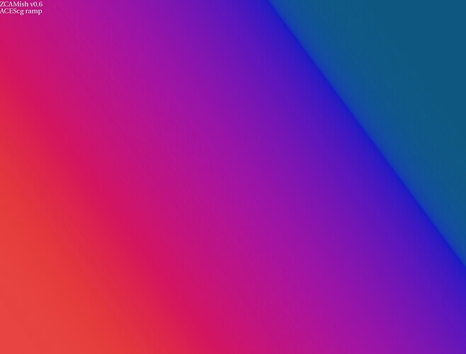
The implication of this is that it impossible to avoid the problem of smooth gradient turning into something like this (by Christophe Brejon, in the user testing topic):
image

without either relaxing the requirement to preserve hues, or the requirement to be able to reach all colors in the RGB gamut.

5 Likes

Thanks, this is spot on and I totally agree, Lightness / Brightness, in our context, are 1-dimensional colour appearance attributes. As you rightly point out, perceived colour, by definition, cannot be described by a single attribute.

For the interested readers, the ZCAM publication has a great, up-to-date, classification in 1-dimensional / 2-dimensional categories, of all the colour appearance correlates: Optica Publishing Group

Cheers,

Thomas

1 Like

The large jumps in chroma however are related. Again, not making a case that the hull of sRGB is continuous perceptually, but that it’s all massaging until the facet of brightness can be sorted. In fact, it is somewhat self-evident that a nonuniform perceptual bounding box would be nonuniform perceptually.

That is, we can probably agree that, were the increment of hue uniform, the relative perceptual discontinuity left to right would be lessened in the first plot. Further, if the relative perceptual brightness were uniform, that too would move the value up or down, which would also smoothen the perceptual discontinuity.

It would seem very challenging to discuss further discontinuities prior to that, which would likely be tied to the greyness boundary.

1 Like

What would you want the brightness/lightness prediction to do more or differently?

Related, how would you want to approach the representation of a perceptual uniform space in two dimensions?

1 Like

Uncertain. I suspect a brightness metric should be gained congruent relative to Abney’s complimentary. EG: Start with compliment blue and yellow as achromatic as an entry point. The chromatic-like axis being deeply woven with chroma / colourfulness (Hunt) and a critical part of the brightness metric.

I reckon the common 3D perceptual appearance coordinates (“Brightness-like”, “Hue-like”, “Chroma-like”) would suffice if anything better than the common handling of brightness were accounted for? Factoring Swenholt / Evans seems monumentally important in this regard with respect to the meaningfulness of any such model given how the other twin attributes lean on that spine?

For image formation, it doesn’t feel we need deep colour science, but rather a privileging of specific facets in relation to the output medium’s volume. Under this lens, the lowest hanging fruit could be brightness given how unfortunate existing implementations are.

1 Like

That is, we can probably agree that, were the increment of hue uniform, the relative perceptual discontinuity left to right would be lessened in the first plot. Further, if the relative perceptual brightness were uniform, that too would move the value up or down, which would also smoothen the perceptual discontinuity.

This is not the case unfortunately. Improvements to hue and brightness estimates could only have a marginal effect at best. Smoothly varying hue on the hull of the sRGB gamut inevitably leads to large discontinuous steps in chroma, making a decent hue estimate better does can not compensate for that. I don’t know how to explain it anymore clearly than I previously have though. Is there any part of the argument that is unclear or you believe to be inaccurate?

Uncertain. I suspect a brightness metric should be gained congruent relative to Abney’s complimentary. EG: Start with compliment blue and yellow as achromatic as an entry point. The chromatic-like axis being deeply woven with chroma / colourfulness (Hunt) and a critical part of the brightness metric.

I have a hard time following what this would mean more concretely. Do you have a less abstract way to describe this or a way to explain it visually? Even something simple as colors you consider to be of equal brightness would make this easier to discuss I think.

Any comments on the brightness-like metric proposed in the original post in the section “Designing a hue linear path to white”? Is that similar to what you are after?

3 Likes

Curious what you have based this conclusion on?

It seems to me that this is a pretty clear conclusion based on what the plot we are talking about. Even if we had the perfectly perceptual-correlate “H, C, L”-type space that you’re proposing, if we:

  • Very brightness smoothly across one axis of the plot
  • Vary hue smoothly across the other axis
  • Allow chroma to vary arbitrarily such that we are always exactly on the hull-surface of the sRGB gamut (which is the point of the plot being discussed)

Then it would be a pure coincidence if those arbitrary variations of chroma to stay on the hull of the sRGB gamut happened to stay perceptually “smooth”/correlated. There’s nothing that indicates that such a plot should be perceptually smooth given that the shape of the sRGB gamut is arbitrary and not at all based on trying to be perceptually even in this context.

RGB is a tristimulus model. It should be self-evident that a tristimulus psychophysical specification is not perceptually uniform.

This isn’t the issue.

See above. It is baked into the specification’s domain.

With that said, if the goal becomes “Ok… so what is the optimal perceptually uniform hull?”, then that is another question based on critical ideas as to the veracity of the first principles employed to find and deduce it.

A fit model stacked against a fit model plotted against a fit model is the endless cycle of fit models.

At some level, it’s layers of abstraction built atop layers of potentially erroneous data (See Hartman / Hyde et. al and the impact on 1931, for example) taking us up into architecture astronautism.

Net sum is chasing problems that are self designed.

Addition through subtraction, and kicking the tires of first principles.

2 Likes

Small update to the experiments

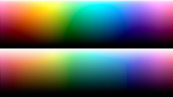
I played around with making a tighter smoothed gamut approximation to see what that would look like. Looks like this in the extreme. First one with soft clipping, second without. The gamut has been designed to match the soft clip amount.

Code for the clipping itself is here:

The code to derive the approximation here: Google Colab

Could be adopted to other color models and RGB color spaces quite easily.

7 Likes

Thank you @bottosson for a great posts and examples. I certainly learned a lot from this post. I decided to implement Oklab based DRT for Nuke, OkishDRT, for testing. Available from: GitHub - priikone/aces-display-transforms: Prototype ACES display rendering transforms

It has the following features (I’ve tested Rec.709 only):

  • Tonescale derivative driven path-to-white. The tonescale is the MM tonescale, same as in the three ACES2 candidates. At first I went with simple derivative but it caused too many artifacts so it now includes a proper derivative, thanks to Mathematica.
  • Uses mid(RGB) norm or alternatively Oklab L with the tonescale
  • MacAdam limit approximation for BT.709, P3D65 and BT.2020
  • Gamut mapping based on ZCAM DRT’s gamut mapper (LCh)
  • Gamut approximation (for BT.709 only) as alternative gamut mapper. It’s not exactly identical to Björn’s example, I couldn’t get it working without artifacting.

Overall I’m not sure how useful the MacAdam limit is in practice. I would rather use it to make sure the DRT can reach colors that we want it to reach, rather than worry about fluorescing colors. In fact, I thought about adding RGBCMY weights to the Intensity (mid(RGB) or L) so that they could be used to sculpt the path-to-white better, for example to make sure that bright saturated yellows are possible to reach. The derivative driven path-to-white, though, works really well I think. Very easy to use in other DRTs too, like in ZCAM DRT, which I’ve tried already.


5 Likes