Some reflections and experiments

To connect this more to the development of an output transforms:

The implication of this is that it impossible to avoid the problem of smooth gradient turning into something like this (by Christophe Brejon, in the user testing topic):
image

without either relaxing the requirement to preserve hues, or the requirement to be able to reach all colors in the RGB gamut.

5 Likes

Thanks, this is spot on and I totally agree, Lightness / Brightness, in our context, are 1-dimensional colour appearance attributes. As you rightly point out, perceived colour, by definition, cannot be described by a single attribute.

For the interested readers, the ZCAM publication has a great, up-to-date, classification in 1-dimensional / 2-dimensional categories, of all the colour appearance correlates: Optica Publishing Group

Cheers,

Thomas

1 Like

The large jumps in chroma however are related. Again, not making a case that the hull of sRGB is continuous perceptually, but that it’s all massaging until the facet of brightness can be sorted. In fact, it is somewhat self-evident that a nonuniform perceptual bounding box would be nonuniform perceptually.

That is, we can probably agree that, were the increment of hue uniform, the relative perceptual discontinuity left to right would be lessened in the first plot. Further, if the relative perceptual brightness were uniform, that too would move the value up or down, which would also smoothen the perceptual discontinuity.

It would seem very challenging to discuss further discontinuities prior to that, which would likely be tied to the greyness boundary.

1 Like

What would you want the brightness/lightness prediction to do more or differently?

Related, how would you want to approach the representation of a perceptual uniform space in two dimensions?

1 Like

Uncertain. I suspect a brightness metric should be gained congruent relative to Abney’s complimentary. EG: Start with compliment blue and yellow as achromatic as an entry point. The chromatic-like axis being deeply woven with chroma / colourfulness (Hunt) and a critical part of the brightness metric.

I reckon the common 3D perceptual appearance coordinates (“Brightness-like”, “Hue-like”, “Chroma-like”) would suffice if anything better than the common handling of brightness were accounted for? Factoring Swenholt / Evans seems monumentally important in this regard with respect to the meaningfulness of any such model given how the other twin attributes lean on that spine?

For image formation, it doesn’t feel we need deep colour science, but rather a privileging of specific facets in relation to the output medium’s volume. Under this lens, the lowest hanging fruit could be brightness given how unfortunate existing implementations are.

1 Like

That is, we can probably agree that, were the increment of hue uniform, the relative perceptual discontinuity left to right would be lessened in the first plot. Further, if the relative perceptual brightness were uniform, that too would move the value up or down, which would also smoothen the perceptual discontinuity.

This is not the case unfortunately. Improvements to hue and brightness estimates could only have a marginal effect at best. Smoothly varying hue on the hull of the sRGB gamut inevitably leads to large discontinuous steps in chroma, making a decent hue estimate better does can not compensate for that. I don’t know how to explain it anymore clearly than I previously have though. Is there any part of the argument that is unclear or you believe to be inaccurate?

Uncertain. I suspect a brightness metric should be gained congruent relative to Abney’s complimentary. EG: Start with compliment blue and yellow as achromatic as an entry point. The chromatic-like axis being deeply woven with chroma / colourfulness (Hunt) and a critical part of the brightness metric.

I have a hard time following what this would mean more concretely. Do you have a less abstract way to describe this or a way to explain it visually? Even something simple as colors you consider to be of equal brightness would make this easier to discuss I think.

Any comments on the brightness-like metric proposed in the original post in the section “Designing a hue linear path to white”? Is that similar to what you are after?

3 Likes

Curious what you have based this conclusion on?

It seems to me that this is a pretty clear conclusion based on what the plot we are talking about. Even if we had the perfectly perceptual-correlate “H, C, L”-type space that you’re proposing, if we:

  • Very brightness smoothly across one axis of the plot
  • Vary hue smoothly across the other axis
  • Allow chroma to vary arbitrarily such that we are always exactly on the hull-surface of the sRGB gamut (which is the point of the plot being discussed)

Then it would be a pure coincidence if those arbitrary variations of chroma to stay on the hull of the sRGB gamut happened to stay perceptually “smooth”/correlated. There’s nothing that indicates that such a plot should be perceptually smooth given that the shape of the sRGB gamut is arbitrary and not at all based on trying to be perceptually even in this context.

RGB is a tristimulus model. It should be self-evident that a tristimulus psychophysical specification is not perceptually uniform.

This isn’t the issue.

See above. It is baked into the specification’s domain.

With that said, if the goal becomes “Ok… so what is the optimal perceptually uniform hull?”, then that is another question based on critical ideas as to the veracity of the first principles employed to find and deduce it.

A fit model stacked against a fit model plotted against a fit model is the endless cycle of fit models.

At some level, it’s layers of abstraction built atop layers of potentially erroneous data (See Hartman / Hyde et. al and the impact on 1931, for example) taking us up into architecture astronautism.

Net sum is chasing problems that are self designed.

Addition through subtraction, and kicking the tires of first principles.

2 Likes

Small update to the experiments

I played around with making a tighter smoothed gamut approximation to see what that would look like. Looks like this in the extreme. First one with soft clipping, second without. The gamut has been designed to match the soft clip amount.

Code for the clipping itself is here:

The code to derive the approximation here: Google Colab

Could be adopted to other color models and RGB color spaces quite easily.

7 Likes

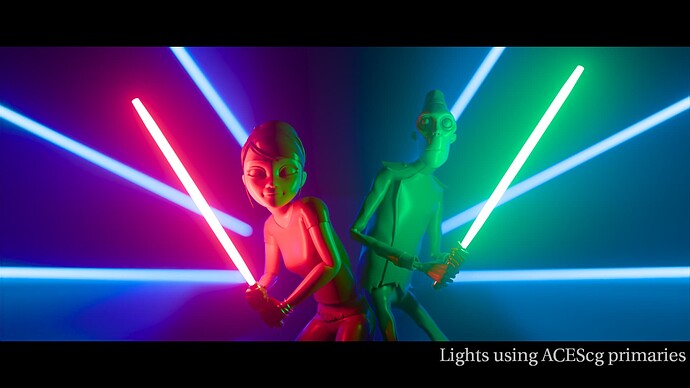
Thank you @bottosson for a great posts and examples. I certainly learned a lot from this post. I decided to implement Oklab based DRT for Nuke, OkishDRT, for testing. Available from: GitHub - priikone/aces-display-transforms: Prototype ACES display rendering transforms

It has the following features (I’ve tested Rec.709 only):

  • Tonescale derivative driven path-to-white. The tonescale is the MM tonescale, same as in the three ACES2 candidates. At first I went with simple derivative but it caused too many artifacts so it now includes a proper derivative, thanks to Mathematica.
  • Uses mid(RGB) norm or alternatively Oklab L with the tonescale
  • MacAdam limit approximation for BT.709, P3D65 and BT.2020
  • Gamut mapping based on ZCAM DRT’s gamut mapper (LCh)
  • Gamut approximation (for BT.709 only) as alternative gamut mapper. It’s not exactly identical to Björn’s example, I couldn’t get it working without artifacting.

Overall I’m not sure how useful the MacAdam limit is in practice. I would rather use it to make sure the DRT can reach colors that we want it to reach, rather than worry about fluorescing colors. In fact, I thought about adding RGBCMY weights to the Intensity (mid(RGB) or L) so that they could be used to sculpt the path-to-white better, for example to make sure that bright saturated yellows are possible to reach. The derivative driven path-to-white, though, works really well I think. Very easy to use in other DRTs too, like in ZCAM DRT, which I’ve tried already.

5 Likes

I’ve had a little play with this is SDR and HDR now.

Compared with the current v12 of the stock ZCAM DRT (Candidate C), the SDR rendering is desaturated, whilst the HDR one is more saturated, which to my eye reduces the quality of the match between the two renderings. Subjectivly anyway.

I feel like in SDR it’s a win for images that have data of questionable quality at the top end, hiding some sins. But I’m not sure if that’s a net gain if it means it’s harder to hit bright saturated corners of the display when you do have good data up there. Killing the saturation of bad highlight data is something eaisly done in a grade op, but the inverse is not true if it’s being sent to grey by the DRT.

These are my first impressions anyway.

Just to verify, did you test against the OkishDRT or the ZCAM DRT with the derivative driven desaturation?

Do you find that this behaves similarly to per-channel transform like rgbDT in HDR or is it worse? The default settings I have there push things a bit and I wouldn’t be surprised if HDR would have to have its own settings.

This to me too is still something to explore, to try and still have the ability to hit those corners with this technique. That is one thing I like about the current approach in ZCAM DRT.

Edit:
It occurred to me that the derivative used to do the desaturation is effectively just a mask, so it doesn’t have to be the exact derivative. It can be modified, or based on some other tonescale or be in fact any compatible curve. I tested with Daniele’s original MM tonescale and used its derivative as the path to white (but not as tonescale) and it works fine. The flare parameter can be used to precisely affect the saturation in the shadows, contrast changes the saturation in the mid tones and the peak luminance can be used to change how the top end desaturates. The only thing it can’t be used to adjust is the shape of the shoulder, which would be nice extra adjustment to control the top end saturation more precisely. Having parameters separate from the tone scale parameters probably makes sense.

It really does show how subjective this all is. I have always found the HDR rendering of ZCAM a bit desaturated compared to the SDR to my eye. So I personally prefer the behaviour of @priikone’s rendering.

(Caveat, I don’t have a reference monitor, so am viewing on an LG OLED TV)

I was thinking about this again today. Perhaps the Okish HDR is more saturated than the SDR, but my brain is anticipating the HK effect, so a brighter image being more saturated feels “correct” to me, and desaturating to compensate feels “wrong”.

The plot thickens!

1 Like

There is no right or wrong here, just preference and viewing experience.
My own pivot about this topic changed several times over the course of the last few years.
Mainly because of the pragmatic pros and cons that come with the different approaches.

I would not go down that rapid hole and try to explain your current preference with some half-understood (in general) colour appearance phenomena because they do not apply to complex stimuli. Further modelling vision in a per-pixel transfer is doomed anyway.

I think it is clear that objectiv reasoning does not bring us any further. There will be no objective correct solution to this problem. If we agree on that, the task becomes much simpler.

9 Likes

Daniele is right. At some point, things become a matter of preference and some content works better than other with one DRT or another depending on how it was look-deved. As an example, when we tried OpenDRT at Larian, we got two different kind of reactions: artists who didn’t compensate for ACES 1 hue skews liked it while others who had specifically done colour picking in order to compensate for ACES 1 hue skews (or were exploiting the hue skews for another purpose) hated it because their content now looked all wrong. In the end, we removed it because of both the license change and because the modified version of v11 Candidate C combined with the LMT I made pleased everyone and I was able to close the JIRA.

As a supporting point to the SDR vs HDR saturation, this is where interactive media has an advantage : we can add calibration screens to allow users to tweak saturation, contrast and brightness to their liking. Preaching for my domain here (is that how it’s said in english???) :slight_smile:

1 Like

Absolutely.

Perhaps I was wrong to attribute it specifically to the HK effect. But to my eyes, what the Okish DRT does when switching to HDR “feels more like what I expect”, for whatever reason. But for others (including my wife, looking at the same LG OLED as me) what ZCAM does in HDR “matches expectations better” and the OKish DRT “doesn’t feel right”.

1 Like

Interesting. While it may mostly be about aesthetic preference, a more objective goal can be to make the HDR and SDR feel similar and have similar level of saturation. And to make sure colorist can take the HDR to a different direction with more colourfulness if that’s what they want.

Sorry, I should have been specific, I was looking at: DRT_ZCAM_IzMh_v12_deriv