ACES 2.0 CAM DRT Development

Unfortunately BlinkScript does not seem to be geared up to work in double precision. When I change the working variables in the matrix derivation to doubles instead of floats, Nuke instantly crashes with a seg fault when I recompile.

Maybe getting a bit confused with all the various depositories in GitHub. Are the most recent transforms at GitHub - ampas/ACES_ODT_Candidates ?

If so I am getting a lot of saturation compared to previous versions. Also could instructions for using these in DaVinci Resolve be restated. Since the iPad can only still add DCTL and not ACES transforms can I still just remove the first line to make them work (this was working well before and want to know if still valid.) (I am testing on both AMD system with Decklinked OLED TV and the iPad Pro in Reference Mode, SDR and HDR versions of ver053.)

Also, is the timeline space now AP1 which I thought originally was AP0? Maybe I have the settings mixed up which gives the saturation issues. Thanks

That’s the correct repo. I tested v053 Rec.709 DCTL and I can’t see any issues compared to previous versions. That was with normal ACEScct color managed setup in Resolve.

1 Like

After testing with ACES v053, I have a few observations.

It seems very good overall and many artifacts are resolved by using ACES 2. The match between SDR and HDR is much better. My main concern, if I’m using the correct terms, is that both the gamut compression and chroma compression seem quite aggressive compared to ACES 1. Is this something that can be backed off without causing artifacts? I am viewing images on a Sony x310 in HDR.

-Very saturated looks are a fight in v2. Saturated colours start blowing out and going bright rather than becoming more saturated. Certain projects I work on would be fighting this gamut compression.
-Reds look more pink and desaturated than red/orange and saturated (fires, stop lights, many of the ACES test images). It easy to desaturate extreme colours or bleach highlights, but it is hard to get that back once the colour is gone.
-Strong pure blues don’t seem to exist. They are very desaturated and swing towards different hues. In the ACES test shots this is most noticeable on the rainbow board of circles, the rainbow balloon, the frontier casino sky, and the bluescreen shot.

Thanks for taking the time to test, all feedback is useful. I would say your feedback is in line with what we’ve received so far.

This is what we’ve heard before for Rec.709 100 nit transform, especially for reds, and blues as you also mentioned. Are you saying that you’re seeing same happening also with Rec.2100 1000 nit transform? One way to retain that saturation is to darken highly saturated bright colors in Rec.709, but so far based on my own testing it shouldn’t be necessary in Rec.2100.

For some highly saturated blues ACES2 is still going to need the RGC (Reference Gamut Compressor), like with the blue screen image you mentioned.

I guess the follow up question is, are you able to color grade with it to get the colors where you want?

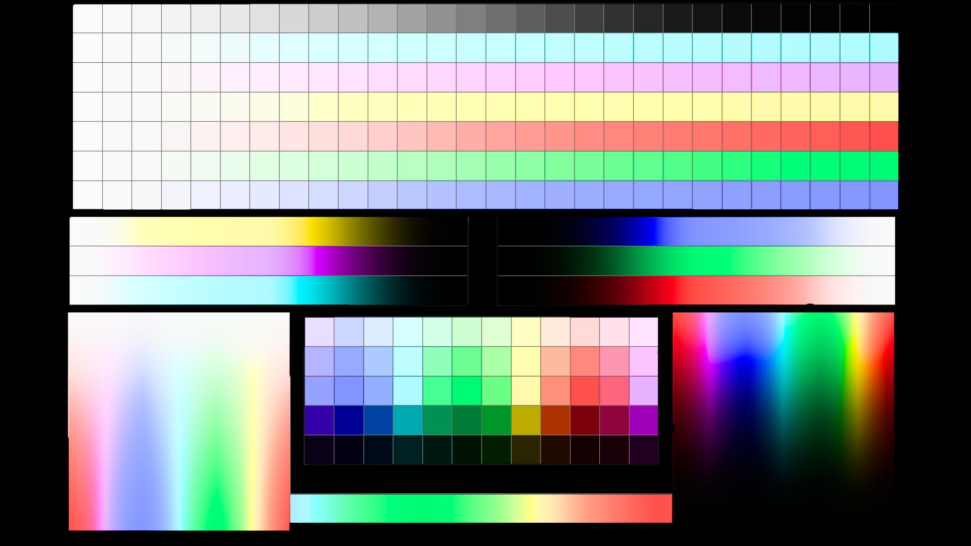
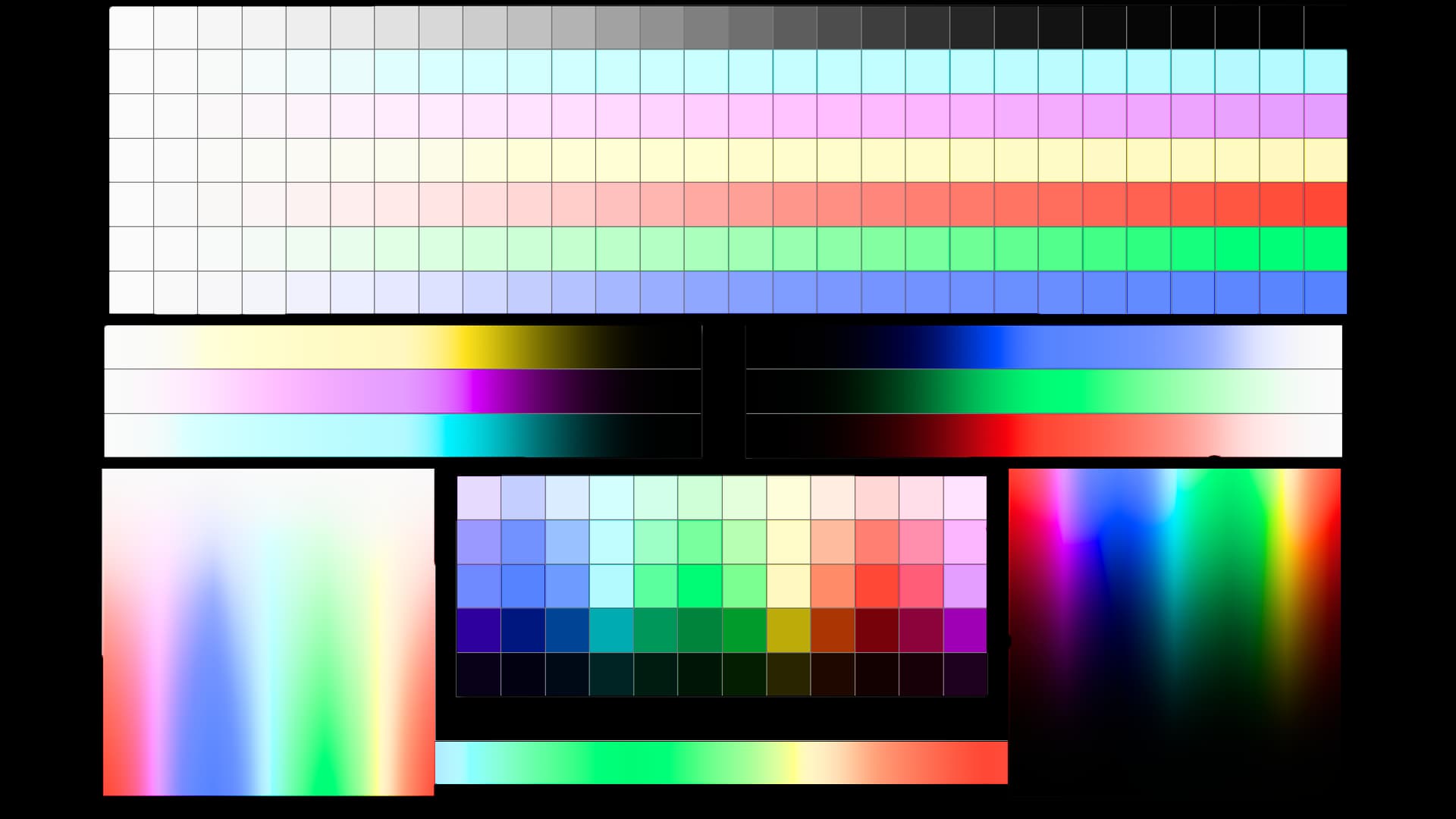
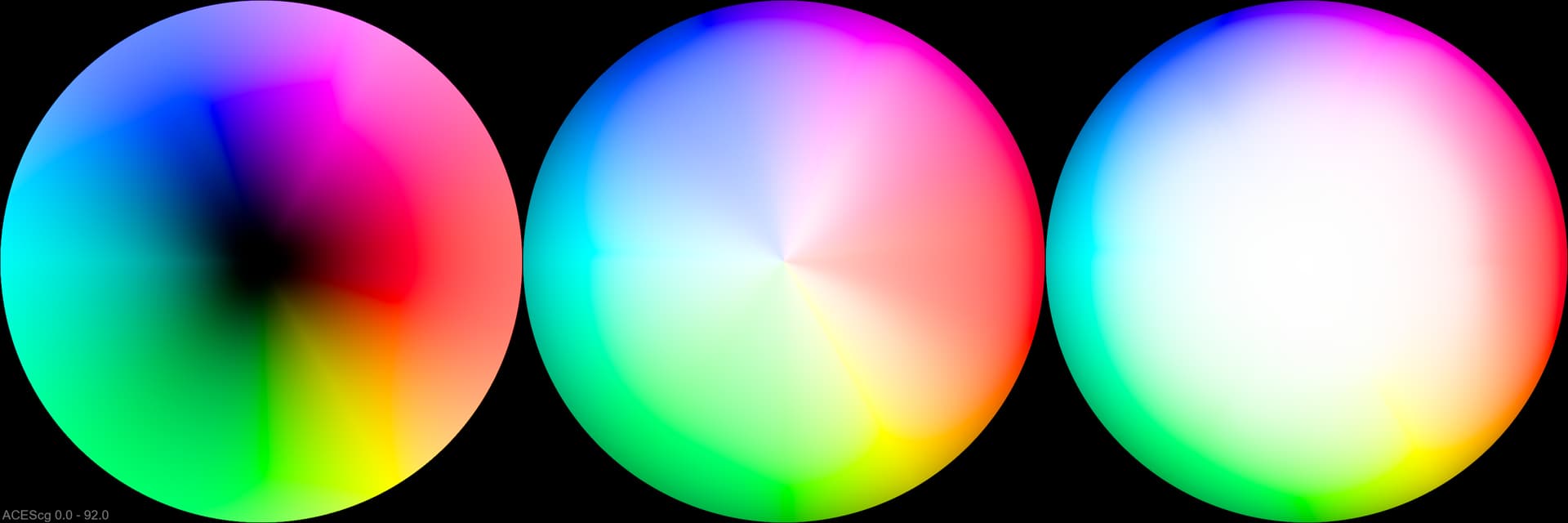
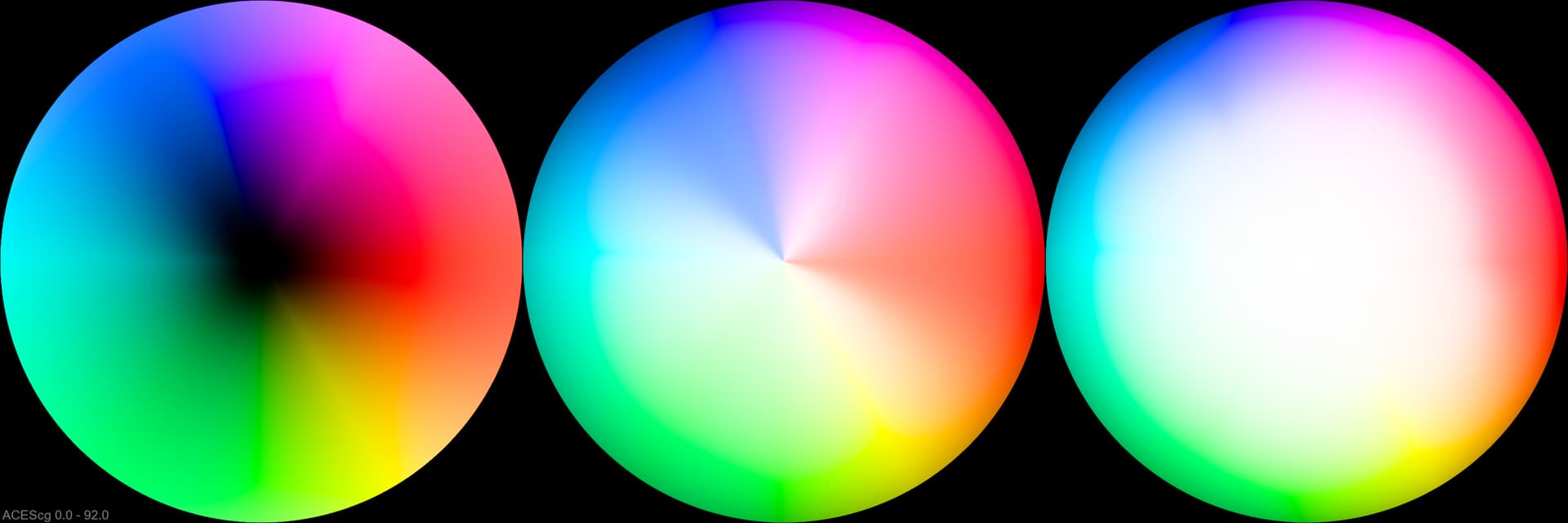
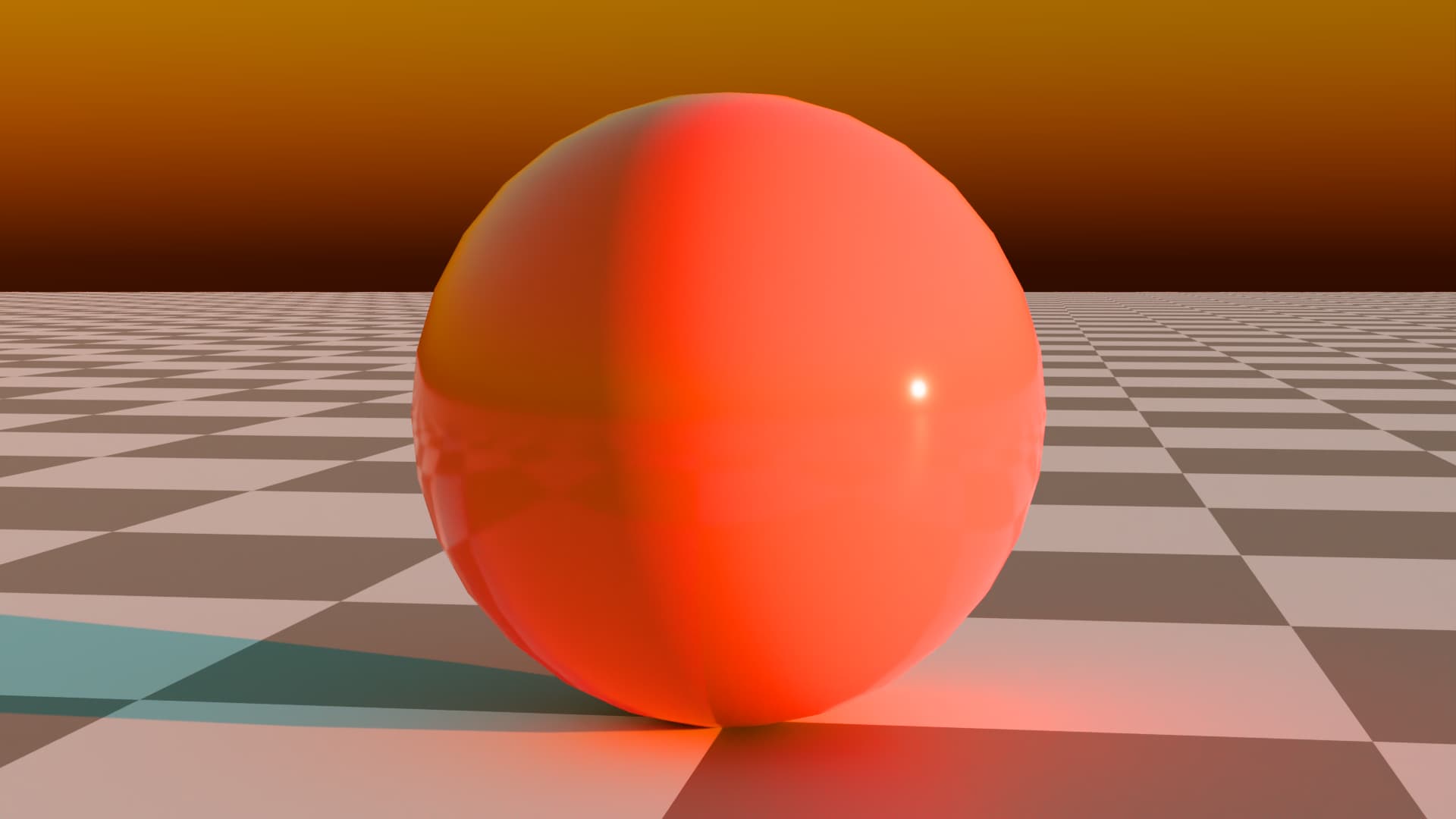
Here is one more attempt at changing the transform so that we can retain colorfulness better in SDR and have smoother gradients. What I learned almost a year ago with the Alternative compress mode is that the reason why blue and red desaturate so quickly (and contribute to poor gradients) is partly the compress mode, and not the gamut mapper alone. In that thread I went over why we need the compress mode, but I now believe there is a way to entirely remove the compress mode from the transform.

I’ve done that as CAM DRT v054-pex1 experimental version, available from my repo under that name, as well as Rec.709 and Rec.2100 LUTs and DCTLs, available under the LUT directory. It does the following:

  • Clamps the input chromaticities to the rendering space of the transform, that is AP1
  • Removes the Björn compress mode (it’s disabled)
  • Adjusts the custom LMS primaries

This brings the following (IMHO) positives (and no negatives that I have seen so far):

  • Simpler transform as the compress mode is now unnecessary
  • No negative impact for the inverse
  • Preseve saturation better with highly saturated bright colors, especially red and blue
  • Smoother gradients with highly saturated colors (still not perfect)
  • Better SDR and HDR appearance match for highly saturated bright colors

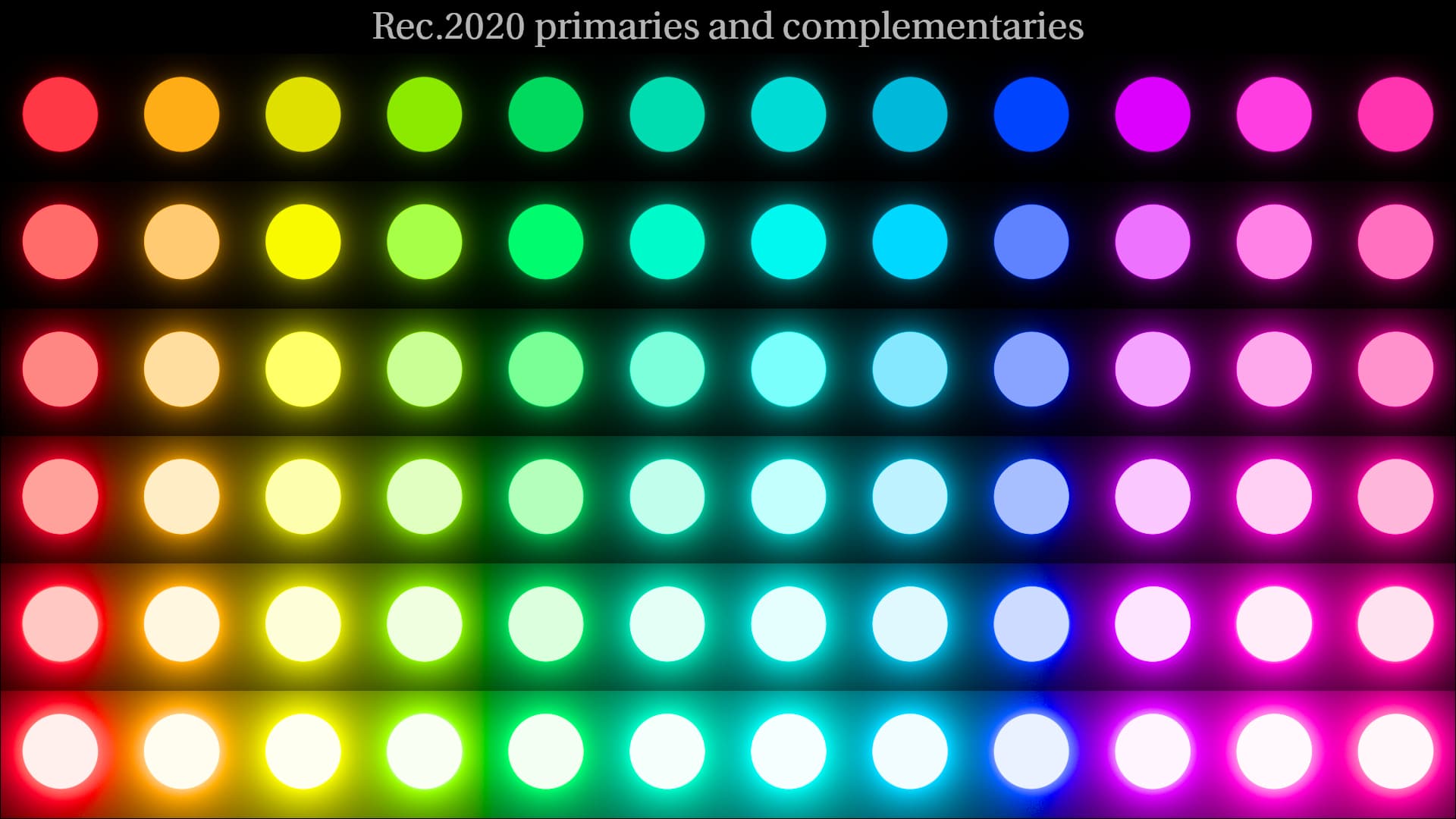
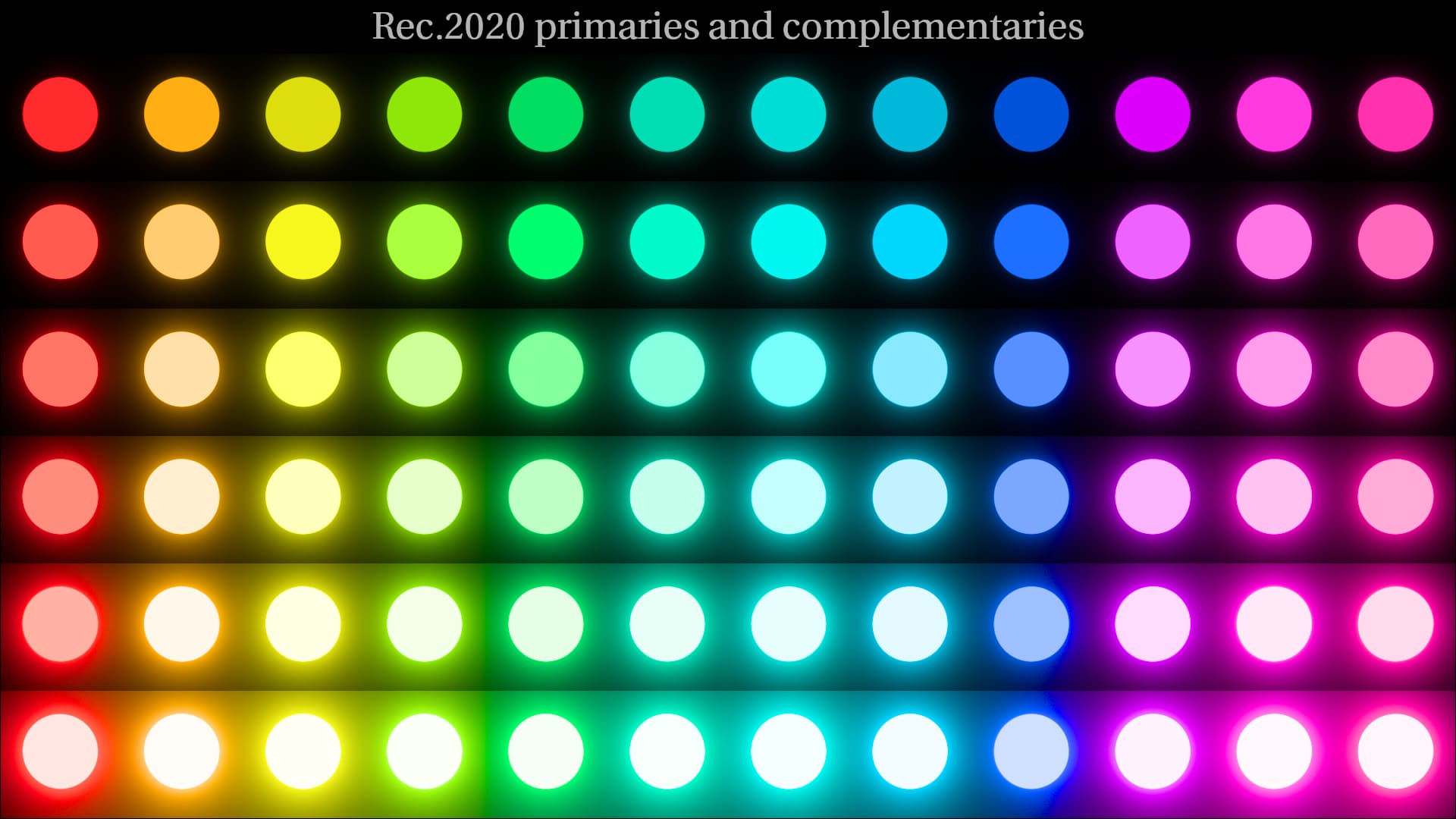
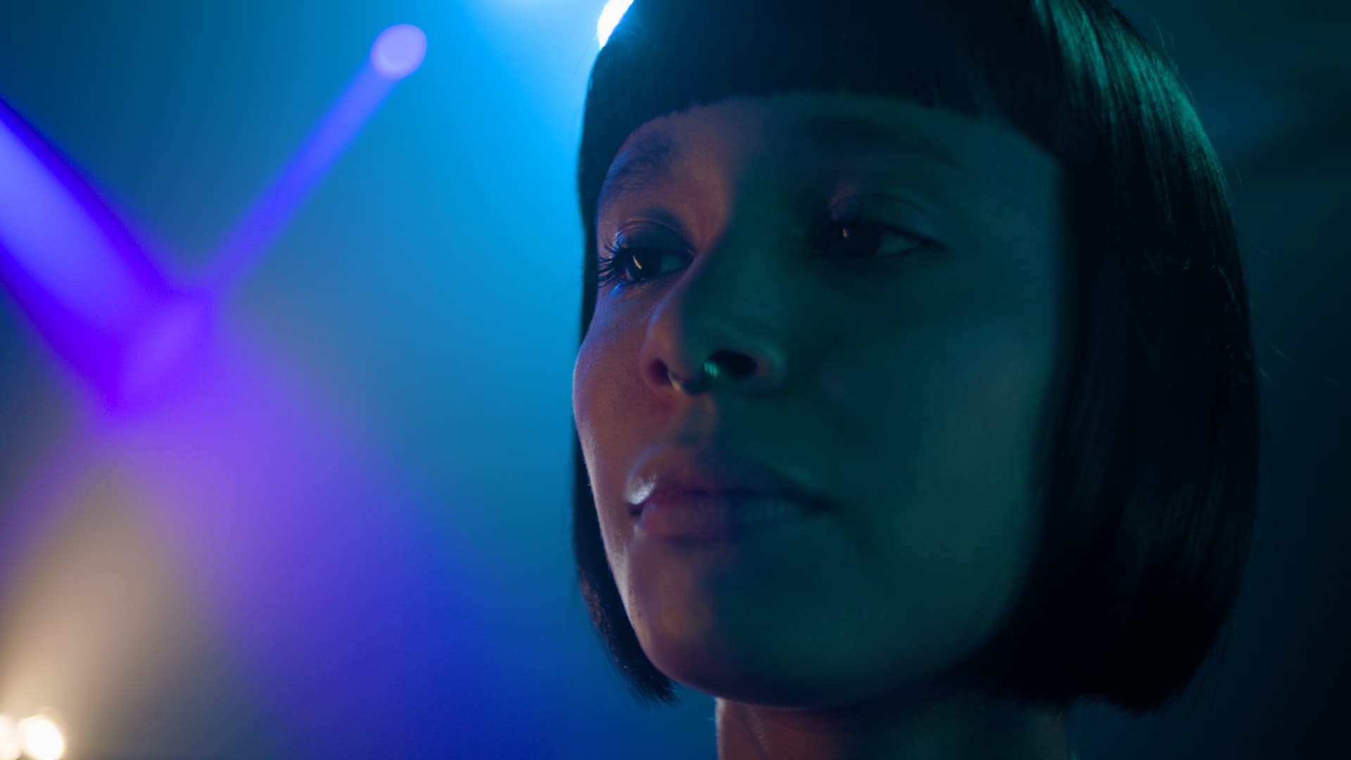
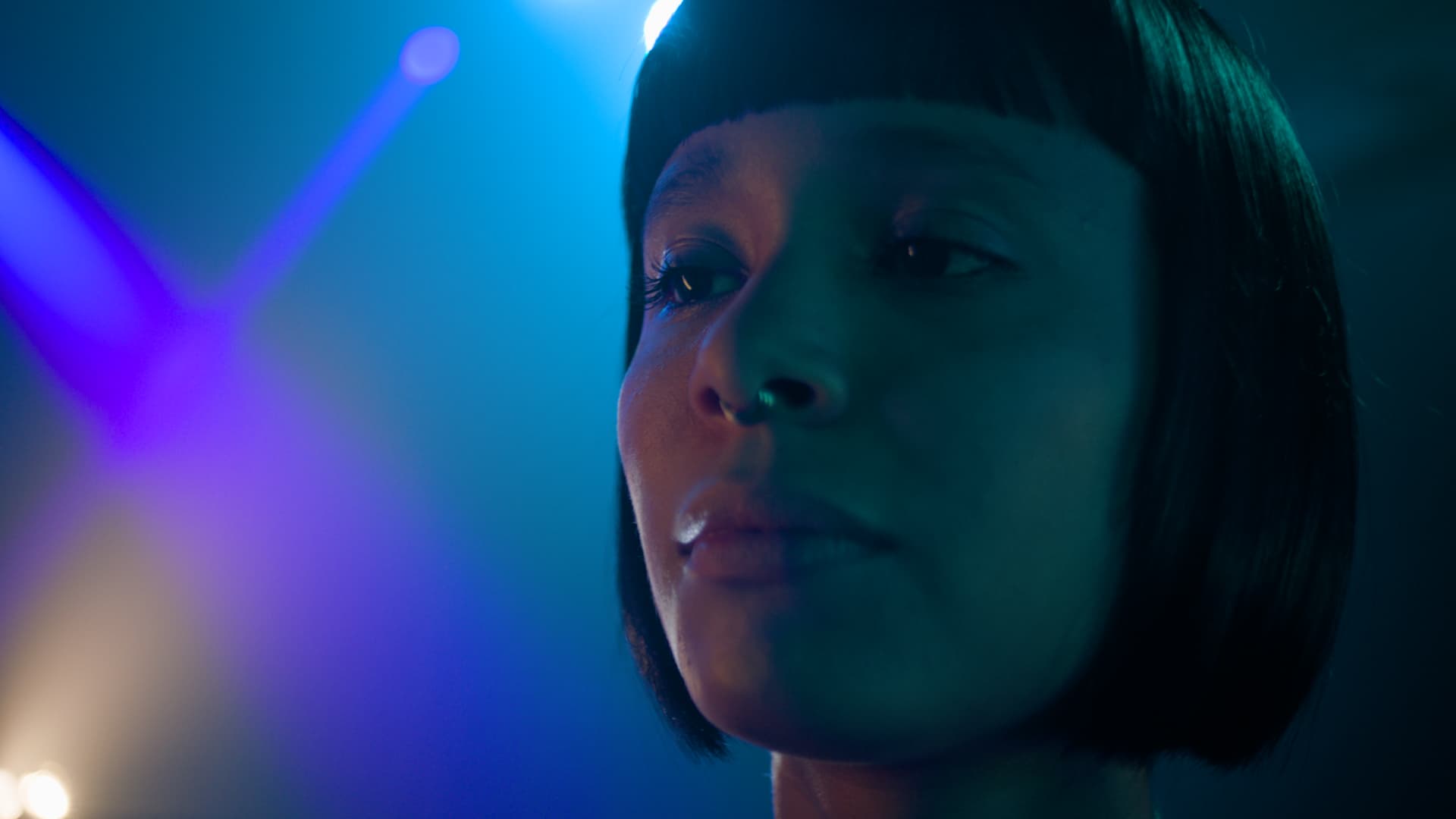
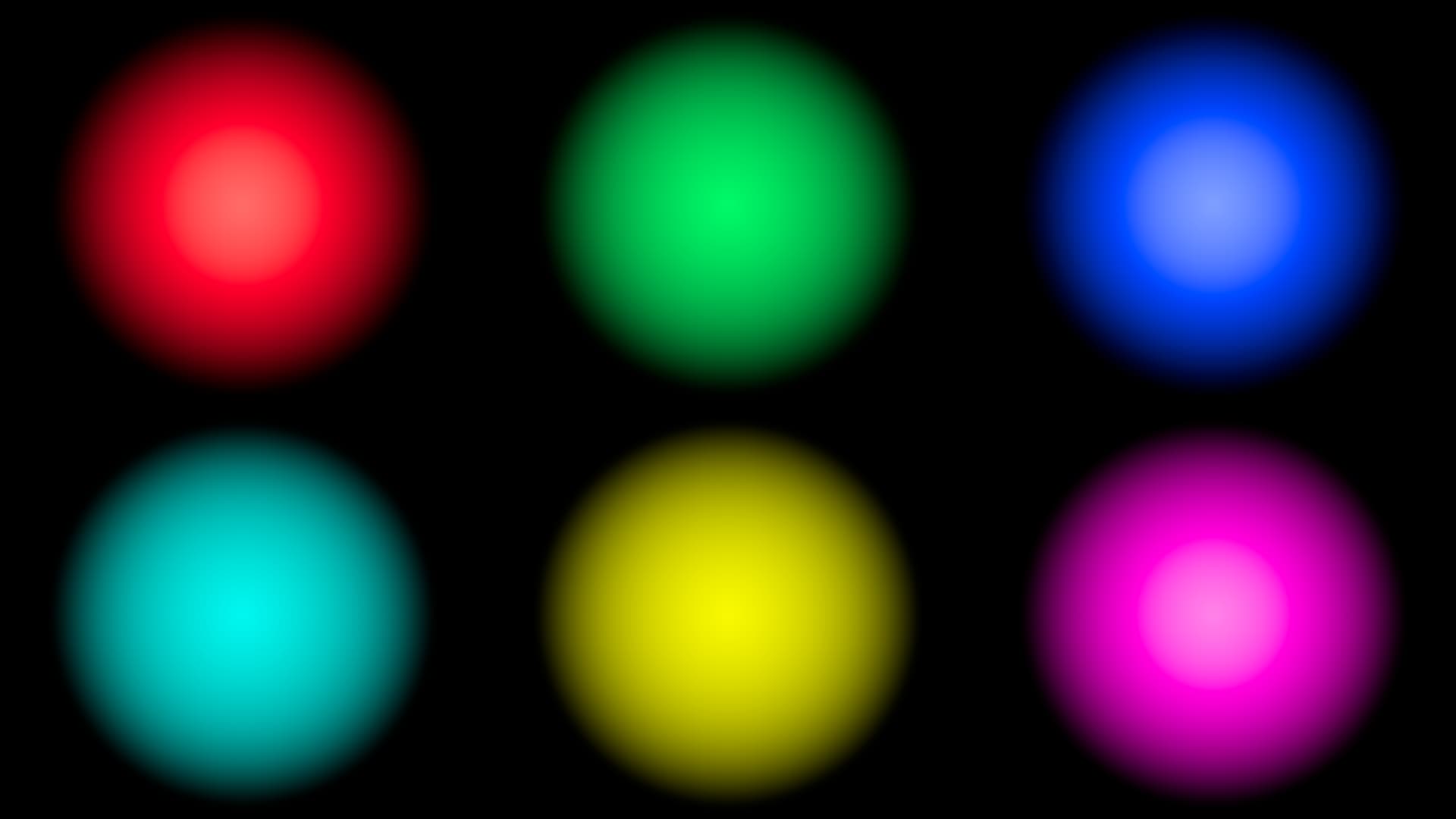
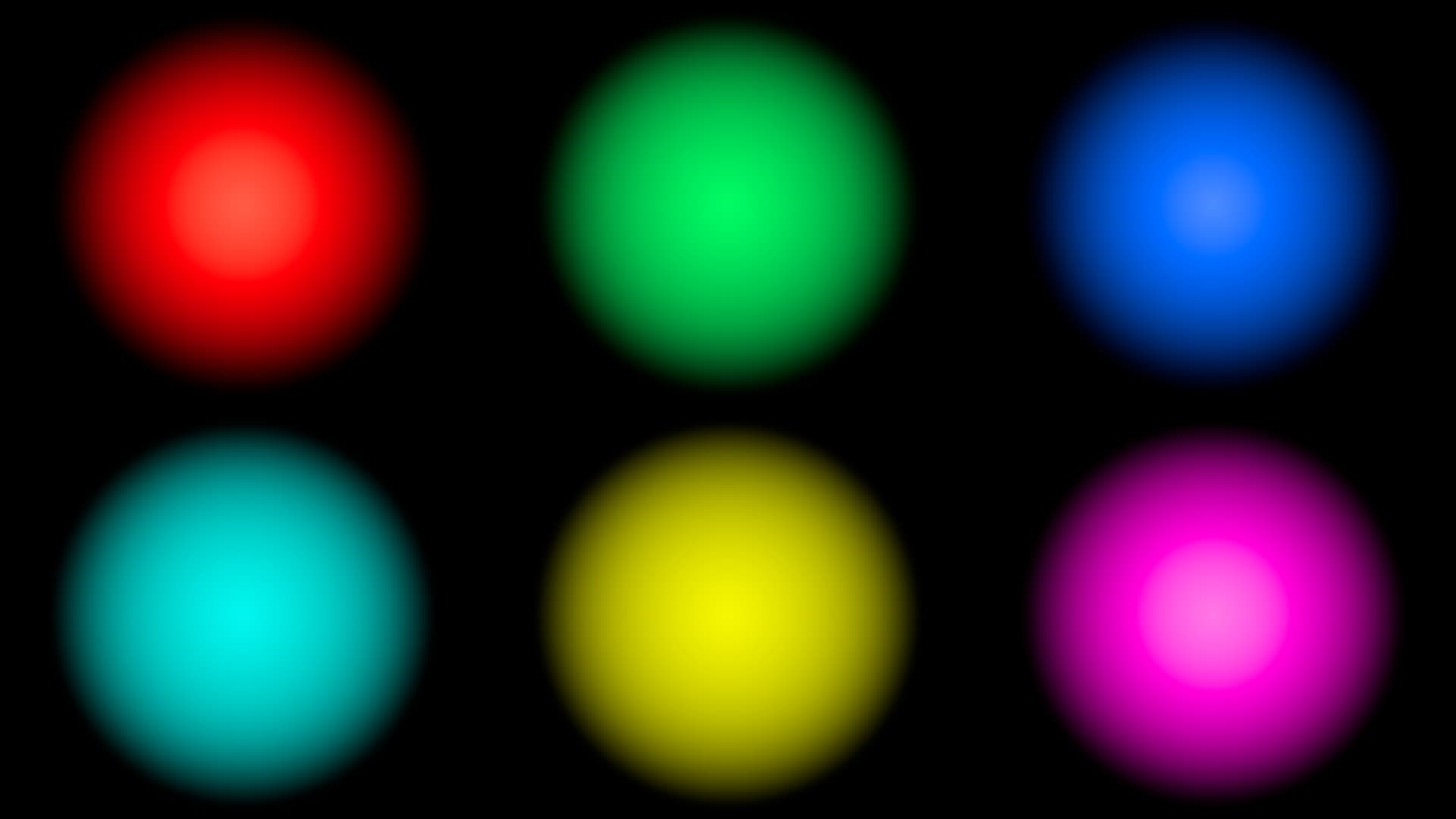
I’ve tested this with both SDR and HDR. This was a quick test and with small parameter adjustments it can be improved more. To my eye the match is markedly better with highly saturated colors, especially in images like the Blue Bar (good match), and in the color gradient images (improved match).

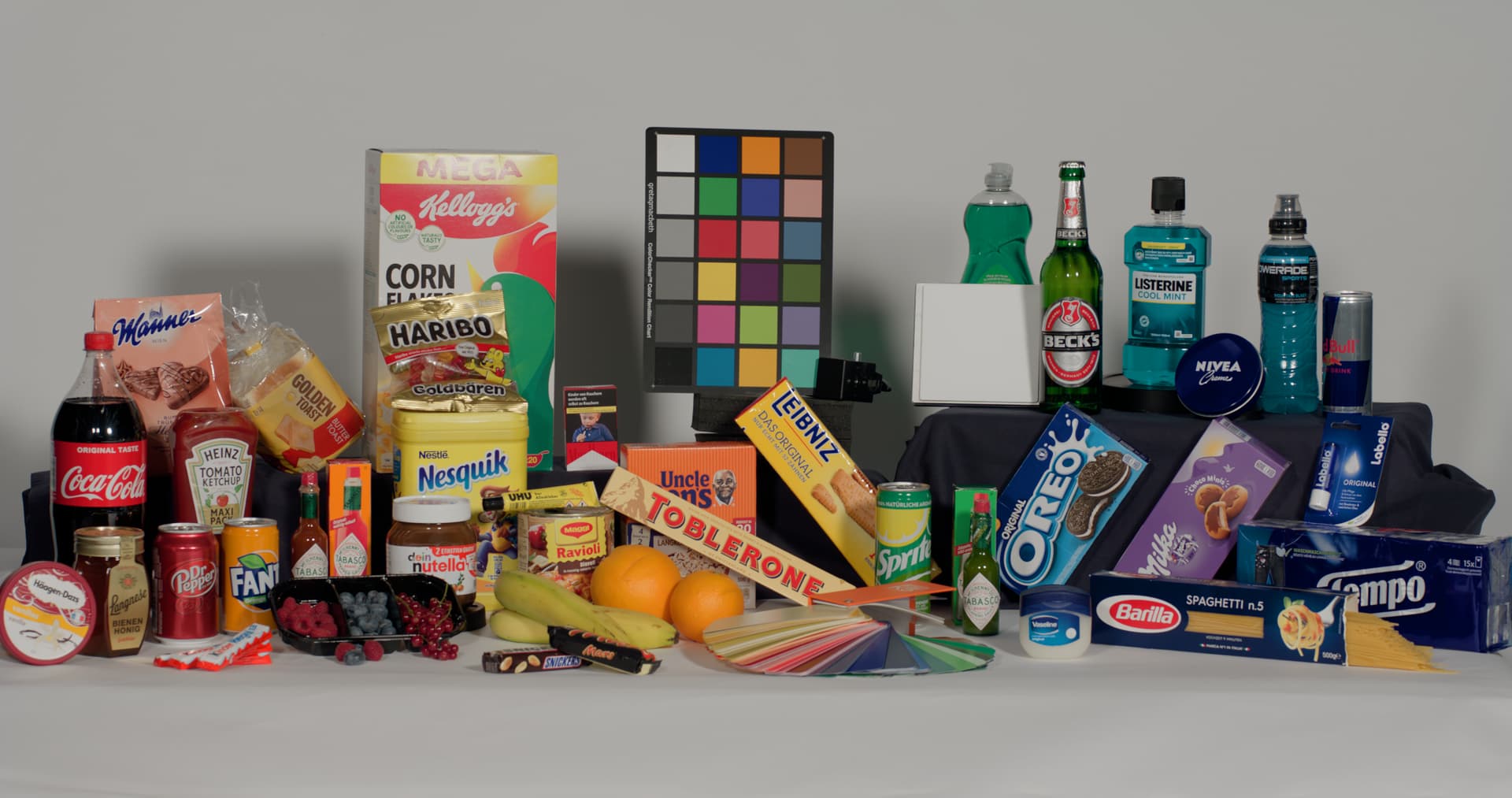
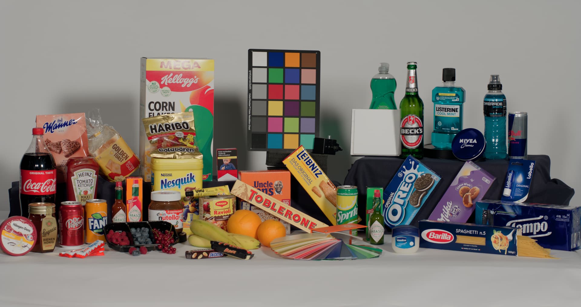
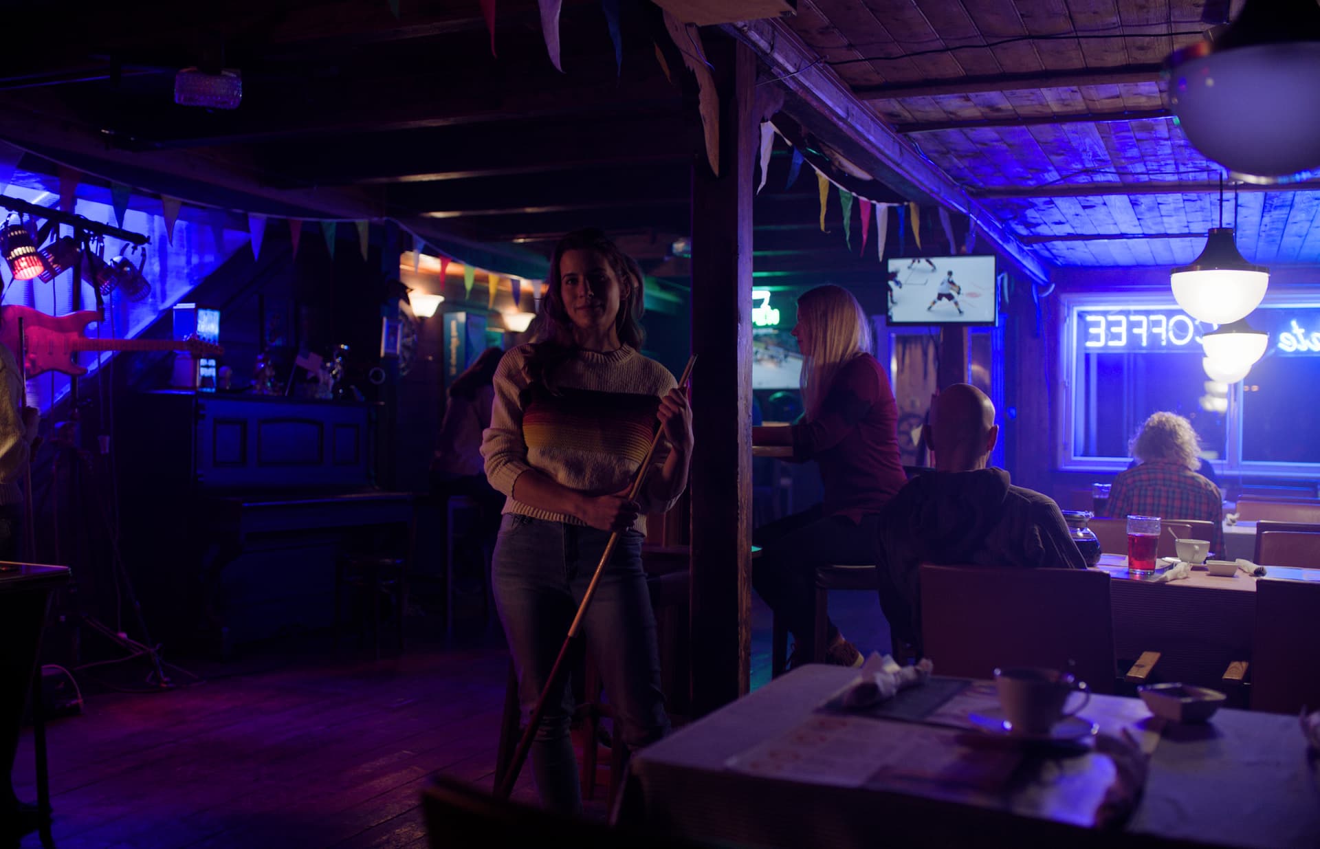
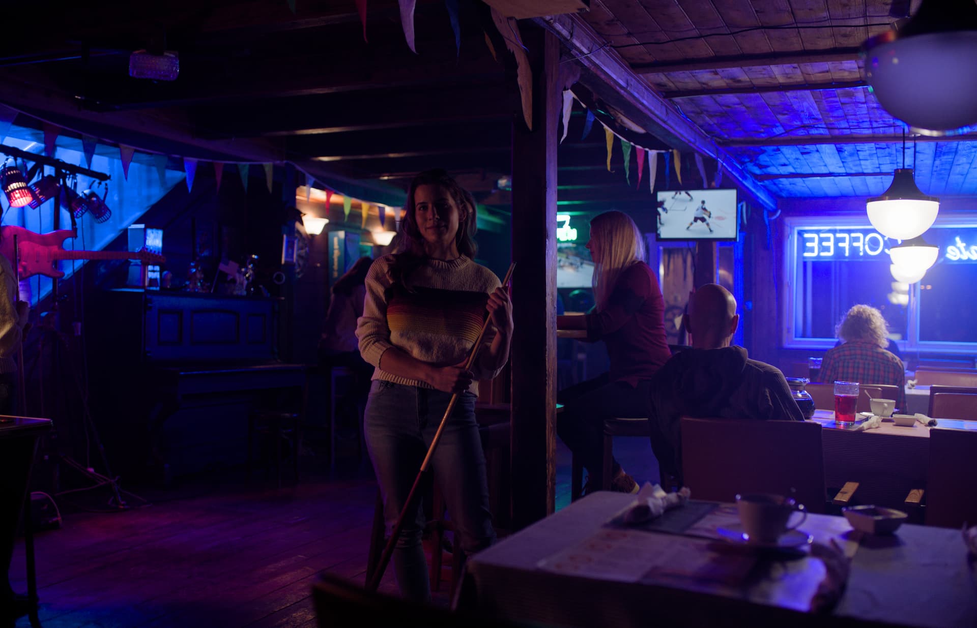
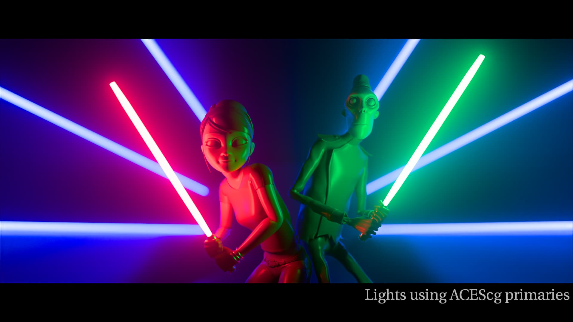
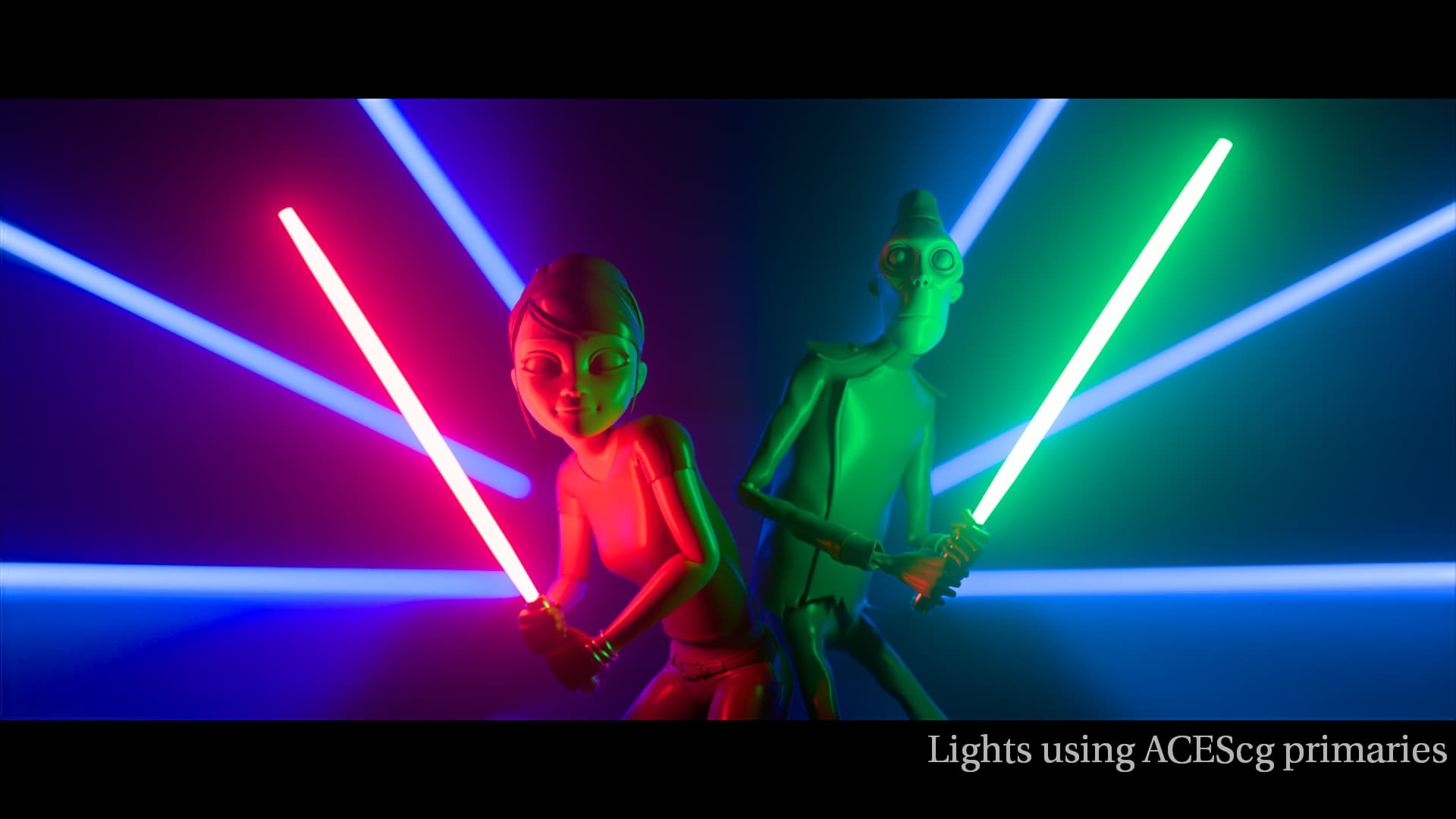
Below are images of v053 sRGB vs v054-pex1 sRGB, in that order.


4 Likes

Thank you for all the hard work! Some gradients look better and some look worse. For example, the wall in this picture have much smoother gradient now but blue reflection on the table is more saturated.

Blue orbs have smoother halos in the new version but overall brightness and peak brightness (!) is lower. It can look really weird in a real image.

Same with the red orbs.

rev054 from Pekka looks good to me and better then rev053. I would like to have the rest of the 2100 ST2084 set this way… but hopefully will get them soon as DCTL rather than LUTs.

I am not sure about the overall and peak brightness issue mentioned by Fedor as the “real” images of the sample group look pretty good with blues and reds not looking out of place… but will pay attention to this. And keeping in mind that these are LUTs which can break towards extremes… but I feel adjustments can be made to these two rev054 better than most previous versions.

I am still wary of baking a clamp like this into the transform, with its resulting scene space skews.

Clamping the input to AP1 is easy for the user to do. It could even be part of a default LMT if it was felt desirable for the “out-of-the-box” look. But putting it in an LMT makes it easier to switch off for those who don’t want it. And there’s always the RGC…

That’s an important point. Extreme images may well include values which are not covered by the LUT shaper.

1 Like

Thanks for the reply Pekka!

Yes, using the HDR 1000 nit transform. If you try to match what the bluescreen shot looks like under ACES 1 using ACES 2 v053, it’s not straightforward. The image very quickly breaks in ACES 2.0 as you are fighting the aggressive compression built in to ACES 2.

In your post below this comparing v053 and v054_pex1, you can see on the “Rec.2020 primaries and complementaries” image that there is a strong change in the reds (column 1) and blues (column 9) almost immediately in v053. That problem in v053 is also apparent in HDR, not just SDR.

There are a certain number of projects where the answer to this would be “Yes, with many nodes” and another number where the answer would be “No, the compression is too limiting”.

I do understand that compromises need to made to best fit the mast majority of projects. For most projects, the gamut compression wouldn’t be a concern. Though I do think the chroma compression would be. I am just concerned that certain projects become boxed in by ACES 2 and that the starting point for ACES 2 seems off for certain colours (red and especially blue). While I can’t say for certain what either the bluecreen or Frontier Casino shot are supposed to look like, when I look at both of them in ACES 2 them seem very off (relative to ACES 1, Trulight CAM v3, RED IPP2) where I would expect them to land.

1 Like

Still haven’t found a good moment to fully evaluate the current 2.0 DRT but over the course of the last meetings I do see some of my concerns being discussed. I think it’s heading in the right direction but since I feel that feedback is a bit scarce I will throw out some of my personal findings. Please be mindful that I’m just one sample of opinions :smiley: .

These are all based on v055 SDR Rec.709.
Screengrabs always have v055 in the middle (second image).

Overall SDR:
I think the rendering is very pleasing and feels quite ‘neutral’ compared to some other DRTs which I find the most desireable to start grading.

Overal HDR:
Can’t comment yet until I’ve evaluated it properly. But I do have a Resolve setup prepped. Don’t have a fancy grading suite but I do have a PA32UGC and dimmable room which should be good enough.

01: ‘normal’ blues SDR
I feel that blue renders slightly too dark or too saturated, or a bit of both. This is very visible when comparing to other renderings but even in isolation I feel that they stand out from other colors too much. My reasoning behind that is that clear skies look quite colorful when objects lit by sunlight look quite desaturated in relation. This ratio looks more sensible in other renderings.

I think that this could be slightly more balanced so that a colorist doesn’t have to worry about always having blues more intense than any other color when wanting to push saturation in a look for example.

Grading: easy to correct.

Examples: (v055 middle)


02: night sky blue
There is one particular image that stood out to me.
The blue sky feels slightly greenish for some reason. I don’t know if this is the same situation as with the notourious blue screen image regarding where the actual data sits… but for this one it just feels ever so slightly off. Perhaps there is a way to ‘justify’ or explain why this is.

Grading: very easy to correct.

Example: (v055 middle)

03: high saturated/emissive blues
While I think improvements have been made to this, I feel that the biggest issue with how blue looks has to do with the transition/gradient to white and probably less with how long it retains color or how dark it is in general. When looking at for example the Rec.2020 spheres you can still see that there is a sort of ‘fold’ in the gradient that in my mind should be smooth. Same can be said for the ‘blue bar’ and the CG dragon with red/blue spheres.

What I found interesting when messing with Resolve’s color warper was that on blue bar, the rendering can very quickly ‘snap’ into a better look by moving the blue outer point slightly towards cyan. Then I found the same tactic also worked for the other problematic images. It feels like there is a point in the DRT that once information sits there it either becomes full blue primary, or becomes desaturated cyan, or jumps to purple. But the range where this happens feels incredibly tight.

I could give myself the argument that I can always grade such images to correct the rendering but it feels odd to me that other renderings don’t suffer from this. When I slide that blue point up and down in the two other DRTs I tested the colors don’t break at that small range I mentioned above.

Grading: what I mentioned above did improve the appearance but it is quite tricky and finicky to manage and make look good so I wouldn’t accept this as part of a colorist’s task and try to aim for a better behaving rendering.


Here is also a video example of what I did.

It’s also worth mentioning that I didn’t use RGC anywhere. I found that RGC didn’t contribute anything to v055 regarding this issue. It only desaturated colors a bit more but didn’t improve gradation. Perhaps different settings are required or a different type of RGC all together for this new DRT instead of the current reference implementation?

04: red noise
I have an image of which you may argue that it’s from a less relevant camera in today’s cinematogrpahy, EPIC-X. But I found it to have a lot of noise on deep red cloth compared to other DRTs. This however is totally diminished and cleaned up when RGC is applied. So I don’t see this as a huge issue but perhaps as an image it’s something interesting to look at. I could probably share this frame with censoring/or crop for internal testing for those of you actually developing it, so if you’re curious let me know.


That’s all I have for now. Hope it’s useful!

1 Like

Shebbe: As to the “jumping”, “breaking”, “tight range” of blue: Could this be due to using a LUT? Just wondering because I have been dismissing adjustments “breaking” to a LUT (or still maybe precision) and looking forward to the math DCTL.

As to the darker blues as you indicate, I can agree. But they are far better than in previous versions. Maybe it is just that the tweak made can be backed off just a bit. The skies in your 2nd and 3rd examples, of the left, seem weak to me. In 4th example, the right sky looks too much saturated. In your Blue-Bar examples the blue in v055 middle seems best to me, even if a bit dark as you point out. Again, maybe backing off the tweak a bit.

The reds could be a bit dark as well, similar to the blues but not as much. I seem to recall that Pekka also mentioned such in the meeting and was considering further refinements???
Only having worked with the two from Pekka, I just got the ver055 put up yesterday so still need to look them over. But I do plan to add another bit to the opinion pile.

Hey Jeffrey, good call. I haven’t looked at Nick’s DCTL implementation yet but I don’t know if that’s already up to v055.

I also agree that the rendering of v055 is better than previous iterations but I didn’t want to compare too much to older versions of the same and rather judge things from where they stand at the moment :slight_smile:

I agree that it looks mostly desirable over the other two, except for the fact that there are harsh jumps which you can also see in those spheres. I think if that can be solved the rest is up to taste parameter tweaking wise.

Just a quick note as to the latest rev055 ODT. The HDR PQ1000 and PQ500 seem to be a good match with the SDR rec.709. >>> However the rec.2100-rec.709sim is way off in both luminance and saturation. (sort of a high contrast, over saturation and clipping)

The P3D65 SDR seems to somewhat match the rec.709 SDR although there is less saturation in the reds of P3. (only a quick look - this is also evidenced on the Vector Scope)

I am viewing these on my M2 iPad Pro in reference mode which can do both SDR and HDR. Keep in mind that having only one of these devices I can only switch between modes and not view side by side. Later I will try comparing with LG OLED TV through a Decklink on my AMD system - keeping in mind that calibration differences may obscure some things. (Also keep in mind that to use the transforms on the iPad, the first line of the DCTL must be commented out and then used in Resolve-for-iPad as a DCTL. This is because Resolve for iPad still does not recognize new “xDT” files from the ACES Transforms folder.)

I just had a rough look and didn’t see a different rendering in v055 2100 709sim over v053 2100 709sim apart from the actual version updates. Didn’t have a second setup handy for comparison to normal 709 though but it looked normal to me.

/////

Out of curiosity I looked at the blue sky again in two images. This time in Rec2100 P3 lim 1000nits and 2100 709 sim. Monitor was PA32UGC in forced HDR PQ clip mode, local dimming enabled, coming from DeckLink Mini 4K HDMI on Windows.

The OT candidate exr in-image labeled 0012 with palm trees felt like a really good match. But the red letters on the vertical sign felt a bit ‘luminous’ in 709sim. Reds overall in that image in 709sim felt slightly ‘salmony’? Not sure how to put it but not as muted red as it presented itself in v055 HDR in relation to the rest of the scene. I think REVEAL (SDR) handled that slightly better but at the same time I also think that reds in REVEAL are incredibly dark, to the point that it feels like a look to me…

REVEAL ------------------------ v055

The OT candidate exr in-image labeled 0049 with mountains. Weirdly the REVEAL P3 1000nit sky felt like a better match to v055 709sim where v055 HDR was a bit too saturated.
Going by what I said in my earlier SDR based findings this perceived mismatch would be increased even more, unless the effects of changing it (making it slightly less saturated) would be counting perceptually equal for SDR and HDR rendering. In any case, wouldn’t want them to be further apart than they are now.

A very quick last comment about the high saturated/emissive blues in HDR, they actually looked totally fine to me. The blue bar still looked very slightly ‘clippy’ on the edges of the window and right next to the core white of the blue text object but that’s somewhat to be expected I guess with such an intense lightsource presenting itself in P3 1000nits. At least it looks as blue as it can be and can be massaged by the user.

Don’t want to say or evaluate much more for now regarding HDR until some other improvements have been made to SDR or some more parameters are locked in.

As to the rec.2100-rec.709sim candidate, I downloaded again and copied to iPad and it does work as expected.

I think what I may have done in my haste is use the P3D65 (Rec709 sim) instead of the Rec2100 (Rec709 sim). I checked the P3D65 (Rec709 sim) and it behaves as the P3D65 also showing less saturation in reds compared with Rec.709

Unfortunately I do not yet have a mathematical DCTL implementation of v55. It’s a lot of repeated work to track each version’s changes in the DCTL.

I hope things are pretty locked down now, and any future changes will just be parameter tweaks, which will be simpler to update in the DCTL. So I will work on having a v55 (or v56) DCTL soon.

2 Likes

Hi @Shebbe what is on the left and right in this post? You mentioned v055 is in the middle. Apologies if I missed the description somewhere else

Hi @swcolour ,

I deliberately didn’t specify the others in my initial post because I felt that naming them may create a certain bias. I also mostly tried to compare them in relation to how they present various tones each within their own and not cross check them too much if that makes sense. But left is REVEAL and right is DaVinci. In the example video you can also see me testing in that same order, the DRT nodes are visible there :slight_smile: .