Alternative compress mode for ACES2 CAM DRT

This post is about trying to find a better alternative for the current compress mode in CAM DRT. My intention at first was to compare 3-4 different compression techniques and maybe find a better alternative, but deeper I got into this, more confused I got about how the current compress mode works.

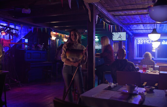
This all started as I wanted to understand why blue behaves so strangely in the Rec.709 transform, why there isn’t highly saturated blue at higher exposures at all (it’s pale blue or white), and why the blues in image like the Blue Bar doesn’t match the HDR version of the rendering (not hue or saturation). Other transforms doesn’t seem to have the same issue. This led me to the compress mode. But, trying just different compression algorithms didn’t really solve the issue.

Why compress mode?

The simplified reason for the compress mode is that the CAM’s perceptual space (let’s call it LMS space) doesn’t deal with negative values well, so chromaticities that are far out there, like they are in some extreme images because of IDTs, or with noise, will lead to skews or artifacting in the final picture. We deal with this problem by compressing the LMS space.

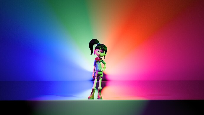
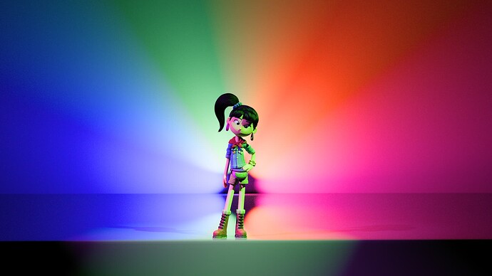
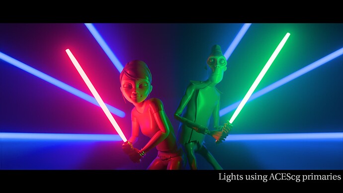
Here’s an extreme example of what may happen without compress mode:

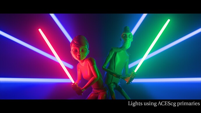
Compress mode enabled:

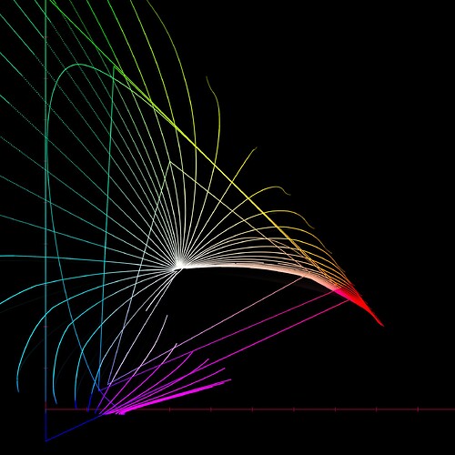
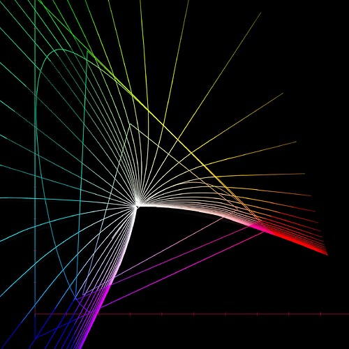
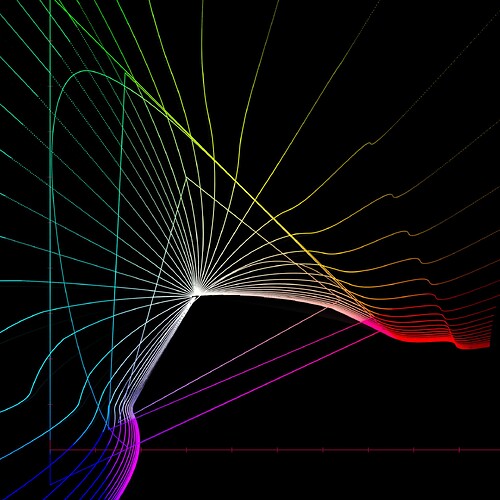
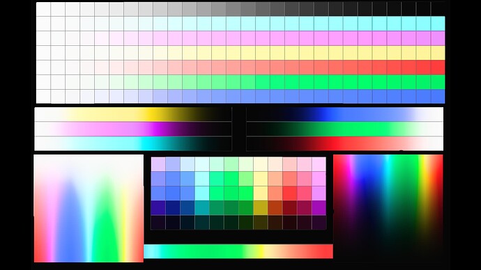
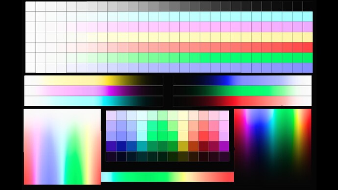
Following image shows hue lines in chromaticity space through the DRT (input is the Dominant Wavelength ramp):

Without compression:

With compression:

With those straighter lines the assumption is that the model now behaves better… but, does it?

Current compress mode

The current compress mode compresses the linear LMS values before the model applies non-linearity, then uncompresses the LMS values, and then the model derives the perceptual components J, M and h. Same compression and uncompression happens on the way back to RGB from JMh. This is what produces those straighter lines in the second diagram above.

But, it is this uncompression that confuses me. Why are we choosing to uncompress and likely go back to negative values? I could understand it perhaps if the intention was to return back to the original scene chromaticities. But instead the intention is to produce entirely new set of display chromaticities. Perhaps it would be better to not do the uncompression and derive the perceptual components from saner values.

Alternative compress mode

I’ve tried two alternatives. One that only compresses and doesn’t uncompress at all. The other compresses in XYZ-to-JMh and only uncompresses in JMh-to-XYZ. The results are practically identical in forward direction, but perhaps unsurprisingly, the second one inverts better. The second one is what rest of this post is about.

I’m treating this as a gamut compression, it just happens to be done in the LMS space. The idea is to reduce the negative values, then stay with those compressed values throughout the transform, and come out of the JMh space with hopefully better display values.

Results

In all of the following examples, I am using the stock CAM16 primaries with the new compress mode. The stock CAM16 primaries actually work quite well, so I decided not to use custom ones. But we know from the past that the blue from this model can be very dark so adjustment to the primaries will be in order. However, I chose not to do that for this experiment to keep things simpler.

The compression algorithm itself is also different. The one that is currently used in the DRT, I found to compress too much in this use case, so I switched it to the ACES GC algorithm so that I can better control how much to compress. All the results are with that algorithm.

Here is the same diagram of the Dominant Wavelengths with the new compression. The lines aren’t as straight as in the current compress mode, but that is because I am not compressing as much. The lines would become straighter if compression is increased:

Images

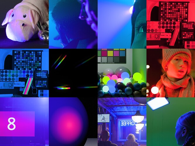
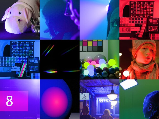
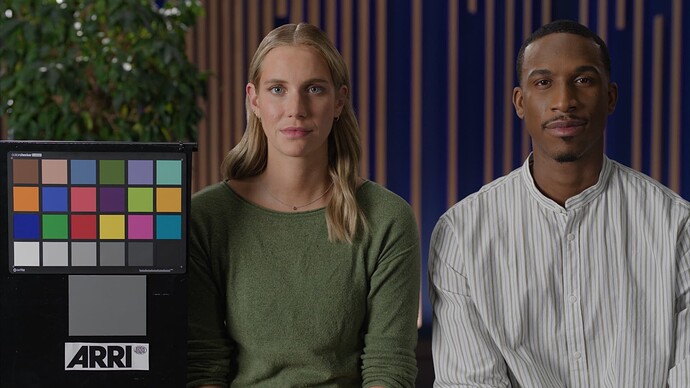
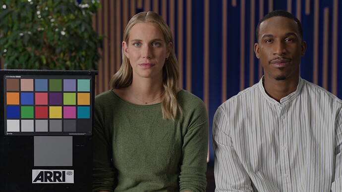
New mode is first image, old mode is second image. Both versions are v034.

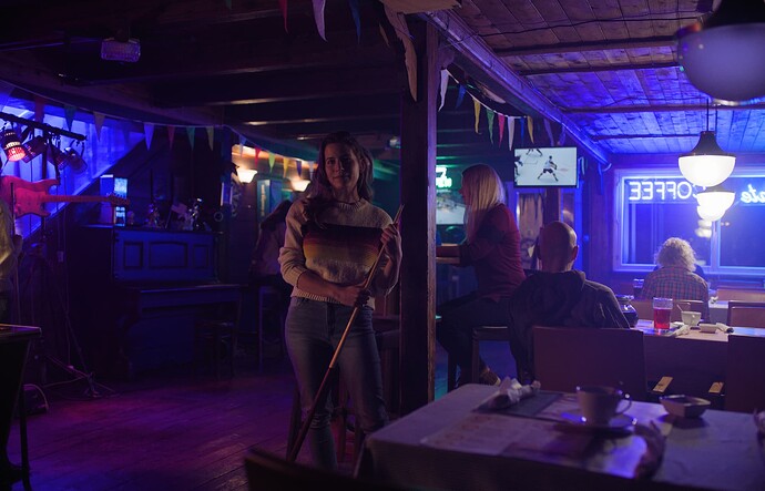
In the Blue Bar, the blue hue is now a close appearance match for Rec.2100 hue and the saturation is a reasonable match:


old:

new:

old:

new:

old:

This image is now a very close match to Rec.2100, which is just brighter version of this:


old:

This image is now a closer match to Rec.2100, which is mainly brighter and more intense version of this:


old:

The blue is clearly darker with the CAM16 stock primaries. On the other hand, this matches Rec.2100 rendering very well (the CAM16 stock primaries darken the blue in Rec.2100 also):


old:

new:

old:

new:

old:

In testing I have found that red matches Rec.2100 red a bit better, including in these images:


old:

new:

old:

Inverse transform

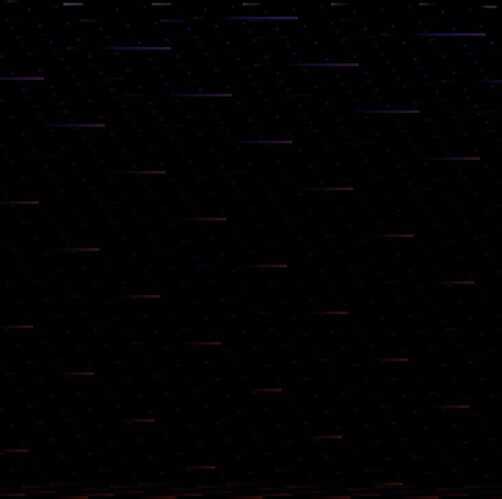
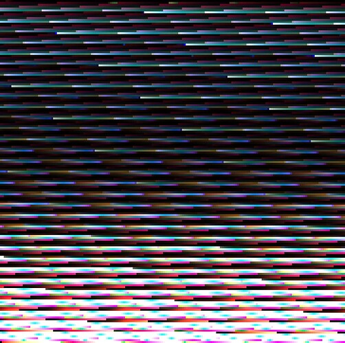
Inverse is clearly better with the new compress mode. Following images show the difference to original linear cube (CMSTestPattern, exposed up by 11 stops to see the differences). NOTE: hard clamping, soft clamping and cusp smoothing has been disabled to see the differences from the compress mode mainly. Darker image is better inverse.

New compress mode, difference:

Old compress mode, difference:

Summary

A prototype version of v034 with this compress mode is available for testing in my repo. It’s named CAM_DRT_v034_new_compress_mode.

I think the results are an improvement and so far I have not found any real issues with this approach. I think this needs to be discussed further and I am certainly looking for comments on this test. The blue, I think, is too dark with stock CAM16 primaries so it should be adjusted. I included only extreme images here, but normal images have no real differences between the modes. The differences that are there are coming from changing to use the stock CAM16 primaries, which brings darker blue as the main difference.
4 Likes

So if I understand correctly, the intent of the compression used in “compress mode” has changed.

In the original version, based on @bottosson’s approach, the LMS values are desaturated non-linearly in order to make all values positive, then the non-linear curve is applied, and then the ‘desaturation’ is inverted. I assume the intent of this is to make values which were already well within range end up with similar values to those they would have produced without ‘compress mode’. But does that actually happen? Since the uncompress happens after a curve has been applied, it is not inverting the same values, so I suspect all values get changed.

In the new alternate approach a ‘gamut compression’, based on the RGC, is applied to the LMS values before the non-linear curve. No inversion of that is then applied until the end, when the entire JMh conversion is inverted back to XYZ. I’m guessing that because the RGC-style compression has a threshold below which values are unaffected, this is what keeps ‘normal’ LMS values unaffected by the gamut compression, so no uncompress is needed.

Am I understanding correctly?

Yes, that’s how this experiment works. For purely forward direction the last uncompress (in JMh-to-XYZ) isn’t needed either, but it’s essential for the inverse transform. That’s interesting actually as the inverse of course starts with 0-1 range display values that are taken to JMh. So, the inverse is best when the display values are also first compressed. I think that’s interesting because, in theory, it should be enough to compress in XYZ-to-JMh in forward direction, and uncompress in JMh-to-XYZ in inverse direction. But that’s not the case. The best inverse is when both compress/uncompress is done in both forward and inverse directions.

From last meeting notes:

  • Pekka Riikonen: I’ll open a PR with a tweaked version that makes the lines less curvy.

I’ve been unable to get it to a point where there isn’t some issue and I am hesitant making a new version that isn’t an improvement. It seems that if we want to lessen the skew to purple then the blue will always be dark (think blue patch in ColorChecker getting darker, or the example pictures above). With brighter blue the skew either always happens, or if it’s “fixed” then other issues come up, like the gamut mapping result around cyan/blue that has been discussed before gets worse. I can see the same happening with the old compression as well by changing primaries. It seems we’ve made this skew worse in our effort to have brighter blue. There may be a compromise that is good enough, but not without darker blue. But why is the blue so dark in this model? Perhaps the lightness metric for blues could be changed, somehow? BTW, making the blue brighter in LMT works fine without introducing any skew to purple (with the above experimental version).

In the last meeting a comparison was shown of the blue bar between the ‘prototype’ version (posted here ) and one that was further tweaked to preserve more brightness information with less skew.

I’m looking at v034 in Resolve now HDR 1000nits and I personally feel that maintaining color more than brightness for SDR makes more sense. I find it to be a better match, as in HDR the color is more saturated of course but it is still darker than the white lights whereas in SDR if it becomes less saturated and brighter it diminishes those relative ratios. If that makes sense. In HDR you also just don’t have the sense of any ‘hot spot’ on that ceiling. The center is the ‘fullest’ color and only fades off in saturation and brightness towards the edges. In SDR you look at a white ish source and a colorful edge.

Also with the other images posted here I feel like it’s a definite plus to keep more color information rather than brightness in the blues for longer in higher exposure ranges. But I understand that the overall brightness of blue is something that needs to be investigated.

I tried grading v034 SDR blue bar to match HDR more. It does somewhat work with the color warper in Resolve but I felt that I had to move the surrounding information too much along the way.

Just some of my thoughts, hope it’s useful.

1 Like

I haven’t had much time with this but I found in testing that by changing the Hellwig2022 model by removing the 0.1 addition from the post adaptation cone response formula and the 0.305 subtraction from the achromatic response formula, the inverse with @bottosson’s compression algorithm is almost identical to inverse with ACES GC algorithm. Nothing seems to change with the ACES GC so it’s not like it improves inverse, but it does have huge impact with the current compression algorithm. See the difference images in the post above to get an idea.

So the formulas would change from:
A = 2R_a + G_a + 0.05 B_a - 0.305
RGB_c=(400 * sign(FLRGB) * FLRGB) / (27.13 + FLRGB) + 0.1

to:
A = 2R_a + G_a + 0.05 B_a
RGB_c=(400 * sign(FLRGB) * FLRGB) / (27.13 + FLRGB)

for achromatic response and post adaptation cone response, respectively. There’s no visible difference in the image.

These changes would be in line with what has been suggested also for CIECAM02 and CAM16, for example in paper Algorithmic improvements for the CIECAM02 and CAM16 color appearance models.

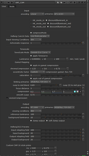
I pushed a new v035 proto version to my proto DRT repo. It now includes the adjusted formulas I posted above, an achromatic response slider in the GUI to change it, and adjusted primaries to improve the SDR/HDR blue match.

The achromatic response slider adjusts how much each LMS channel contributes to the achromatic response. 0 would be equal contribution and 1 is the default from the model. I’ve set it to 1 by default.

The pimaries change the blue hue a tiny amount, but it’s enough to bring the SDR/HDR match closer, based on my testing. It’s not a big change but the match feels better. The blue is a bit darker as a result, which can then be adjusted with the achromatic response slider, if wanted.

Example images follow. v035 proto first image, v034 second image.


Haven’t put SDR/HDR side by side yet but from memory that first new image does look a lot better than previous version. Doesn’t shift that much to purple anymore making the ‘hotspot’ as I called it earlier much less apparent. Now I’m not that ‘offended’ anymore by it desaturating more in SDR representation. Small change, big win imo.

Looking good. The only thing I would point out is that by preserving the saturation of the blue light shining on the green baize of the pool table, it creates the appearance of the pool balls having shadows which are brighter than the surrounding table, as they have higher luminance.

We had this same issue with the Reference Gamut Compression. and that image.

Taking the Achromatic response slider down to e.g. 0.3 fixes the “bright shadow” issue, but introduces some magenta skew.

My feeling is that it’s probably more blue brightness issue than saturation issue. For example, the proto version from the top of this thread has a very dark and saturated blue, but if you make it brighter in LMT (for example increase blue value), it looks better and still has nice saturation.

Thank you Pekka for your continued tinkering.

This latest result appears to be a reasonable compromise.

It seems like many of the (potentially) final components in this transform have been settling into place over the past several weeks/months and may only require fine tuning of the parameters. This particular component seems a bit more difficult to tame, but I think the (differing) results are worth exhausting the possible options.

This question has effectively been asked before, and also echoes Shebbe’s first comment, but I wanted to get it in a post with the hope of a clearer understanding.

What is the interplay between the choice of LMS primaries, choice of compression algorithm, parameters of the compression algorithm and use of your custom Hue eccentricity function (for H-K or chroma compression/Gamut mapping)?

Blue bar is a great worst case example, but I wonder if some better “ground truth” type images/targets could be produced to better evaluate the most difficult blue regions.

1 Like

The LMS primaries has the biggest impact in color. The LMS compression has impact as well, but that’s a technical necessity, as explained in the beginning of this thread.

The custom eccentricity factor has only a small impact. The eccentricity factor is actually part of the chroma compression gamut (not related to gamut mapping limiting gamut), and that has bigger impact. It is what was introduced v032 with the new chroma compression algorithm. It effectively limits how much chroma compression compresses, with the intention of protecting purer colors from being over compressed. This is done in the name of getting tighter inverse, with the goal of being able to invert Rec.709 to AP1.

I have no doubt the forward direction could be made better if there was no need to invert. And it could be made better if we didn’t have the need to invert to AP1. IMHO, AP1 inversion is a tough requirement because the source camera material, even in best cases, is going to be within AP0, and in practice often outside AP0.

But the question I still have is, why is the blue so dark in this model? ZCAM didn’t have the blue this dark. Not in the higher exposure levels, and not in the lower either. I don’t think it’s just the LMS primaries. It may be the lightness metric, which is why I started playing with the achromatic response. But I’m still none the wiser.

The best blue I’ve seen with this model is the prototype version from the top of this thread with an LMT that makes the blue brighter. Not only will it retain saturation at higher exposure levels longer, but by also making it brighter it makes all these challenging images look better (and match HDR better).

I am not yet using v035, but the issue I am noting is with the Blue channel and I am not sure v035 will fix as I also note it with using ACES Transform in Resolve and previous versions. So I am placing post here… please move if better suited elsewhere.

Something does seem off with the blue channel. I am using DaVinci Resolve 18.5

I selected a couple test images and then made nine frames of each. I then used the RGB Mixer to set each to a single channel of R, G or B with either rec709, rec2100(rec709sim) or rec2100(P3D65,540nits) The RGB Mixer node was placed last, after the transforms and with ‘Preserve Luminance’ unchecked.

In both SDR and HDR the blue channel showed issues in that lighter parts look disproportionately lighter. There may be also issues in the darker portions. In particular looking at the neon COFFEE sign in frame 0075 (blue bar): In the blue channel the higher brightness level looks not only too high but then also seems to reverse (sort of like a solarization.) In the SDR rec.709, one must look carefully, but will see the same (wiggling the gain adjustment can help to see it.) This is the same in both SDR and HDR, but more noticeable in HDR.

I then checked some earlier versions to see where this issue might have first appeared. I found this issue in the blue channel always appeared. So then I tried in ACES 1.3 SDR and HDR and also the issue appeared.

Then I replaced the ACES Transform with a DaVinci Resolve Color Space Transform. Input space/gamma to ACES (AP0)/Linear and output of rec.709 Gamma 2.4. The issue DID NOT SHOW and changing gain would vary the brightness as expected.

So then I changed the Color Space Transform output to ‘use timeline’ which was still set to ACES as it had not been changed from working with ACES2. And I added a DCTL of the v034 rec.709. Some of the issue (solarization like effect) could then be noticeable when twisting the gain.

I then repeated for HDR settings. (DCTL node disabled; output color space of the CST set to P3-D65/Rec.2100 ST2084; and the color management output set to Rec.2100 ST2084 and remaining on timeline of ACES)
Changing gain would vary the brightness as expected with NO ISSUE.

Then the CST output was set to timeline and the DCTL for HDR v034 Rec.2100(Rec.709sim) added. At lower gain settings the letters of the sign were darker than surrounding and with higher gain higher than surrounding. Remember this is looking at the blue channel only.

And then with the DCTL changed to Rec.2100(P3-D65, 540nit limited) the issue can be clearly seen, also looking like solarization as before.

These results can also be seen clearly in frame 0058.
Frame 0017 also shows issue in area of sun (there is also a bit in the red channel, and green channel at low levels.)
Frame 0050, the blue glass on table shows issue when gain is lowered. (I am also remembering the green bottle shown at meeting, but I was concentrating on Blue channel here.)

Related or not, several frames show noticeable banding in individual color channels with blue having the greatest amount.
frame 0035 shows lots of banding in all channels (output monitoring is 12-bit 4:4:4)
frames 0039, 0045, 0060 show significant banding in blue channel

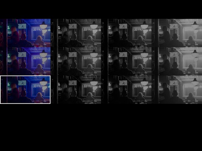
Here is an example of above solarization like issue (in the blue channel.) Note that in order to show the example I have had to make the screenshot at a lowered gain. Original results look nicer, but will just be washed out/clipped in screenshot photo.
(Please excuse the bright white surround box as this is an annoying issue that I have already reported to BMD.)
Using iPad Pro M2 with DaVinci Resolve for iPad version 18.1.3.0.0004

Columns are:

  1. full RGB
  2. R channel
  3. G channel
  4. B channel

top row is DaVinci CST set to Rec.709 color space & Rec.200 ST2084 Gamma, tone-mapped 200 nit max (set to make similar brightness to others)

middle row is rev034 Rec2100(Rec709 sim) (this shows the issue in the Blue channel)

bottom row is Resolve ACES Transform ACES1.3, P3-D65 ST2084 (108nits) with ACES reference gamut compress (a rough comparison to compare the above with ACES 1.3)

1 Like

9 posts were split to a new topic: Debating CAMs